In the fast-paced world of steel and metals manufacturing, every process — from raw material procurement to product dispatch — affects profitability and operational efficiency. Tracking all this manually is nearly impossible. That’s where the Steel & Metals Dashboard in Excel comes in — a ready-to-use, interactive, and data-driven dashboard that transforms complex manufacturing data into clear visual insights.
This Excel-based dashboard gives managers, engineers, and analysts a holistic view of business performance — covering production, costs, revenues, energy efficiency, and customer satisfaction — all in one centralized platform.
Let’s explore how this powerful Excel dashboard can help the steel and metals industry achieve operational excellence.
Click to Purchases Steel & Metals Dashboard in Excel
What Is a Steel & Metals Dashboard in Excel?
A Steel & Metals Dashboard in Excel is an advanced analytical tool built entirely in Microsoft Excel that helps track, visualize, and analyze key metrics from steel and metal production operations.
It consolidates data from multiple departments — including production, finance, sales, energy management, and customer relations — to provide a unified, real-time performance snapshot.
Instead of spending hours compiling reports, you can now view all critical KPIs in one dashboard and identify issues quickly.
Key Features of the Steel & Metals Dashboard
The dashboard is designed to be user-friendly, interactive, and highly visual, with built-in slicers and a clear page navigator. Here’s what makes it stand out:
Page Navigator
Located on the left side, the page navigator allows seamless movement between pages like Overview, Department, Product, Plant, and Month Analysis. Users can switch between reports instantly — improving accessibility and saving time.
Slicers for Dynamic Filtering
Each analytical page includes slicers that let you filter data by time, location, product type, or department. This flexibility makes your analysis more detailed and context-specific.
Clean Visual Design
With a professional color scheme, clear typography, and interactive visuals, the dashboard offers a modern, easy-to-interpret layout ideal for executive presentations.
Pages Included in the Dashboard
The Steel & Metals Dashboard in Excel includes five major analytical pages, each focusing on a specific business dimension.
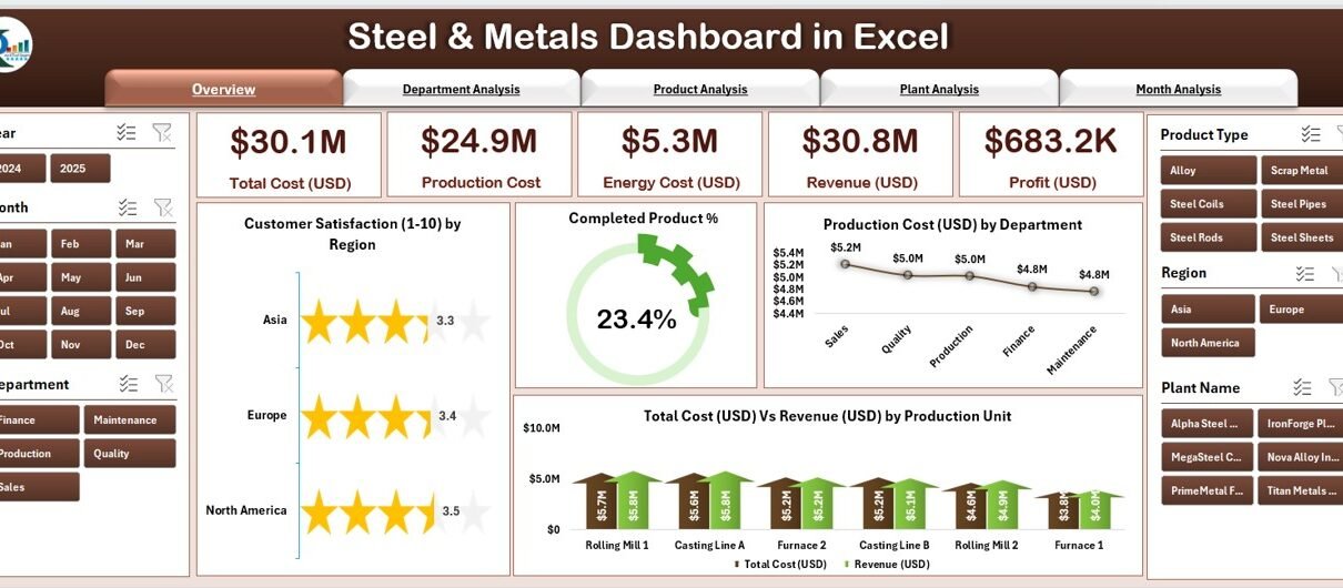
1. Overview Page — The Executive Summary

The Overview Page is the main landing page of the dashboard. It summarizes the entire business performance at a glance.
It contains:
-
4 KPI Cards displaying key indicators like:
-
Customer Satisfaction (1-10 scale)
-
Completed Product %
-
Product Cost (USD)
-
Total Cost (USD) vs Revenue (USD)
-
-
Charts that provide quick insights:
-
Customer Satisfaction (1-10) by Region
-
Completed Product % by Department
-
Product Cost (USD) by Department
-
Total Cost (USD) vs Revenue (USD) by Product Unit
-
This page allows top management to see how well each region and department performs, ensuring informed strategic decisions.
2. Department Analysis — Performance by Function

The Department Analysis page dives deeper into departmental efficiency and financial contribution.
It includes:
-
Customer Satisfaction (1-10) by Department
-
Total Cost (USD) vs Revenue (USD) by Department
-
Energy Cost (USD) by Department
This analysis helps identify departments that are exceeding or falling short of their goals. For example, a department with high energy costs and low customer satisfaction signals a need for immediate review.
3. Product Analysis — Profitability by Product Line

The Product Analysis page examines how each product contributes to total revenue, cost, and profitability.
Key visualizations include:
-
Customer Satisfaction (1-10) by Product
-
Total Cost (USD) vs Revenue (USD) by Product
-
Profit (USD) by Product Type
Click to Purchases Steel & Metals Dashboard in Excel
This helps management pinpoint high-margin products, underperforming lines, and potential areas for product improvement or pricing optimization.
4. Plant Analysis — Operational Efficiency by Plant
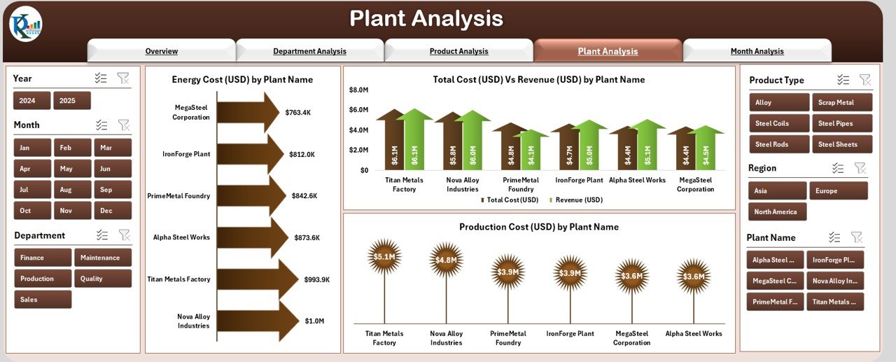
Every manufacturing plant has unique challenges. The Plant Analysis page offers insights into plant-wise performance metrics.
It includes:
-
Total Cost (USD) vs Revenue (USD) by Plant Name
-
Product Cost (USD) by Plant Name
-
Energy Cost (USD) by Plant Name
By comparing plants side-by-side, you can detect bottlenecks, inefficiencies, or cost overruns and take corrective actions swiftly.
5. Month Analysis — Time-Based Performance Tracking
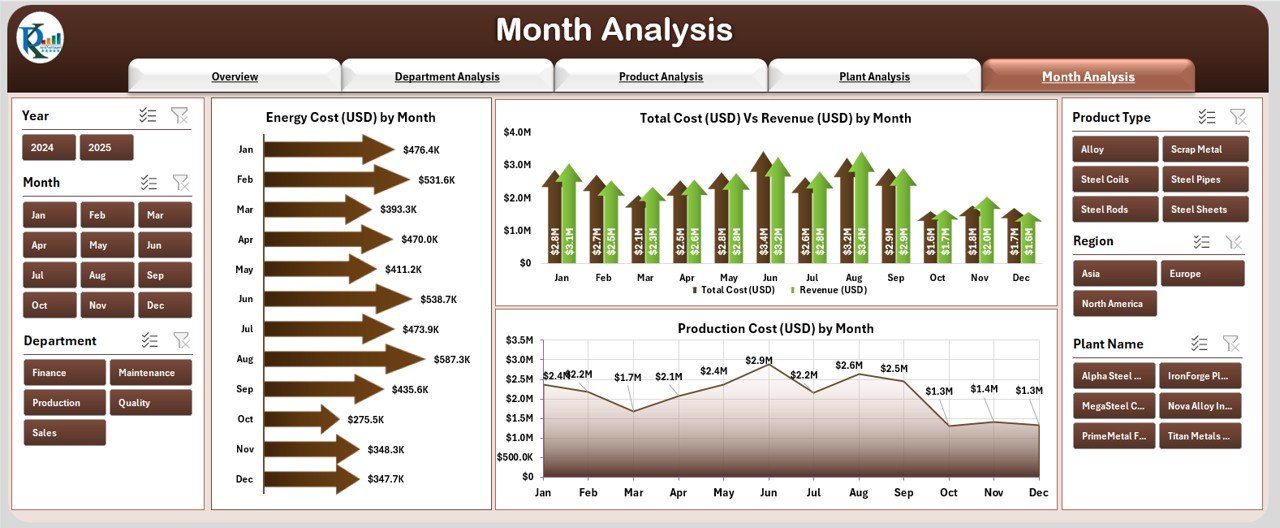
The Month Analysis page helps track cost and revenue trends over time.
Charts include:
-
Energy Cost (USD) by Month
-
Total Cost (USD) vs Revenue (USD) by Month
-
Product Cost (USD) by Month
This temporal analysis allows you to study seasonal trends, forecast future performance, and adjust resource allocation accordingly.
Support Sheets
Data Sheet
All the raw data — including product details, plant data, costs, and satisfaction scores — is stored in a structured data sheet. The dashboard pulls insights dynamically from this source, ensuring that every visualization is updated in real time when data changes.
Why Use a Steel & Metals Dashboard in Excel?
Managing a steel and metals business involves numerous interrelated variables — production efficiency, energy consumption, customer satisfaction, and revenue margins. Relying on manual reports often causes delays, inconsistencies, and poor visibility.
The Excel dashboard solves these issues by providing:
-
Centralized data visibility
-
Automated performance reporting
-
Quick decision-making tools
-
Clear communication across teams
Advantages of the Steel & Metals Dashboard in Excel
Here are some major advantages that make this dashboard indispensable:
✅ 1. Real-Time Performance Tracking
Monitor production, cost, and satisfaction metrics in real time without manual updates.
✅ 2. Easy Customization
Modify charts, KPIs, or slicers easily to fit any department, region, or timeframe.
✅ 3. Improved Decision-Making
Executives can visualize trends and take proactive measures to improve output or reduce costs.
✅ 4. Energy Cost Optimization
Identifying high-energy-consuming plants or departments helps control waste and reduce bills.
✅ 5. Enhanced Customer Focus
Customer satisfaction charts ensure teams stay aligned with market expectations.
✅ 6. Ideal for Presentations
The sleek design and dynamic visuals make it perfect for board meetings or investor updates.
How the Dashboard Supports Business Decisions
A well-designed Excel dashboard offers insights that can drive real business transformation. Here’s how:
Operational Optimization
By identifying inefficiencies in energy consumption or production time, managers can implement corrective actions.
Financial Management
Tracking revenue and cost across plants, products, and departments reveals profit drivers and cost centers.
Customer Relationship Enhancement
Continuous monitoring of customer satisfaction helps improve product quality and service responsiveness.
Strategic Planning
Historical trend analysis assists in accurate forecasting, resource planning, and budgeting.
Best Practices for Using the Steel & Metals Dashboard
To get the most value from your dashboard, follow these best practices:
⚙️ 1. Keep Data Updated
Always refresh or import the latest data before reviewing KPIs to ensure accurate reporting.
📊 2. Define Clear Targets
Set monthly or quarterly targets for each KPI to track progress effectively.
🧠 3. Use Filters Wisely
Leverage slicers to analyze data by plant, department, or month for precise insights.
💡 4. Compare Trends
Review month-on-month changes in cost, production, or satisfaction to detect performance shifts early.
🧾 5. Review Profitability
Regularly analyze Total Cost vs Revenue charts to identify underperforming areas.
🔍 6. Maintain Data Hygiene
Ensure all input data (especially numeric columns like cost, units, and ratings) follows consistent formatting.
🏭 7. Customize Visuals
Tailor color codes and chart layouts to match your corporate style for professional reporting.
Practical Applications of the Dashboard
This Excel template can be used by:
-
Production Managers — to monitor daily plant performance
-
Finance Teams — to analyze cost and revenue patterns
-
Operations Heads — to compare departmental efficiencies
-
Top Management — to track profitability trends and set strategies
It’s especially useful for medium to large-scale steel and metal industries that require consolidated data visibility without investing in complex ERP tools.
Why Excel Is the Ideal Platform
While there are many BI tools, Excel remains a favorite due to:
-
Accessibility: Everyone knows how to use Excel
-
Cost-Effectiveness: No expensive software licenses
-
Customizability: Full control over formulas, visuals, and data structure
-
Offline Availability: Works without internet access
-
Integration Flexibility: Easily connects with CSV, ERP exports, or manual input data
How to Implement the Steel & Metals Dashboard
Follow these steps to start using it:
-
Collect Data: Gather data from production, finance, and customer sources.
-
Input into the Data Sheet: Enter or link data into the dashboard’s Data tab.
-
Refresh the Dashboard: Use the slicers to view data across dimensions.
-
Customize Charts: Adjust visuals or KPI targets as per your organization’s structure.
-
Share Insights: Export visuals to PowerPoint or PDF for management reports.
Within minutes, you’ll have an actionable, visual summary of your business.
Conclusion
The Steel & Metals Dashboard in Excel is more than a reporting tool — it’s a strategic asset for modern manufacturing organizations.
It transforms raw data into actionable insights, helping managers optimize production, control costs, enhance energy efficiency, and maintain customer satisfaction.
With its interactive pages, slicers, and dynamic charts, it simplifies decision-making at every level — from shop floor supervisors to executive directors.
If you’re looking for a ready-to-use, powerful, and professional dashboard to analyze your steel and metals operations, this Excel solution is your go-to choice.
Frequently Asked Questions (FAQs)
1. Who can use the Steel & Metals Dashboard in Excel?
Manufacturing companies, plant managers, financial analysts, and department heads in the steel or metals industry can use this dashboard to monitor and analyze performance metrics.
2. Can I add more KPIs to the dashboard?
Yes, you can easily add more KPIs or modify existing ones by updating formulas in the Data Sheet and linking them to new visuals.
3. Does it work with Power BI or Google Sheets?
While this dashboard is built for Excel, the same data structure can be exported to Power BI or Google Sheets if needed.
4. How often should I update the data?
For accurate insights, update the data weekly or monthly, depending on production and reporting frequency.
5. Can it handle large datasets?
Yes. Excel’s advanced table and pivot features can manage thousands of records efficiently, especially when structured properly.
6. Is this dashboard beginner-friendly?
Absolutely. It’s designed for easy use with clear labels, slicers, and automated calculations — no advanced Excel skills required.
Visit our YouTube channel to learn step-by-step video tutorials