Venture capital teams handle high-value investments, portfolio risks, fund performance tracking, partner reviews, and industry trend analysis every day. Because of this, they need a clear and organized way to monitor essential numbers in one place. However, many VC analysts still manage their reports in scattered spreadsheets. When they do that, they lose visibility, slow down decisions, and struggle to measure fund health properly.
A Venture Capital Dashboard in Excel solves these problems instantly. It brings all portfolio KPIs—valuations, exit probability, burn rates, revenue trends, partner performance, and industry insights—together in a single visual dashboard. You get clean charts, dynamic slicers, and ready-to-use insights that help you move from manual reporting to confident, data-driven investment decisions.
In this guide, you will understand everything about this dashboard—its structure, features, benefits, best practices, and real-world use cases. You will also learn how this Excel template helps investors, VC analysts, and fund managers track performance with accuracy and speed.
Click to Purchases Venture Capital Dashboard in Excel
What Is a Venture Capital Dashboard in Excel?
A Venture Capital Dashboard in Excel is a ready-to-use analytics system that tracks fund performance, investment metrics, partner activity, industry trends, and monthly valuations. It organizes all important financial and operational data in easy-to-understand visuals. You can use slicers to select months, funds, partners, or industries and instantly see updated charts.
Because Excel is accessible, flexible, and powerful, a dashboard becomes a perfect tool for every VC team. It works like a decision-support system that gives you quick answers about fund health, risk exposure, future opportunities, and expected returns.
Why Does a Venture Capital Team Need a Dashboard?
Every investment decision depends on clear data. Without a dashboard, numbers stay scattered and disconnected. As a result, teams spend more time searching for insights instead of acting on them.
When you use a VC dashboard in Excel:
-
You view real-time portfolio performance.
-
You compare valuation changes over months.
-
You evaluate industries with high return potential.
-
You measure partner contribution and deal activity.
-
You identify funds with high exit probability.
-
You track burn rate, risks, and ESG performance.
Because the dashboard is visual and dynamic, analysts and partners can review trends faster and make decisions with confidence.
Key Features of the Venture Capital Dashboard in Excel
The dashboard includes 5 powerful analytical pages, a Page Navigator, and two support sheets. Let us understand each part in detail.
Page Navigator: What Makes Navigation Easier?
The dashboard includes a sidebar navigator on the left side. It helps you switch between different pages quickly. You simply click the desired page, and Excel loads the full report instantly.
This feature makes the dashboard user-friendly because you don’t need to scroll or jump manually between worksheets.
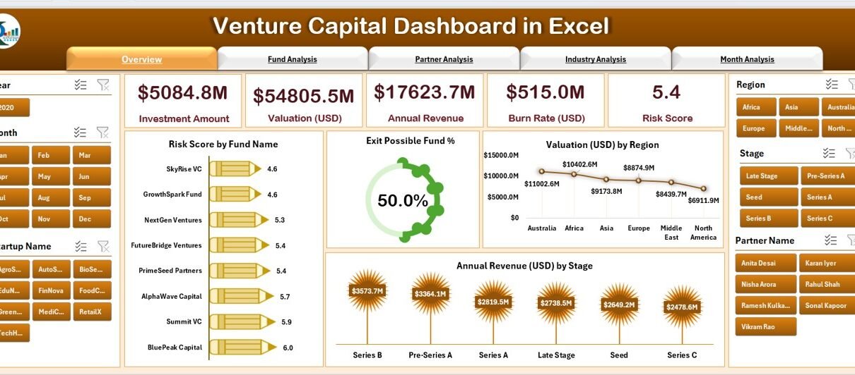
1. Overview Page – What Insights Does It Provide?

The Overview Page acts as the main summary of the entire VC portfolio.
✔ Key Elements on This Page
-
A right-side slicer to filter data by Fund Name, Region, Stage, or Industry.
-
Five performance cards showing important KPIs.
-
Four analytical charts, including:
-
Risk Score by Fund Name
-
Exit Possible Fund %
-
Valuation (USD) by Region
-
Annual Revenue (USD) by Stage
-
✔ Why This Page Matters
You get a complete snapshot of portfolio performance in one place. Every chart reacts to your slicer selection, so you can review funds individually or as a group. It helps teams understand which funds carry higher risk, which regions show stronger valuations, and which stages deliver the most revenue.
Because the layout is visual, you interpret results within seconds.
2. Fund Analysis – How Do You Evaluate Every Fund?

The Fund Analysis Page highlights fund-level performance in detail.
✔ What This Page Includes
You get a right-side slicer and three powerful charts:
-
ESG Score by Fund Name
-
Burn Rate (USD) by Fund Name
-
Valuation (USD) by Fund Name
✔ Why It Helps
This page gives you the ability to:
-
Compare ESG performance for responsible investing.
-
Identify funds with high burn rates.
-
Track valuation growth across the portfolio.
Because ESG and burn rate metrics influence long-term investment behavior, this page plays a key role in fund monitoring.
3. Partner Analysis – What Contribution Do Partners Make?

Every deal depends on partners. This page gives you a clear view of partner-level activity.
✔ Charts Included
-
Annual Revenue (USD) by Partner
-
Investment Amount (USD) by Partner Name
-
Burn Rate (USD) by Partner Name
✔ Why It Helps VC Teams
You immediately understand:
-
Which partners bring higher revenue.
-
Who invests more frequently.
-
Which partners handle cost-heavy projects.
With this clarity, you manage partnership strategies better and allocate responsibilities more effectively.
4. Industry Analysis – Which Industries Perform the Best?
Click to Purchases Venture Capital Dashboard in Excel

The Industry Analysis Page gives you a sector-level performance comparison.
✔ Charts Included
-
Valuation (USD) by Industry
-
Annual Revenue (USD) by Industry
-
Exit Possible Fund % by Industry
✔ Why It Matters
Because every industry performs differently, this page guides investment strategy. You can see:
-
Which industries offer higher revenue potential.
-
Areas where valuations are rising.
-
Sectors with better exit opportunities.
This insight helps VC teams identify the strongest investment categories.
5. Month Analysis – How Does Performance Change Month by Month?

The Month Analysis Page shows the movement of KPIs across different months.
✔ Charts Included
-
Investment Amount (USD) by Month
-
Valuation (USD) by Month
-
Annual Revenue (USD) by Month
✔ Benefits
You track portfolio growth over time. Because trends shift regularly, this page helps you evaluate improvements, declines, and seasonal performance.
Support Sheets
✔ Support Sheet
Used to store reference tables, dropdown lists, and mapping tables for slicers and KPIs.
✔ Data Sheet
This is where all raw data is stored.
The dashboard pulls information from this sheet to update all visuals dynamically.
Advantages of a Venture Capital Dashboard in Excel
Using this dashboard gives many powerful benefits. Below are the most important advantages.
1. Instant Visibility of Portfolio Performance
The dashboard gives you real-time insights without complex tools. You understand fund performance, partner contribution, revenue trends, and risk factors quickly.
2. Better Investment Decisions
Because data stays structured and visual, you can evaluate investment opportunities clearly. You decide faster and with confidence.
3. Clear Fund Comparison
The dashboard displays fund names, their risk score, valuation, and revenue. You compare them in seconds and identify high-performing funds.
4. Improved Partner and Industry Insight
You track partner-level performance and industry trends. With this knowledge, you manage relationships better and allocate investments wisely.
5. Easy to Use and Easy to Customize
Excel dashboards are simple, flexible, and user-friendly. You can modify charts, slicers, and data tables without advanced technical knowledge.
6. Helps Monitor Risk and Exit Possibilities
You view risk scores, burn rates, and exit percentages. These numbers help you manage future risks and plan exit strategies with accuracy.
7. Works for Small and Large VC Teams
Because Excel is accessible, every organization—from small firms to large investment groups—can use this dashboard effectively.
Best Practices for Using a Venture Capital Dashboard in Excel
To get the best results, follow these smart practices:
1. Keep Your Data Updated Regularly
Update the Data Sheet whenever you add new investments, valuations, or revenue numbers. Updated data ensures accurate insights.
2. Standardize Data Formats
Use consistent date formats, currency formats, and metric units. Standardized data gives clean visualizations.
3. Use Slicers for Deeper Analysis
Slicers help you filter the dashboard instantly. Use them to compare:
-
Funds
-
Investors
-
Regions
-
Industries
-
Stages
-
Months
This gives you a 360-degree understanding of your portfolio.
4. Review Monthly Trends Carefully
Month-over-month charts help you detect early performance changes. Use this data to adjust your investment strategies.
5. Track Both Risk and Valuation Together
A fund’s valuation may rise even when risk levels change. Always monitor both metrics to maintain a balanced investment approach.
6. Use the Dashboard During Strategy Meetings
Present insights directly from the dashboard. It improves communication and supports faster decisions.
7. Backup Your Data Regularly
Keep a secure copy of your Data Sheet. It protects you from accidental loss and ensures stability.
Real-World Use Cases
This dashboard works perfectly for many scenarios:
-
Portfolio performance review
-
Monthly investor meetings
-
Pre-investment due diligence
-
Partner compensation analysis
-
Industry growth analysis
-
Exit strategy planning
-
Risk review sessions
-
Valuation forecasting
Its versatility makes it a valuable tool for every VC team.
Conclusion
A Venture Capital Dashboard in Excel helps teams manage investments with clarity, speed, and confidence. It organizes all essential metrics—fund performance, partner contribution, industry trends, monthly valuation, revenue, ESG score, and burn rate—into one powerful visual tool. Because it uses Excel, you can customize it, expand it, and update it easily.
This dashboard supports smarter, faster, and more strategic decisions. Whether you handle early-stage startups or large diversified portfolios, this template can transform the way you track and review investment performance.
Frequently Asked Questions (FAQs)
1. What is a Venture Capital Dashboard in Excel?
It is a ready-to-use Excel template that tracks fund performance, valuations, revenue growth, risk score, partner contribution, and industry trends using charts, slicers, and data tables.
2. Who can use this dashboard?
VC analysts, fund managers, investors, financial consultants, startup incubators, and portfolio managers can use it for smarter decision-making.
3. Is Excel good for venture capital analysis?
Yes, Excel offers flexibility, simple customization, and powerful formulas. It works well for portfolio tracking, valuation analysis, and trend monitoring.
4. What are the main components of this dashboard?
The dashboard includes Overview, Fund Analysis, Partner Analysis, Industry Analysis, and Month Analysis pages along with support and data sheets.
5. Can I customize the charts and slicers?
Yes, you can modify colors, formulas, layouts, and chart types based on your requirements.
6. Does the dashboard work for multiple funds?
Yes, the slicers allow you to filter and analyze any number of funds, partners, or industries.
7. How often should I update the data?
You should update it weekly or monthly depending on the frequency of portfolio changes.
8. Why should I track burn rate and risk score?
Burn rate shows how fast funds spend money, and risk score helps you evaluate long-term sustainability. Together, they help you make smarter investments.
9. Does this dashboard help with exit planning?
Yes, the Exit Possible Fund % metric helps you identify which funds have higher exit potential.
10. Can beginners use this dashboard?
Yes, the layout is simple, easy to navigate, and beginner-friendly.
Visit our YouTube channel to learn step-by-step video tutorials
Click to Purchases Venture Capital Dashboard in Excel