In today’s data-driven world, tracking and optimizing energy performance is crucial. With increasing global attention on renewable energy sources, Wind Energy KPI Dashboards in Power BI offer a modern and interactive way to measure wind energy performance effectively. This article explores how a Power BI dashboard can help track key metrics, identify improvement areas, and ensure energy targets are being met.
What is a Wind Energy KPI Dashboard in Power BI?
A Wind Energy KPI Dashboard in Power BI is a visual analytics tool designed to monitor, analyze, and track performance indicators (KPIs) related to wind energy generation. These KPIs help organizations optimize operations, ensure regulatory compliance, and improve overall energy output.
Click to Purchases Wind Energy KPI Dashboard in Power BI
Power BI’s dynamic visuals, slicers, and drill-through capabilities make it the ideal platform for building such dashboards.
Key Features of the Wind Energy KPI Dashboard
This dashboard includes three interactive pages designed in the Power BI desktop application:
Summary Page
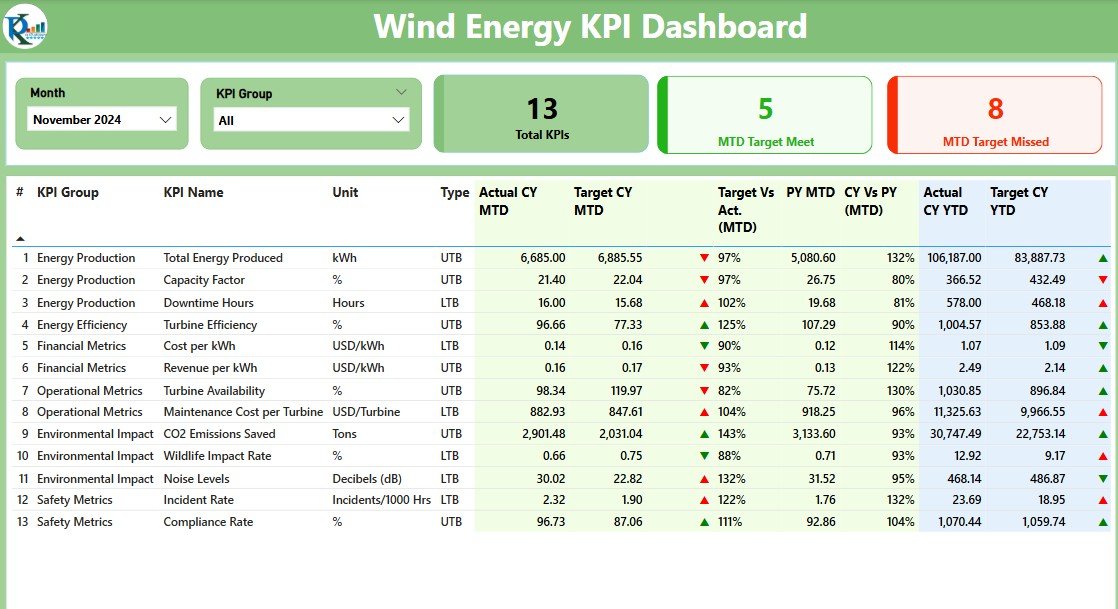
This is the main hub where you can track all essential wind energy KPIs.
Top Section Includes:
- Month Slicer: To view data for a specific month
- KPI Group Slicer: Filter KPIs based on operational categories
KPI Cards:
- Total KPI Count
- MTD (Month-To-Date) Target Met
- MTD Target Missed
Main Table Includes:
- KPI Number
- KPI Group (category such as Turbine Efficiency, Maintenance, etc.)
- KPI Name
- Unit (e.g., kWh, %)
- Type (UTB: Upper the Better / LTB: Lower the Better)
- Actual CY MTD
- Target CY MTD
- MTD Icon (Red ▼ or Green ▲)
- Target Vs Actual MTD (%)
- PY MTD (Previous Year MTD)
- CY Vs PY MTD (%)
- Actual CY YTD
- Target CY YTD
- YTD Icon (Red ▼ or Green ▲)
- Target Vs Actual YTD (%)
- PY YTD
- CY Vs PY YTD (%)
KPI Trend Page

This page allows deep analysis of individual KPIs.
- Interactive Combo Charts: Compare Actuals, Targets, and Previous Year performance
- Slicer: Select a specific KPI to drill down into MTD and YTD trends
KPI Definition Page (Drill-through Enabled)
- Hidden from main navigation
- Drill-through from Summary Page
- Shows KPI Name, Formula, Definition, and Type
- Includes back button for easy navigation
📊 Excel Data Structure
Power BI pulls data from a well-organized Excel file consisting of three key sheets:
Input Actual Sheet

- Fields: KPI Name, Month (first date), MTD Actual, YTD Actual
Click to Purchases Wind Energy KPI Dashboard in Power BI
Input Target Sheet

- Fields: KPI Name, Month (first date), MTD Target, YTD Target
KPI Definition Sheet
- Fields: KPI Number, KPI Group, KPI Name, Unit, Formula, Definition, Type (UTB or LTB)
Advantages of Wind Energy KPI Dashboard in Power BI
✅ Real-time Monitoring
You can access up-to-date information across months and years to track wind energy performance instantly.
✅ Enhanced Decision Making
Quickly identify which areas are underperforming and need attention by comparing actual vs. target values.
✅ Data-Driven Optimization
The dashboard shows trend lines and year-on-year comparisons, helping with long-term planning.
✅ User-Friendly Interface
Intuitive filters and charts allow users from non-technical backgrounds to explore data effortlessly.
✅ Seamless Integration
You can easily connect Power BI with Excel or other systems for real-time updates.
Best Practices for Building Wind Energy KPI Dashboards
✏️ Define Clear KPIs
Ensure your KPIs are specific, measurable, and relevant to wind energy operations.
✏️ Maintain Clean Data
Use consistent formatting in Excel sheets to avoid issues in Power BI.
✏️ Use Visual Cues Wisely
Icons, color coding, and conditional formatting make the dashboard easy to interpret.
✏️ Use Drill-Through for Details
Allow users to explore more granular data without overwhelming the main screen.
✏️ Automate Data Refresh
Set up scheduled refresh in Power BI service for real-time performance monitoring.
How Does It Help in Achieving Energy Goals?
The dashboard helps teams:
- Track turbine performance and downtime
- Compare actual energy output vs. targets
- Monitor efficiency across months and years
- Make quick decisions based on visual trends
You not only save time but also increase accountability across departments.
Conclusion
A Wind Energy KPI Dashboard in Power BI provides all the insights needed to boost performance, track goals, and ensure efficient energy production. With customizable visuals, trend analysis, and real-time data connection, it becomes a must-have tool for any organization focused on wind energy.
Whether you’re an energy analyst, project manager, or sustainability officer, using this dashboard can significantly improve how you track and manage renewable energy operations.
Frequently Asked Questions (FAQs)
1. What KPIs should I track for wind energy?
Track KPIs like Turbine Uptime, Energy Output, Maintenance Hours, and Cost per kWh.
2. Can I use this dashboard with other data sources?
Yes, Power BI allows integration with multiple sources including SQL, SharePoint, and APIs.
3. How often should I update the Excel data?
Ideally, update it monthly. For real-time use, automate the refresh in Power BI Service.
4. Is this suitable for non-technical users?
Absolutely. The dashboard is user-friendly with slicers and icons for easy understanding.
5. What makes this better than a static report?
Interactivity, real-time updates, visual alerts, and deeper insights through drill-down features make it superior to static reports.
Click to Purchases Wind Energy KPI Dashboard in Power BI
Visit our YouTube channel to learn step-by-step video tutorials