Running a test preparation centre demands careful planning, real-time insights, and quick decision-making. Students expect organised batches, skilled trainers, and smooth learning experiences. However, centres handle large volumes of information every day—course performance, batch status, trainer ratings, expenses, revenue, and many more.
Because of this, teams face difficulty when they try to analyse trends. They also struggle when they compare performance across batches and months. Therefore, a Test Preparation Centres Dashboard in Power BI becomes a powerful solution. It brings all important KPIs to one place and displays insights through charts, cards, and visuals.
Click to Purchases Test Preparation Centres Dashboard in Power BI
In this detailed article, you will learn everything about this Power BI dashboard. You will explore its structure, pages, benefits, best practices, and how it helps institutes make faster and smarter decisions. So, let us dive into the complete guide.
What Is a Test Preparation Centres Dashboard in Power BI?
A Test Preparation Centres Dashboard in Power BI is a visual reporting solution that tracks all critical operational and academic KPIs of a test prep institute. It shows real-time data in a clear and interactive format. Therefore, centre managers can monitor student enrolment, batch performance, trainer efficiency, expenses, and revenue—all in one view.
Since the dashboard uses Power BI, it processes large datasets quickly. You can filter the data, compare multiple periods, and find patterns that help you improve results every month.
Why Do Test Preparation Centres Need a Power BI Dashboard?
Test prep institutes deal with many parallel activities—multiple courses, batch schedules, marketing channels, trainer allocation, and finance. Because of these moving parts, manual reporting becomes slow and inaccurate.
A Power BI dashboard solves these problems because it:
-
Updates the metrics automatically
-
Shows trends through simple visuals
-
Reduces manual work and errors
-
Improves decision-making speed
-
Helps you identify strengths and weaknesses instantly
In short, it becomes a smart command centre for your institute.
Key Features of the Test Preparation Centres Dashboard in Power BI
This dashboard includes five powerful pages, each designed to answer a specific management question. Let us look at every page in detail.
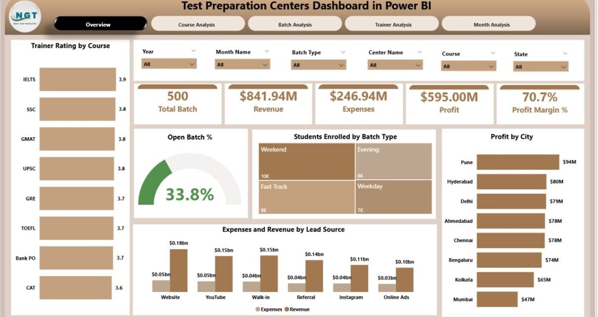
1. Overview Page: What Does It Show?
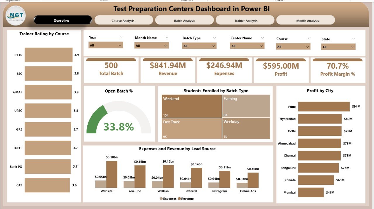
The Overview Page works as the main control centre of the dashboard. It gives a quick snapshot of all essential KPIs. Since decision-makers need a high-level view, this page presents everything in a clean and structured layout.
What You See on the Overview Page
The page includes four KPI cards and five detailed charts, such as:
✔ Trainer Rating by Course
You can easily compare trainer performance across different courses. This helps you understand which trainers create the best learning outcomes.
✔ Open Batch %
This metric shows how many batches are still open or active. When the percentage rises, it may indicate a delay in closing batches or completing sessions.
✔ Student Enrollment by Batch Type
This chart helps you track which batch type attracts more students—weekday, weekend, fast-track, or compact batches.
✔ Profit by City
You can compare which location performs better financially. As a result, you can plan marketing efforts and resource allocation accordingly.
✔ Expenses and Revenue by Lead Source
You see the financial impact of marketing channels like online ads, referrals, offline promotions, or website leads.
This page allows managers to make decisions quickly because all major insights appear at a glance.
2. Course Analysis Page: How Does It Help?
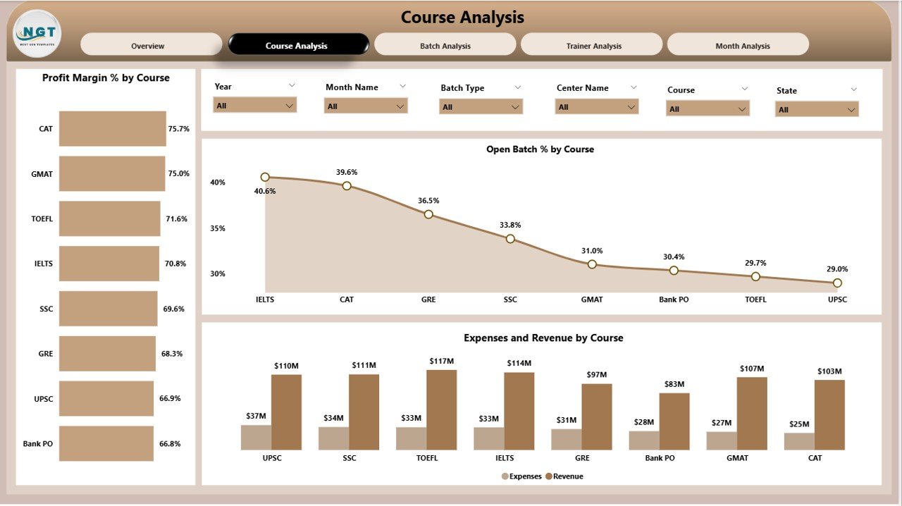
The Course Analysis Page focuses on course-wise performance. Every test preparation centre offers multiple programs, such as IELTS, SAT, GRE, GMAT, Bank Exams, or College Entrance Tests. Because of this, you need course-level insights to plan improvements.
Major Visuals on This Page
✔ Profit Margin %
✔ Open Batch % by Course
✔ Expenses and Revenue by Course
These visuals help you find the strongest courses and identify the ones that need improvement. For example:
-
If a course shows low profit but high enrolment, the fee structure may need adjustment.
-
If a course shows high expenses, you may review trainer allocation or study material costs.
-
If open batch percentage looks high, the schedules may need optimisation.
Thus, this page supports academic and financial decisions at the course level.
3. Batch Analysis Page: Why Is It Important?
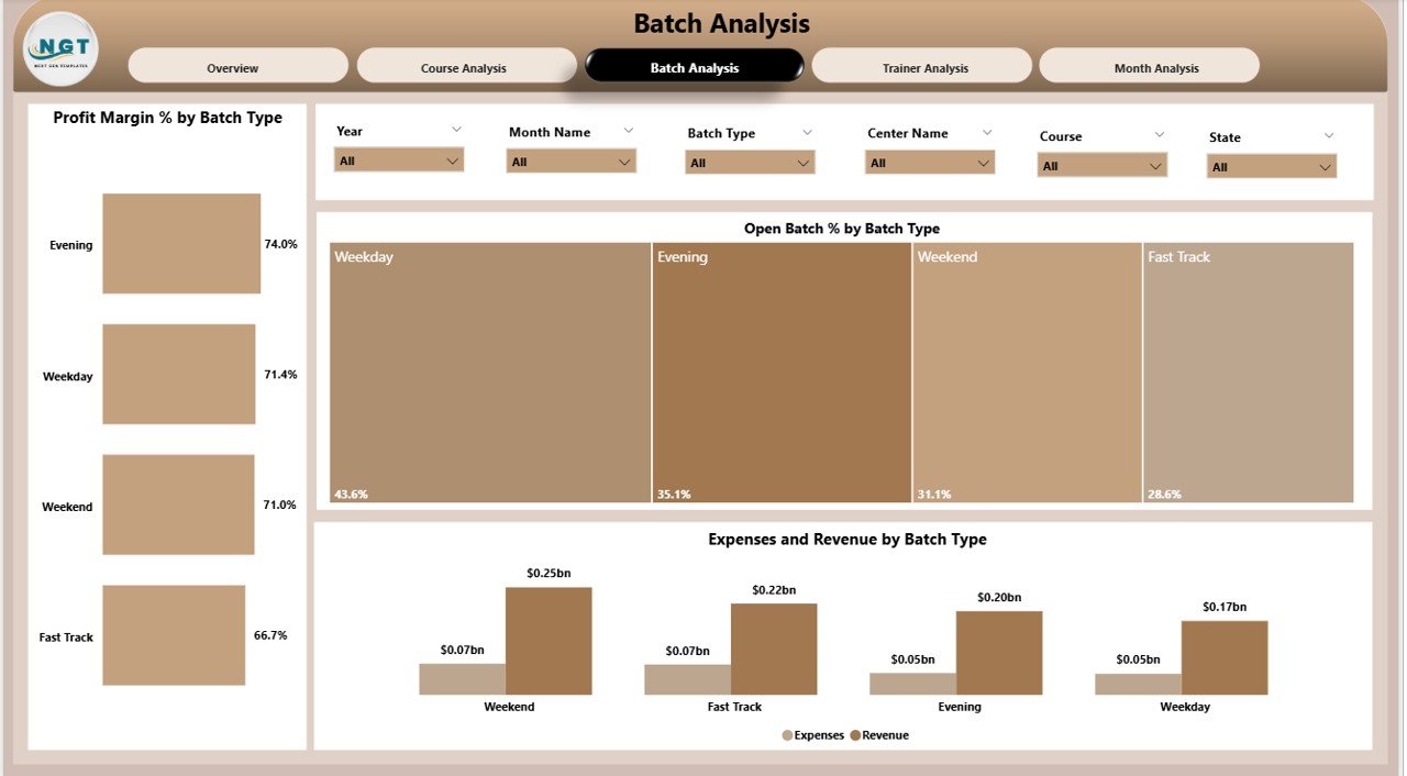
Every batch functions differently, and performance varies due to timing, trainer skill, student mix, or schedule frequency. The Batch Analysis Page answers all batch-related questions.
Key Charts on This Page
-
Profit Margin %
-
Batch Type Analysis
-
Open Batch % by Batch Type
-
Expenses and Revenue by Batch Type
This page helps you discover which batch types perform best. For example:
-
Weekend batches may bring more revenue.
-
Fast-track batches may show better completion rates.
-
Evening batches may show higher expenses due to operational costs.
When you understand batch-wise variations, you can optimise schedules and resource allocation.
Click to Purchases Test Preparation Centres Dashboard in Power BI
4. Trainer Analysis Page: What Insights Does It Offer?
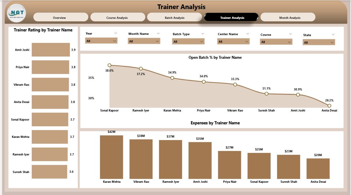
Trainers play a crucial role in student success. Therefore, their performance must be reviewed regularly. This page helps you evaluate trainer effectiveness from multiple angles.
Important Charts on Trainer Analysis Page
✔ Trainer Rating by Trainer Name
✔ Open Batch % by Trainer
✔ Expenses by Trainer Name
With these visuals, you can:
-
Identify the highest-rated trainers
-
Review workload distribution
-
Understand cost contribution for each trainer
-
Compare trainer performance across batches
Because of these insights, you can take steps to improve training quality and student satisfaction.
5. Monthly Trends Page: What Patterns Can You Track?
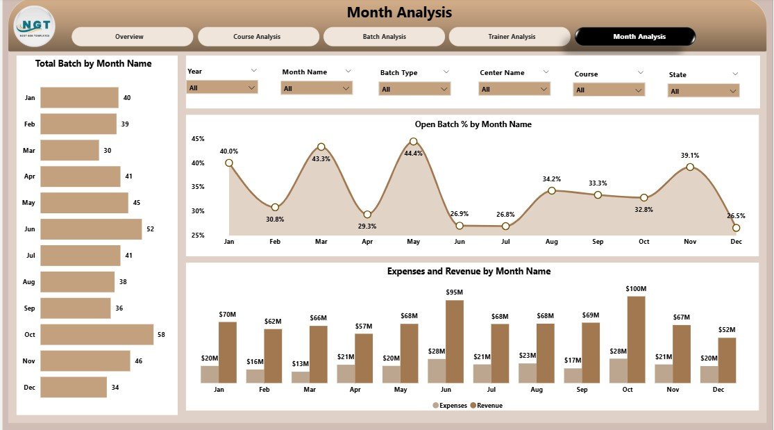
The Monthly Trends Page gives you a clear picture of performance throughout the year. Instead of guessing patterns, you can see real-time monthly changes.
Charts on This Page
-
Total Batch Count by Month
-
Open Batch % by Month
-
Expenses and Revenue by Month
You can easily answer questions like:
-
Which month shows the highest enrolment?
-
When do expenses increase?
-
Which months bring maximum revenue?
-
Does the open batch percentage rise during exam season?
These insights help you plan marketing, scheduling, budgeting, and staffing more effectively.
Advantages of Test Preparation Centres Dashboard in Power BI
A Power BI dashboard brings several operational, academic, and financial benefits. Let us look at the major advantages.
1. Real-Time Visibility
You see updated data instantly, which means you take decisions faster without waiting for manual reports.
2. High Accuracy
Because the dashboard connects with your data source, it reduces human errors and ensures accurate insights.
3. Improved Trainer Evaluation
You compare trainers using ratings, expenses, and batch performance—this helps you assign batches more effectively.
4. Financial Clarity
Charts show which courses, locations, or lead sources generate the highest revenue and profit.
5. Improved Batch Management
Open batch percentages, batch types, and trends help you optimise scheduling and resource utilisation.
6. Better Student Enrollment Insights
You understand which batch types and courses attract more students. As a result, you can plan marketing strategies accordingly.
Best Practices for the Test Preparation Centres Dashboard in Power BI
To get the best results from this dashboard, follow these proven practices:
1. Refresh the Data Regularly
Daily or weekly updates ensure accuracy and improve decision-making.
2. Maintain Clean Data
Remove duplicates, maintain correct formats, and update master data to keep visuals reliable.
3. Track KPIs Consistently
Do not change KPI definitions frequently. Consistent tracking helps you identify long-term patterns.
4. Use Filters Strategically
Apply slicers carefully so that the visuals reflect the exact insights you need.
5. Compare Performance Periodically
Review monthly, quarterly, and yearly trends to spot long-term improvement areas.
6. Train Your Team to Use the Dashboard
When your staff understands how to read visuals, they make better decisions faster.
Click to Purchases Test Preparation Centres Dashboard in Power BI
Conclusion
A Test Preparation Centres Dashboard in Power BI simplifies complex reporting and presents insights in a single window. Because of its structured pages—Overview, Course Analysis, Batch Analysis, Trainer Analysis, and Monthly Trends—you get a complete picture of your institute’s performance.
This dashboard helps you monitor batch efficiency, trainer quality, student enrolment, expenses, and profitability. It also supports strategic planning and improves decision-making across departments. When you combine clean data with Power BI’s visual power, you transform your test prep centre into a data-driven organisation.
Frequently Asked Questions (FAQs)
1. Who can use a Test Preparation Centres Dashboard in Power BI?
Centre owners, academic heads, trainers, and finance teams can use this dashboard to track performance and make decisions.
2. Do I need advanced technical skills to use this dashboard?
No, you only need basic Power BI navigation. The visuals are simple, clear, and interactive.
3. Can I customise the dashboard for my institute?
Yes, you can add new KPIs, change layouts, adjust colours, and include additional data fields.
4. How often should I update the dashboard?
You should refresh the data weekly or daily for accurate and meaningful insights.
5. Does this dashboard help improve student results?
Yes. When you monitor trainer rating, batch type, and enrolment trends, you take actions that directly improve student outcomes.
Visit our YouTube channel to learn step-by-step video tutorials