Digital teams manage thousands of assets every day. Images, videos, documents, creative files, and digital resources keep increasing. When the volume grows, teams face challenges with tracking usage, performance, approvals, metadata accuracy, and storage efficiency. However, when you use a Digital Asset Management (DAM) system along with a KPI Dashboard in Power BI, you bring complete clarity to your workflow.
In this guide, you will learn everything about the Digital Asset Management KPI Dashboard in Power BI, how it works, why it matters, and how teams can improve performance by tracking the right KPIs. You will also discover the structure of the dashboard, its key features, its advantages, and the best practices to use it effectively.
Click to Purchases Digital Asset Management KPI Dashboard in Power BI
What Is a Digital Asset Management KPI Dashboard in Power BI?
A Digital Asset Management KPI Dashboard in Power BI helps teams track, measure, and analyze all activity related to digital assets. You can see how assets perform, how teams use those assets, how much storage each asset consumes, and how long the approval cycle takes. Because the dashboard works inside Power BI, it gives you dynamic visuals, automated updates, and real-time decision-making support.
The dashboard works with simple Excel files, making it easy for digital teams, marketing departments, agencies, and creative studios to update KPIs without complex tools.
Why Do Businesses Need a DAM KPI Dashboard?
Digital transformation grows every year. As a result, companies create more assets than ever before. Without proper tracking, teams face problems like:
-
Missing or duplicated assets
-
Slow approval cycles
-
High storage cost
-
Poor utilization of assets
-
Inaccurate metadata
-
Low ROI from content production
A DAM KPI dashboard solves these issues because it shows clear performance indicators. As a result, you make faster decisions, improve productivity, and reduce operational waste.
Key Features of the Digital Asset Management KPI Dashboard in Power BI
This dashboard is a ready-to-use solution. It reads data from Excel and turns it into clean visualization pages. You get insights about MTD (Month-to-Date), YTD (Year-to-Date), targets, previous year numbers, and KPI definitions.
The dashboard includes three main pages:
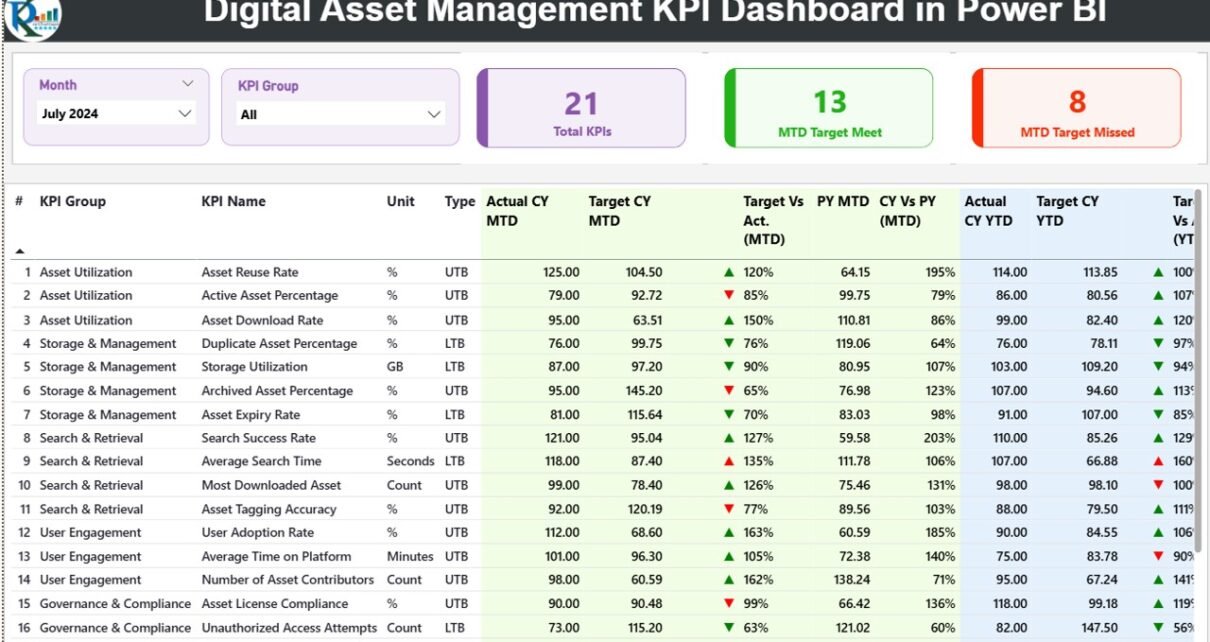
1. Summary Page
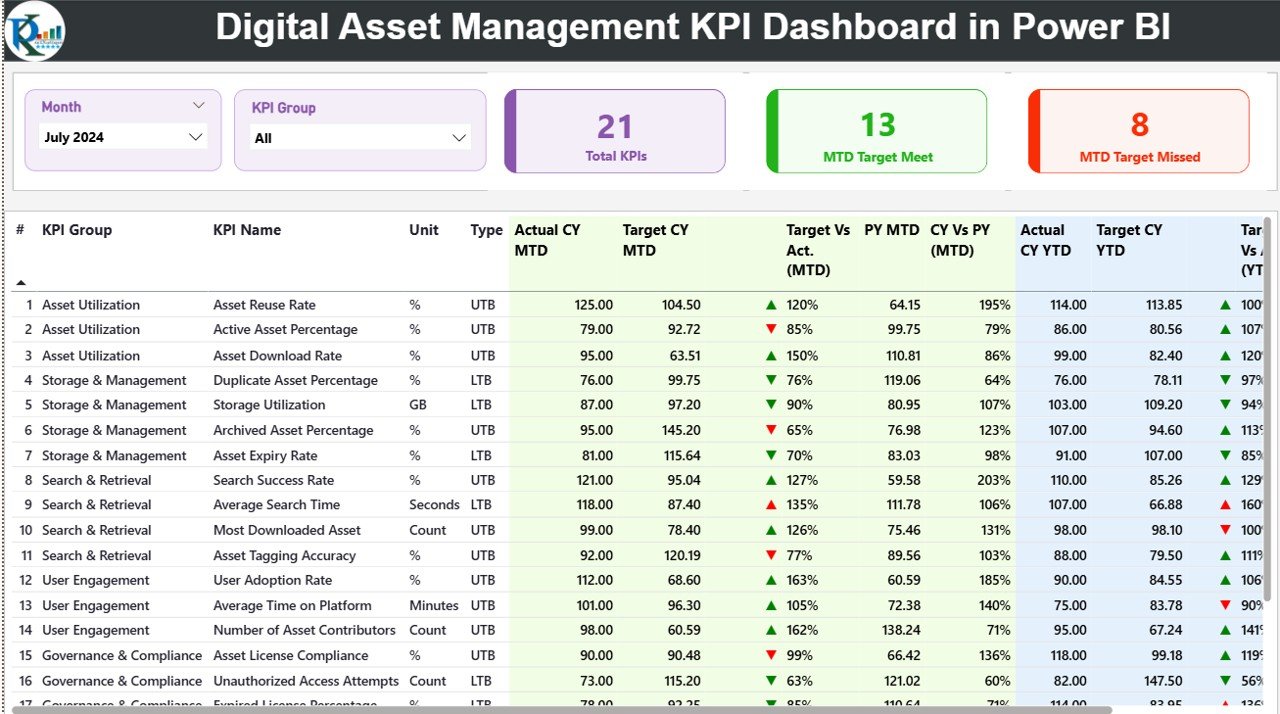
The Summary Page is the most important part of the dashboard. It gives you a complete view of all KPIs in one place. You can select the Month and KPI Group from slicers at the top, and the table updates instantly.
What You See on This Page:
✔ Slicers
You can filter the dashboard by Month and KPI Group.
✔ Cards
-
Total KPIs Count
-
MTD Target Met Count
-
MTD Target Missed Count
✔ Detailed KPI Table
The table includes:
-
KPI Number – Sequence number
-
KPI Group – Category such as approvals, metadata, file storage, downloads, etc.
-
KPI Name – Exact KPI that you are tracking
-
Unit – Measurement unit such as %, count, or days
-
Type – LTB (Lower The Better) or UTB (Upper The Better)
-
Actual CY MTD – Current year MTD actual
-
Target CY MTD – Current year MTD target
-
MTD Icon – Green or red arrows to show if the KPI meets the target
-
Target vs Actual (MTD) – Percentage comparison
-
PY MTD – Previous year’s MTD value
-
CY vs PY (MTD) – Comparison between current year and previous year MTD
You also get the complete YTD section:
-
Actual CY YTD
-
Target CY YTD
-
YTD Icon
-
Target vs Actual (YTD)
-
PY YTD
-
CY vs PY (YTD)
Because you see everything in one place, you take immediate action whenever a KPI misses the target.
Click to Purchases Digital Asset Management KPI Dashboard in Power BI
2. KPI Trend Page
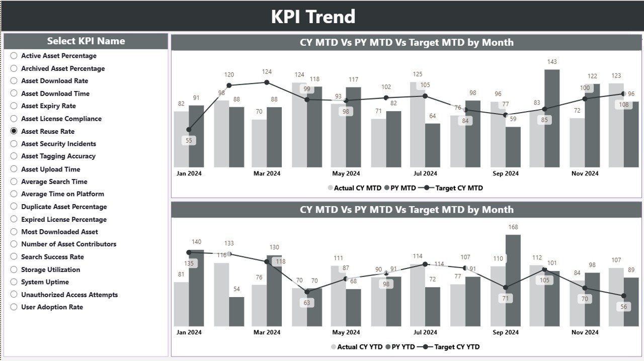
The trend page is the visual page for all KPIs. You select a KPI from a slicer on the left, and two combo charts appear.
These combo charts display:
-
Current Year Actual
-
Previous Year Actual
-
Target Values
-
MTD trends
-
YTD trends
This page helps you understand performance patterns. You easily identify:
-
Month-on-month changes
-
Seasonal variations
-
Areas where performance drops
-
KPIs that show consistent growth
Trend monitoring helps digital teams improve content planning, metadata quality, and asset usage.
3. KPI Definition Page
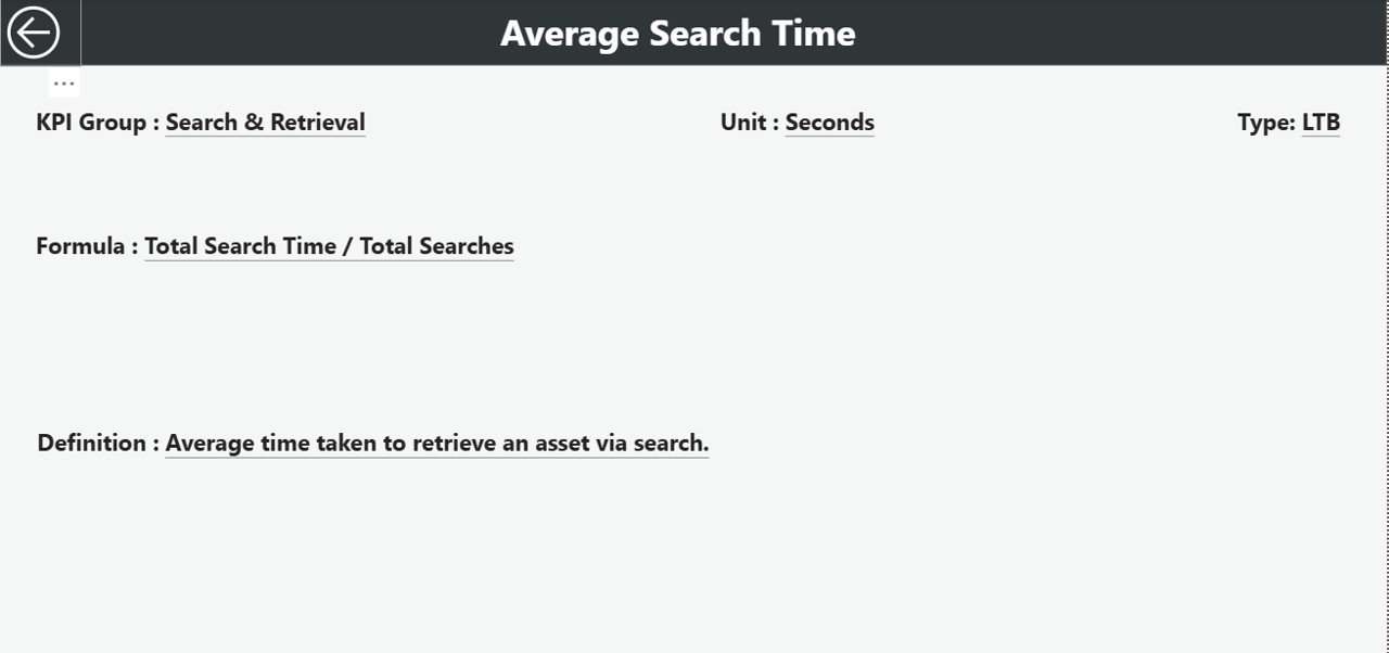
This is a hidden drill-through page. When you click any KPI in the Summary Page, you can drill through to see its details.
This page displays:
-
KPI Number
-
KPI Group
-
KPI Name
-
Formula
-
KPI Definition
-
Unit of Measurement
-
KPI Type (LTB or UTB)
You also get a back button on the top-left corner that returns you to the Summary Page.
Excel Data Structure for the Dashboard
The dashboard reads data from three Excel worksheets. They are very simple to update.
1. Input_Actual Sheet
Fill this sheet with:
-
KPI Name
-
Month (use the first day of each month like 1-Jan-2024)
-
MTD Actual
-
YTD Actual
2. Input_Target Sheet
Fill this sheet with:
-
KPI Name
-
Month
-
MTD Target
-
YTD Target
3. KPI Definition Sheet
This sheet contains:
-
KPI Number
-
KPI Group
-
KPI Name
-
Unit
-
Formula
-
Definition
-
Type (LTB or UTB)
Once you update these three sheets, the Power BI dashboard refreshes automatically.
What KPIs Should You Track in Digital Asset Management?
Here are the most common DAM KPIs:
Performance KPIs
-
Total Assets Created
-
Assets Approved
-
Assets Rejected
-
Assets Updated
-
Duplicate Assets Removed
Quality KPIs
-
Metadata Accuracy Rate
-
Tag Completeness
-
Assets Without Metadata
-
Assets That Need Review
Usage KPIs
-
Downloads per Asset
-
Top Downloaded Assets
-
Assets Never Used
-
Department-wise Usage
Operational KPIs
-
Approval Time
-
Upload to Publish Time
-
SLA Compliance Rate
Storage KPIs
-
Total Storage Used
-
Storage by File Type
-
Storage by Department
-
High-Size Assets
You can customize the spreadsheet to track more KPIs as your needs grow.
How Does a Digital Asset Management KPI Dashboard Help Teams?
Click to Purchases Digital Asset Management KPI Dashboard in Power BI
This dashboard improves the performance of any digital team. Because the dashboard shows MTD, YTD, target comparisons, and previous year data, teams make decisions faster.
You get these benefits:
-
Faster approval cycles
-
Better visibility of asset performance
-
Clear understanding of content value
-
Improved metadata quality
-
Reduced storage waste
-
Higher ROI from content creation
The dashboard works for marketing teams, branding agencies, creative studios, e-commerce companies, and enterprises with large asset libraries.
Advantages of the Digital Asset Management KPI Dashboard in Power BI
This dashboard brings many benefits to organizations. Here are the most important advantages:
1. You Make Quick Decisions
The dashboard updates instantly when you select a KPI or month. Because everything is visual, you make faster decisions without checking multiple files.
2. You Improve Content Quality
When you track metadata accuracy and approval cycles, you improve the quality of your digital assets. As a result, your content stays consistent and easy to find.
3. You Reduce Storage Costs
Storage costs increase when teams upload duplicate or unnecessary files. The dashboard highlights these issues and helps you remove unnecessary files.
4. You Improve Asset Usage
Because the dashboard shows which assets perform well, teams reuse top-performing content. This increases brand consistency and reduces production time.
5. You Increase ROI
When teams see how assets perform, they create better content. You get more value from your investment in content production, design, and digital marketing.
Best Practices for the Digital Asset Management KPI Dashboard
To get the best value from the dashboard, follow these best practices:
1. Update the Excel Files Regularly
Update the Actual and Target sheets every month. This keeps your dashboard accurate and trustworthy.
2. Define KPIs Clearly
Make sure your KPI definitions and formulas stay clear. Team members understand what each KPI means and how to measure it.
3. Use Consistent Naming Conventions
Always use the same KPI names in Actual and Target sheets. This avoids errors and makes updates easier.
4. Monitor Trends Monthly
Use the Trend page to monitor performance changes. When you track trends, you correct problems early.
5. Automate Where Possible
You can automate Excel updates using Power Automate or scripts. This saves time and reduces manual mistakes.
6. Review Storage KPIs Frequently
Storage KPIs increase fast. Review them regularly to control cost and avoid unnecessary asset buildup.
Conclusion
A Digital Asset Management KPI Dashboard in Power BI helps every digital team work smarter. You get complete visibility of asset usage, performance, metadata quality, and storage cost. The dashboard uses simple Excel sheets, so anyone can update KPIs without technical difficulty. When you use the Summary Page, Trend Page, and KPI Definition Page, you get deeper insights and take faster actions. As a result, your digital asset workflow becomes more efficient and more productive.
Frequently Asked Questions (FAQs)
1. What is a Digital Asset Management KPI Dashboard?
It is a Power BI dashboard that tracks and visualizes key metrics related to digital assets such as metadata quality, usage, storage, and approval cycles.
2. Which teams use a DAM KPI Dashboard?
Marketing teams, creative studios, e-commerce departments, branding teams, and enterprises with large digital libraries use this dashboard.
3. Does the dashboard require coding?
No. You only need to fill data in simple Excel sheets. Power BI handles the rest.
4. Can I customize the KPIs?
Yes. You can add or modify KPIs in the Excel definitions sheet, and the dashboard updates automatically.
5. How often should I update the data?
You should update monthly to keep MTD and YTD values accurate.
6. Does it support department-wise analysis?
Yes, you can add department fields to your Excel sheets and enhance filtering options.
7. Does Power BI automatically refresh the dashboard?
Yes, if you connect it with Power BI Service and schedule refreshes.
Visit our YouTube channel to learn step-by-step video tutorials


