The packaging industry runs on speed, accuracy, and real-time decision-making. Every day, teams monitor production volumes, energy usage, material performance, defect levels, and delivery timelines. When managers track these KPIs manually, they spend long hours on data cleaning and reporting. As a result, they miss early warning signs and lose control over performance.
A Packaging Industry Dashboard in Power BI solves this problem. It converts raw manufacturing data into meaningful insights that support fast and accurate decisions. Production teams understand what happens on the shop floor, and leadership gains full visibility into operational efficiency.
In this detailed, easy-to-understand guide, you will learn everything about the Packaging Industry Dashboard in Power BI. You will explore how it works, what each page includes, and how it helps packaging units improve productivity, quality, and delivery performance. You will also learn the top benefits, best practices, and answers to common questions.
Click to Purchases Packaging Industry Dashboard in Power BI
Let us explore this powerful reporting system step by step.
What Is a Packaging Industry Dashboard in Power BI?
A Packaging Industry Dashboard in Power BI is a ready-to-use analytical tool that tracks all key KPIs of a packaging plant. It pulls data from Excel, ERP, or production logs and presents it through charts, cards, slicers, and dynamic visuals. Teams use this dashboard to review real-time production, analyze product categories, track energy usage, monitor material performance, and evaluate monthly trends.
With one click, users switch the month, filter product categories, compare shift supervisors, or break down each packaging type. The dashboard updates instantly and shows fresh insights without any manual effort.
This system brings complete clarity to operations and supports quick decision-making. Production heads, plant managers, supervisors, and quality teams use it daily to stay aligned and improve performance.
How Does the Packaging Industry Dashboard in Power BI Improve Manufacturing Visibility?
This dashboard improves visibility by combining multiple pages, each designed for a specific purpose. The five-page structure covers every area of packaging operations. Users jump from overview to product category analysis, package type breakdowns, material insights, and monthly trends.
Below is the complete explanation of every page in this dashboard.
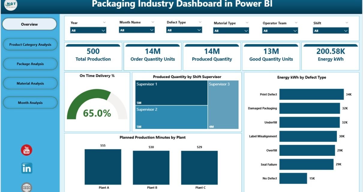
What Does the Overview Page Include?
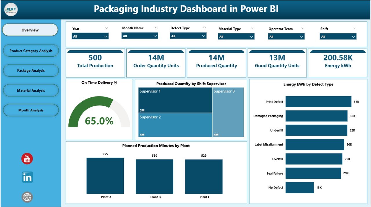
The Overview Page acts as the control center of the dashboard. It brings all critical KPIs together so managers can see the health of the production process in seconds.
This page includes:
-
Interactive slicers for quick filtering
-
Four KPI cards that show real-time numbers
-
Four key charts that explain production performance
The visuals include:
-
On-Time Delivery %
-
Produced Quantity by Shift Supervisor
-
Energy (kWh) by Defect Type
-
Planned Production Minutes by Plant
Managers use this page to answer questions like:
-
Are we meeting our delivery commitments?
-
Which shift supervisor manages the highest output?
-
Does energy consumption rise with specific defect types?
-
Which plant meets production planning most effectively?
The Overview Page helps users take a quick decision without navigating deeper into the dashboard.
Click to Purchases Packaging Industry Dashboard in Power BI
What Can You Learn From the Product Category Analysis Page?
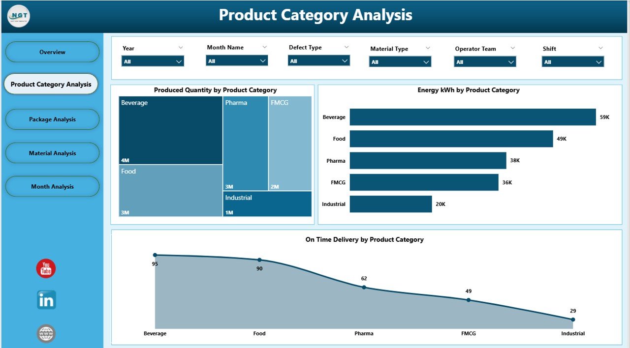
The Product Category Analysis Page focuses on performance by product category. Packaging units produce many different product types. Each one performs differently in terms of volume, energy use, and delivery timelines.
This page helps you understand:
-
Which product category delivers the highest output
-
Which category consumes the most energy
-
How on-time delivery varies by category
This page contains three key charts:
-
Produced Quantity by Product Category
-
Energy kWh by Product Category
-
On-Time Delivery % by Product Category
Teams use this page when they want to compare product lines, shift their strategy, or improve category-level performance.
Why Do You Need the Package Analysis Page?
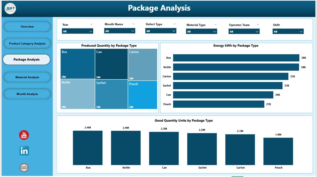
Every packaging unit handles different types of packaging such as cartons, bottles, pouches, bags, cans, sleeves, and more. The Package Analysis Page explains how each packaging type performs in terms of production and quality.
This page includes:
-
Produced Quantity by Package Type
-
Energy kWh by Package Type
-
Good Quantity Units by Package Type
This analysis answers important questions:
-
Which packaging type delivers the highest good units?
-
Does energy usage increase for specific packaging types?
-
How do different package types contribute to total output?
This page helps managers optimize packaging formats, review quality performance, and plan the next production cycle.
Click to Purchases Packaging Industry Dashboard in Power BI
How Does the Material Analysis Page Support Production Improvement?
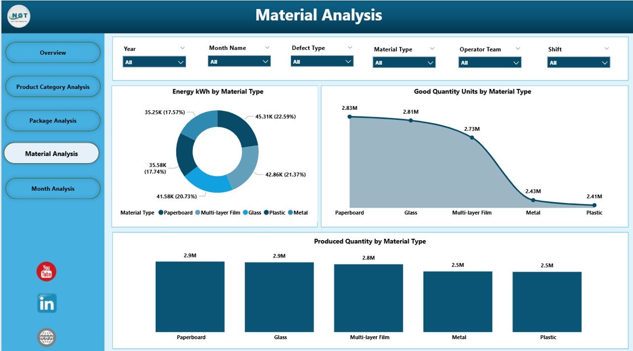
Material variation plays a big role in packaging quality and production stability. The Material Analysis Page helps teams analyze how each material type affects production speed, energy usage, and defect rates.
This page displays:
-
Produced Quantity by Material Type
-
Energy kWh by Material Type
-
Good Quantity Units by Material Type
Key questions answered:
-
Which material type offers the strongest productivity?
-
Does a material result in high energy usage?
-
Which materials produce the highest number of good units?
Material decisions influence cost, quality, performance, and output. This page supports smart material selection and supplier evaluation.
What Insights Does the Monthly Trends Page Provide?
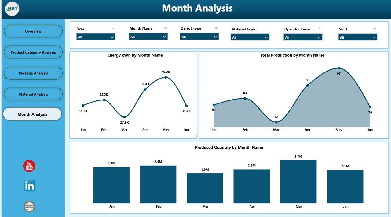
The Monthly Trends Page displays long-term performance. It helps managers understand how production, energy consumption, and total output move month after month.
This page includes the following charts:
-
Produced Quantity by Month
-
Energy kWh by Month
-
Total Production by Month
This analysis helps users:
-
Identify peak and low production seasons
-
Measure progress against annual plans
-
Detect unusual spikes in energy consumption
-
Review monthly performance patterns
Monthly trends support strategic planning and help production teams adjust resources, schedules, and targets.
Advantages of Packaging Industry Dashboard in Power BI
When packaging companies use this dashboard, they gain several benefits. It reduces manual reporting, supports real-time analysis, and removes confusion. Here are the top advantages.
1. Faster Decision-Making
Managers do not wait for daily or weekly reports. The dashboard updates instantly and displays accurate KPIs. Every decision becomes faster and more reliable.
2. Increased Production Visibility
Users view all production activities in one place. They see product category performance, packaging types, material impact, and shift efficiency without switching files.
3. Improved Quality Control
Charts like energy consumption by defect type help teams track quality issues. The dashboard highlights problem areas so teams take action early.
4. Better Resource Planning
Trends in material usage, energy consumption, and production minutes help optimize resource allocation. Leaders plan shifts and materials with full clarity.
5. Stronger On-Time Delivery Performance
Users monitor delivery percentages and track factors that affect deadlines. As a result, teams improve delivery commitments and customer satisfaction.
6. Reduced Manual Work
Power BI replaces multiple Excel sheets and manual calculations. This saves time and reduces errors.
7. Clearer Communication Across Teams
Everyone — from supervisors to managers — sees the same data. This ensures consistent communication and aligned decisions.
Why Should Packaging Companies Use Power BI Dashboards?
Click to Purchases Packaging Industry Dashboard in Power BI
Packaging units face daily challenges: high energy cost, production delays, material variations, and quality issues. When companies use Power BI dashboards, they understand every issue with clarity. They detect early trends and act before problems grow.
Power BI also supports automation. It refreshes KPIs with one click. It provides stunning visuals that help teams explain performance during meetings. It makes data easier to understand, even for non-technical users.
Power BI empowers packaging companies with real-time visibility, strategic insights, and performance improvement tools.
Best Practices for Using a Packaging Industry Dashboard in Power BI
To get the best results, users follow some simple best practices.
1. Update Data Regularly
Fresh data gives accurate insights. Teams update production, energy, and quality data daily or weekly for better visibility.
2. Use Slicers for Deep Analysis
Slicers help filter months, products, materials, and package types. Users explore data from different angles to get meaningful answers.
3. Compare KPIs Across Categories
Comparing product categories, materials, and packages helps teams detect performance gaps quickly.
4. Review Monthly Trends
Monthly charts show long-term growth patterns. Leaders use these trends for planning and budgeting.
5. Share the Dashboard Across Teams
Multiple teams — production, quality, planning, supply chain — should use the same dashboard for consistent decision-making.
6. Track On-Time Delivery Every Day
Delivery performance affects customer trust. Users track OTD daily to ensure timely shipments.
7. Improve Energy Efficiency
Energy cost remains one of the biggest production expenses. Monitoring energy charts helps reduce wastage.
8. Focus on Good Quantity Units
Good units determine actual saleable output. Teams aim to increase good units across product categories and material types.
Conclusion
A Packaging Industry Dashboard in Power BI transforms raw production data into clear insights. It shows daily performance, category analysis, packaging type breakdowns, material strength, and monthly trends. This dashboard helps packaging companies track production, improve quality, reduce costs, and make faster decisions.
When teams use this dashboard every day, they enjoy full visibility, higher productivity, and strong operational control. The dashboard becomes a central tool for planning, monitoring, and reporting.
Frequently Asked Questions (FAQ)
1. What is a Packaging Industry Dashboard in Power BI?
It is a visual reporting tool that tracks packaging KPIs such as production volume, energy consumption, defects, material usage, and delivery performance.
2. Who uses this dashboard?
Production managers, plant heads, supervisors, planners, and quality teams use this dashboard daily.
3. Can beginners use Power BI dashboards?
Yes. The visuals are easy to read, and users do not need technical skills.
4. How often should companies update their dashboard?
Daily or weekly updates give the most accurate insights.
5. Does this dashboard help reduce production costs?
Yes. It helps detect material inefficiencies, energy spikes, defects, and low-performing categories.
6. Can we add more KPIs to this dashboard?
Yes. Power BI allows customization, so users add new KPIs anytime.
7. Why is On-Time Delivery % important?
It measures delivery performance. A higher OTD% increases customer satisfaction and trust.
8. Does this dashboard support long-term planning?
Yes. Monthly trends help build forecasts and annual production plans.
Visit our YouTube channel to learn step-by-step video tutorials