In today’s competitive and connected business world, partnerships play a critical role in driving growth, expanding market reach, and increasing revenue. However, managing partner alliances without clear metrics often leads to missed opportunities, weak accountability, and poor decision-making. That is exactly why organizations now rely on a Partner Alliances KPI Dashboard in Power BI.
This detailed guide explains everything you need to know about a Partner Alliances KPI Dashboard in Power BI. Moreover, it expands on the already created dashboard structure and explains how organizations can use it effectively. Throughout this article, you will learn what this dashboard is, why it matters, how it works, its page-wise structure, Excel data design, advantages, best practices, and frequently asked questions.
Click to buy Partner Alliances KPI Dashboard in Power BI
What Is a Partner Alliances KPI Dashboard in Power BI?
A Partner Alliances KPI Dashboard in Power BI is an interactive, data-driven analytics solution designed to track, monitor, and evaluate the performance of strategic partners and alliances.
Instead of reviewing scattered Excel files, static reports, or manual updates, this dashboard consolidates all partner-related KPIs into one centralized view. As a result, leadership teams, alliance managers, and business development teams can clearly understand performance trends, identify gaps, and take corrective actions quickly.
Moreover, since the dashboard uses Power BI with Excel as the data source, it remains flexible, scalable, and easy to maintain.
Why Do Organizations Need a Partner Alliances KPI Dashboard?
Partner ecosystems grow complex as businesses scale. Therefore, tracking alliance performance manually becomes inefficient and error-prone. A Partner Alliances KPI Dashboard solves this challenge effectively.
Here is why organizations need it:
- It brings full visibility into partner performance
- It enables data-driven decision-making
- It improves accountability across alliance teams
- It highlights target achievements and gaps instantly
- It supports monthly and yearly performance reviews
As a result, organizations strengthen partner relationships while maximizing return on alliances.
How Does a Partner Alliances KPI Dashboard in Power BI Work?
The dashboard works by connecting Power BI to a structured Excel data model. You update KPI actuals, targets, and definitions in Excel, while Power BI automatically refreshes visuals and calculations.
Because of this approach:
- Data entry remains simple
- Reporting becomes automated
- Insights stay consistent and reliable
Moreover, users can interact with slicers, drill-through pages, and trend charts to analyze performance deeply.
Page-Wise Structure of Partner Alliances KPI Dashboard in Power BI
This ready-to-use dashboard contains three well-structured pages, each designed for a specific analytical purpose.
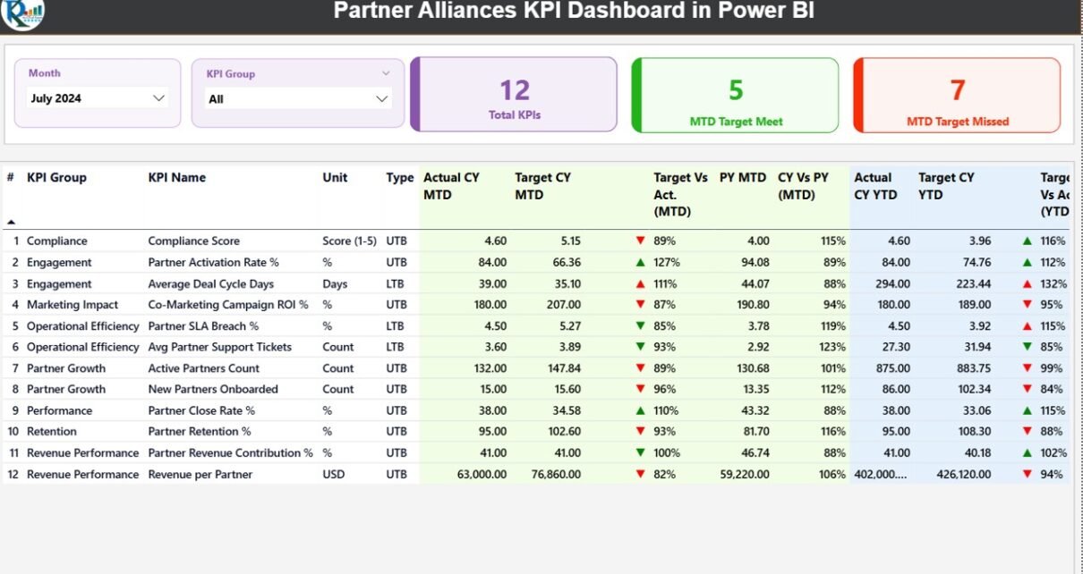
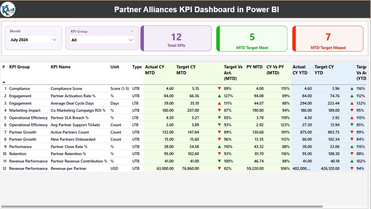
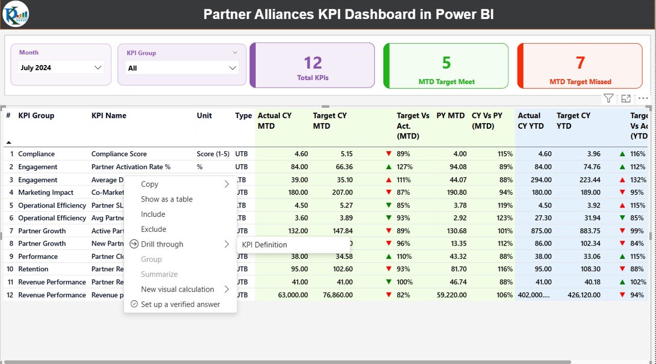
Summary Page
The Summary Page acts as the control center of the dashboard. It provides a high-level overview of all partner alliance KPIs.
Key Elements on the Summary Page
Slicers
- Month slicer at the top
- KPI Group slicer for category-based analysis
KPI Cards
- Total KPIs Count
- MTD Target Met Count
- MTD Target Missed Count
These cards instantly show overall performance status.
Detailed KPI Table Explained
The detailed table displays comprehensive KPI-level insights:
- KPI Number – Unique sequence number for each KPI
- KPI Group – Category or group of the KPI
- KPI Name – Name of the alliance KPI
- Unit – Unit of measurement
- Type – LTB (Lower the Better) or UTB (Upper the Better)
MTD Performance Metrics
- Actual CY MTD – Current Year Month-to-Date actual value
- Target CY MTD – Current Year Month-to-Date target value
- MTD Icon – ▲ or ▼ icons with green/red indicators
- Target vs Actual (MTD) – Actual ÷ Target percentage
- PY MTD – Previous Year MTD value
- CY vs PY (MTD) – Current MTD ÷ Previous Year MTD
YTD Performance Metrics
- Actual CY YTD – Current Year Year-to-Date actual
- Target CY YTD – Current Year Year-to-Date target
- YTD Icon – Status indicator against YTD target
- Target vs Actual (YTD) – Actual ÷ Target percentage
- PY YTD – Previous Year YTD value
- CY vs PY (YTD) – Current YTD ÷ Previous Year YTD
Because of this structured layout, users can evaluate performance instantly without switching screens.
Click to buy Partner Alliances KPI Dashboard in Power BI
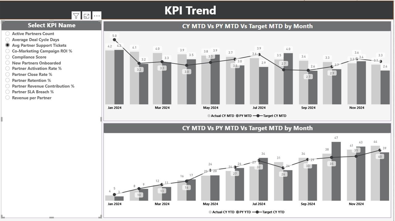
KPI Trend Page
The KPI Trend Page focuses on performance trends over time.
Key Highlights of the KPI Trend Page
- Two combo charts for MTD and YTD analysis
- Comparison between Current Year Actual, Previous Year Actual, and Targets
- A KPI Name slicer on the left
As a result, users can easily identify seasonal patterns, growth trends, and performance gaps for each alliance KPI.
Click to buy Partner Alliances KPI Dashboard in Power BI
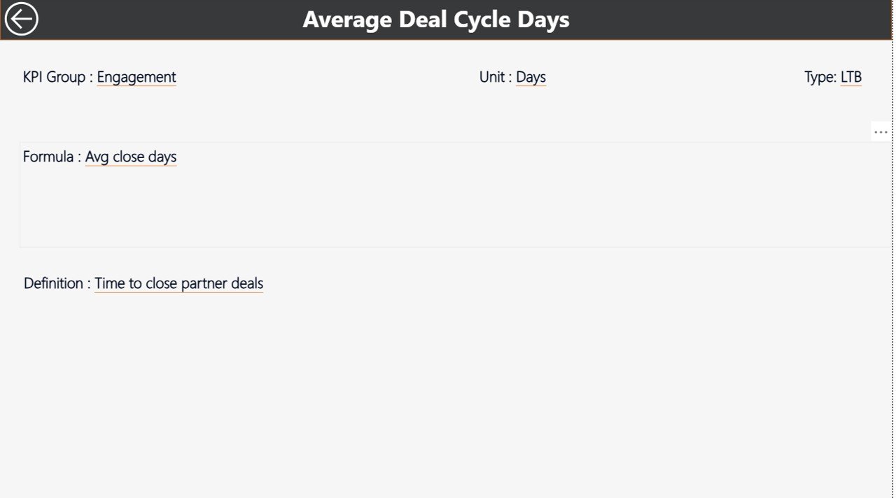
KPI Definition
The KPI Definition Page acts as a drill-through and reference page.
Features of the KPI Definition Page
- Hidden from main navigation
- Accessible through drill-through from Summary Page
- Displays KPI Formula and Definition
This page ensures clarity and alignment across teams. Moreover, users can always understand how each KPI is calculated and why it matters.
How Do You Navigate Back to the Main Page?
Navigation remains simple and user-friendly. To return to the main page, just click the Back button available at the top-left corner.
Click to buy Partner Alliances KPI Dashboard in Power BI
Excel Data Structure Used in the Dashboard
The dashboard uses an Excel file as its data source, which contains three structured worksheets.
Input_Actual Sheet – How Do You Enter Actual Data?
In this sheet, you enter actual KPI values.
Required fields include:
- KPI Name
- Month (use first date of the month)
- MTD Actual Number
- YTD Actual Number
This structure ensures consistency across time periods.
Input_Target Sheet – How Do You Manage Targets?
In this sheet, you define target values.
Required fields include:
- KPI Name
- Month (use first date of the month)
- MTD Target Number
- YTD Target Number
By separating actuals and targets, the dashboard maintains clean calculations.
Click to buy Partner Alliances KPI Dashboard in Power BI
KPI Definition Sheet – Why Is This Sheet Important?
This sheet stores master data for all KPIs.
Fields include:
- KPI Number
- KPI Group
- KPI Name
- Unit
- Formula
- Definition
- Type (LTB or UTB)
Because of this design, the dashboard stays scalable and easy to update.
Advantages of Partner Alliances KPI Dashboard in Power BI
Using this dashboard offers several strong advantages.
Strategic Advantages
- Clear visibility into partner performance
- Faster and better decision-making
- Improved alliance accountability
Operational Advantages
- Automated reporting
- Reduced manual errors
- Consistent KPI definitions
Analytical Advantages
- MTD and YTD comparison
- Target vs Actual analysis
- Year-over-Year performance tracking
As a result, organizations gain complete control over their partner ecosystem.
Who Can Benefit from This Dashboard?
This dashboard suits multiple roles and industries.
- Alliance Managers
- Business Development Teams
- Sales Leadership
- Channel Management Teams
- Corporate Strategy Teams
Moreover, companies of all sizes can adapt it easily.
Best Practices for the Partner Alliances KPI Dashboard in Power BI
To get maximum value, follow these best practices.
Standardize KPI Definitions
Always define KPIs clearly in the KPI Definition sheet. This practice avoids confusion and misinterpretation.
Update Data Regularly
Update actual and target data monthly. As a result, insights stay relevant and reliable.
Use Consistent Time Periods
Always use the first date of the month for reporting. This approach ensures accurate time intelligence.
Review Trends, Not Just Numbers
Focus on trends in the KPI Trend page. Trends often reveal issues earlier than summary metrics.
Align KPIs with Strategy
Track KPIs that truly reflect alliance success, not just activity metrics.
How Does This Dashboard Support Executive Decision-Making?
Executives need clarity, not complexity. This dashboard provides:
- High-level KPI status
- Drill-down capability
- Clear performance indicators
Therefore, leaders can make confident, data-backed decisions.
Can This Dashboard Scale with Growing Partner Networks?
Yes, it can. Because the dashboard relies on structured Excel inputs and Power BI visuals, it scales easily as the number of partners and KPIs increases.
Conclusion: Why Should You Use a Partner Alliances KPI Dashboard in Power BI?
A Partner Alliances KPI Dashboard in Power BI transforms how organizations manage and measure alliances. Instead of relying on intuition or fragmented data, teams gain a clear, unified, and actionable performance view.
Moreover, with structured Excel inputs, powerful Power BI visuals, and drill-through insights, this dashboard becomes an essential tool for modern partnership management. If your organization wants transparency, control, and growth from alliances, this dashboard delivers exactly that.
Frequently Asked Questions (FAQs)
What is the main purpose of a Partner Alliances KPI Dashboard in Power BI?
The main purpose is to track, analyze, and improve partner alliance performance using clear KPIs and visual insights.
Do I need advanced Power BI skills to use this dashboard?
No. Since data entry happens in Excel, even non-technical users can maintain it easily.
Can I customize KPIs in the dashboard?
Yes. You can add, remove, or modify KPIs using the KPI Definition sheet.
How often should I update the data?
You should update data monthly to maintain accurate MTD and YTD analysis.
Can this dashboard support multiple KPI groups?
Yes. The KPI Group slicer allows easy category-wise analysis.
Is this dashboard suitable for executive reporting?
Absolutely. The Summary Page offers a clear executive-level overview with drill-down capability.
Visit our YouTube channel to learn step-by-step video tutorials
Watch the step-by-step video tutorial:
Click to buy Partner Alliances KPI Dashboard in Power BI