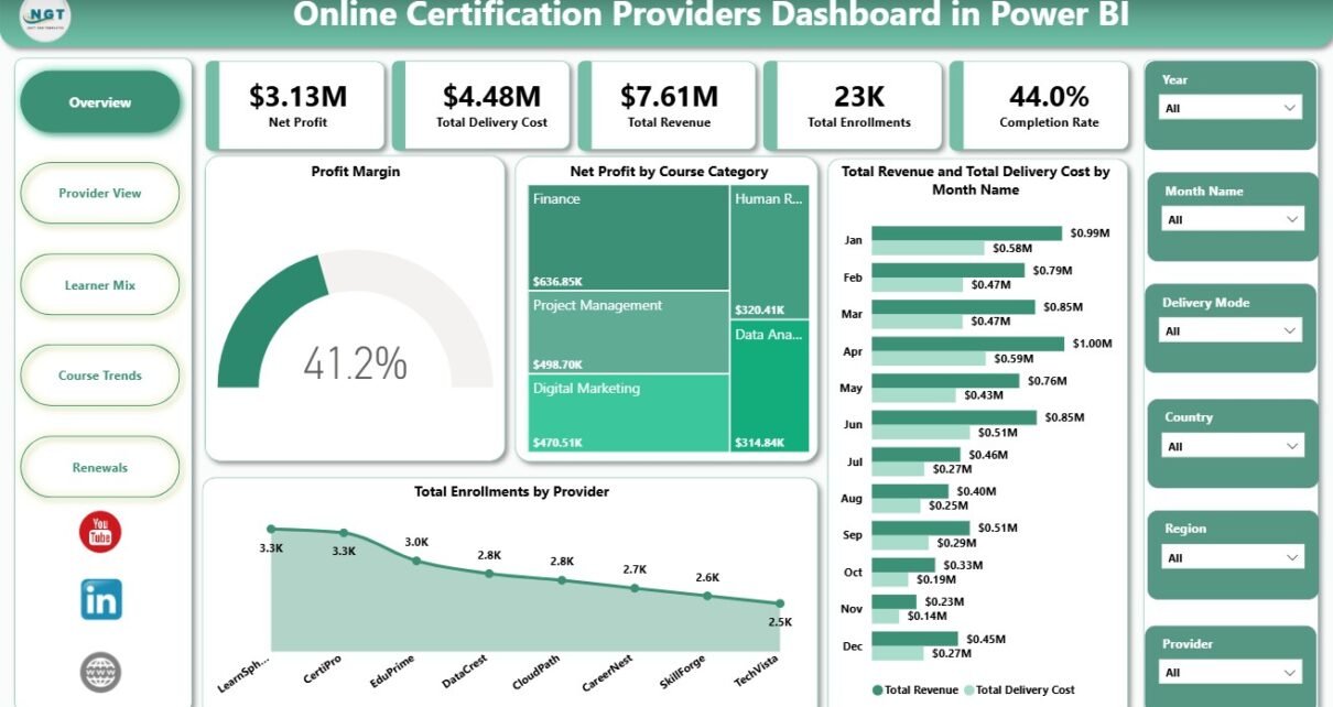
Online Certification Providers Dashboard in Power BI is a ready-to-use PBIX report for certification providers, online academies, professional training teams, and education analysts who need a faster way to review revenue, delivery cost, enrollments, completion rate, profit, learner mix, provider performance, course trends, and renewals. The report includes 5 interactive pages, 5 executive KPI cards, and 15 chart views, so teams can move from exported records to decision-ready visuals without building a Power BI report from scratch.
Power BI reports are especially useful when decision makers need slicers, multiple analysis pages, and repeatable monthly refreshes. Microsoft describes Power BI reports as interactive, multi-page analytical views, and this template follows that pattern for online certification analytics. You can learn more about the platform from Microsoft Learn’s Power BI report documentation.
Key Features of Online Certification Providers Dashboard in Power BI
- 5 report pages: Overview, Provider View, Learner Mix, Course Trends, and Renewals.
- 5 KPI cards: Net Profit, Total Delivery Cost, Total Revenue, Total Enrollments, and Completion Rate.
- 15 analysis charts: Track profit, revenue, cost, enrollments, completion, satisfaction, renewals, records, and region.
- Certification-focused metrics: Review course categories, providers, learner segments, delivery modes, certification levels, marketing channels, renewal status, and completion status.
- Editable PBIX file: Open in Power BI Desktop, replace the sample data, customize visuals, and publish to Power BI Service if needed.
- One-time purchase: Download the template once from NextGenTemplates with no recurring dashboard subscription.
Dashboard Pages Explanation
1 – Overview Page
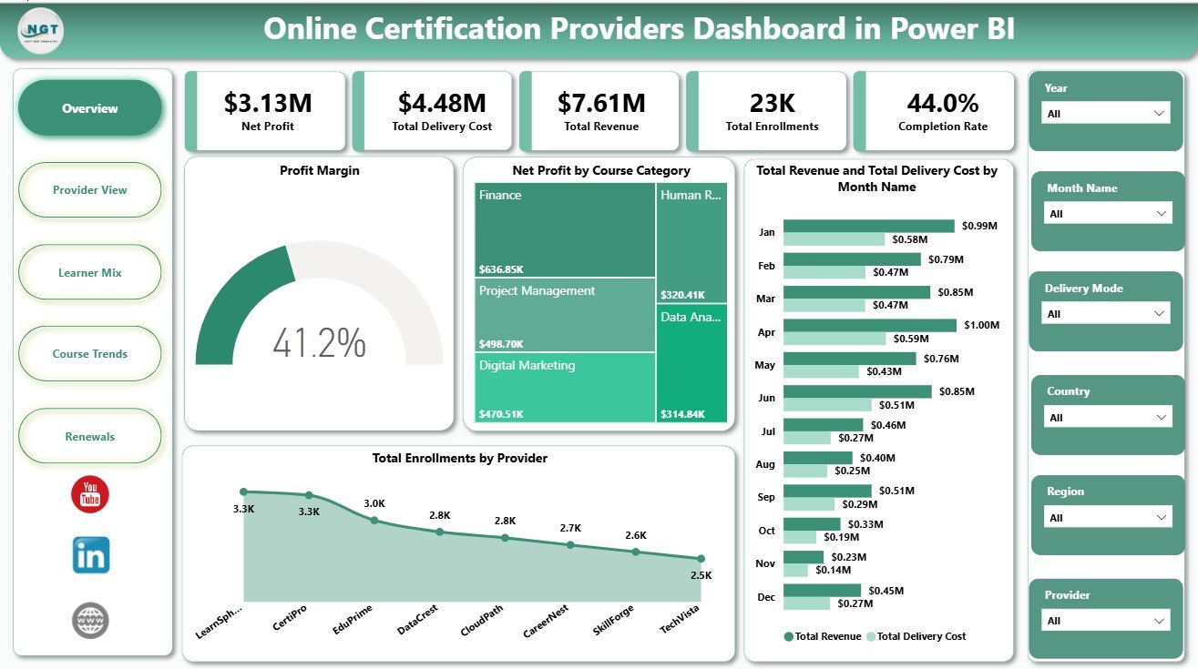
The Overview page gives leadership a clear starting point with Net Profit, Total Delivery Cost, Total Revenue, Total Enrollments, and Completion Rate cards. These cards help teams quickly check whether growth is profitable, whether delivery cost is under control, and whether learners are completing certification programs at the expected rate.
Profit Margin by Overall: This chart summarizes the overall margin position of the certification business. It helps leaders see whether revenue is turning into profit before they drill into categories or providers.
Net Profit by Course Category: This chart identifies which course categories contribute the strongest profit. Use it to guide course portfolio decisions, marketing focus, and content investment.
Total Revenue and Total Delivery Cost by Month Name: This trend compares revenue and cost month by month. It helps reveal whether revenue growth is supported by healthy cost control or whether delivery expense is rising too quickly.
Total Enrollments by Provider: This chart ranks providers by enrollment volume. It helps certification teams see which providers are driving learner demand and where partnership management may matter most.
2 – Provider View
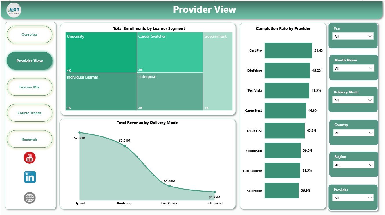
The Provider View page focuses on provider-level performance through learner segments, provider completion rate, and revenue by delivery mode. It is useful when management wants to compare not only who enrolls learners, but also who helps learners complete programs successfully.
Total Enrollments by Learner Segment: This visual shows which learner groups are joining your certification programs. It supports better campaign targeting, pricing decisions, and course positioning.
Completion Rate by Provider: This chart compares completion performance provider by provider. It helps flag providers with strong enrollment but weaker completion outcomes.
Total Revenue by Delivery Mode: This chart compares revenue across delivery formats such as online, blended, live, self-paced, or other modes. It helps decide where to expand delivery capacity or course content.
3 – Learner Mix
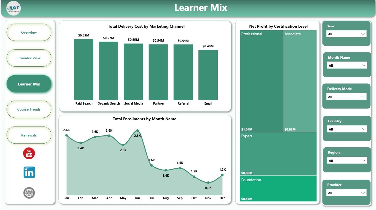
The Learner Mix page explains how learner acquisition, certification level, and time patterns affect the business. Marketing teams can use it to understand cost by channel, while program managers can compare profitability by certification level.
Total Delivery Cost by Marketing Channel: This chart connects delivery cost to acquisition source. It helps show whether certain channels bring learners who are more expensive to serve.
Net Profit by Certification Level: This chart compares profit across certification levels. It helps decide whether beginner, intermediate, advanced, or professional tracks deserve more promotion or refinement.
Total Enrollments by Month Name: This trend shows enrollment movement over time. It helps identify seasonality, campaign lift, and slower demand periods.
4 – Course Trends
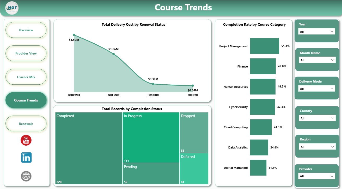
The Course Trends page focuses on renewal status, completion status, and course category completion rate. It is best for program managers who need to understand where learner progress is strong and where follow-up is needed.
Total Delivery Cost by Renewal Status: This chart compares delivery cost by renewal group. It helps reveal whether renewed learners, new learners, expired learners, or other groups create different service cost patterns.
Total Records by Completion Status: This visual breaks records into completion groups such as completed, in progress, or dropped. It supports operational follow-up and learner success monitoring.
Completion Rate by Course Category: This chart compares completion performance across course categories. It helps identify categories where course design, learner support, or difficulty level may need review.
5 – Renewals
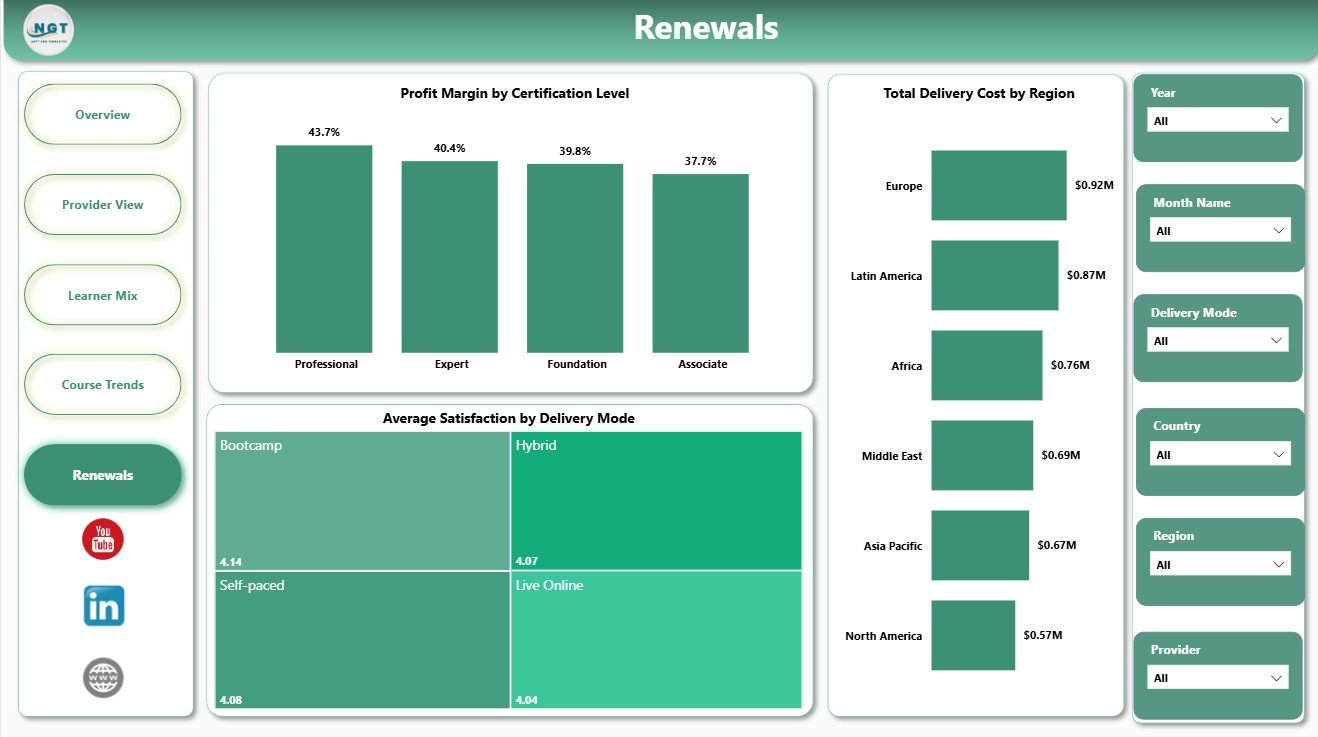
The Renewals page is built for margin, satisfaction, and regional cost review. It helps certification businesses understand whether renewals and delivery models are creating healthy learner outcomes and healthy profit.
Profit Margin by Certification Level: This chart shows which certification levels generate better margin. It supports pricing, promotion, and course portfolio discussions.
Average Satisfaction by Delivery Mode: This visual compares learner satisfaction across delivery formats. It helps identify whether online, live, blended, or self-paced modes are producing the best learner experience.
Total Delivery Cost by Region: This chart compares cost across regions. It helps teams spot regional cost pressure and make better delivery model decisions.
Online Certification Providers Dashboard in Power BI vs. Tableau vs. Paid LMS/SaaS – Feature Comparison
| Feature | This Power BI template | Tableau alternative | Paid LMS/SaaS |
|---|---|---|---|
| Cost | $17.99 one-time sale price | Requires Tableau licensing and build time | Monthly or annual subscription |
| Platform | Power BI Desktop and Power BI Service | Tableau Desktop or Tableau Cloud | Vendor-hosted learning platform |
| Setup time | Replace or connect data and refresh | Build or adapt workbook manually | Implementation and configuration |
| Real-time collaboration | Available after publishing through Power BI Service | Available after publishing through Tableau | Usually built in |
| Mobile access | Available after Power BI Service setup | Available after Tableau publishing | Usually built in |
| Customizable fields | Editable PBIX model, pages, visuals, and measures | Editable if built internally | Plan and vendor dependent |
| Share with link | Requires appropriate Microsoft sharing setup | Requires Tableau sharing setup | Usually account based |
| Year-1 cost at 5 users | Template price plus any Microsoft sharing licenses | License and implementation cost can be much higher | Often hundreds or thousands per year |
| Certification analytics fit | Prebuilt pages for provider, learner, course, and renewal analysis | Depends on custom design | Strong if the LMS includes BI reporting |
Who Should Use This Template
This template is best for online certification providers, training academies, exam-prep businesses, professional education teams, course marketplaces, certification program managers, and analysts who already have structured certification records. It is also useful for consultants who need a starter reporting model for an education client.
It is not a replacement for an LMS, payment system, course authoring platform, certificate generator, or learner portal. If you need transactional workflows, permissions, enrollments, reminders, or built-in payments, keep using your operational platform and use this dashboard as the analytics layer.
Real-World Use Cases
- An online academy owner reviews revenue, delivery cost, enrollments, completion rate, and net profit before changing monthly campaign spend.
- A certification program manager compares completion rate by provider and course category before meeting with delivery partners.
- A training operations analyst refreshes the PBIX file every month and shares provider, learner, course, and renewal insights with leadership.
Advantages of Online Certification Providers Dashboard in Power BI
The biggest advantage is structure. The template already organizes certification analytics into a logical set of pages: executive overview first, provider analysis next, then learner mix, course trends, and renewals. This saves report planning time and gives users a clear review flow.
Because it is a PBIX file, the dashboard remains editable. You can change visuals, update measures, rename pages, adjust slicers, and publish to Power BI Service when your team is ready for online sharing. It is also a one-time purchase, which makes it practical for smaller training companies that do not want another analytics subscription.
Opportunities for Improvement
The dashboard still depends on clean data. Before relying on the report, confirm that provider names, course categories, learner segments, dates, renewal status, completion status, and delivery modes are consistent in the source table. You may also need to adapt field names, Power Query steps, or DAX calculations if your internal certification definitions differ from the sample data.
Teams planning to publish the report should also think about workspace access, refresh credentials, row-level security, and mobile layout testing. The template accelerates reporting, but it does not replace data governance.
Best Practices
- Define each KPI before replacing the sample data, especially completion rate, profit margin, delivery cost, and net profit.
- Load one reporting period first and reconcile totals against your LMS, CRM, or finance source.
- Keep provider, region, learner segment, certification level, and delivery mode names standardized.
- Use slicers for recurring management questions, not every possible field.
- Refresh and review the dashboard on a fixed monthly cadence.
Explore Relevant Templates
Get the Online Certification Providers Dashboard in Power BI from NextGenTemplates.
You may also like the Online Certification Providers Dashboard in Excel if your team prefers Excel, and the OKR Management Dashboard in Power BI for goal and initiative reporting. Browse more Power BI dashboard templates on NextGenTemplates.
Frequently Asked Questions
What is included in the Online Certification Providers Dashboard in Power BI?
It includes 5 report pages: Overview, Provider View, Learner Mix, Course Trends, and Renewals. The dashboard includes KPI cards and chart views for revenue, delivery cost, enrollments, completion, profit, learner segments, providers, course categories, renewal status, satisfaction, and region.
Do I need Power BI Desktop to use this dashboard?
Yes. Open the PBIX file in Power BI Desktop. Power BI Desktop is free from Microsoft, while sharing through Power BI Service may require Microsoft licensing.
Can I replace the sample data?
Yes. Replace or connect the sample data source with your own certification provider records, then refresh the report.
Can I customize the dashboard pages?
Yes. You can edit visuals, slicers, page names, measures, colors, and model relationships inside Power BI Desktop.
Is this dashboard an LMS?
No. It is an analytics report for certification performance. It does not host courses, manage users, process payments, or issue certificates.
Is this a subscription?
No. It is a one-time downloadable Power BI template purchase from NextGenTemplates.
About the Author
Built by PK – Microsoft Certified Professional with 15+ years of Excel, Google Sheets, and Power BI experience. Founder of NextGenTemplates, reaching 300K+ subscribers across YouTube channels. Every template is hand-built and tested before release.
Conclusion
The Online Certification Providers Dashboard in Power BI gives certification teams a clean reporting layer for provider, learner, course, renewal, revenue, cost, and profit analysis. It is a practical choice when your team already has certification data and wants a faster way to turn that data into monthly management insight.
Visit our YouTube channel for step-by-step tutorials:
Youtube.com/@PKAnExcelExpert


