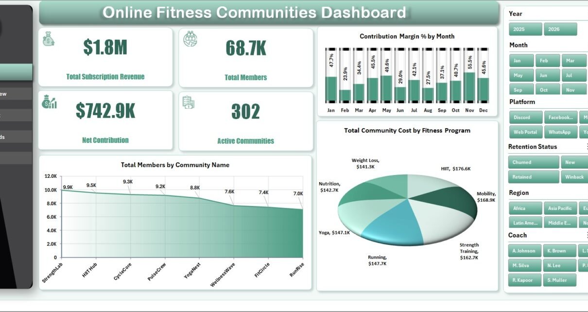
The Online Fitness Communities Dashboard in Excel is built for teams that manage subscription-based fitness communities, virtual coaching programs, challenge groups, and member-led wellness platforms. Instead of reviewing revenue in one file, member counts in another, and retention in a third, this workbook brings the main operating metrics into one refreshable Excel dashboard.
The dashboard includes 7 worksheet tabs, 4 executive KPI cards, multiple slicers, 18 analysis charts, a structured Data Sheet, and a pivot-powered Support Sheet. For online fitness teams that already export data from community platforms, payment systems, or coaching tools, this template gives a practical reporting layer without another monthly analytics subscription.
Key Features of Online Fitness Communities Dashboard in Excel
- 7 worksheet tabs for Overview, Community View, Member Mix, Program Trends, Retention, Data Sheet, and Support Sheet.
- 4 executive KPI cards on the Overview Page: Total Subscription Revenue, Total Members, Net Contribution, and Active Communities.
- Multiple slicers for quickly filtering by fields such as community name, platform, region, coach, fitness program, membership tier, age group, signup channel, retention status, and activity status.
- Community-level analysis for subscription revenue, satisfaction by coach, members by platform, and revenue by region.
- Member mix reporting by membership tier, age group, signup channel, and retention status.
- Program trend reporting for monthly subscription revenue, contribution margin by platform, completed challenges, and activity status.
- Retention views for goal outcome, active percentage by region, and margin by fitness program.
- Refresh All workflow so pivot tables, charts, slicers, and cards update after replacing the source data.
Dashboard Pages Explanation
1. Overview Page
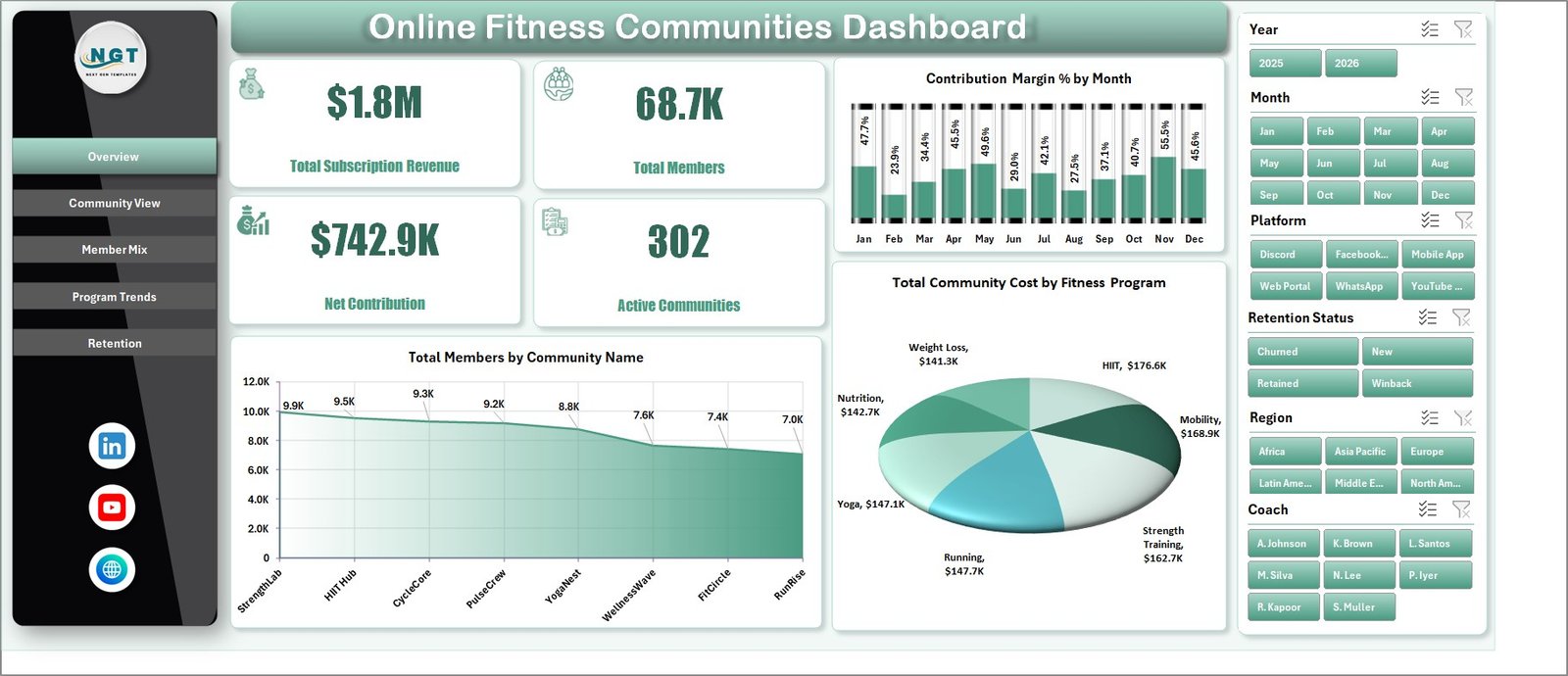
The Overview Page is the executive summary of the workbook. The top cards show Total Subscription Revenue, Total Members, Net Contribution, and Active Communities, giving managers a quick picture of revenue, scale, profit contribution, and active community count.
Contribution Margin % by Month: This chart tracks monthly margin movement. It helps users see whether online fitness communities are becoming more or less profitable over time.
Total Members by Community Name: This chart compares member volume across community names. It quickly identifies the largest communities and highlights smaller groups that may need growth support.
Total Community Cost by Fitness Program: This chart shows cost by fitness program. It helps teams understand which programs require the most community investment and where cost control may be needed.
2. Community View
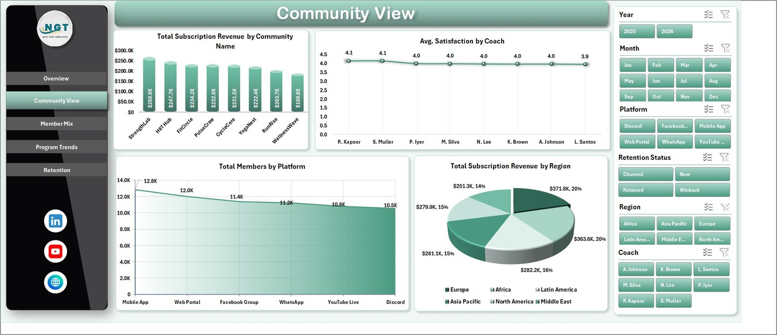
The Community View sheet focuses on how individual communities, coaches, platforms, and regions are performing. It includes Total Subscription Revenue by Community Name, Avg. Satisfaction by Coach, Total Members by Platform, and Total Subscription Revenue by Region.
Total Subscription Revenue by Community Name: This chart shows which communities are producing the most subscription income. It helps founders and managers identify flagship communities and underperforming groups.
Avg. Satisfaction by Coach: This chart compares member satisfaction by coach. It is useful for coaching quality reviews and understanding which coaches may be driving better member experiences.
Total Members by Platform: This chart compares member count by platform. It helps decide where to focus community operations, content posting, and technical support.
Total Subscription Revenue by Region: This chart shows revenue by region. It helps growth teams identify strong markets and regions that may need localization, pricing review, or campaign support.
3. Member Mix
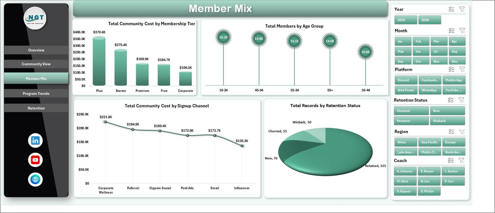
The Member Mix sheet explains who is inside the communities and how different member groups affect cost and retention. It includes Total Community Cost by Membership Tier, Total Members by Age Group, Total Community Cost by Signup Channel, and Total Records by Retention Status.
Total Community Cost by Membership Tier: This chart compares community cost across tiers. It helps teams check whether premium, standard, or trial segments are creating different cost profiles.
Total Members by Age Group: This chart shows the age distribution of the member base. It supports program positioning, content planning, and coaching communication style.
Total Community Cost by Signup Channel: This chart shows cost by acquisition source. It helps compare whether organic, referral, paid, or partner channels bring different operating costs.
Total Records by Retention Status: This chart summarizes retention status. It helps teams see how many records fall into retained, at-risk, churned, or other retention groups.
4. Program Trends
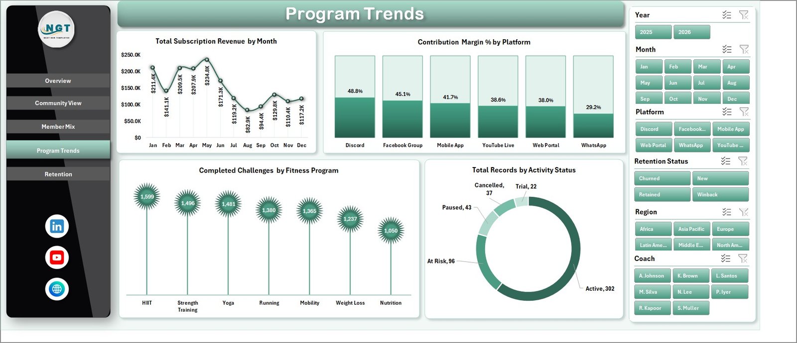
The Program Trends sheet focuses on performance over time and program participation. It includes Total Subscription Revenue by Month, Contribution Margin % by Platform, Completed Challenges by Fitness Program, and Total Records by Activity Status.
Total Subscription Revenue by Month: This chart shows monthly subscription revenue movement. It helps users spot growth, decline, seasonality, and campaign impact.
Contribution Margin % by Platform: This chart compares margin across platforms. It helps identify where the business is generating healthier contribution after community costs.
Completed Challenges by Fitness Program: This chart shows challenge completion by program. It is useful for reviewing program engagement and member accountability.
Total Records by Activity Status: This chart summarizes activity status. It helps users understand the split between active, inactive, paused, or other member statuses.
5. Retention
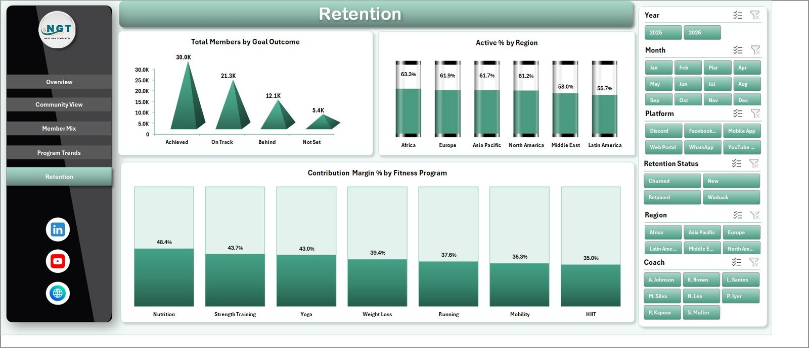
The Retention sheet helps users understand whether members are reaching goals, staying active, and contributing profitably. It includes Total Members by Goal Outcome, Active % by Region, and Contribution Margin % by Fitness Program.
Total Members by Goal Outcome: This chart shows member distribution by goal outcome. It helps teams evaluate whether programs are helping members reach the expected fitness result.
Active % by Region: This chart compares active percentage across regions. It helps highlight markets where engagement is strong and markets where activity may need improvement.
Contribution Margin % by Fitness Program: This chart compares margin by program. It helps identify programs that are both engaging and financially healthy.
6. Data Sheet Tab
The Data Sheet is where the source records are stored. Users should add or paste their own data in the same format as the sample records so the pivot tables and charts continue to refresh correctly.

7. Support Sheet Tab
The Support Sheet contains the pivot tables that power the dashboard dynamically. After updating the Data Sheet, go to the Data tab in the Excel Ribbon and click Refresh All. All pivots and charts will refresh. You can keep this sheet hidden for normal dashboard users.

Online Fitness Communities Dashboard in Excel vs. Google Sheets vs. Paid Community SaaS – Feature Comparison
| Feature | This Excel Dashboard | Google Sheets Alternative | Paid Community SaaS |
|---|---|---|---|
| Cost | $17.99 one-time | Low cost, but often needs rebuild | Monthly or annual subscription |
| Platform | Microsoft Excel | Browser spreadsheet | Vendor cloud platform |
| Setup time | Replace data and refresh | Build formulas, pivots, and charts | Requires onboarding and configuration |
| Real-time team collaboration | Possible through OneDrive or SharePoint | Built in | Usually included |
| Mobile access | Limited compared with web SaaS | Good browser access | Usually included |
| Customizable fields | Fully editable workbook | Editable sheet | Limited by vendor configuration |
| Share with link | Use OneDrive or SharePoint | Built in | Login controlled |
| Year-1 cost at 5 users | $17.99 plus Excel licensing already used | Usually low | Often hundreds or thousands |
| Fitness community reporting | 5 dashboard pages plus data and support pivots | Requires equivalent build | Depends on plan and connected data |
Who Should Use This Template
This template is useful for online fitness community owners, virtual coaching businesses, challenge-based fitness groups, community managers, membership analysts, subscription operators, finance teams, and consultants who prepare recurring reports for fitness or wellness communities.
It is especially helpful when the team already has exported data and wants a reusable dashboard instead of rebuilding pivot tables and charts every month.
Real-World Use Cases
Weekly community review: A community manager filters the dashboard by platform and coach to review total members, satisfaction, and retention status before a team meeting.
Program profitability review: A founder compares community cost, subscription revenue, and contribution margin across programs to decide where to invest next.
Regional engagement review: A subscription analyst reviews Active % by Region and revenue by region to identify markets with strong engagement and markets needing retention work.
Advantages of Online Fitness Communities Dashboard in Excel
- Fast setup: Replace sample data and refresh instead of building every pivot, chart, and KPI card manually.
- Clear executive view: Revenue, members, net contribution, and active communities are visible on the first page.
- Community-level insight: Revenue, satisfaction, platform members, and regional revenue can be reviewed together.
- Retention visibility: Goal outcomes, active percentage, and retention status help teams focus on member stickiness.
- Editable workbook: Excel users can adjust formulas, labels, colors, slicers, charts, and pivots as needed.
Opportunities for Improvement
The dashboard depends on clean source data. If community names, coach names, regions, platforms, membership tiers, age groups, signup channels, or retention statuses are inconsistent, the charts may need cleanup before they become reliable.
The workbook also does not replace a live community platform, payment system, workout app, automated event tracker, or CRM. Teams that need live behavioral events or automatic billing feeds can still use this workbook as a monthly reporting layer after exporting clean data.
Best Practices
- Keep the Data Sheet column structure unchanged.
- Use consistent names for communities, coaches, platforms, regions, fitness programs, tiers, and statuses.
- Add new records below the existing records instead of overwriting headers.
- Click Refresh All after every data update.
- Review retention and margin together before increasing ad spend.
- Hide the Support Sheet after setup if end users only need the dashboard pages.
- Save a monthly copy if you want historical snapshots outside the live workbook.
Explore Relevant Templates
You can review the Online Fitness Communities Dashboard in Excel on NextGenTemplates. You may also find the Fitness Apps Dashboard in Excel, Fan Communities Platforms Dashboard in Power BI, and Excel Dashboard Templates category useful.
For Excel refresh and workbook support concepts, Microsoft also provides helpful documentation for Microsoft Excel.
Frequently Asked Questions
What does the Online Fitness Communities Dashboard in Excel track?
It tracks subscription revenue, total members, net contribution, active communities, satisfaction, community cost, membership tier, age group, signup channel, retention status, activity status, completed challenges, goal outcome, active percentage, platform, region, coach, and fitness program.
How many worksheet tabs are included?
The workbook includes 7 tabs: Overview, Community View, Member Mix, Program Trends, Retention, Data Sheet, and Support Sheet.
Do I need advanced Excel skills?
No. The main workflow is to replace the sample data, keep the column format, and click Refresh All. Advanced users can customize pivots, charts, slicers, and formulas if needed.
Does this dashboard need macros?
No. It uses standard Excel tables, pivot tables, charts, slicers, and refresh behavior.
Can I use it for more than one community?
Yes. The dashboard includes analysis by community name, program, platform, region, coach, and membership tier, so multiple communities can be reviewed in one workbook.
Can I hide the Support Sheet?
Yes. The Support Sheet contains the pivot tables that power the dashboard and can be hidden after setup.
About the Author
Built by PK – Microsoft Certified Professional with 15+ years of Excel, Google Sheets, and Power BI experience. Founder of NextGenTemplates, reaching 300K+ subscribers across YouTube channels. Every template is hand-built and tested before release.
Conclusion
The Online Fitness Communities Dashboard in Excel gives fitness community teams a practical way to review members, revenue, costs, contribution, programs, activity, satisfaction, and retention from one workbook. Instead of rebuilding the same charts every reporting cycle, users can update the Data Sheet, refresh the pivots, and review performance through ready dashboard pages.
Visit our YouTube channel for step-by-step video tutorials: Youtube.com/@PKAnExcelExpert.