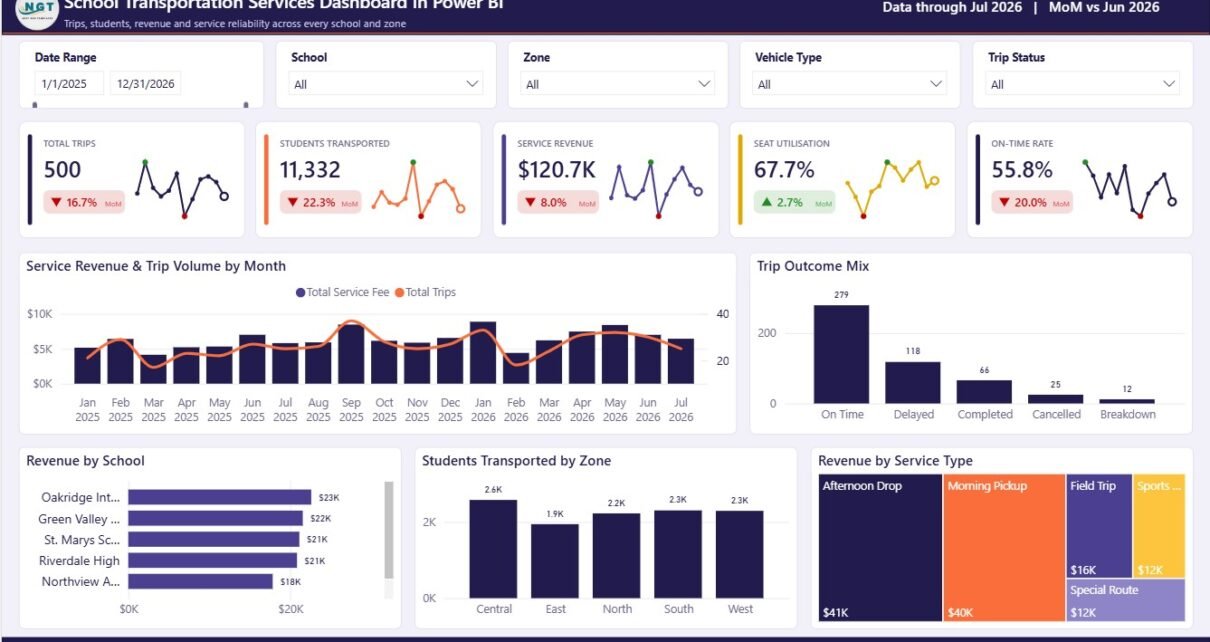
School transportation is a daily operating system with real money, safety, and family trust behind every route. A single missed trend can show up as late arrivals, underused seats, avoidable fuel cost, or repeated driver incidents. The School Transportation Services Dashboard in Power BI gives school administrators, fleet supervisors, route coordinators, and finance teams a 5-page reporting model for monitoring trips, students, service revenue, seat utilisation, route demand, profitability, complaints, and safety performance in one Power BI file.
This dashboard is built for teams that already collect school transportation data but need a cleaner way to convert it into management-ready insight. Open the .pbix file in Power BI Desktop, replace the sample data with your own source, refresh the model, and use the report pages for weekly route reviews, monthly finance reporting, fleet-cost analysis, and safety monitoring.
Key Features of School Transportation Services Dashboard in Power BI
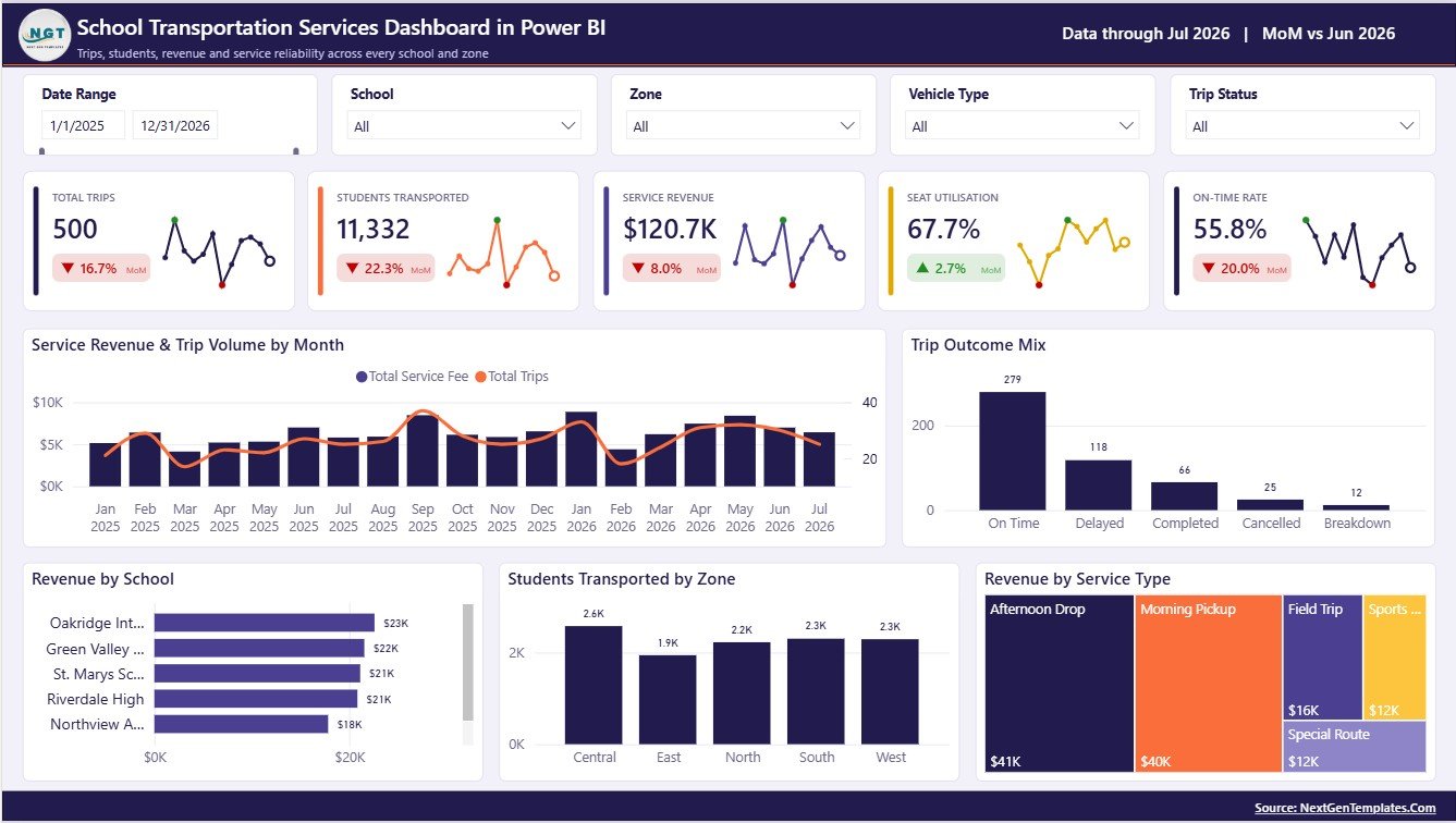
- 5 executive KPI cards: Total Trips, Students Transported, Service Revenue, Seat Utilisation, and On-Time Rate.
- 5 report pages: Overview, Route Operations, School Demand and Capacity, Fleet Cost and Profitability, and Safety and Incident Monitoring.
- 22 dashboard visuals: analyze monthly revenue, trip outcomes, route ranking, ridership, seat fill, operating cost, profit margin, incidents, complaints, and safety scores.
- Interactive slicers: filter the report by route, school, zone, service type, driver, vehicle, month, and other available fields.
- Editable Power BI file: adjust visuals, measures, layout, colors, and data connections in Power BI Desktop.
- One-time purchase: use the dashboard without a recurring school transport analytics subscription.
Dashboard Pages Explanation
1 – Overview Page
The Overview Page gives leadership a fast operating summary. The top cards show Total Trips, Students Transported, Service Revenue, Seat Utilisation, and On-Time Rate, so the main service indicators are visible before reviewing detailed charts.
Service Revenue and Trip Volume by Month: This chart compares monthly revenue with trip volume. It helps teams see whether increased trip activity is also producing stronger revenue.
Trip Outcome Mix by Trip Status: This visual shows how trips are distributed by status. Use it to identify completed trips, delays, cancellations, or other outcome groups that need attention.
Revenue by School: This chart compares revenue contribution by school. It helps finance and transportation teams identify the campuses generating the highest service value.
Students Transported by Zone: This visual shows student movement by zone. It supports regional capacity planning and zone-level service review.
Revenue by Service Type: This chart compares revenue across service categories. It helps leaders understand which transport service lines contribute most to income.
2 – Route Operations
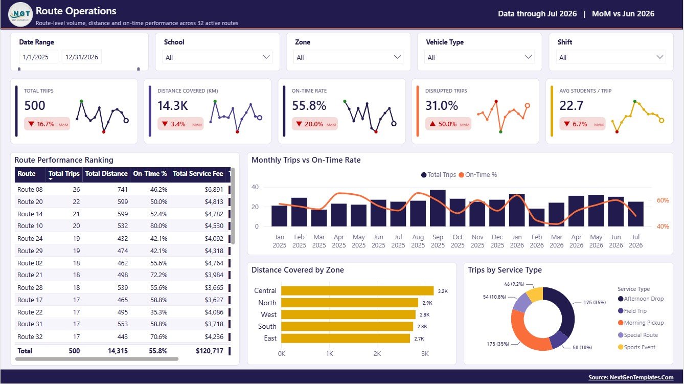
The Route Operations page is built for day-to-day performance review. It helps route coordinators compare route ranking, monthly trips, on-time rate, zone distance, and trip volume by service type.
Route Performance Ranking by Route: This chart ranks routes so teams can identify strong routes and routes needing follow-up. It is useful for route meetings and recurring service improvement.
Monthly Trips and On-Time Rate by Month: This chart compares trip activity with punctuality. It helps reveal whether high-volume months are creating on-time performance pressure.
Distance Covered by Zone: This visual shows the distance load by zone. It supports fuel planning, route redesign, and operating-cost discussions.
Trips by Service Type: This chart compares workload across service categories. Use it to understand which service types drive the most daily operations.
3 – School Demand and Capacity
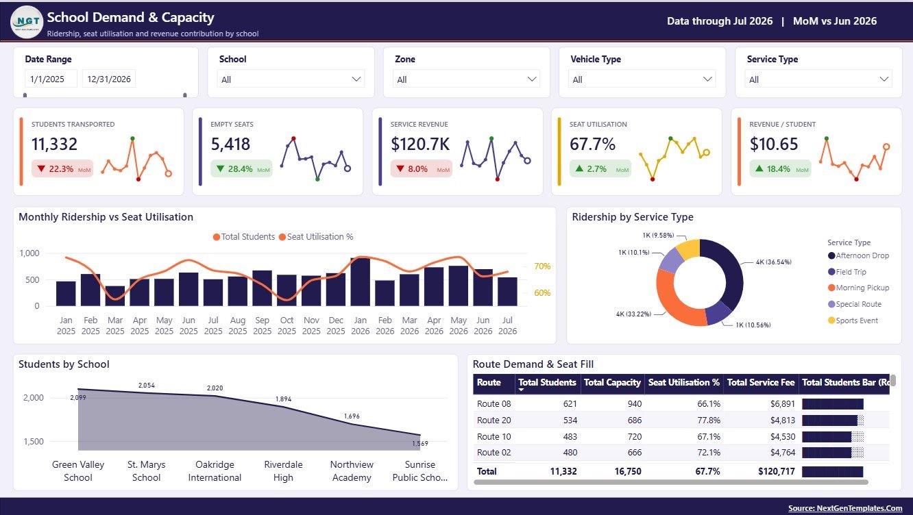
The School Demand and Capacity page helps administrators understand whether transport capacity is aligned with student demand. It is especially useful during enrollment changes, route expansion, or seasonal schedule reviews.
Monthly Ridership and Seat Utilisation by Month: This chart compares ridership and seat usage over time. It helps identify periods of overcapacity, underuse, or rising demand.
Ridership by Service Type: This visual compares students by service category. It supports planning across regular transport, special services, after-school runs, or custom service groups.
Students by School: This chart compares student volume by school. It helps teams prioritize high-demand campuses and review capacity allocation.
Route Demand and Seat Fill by Route: This visual compares route demand with seat fill. It helps identify overloaded routes, low-fill routes, and routing opportunities.
4 – Fleet Cost and Profitability
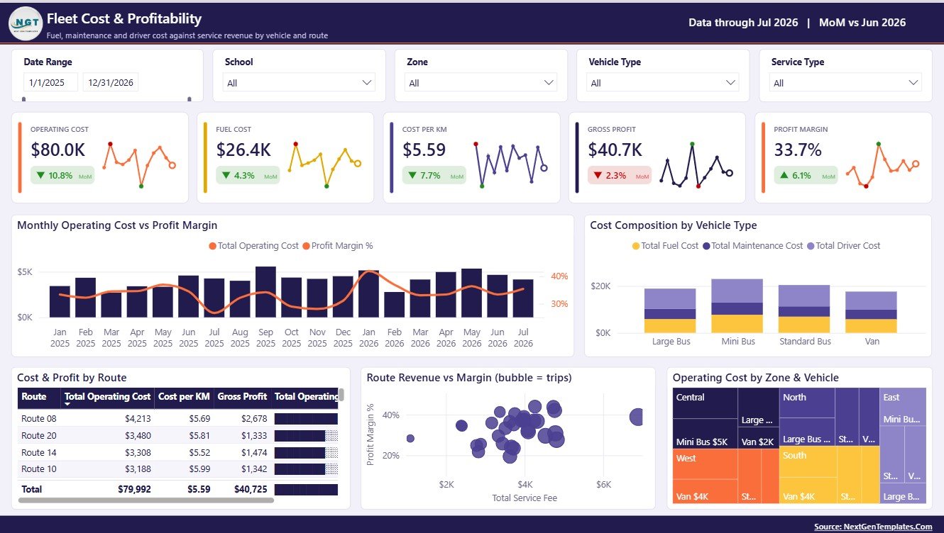
The Fleet Cost and Profitability page connects operations with financial performance. It helps managers compare operating cost, cost composition, route profitability, revenue, and margin.
Monthly Operating Cost and Profit Margin by Month: This chart compares cost trend with profit margin. It helps identify months where rising operating cost reduces profitability.
Cost Composition by Vehicle Type: This chart shows how costs are distributed by vehicle group. Use it for maintenance planning and fleet strategy discussions.
Cost and Profit by Route: This visual compares cost and profit at route level. It helps identify routes that need pricing, capacity, or cost review.
Route Revenue and Margin by Route: This chart separates high-revenue routes from high-margin routes. It is useful for finance and operations planning.
Operating Cost by Zone and Vehicle: This visual shows cost by zone and vehicle category. It helps locate cost-heavy areas and vehicle groups.
5 – Safety and Incident Monitoring
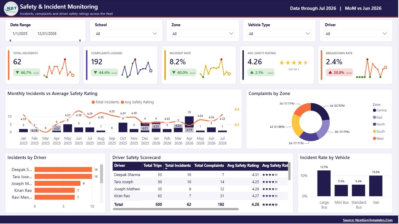
The Safety and Incident Monitoring page helps supervisors review safety outcomes by month, zone, driver, and vehicle. It is designed for safety meetings, incident follow-up, and driver coaching.
Monthly Incidents and Average Safety Rating by Month: This chart compares incident volume with safety ratings. It helps identify periods where safety performance may be weakening.
Complaints by Zone: This visual compares complaints by operating zone. It helps teams focus service improvement where complaint pressure is highest.
Incidents by Driver: This chart shows driver-level incident counts. It supports coaching, training, and follow-up action.
Driver Safety Scorecard by Driver: This scorecard compares driver safety performance. It helps recognize strong performers and identify improvement needs.
Incident Rate by Vehicle: This visual compares incident rate across vehicles. It helps fleet teams spot vehicles that need closer monitoring or maintenance review.
School Transportation Services Dashboard in Power BI vs. Tableau vs. Paid School Transport SaaS – Feature Comparison
| Feature | This Power BI dashboard | Tableau alternative | Paid school transport SaaS |
|---|---|---|---|
| Cost | One-time template purchase | Requires Tableau access and build effort | Usually monthly, annual, or per-student pricing |
| Platform | Power BI Desktop and Power BI ecosystem | Tableau Desktop or Tableau Cloud | Vendor-hosted transport system |
| Setup time | Open .pbix, replace data, refresh | Build or adapt workbook | Configure account, users, routes, and data |
| Customizable fields | Edit pages, visuals, model, and measures | Editable if you own the workbook | Limited by vendor settings |
| Mobile access | Available after publishing to Power BI Service | Available through Tableau Cloud or Server | Usually included in the vendor app |
| Year-1 cost at 5 users | Template price plus any Microsoft licensing | Template or build cost plus Tableau licensing | Can grow with users, buses, routes, or students |
| School transport analysis | Included across trips, students, routes, fleet cost, and safety | Requires custom build | Often includes modules beyond reporting |
Who Should Use This Template
This dashboard is useful for school administrators, school district transport teams, private bus operators, fleet supervisors, route managers, school finance officers, safety officers, and operations analysts who need a reporting view of school transportation performance.
It is not built to replace GPS tracking, live dispatch software, parent notification systems, bus routing optimization, payment processing, or legal compliance systems. It is a reporting and analysis file for Power BI.
Real-World Use Cases
Anita, school operations manager: reviews trips, students transported, and on-time rate every Monday before the route planning meeting.
Marcus, fleet supervisor: checks operating cost by vehicle type and incident rate by vehicle before scheduling maintenance.
Priya, finance officer: uses service revenue, route revenue, and margin analysis to prepare monthly reporting for management.
Advantages of School Transportation Services Dashboard in Power BI
The biggest advantage is speed. Instead of building five reporting pages from scratch, your team starts with a structured Power BI model focused on school transport operations. It also keeps operational and financial analysis together, so route performance, capacity, cost, profitability, and safety can be reviewed in the same file.
Another advantage is flexibility. Because this is a Power BI report, users comfortable with Power BI Desktop can adapt data connections, visuals, DAX measures, filters, page names, and color themes to match their organization.
Opportunities for Improvement
For advanced teams, the dashboard can be extended with live database connections, scheduled refresh through Power BI Service, row-level security by school or region, and additional drill-through pages for individual routes, vehicles, or drivers.
If your organization uses GPS, routing, or ticketing systems, you can also connect those sources to expand the analysis beyond the included sample-data structure.
Best Practices
Keep route names, school names, zones, service types, driver names, and vehicle IDs consistent in your source data. Standard naming makes slicers, charts, and comparisons much cleaner.
Review the dashboard on a fixed schedule. For example, route and safety teams can use weekly views, while finance teams can use monthly revenue and margin reviews.
Use Power BI documentation when changing data sources or publishing reports. Microsoft provides official Power BI guidance at Microsoft Learn for Power BI.
Explore Relevant Templates
- School Transportation Services Dashboard in Power BI
- School Transportation Services Dashboard in Excel
- Transportation Services KPI Dashboard in Excel
- Power BI dashboard templates
Frequently Asked Questions
What does this Power BI dashboard track?
It tracks trips, students transported, service revenue, seat utilisation, on-time rate, route performance, ridership, seat fill, operating cost, profit margin, complaints, incidents, drivers, vehicles, and safety ratings.
How many pages are included?
The dashboard includes 5 pages: Overview, Route Operations, School Demand and Capacity, Fleet Cost and Profitability, and Safety and Incident Monitoring.
Do I need Power BI Desktop?
Yes. Open the .pbix file in Power BI Desktop, replace the sample data with your own source, and refresh the report.
Can I customize the dashboard?
Yes. You can customize report pages, visuals, measures, slicers, colors, and data connections if you are comfortable editing Power BI files.
Does this include live bus tracking?
No. This is a reporting dashboard. It does not provide GPS tracking, dispatch automation, parent alerts, or live route optimization.
Can private transport operators use it?
Yes. Private school transport providers can adapt the dashboard if their data includes schools, routes, zones, services, vehicles, drivers, trips, costs, revenue, and safety fields.
About the Author
Built by PK – Microsoft Certified Professional with 15+ years of Excel, Google Sheets, and Power BI experience. Founder of NextGenTemplates, reaching 300K+ subscribers across YouTube channels. Every template is hand-built and tested before release.
Conclusion
The School Transportation Services Dashboard in Power BI gives school transport teams a practical way to review operations, demand, capacity, cost, profitability, and safety in one report. It is best suited for teams that want an editable Power BI file instead of a locked or recurring SaaS reporting tool.
For more dashboard tutorials and template walkthroughs, visit YouTube.com/@PKAnExcelExpert.