Last updated: August 9, 2026. The Seaport Dredging Services Dashboard in Power BI is a ready-to-use reporting template for dredging contractors, port authorities, marine operations teams, project controls teams, finance analysts, safety teams, and quality managers. It includes 5 Power BI report pages, 5 executive KPI cards, 22 analysis visuals, and interactive slicers so users can review revenue, gross profit, dredged volume, project delivery, fleet utilization, productivity, safety incidents, environmental alerts, and quality performance in one place Seaport Dredging Services Dashboard in Power BI.
Instead of building a Power BI model from scratch, users can open the .pbix file in Power BI Desktop, replace or connect the sample data, refresh the report, and start reviewing dredging performance by port, region, month, contract type, vessel, method, status, depth zone, material, and priority. For Power BI setup help, users can also refer to Microsoft Learn’s Power BI Desktop getting started guide.
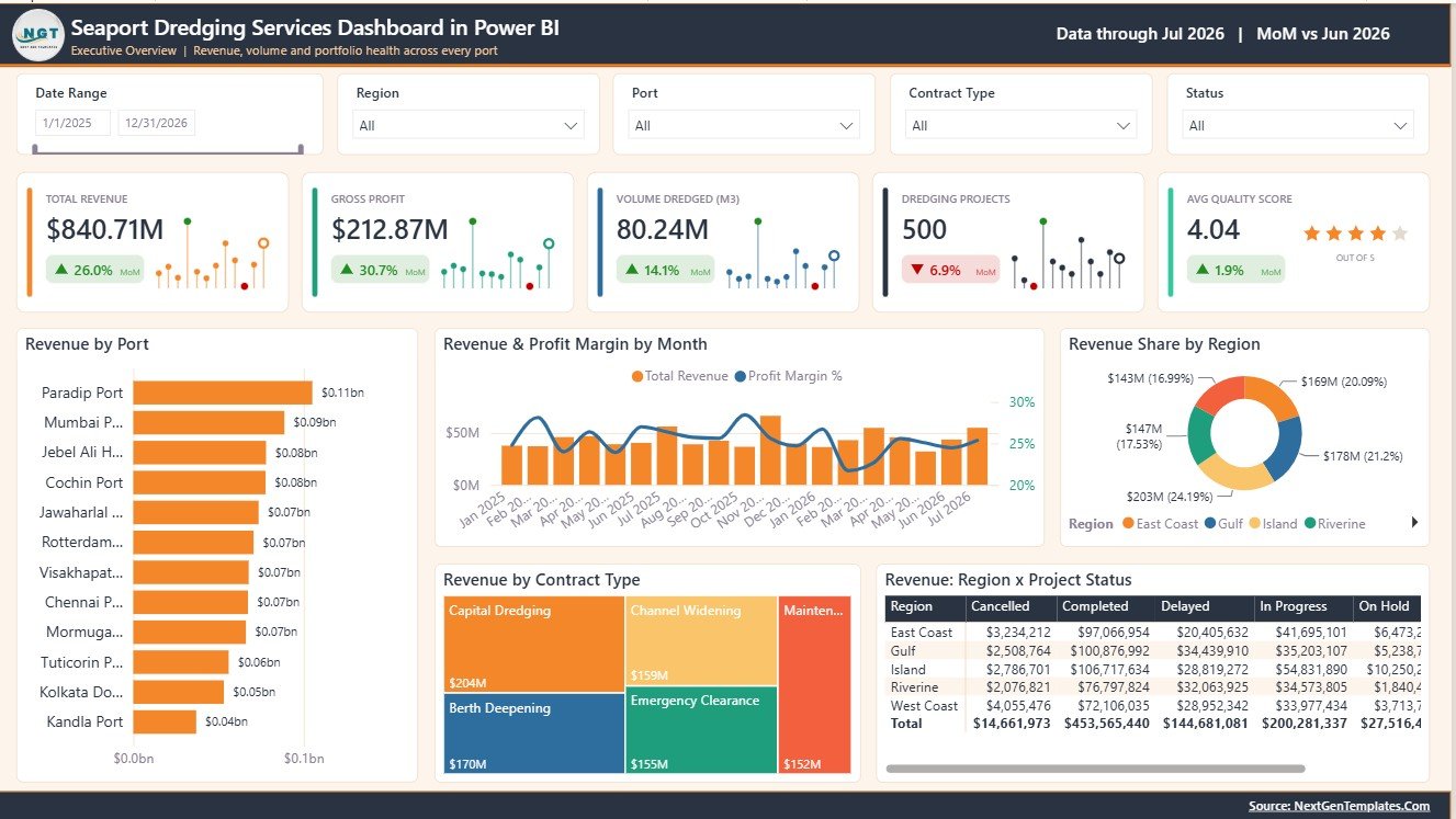
Key Features of Seaport Dredging Services Dashboard in Power BI
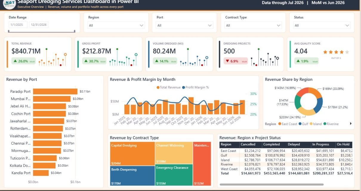
- 5 KPI cards: Total Revenue, Gross Profit, Volume Dredged (M3), Dredging Projects, and Avg Quality Score.
- 5 Power BI pages: Overview, Port & Fleet Operations, Project Status & Delivery, Productivity & Efficiency, and Safety, Environment & Quality.
- 22 analysis visuals: analyze revenue, margin, port output, vessel performance, utilization, delivery status, productivity, incidents, environmental alerts, and quality.
- Interactive slicers: filter dashboard pages quickly by available dimensions and compare filtered results across pages.
- Editable Power BI file: customize visuals, colors, measures, page names, fields, relationships, and report logic in Power BI Desktop Seaport Dredging Services Dashboard in Power BI
Dashboard Pages Explanation
1 – Overview Page
The Overview Page works as the executive summary for dredging service performance. It starts with KPI cards for Total Revenue, Gross Profit, Volume Dredged (M3), Dredging Projects, and Avg Quality Score, giving decision-makers a quick reading of commercial performance, production volume, workload, and quality health.
Revenue by Port: Compares revenue contribution across ports. Use it to identify high-value locations and understand where dredging revenue is concentrated.
Revenue and Profit Margin by Month: Shows revenue movement together with profit margin. It helps teams see whether high-revenue months are also producing healthy margin performance.
Revenue Share by Region: Breaks revenue into regional contribution. It helps leadership compare regional demand and identify where commercial activity is strongest.
Revenue by Contract Type: Compares revenue across contract models. Use it to review which contract types are creating the largest business impact.
Revenue by Region and Project Status: Combines region and project status in one view. It helps teams understand whether revenue is linked to active, completed, delayed, or planned work.
2 – Port & Fleet Operations
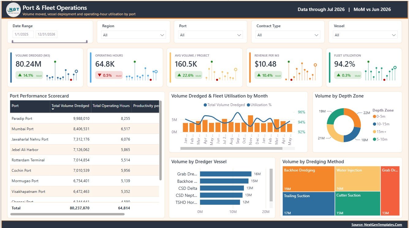
This page focuses on output, fleet workload, vessel use, methods, and depth zones. It helps operations managers move from financial review into practical production questions.
Total Volume Dredged by Port: Shows dredged volume by port. It helps teams identify the ports carrying the highest production load.
Total Operating Hours by Port: Compares operating hours by port. Use it to review workload intensity and vessel commitment across locations.
Productivity per Hour by Port: Measures output efficiency by port. It helps managers compare where the team is producing the most volume for each operating hour.
Volume Dredged and Fleet Utilisation by Month: Compares production volume with fleet utilization. It helps determine whether utilization is converting into real output.
Volume by Depth Zone: Shows production by depth zone. It supports channel, berth, and maintenance dredging review by work area.
Volume by Dredger Vessel: Compares production by vessel. It helps fleet managers identify high-performing vessels and vessels that may need review.
Volume by Dredging Method: Breaks volume by method. It supports method selection, planning, and equipment allocation decisions.
3 – Project Status & Delivery
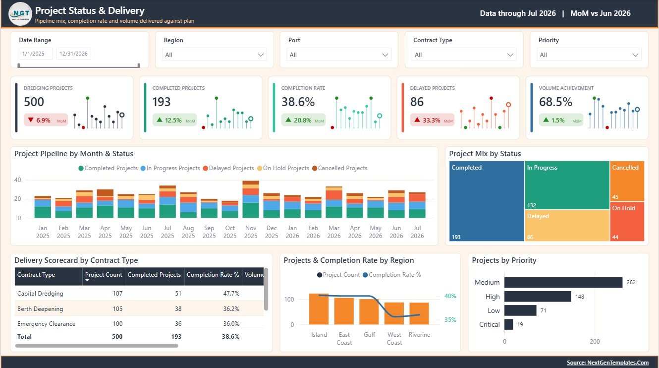
This page helps teams track the project pipeline, completion performance, project priority, delivery by contract type, and regional project mix.
Project Pipeline by Month and Status: Shows project movement by month and status. It helps teams monitor active, completed, delayed, and planned work over time.
Project Mix by Status: Summarizes the project portfolio by status. Use it to understand delivery balance and quickly spot areas requiring attention.
Delivery Scorecard by Contract Type: Compares delivery performance by contract type. It helps commercial and project teams review whether specific contract models need follow-up.
Projects and Completion Rate by Region: Compares project count and completion rate by region. It helps leadership see workload and delivery success together.
Projects by Priority: Groups projects by priority. It helps managers keep high-priority work visible in regular reviews.
4 – Productivity & Efficiency
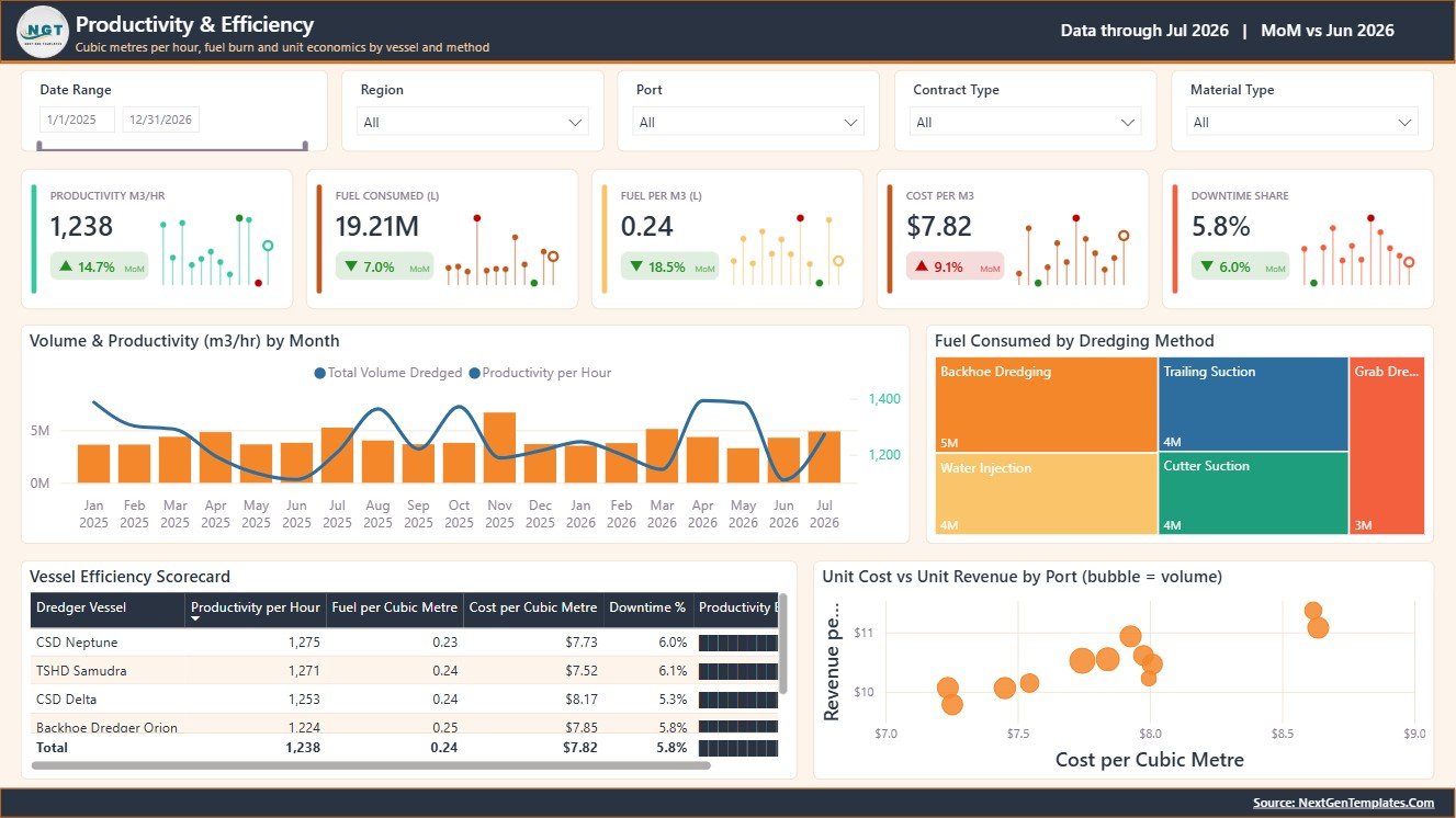
This page focuses on how efficiently dredging output is produced. It combines monthly productivity, fuel consumption, vessel efficiency, and port-level unit economics.
Volume and Productivity by Month: Compares monthly dredged volume with productivity. It helps teams find efficiency gains, slowdowns, and seasonal movement.
Fuel Consumed by Dredging Method: Shows fuel usage by method. Use it to compare energy consumption and review cost pressure by dredging approach.
Vessel Efficiency by Dredger Vessel: Compares vessel-level efficiency. It supports fleet planning, maintenance review, and vessel performance management.
Unit Cost and Unit Revenue by Port: Compares cost and revenue per unit by port. It helps finance and operations teams understand port-level economics.
5 – Safety, Environment & Quality
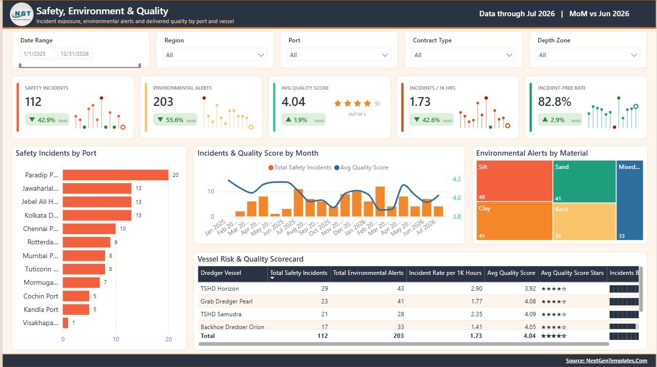
This page gives safety, environmental, and quality teams a focused view of operational risk and performance. It helps connect incident trends, material alerts, vessel risk, and quality score in one place.
Safety Incidents by Port: Compares incidents across ports. It helps safety teams prioritize investigation, training, and site-level follow-up.
Incidents and Quality Score by Month: Compares incident count with quality score over time. It helps managers see whether risk and quality performance are moving together.
Environmental Alerts by Material: Shows environmental alerts by material type. It supports environmental review and material-handling discussions.
Vessel Risk and Quality by Dredger Vessel: Compares vessel risk with quality performance. It helps identify vessels that need safety, quality, or process attention.
Seaport Dredging Services Dashboard in Power BI vs. Tableau vs. Paid Port Management SaaS – Feature Comparison
| Feature | This Power BI dashboard | Tableau alternative | Paid port management SaaS |
|---|---|---|---|
| Cost | $17.99 one-time sale price | Requires Tableau access plus build time | Usually subscription or module based |
| Platform | Power BI Desktop and Power BI Service | Tableau Desktop or Tableau Cloud | Vendor-hosted app |
| Setup time | Open .pbix, replace data, refresh | Build or adapt a workbook | Requires onboarding and configuration |
| Customizable fields | Editable visuals, measures, model, and pages | Editable when you own the workbook | Limited by vendor settings |
| Dredging focus | Ports, vessels, volume, methods, delivery, productivity, safety, environment, and quality | Must be customized | Depends on vendor module |
Who Should Use This Template
This template is useful for port authorities, marine contractors, dredging service providers, operations managers, fleet supervisors, project controls analysts, finance controllers, environmental teams, and quality managers who need a clear Power BI view of dredging service performance.
Real-World Use Cases
Rahul, dredging project manager: reviews project pipeline, completion rate, and priority mix before weekly delivery meetings.
Maria, port operations analyst: compares dredged volume, operating hours, productivity, vessels, and methods to understand fleet output.
Kevin, finance controller: reviews revenue, gross profit, unit cost, unit revenue, and contract performance before month-end reporting.
Advantages of Seaport Dredging Services Dashboard in Power BI
The main advantage is speed. Users do not need to design every card, slicer, chart, and page from a blank Power BI canvas. The dashboard already organizes commercial, operational, project, productivity, safety, environmental, and quality reporting into a practical page structure.
It is also flexible. Because it is a Power BI file, users can adjust visuals, rename fields, edit measures, change filters, connect a different source, publish to Power BI Service, and share access according to their Microsoft environment.
Opportunities for Improvement
This dashboard is designed for analysis and reporting. It is not a live vessel tracking tool, hydrographic survey processor, GIS system, dispatch console, maintenance CMMS, or compliance management platform. Teams that need live AIS/GPS feeds, automated operational control, or regulated reporting should use this dashboard alongside their operational systems.
Best Practices
- Keep the same field structure when replacing sample data.
- Validate revenue, gross profit, volume, and project status fields before management reporting.
- Use consistent naming for ports, regions, vessels, methods, materials, contract types, and project status values.
- Refresh the report after changing or reconnecting the data source.
- Review slicer selections before presenting the dashboard in a meeting.
Explore Relevant Templates
- Seaport Dredging Services Dashboard in Power BI
- Seaport Dredging Services Dashboard in Excel
- Port Tender Dashboard in Excel
- Browse Power BI dashboard templates
Frequently Asked Questions
What does this Power BI dashboard track?
It tracks revenue, gross profit, dredged volume, projects, quality score, ports, regions, contract types, vessels, methods, utilization, productivity, fuel, incidents, environmental alerts, and vessel risk.
How many pages are included?
It includes 5 pages: Overview, Port & Fleet Operations, Project Status & Delivery, Productivity & Efficiency, and Safety, Environment & Quality.
Do I need Power BI Desktop?
Yes. Open the .pbix file in Power BI Desktop, replace or connect your data, and refresh the report.
Can I customize it?
Yes. You can customize visuals, measures, fields, report pages, slicers, colors, and the data model.
Does it include live vessel tracking?
No. It is a reporting dashboard, not a live GPS, AIS, dispatch, or hydrographic survey system.
About the Author
Built by PK – Microsoft Certified Professional with 15+ years of Excel, Google Sheets, and Power BI experience. Founder of NextGenTemplates, reaching 300K+ subscribers across YouTube channels. Every template is hand-built and tested before release.
Conclusion
The Seaport Dredging Services Dashboard in Power BI helps marine and port teams turn dredging service data into clear management reporting. With 5 report pages, 5 KPI cards, 22 visuals, and slicer-driven analysis, it gives users a practical way to monitor commercial performance, fleet operations, project delivery, productivity, safety, environmental alerts, and quality from a single Power BI report.
For more tutorials, visit YouTube.com/@PKAnExcelExpert.