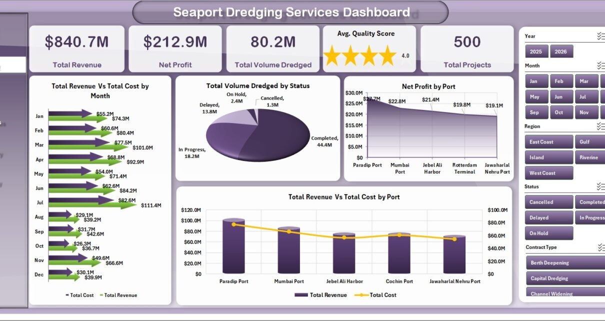
Last updated: August 9, 2026. The Seaport Dredging Services Dashboard in Excel is a ready-to-use reporting template for dredging contractors, port authorities, marine operations teams, and project controls professionals. It includes 7 workbook tabs, 5 high-level KPI cards, 17 analysis charts, and slicer-based filtering so teams can review revenue, cost, net profit, dredged volume, project progress, quality, incidents, vessels, ports, and regions from one Excel file.
Dredging work can involve multiple ports, contract types, vessels, material types, depth zones, and project priorities. When this data is spread across reports, emails, and manual trackers, it becomes difficult to see whether the operation is profitable, on schedule, safe, and producing the expected dredged volume. This dashboard turns structured dredging records into visual insight for monthly reviews, project status meetings, cost analysis, and operational planning.

Key Features of Seaport Dredging Services Dashboard in Excel
- 5 executive KPI cards: Total Revenue, Net Profit, Total Volume Dredged, Avg. Quality Score, and Total Projects.
- 7 worksheet tabs: Overview, Port Ops, Project Status, Productivity, Risk Quality, Data Sheet, and Support Sheet.
- 17 analysis charts: compare month, port, region, vessel, depth zone, priority, dredging method, contract type, material type, and status.
- Multiple slicers: filter the dashboard quickly without rebuilding formulas or charts.
- Pivot-based engine: update the Data Sheet, then use Data > Refresh All in Excel.
- Editable Excel format: adapt the workbook to your own ports, vessels, contract types, methods, and reporting process.
Dashboard Pages Explanation
1 – Overview Page
The Overview Page is the executive summary for the dashboard. At the top, it shows Total Revenue, Net Profit, Total Volume Dredged, Avg. Quality Score, and Total Projects. These cards give managers a fast read on commercial performance, production volume, quality output, and project workload.
Total Revenue Vs Total Cost by Month: This chart compares monthly revenue with operating cost so you can see margin pressure and seasonal movement. It helps finance and project teams identify months where cost increased faster than revenue.
Total Volume Dredged by Status: This chart groups dredged volume by project or work status. It helps managers understand how much volume is completed, active, delayed, pending, or in another status category from the dataset.
Net Profit by Port: This view highlights which ports are delivering stronger profit. It supports port-level commercial review, project prioritization, and bid strategy.
Total Revenue Vs Total Cost by Port: This chart compares port-level income and cost side by side. It is useful for identifying high-cost ports, margin gaps, and locations that require closer operational review.
2 – Port Ops
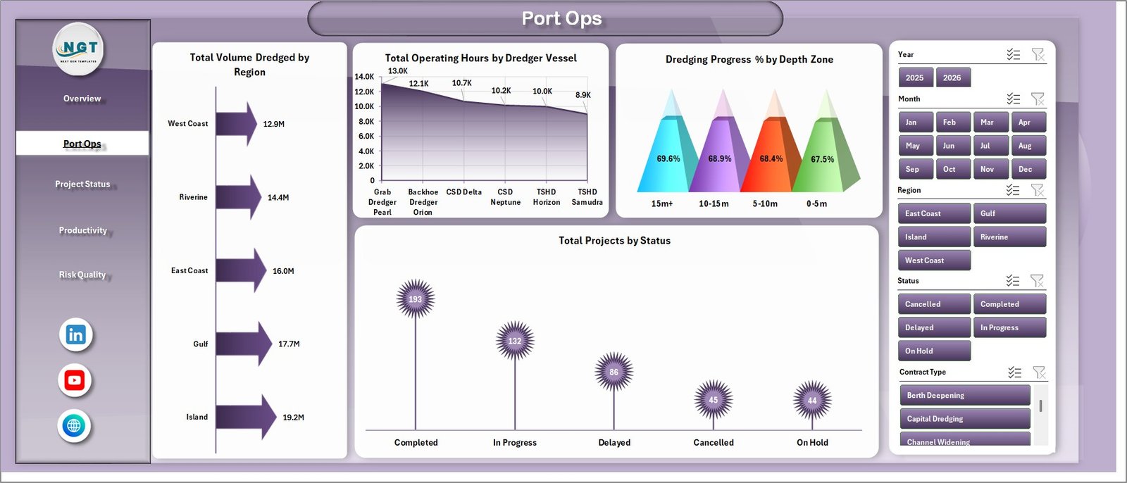
The Port Ops page focuses on daily and regional dredging operations.
Total Volume Dredged by Region: This chart shows where dredging production is concentrated. It helps teams compare output across operating regions and allocate resources more effectively.
Total Operating Hours by Dredger Vessel: This view compares vessel workload and utilization. It can support vessel planning, maintenance discussions, and productivity reviews.
Dredging Progress % by Depth Zone: This chart shows progress by channel, berth, basin, or other depth-zone grouping. It helps managers see whether deeper or more complex zones are progressing as expected.
Total Projects by Status: This chart counts projects by status. It gives a quick operational picture of completed, active, delayed, and pending work.
3 – Project Status
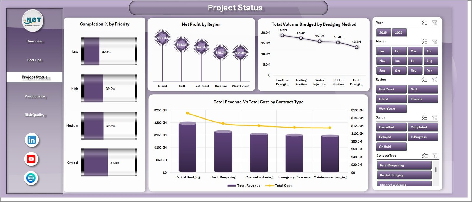
The Project Status page reviews performance by priority, region, dredging method, and contract type.
Completion % by Priority: This chart shows whether urgent and high-priority work is being completed on time. It is useful for weekly project review meetings and escalation planning.
Net Profit by Region: This view compares profitability across regions. It helps leadership see which areas are contributing more value and which need cost review.
Total Volume Dredged by Dredging Method: This chart compares production volume by dredging method. It helps operations teams understand which methods are contributing most to total output.
Total Revenue Vs Total Cost by Contract Type: This chart supports contract performance analysis by comparing revenue and cost for each contract type. It helps teams identify which commercial structures are more profitable.
4 – Productivity
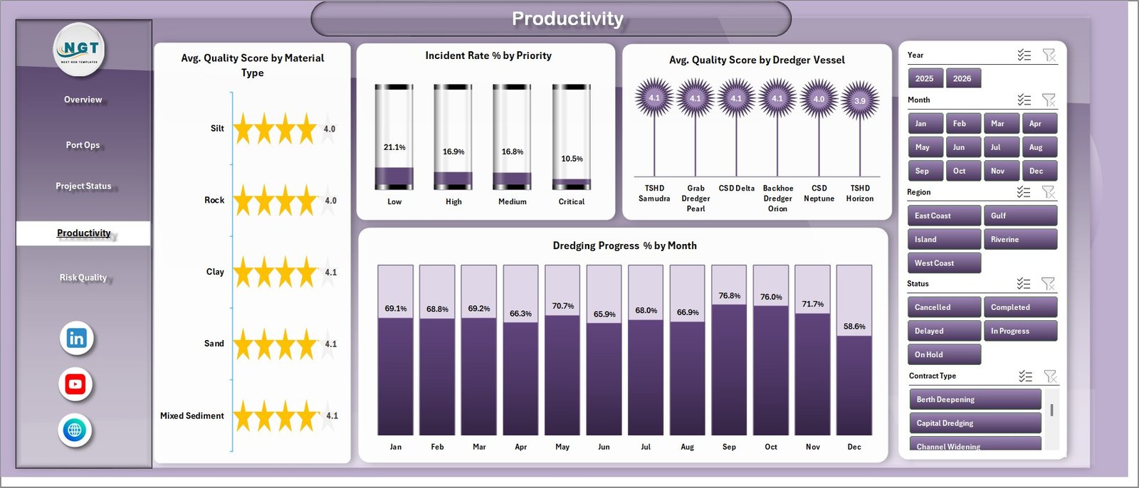
The Productivity page gives a focused view of quality, incidents, vessel performance, and monthly progress.
Avg. Quality Score by Material Type: This chart compares quality scores across material categories. It helps managers see where output quality is strong or where material conditions may need attention.
Incident Rate % by Priority: This view connects risk with project priority. It helps safety and operations teams understand whether high-priority work is creating elevated incident exposure.
Avg. Quality Score by Dredger Vessel: This chart compares dredger vessels by quality score. It supports vessel performance review and operator improvement discussions.
Dredging Progress % by Month: This monthly trend shows whether progress is improving, flat, or falling behind. It is useful for management updates and schedule review.
5 – Risk Quality
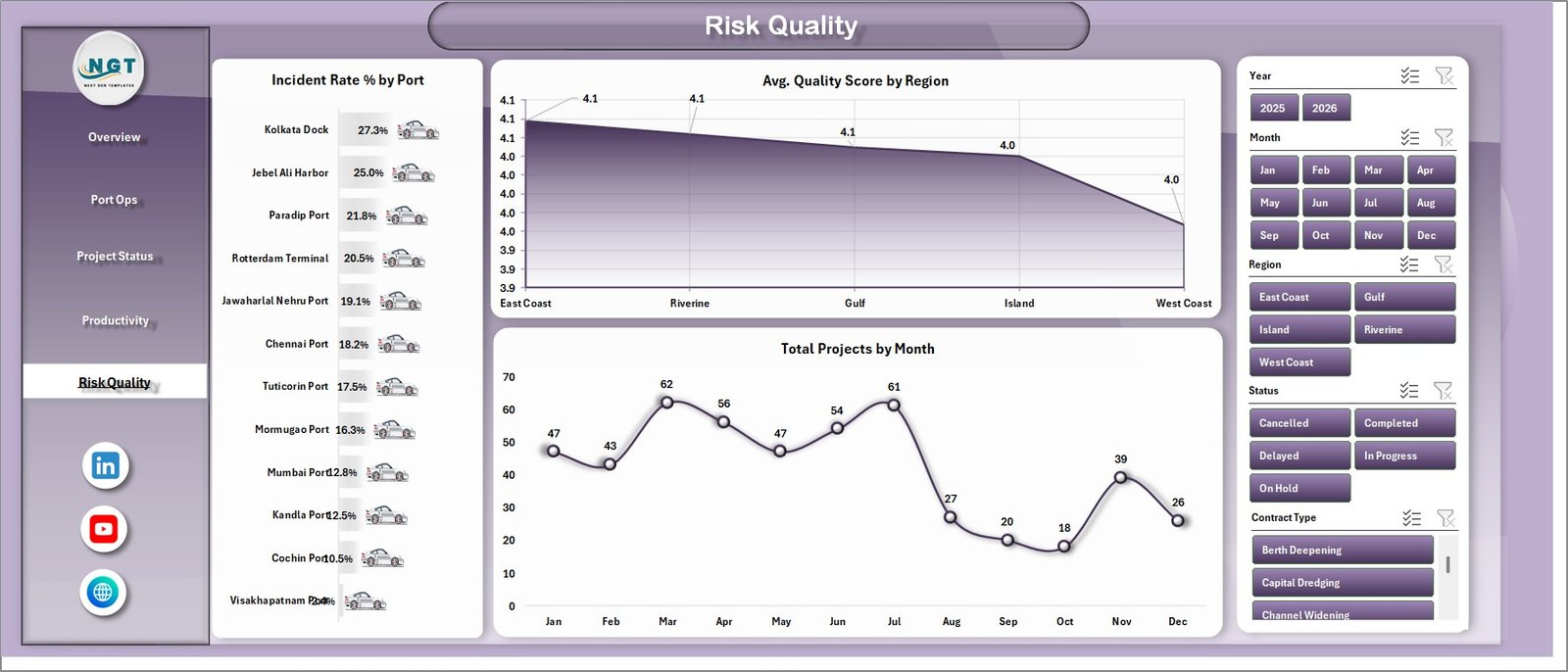
The Risk Quality page brings together safety, quality, and project load indicators.
Incident Rate % by Port: This chart identifies ports with higher incident rates. It helps safety teams decide where to investigate conditions, procedures, or resource constraints.
Avg. Quality Score by Region: This chart compares quality across regions. It helps managers find regional patterns in dredging performance and output acceptance.
Total Projects by Month: This chart shows project volume over time. It supports workload planning and helps explain changes in revenue, cost, operating hours, and incidents.
6 – Data Sheet Tab
The Data Sheet is where you add the dredging service records in the same format as the sample data. Keeping the same headers and structure ensures that the pivot tables, slicers, cards, and charts continue to work correctly.

7 – Support Sheet
The Support Sheet contains multiple pivot tables used to create the dashboard dynamically. After updating the Data Sheet, go to the Data tab in the Excel ribbon and click Refresh All. The pivot tables and dashboard charts will refresh together. You can keep this sheet hidden during normal use.

Seaport Dredging Services Dashboard in Excel vs. Google Sheets vs. Paid Port Management SaaS – Feature Comparison
| Feature | This Excel Dashboard | Google Sheets Alternative | Paid Port Management SaaS |
|---|---|---|---|
| Cost | One-time template purchase | Template cost or manual build time | Usually monthly, annual, or per-user pricing |
| Platform | Microsoft Excel | Google Sheets in Drive | Vendor-hosted web application |
| Setup time | Replace data and refresh pivots | Requires formula and chart setup if built manually | Requires onboarding, permissions, and configuration |
| Real-time team collaboration | Possible through OneDrive or SharePoint | Native browser collaboration | Usually included |
| Mobile access | Excel mobile app support depends on workbook use | Good mobile access in browser or app | Usually available |
| Customizable fields | Editable workbook structure | Editable sheet structure | Limited by vendor settings |
| Share with link | Possible through Microsoft 365 sharing | Native sharing | Vendor-controlled sharing |
| Year-1 cost at 5 users | Template cost plus any Microsoft licensing | Template cost plus any Google Workspace licensing | Can increase with seats, modules, and ports |
| Dredging-specific charts | Included for volume, vessel, port, region, method, quality, incident, and contract analysis | Must be built or customized | Depends on selected vendor module |
Who Should Use This Template
This template is useful for port authorities, dredging contractors, marine construction firms, operations managers, project controls teams, finance controllers, quality teams, and safety analysts who want an Excel-based reporting layer for dredging services.
It is especially useful when the team already has structured project data but needs a faster way to present trends, compare ports, explain monthly performance, and identify operational risks.
Real-World Use Cases
Rahul, dredging project manager: reviews Dredging Progress % by Month and Completion % by Priority before client progress meetings.
Maria, port operations analyst: compares Total Volume Dredged by Region and Total Operating Hours by Dredger Vessel to understand resource usage.
Kevin, finance controller: uses Net Profit by Port and Revenue Vs Cost by Contract Type to prepare monthly margin commentary.
Advantages of Seaport Dredging Services Dashboard in Excel
The main advantage is speed. Instead of building every pivot table and chart from scratch, you start with a ready dashboard structure. The template also keeps the workflow familiar because it stays inside Microsoft Excel. Teams can review the Data Sheet, inspect pivot tables in the Support Sheet, and adjust the workbook when their reporting needs change.
The dashboard also helps combine commercial, operational, quality, and risk views in one workbook. That is useful because dredging performance is rarely about one metric alone. Revenue may look strong while cost, incidents, or quality scores show warning signs. This dashboard makes those comparisons easier.
Opportunities for Improvement
This is an Excel dashboard, so it is best used as a reporting and analysis template rather than a live operational system. It does not replace hydrographic survey software, live vessel tracking, GPS dispatch, bathymetry tools, GIS systems, or regulated compliance platforms.
Teams that need automated data imports, multi-user approval workflows, real-time vessel telemetry, or role-based access control may eventually connect Excel to Power Query, Power BI, SharePoint, or a dedicated operational platform. For many teams, however, this workbook is a practical starting point for structured reporting.
Best Practices
- Keep the Data Sheet column structure unchanged when replacing sample data.
- Use consistent names for ports, regions, dredger vessels, methods, status values, and contract types.
- Refresh all pivot tables after every data update.
- Review the Overview Page first, then move to Port Ops, Project Status, Productivity, and Risk Quality for detail.
- Keep the Support Sheet hidden for normal users after setup to reduce accidental edits.
- Save a backup copy before making structural changes to formulas, pivots, slicers, or charts.
Explore Relevant Templates
You may also like the Port Operations Dashboard in Excel, the Port Procurement KPI Dashboard in Excel, and the Port Contract Management Dashboard in Power BI. You can also browse more Excel dashboard templates on NextGenTemplates.
Frequently Asked Questions
What does the Seaport Dredging Services Dashboard in Excel track?
It tracks revenue, cost, net profit, dredged volume, quality score, total projects, operating hours, progress percentage, incident rate, ports, regions, dredger vessels, dredging methods, priority, status, contract type, and month-based trends.
How many worksheet tabs are included?
The workbook includes 7 worksheet tabs: Overview, Port Ops, Project Status, Productivity, Risk Quality, Data Sheet, and Support Sheet.
Do I need advanced Excel skills?
No advanced Excel skills are required for normal use. You update the Data Sheet, refresh the workbook, and use slicers to filter the dashboard pages.
How do I refresh the charts?
After updating the Data Sheet, go to the Data tab in the Excel ribbon and click Refresh All. The pivot tables on the Support Sheet and all related charts will refresh.
Can I hide the Support Sheet?
Yes. The Support Sheet contains pivot tables for the dashboard engine. You can keep it hidden after setup to protect the workbook structure.
Can this replace marine operations software?
No. This is a reporting dashboard, not live vessel tracking, GIS, bathymetry, dispatch, or compliance software. Use it to analyze structured dredging service data in Excel.
About the Author
Built by PK – Microsoft Certified Professional with 15+ years of Excel, Google Sheets, and Power BI experience. Founder of NextGenTemplates, reaching 300K+ subscribers across YouTube channels. Every template is hand-built and tested before release.
For official guidance on refreshing data connections and PivotTables in Excel, see Microsoft Support.
Conclusion
The Seaport Dredging Services Dashboard in Excel gives port and dredging teams a clear way to monitor financial, operational, productivity, quality, and risk performance in one workbook. With 5 KPI cards, 17 charts, slicers, a Data Sheet, and a Support Sheet, the template helps you move from raw dredging records to management-ready insights faster.
Visit our YouTube channel for step-by-step Excel, dashboard, and reporting tutorials: YouTube.com/@PKAnExcelExpert.