Sentiment Analysis Startups Dashboard in Excel is a ready-to-use Excel dashboard template for tracking startup subscription revenue, cloud cost, gross profit, text processing volume, model accuracy, sentiment mix, completion status, and churn risk. The sentiment analytics market is estimated at USD 5.26 billion in 2025 and projected to reach USD 21.84 billion by 2035, according to Market.us. For AI, NLP, customer feedback, and text analytics startups, that growth also creates a reporting challenge: teams need to understand not only how many texts are processed, but whether the work is profitable, accurate, fast, and healthy from a customer-risk point of view Sentiment Analysis Startups Dashboard in Excel
This Excel dashboard gives you multiple analysis pages, KPI cards, slicers, charts, a structured Data Sheet, and a Support Sheet with pivot tables. You can replace the sample records with your own data, refresh the pivots, and review the updated dashboard quickly.
Sentiment Analysis Startups Dashboard in Excel
Key Features of Sentiment Analysis Startups Dashboard in Excel
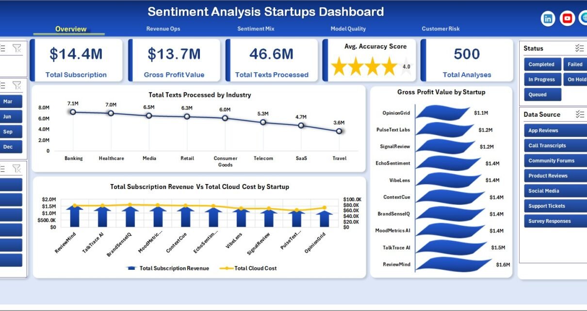
- 5 KPI cards: Total Subscription, Gross Profit Value, Total Texts Processed, Avg. Accuracy Score, and Total Analyses.
- 5 dashboard pages: Overview, Revenue Ops, Sentiment Mix, Model Quality, and Customer Risk.
- 18 analysis charts: review revenue, cost, profit, text volume, sentiment share, model quality, completion, priority, and churn metrics.
- Interactive slicers: filter dashboard views by available fields and review specific segments quickly.
- Editable Data Sheet: add your own sentiment analysis startup records in the same format.
- Support Sheet: pivot tables power the dashboard dynamically and can be hidden after setup.
- No recurring SaaS fee: use an Excel-based reporting layer for internal analysis and recurring reviews.
Dashboard Pages Explanation
1 – Overview Page
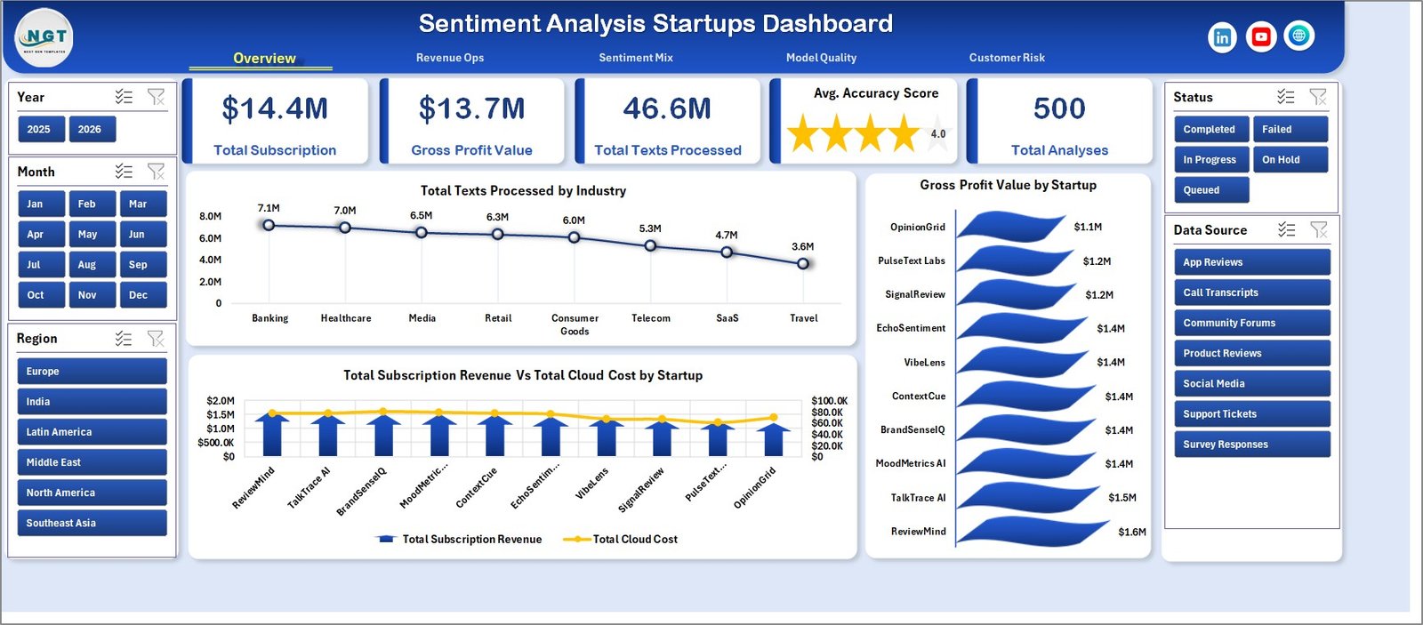
The Overview Page gives a high-level summary of sentiment analysis startup performance. At the top, the dashboard shows Total Subscription, Gross Profit Value, Total Texts Processed, Avg. Accuracy Score, and Total Analyses.
Total Texts Processed by Industry: This chart shows which industries are generating the most text processing volume. It helps teams understand where customer demand and processing load are highest.
Total Subscription Revenue Vs Total Cloud Cost by Startup: This chart compares revenue against cloud cost for each startup. It helps identify accounts where infrastructure cost may be reducing profitability.
Gross Profit Value by Startup: This chart ranks startups by gross profit value. It helps revenue and finance teams see which accounts contribute the strongest margin Sentiment Analysis Startups Dashboard in Excel
2 – Revenue Ops
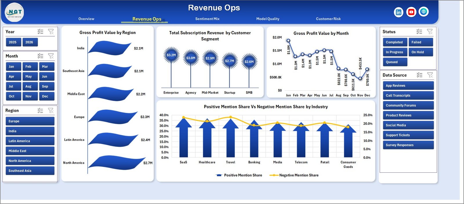
The Revenue Ops sheet focuses on revenue, profit, region, customer segment, monthly performance, and industry sentiment balance.
Gross Profit Value by Region: This chart compares profit contribution across regions. It helps teams identify high-margin markets and regions that may need cost or pricing review.
Total Subscription Revenue by Customer Segment: This chart shows recurring revenue by customer segment. It helps sales teams understand which segment is contributing the most subscription value.
Gross Profit Value by Month: This chart tracks gross profit over time. It is useful for reviewing monthly performance and spotting margin changes.
Positive Mention Share Vs Negative Mention Share by Industry: This chart compares sentiment balance by industry. It helps identify industries with stronger positive feedback or higher negative signals.
Revenue Ops
3 – Sentiment Mix
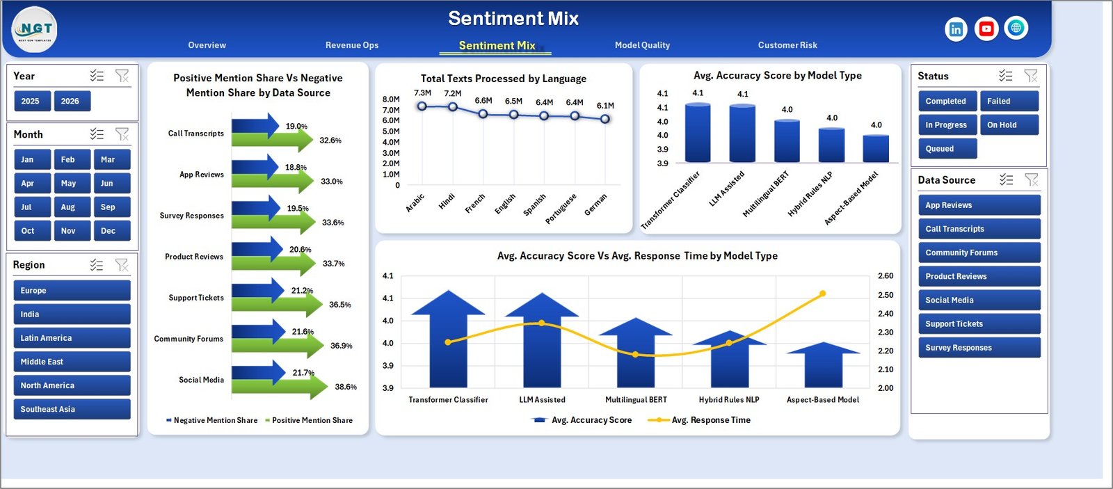
The Sentiment Mix sheet helps analyze sentiment distribution, data sources, languages, model types, accuracy, and response time.
Positive Mention Share Vs Negative Mention Share by Data Source: This chart compares sentiment share across different text sources. It helps users see whether reviews, chats, tickets, or other channels are producing more negative mentions.
Total Texts Processed by Language: This chart shows text processing volume by language. It is useful for multilingual sentiment analysis teams that need to plan model support and quality checks.
Avg. Accuracy Score by Model Type: This chart compares average accuracy across model types. It helps analytics teams review which models are performing better.
Avg. Accuracy Score Vs Avg. Response Time by Model Type: This chart compares accuracy and speed together. It helps teams balance model quality with response-time expectations.
Sentiment Mix
4 – Model Quality
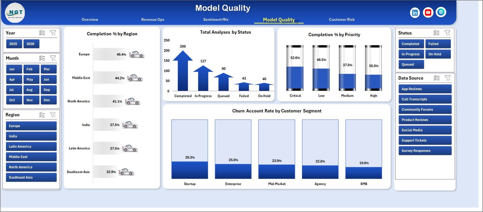
The Model Quality sheet focuses on completion percentage, analysis status, priority, and customer churn risk.
Completion % by Region: This chart compares completion percentage by region. It helps teams find operational gaps across markets.
Total Analyses by Status: This chart shows how many analyses are completed, pending, failed, or in another status. It gives managers a quick workload and progress view.
Completion % by Priority: This chart compares completion rate by priority level. It helps ensure high-priority work is being handled properly.
Churn Account Rate by Customer Segment: This chart shows churn account rate by segment. It helps customer success teams focus retention work on higher-risk groups.
Model Quality
5 – Customer Risk
The Customer Risk sheet is designed for churn and negative sentiment review.
Churn Account Rate by Industry: This chart compares churn risk across industries. It helps teams identify verticals where customers may need better onboarding, support, or product fit.
Negative Mention Share by Region: This chart shows negative mention share by region. It helps customer teams understand where sentiment problems may be concentrated.
Churn Account Rate by Month: This chart tracks churn account rate over time. It helps leaders see whether risk is rising or improving month by month.
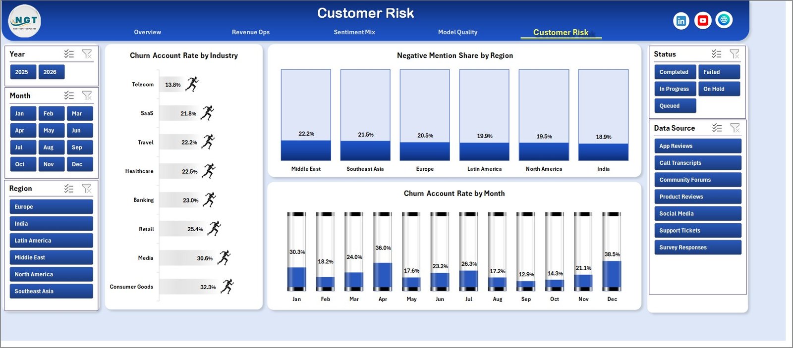
Customer Risk
6 – Data Sheet Tab
The Data Sheet is where you add the source data in the same format as the sample records. Keep the column structure unchanged so the KPI cards, charts, slicers, and pivot tables continue to work correctly.

Data Sheet tab
7 – Support Sheet
The Support Sheet contains multiple pivot tables used to create the entire dashboard dynamically. After updating the Data Sheet, go to the Data tab in the Excel ribbon and click Refresh All. Microsoft also explains that Excel users can refresh PivotTables using Refresh or Refresh All. Once refreshed, the dashboard cards and charts will update. You can keep this sheet hidden for regular users.

Support sheet tab
Sentiment Analysis Startups Dashboard in Excel vs. Google Sheets vs. Paid Analytics SaaS – Feature Comparison
| Feature | This Excel Dashboard | Google Sheets Alternative | Paid Analytics SaaS |
|---|---|---|---|
| Cost | One-time template purchase | Low software cost but manual build needed | Recurring monthly or annual fee |
| Platform | Microsoft Excel | Google Sheets | Vendor-hosted platform |
| Setup time | Replace data and refresh pivots | Build charts, formulas, and filters | Implementation and integrations |
| Customization | Edit sheets, charts, pivots, slicers, and labels | Editable but requires manual setup | Depends on vendor permissions |
| Best for | Fast spreadsheet reporting | Cloud collaboration | Live enterprise workflows |
Who Should Use This Template
This dashboard is useful for sentiment analysis startups, NLP product teams, AI SaaS founders, customer feedback analysts, revenue operations teams, customer success managers, and finance teams that need to review revenue, cloud cost, margin, model quality, and customer risk in one place.
Real-World Use Cases
AI startup founder: reviews subscription revenue, cloud cost, gross profit, and processed text volume before monthly investor updates.
Customer success manager: checks negative mention share, churn account rate, and customer segment risk before planning account outreach.
ML operations analyst: compares average accuracy score and response time by model type before recommending model changes.
Advantages of Sentiment Analysis Startups Dashboard in Excel
- It keeps financial, operational, model quality, and customer risk metrics in one workbook.
- It uses familiar Excel functionality, including tables, charts, slicers, and pivot tables.
- It gives teams a quick way to report on sentiment analytics without building a dashboard from scratch.
- It can be customized for different industries, regions, models, segments, and data sources.
Opportunities for Improvement
This template is a reporting dashboard, not a live NLP system. It does not process raw text, train models, connect to APIs, or automate data ingestion. Teams that need live pipelines can still use this workbook as a reporting layer after exporting prepared data from their own systems.
Best Practices
- Keep the Data Sheet column structure the same when replacing sample data.
- Refresh all pivots after every major data update.
- Use slicers to review performance by startup, industry, region, segment, source, language, model type, status, priority, and month.
- Check gross profit together with cloud cost so high text volume does not hide weak account economics.
- Review accuracy and response time together when comparing model types.
Explore Relevant Templates
You can download the product here: Sentiment Analysis Startups Dashboard in Excel.
You may also like these related templates:
- Online Reputation KPI Dashboard in Excel
- Convenience Apps Dashboard in Excel
- EdTech Dashboard in Google Sheets
- Railway Tech Startups Dashboard in Power BI
Frequently Asked Questions
What does the Sentiment Analysis Startups Dashboard in Excel track?
It tracks subscription revenue, cloud cost, gross profit, total texts processed, average accuracy score, total analyses, sentiment share, response time, completion percentage, analysis status, priority, churn account rate, industry, region, customer segment, language, data source, and model type.
Do I need advanced Excel skills to use it?
No. You can replace the sample records in the Data Sheet, refresh the workbook, and use the slicers to filter the dashboard. Advanced users can customize the pivots and charts if needed.
Does this dashboard require macros?
No macro requirement is described for this template. It is built around Excel sheets, pivot tables, charts, slicers, and structured data.
Can I use this with my own sentiment platform export?
Yes. Export your prepared data, match it to the Data Sheet columns, paste it into the workbook, and refresh the dashboard.
Is this a replacement for a sentiment analysis API?
No. This is a reporting dashboard, not an NLP model, API, annotation tool, or text processing engine.
Can I hide the Support Sheet?
Yes. The Support Sheet contains pivot tables that power the dashboard. You can keep it hidden after setup.
About the Author
Built by PK – Microsoft Certified Professional with 15+ years of Excel, Google Sheets, and Power BI experience. Founder of NextGenTemplates, reaching 300K+ subscribers across YouTube channels. Every template is hand-built and tested before release.
Conclusion
The Sentiment Analysis Startups Dashboard in Excel gives AI and NLP teams a practical way to review subscription revenue, cloud cost, gross profit, processing volume, model quality, sentiment mix, and customer risk in a single Excel workbook. Instead of building reports from scratch, you can update the Data Sheet, refresh the pivots, and use the dashboard pages to support investor updates, operations reviews, customer success meetings, and model performance discussions.
For more Excel, Google Sheets, and Power BI tutorials, visit PK: An Excel Expert on YouTube.
Sources: Market.us Sentiment Analytics Market Report and Microsoft Support: Refresh Data in Excel.