If you keep a list of climate tech or clean tech companies — a fund portfolio, an accelerator cohort, an internal innovation pipeline, a market map — you have almost certainly built the same spreadsheet more than once. A tab of raw records, a pile of pivot tables, half a day of chart formatting, and a report that goes stale the moment someone sends a new export.
The Climate Tech Startups Dashboard in Excel is that spreadsheet, already built. Five linked pages, five KPI cards, page-synced slicers and fifteen charts, all fed by a single flat data table. You paste your records in, hit Refresh All, and the report rebuilds itself.
First, what this dashboard does not do
The topic invites assumptions, so it is worth putting the boundaries up front rather than burying them in a footnote.
This workbook is a reporting layer for numbers you already hold. It reads a table and draws charts. Specifically:
- It does not measure, calculate, estimate, audit or verify emissions. The Total Emissions Reduced KPI adds up a column that you type in by hand. If you enter a number, the dashboard totals it and charts it. It has no way of knowing where that number came from or whether it is correct.
- It is not a carbon accounting tool. It applies no emissions methodology and makes no claim of alignment with the GHG Protocol, SBTi, CSRD, TCFD, ISSB or any other framework or reporting regime.
- It says nothing about carbon credits or offsets — not their validity, not their quality, not their pricing.
- It does not evaluate an investment. It does not score companies, rank opportunities or recommend anything. Nothing here is investment advice.
- It performs no environmental impact assessment.
What it does do is turn a company list into a clean, filterable, presentation-ready set of pages — which, if you have ever assembled a quarterly portfolio pack by hand, is the part that actually eats the week.
The data model: one table, everything downstream
There is a single flat data sheet. One row per company record, with columns for sector, funding stage, region, country, lead investor, business model, funding band, funding amount, valuation, revenue, operating cost, employee count, month and the rest of the fields the pages chart.
Every pivot table, every chart and every KPI card on all five pages reads from that one table. That is the whole architecture, and it is why maintenance is trivial: paste a new export under the header row, press Ctrl+Alt+F5, and the entire report is current.
The workbook ships with 500 rows of demo data. Those rows are invented. The company counts, the currency figures, the country names and the eight lead investor names (Aurora Impact Partners, Helios Green Fund, Northwind Climate, Ecliptic Growth, Blue Horizon Ventures, Breakthrough Ventures, Verdant Capital, Terra Nova Capital) are all fictional sample records, there so the pages are populated when you first open the file. Every number in the screenshots below is demo data. Delete it and paste your own.
Page 1: Overview
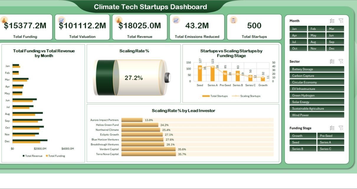
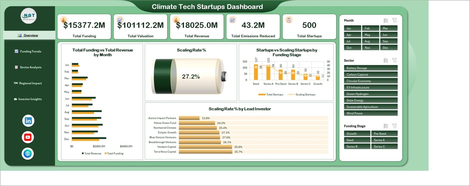
The page a stakeholder sees first. Five KPI cards run across the top — Total Funding, Total Valuation, Total Revenue, Total Emissions Reduced and Total Startups — and each one recalculates the moment a slicer changes.
Below them: Total Funding vs Total Revenue by Month as paired horizontal bars, so the two measures are legible side by side across all twelve months. A gauge shows the overall Scaling Rate % (27.2% in the demo data). Startups vs Scaling Startups by Funding Stage puts company counts as columns against scaling counts as a line, from Seed through Growth. And Scaling Rate % by Lead Investor ranks the eight demo investors as percentage bars.
The slicer panel on the right — Month, Sector, Funding Stage — is synced across all five pages. Click Green Hydrogen here and every chart in the workbook follows.
Page 2: Funding Trends
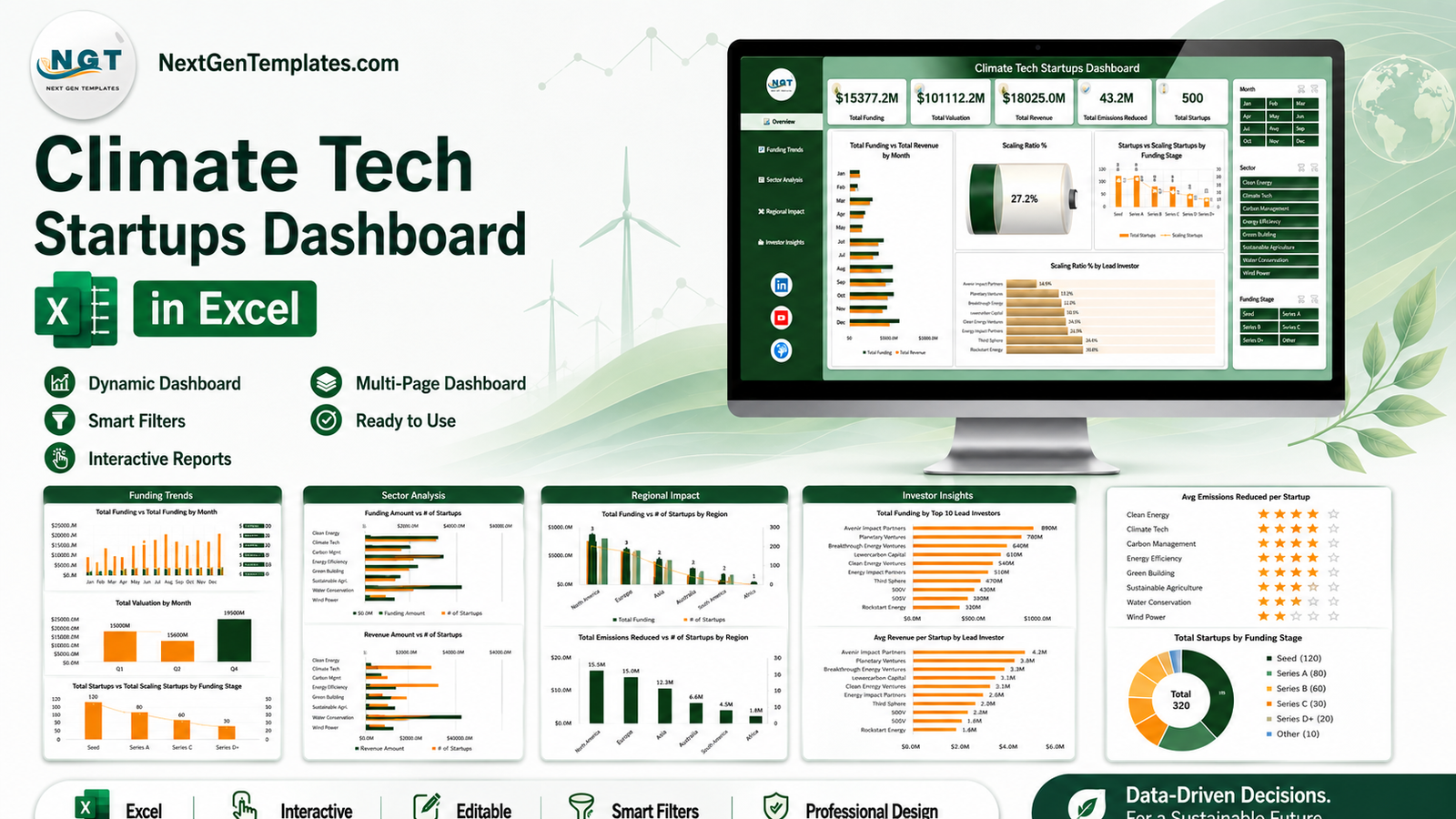
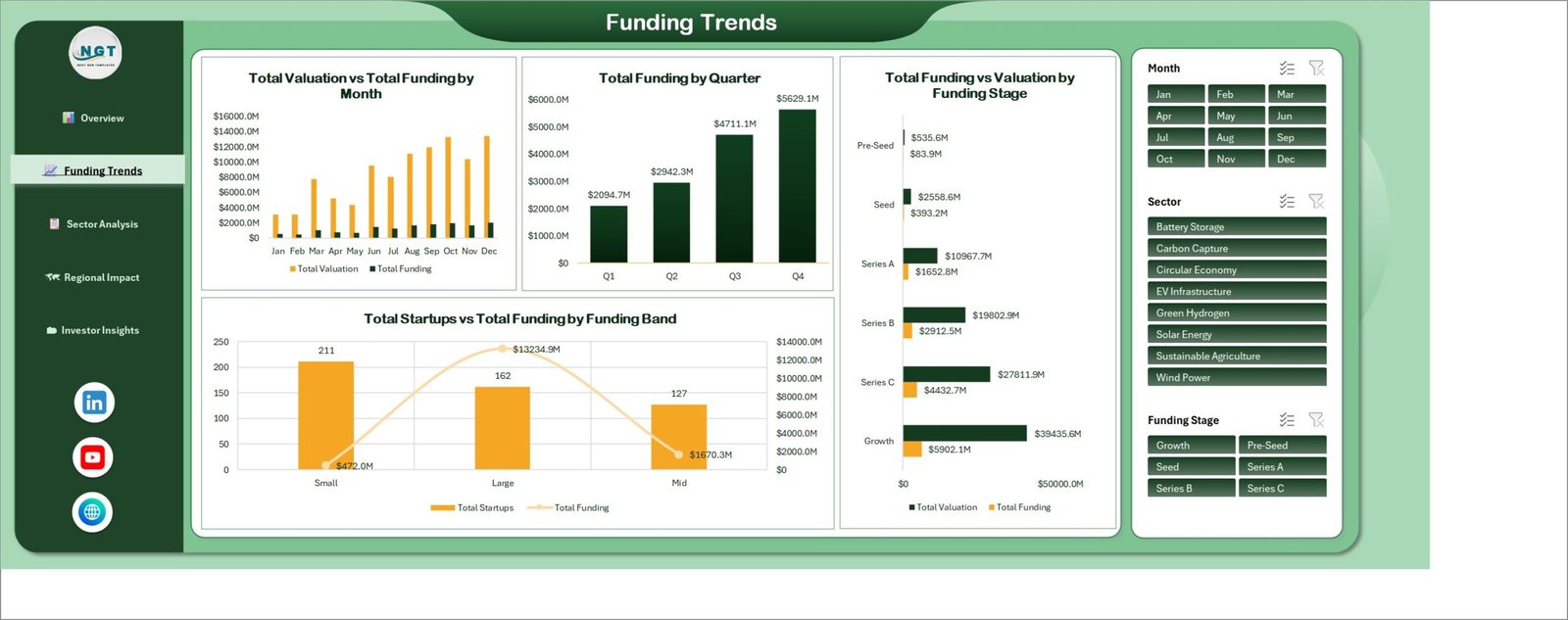
Where the money moved. Total Valuation vs Total Funding by Month runs the two measures across the year as clustered columns — useful for spotting the months when valuation ran ahead of capital in. Total Funding by Quarter compresses the same story to four labelled columns, which is usually the chart that ends up on the board slide.
Total Funding vs Valuation by Funding Stage compares both measures from Pre-Seed through Growth as paired horizontal bars, and Total Startups vs Total Funding by Funding Band pairs company counts against total capital for the Small, Mid and Large bands.
Page 3: Sector Analysis
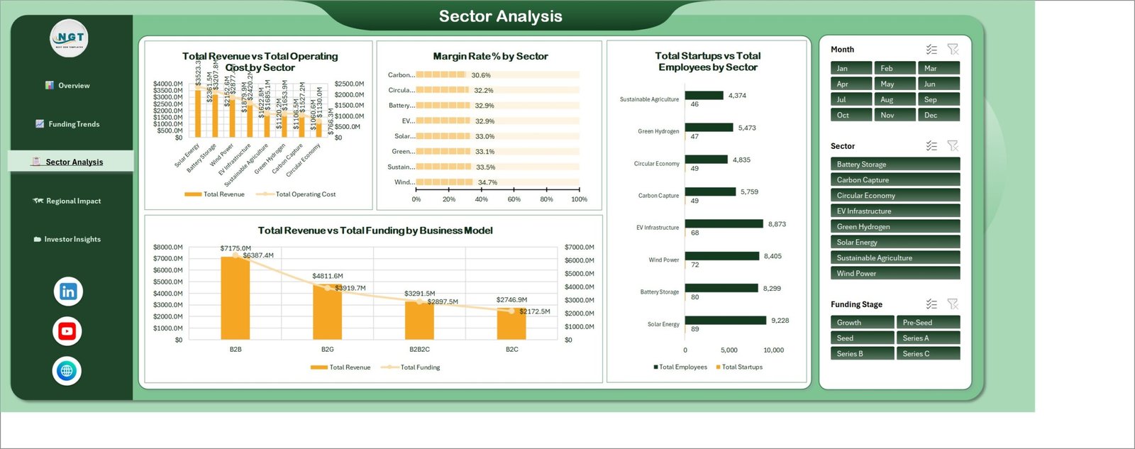
Eight sectors are pre-wired into the demo data: Battery Storage, Carbon Capture, Circular Economy, EV Infrastructure, Green Hydrogen, Solar Energy, Sustainable Agriculture and Wind Power. They are ordinary text values read from the data table, not hard-coded categories, so renaming them to your own taxonomy is a find-and-replace away.
Total Revenue vs Total Operating Cost by Sector pairs the two measures as columns and a line. Margin Rate % by Sector ranks the same eight sectors as percentage bars. Total Startups vs Total Employees by Sector puts headcount next to company count, which is a quicker read on where a portfolio’s weight actually sits than funding alone. And Total Revenue vs Total Funding by Business Model splits the numbers across B2B, B2G, B2B2C and B2C.
Page 4: Regional Impact
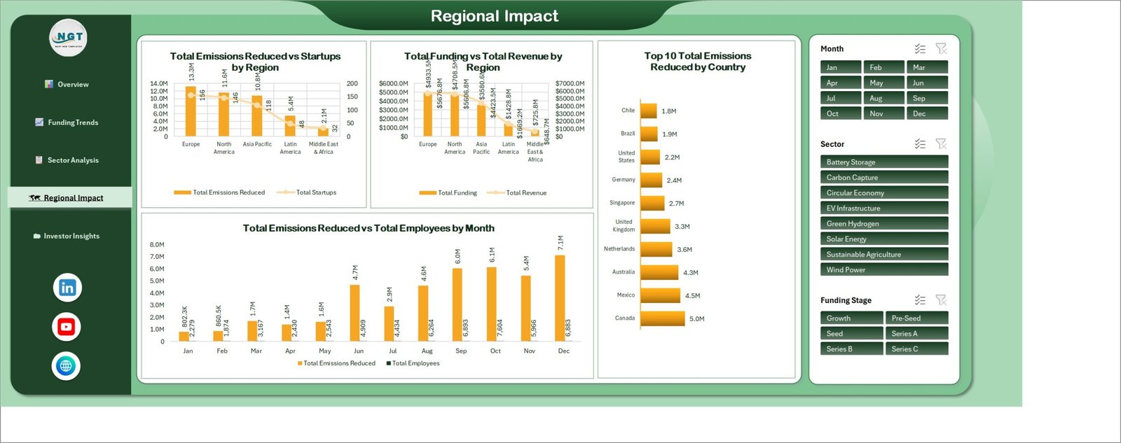
The geographic cut, across five regions: Europe, North America, Asia Pacific, Latin America and Middle East & Africa. Total Emissions Reduced vs Startups by Region and Total Funding vs Total Revenue by Region sit side by side, Top 10 Total Emissions Reduced by Country ranks countries as a horizontal bar, and Total Emissions Reduced vs Total Employees by Month tracks the measure through the year.
This is the page where the caveat above matters most, so it bears repeating plainly: the emissions figures on this page are sums of a column that a user typed into the data table. The workbook does not derive them from activity data, does not apply any calculation methodology, and does not audit or verify them. If you leave that column blank, these charts simply render empty — and the other four pages carry on working. Treat the number the way you would treat any other self-reported field in a portfolio tracker.
Page 5: Investor Insights
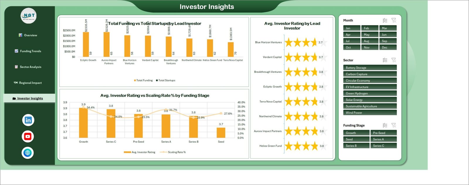
The lead-investor view. Total Funding vs Total Startups by Lead Investor ranks the eight demo investors by capital deployed with company counts alongside. A star panel displays Avg. Investor Rating by Lead Investor. And Avg. Investor Rating vs Scaling Rate % by Funding Stage puts the rating against the scaling rate from Pre-Seed through Growth.
The rating deserves the same clarification as the emissions column: it is a score you assign yourself, stored in the data table and averaged by a pivot. The workbook does not assess, rate or rank any investor, and the rating is not a judgement about anyone’s performance. In the shipped demo data it is a set of made-up values attached to made-up firms.
Getting your own data in
- Open the workbook and click around first. All five pages are populated, so you can test the navigation rail and the slicers before you change anything.
- Read the data sheet’s column headers. The pivots reference those names, so leave them alone even if your source system calls things differently.
- Delete the 500 demo rows and paste your records under the header, column for column. Anything you do not track can stay blank.
- Rename categories freely. Sector, funding stage, region, business model and funding band are plain text. Type Marine Energy and it appears on the charts.
- Data → Refresh All (or Ctrl+Alt+F5). Every KPI and chart on every page updates.
- Filter, then present. Cut with the slicers, then print the page to PDF or screenshot it for the deck.
Honest limitations
Two things worth knowing before you buy, neither of which affects the numbers:
- Two chart titles overlap their data labels. On the Sector Analysis page, the Total Revenue vs Total Operating Cost by Sector title sits over the top row of value labels; the same happens to Total Funding vs Total Startups by Lead Investor on the Investor Insights page. It is a cosmetic layout issue in the shipped build, not a calculation error, and it takes about ten seconds to fix — click the chart title and drag it up, or turn the labels off from the chart’s plus menu.
- Slicers need desktop Excel. Excel for the web will open and display the file, but slicer behaviour there is limited. Use Excel 2016 or later on Windows or Mac for the full experience.
Beyond that: there are no macros, so nothing to unblock; no add-ins, so nothing to install; and no external data connections, so the file works offline and your data never leaves your machine.
Who gets the most out of it
- Climate and clean tech fund teams producing a recurring portfolio report.
- Accelerator and incubator programme managers tracking a cohort through funding stages.
- Corporate venture and innovation teams reporting an internal list upward.
- Market researchers and ecosystem builders summarising a sector landscape.
- Consultants who need a presentable deliverable without a day of chart formatting.
- Anyone who wants a working pivot-and-slicer dashboard to take apart and learn from.
Frequently asked questions
Does it measure emissions?
No. It totals a column you fill in. No methodology, no calculation from activity data, no audit, no verification, and no alignment claim to the GHG Protocol, SBTi, CSRD, TCFD, ISSB or anything else.
Will it tell me which company to invest in?
No. It presents figures you supply. It does not score or evaluate companies or investors and provides no investment advice or recommendation of any kind.
Are the figures in the screenshots real?
No — all 500 rows are invented demo data, including the investor names and every currency amount. They exist so the file looks finished on first open.
Does it need macros?
No. Plain .xlsx, native pivot tables, pivot charts and slicers. No VBA, no security prompt, no add-in.
How many records will it hold?
The demo uses 500. Pivot tables cope with tens of thousands comfortably on ordinary hardware; refresh time scales with row count, not with the number of charts.
Can I restyle it?
Yes. Nothing is locked or protected. Colours, fonts, titles, KPI labels, chart types and the page layout are all editable, and you can add your own pivots and charts.
Get the template
The Climate Tech Startups Dashboard in Excel is a one-time purchase with instant download — no subscription and no per-seat licence. You get the .xlsx workbook with all five pages, the data table, every pivot and chart, and the 500 demo rows to practise on.
If you are building out a wider reporting set, these sit alongside it well:
- Carbon Trading Dashboard in Power BI — the closest neighbour by topic, if your reporting lives in Power BI rather than Excel.
- Clean Tech Dashboard in Power BI — a broader clean tech view.
- VC Portfolio Dashboard in Excel — sector-agnostic portfolio reporting in the same Excel style.
- Channel Development Teams Dashboard in Excel and Cloud Gaming Dashboard in Excel — the same five-page build applied to different subjects.
Browse the full range of Excel dashboard templates on NextGenTemplates.