Subscription game-streaming businesses generate a lot of rows and very few answers. Session logs, plan changes, regional billing exports and support-side quality labels all land in different files, and by the time somebody has stitched them together in a spreadsheet the month is over. The Cloud Gaming Dashboard in Excel is a reporting layer for exactly that pile: five linked pages, 19 pivot-driven charts, 5 KPI cards and 4 slicers that are synced across every page, all fed by one flat Data sheet holding 500 rows of replaceable demo data.
Two things to be clear about before anything else. First, this is a template, not a monitoring product: it charts values you record, and it never connects to a gaming platform, a CDN or an API. Second, every number in the screenshots below – every region, data center, genre and rating – is fictional demo data generated to fill the layout. Nothing here describes the performance of any real cloud gaming service, and any brand-like name that appears in a sample column is placeholder text.
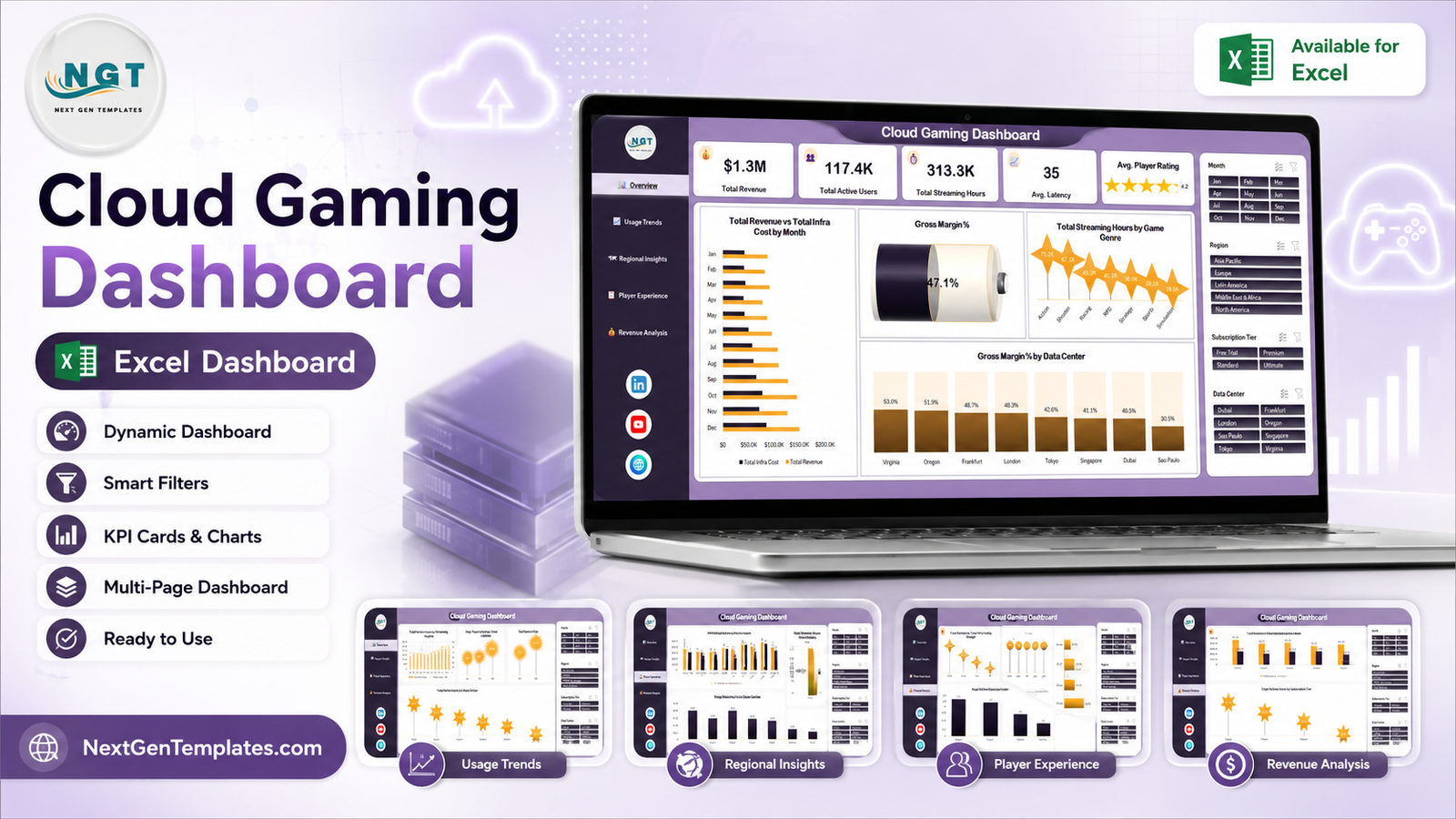
Key Features of the Cloud Gaming Dashboard in Excel
- Five pages behind one navigation rail. Overview, Usage Trends, Regional Insights, Player Experience and Revenue Analysis, each a click away from the others.
- Four slicers, synced everywhere. Month, Region, Subscription Tier and Data Center sit on all five pages and are wired to every pivot table, so one filter reshapes the whole report.
- Pivot tables, not hard-coded ranges. Each chart reads from a pivot on a Support sheet. Add rows to Data, press Refresh All, and everything moves.
- Revenue and cost in the same frame. Three paired charts put Total Revenue against Total Infra Cost – by month, by region and by subscription tier.
- Experience metrics get their own page. Rating by device, rating by plan, and a service-status count across your logged sessions.
- Unit economics. Avg. Revenue Per User by Subscription Tier and Net Gross Profit by Game Genre are calculated, not typed.
- Plain .xlsx. No VBA, no add-ins, no internet requirement. Excel 2016 or later.
Dashboard Pages Explanation
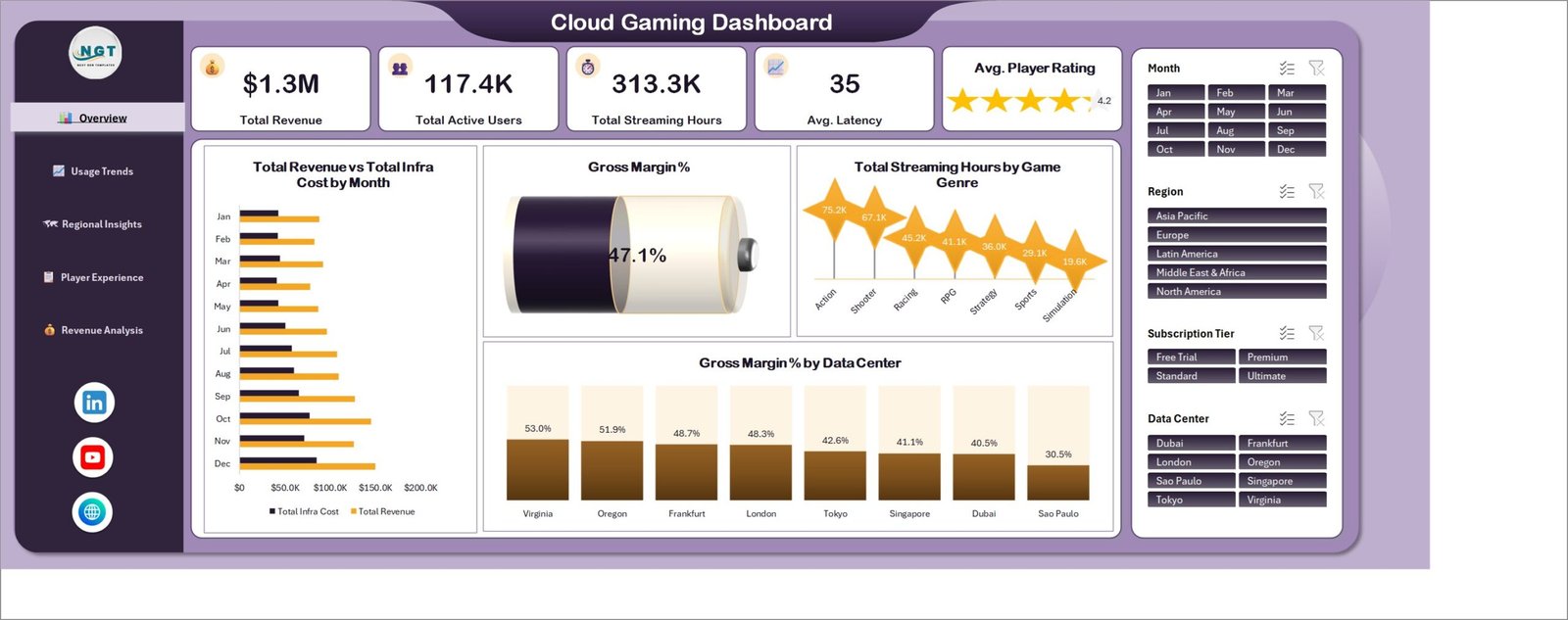
Page 1 – Overview
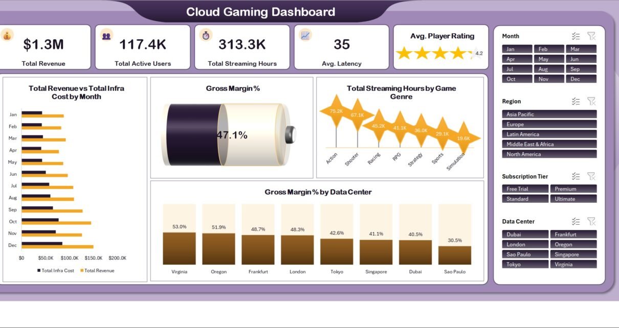
The landing page carries five KPI cards: Total Revenue, Total Active Users, Total Streaming Hours, Avg. Latency and Avg. Player Rating, the last of these drawn as a star card. Underneath, Total Revenue vs Total Infra Cost by Month runs the two money series down twelve months, a dial shows Gross Margin % as a single figure, Total Streaming Hours by Game Genre ranks the seven demo genres, and Gross Margin % by Data Center spreads margin across the eight demo sites. It is the page you would screenshot into a monthly deck.
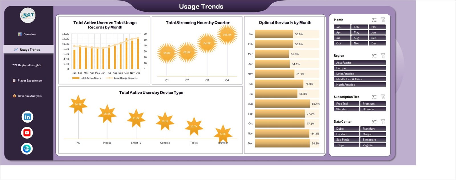
Page 2 – Usage Trends
Everything time-based. Total Active Users vs Total Usage Records by Month puts columns and a line on twin axes so a rise in users and a rise in logged sessions can be compared rather than guessed at. Total Streaming Hours by Quarter rolls the same measure up to Q1-Q4. Optimal Service % by Month gives a month-by-month bar of the share of your records carrying an optimal status. And Total Active Users by Device Type ranks PC, Mobile, Smart TV, Console, Tablet and Browser – useful when someone asks whether the TV app is worth the engineering time.
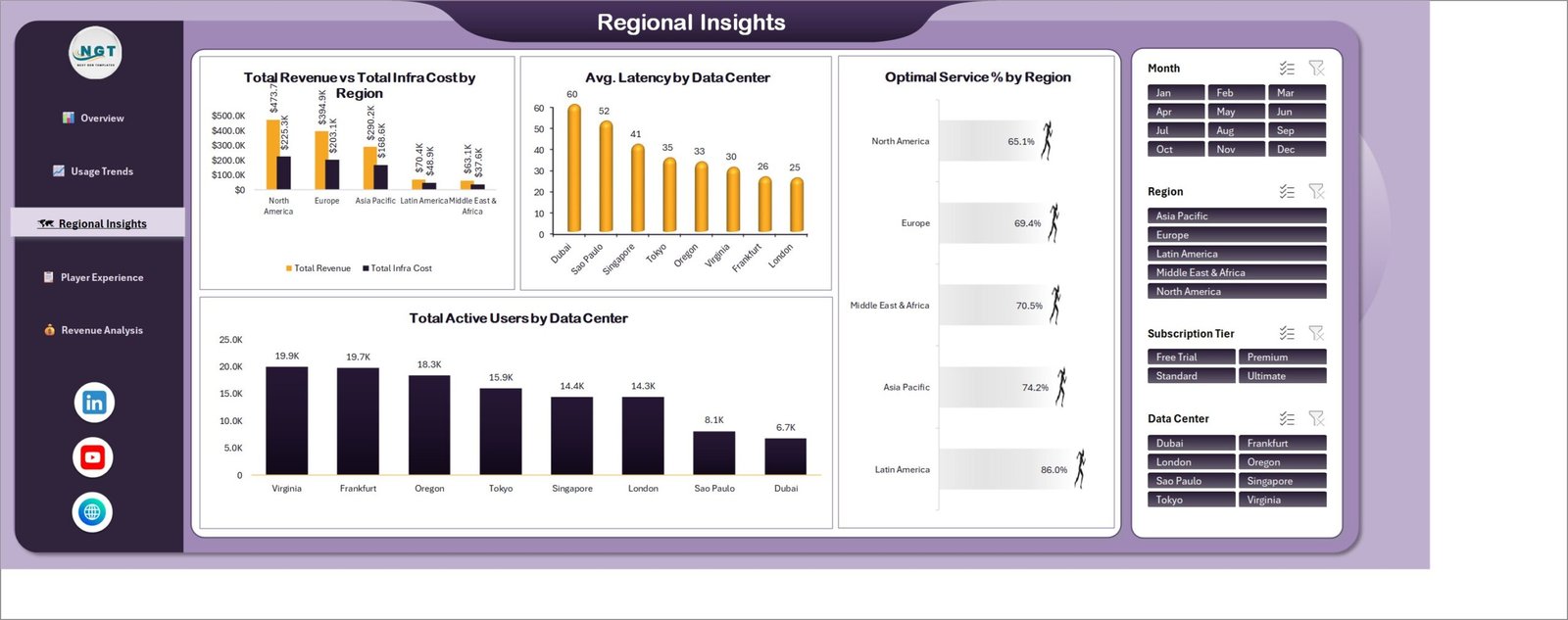
Page 3 – Regional Insights
Geography and infrastructure sit together here. Total Revenue vs Total Infra Cost by Region pairs the two series across five demo regions; Avg. Latency by Data Center ranks the eight demo sites from highest to lowest; Optimal Service % by Region and Total Active Users by Data Center finish the page. Worth repeating: the latency values are whatever your own exports contain. The workbook plots them, it does not measure them, and the demo figures are invented.
Page 4 – Player Experience
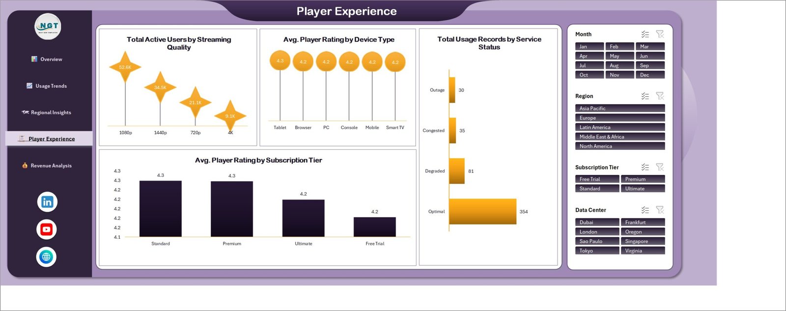
The quality page. Total Active Users by Streaming Quality splits users across 720p, 1080p, 1440p and 4K. Avg. Player Rating by Device Type and Avg. Player Rating by Subscription Tier show whether the rating you collect tracks hardware or plan – in the demo data both are flat, which is itself a useful shape to recognise. Total Usage Records by Service Status counts sessions across the Optimal, Degraded, Congested and Outage labels. Those labels are just text in a column of your Data sheet; you decide what qualifies as which.
Page 5 – Revenue Analysis
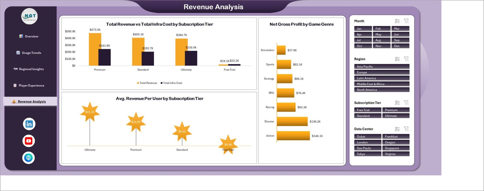
The commercial close. Total Revenue vs Total Infra Cost by Subscription Tier lines the four demo plans up side by side; Net Gross Profit by Game Genre ranks the genres by what is left after cost; Avg. Revenue Per User by Subscription Tier gives a per-user figure per plan. In the demo data the Free Trial tier costs more to serve than it brings in – a trivially obvious result in fictional numbers, but the exact question this page exists to put in front of a finance lead when the numbers are real.
Behind the pages
Two working sheets sit behind the five dashboards: a flat Data sheet – the 500 demo rows you overwrite – and a Support sheet holding every pivot table. You only ever type on Data. If you are new to how pivot tables and slicers connect, Microsoft’s own guide to using slicers to filter data covers the mechanics this workbook relies on.
Cloud Gaming Dashboard in Excel vs. Google Sheets vs. a Paid Analytics SaaS – Feature Comparison
| This template (Excel) | Google Sheets equivalent | Paid analytics SaaS | |
|---|---|---|---|
| Cost | One payment, 17.99 | One payment, ~9.99 | Typically 50-300 per user / month |
| Platform | Excel 2016+ / Microsoft 365, works offline | Browser, Google account | Browser, vendor cloud |
| Setup time | Paste data, Refresh All – about 15 minutes | Copy the file, paste data – about 15 minutes | Days to weeks |
| Real-time team collaboration | OneDrive / SharePoint co-authoring | Yes, native | Yes, native |
| Mobile access | Excel mobile app | Sheets mobile app | Vendor mobile app |
| Customizable fields | Full – it is your workbook | Full | Only what the vendor exposes |
| Share with link | Yes, once in OneDrive | Yes | Yes |
| Year-1 cost at 5 users | 17.99 total | ~9.99 total | 3,000-18,000 |
| Live platform connection | No – paste exports | No | Yes, via connectors |
| You own the file forever | Yes | Yes | No |
Who Should Use This Template
It suits a subscriptions or revenue analyst at a game-streaming or subscription entertainment service who already pulls monthly exports and needs a repeatable pack rather than a fresh pivot every month. It suits an infrastructure or operations lead who wants the cost and service-status side charted next to the commercial side. It suits a consultant who needs one presentable file per client with nothing proprietary inside it. And it suits a founder or product manager who wants the tier economics visible without commissioning a BI project.
It does not suit anyone who needs live data – there are no connectors here. It is not a network monitoring tool, a billing engine, a support desk, or a content-licensing tracker. It says nothing about how any named service performs and it is not an industry benchmark. And if you are holding millions of session rows, move to Power BI; Excel pivots will feel heavy well before that.
Real-World Use Cases
Monthly management pack. Export last month’s subscription and session tables, paste them over the Data sheet, Refresh All, then print or PDF the five pages. What used to be an afternoon of pivot-wrangling becomes about fifteen minutes.
Regional review. Filter the Region slicer to a single market and every page follows. The Regional Insights page then reads as a one-market briefing without anyone building a second file.
Tier pricing discussion. Take the Revenue Analysis page into a pricing meeting. ARPU by tier and revenue-versus-cost by tier are on the same screen, which keeps the conversation on the gap rather than on whose spreadsheet is right.
Device and quality planning. The Usage Trends and Player Experience pages together answer where your users actually are – which device, which resolution – before a roadmap argument starts.
Advantages of the Cloud Gaming Dashboard in Excel
- Refresh, don’t rebuild. Because every chart sits on a pivot, growing the data set is a paste and a refresh rather than a re-layout.
- One filter, five pages. Synced slicers remove the classic dashboard failure where page 3 is still showing last quarter.
- No dependencies. No macros to enable, no add-ins to whitelist, no account to create. IT departments tend to like this.
- Editable end to end. Rename a tier, delete a chart, add a page – it is an ordinary workbook.
- Cost is visible next to revenue in three separate cuts, which is unusual in template dashboards and is the main reason the Revenue Analysis page earns its place.
Opportunities for Improvement
Honest notes on this build, so nothing is a surprise after purchase:
- A cosmetic chart-title overlap on the Regional Insights page. On Total Revenue vs Total Infra Cost by Region the two-line chart title wraps down far enough to sit over the topmost data label, so the first bar’s value is partly hidden behind the word “Region”. The underlying figure is correct and the chart is not broken – dragging the title up a few pixels, or widening the chart, clears it. It is the only overlap of its kind in the workbook.
- Chart titles are two lines on the narrower panes. A handful of titles wrap, which costs a little plot height. Shortening the title text recovers it.
- No live connection. By design, but worth stating twice: you paste exports.
- Rating scale is whatever you use. The demo data happens to sit near 4.2 on a 5-point scale. Nothing in the workbook enforces a scale, so if yours is out of 10 the star card will read oddly until you adjust it.
- Excel Online is view-first. Slicer behaviour and some chart formatting are limited in the browser. Edit in the desktop app.
Best Practices
- Keep the headers exactly as shipped. The pivots are bound to the column names; rename one and its chart empties.
- Be consistent with dimension spelling. “Asia Pacific” and “APAC” become two separate slicer buttons.
- Paste values, not formatted cells. It keeps the Data sheet light and avoids inherited formatting fighting the theme.
- Refresh All after every paste. Data > Refresh All. A stale pivot is the single most common cause of “the dashboard is wrong”.
- Keep one file per period or per client. Saves a lot of arguing about which version the numbers came from.
- Clear slicers before sharing. A file saved with three filters applied is the second most common cause of “the dashboard is wrong”.
- Define your service-status labels once and write the definition somewhere in the workbook. Otherwise Optimal means something different each quarter.
Explore Relevant Templates
- Gaming Esports Dashboard in Excel – tournament, team and viewership reporting in the same pivot-and-slicer style.
- Gaming Esports Dashboard in Power BI – the Power BI build for larger data sets.
- Board Game Startups Dashboard in Excel – an adjacent games-industry build.
- Climate Tech Startups Dashboard in Excel – same five-page structure, different sector.
- Channel Development Teams Dashboard in Excel – partner and channel revenue reporting.
Frequently Asked Questions
Does the Cloud Gaming Dashboard in Excel connect to my platform?
No. There are no connectors and no API calls. You export your own subscription, session and billing data and paste it into the Data sheet. The file works entirely offline.
Are the figures in the screenshots real?
No. All 500 rows shipped in the workbook are fictional demo data created to fill the layout. Regions, data centers, genres, ratings and revenue are invented, and any platform-like name in a sample column is placeholder text – not a statement about that company.
Does it measure latency, bitrate or stream quality?
No. It charts the latency and service-status values you supply. It is a reporting layer, not a monitoring agent, and it cannot tell you anything about a service it has not been given data for.
Do I need macros enabled?
No. It is a plain .xlsx file built from pivot tables, pivot charts and slicers. There is no VBA in it.
Can I change the tiers, genres or regions?
Yes. They are values in your Data sheet, not fixed settings. Replace them, refresh, and the axes and slicers relabel themselves.
Which Excel versions does it work in?
Excel 2016 and later on Windows, and Excel for Mac. Excel Online will display it, but edit in the desktop app for full slicer and formatting behaviour.
What do I get in the download?
A zip containing the .xlsx workbook with all five dashboard pages plus the Data and Support sheets, with unlimited re-downloads and free minor updates.
About the Author
Built by PK – Microsoft Certified Professional with 15+ years of Excel, Google Sheets, and Power BI experience. Founder of NextGenTemplates, reaching 300K+ subscribers across YouTube channels. Every template is hand-built and tested before release.
Conclusion
The Cloud Gaming Dashboard in Excel does one job properly: it takes the exports a subscription streaming business already produces and turns them into five readable pages that stay in sync when you filter them. Five KPI cards, 19 charts, four synced slicers and one Data sheet you overwrite – and one cosmetic title overlap on the Regional Insights page that takes a few seconds to nudge out of the way. It will not monitor your infrastructure and it will not tell you how anyone else’s service performs. What it will do is save the afternoon you currently lose rebuilding pivots every month.
Get the Cloud Gaming Dashboard in Excel on NextGenTemplates – one payment, lifetime access, unlimited re-downloads.
For more Excel dashboard walkthroughs, subscribe to PK: An Excel Expert on YouTube.