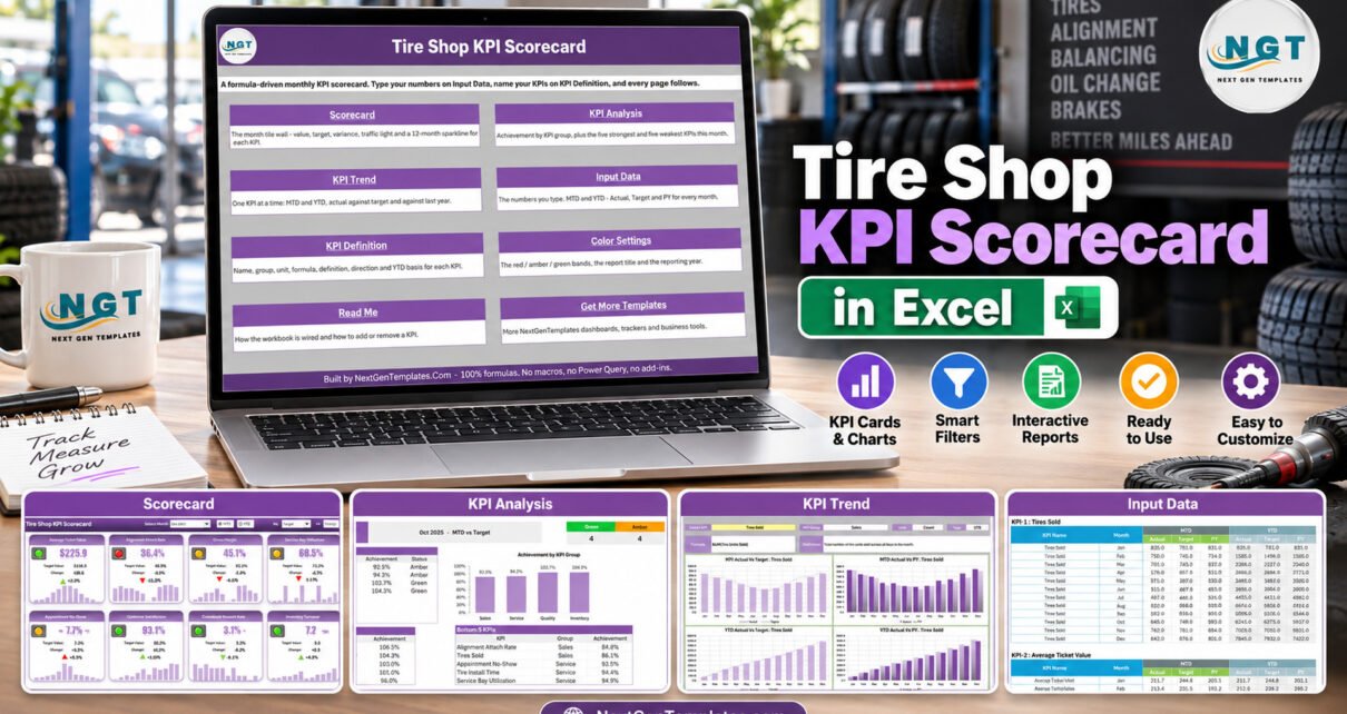
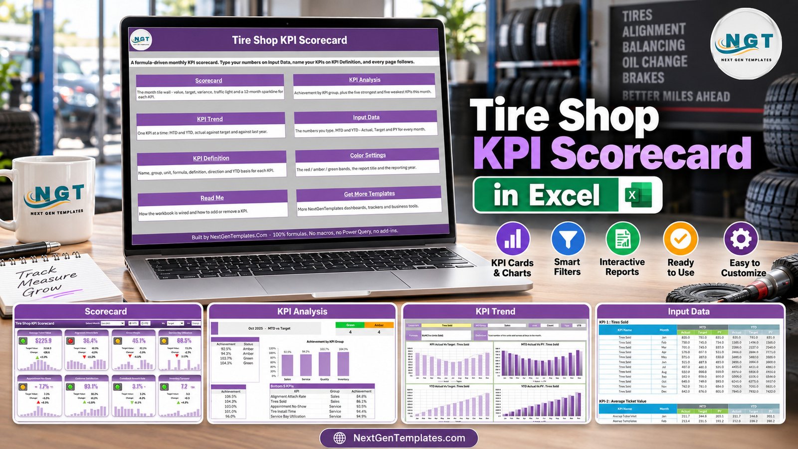
The Tire Shop KPI Scorecard in Excel puts 10 tire shop KPIs from 4 KPI groups on a single monthly page, with a month picker, an MTD / YTD switch, three comparison bases and direction-aware traffic lights across 9 visible sheets. The sample year it ships with, set to October 2025, MTD vs Target, reads 4 Green, 4 Amber and 2 Red. It is built from formulas only: no macros, no Power Query and no add-ins.
Most tire shops already have the numbers – units sold and invoice totals in the point-of-sale system, bay hours and install times on the work orders, no-shows in the appointment book and rework in the service log. What they rarely have is one page that lines those numbers up in the same shape every month. This tire shop KPI scorecard is that page, and in this post we walk through every sheet, the ten KPIs it ships with, and how to put it to work in your own shop.
Key Features of the Tire Shop KPI Scorecard in Excel
- Ten tire shop KPIs on one page. Tires Sold, Average Ticket Value, Alignment Attach Rate, Gross Margin, Service Bay Utilization, Tire Install Time, Appointment No-Show, Customer Satisfaction, Comeback Rework Rate and Inventory Turnover. Each tile carries the value, the comparison value, the change in units and percent, an arrow and a 12-month sparkline.
- Month picker and MTD / YTD switch. Choose any month of the reporting year and flip the entire scorecard between month-to-date and year-to-date.
- Three comparison bases. The Vs. dropdown compares actual against Target, against the same period last year (PY) or against the Prior Month.
- Direction-aware traffic lights. Seven KPIs are upper-the-better (UTB) and three are lower-the-better (LTB): Tire Install Time, Appointment No-Show and Comeback Rework Rate. A falling rework rate therefore shows a green light and a green down-arrow.
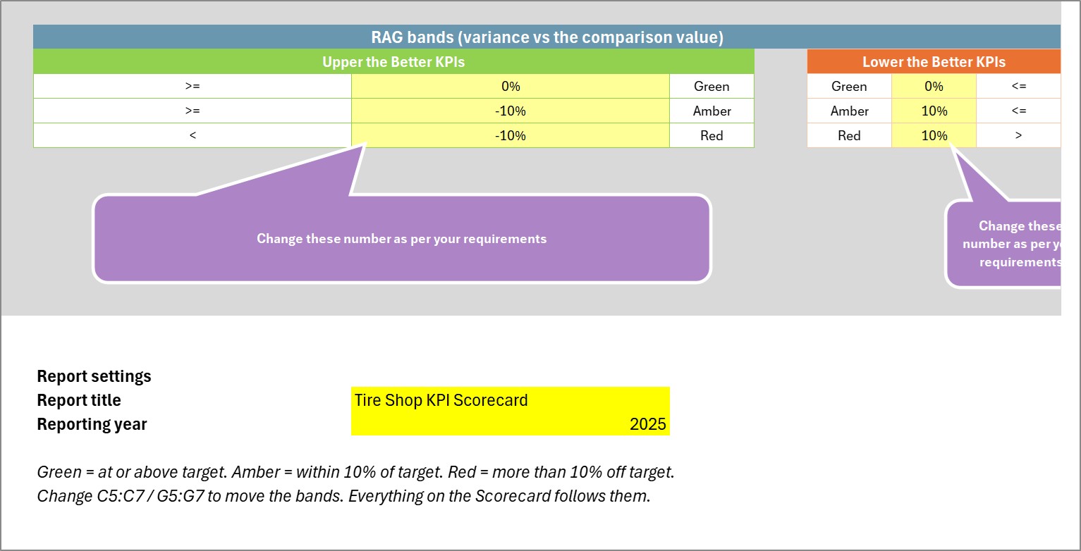
- Editable RAG bands. Green means at or above target, amber within 10% and red more than 10% off, and all three bands are plain cells on Color Settings.
- Room for 20 KPIs. The KPI set picker switches the scorecard between KPI 1-10 and KPI 11-20.
Workbook Sheets Explanation
Home
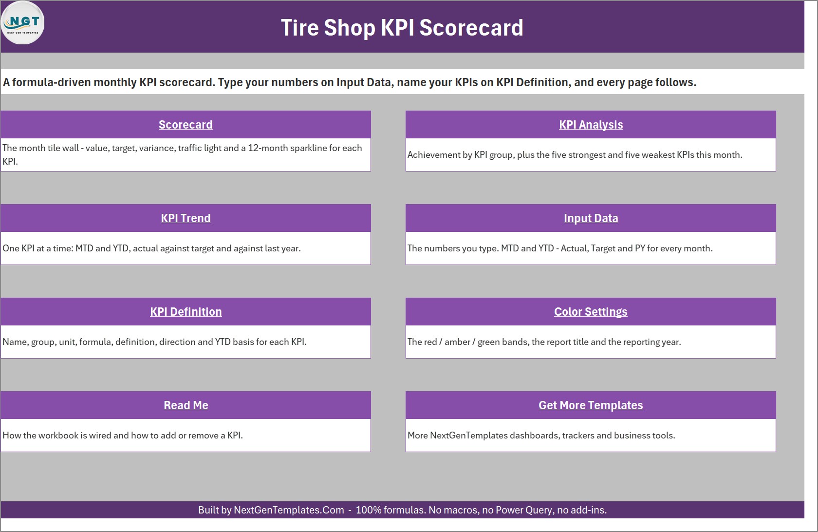
A navigation page with one button per sheet and a one-line description of what each sheet does, so anyone opening the file knows where to type and where to read.
Scorecard
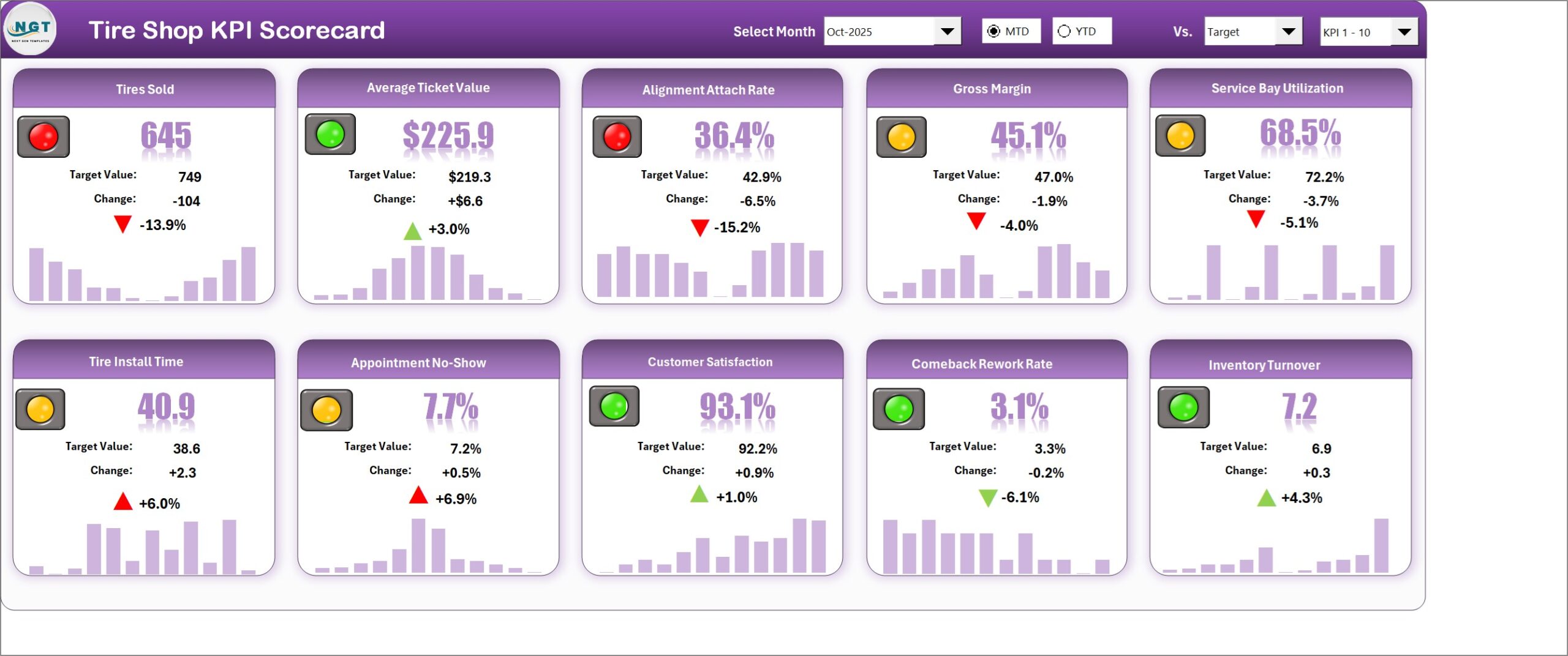
The main tile wall. In the October 2025 sample, Average Ticket Value is $225.9 against a $219.3 target (green), Customer Satisfaction is 93.1% against 92.2% (green), and Tires Sold is 645 against 749 (red). Tire Install Time at 40.9 minutes against 38.6 shows amber with a red up-arrow, because for that KPI higher is worse.
KPI Analysis
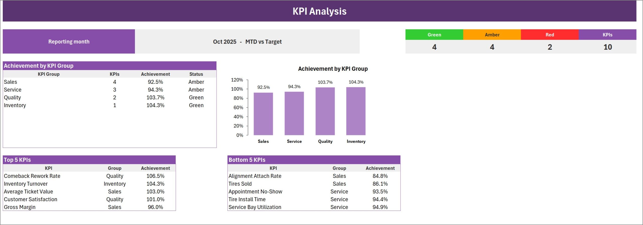
RAG counts at the top, Achievement by KPI Group as a table and a column chart, and the Top 5 and Bottom 5 KPIs for the month. In the sample, Quality (103.7%) and Inventory (104.3%) are green, while Sales (92.5%) and Service (94.3%) are amber. Alignment Attach Rate (84.8%) and Tires Sold (86.1%) head the Bottom 5.
KPI Trend
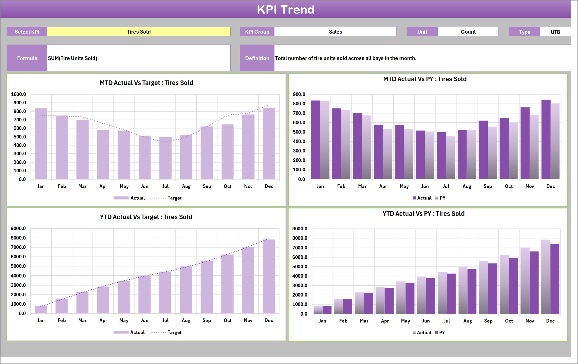
Select a single KPI to see its group, unit, type, formula and definition, followed by four charts: MTD Actual vs Target, MTD Actual vs PY, YTD Actual vs Target and YTD Actual vs PY, each across twelve months.
Input Data
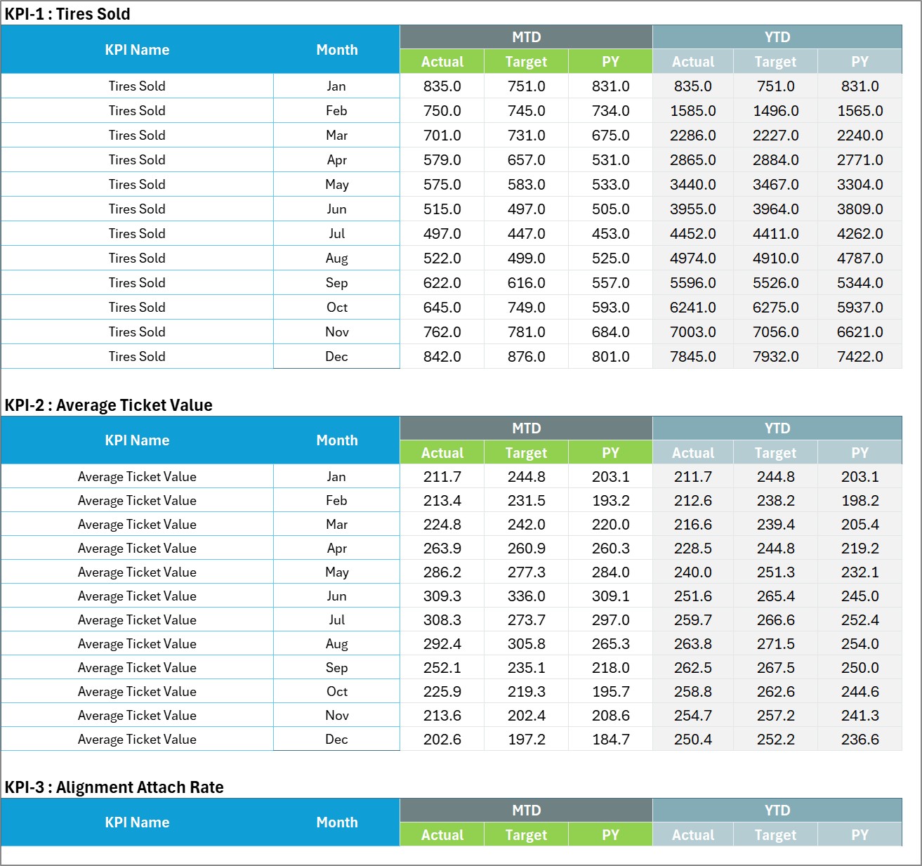
One numbered block per KPI, twelve rows each, with MTD Actual, Target and PY followed by YTD Actual, Target and PY. This is the only place monthly figures are typed.
KPI Definition
The master list: group, KPI name, unit, formula, definition, type (UTB or LTB) and YTD basis. A Check column flags duplicate KPI names, because every page looks a KPI up by name.

Color Settings
RAG bands for upper-the-better and lower-the-better KPIs, plus the report title and reporting year that feed the month picker.
Read Me
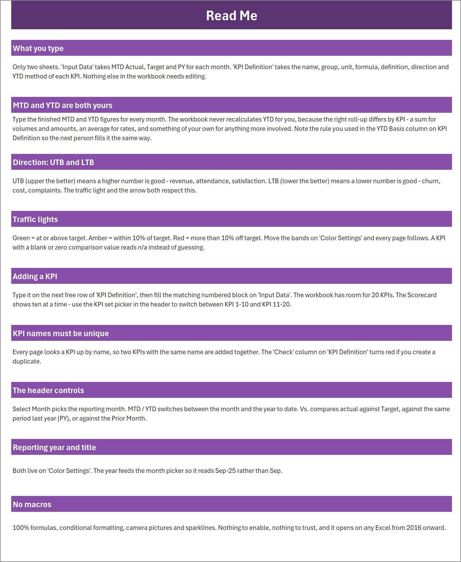
Plain-language notes on what you type, how MTD and YTD work, what UTB and LTB mean, how the header controls behave and how to add a KPI.
A ninth sheet, Get More Templates, links to other NextGenTemplates product families.
The ten tire shop KPIs
| Group | KPI | Unit | Direction |
|---|---|---|---|
| Sales | Tires Sold | Count | UTB |
| Sales | Average Ticket Value | USD | UTB |
| Sales | Alignment Attach Rate | % | UTB |
| Sales | Gross Margin | % | UTB |
| Service | Service Bay Utilization | % | UTB |
| Service | Tire Install Time | Minutes | LTB |
| Service | Appointment No-Show | % | LTB |
| Quality | Customer Satisfaction | % | UTB |
| Quality | Comeback Rework Rate | % | LTB |
| Inventory | Inventory Turnover | Turns | UTB |
Tire Shop KPI Scorecard in Excel vs. Google Sheets vs. Shop Management Software – Feature Comparison
| Feature | This Excel scorecard | Google Sheets scorecard | Tire / auto shop management software |
|---|---|---|---|
| Cost | One-time purchase | One-time purchase | Monthly subscription |
| Platform | Excel 2016 or later | Google Sheets | Vendor app |
| Setup time | Under an hour | Similar | Days to weeks |
| Works offline | Yes | Limited | Usually no |
| Team collaboration | Via OneDrive / SharePoint | Built in | Built in |
| Custom KPIs and thresholds | Yes, up to 20 KPIs | Yes | Vendor reports only |
| Automatic data capture | No – typed monthly figures | No | Yes |
| Macros or add-ins | None | None | Not applicable |
For tire shop owners who want one monthly performance page without another subscription, this scorecard sits in the sweet spot – beside the POS, not instead of it.
Who Should Use This Template
Perfect for:
- Independent tire shop and wheel-alignment owners running a monthly review
- Service managers reporting to an owner, partner or franchisor
- Bookkeepers and consultants building month-end packs for tire dealers
Not a fit if:
- You need figures pulled live from a POS or shop system – this is a typed-input scorecard
- You need invoicing, stock control or booking – it reports on those, it does not run them
- You want store-by-store drill-down for a multi-site chain in one file
Real-World Use Cases
Maria owns a two-bay tire and alignment shop. After typing October’s figures she sees Alignment Attach Rate at 36.4% against a 42.9% target. She adds an alignment check to the counter script for every set of four tires and watches the tile over the next two months.
Dev runs the service floor at a busy tire centre. Service Bay Utilization sits at 68.5% while Tire Install Time has risen to 40.9 minutes. Low utilisation plus slower installs points to bay workflow rather than demand, so he reviews how cars are staged before they reach the lift.
A bookkeeper serving three tire dealers keeps one copy of the workbook per client and sends the KPI Analysis page with every month-end pack, so each owner sees the weakest group first.
Advantages of This Tire Shop Scorecard
- One page, every month. The same ten tiles in the same place make month-on-month change easy to spot.
- Honest traffic lights. UTB / LTB logic means rework, no-shows and install time are judged the right way round.
- No lock-in. A standard .xlsx with formulas, conditional formatting and Excel sparklines – nothing to enable, nothing to renew.
- Adaptable. Rename KPIs, change groups, move the bands or extend to 20 KPIs without editing a formula.
Opportunities for Improvement
- YTD is typed, not calculated. You enter the finished YTD figure for each month, because the correct roll-up differs by KPI (a sum for Tires Sold, an average for rates). It is flexible, but it is one more column to fill.
- No live data link. Figures are typed or pasted from your POS each month.
- Small cosmetic points. The Color Settings callouts read “Change these number”, and the right-hand callout is partly clipped at the sheet edge. Neither affects any calculation. Sample figures on Input Data are also shown to one decimal place, including counts such as Tires Sold.
Best Practices
- Set targets on Input Data before the year starts so the first months have something to be judged against.
- Write the YTD rule you used in the YTD Basis column on KPI Definition, so the next person fills it the same way.
- Review the KPI Analysis Bottom 5 first each month, then open KPI Trend on those KPIs.
- Keep KPI names unique – two KPIs with the same name are added together.
Explore Relevant Templates
If you track tire stock day to day, the Tyre Shop Stock Data Entry System in Excel records stock movements with a simple form. For transaction-level analysis of a repair business, see the Auto Repair Dashboard in Excel, and for vehicle sales the Car Dealership Dashboard in Excel. The same scorecard layout is used for other trades too, such as the Pressure Washing Services KPI Scorecard in Excel and the Snow Removal Services KPI Scorecard in Excel.
Also available as: the Tire Shop KPI Scorecard in Google Sheets – a separate product with its own KPI list and layout, not a copy of this workbook. Browse more KPI templates on NextGenTemplates.
Frequently Asked Questions
What does the Tire Shop KPI Scorecard in Excel track?
It tracks 10 tire shop KPIs in four groups – Sales, Service, Quality and Inventory – including Tires Sold, Average Ticket Value, Alignment Attach Rate, Service Bay Utilization, Comeback Rework Rate and Inventory Turnover. Each KPI can be renamed on the KPI Definition sheet.
Do I need macros to use it?
No. This Excel KPI scorecard is a standard .xlsx built from formulas, conditional formatting and sparklines. There are no macros, no Power Query and no add-ins, and it opens in Excel 2016 or later.
How long does setup take?
Most shops finish setup in under an hour: set the title and year on Color Settings, adjust the KPI list, then type twelve months of Actual, Target and PY on Input Data.
Can it read data from my POS?
No. The scorecard has no live connection. You type or paste monthly totals from your POS or shop system onto Input Data.
How does this compare to shop management software reports?
Shop software records every transaction and usually costs a monthly fee. This tire shop KPI template summarises the month on one page for a one-time price, and many owners use it alongside their software for the monthly review.
Is the Google Sheets edition the same?
No. The Google Sheets edition is a separate product with a different KPI list – for example it includes Tire Warranty Claim Rate and First-Time Fix Rate. Choose the Excel edition if your team works in desktop Excel.
About the Author
Built by PK – Microsoft Certified Professional with 15+ years of Excel, Google Sheets and Power BI experience. Founder of NextGenTemplates, reaching 300K+ subscribers across YouTube channels. Every template is hand-built and tested before release.
Conclusion
The Tire Shop KPI Scorecard in Excel gives a tire shop one clear monthly page: ten KPIs, honest traffic lights, a trend view for any KPI and a group analysis that points straight at the weakest area. Type your figures, pick a month and review.
Click here to Purchase the Tire Shop KPI Scorecard in Excel
Instant download – One-time payment – No subscription
Watch more tutorials on Youtube.com/@PK-AnExcelExpert
Last updated: September 2026