Independent auto repair shops generate roughly $880 in revenue per repair order on average, with multi-bay operators running 250 to 600 jobs per month per location. The math sits there in invoice software — but pulling Total Profit, Avg. Customer Rating, and mechanic productivity into one view usually means buying a $129 to $379 per-month shop management system. That’s the problem the Auto Repair Dashboard in Excel solves: a one-time-purchase Excel file that turns your existing job records into a five-page interactive dashboard with 17 charts and slicers across branch, service category, mechanic, and vehicle make.
This guide walks through what’s inside the template, who it fits, where it doesn’t, and how to use it in under 10 minutes.
Introduction to the Auto Repair Dashboard in Excel
Auto repair is a service business with three tightly linked variables: how much you charge, how much it costs to deliver the job, and how the customer feels about the experience. Excel is the natural place to model this — it already lives on every owner’s laptop, costs nothing extra, and it doesn’t lock you into a vendor’s data format. The Auto Repair Dashboard in Excel takes that natural fit and adds the structure most owners don’t have time to build: pre-wired pivot tables, 17 charts, slicers, and a hidden Support sheet that drives every visual.
The template is built for shops that already track jobs somewhere — paper invoices, QuickBooks line items, point-of-sale exports, or a basic spreadsheet — and want a clean monthly KPI view without subscribing to Tekmetric, Shop-Ware, or Mitchell 1 just for the reporting layer. Microsoft’s official Refresh All documentation is the only outside reading required to use it.
👉 Click here to Purchase the Auto Repair Dashboard in Excel
Key Features of Auto Repair Dashboard in Excel
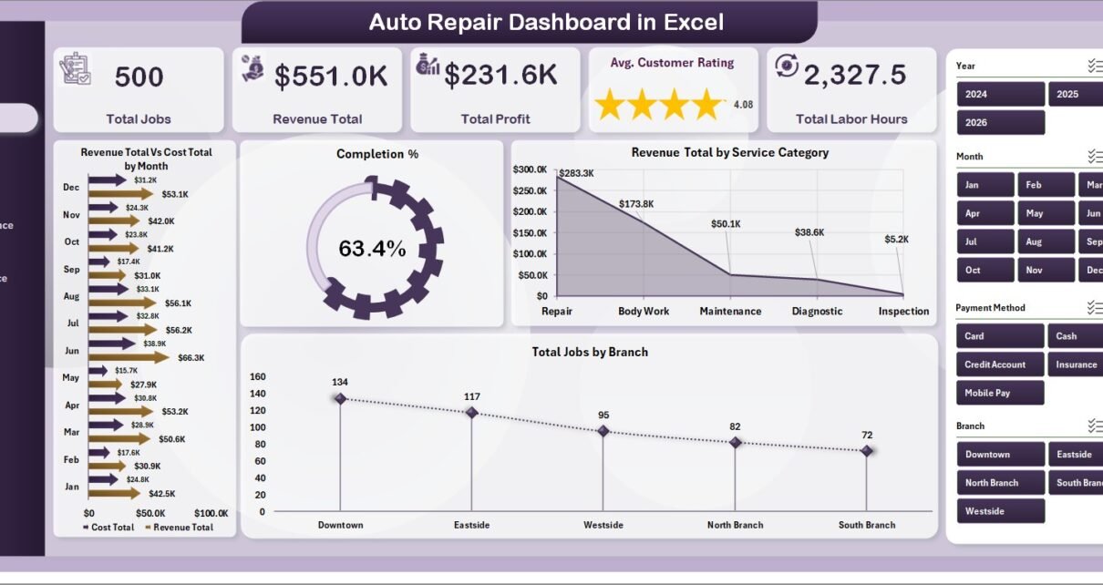
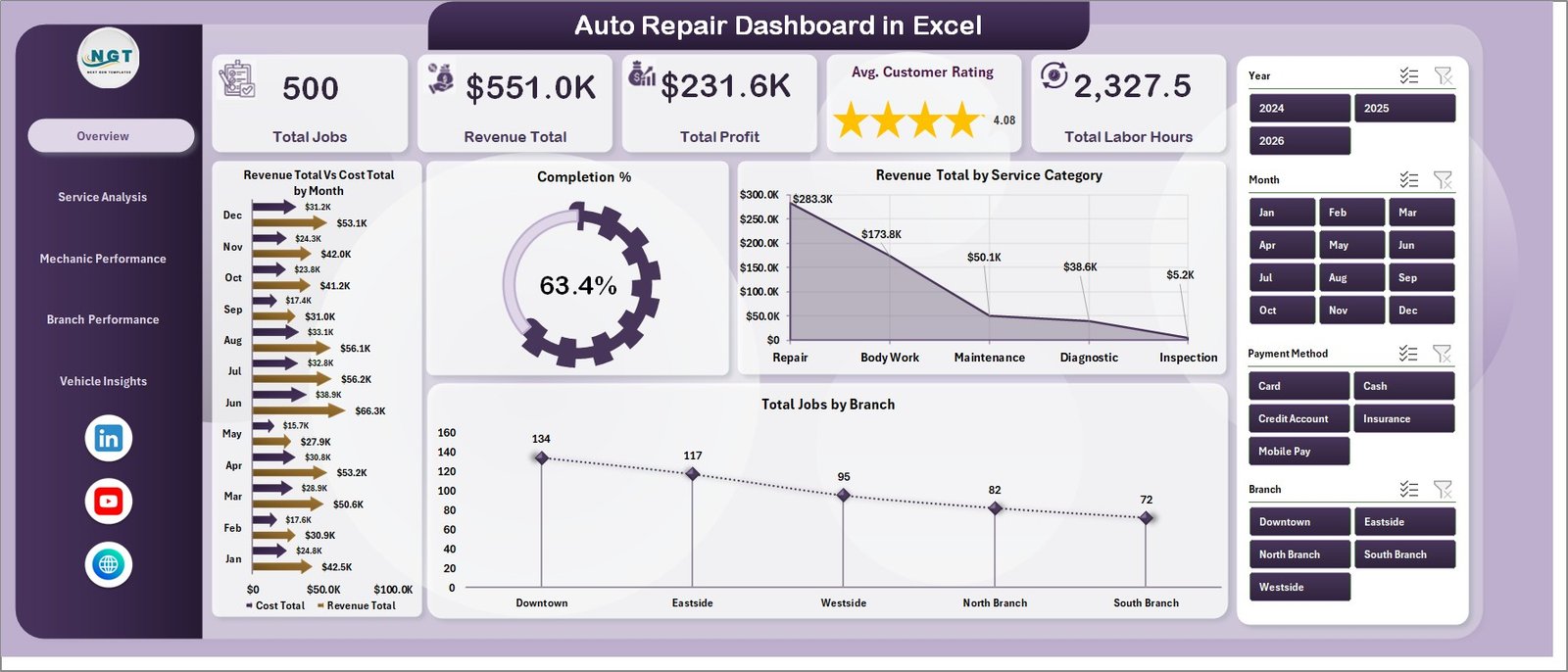
🔹 Five top-line KPI cards on the Overview page — Total Jobs, Revenue Total, Total Profit, Avg. Customer Rating, and Total Labor Hours. Every card recalculates when you change a slicer.
🔹 17 pre-built charts spread across five pages — Overview (4 charts), Service Analysis (4 charts), Mechanic Performance (4 charts), Branch Performance (4 charts), and Vehicle Insights (1 chart group with 4 views). All wired to the Support sheet pivots.
🔹 Top-five mechanic leaderboards — Revenue Total vs. Cost Total, Total Labor Hours, Avg. Customer Rating, and Total Profit per mechanic. Built for monthly reviews and bonus discussions.
🔹 Multi-branch P&L comparison — Revenue vs. Cost, Total Profit, Customer Rating, and Completion % all sliceable by branch. Franchise and chain operators can rank locations on a single sheet.
🔹 Service category profitability — Profit Margin %, Avg. Revenue/Job, and Total Jobs per category surface which service lines pay for the lights and which barely break even.
🔹 Vehicle make and payment method analytics — Revenue by Vehicle Make, Avg. Revenue/Job by Payment Method, Total Jobs by Payment Method, and Avg. Labor Hours/Job by Vehicle Make. Useful for shops deciding which makes to specialise in.
🔹 One-click refresh architecture — Update the Data sheet, click Data → Refresh All, and the entire dashboard rebuilds itself. No formulas to drag. No charts to redraw.
Dashboard Pages Explanation
Overview Page
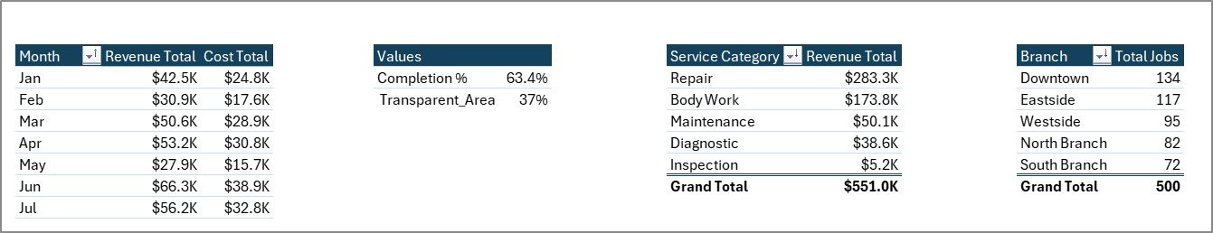
Five KPI cards anchor the top of the page: Total Jobs, Revenue Total, Total Profit, Avg. Customer Rating, and Total Labor Hours. Below them sit four charts — Revenue Total vs. Cost Total by Month (trend line), Completion % (gauge style), Revenue Total by Service Category, and Total Jobs by Branch. Slicers for branch, month, and service category drive every visual on the page in one click.
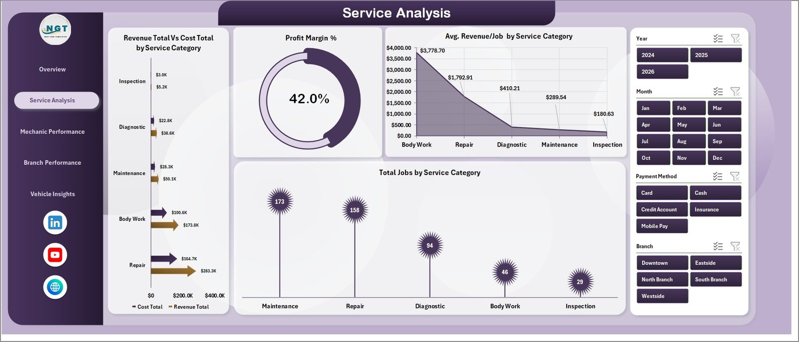
Service Analysis Page
Four charts dedicated to service-mix economics: Revenue Total vs. Cost Total by Service Category, Profit Margin % by Service Category, Avg. Revenue per Job by Service Category, and Total Jobs by Service Category. This is the page that tells you whether your $39 oil change is bringing customers in or quietly bleeding margin.
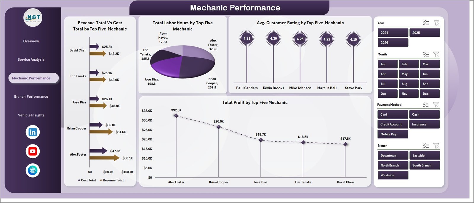
Mechanic Performance Page
Top-five mechanic leaderboards on Revenue Total vs. Cost Total, Total Labor Hours, Avg. Customer Rating, and Total Profit. This is the page service managers open during quarterly reviews — it ranks technicians fairly on revenue contribution, productivity (hours), customer experience (rating), and bottom-line profit.
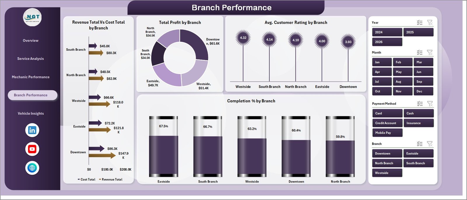
Branch Performance Page
Revenue Total vs. Cost Total by Branch, Total Profit by Branch, Avg. Customer Rating by Branch, and Completion % by Branch. Multi-location operators can spot which shops are pulling weight and which need attention. Pair it with the slicer set to compare a single month or a rolling quarter.
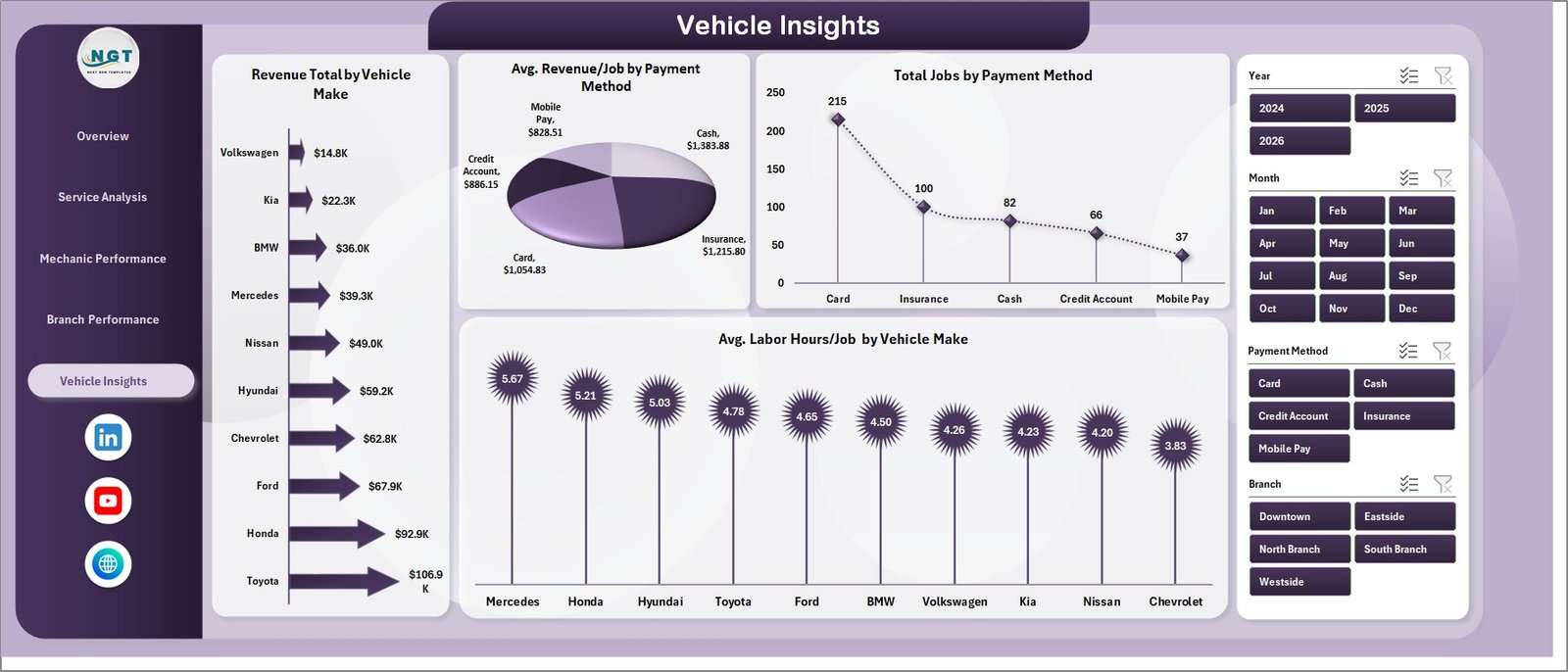
Vehicle Insights Page
Revenue by Vehicle Make, Avg. Revenue per Job by Payment Method, Total Jobs by Payment Method, and Avg. Labor Hours per Job by Vehicle Make. Helpful for spotting which makes deliver outsized revenue, which payment methods come with longer jobs, and where to focus parts inventory.
Data Sheet
The Data sheet is the single source of truth — every chart, KPI card, and slicer reads from here through the Support sheet pivots. Add new jobs in the same column structure as the sample (Job ID, Date, Branch, Service Category, Mechanic, Vehicle Make, Payment Method, Revenue, Cost, Labor Hours, Customer Rating, Completion Status) and the dashboard pulls them in on the next refresh.

Support Sheet
The hidden Support sheet contains every pivot table that drives the dashboard. After updating Data, hit Data → Refresh All on the Excel ribbon and every pivot regenerates — which then refreshes every chart and KPI card automatically. Right-click the Support tab and choose Hide before sharing with owners or clients.
Auto Repair Dashboard in Excel vs. Google Sheets Equivalent vs. Paid Shop Management Software — Feature Comparison
| Feature | Auto Repair Dashboard in Excel | Google Sheets Equivalent | Shop-Ware / Tekmetric / Mitchell 1 |
|---|---|---|---|
| Cost | $17.99 one-time | $8 – $15 one-time | $129 – $379 / shop / month |
| Platform | Microsoft Excel (.xlsx) | Google Sheets (cloud) | Cloud SaaS |
| Setup time | Under 10 minutes | 10 – 15 minutes | 2 – 6 weeks (onboarding) |
| Works offline | ✅ Yes | ❌ No | ❌ No |
| Per-user fees | ✅ None | ✅ None (within Workspace) | ❌ $30 – $80 per user / mo |
| Customisable charts & columns | ✅ Fully editable | ✅ Fully editable | ⚠️ Limited to vendor templates |
| Mechanic & branch P&L views | ✅ Built-in | ⚠️ DIY | ✅ Built-in (premium tier) |
| Year-1 cost at 5 users | $17.99 total | ~$10 total | $7,740 – $22,740 |
| Lifetime access | ✅ Yes | ✅ Yes | ❌ No (subscription) |
For independent and multi-branch auto repair shops that want clear KPI reporting without paying $150+ per month, the Auto Repair Dashboard in Excel sits in the sweet spot.
Who Should Use This Template
Perfect for:
- Independent auto repair shop owners with 1–10 mechanics tracking jobs in spreadsheets
- Multi-branch repair chain operators needing branch-vs-branch profit and rating comparisons
- Service managers running monthly performance reviews on technician productivity
- Franchise owners (oil change, tire centres, brake shops) needing consistent location reporting
- Bookkeepers and small-business accountants serving repair shop clients
Not a fit if:
- You need live VIN decoding or OEM repair information (use Mitchell 1 / ALLDATA)
- You require text-message customer approvals or digital vehicle inspections (use Tekmetric / Shop-Ware)
- You want a phone app for technicians on the floor — this is a desktop Excel file
- You need real-time multi-user concurrent editing (consider the Google Sheets version)
Real-World Use Cases
Marcus runs a 3-bay independent shop in Phoenix. Before the dashboard he averaged service categories on a clipboard. He uses the Auto Repair Dashboard in Excel each Sunday evening to refresh the previous week’s job data and check Profit Margin % by Service Category. Last quarter he found his $39 oil change promotion was running at a 4% margin while his brake jobs averaged 38%. He pulled the oil-change banner off his website’s hero section, redirected the budget to brake-job-focused Google Ads, and watched monthly profit climb without adding a single bay.
Linda manages 4 franchise tire centres across Texas. Each Monday her store managers email last week’s job log. She pastes the four logs into the Data sheet, hits Refresh All, and within five minutes has a Branch Performance page ready for her franchise call. The Avg. Customer Rating by Branch chart caught a Houston location dropping from 4.7 to 3.9 — turned out a senior mechanic had quit. She had a replacement in place before churn caught up to her review pages.
Raj is a bookkeeper for two family-owned auto shops. He uses the Mechanic Performance page during quarterly reviews to recommend bonus payouts based on Revenue, Total Profit, and Avg. Customer Rating per top-five mechanic. The owners pay him monthly for the analysis — the dashboard does the heavy lifting and he picks up an extra retainer per shop.
Advantages of Auto Repair Dashboard in Excel
🔹 One-time cost vs. recurring SaaS — at $17.99 the dashboard pays for itself the day you’d otherwise have signed up for Shop-Ware or Tekmetric. Year-one savings against a $179/month plan are around $2,130 per shop.
🔹 No vendor lock-in — the file is yours forever. Your data stays in Excel, on your laptop, in a format you can email, archive, or hand to your accountant.
🔹 Works on Windows and Mac, online or offline — anywhere Excel 2016 or later runs.
🔹 Standard pivot table architecture — anyone on your team who knows Excel can extend it. No proprietary scripting, no add-ins, no Power Query.
🔹 Customisable — change colors, swap chart types, rename pages, add your shop logo. The whole file is editable.
Opportunities for Improvement
The Auto Repair Dashboard in Excel is a reporting layer, not a shop management system. Three honest limitations worth flagging:
🔹 Manual data entry. If your point-of-sale exports a CSV, you’ll need to copy-paste it into the Data sheet weekly or monthly. There’s no live API connection.
🔹 Single-user editing. Excel’s co-authoring works through OneDrive but isn’t as smooth as Google Sheets for multiple managers updating the same file simultaneously. For real-time collaboration, the Google Sheets version is a better fit.
🔹 No customer-facing features. No appointment booking, no SMS estimates, no digital vehicle inspections. Pair the dashboard with a separate booking tool if you need those.
Best Practices
🔹 Refresh weekly, not daily. A weekly cadence (every Sunday or Monday morning) gives you stable trend lines on the Revenue vs. Cost by Month chart without the noise of day-to-day variation.
🔹 Hide the Support sheet before sharing. Right-click the tab and choose Hide. Owners and clients shouldn’t see the pivot tables.
🔹 Keep column headers and order on the Data sheet intact. The pivot tables on the Support sheet reference these columns by name. Adding a new column is fine; reordering or renaming will break charts until the pivots are refreshed.
🔹 Use slicers, not chart filters. Slicers cascade across every chart on the page. Chart-level filters only affect that one chart.
🔹 Save a master copy each month. Before pasting in next month’s data, save a copy of the file as AutoRepair_2026-05.xlsx. You’ll have a year-long archive of monthly snapshots for tax season and trend analysis.
Explore Relevant Templates
🔹 Car Dealership Dashboard in Excel — sister template covering the sales side of automotive (vehicle inventory, leads, deals).
🔹 Automotive Parts Manufacturing Dashboard in Excel — for parts suppliers feeding repair shops.
🔹 Vehicle Reservation Tracker in Excel — useful for shops offering loaner cars.
🔹 Marina Dashboard in Excel — the same service-business architecture for boat repair operators.
🔹 Browse the full Excel Dashboard Templates collection on NextGenTemplates.
Also available as: Car Dealership Dashboard in Power BI for teams already on Power BI. The full Power BI Dashboard Templates collection is worth exploring too.
Frequently Asked Questions
What KPIs does the Auto Repair Dashboard in Excel track?
The Auto Repair Dashboard in Excel tracks 5 high-level KPIs — Total Jobs, Revenue Total, Total Profit, Avg. Customer Rating, and Total Labor Hours — plus 17 deep-dive charts covering service category, mechanic, branch, vehicle make, and payment method analytics across 5 interactive pages.
How long does setup take?
Setup of the Auto Repair Dashboard in Excel takes under 10 minutes. Open the .xlsx file, paste your job records into the Data sheet using the same column order as the sample, then click Data → Refresh All. Every chart, KPI card, and slicer recalculates automatically — no formulas to edit.
Do I need macros, VBA, or Power Query to run it?
No. The Auto Repair Dashboard in Excel uses standard Excel pivot tables and pivot charts only. There are no macros, no VBA, no Power Query, and no add-ins. It works on any installation of Microsoft Excel 2016 or later, on Windows or Mac.
How does this compare to Tekmetric or Shop-Ware?
Tekmetric and Shop-Ware are full shop management systems with VIN decoding, parts ordering, and digital inspections — costing $129 to $379 per shop per month. The Auto Repair Dashboard in Excel is a one-time $17.99 reporting layer for shops that already track jobs elsewhere and just want clean KPI reporting and branch comparisons.
👉 Click here to Purchase the Auto Repair Dashboard in Excel
Can I track multiple branches in one file?
Yes. The Auto Repair Dashboard in Excel includes a dedicated Branch Performance page comparing Revenue vs. Cost by branch, Total Profit by branch, Avg. Customer Rating by branch, and Completion % by branch. Add a Branch column value for each job in the Data sheet and the page populates automatically.
Is the file editable, and can I add my shop logo?
Yes. The Auto Repair Dashboard in Excel is fully editable — change colors, fonts, KPI card labels, chart types, add your shop logo, and rename pages. Hide the Support sheet before sharing the file with owners or clients to keep the pivot tables out of view.
Will I get future updates?
Your purchase includes lifetime access to the version you download. NextGenTemplates also publishes free walkthroughs and improvements on YouTube — subscribe to @PK-AnExcelExpert to be notified when new versions ship.
About the Author
Built by PK — Microsoft Certified Professional with 15+ years of Excel, Google Sheets, and Power BI experience. Founder of NextGenTemplates, reaching 300K+ subscribers across YouTube channels. Every template is hand-built and tested before release.
Conclusion
For an independent auto repair shop or multi-branch chain that already tracks jobs somewhere — and wants Total Jobs, Revenue, Profit, Customer Rating, and Labor Hours rolled up across mechanic, branch, service category, and vehicle make in five clicks — the Auto Repair Dashboard in Excel does the job at a fraction of the cost of a SaaS shop management system.
👉 Click here to Purchase the Auto Repair Dashboard in Excel
✅ Instant download · One-time payment · No subscription · Lifetime access
🎥 Visit our YouTube channel for step-by-step Excel dashboard tutorials: YouTube.com/@PK-AnExcelExpert
📅 Last updated: May 2026