Independent auto repair shops generate roughly $880 in revenue per repair order on average, with multi-bay operators running 250 to 600 jobs per month per location. The data sits in invoice systems and spreadsheets — but rolling Total Jobs, Net Profit, mechanic productivity, and branch comparisons into a single shared report usually means buying a $129 to $379 per-month shop management platform. That’s the gap the Auto Repair Dashboard in Power BI closes: a one-time-purchase .pbix file that turns your existing job records into a five-page interactive Power BI report with 16 visuals and slicers across branch, service category, mechanic, and vehicle make.
This guide walks through what’s inside the template, who it fits, where it doesn’t, and how to set it up in under 10 minutes.
👉 Click here to Purchase the Auto Repair Dashboard in Power BI
Introduction to the Auto Repair Dashboard in Power BI
Auto repair is a service business with three tightly linked variables: how much you charge, how much it costs to deliver the job, and how the customer feels about the experience. Power BI is a natural fit for this — it sits on top of whatever system already holds your job data (Excel, CSV exports, QuickBooks, SQL), it’s free to use on Power BI Desktop, and it produces visuals you can publish to managers’ phones via the Power BI Service. The Auto Repair Dashboard in Power BI takes that natural fit and adds the structure most owners don’t have time to build: pre-wired DAX measures, 16 visuals, slicers, and a clean five-page layout.
The template is built for shops that already track jobs somewhere — paper invoices, point-of-sale exports, or a basic spreadsheet — and want a clean monthly KPI view without subscribing to Tekmetric, Shop-Ware, or Mitchell 1 just for the reporting layer. Microsoft’s official Power BI Desktop documentation is the only outside reading required to use it.
👉 Click here to Purchase the Auto Repair Dashboard in Power BI
Key Features of Auto Repair Dashboard in Power BI
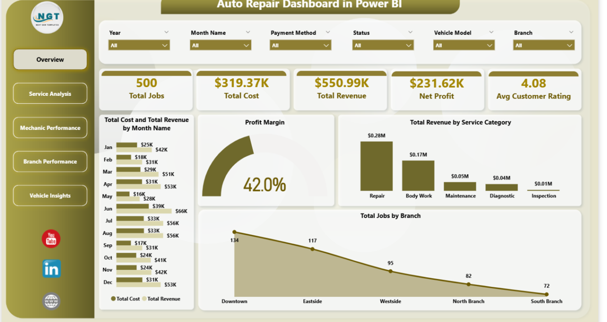
🔹 Five top-line KPI cards on the Overview page — Total Jobs, Total Cost, Total Revenue, Net Profit, and Avg Customer Rating. Every card recalculates instantly when you change a slicer for branch, month, service category, or mechanic.
🔹 16 pre-built visuals spread across five pages — Overview (4 visuals), Service Analysis (3), Mechanic Performance (3), Branch Performance (3), and Vehicle Insights (3). All wired to the underlying Power BI data model with cross-filtering enabled.
🔹 Top-ten mechanic leaderboards — Avg Labor Hours Per Job, Avg Customer Rating, and Net Profit per mechanic. Built for monthly reviews, technician coaching plans, and bonus discussions.
🔹 Multi-branch P&L comparison — Net Profit by Branch, Avg Customer Rating by Branch, and Completion Rate by Branch all sliceable in one click. Franchise and multi-location operators can rank shops on a single page.
🔹 Service category profitability — Profit Margin by Service Category, Avg Revenue Per Job by Service Category, and Total Jobs by Service Category surface which lines pay for the lights and which barely break even.
🔹 Vehicle make analytics — Total Jobs by Vehicle Make, Total Revenue by Vehicle Make, and Avg Labor Hours Per Job by Vehicle Make. Useful for shops deciding which makes to specialise in or which to refer out.
🔹 One-click refresh architecture — Update the data source, click Refresh on the Power BI ribbon, and the entire dashboard rebuilds itself. No DAX edits required for routine refreshes.
Dashboard Pages Explanation
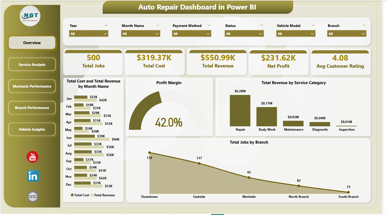
Overview Page
Five KPI cards anchor the top of the page: Total Jobs, Total Cost, Total Revenue, Net Profit, and Avg Customer Rating. Below them sit four visuals — Total Cost and Total Revenue by Month Name (clustered column or line chart), Profit Margin (gauge), Total Revenue by Service Category, and Total Jobs by Branch. Slicers for branch, month, and service category drive every visual on the page through Power BI’s native cross-filtering.
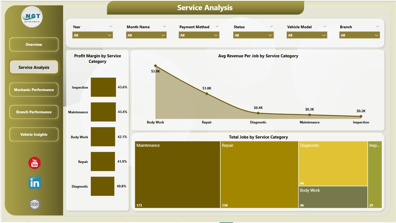
Service Analysis Page
Three visuals dedicated to service-mix economics: Profit Margin by Service Category, Avg Revenue Per Job by Service Category, and Total Jobs by Service Category. This is the page that tells you whether your $39 oil change is bringing customers in or quietly bleeding margin.
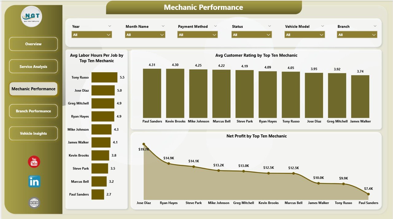
Mechanic Performance Page
Top-ten mechanic leaderboards on Avg Labor Hours Per Job, Avg Customer Rating, and Net Profit. Service managers open this page during quarterly reviews — it ranks technicians fairly on productivity (hours per job), customer experience (rating), and bottom-line profit contribution.
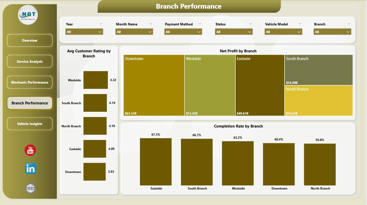
Branch Performance Page
Avg Customer Rating by Branch, Net Profit by Branch, and Completion Rate by Branch. Multi-location operators can spot which shops are pulling weight and which need attention. Pair it with the slicer set to compare a single month or a rolling quarter and the visuals redraw in milliseconds.
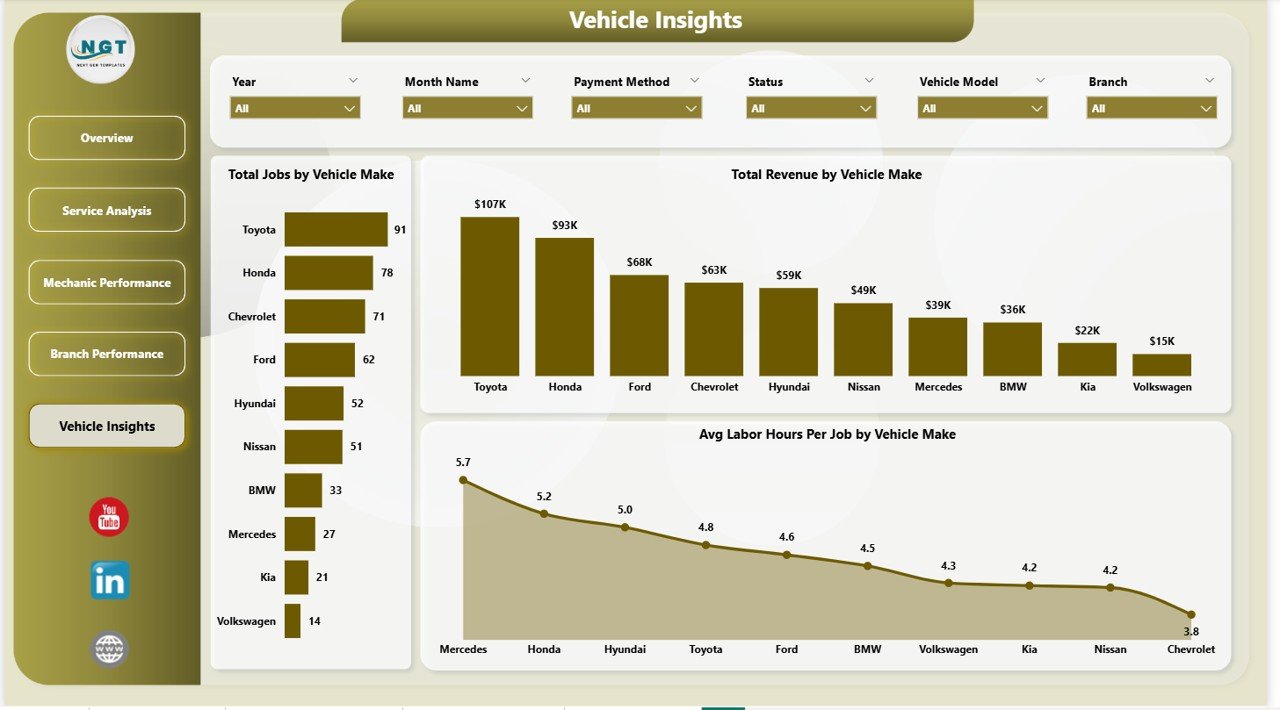
Vehicle Insights Page
Total Jobs by Vehicle Make, Total Revenue by Vehicle Make, and Avg Labor Hours Per Job by Vehicle Make. Helpful for spotting which makes deliver outsized revenue per job, which makes consume disproportionate labor hours, and where to focus parts inventory and technician training budgets.
Auto Repair Dashboard in Power BI vs. Tableau / Qlik vs. Paid Shop Management Software — Feature Comparison
| Feature | Auto Repair Dashboard in Power BI | Tableau / Qlik Sense | Shop-Ware / Tekmetric / Mitchell 1 |
|---|---|---|---|
| Cost | $17.99 one-time | $70 – $150 / user / month | $129 – $379 / shop / month |
| Platform | Power BI Desktop (.pbix) | Tableau Cloud / Qlik Sense Cloud | Cloud SaaS |
| Setup time | Under 10 minutes | 2 – 4 hours per dashboard | 2 – 6 weeks (onboarding) |
| Real-time team sharing via web | ✅ Via Power BI Service | ✅ Yes | ✅ Yes |
| Mobile access | ✅ Power BI mobile app | ✅ Tableau / Qlik mobile | ✅ Vendor mobile app |
| Per-user fees | ✅ Free Desktop, $10/user Pro | ❌ $70 – $150 per user / mo | ❌ $30 – $80 per user / mo |
| Customisable visuals & DAX | ✅ Fully editable | ✅ Fully editable | ⚠️ Limited to vendor templates |
| Mechanic & branch P&L views | ✅ Built-in | ⚠️ DIY | ✅ Built-in (premium tier) |
| Year-1 cost at 5 users | $17.99 + ~$600 Pro | $4,200 – $9,000 | $7,740 – $22,740 |
For independent and multi-branch auto repair shops that already have Power BI Desktop installed and want clear KPI reporting without paying $150+ per month, the Auto Repair Dashboard in Power BI sits in the sweet spot.
Who Should Use This Template
Perfect for:
- Independent auto repair shop owners with 1–10 mechanics already using or willing to install Power BI Desktop
- Multi-branch repair chain operators needing branch-vs-branch profit and rating comparisons
- Service managers running monthly reviews on top-ten mechanic productivity
- Franchise owners (oil change chains, tire centres, brake shops) needing consistent reporting across locations published to the Power BI Service
- BI consultants and bookkeepers serving auto repair clients who want a starter Power BI model
Not a fit if:
- You need live VIN decoding or OEM repair information (use Mitchell 1 / ALLDATA)
- You want to skip Power BI Desktop entirely (use the Auto Repair Dashboard in Excel instead)
- You require text-message customer approvals or digital vehicle inspections (use Tekmetric / Shop-Ware)
- You need fully offline mobile access — Power BI mobile needs intermittent connectivity
Real-World Use Cases
Marcus runs a 3-bay independent shop in Phoenix. Before the dashboard he averaged service categories on a clipboard. He now uses the Auto Repair Dashboard in Power BI each Sunday evening to refresh the previous week’s job data and check Profit Margin by Service Category. Last quarter he found his $39 oil change promotion was running at a 4% margin while his brake jobs averaged 38%. He pulled the oil-change banner off his website’s hero section, redirected the budget to brake-job Google Ads, and watched monthly Net Profit climb without adding a single bay.
Linda manages 4 franchise tire centres across Texas. Each Monday her store managers email last week’s job log. She refreshes the .pbix file, publishes the report to her Power BI Service workspace, and within five minutes has a Branch Performance page ready for her franchise call. The Avg Customer Rating by Branch visual caught a Houston location dropping from 4.7 to 3.9 — turned out a senior mechanic had quit. She had a replacement in place before churn caught up to her review pages.
Raj is a BI consultant for two family-owned auto shops. He uses the Mechanic Performance page during quarterly reviews to recommend bonus payouts based on Net Profit and Avg Customer Rating per top-ten mechanic. The owners pay him a monthly retainer for the analysis — the dashboard does the heavy lifting and he picks up an extra $400/month per shop on the back of one .pbix file.
Advantages of Auto Repair Dashboard in Power BI
🔹 One-time cost vs. recurring SaaS — at $17.99 the dashboard pays for itself the day you’d otherwise have signed up for Shop-Ware or Tekmetric. Year-one savings against a $179/month plan are around $2,130 per shop.
🔹 No vendor lock-in — the .pbix file is yours forever. Your DAX, your visuals, your data, in a format you can extend or migrate.
🔹 Free Power BI Desktop runs the whole report — no Pro license required for single-user analysis. Pro ($10/user/month) is only needed if you want to publish and share via the Power BI Service.
🔹 Standard Power BI architecture — anyone who knows DAX can extend it. No proprietary scripting, no custom visuals required, no third-party connectors.
🔹 Mobile-friendly — once published to the Power BI Service, branch managers can read the dashboard on the Power BI mobile app without leaving the floor.
Opportunities for Improvement
The Auto Repair Dashboard in Power BI is a reporting layer, not a shop management system. Three honest limitations worth flagging:
🔹 Manual data refresh. If your point-of-sale exports a CSV, you’ll need to drop it into the Power BI source folder weekly or monthly. There’s no live API connection out of the box — though setting one up via Power BI gateways is possible.
🔹 Power BI Pro for sharing. Single-user analysis on Power BI Desktop is free. But to share the report online with branch managers, every viewer needs a Pro license (~$10/user/month) unless you go with Power BI Premium per Capacity.
🔹 No customer-facing features. No appointment booking, no SMS estimates, no digital vehicle inspections. Pair the dashboard with a separate booking tool if you need those.
Best Practices
🔹 Refresh weekly, not daily. A weekly cadence (every Sunday or Monday morning) gives you stable trend lines on the Total Cost vs. Total Revenue by Month visual without the noise of day-to-day variation.
🔹 Publish to a Power BI Service workspace. Once your data is clean, publish from Desktop → Power BI Service. Branch managers can then bookmark the dashboard URL and open it on mobile.
🔹 Keep column names in your data source intact. The DAX measures reference columns by name. Adding new columns is fine; renaming or reordering will break visuals until you update the model.
🔹 Use slicers, not visual filters. Slicers cascade across every visual on the page. Visual-level filters only affect that one chart.
🔹 Save versioned .pbix copies each month. Before swapping in next month’s data, save a copy as AutoRepair_2026-05.pbix. You’ll have a year-long archive of monthly snapshots for tax season and trend analysis.
Explore Relevant Templates
🔹 Auto Repair Dashboard in Excel — the same template architecture for teams that prefer Excel pivots over Power BI visuals.
🔹 Car Dealership Dashboard in Power BI — sister template covering the sales side of automotive (vehicle inventory, leads, deals).
🔹 HVAC Service Dashboard in Power BI — same service-business reporting pattern for HVAC contractors.
🔹 Plumbing Contractor Dashboard in Power BI — for plumbing service businesses with branch and technician analytics.
🔹 Browse the full Power BI Dashboard Templates collection on NextGenTemplates.
Also available as: Auto Repair Dashboard in Excel for teams already on Excel. Browse the full Excel Dashboard Templates collection too.
Frequently Asked Questions
What KPIs does the Auto Repair Dashboard in Power BI track?
The Auto Repair Dashboard in Power BI tracks 5 high-level KPIs — Total Jobs, Total Cost, Total Revenue, Net Profit, and Avg Customer Rating — plus 16 deep-dive visuals covering service category, mechanic, branch, and vehicle make analytics across 5 interactive Power BI report pages.
How long does setup take?
Setup of the Auto Repair Dashboard in Power BI takes under 10 minutes. Open the .pbix file in Power BI Desktop, point the data source to your own job records via Transform Data, and click Refresh. Every visual, KPI card, and slicer recalculates automatically — no DAX edits required.
Do I need a paid Power BI license?
No. Power BI Desktop is free from Microsoft and runs the Auto Repair Dashboard in Power BI fully on your laptop. You only need a Power BI Pro license (~$10/user/month) if you want to publish the dashboard to the Power BI Service for shared online viewing.
How does this compare to Tekmetric or Shop-Ware?
Tekmetric and Shop-Ware are full shop management systems with VIN decoding, parts ordering, and digital inspections — costing $129 to $379 per shop per month. The Auto Repair Dashboard in Power BI is a one-time $17.99 reporting layer for shops that already track jobs elsewhere and want clean Power BI KPI reporting.
👉 Click here to Purchase the Auto Repair Dashboard in Power BI
Can I track multiple branches in one .pbix file?
Yes. The Auto Repair Dashboard in Power BI includes a dedicated Branch Performance page that compares Avg Customer Rating, Net Profit, and Completion Rate by branch. Add a Branch column value for each job in your data source and the page populates automatically.
Is the file editable, and can I add my shop logo?
Yes. The Auto Repair Dashboard in Power BI is fully editable — change colors, swap visuals, edit DAX measures, add your shop logo, and rename pages. Power BI’s theme JSON file lets you restyle the whole report in one go.
Will I get future updates?
Your purchase includes lifetime access to the version you download. NextGenTemplates also publishes free walkthroughs and improvements on YouTube — subscribe to @PK-AnExcelExpert to be notified when new versions ship.
About the Author
Built by PK — Microsoft Certified Professional with 15+ years of Excel, Google Sheets, and Power BI experience. Founder of NextGenTemplates, reaching 300K+ subscribers across YouTube channels. Every template is hand-built and tested before release.
Conclusion
For an independent auto repair shop or multi-branch chain that already has Power BI Desktop installed — and wants Total Jobs, Total Revenue, Net Profit, Avg Customer Rating, and Total Cost rolled up across mechanic, branch, service category, and vehicle make in five clicks — the Auto Repair Dashboard in Power BI does the job at a fraction of the cost of a SaaS shop management system.
👉 Click here to Purchase the Auto Repair Dashboard in Power BI
✅ Instant download · One-time payment · No subscription · Lifetime access
🎥 Visit our YouTube channel for step-by-step Power BI dashboard tutorials: YouTube.com/@PK-AnExcelExpert
📅 Last updated: May 2026