Community development teams tend to be data-rich and report-poor. The project list is in one workbook, the grant register in another, the volunteer log in a third, and the milestone plan somewhere in a shared folder. Everything needed for a decent monthly pack already exists – it is just never in one place at one time.
The Community Development Dashboard in Power BI is a finished report template that closes that gap. It sits on top of a single Excel workbook and turns it into five laid-out, interactive report pages. This post walks through each page, explains what the template is honestly good for, and is equally explicit about what it is not.
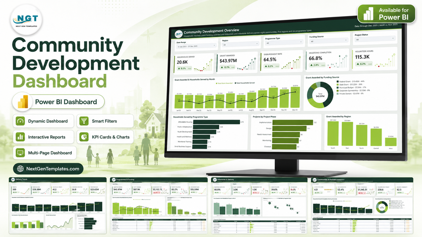
What This Template Is – And What It Is Not
Let us get the important part out of the way first, because it shapes everything below.
This is a reporting layer over your organisation’s own records. It reads a workbook you maintain and draws charts, cards and tables from it. That is the whole scope.
It does not measure or validate social impact. It does not assess grant compliance. It is not built to any funder’s, donor’s or authority’s reporting format, and no funder has reviewed it. It does not audit anything or provide assurance over your numbers. It makes no findings about demographics, equity, or any community, group, cause or jurisdiction. Any figure on screen that looks like an outcome – households served, satisfaction score, completion rate – is a number somebody on your team entered into the workbook, or arithmetic over numbers they entered. It is not measured, verified or certified by the template.
Everything in the screenshots below is demonstration data: 500 invented project rows, with placeholder community names, delivery partners, programme types and focus areas. None of it refers to a real organisation, place, programme or group. The labels exist so the layout has something to render, and they are meant to be renamed.
Page 1 – Overview
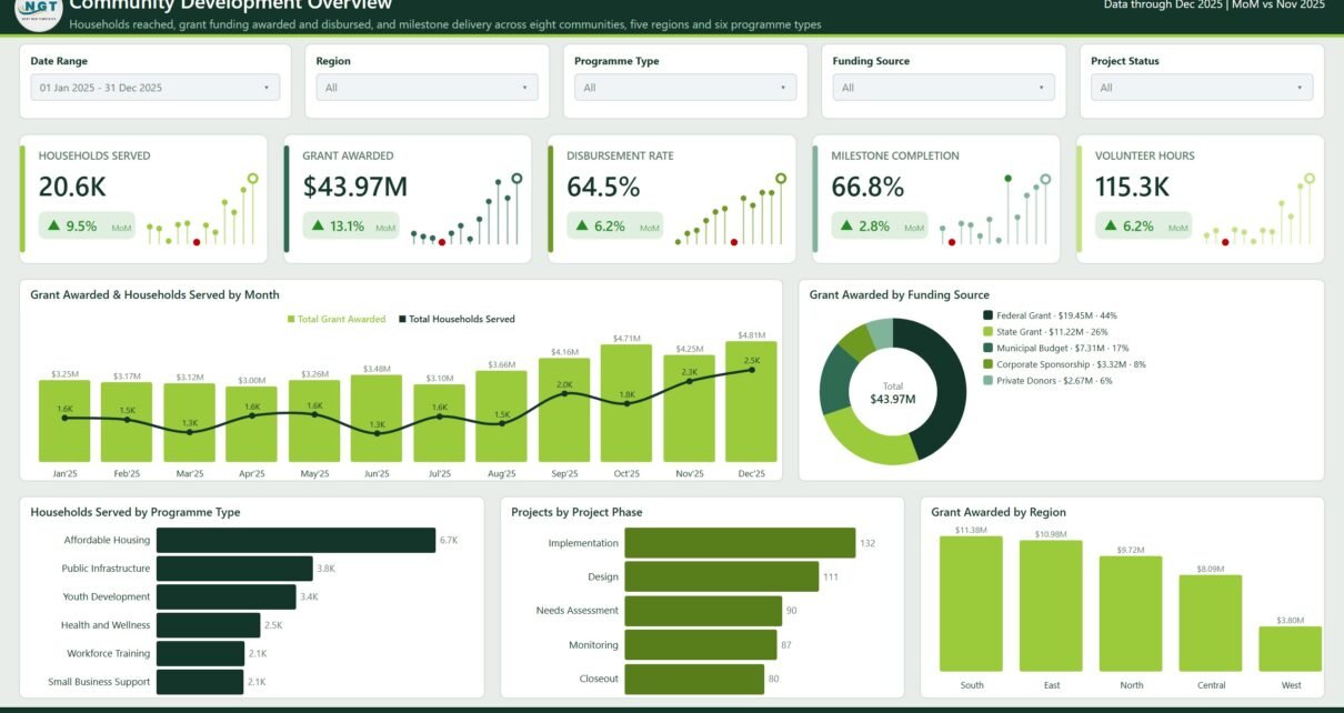
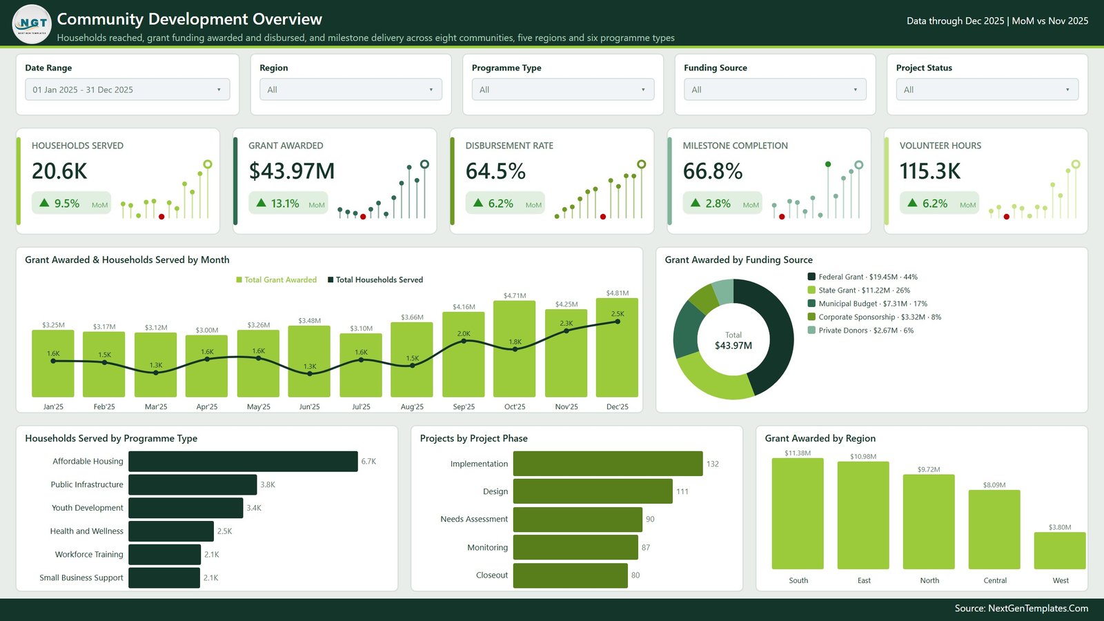
The landing page answers the question a programme director asks first: how much did we do, and with how much money.
Five KPI cards run across the top – Households Served, Grant Awarded, Disbursement Rate, Milestone Completion and Volunteer Hours – each with a month-on-month delta and a small sparkline showing the trend behind the number.
Below them, Grant Awarded & Households Served by Month puts funding columns and a reach line on the same axis, so you can see whether more money is actually landing as more reach. Grant Awarded by Funding Source breaks the total across funder types in a donut with values and shares in the legend. A bottom row of three charts – Households Served by Programme Type, Projects by Project Phase and Grant Awarded by Region – gives the three cuts people ask for immediately.
Page 2 – Delivery Trends
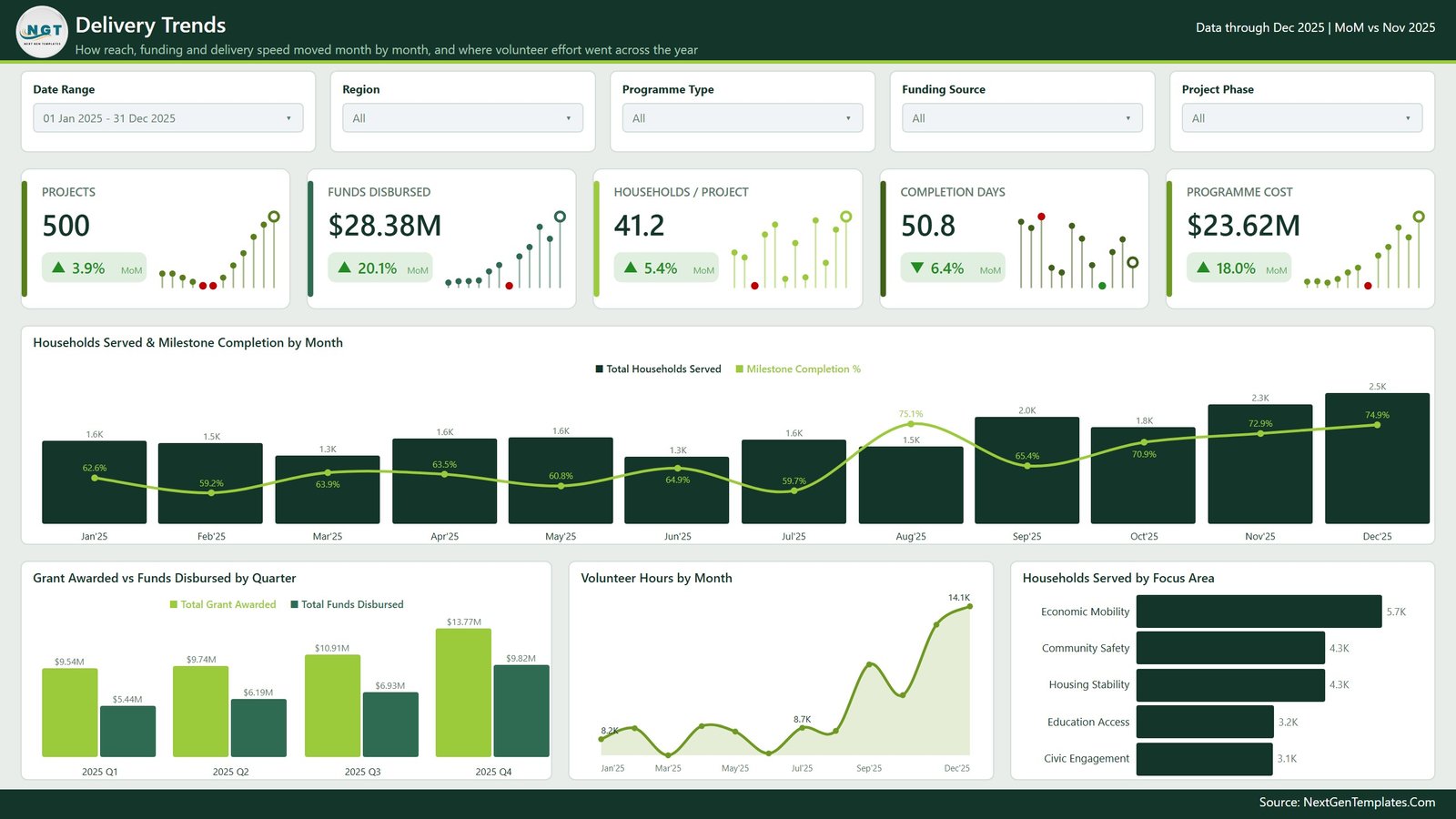
The second page is about movement over the year rather than totals. Its cards cover Projects, Funds Disbursed, Households / Project, Completion Days and Programme Cost.
Households Served & Milestone Completion by Month overlays a completion-percentage line on monthly household columns, which is the clearest way to see whether volume and delivery speed are moving together or against each other. Grant Awarded vs Funds Disbursed by Quarter sets committed money next to released money quarter by quarter – the gap between the two bars is usually the most useful thing on the page. Volunteer Hours by Month is a filled area chart, and Households Served by Focus Area ranks whatever focus-area labels you have defined.
Page 3 – Programmes & Funding
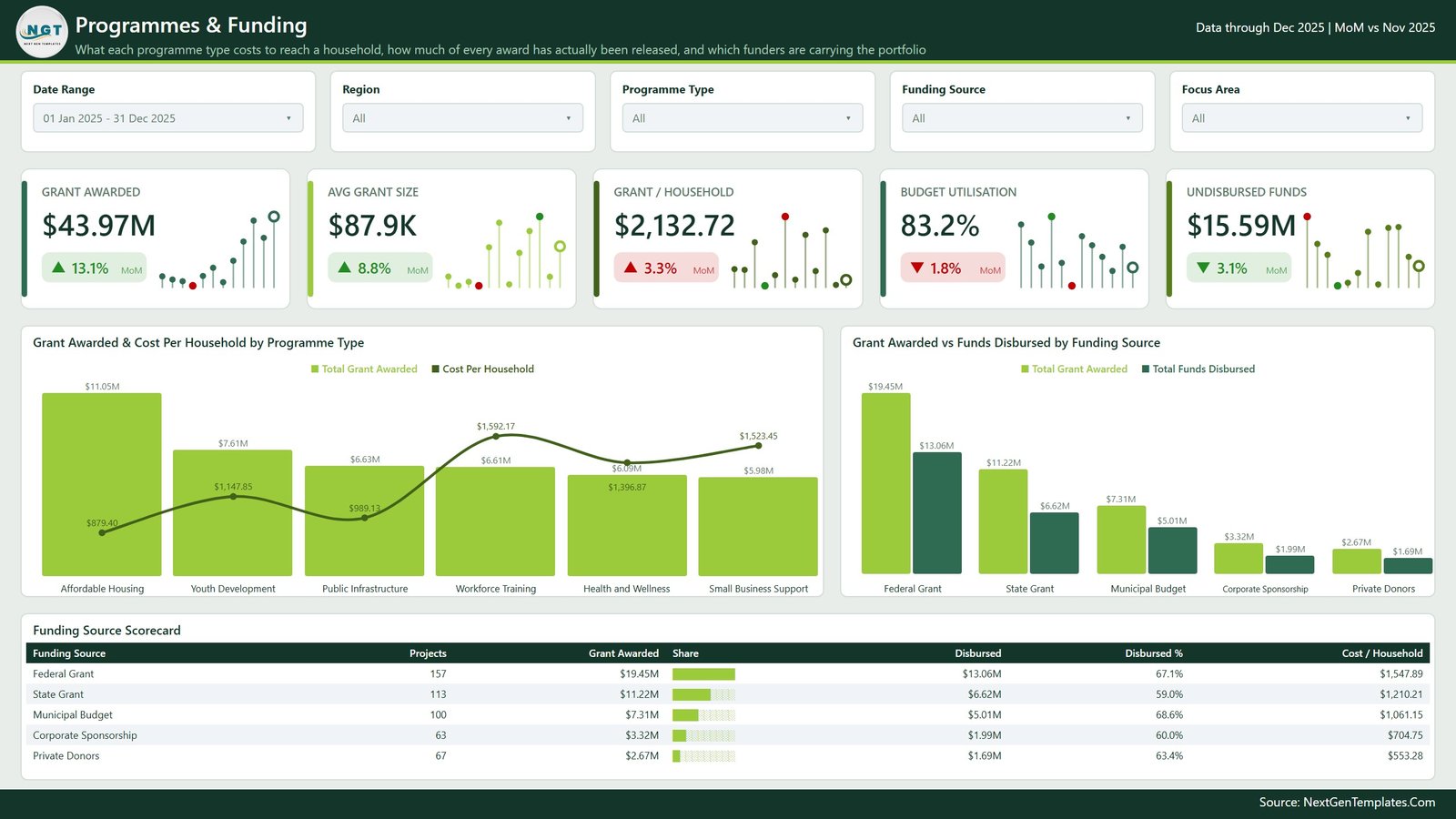
This is the cost page. Cards show Grant Awarded, Avg Grant Size, Grant / Household, Budget Utilisation and Undisbursed Funds.
Grant Awarded & Cost Per Household by Programme Type is the chart most people stop at: columns for where the money went, a line for what it cost to reach one household in each programme type. Grant Awarded vs Funds Disbursed by Funding Source repeats the committed-versus-released comparison at funder level.
The page closes with a Funding Source Scorecard table – projects, grant awarded, an in-cell share bar, disbursed, disbursed % and cost per household for every funding source. A note on reading it: cost per household is simply money divided by a household count you supplied. A lower figure is not automatically better and a higher one is not automatically worse; different kinds of work legitimately cost different amounts.
Page 4 – Milestones & Delivery
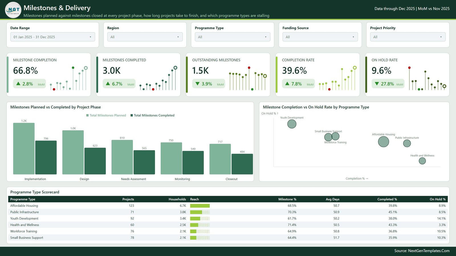
Page four is the delivery-management view: milestones planned against milestones actually closed. Cards show Milestone Completion, Milestones Completed, Outstanding Milestones, Completion Rate and On Hold Rate.
Milestones Planned vs Completed by Project Phase is a paired column chart across the five phases, so a phase where the gap is widening is obvious at a glance. Milestone Completion vs On Hold Rate by Programme Type plots each programme type as a labelled bubble – completion across, on-hold rate up. Below both, the Programme Type Scorecard lists projects, households, a reach bar, milestone %, average days, completed % and on-hold % per programme type.
Page 5 – Communities & Partners
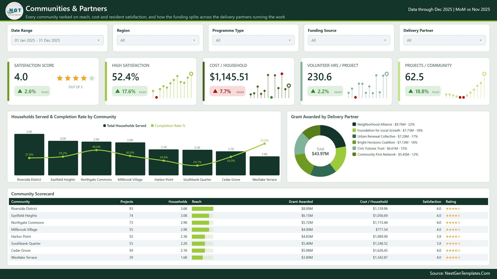
The last page ranks every community side by side and shows how funding splits across the delivery partners doing the work. Cards cover Satisfaction Score (with a star row), High Satisfaction, Cost / Household, Volunteer Hrs / Project and Projects / Community.
Households Served & Completion Rate by Community combines reach columns with a completion line, and Grant Awarded by Delivery Partner is a donut across partner organisations. The Community Scorecard table lists projects, households, a reach bar, grant awarded, cost per household, satisfaction and a star rating for each community.
Worth saying plainly: the satisfaction figures are whatever your own feedback process produced and typed into the workbook. The dashboard does not survey anyone, weight anything, or check that the responses are representative.
What Is Under the Hood
The .pbix file contains nine pages, not five. Alongside the five report pages above there is:
- A hidden Details drillthrough page. Right-click a data point on any chart and drill through on community, region, programme type, focus area, funding source, project priority, project lead, delivery partner, project phase or project status – ten fields in all – to see the underlying project rows.
- Two compact tooltip pages, Category Detail and Trend Detail, that pop up small breakdowns on hover rather than forcing a click.
- A visible Get More Dashboards page, which is our own catalogue link and is meant to be deleted before you circulate the file internally.
The semantic model is import mode with a proper generated date table, which is why month, quarter and year-over-year logic works without you writing anything. Every page carries five slicers – Date Range, Region, Programme Type, Funding Source, plus one page-specific slicer – and they are synced, so a filter you set on the Overview follows you to the other pages.
Setting It Up With Your Own Data
- Unzip the download. You get the
.pbix, the sampleData.xlsx, and a user-manual PDF. - Open the
.pbixin Power BI Desktop – the free Microsoft download is enough for everything except publishing to the Service. - Click through the five pages with the sample data still loaded. Ten minutes here saves an hour later, because you learn which workbook column feeds which visual.
- Open
Data.xlsxand replace the sample rows with your own. Keep the column headers exactly as they are – the model binds to those names. - Repoint the data source at your copy of the workbook and hit Refresh.
- Rename the placeholder labels. Programme types, focus areas, community names, delivery partners and funding sources are all just text – change them to your own taxonomy and the charts and scorecards follow.
- Delete the Get More Dashboards page.
A Word About Personal Data
The template ships with no personal data. The sample rows contain organisation, community and staff-role labels only – no individuals.
If you extend the workbook with anything that identifies a beneficiary, a household or a person, that becomes personal data under your own data-protection obligations, and handling it correctly is entirely on you. The dashboard offers no access control, no encryption and no anonymisation of its own; a .pbix sitting in a shared folder is exactly as protected as that folder is. In practice the safest pattern is to keep individual-level records out of the workbook altogether and load only the aggregated counts the visuals actually need.
Limitations and One Rendering Quirk
Things we would rather you knew before buying than after:
- The bubble chart on page 4 crowds its labels. In Milestone Completion vs On Hold Rate by Programme Type, two programme types land close together in the sample data, so their bubbles nearly touch and the Workforce Training label sits directly under the Small Business Support one. Everything is readable and the values are correct, but the spacing is tighter than the rest of the report. Your own data will place the bubbles differently; if it still crowds, drag the labels or widen the visual.
- The refresh is manual unless you set up a gateway. Out of the box you press Refresh in Power BI Desktop. Scheduled refresh needs the Power BI Service and, for a local file, an on-premises data gateway.
- The model expects the shipped column names. Renaming a workbook column without updating the query will break the visuals that use it.
- It is a single-table import model. That keeps it simple to maintain, but if your project data lives across several related tables you will need to flatten it or extend the model yourself.
- No system integration is included. Connecting to a grants, CRM or case-management database is possible via Power Query, but it is work you do, not something the template does.
Who Gets the Most Out of It
- Community development and programme teams already tracking projects in a spreadsheet who want a proper summary view without hiring a BI developer.
- Programme managers who build the same internal monthly or quarterly pack by hand every time.
- Operations and finance staff who need awarded-versus-disbursed and cost-per-household figures in one place.
- Anyone learning Power BI who wants a complete, well-organised report to take apart – the measures, drillthrough setup and tooltip pages are all worth reading.
Frequently Asked Questions
Does this measure our programme’s impact?
No. It displays and totals numbers you enter. There is no impact measurement, outcome validation or independent verification anywhere in it.
Will our funder accept a report produced from this?
We genuinely cannot tell you. No funder or authority has reviewed this template and it follows no particular reporting standard. Use it as an internal management view and check your funder’s own requirements separately.
Are the numbers in the screenshots real?
No – all 500 rows are demonstration data, and the community and partner names are invented placeholders.
Do I need a paid Power BI licence?
Not to use it locally. Power BI Desktop is free. Sharing through the Power BI Service uses whatever licence your organisation already has.
Can I change the programme types and focus areas?
Yes. They are ordinary text labels chosen as neutral placeholders, and renaming them is expected.
Can I use my own database instead of the Excel file?
Yes, by repointing the query in Power Query and mapping your columns to the names the model expects.
Get the Template
The Community Development Dashboard in Power BI is available on NextGenTemplates. The download includes the .pbix, the sample workbook and a user manual, and nothing in the file is locked – every measure, visual and colour is yours to change.
If your reporting sits closer to grants or fundraising, the Nonprofit Grant Dashboard in Power BI and the Nonprofit Fundraising Dashboard in Power BI cover that ground, and the Civil Rights Organizations Dashboard in Excel is the closest equivalent for teams who would rather stay in Excel.
Whichever you pick, the principle is the same: the template does the layout and the arithmetic, and every number in it stays yours.