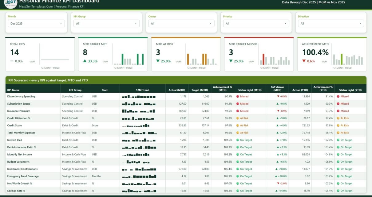
Most money templates fall into one of two camps. Either they chart every transaction you have ever made, or they are a budget sheet with a running total at the bottom. The Personal Finance KPI Dashboard in Power BI does neither. It is a scorecard: 14 personal finance KPIs, one row each, and for every row an MTD actual, a YTD actual, a target you chose yourself, an achievement percentage, a red/amber/green status light and a 12-month sparkline. Pick a month at the top and the whole report moves to it.
Two things to be plain about before anything else. This is not financial advice. The file makes no recommendation about how much you should save, what your budget should look like, or how to handle debt. And it does not connect to your bank, card or brokerage account – there is no Open Banking, no aggregation, no import. Every number in it is one you type in. Every number currently in it is demo data.
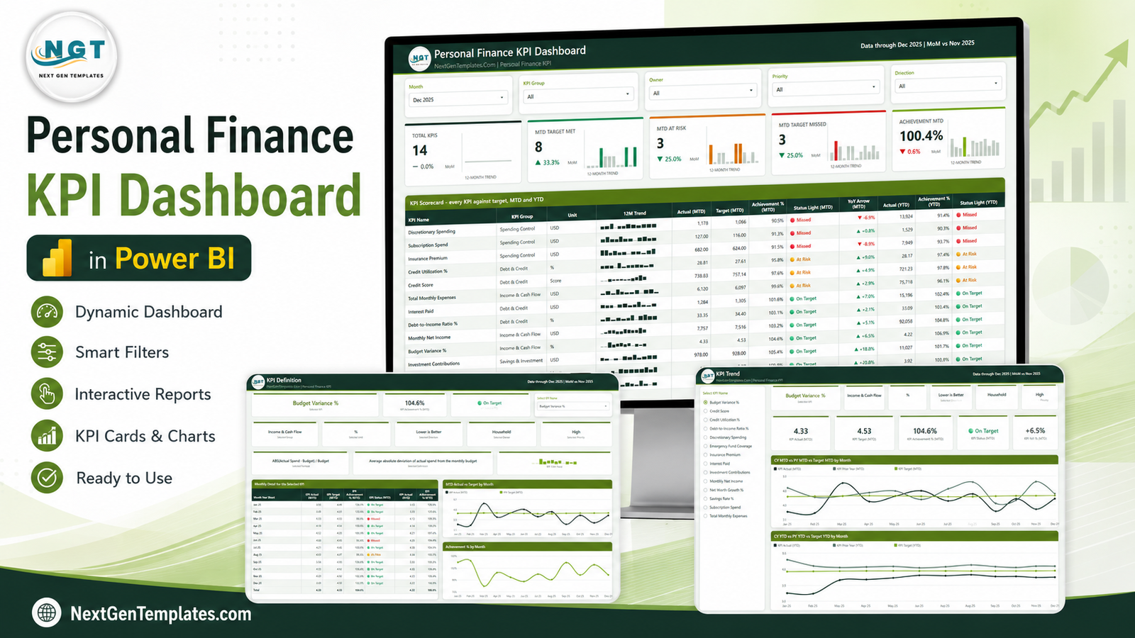
The build is small and honest about its size: 6 report pages (4 you navigate, 2 hidden tooltip pages), 38 DAX measures referenced by the report visuals, and a four-sheet Data.xlsx holding 168 target rows, 336 actual rows and a 14-row KPI definition table with 9 columns.
Key Features of the Personal Finance KPI Dashboard in Power BI
- One month drives everything. The Month slicer on page 1 sets the MTD and YTD context for every card, light and table on the page.
- Four KPI groups. Income & Cash Flow, Spending Control, Debt & Credit, and Savings & Investment – filterable, so you can look at just the debt rows or just the savings rows.
- Targets are yours, not ours. Every target, threshold and status band shipped in the file is a placeholder that exists so the demo renders. None of them is a recommended level.
- Direction-aware achievement. Each KPI carries an upper-the-better or lower-the-better flag, so a lower-is-better KPI scores above 100% when it comes in under target.
- Owner and Priority slicers. Useful in a two-person household where each person watches different rows.
- Prior-year lines built in. Current year, prior year and target are plotted together on both MTD and YTD bases.
- The KPI’s own documentation lives in the file. Formula, definition, unit, direction, owner and priority all sit on the KPI Definition page – no separate spec document to lose.
- Unlocked and native. No custom visuals, no AppSource dependencies, and a single custom theme file behind all the colours.
Dashboard Pages Explanation
Page 1 – KPI Scorecard
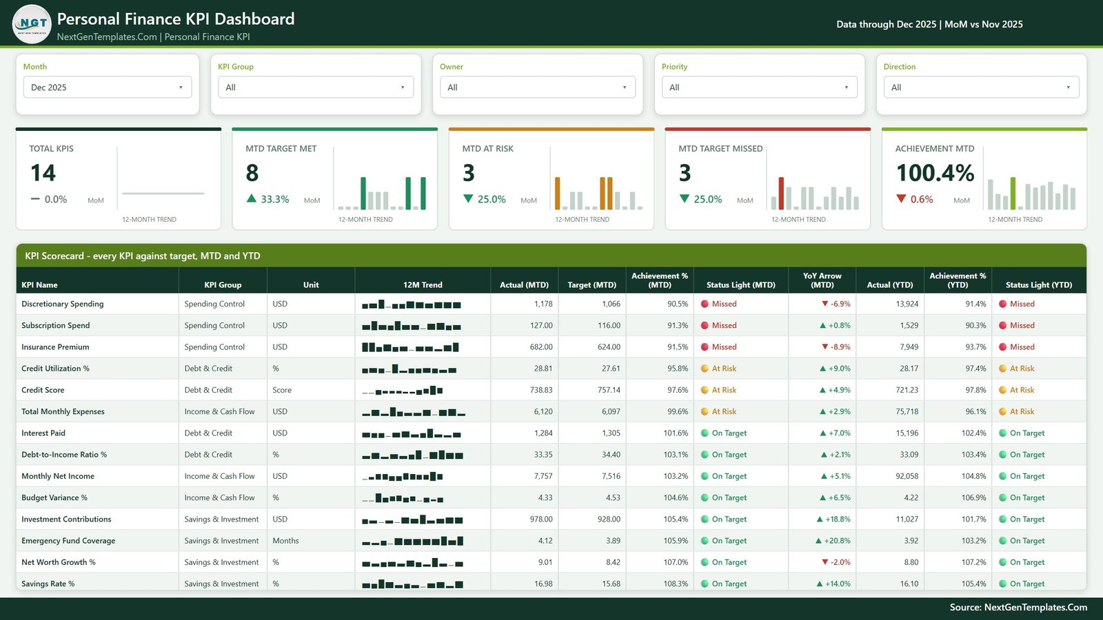
Five slicers run across the top: Month, KPI Group, Owner, Priority and Direction. Below them sit five summary cards, each with its own 12-month sparkline and a month-on-month delta – Total KPIs, MTD Target Met, MTD At Risk, MTD Target Missed and Achievement MTD. Then the scorecard table itself, one row per KPI: KPI Name, KPI Group, Unit, a 12-month trend sparkline, Actual (MTD), Target (MTD), Achievement % (MTD), Status Light (MTD), a year-on-year arrow, and then the YTD trio – Actual (YTD), Achievement % (YTD) and Status Light (YTD).
The 14 demo KPIs are Monthly Net Income, Total Monthly Expenses and Budget Variance % (Income & Cash Flow); Discretionary Spending, Subscription Spend and Insurance Premium (Spending Control); Credit Utilization %, Credit Score, Interest Paid and Debt-to-Income Ratio % (Debt & Credit); and Savings Rate %, Investment Contributions, Emergency Fund Coverage and Net Worth Growth % (Savings & Investment). Every one of those is a label in a spreadsheet, not something baked into the model – rename them and the scorecard follows.
Page 2 – KPI Trend
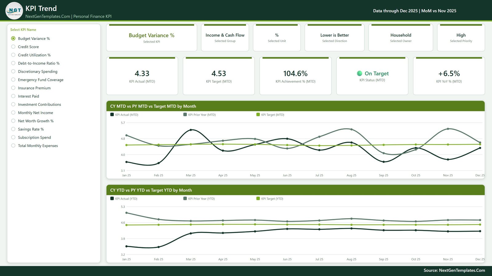
A radio-button list on the left holds all 14 KPI names; pick one and the entire page becomes that KPI. Six context cards restate what you selected – the KPI, its group, unit, direction, owner and priority – so you never lose track of which measure you are looking at. Five metric cards follow: KPI Actual (MTD), KPI Target (MTD), KPI Achievement % (MTD), KPI Status (MTD) and KPI YoY % (MTD).
The two charts underneath are CY MTD vs PY MTD vs Target MTD by Month and CY YTD vs PY YTD vs Target YTD by Month. The first is the noisy, month-by-month view; the second is the smoothed cumulative one. Reading them together is the point – a bad single month looks very different once the YTD line puts it in context.
Page 3 – KPI Definition
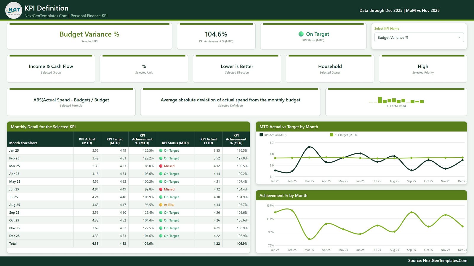
Worth knowing how this page is wired, because it differs from some other files in this line: there is no drillthrough here. Instead, the “Select KPI Name” dropdown on this page and the KPI list on the KPI Trend page belong to the same sync group, so a selection on either page applies to both. Single-select, so you always have exactly one KPI in view.
The page then answers “what is this number, exactly?” – cards for the selected KPI, its achievement % and status, its group, unit, direction, owner and priority, plus a Selected Formula card and a plain-English Selected Definition card. The Monthly Detail for the Selected KPI table runs month by month with actual, target, achievement % and status on the MTD basis and actual plus achievement % on the YTD basis, ending in a total row. Two charts sit alongside: MTD Actual vs Target by Month and Achievement % by Month.
Page 4 – Get More Templates
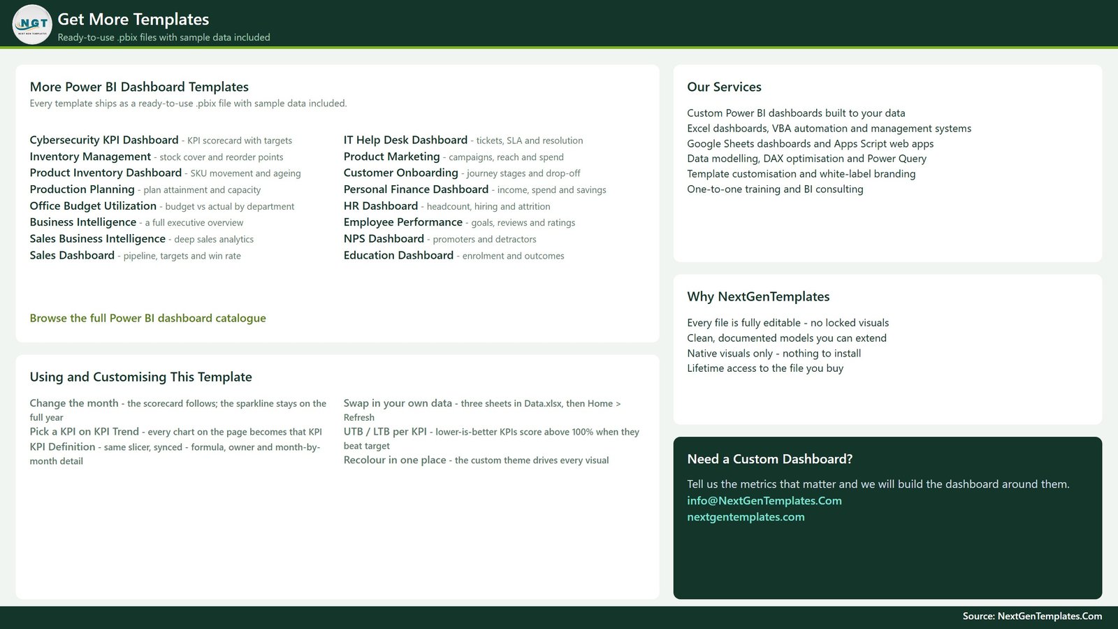
The fourth page is an in-file help and catalogue sheet rather than a report page. Its left column is a short “Using and Customising This Template” guide – how the month picker works, how to swap in your own data, how the upper/lower-the-better scoring behaves and where the colours come from – next to a list of other NextGenTemplates Power BI files. It ships inside the .pbix, so it is shown here rather than quietly cropped out of the screenshots.
The two hidden pages
Behind those four sit KPI Detail and Trend Detail – 280×360 tooltip pages, both set to hidden in view mode. They appear on hover over a scorecard row or a trend point and are not part of the page navigation.
Personal Finance KPI Dashboard vs. Tableau vs. a Paid Money App – Feature Comparison
| This template (Power BI) | Tableau / Qlik build | Paid personal-finance app | |
|---|---|---|---|
| Cost | One-time purchase of the file | Per-user subscription plus your build time | Recurring subscription |
| Platform | Power BI Desktop (free) + Excel | Tableau Desktop / Qlik Sense | Vendor web and mobile app |
| Setup time | Open, replace the demo rows, Refresh | Days – model, measures and layout from scratch | Minutes, on their data model |
| Real-time collaboration | Via Power BI Service once published | Via their server product | Built in on shared plans |
| Mobile access | Power BI mobile app once published | Vendor mobile app | Built in |
| Customizable fields | Every KPI, target, group, owner and label | Fully, if you build it | Limited to their categories |
| Share with link | Yes, once published | Yes, on their server | Yes, within the app |
| Year-1 cost at 5 users | The one-time file price – no per-user fee | Five paid seats | Five subscriptions, renewed annually |
| Traffic-light scorecard against your own targets | Yes – that is the whole file | Only if you build it | Rarely; most show categories, not KPI targets |
| Connects to your bank or card | No – you type every figure | No | Usually yes, that is their model |
Who Should Use This Template
It suits you if you already keep your monthly figures somewhere – a spreadsheet, an export, a notebook you transcribe – and what you actually want is a single page that says whether each measure beat the target you set. It suits two-person households, because Owner and Priority are real fields you can slice on. And it suits people learning Power BI, because the model is small enough to read end to end while still using MTD/YTD patterns, prior-year offsets, SVG card visuals and synced slicers.
It does not suit you if you want automatic transaction import, merchant-level categorisation, or a tool that tells you what your numbers ought to be. None of those are in here, and the last one is deliberate.
Real-World Use Cases
A two-income household doing a monthly review. First Sunday of the month, open the file, set the Month slicer, and each person uses the Owner slicer to see their own rows. The lights measure performance against targets the two of them agreed – not against any external benchmark.
A freelancer with uneven income. Monthly Net Income bounces around, so the single-month view is noisy on its own. The KPI Trend page’s YTD line smooths it, and the prior-year line answers whether this year is genuinely running differently. The Achievement % by Month chart on the KPI Definition page then shows which months moved the annual picture.
Someone learning DAX. Thirty-eight measures is a readable number. The MTD/YTD pair, the prior-year variants, the direction-aware achievement logic and the SVG-based cards are all worth opening up, and the file is small enough that you can trace any one number back to its source.
Advantages of the Personal Finance KPI Dashboard in Power BI
- Documentation travels with the data. Because the formula and definition live in the KPI Definition sheet, the report explains its own numbers six months later.
- Nothing is hard-coded. Change the KPI list in Excel and the scorecard, the trend page and the definition page all follow – no measure rewriting.
- Neutral by design. The file states what your numbers did against targets you chose. It has no opinion about them, which is exactly what you want from a reporting tool.
- Cheap to rebrand. One theme file drives every colour, so a full restyle is a single change.
- No moving parts. Native visuals only, no add-ins, no cloud service required to open it.
- Private by default. Nothing leaves your machine. There is no account to create and no data to hand over.
Opportunities for Improvement
Being straight about the limits:
- Manual data entry. Adding your figures means typing them into Data.xlsx each month. That is the trade-off for having no bank connection, and it will not suit everyone.
- Windows only for editing. Power BI Desktop is a Windows application. Mac users need Power BI Service or a virtual machine.
- Monthly grain only. The model is built around calendar months. Weekly or daily tracking would need a different date table.
- No transaction detail. The scorecard works on aggregates, so “why was Discretionary Spending high in March?” is a question for the analytical dashboard, not this one.
- Refresh path is a file path. If you move Data.xlsx you must update the source in Transform data > Data source settings.
- The Owner field is a label, not security. Anyone with the file sees every row; row-level security would have to be added.
Best Practices
- Set your targets once, in writing, before you look at any lights. A target chosen after you see the actual is not a target.
- Start with fewer than 14 KPIs. Five or six you will genuinely update beats fourteen you abandon in March.
- Get the direction flag right. An upper-the-better flag on a cost KPI turns the whole traffic-light system upside down.
- Fill the KPI Definition sheet properly. Writing the formula and the definition down is what stops next year’s you from redefining a KPI mid-stream.
- Keep one row per KPI per month. Duplicates in Input_ Actual quietly double a total.
- Read MTD and YTD together. One red month on a YTD line that is comfortably on target is a very different story from three in a row.
- Back the workbook up before a big edit, and check the refresh in Power BI Desktop straight after. Microsoft’s data refresh documentation covers what to do if a source path breaks.
Explore Relevant Templates
- Personal Finance KPI Dashboard in Power BI – the template covered in this post.
- Personal Finance Dashboard in Power BI – the analytical companion, for slicing detail rather than scoring KPIs.
- Personal Finance KPI Scorecard in Excel – the same scorecard idea without Power BI Desktop.
- Budget Adherence KPI Dashboard in Power BI – budget versus actual on the same pattern.
- Investment Management Dashboard in Power BI and Crypto Portfolio Dashboard in Power BI for holdings reporting.
- Or browse the full Power BI KPI Dashboard category.
Frequently Asked Questions
Is this financial advice, and does it connect to my bank?
No – to both. It is a reporting template. It offers no financial, investment, tax, debt or retirement advice, and it has no bank, card, brokerage or Open Banking connection of any kind. You type every figure in yourself.
Are the targets in the file recommended levels?
No. Every target, threshold, ratio and status band that ships in the file is a placeholder, put there so the demo renders. They are not benchmarks and not recommendations. Replace them with levels you decide on.
Is the data in the screenshots real?
No. All 168 target rows and all 336 actual rows are generated demo data.
What do I need to run it?
Power BI Desktop, free from Microsoft for Windows, plus something that can save .xlsx to edit the data pack. No custom visuals and nothing to install from AppSource.
Can I change the KPIs?
Yes. Names, groups, units, directions, owners, priorities, formulas and definitions are all rows in Data.xlsx. Use fewer or more than 14 and the scorecard adjusts.
How is this different from the Personal Finance Dashboard in Power BI?
That one is analytical – it slices and charts your underlying detail. This one is a scorecard: a fixed KPI list, a month picker, a target per KPI and a status light per KPI. Different questions, and the two sit happily side by side.
Does the KPI Definition page use a drillthrough?
Not in this build. It uses a visible single-select dropdown that is synced with the KPI Trend page, so selecting a KPI on either page selects it on both.
About the Author
Built by PK – Microsoft Certified Professional with 15+ years of Excel, Google Sheets, and Power BI experience. Founder of NextGenTemplates, reaching 300K+ subscribers across YouTube channels. Every template is hand-built and tested before release.
Conclusion
The Personal Finance KPI Dashboard in Power BI does one job: it turns 14 monthly numbers you already have into a scorecard that says, month by month, whether each one beat the target you set. No advice, no bank connection, no opinion about your money – just your figures, your targets and a traffic light. Six pages, 38 measures and a four-sheet Excel data pack, all editable.
Get the Personal Finance KPI Dashboard in Power BI, or watch more Power BI walkthroughs on the PK: An Excel Expert YouTube channel.
Not financial advice. This template is a reporting tool for figures you enter yourself. It makes no recommendation about savings, budgeting, debt, credit or investment, and it does not connect to any financial institution.