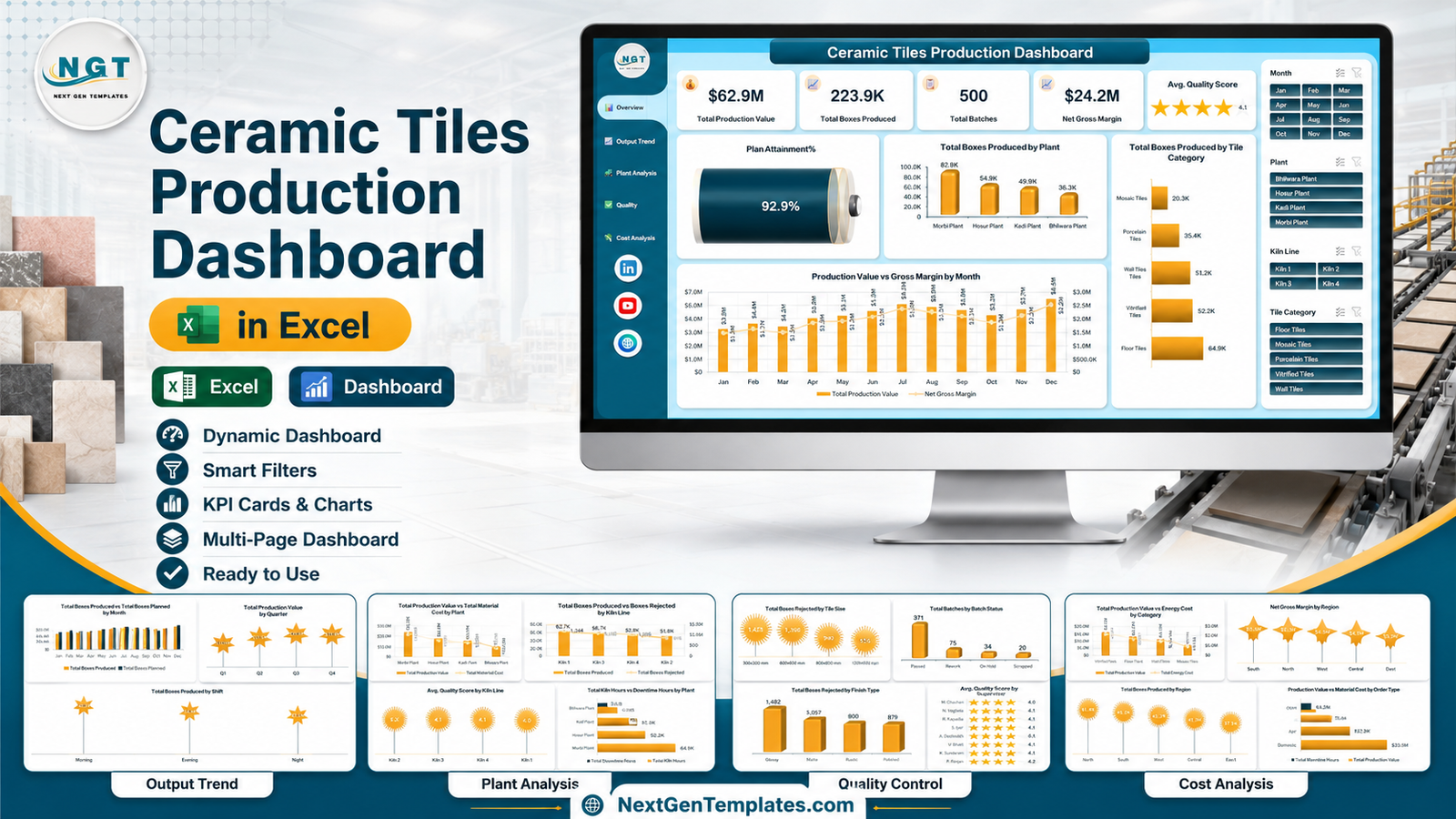
The Ceramic Tiles Production Dashboard in Excel reports on 500 sample batch records across 5 interactive pages, using 5 KPI cards, 20 charts and 4 page-synced slicers. It is a macro-free .xlsx with seven sheets – five dashboard pages, a Data sheet of 32 columns, and a Support sheet holding every pivot table. Setup takes under 10 minutes.
Most tile plants already have the numbers. What they do not have is a way to see them together. Boxes planned sits in one file, kiln hours in another, rejections in a supervisor’s notebook, and energy cost in an accounts spreadsheet nobody on the shop floor opens. The Ceramic Tiles Production Dashboard in Excel takes one flat batch table and produces the monthly production review off it – output against plan, kiln by kiln, plant by plant, and the cost picture beside it.
One thing to be clear about up front: this is a reporting workbook. It charts the numbers and labels your team types in. It does not test tiles, certify quality, assess plant or workplace safety, or produce anything a regulator or a customer would accept as evidence of conformance. The “Not a fit if” section below spells that out.
Key Features of the Ceramic Tiles Production Dashboard in Excel
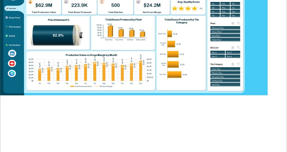
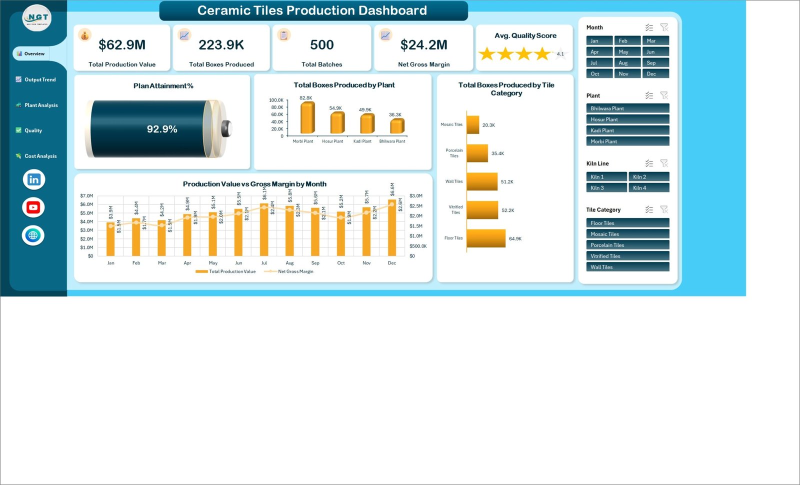
- Five KPI cards on the Overview – Total Production Value, Total Boxes Produced, Total Batches, Net Gross Margin and an Avg. Quality Score star card. On the shipped demo data they read $62.9M, 223.9K boxes, 500 batches, $24.2M and 4.1.
- A Plan Attainment % gauge that compares Boxes Produced against Boxes Planned. The demo data sits at 92.9%, and the gauge follows whatever plan figures you enter.
- 20 charts across five pages – four visuals on every page, so no page is a token screen.
- Four page-synced slicers – Month, Plant, Kiln Line and Tile Category. Click one and all five pages filter together, because the slicers sit on shared pivot caches.
- Kiln-level detail – Total Kiln Hours vs Downtime Hours by Plant, Total Downtime Hours by Month, and Total Boxes Produced vs Boxes Rejected by Kiln Line.
- Rejection analysis three ways – by Tile Size, by Finish Type and by Kiln Line, all from the counts you record.
- Cost and margin in the same workbook – Production Value charted against Raw Material Cost and Energy Cost, plus Net Gross Margin by Region and by Order Type.
- No macros and no add-ins – a plain .xlsx that opens in Excel 2016, 2019, 2021 and Microsoft 365 on Windows and Mac.
Two calculated fields do the arithmetic behind the KPI cards: Gross Margin is Production Value minus Raw Material Cost minus Energy Cost, and Plan Attainment is Boxes Produced divided by Boxes Planned. Both are visible in the workbook, so you can change the definition if your plant measures margin differently.
Dashboard Pages Explanation
Page 1: Overview
The landing page carries the five KPI cards along the top, then a battery-style Plan Attainment % gauge on the left. Beside it sit Total Boxes Produced by Plant and Total Boxes Produced by Tile Category, with Production Value vs Gross Margin by Month running the full width underneath. On the demo data, Morbi Plant leads at 82.8K boxes and Floor Tiles is the largest category at 64.9K.
Page 2: Output Trend
This page answers “are we hitting plan, and when do we lose time?”. Total Boxes Produced vs Total Boxes Planned by Month puts the two series side by side for all twelve months, Total Production Value by Quarter summarises the year in four markers, Total Downtime Hours by Month shows where the hours went, and Total Boxes Produced by Shift splits output across Morning, Evening and Night.
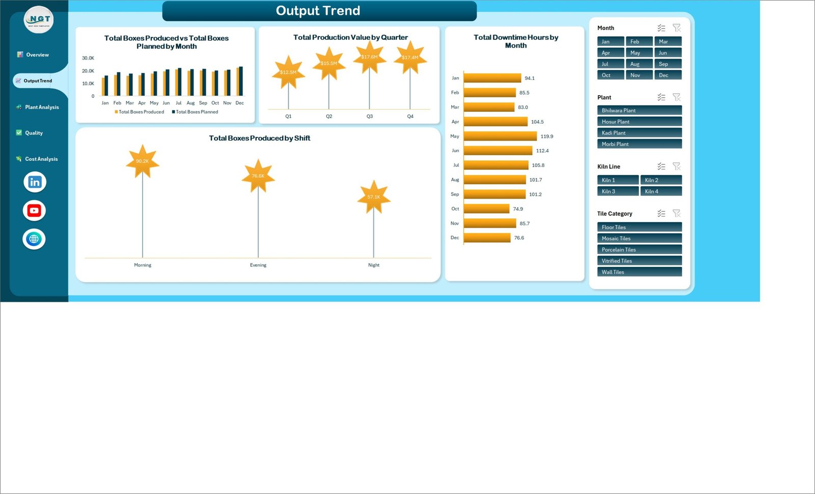
The shift chart is often the most useful one here. On the demo data Morning runs at 90.2K boxes against Night at 57.1K – the kind of gap that starts a staffing conversation rather than ending one.
Page 3: Plant Analysis
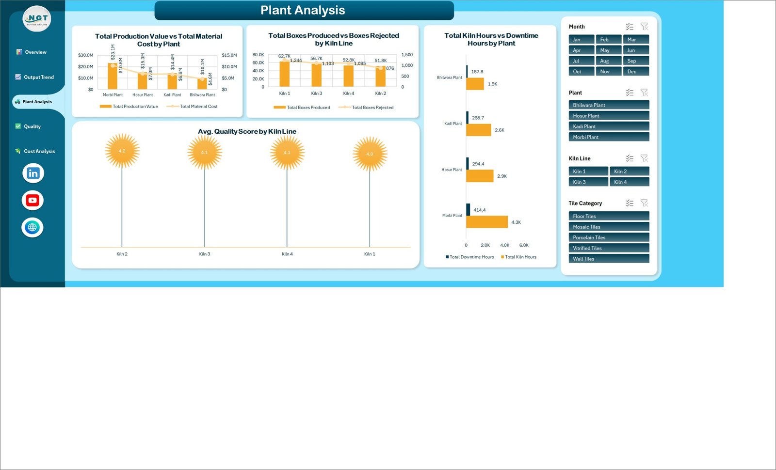
Four plants and four kiln lines compared directly: Total Production Value vs Total Material Cost by Plant, Total Boxes Produced vs Boxes Rejected by Kiln Line, Total Kiln Hours vs Downtime Hours by Plant, and Avg. Quality Score by Kiln Line. Because the value and cost series share an axis pair, a plant that produces a lot but consumes proportionally more material stands out immediately.
Page 4: Quality Control
The quality page summarises the labels your supervisors record. Total Boxes Rejected by Tile Size covers 300×300, 600×600, 800×800 and 1200×600 mm. Total Batches by Batch Status splits into Passed, Rework, On Hold and Scrapped – 371, 75, 34 and 20 on the demo data. Avg. Quality Score by Supervisor lists each supervisor with a star rating, and Total Boxes Rejected by Finish Type covers Glossy, Matte, Rustic and Polished.
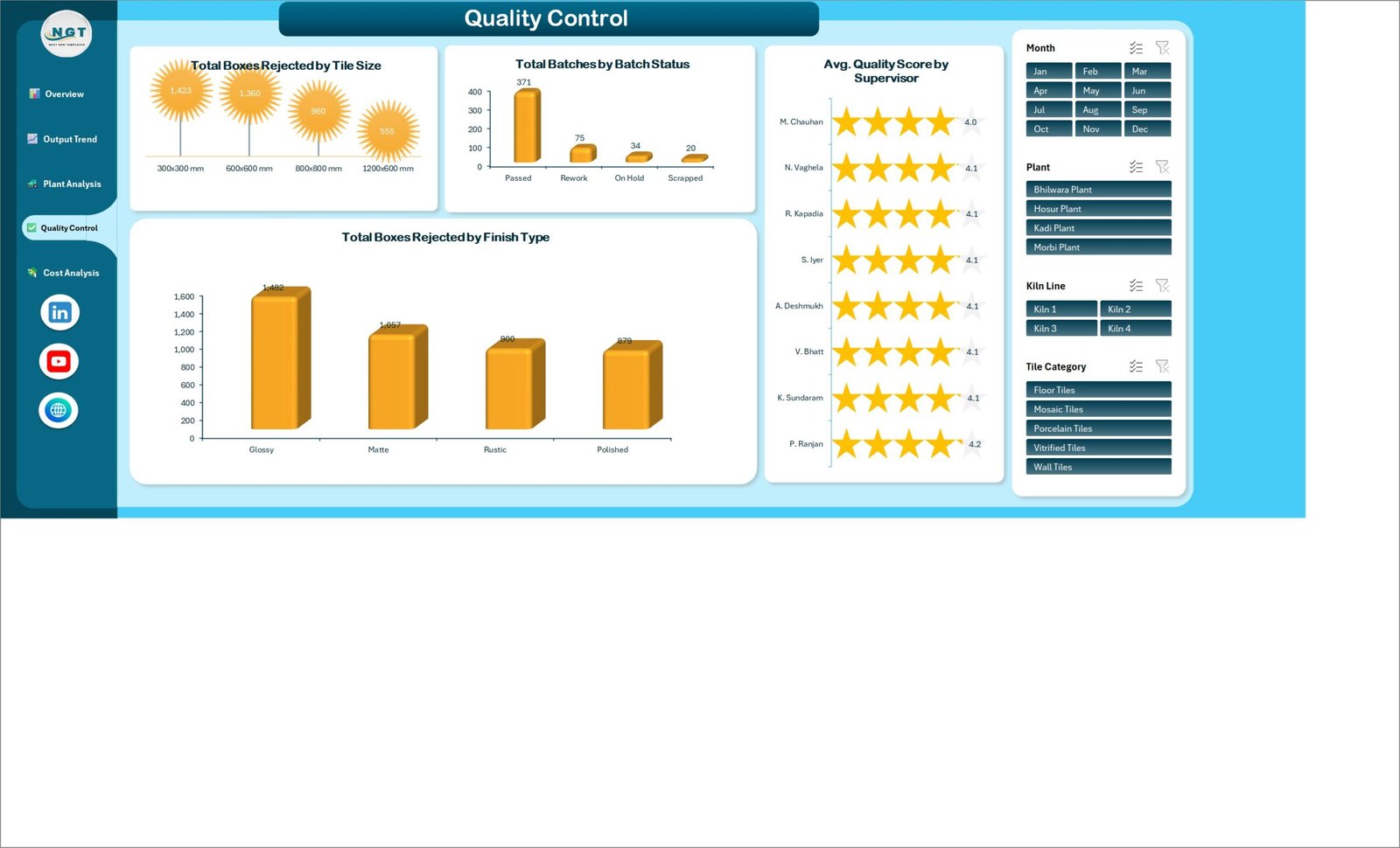
Worth repeating: Quality Score, Batch Status and Boxes Rejected are ordinary columns on the Data sheet. Somebody at your plant types them in, using your own internal grading rules. The dashboard averages and charts those entries. It is not a measurement, and a 4.1 star average is a summary of opinions your team recorded, not a laboratory finding.
Page 5: Cost Analysis
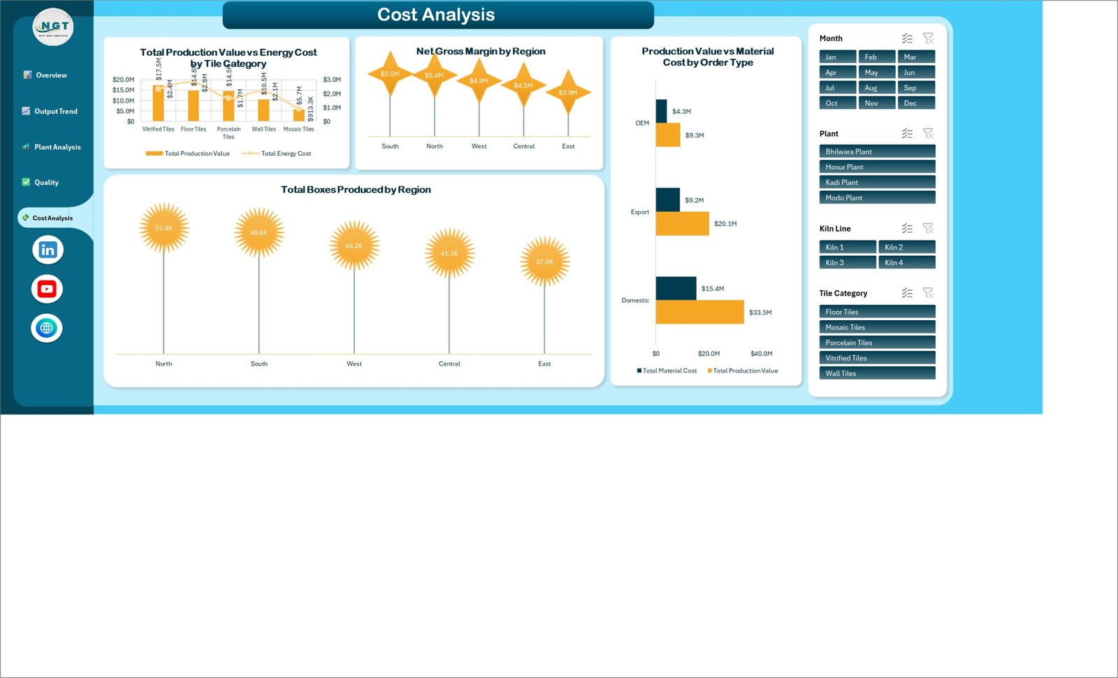
The commercial page carries Total Production Value vs Energy Cost by Tile Category, Net Gross Margin by Region across South, North, West, Central and East, Production Value vs Material Cost by Order Type for Domestic, Export and OEM business, and Total Boxes Produced by Region. On the demo data Domestic accounts for $33.5M of production value against $15.4M of material cost, while Export runs $20.1M against $9.2M.
Data sheet
500 demo batch rows across 32 columns: Batch ID, Production Date, Plant, Kiln Line, Shift, Supervisor, Tile Category, Tile Size, Finish Type, Order Type, Region, Batch Status, Dispatch Status, Boxes Planned, Boxes Produced, Boxes Rejected, Kiln Hours, Downtime Hours, Production Value, Raw Material Cost, Energy Cost, Quality Score, plus Month, Year and Quarter helper fields and a few count columns. Every row is invented sample data for demonstration – delete the lot and paste your own.
Support sheet
Every pivot table that drives the twenty charts lives here, out of the way of the dashboard pages. You never edit it. Its job is to let a single Refresh All update all five pages at once.
Ceramic Tiles Production Dashboard in Excel vs. a Google Sheets Build vs. Paid MES/SaaS – Feature Comparison
| Feature | Ceramic Tiles Production Dashboard in Excel | Google Sheets equivalent | SAP Digital Manufacturing / Tulip MES |
|---|---|---|---|
| Cost | $17.99 one-time | $0-25 build-it-yourself | $40-200 / user / month |
| Platform | Microsoft Excel 2016+ / 365, offline | Browser only | Vendor cloud |
| Setup time | Under 10 minutes | Hours to build from scratch | Weeks of implementation |
| Real-time team collaboration | Via OneDrive / SharePoint | Native | Native |
| Mobile access | Excel mobile app | Browser | App |
| Customisable fields | Every column and chart is editable | Editable | Vendor-controlled |
| Works with no internet | Yes | No | No |
| Kiln, shift and rejection breakdowns out of the box | 20 pre-built charts | Build each one yourself | Included |
| Year-1 cost at 5 users | $17.99 total | Your build time | $2,400-12,000 |
For a tile plant that wants plant, kiln, quality-label and cost reporting without an MES rollout, the Ceramic Tiles Production Dashboard in Excel sits in the sweet spot.
Who Should Use This Template
Perfect for:
- Production and plant managers at ceramic tile factories running one to six kiln lines
- Operations analysts who rebuild the same output-vs-plan chart by hand every month
- Finance and commercial teams who want production value, material cost, energy cost and margin in one file
- Consultants handing a client a ready-made monthly reporting pack
- Anyone in building materials – tiles, sanitaryware, bricks, cement products – whose data is batch-based
- Students and trainees learning pivot-table dashboard construction on a realistic manufacturing dataset
Not a fit if:
- You need product testing or conformance against tile standards such as ISO 13006 or EN 14411. This workbook performs no testing and makes no conformance claim.
- You need to record or prove technical properties like breaking strength, slip resistance or water absorption class. There are no such fields and no such logic.
- You are doing quality-management certification work (ISO 9001, ISO 14001), CE marking, or Declaration of Performance paperwork. This is not an audit or certification tool.
- You need plant safety, workplace safety or incident management. The workbook holds no safety data and must not be used for safety decisions.
- You need emissions, effluent or environmental-compliance reporting for a regulator.
- You want live machine or SCADA feeds. Rows are entered or pasted, not streamed from the kiln.
- You need many people editing at once with an audit trail. Use a database or an MES.
Real-World Use Cases
Rakesh runs a two-plant tile works with four kiln lines. On the first working day of each month he pastes the batch sheet into the Data tab, presses Refresh All, and filters to each plant with the slicer. His owners’ review now runs fifteen minutes off the Overview and Output Trend pages, instead of the two days he used to spend rebuilding charts.
Meera is the commercial controller at a building-materials group. She works almost entirely on the Cost Analysis page, comparing Production Value against Energy Cost by Tile Category before each quarterly price review, then checking Net Gross Margin by Region to see which sales territory is actually carrying the margin. The file never leaves her laptop, which suits her group’s data policy.
Anil consults for mid-size manufacturers. He hands the workbook over on day one of an engagement, swaps in the client’s plant and kiln names, and has a working monthly dashboard running while he is still learning the process. The client keeps it after he leaves.
Advantages of the Ceramic Tiles Production Dashboard in Excel
The biggest advantage is that it meets your team where they already are. Nobody needs an account, a licence seat or training on a new interface – the file opens in the Excel they use every day, and the four slicers are the only control anyone has to learn.
The second is cost. Five users on an MES-style platform will spend somewhere between $2,400 and $12,000 in the first year. This is a single $17.99 purchase with no per-user fee and no renewal, and it works offline, which matters when the plant network is unreliable.
The third is time. Because the pivot layer is already built on the Support sheet, the monthly cycle is paste-and-refresh rather than rebuild. Microsoft’s own documentation on slicers explains the mechanism if you want to extend it to a fifth or sixth filter.
Opportunities for Improvement
It is worth being honest about the edges. The dashboard is only as good as the data typed into it, and there is no validation stopping a supervisor from entering a Quality Score of 9 on a five-point scale. If accuracy matters, add data-validation lists to the Data sheet columns.
There is no OEE calculation. Availability, performance and quality are all derivable from the columns present – kiln hours, downtime hours, boxes planned, boxes produced and boxes rejected – but you would need to add the measures yourself.
Slicer behaviour is noticeably better in desktop Excel than in Excel for the web, so a team that lives in the browser will have a poorer experience. And because everything runs on pivot caches, very large datasets – hundreds of thousands of batch rows – will make the file slow. At that scale, move the data into Power Query or a database and keep this as the presentation layer.
Finally, there is no Power BI twin for this particular template. If you want the same shape in Power BI today, the Cement Mixer Production Dashboard in Power BI is the nearest equivalent.
Best Practices
- Fill Boxes Planned every month. The Plan Attainment gauge is the headline number and it needs a denominator.
- Keep your label vocabulary stable. “Kiln 1” and “Kiln-1” become two separate slicer buttons.
- Paste values, not formatted cells, when importing from your ERP export – it keeps the table clean.
- Refresh All (Ctrl+Alt+F5) after every paste. Charts do not update on their own.
- Keep an untouched copy of the original file before you delete the demo rows, so you always have a working reference.
- Save the monthly file as a dated PDF from each page – it becomes your review archive without any extra tooling.
- Add data validation to Plant, Kiln Line, Tile Category, Finish Type and Batch Status before handing the file to shift supervisors.
Explore Relevant Templates
The closest neighbour is the Cement Mixer Production Dashboard in Excel – same batch-and-plant structure, different industry – which also ships as a Cement Mixer Production Dashboard in Power BI. For a shorter ceramic scorecard, the Ceramic Manufacturing KPI Dashboard in Excel covers headline metrics only. The Flooring and Tiles KPI Dashboard in Power BI takes the tiles theme downstream into sales, while heavy-equipment teams usually pair this with the Railway Equipment Manufacturing Dashboard in Excel. Shop-floor supervisors who need daily entry rather than monthly reporting should look at the Daily Production Output Tracker in Google Sheets.
Buying more than one? The Plant Production Manager Toolkit – 9 Premium Templates (Excel + Power BI) bundles nine production templates together.
Frequently Asked Questions
Does the Ceramic Tiles Production Dashboard certify that my tiles meet ISO 13006 or EN 14411?
No. The Ceramic Tiles Production Dashboard in Excel performs no testing and issues no certificate. It charts the numbers and labels your team types in. Conformance to tile standards, CE marking and Declarations of Performance require an accredited testing laboratory and sit entirely outside this workbook.
What KPIs does the Ceramic Tiles Production Dashboard in Excel track?
It tracks Total Production Value, Total Boxes Produced, Total Batches, Net Gross Margin, Average Quality Score and Plan Attainment %, plus kiln hours, downtime hours, boxes rejected, raw material cost and energy cost. Every figure recalculates when you replace the demo data with your own.
Is the Quality Score a real test result?
No. Quality Score, Batch Status and Boxes Rejected are ordinary columns your supervisors fill in from your own internal grading. The Ceramic Tiles Production Dashboard in Excel averages and charts those entries. It does not measure, verify or validate them in any way.
How long does setup take?
Under 10 minutes. Unzip the file, open the Data sheet in the Ceramic Tiles Production Dashboard in Excel, delete the 500 demo rows, paste your own batch records in the same column order and press Refresh All. There is nothing to install and no add-in to configure.
How does this compare to an MES like SAP Digital Manufacturing or Tulip?
An MES connects to machines, enforces workflow and costs $40-200 per user per month. The Ceramic Tiles Production Dashboard in Excel is a $17.99 one-time reporting layer over data you already keep in a spreadsheet. It does not replace an MES and it needs no rollout.
Can I add my own plants, kiln lines and tile sizes?
Yes. Type your own values into the Plant, Kiln Line, Tile Category, Tile Size, Finish Type and Region columns. Every chart in the Ceramic Tiles Production Dashboard in Excel is pivot-driven, so new labels appear in the slicers after a refresh with no formula editing.
Does it need macros, and which Excel versions work?
The Ceramic Tiles Production Dashboard in Excel is a macro-free .xlsx built on pivot tables, pivot charts and slicers. It opens in Excel 2016, 2019, 2021 and Microsoft 365 on Windows and Mac. Slicers behave best in the desktop app rather than Excel for the web.
About the Author
Built by PK – Microsoft Certified Professional with 15+ years of Excel, Google Sheets, and Power BI experience. Founder of NextGenTemplates, reaching 300K+ subscribers across YouTube channels. Every template is hand-built and tested before release.
Conclusion
If your tile plant already records batches in a spreadsheet, the Ceramic Tiles Production Dashboard in Excel is the fastest route from those rows to a monthly review that people actually read. Five pages, twenty charts, four slicers, no macros, and no subscription – and an honest scope: it reports what you record, and leaves testing, certification and compliance to the people and laboratories qualified to do them.
👉 Click here to Purchase the Ceramic Tiles Production Dashboard in Excel
Instant download · One-time payment · No subscription
For step-by-step Excel dashboard tutorials, visit Youtube.com/@PK-AnExcelExpert.
Last updated: August 2026