A cement mixer plant generates one row per batch, and by the end of a year that is a few thousand rows of planned units, produced units, rejects, machine hours, downtime and cost. The data is almost always there. What is usually missing is the half-day of pivot-building that turns it into a report somebody will actually read on a Monday morning.
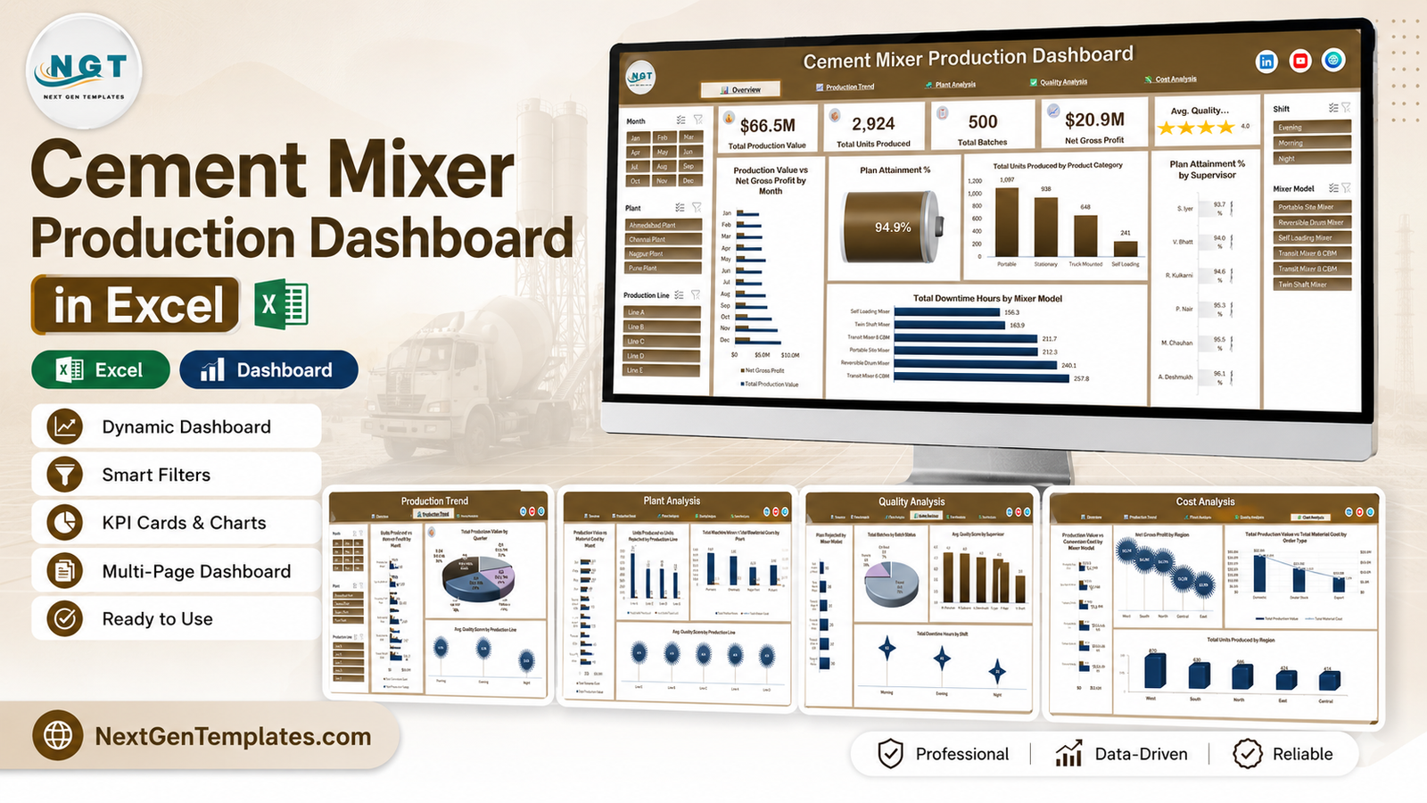
The Cement Mixer Production Dashboard in Excel is that half-day, already done. It is a single .xlsx workbook with seven sheets: five linked dashboard pages, a Data sheet carrying 500 demo batch records across 31 columns, and a Support sheet holding every pivot table behind the charts. Across the five pages there are 21 charts, four KPI cards, an average quality gauge and five slicers shared across the workbook. There are no macros, no add-ins and no external connections – it opens on a locked-down corporate laptop. Cement Mixer Production Dashboard in Excel
Before anything else, one clarification worth making early: the 500 rows shipped in the Data sheet are demo data. They exist so every chart has something to draw. They are not benchmarks, and nothing in this workbook tests materials, validates a mix design, checks a standard or manages a compliance obligation. More on that below.
Key Features of the Cement Mixer Production Dashboard in Excel
- Five pages, one navigation bar. Overview, Production Trend, Plant Analysis, Quality Analysis and Cost Analysis, each reachable from a hyperlink strip at the top of every sheet.
- Four KPI cards plus a quality gauge. Total Production Value, Total Units Produced, Total Batches and Net Gross Profit, with a five-star average quality score beside them.
- Five shared slicers. Month, Plant and Production Line on the left rail; Shift and Mixer Model on the right. They are wired to the pivot cache, so one click re-filters the whole page.
- 21 pivot charts. Every visual reads a pivot table on the Support sheet rather than a hand-built formula range, which is what makes the whole thing survive a data swap.
- A 31-column data model. Batch ID, production date, plant, line, shift, supervisor, product category, mixer model, order type, region, batch status, schedule status, units planned, units produced, units rejected, machine hours, downtime hours, production value, material cost, conversion cost, quality score, and the derived month/year/quarter and counter columns the pivots use.
- Nothing locked. No password, no protected sheets, no hidden VBA. Rename the plants, add a column, recolour the theme. Cement Mixer Production Dashboard in Excel
Dashboard Pages Explanation
Overview
The landing page answers “how did the year go” in one screen. In the demo data the four cards read $66.5M total production value, 2,924 units produced, 500 batches and $20.9M net gross profit, with an average quality score of 4.0 out of 5.
Underneath, Production Value vs Net Gross Profit by Month puts revenue and margin on the same twelve bars. A cylinder gauge shows Plan Attainment % – 94.9% across the demo year, which is the single number most production meetings open with. Total Units Produced by Product Category splits output four ways (Portable 1,097, Stationary 938, Truck Mounted 648, Self Loading 241), and Plan Attainment % by Supervisor ranks the six supervisors from 93.7% to 96.1%. Total Downtime Hours by Mixer Model closes the page, and in the demo set Transit Mixer 6 CBM carries the most downtime at 257.8 hours against Self Loading Mixer’s 156.3. Cement Mixer Production Dashboard in Excel
Production Trend
This is the time page. Units Produced vs Units Planned by Month is the honest one – the gap between the two bars is the whole story, and in the demo year the planned bar sits above produced in every month. Total Production Value by Quarter shows the year loading into Q4 (34% of value against Q1’s 20%). Total Downtime Hours by Month traces a twelve-point line that peaks in March at 123.5 hours and bottoms out in June at 85.5. Total Units Produced by Shift compares Morning (1,194), Evening (1,075) and Night (655).
Plant Analysis
Four charts about where output actually happens. Production Value vs Material Cost by Plant pairs the two bars for Pune, Chennai, Nagpur and Ahmedabad. Units Produced vs Units Rejected by Production Line puts Line A through Line E side by side and immediately shows that the busiest line is not automatically the worst – Line A produces 755 units with 36 rejected, while the much smaller Line D produces 488 with 33. Total Machine Hours vs Total Downtime Hours by Plant gives the utilisation angle, and Avg. Quality Score by Production Line rounds the page off. Cement Mixer Production Dashboard in Excel
Quality Analysis
Batch outcomes, exactly as your team records them. Units Rejected by Mixer Model ranks the six models from 10 to 30 rejected units. Total Batches by Batch Status splits the 500 demo batches into Passed 374 (75%), Rework 89 (18%) and On Hold 37 (7%). Avg. Quality Score by Supervisor and Total Units Rejected by Shift (Morning 62, Evening 45, Night 24) complete it.
Worth being precise here: batch status and quality score are fields somebody types in. The dashboard groups and charts them. It does not assess, test or verify anything. Cement Mixer Production Dashboard in Excel
Cost Analysis
The margin page. Production Value vs Conversion Cost by Mixer Model shows where conversion cost eats into value per model. Net Gross Profit by Region ranks West ($5.7M), South ($4.9M), North ($4.7M), Central ($3.1M) and East ($2.5M). Total Production Value vs Total Material Cost by Order Type compares Domestic ($32.6M value against $18.6M material), Dealer Stock ($21.0M / $12.0M) and Export ($13.0M / $7.2M). Total Units Produced by Region closes the workbook.
Cement Mixer Production Dashboard in Excel vs. Google Sheets vs. Paid MES or ERP – Feature Comparison
| This Excel dashboard | Google Sheets equivalent | Paid MES / ERP module | |
|---|---|---|---|
| Cost | $17.99 one-off | $9.99-$18.99 one-off | $40-$150 per user / month |
| Platform | Excel 2016+ / Microsoft 365, works offline | Browser, needs a connection | Vendor-hosted browser app |
| Setup time | Under an hour | Under an hour | Weeks, with an implementation partner |
| Real-time collaboration | OneDrive / SharePoint co-authoring | Native | Native |
| Mobile access | Excel mobile app | Yes | Yes |
| Customisable fields | Unlimited – your workbook | Unlimited | Vendor-controlled |
| Share with link | Yes, once in OneDrive | Yes | Yes |
| Year-1 cost at 5 users | $17.99 | Under $20 | $2,400-$9,000 |
| Plan attainment by supervisor | Built in | Built in | Configurable |
| Live machine / PLC capture | No | No | Yes |
Who Should Use This Template
It suits a production manager at a cement mixer or construction-equipment works who already keeps a batch log and wants a monthly pack out of it; an operations analyst who needs plan-versus-actual, downtime and rejection charts without rebuilding pivots each month; a finance partner tracking gross margin by plant, region and order type; and a consultant assembling a reporting pack for a manufacturing client.
It is the wrong tool if you need a plant safety or workplace-safety system, concrete or aggregate strength testing, cube-test records, mix-design validation, conformance checking against ASTM, EN or IS standards, ISO 9001 or ISO 14001 certification documentation, emissions monitoring or environmental compliance returns, live machine data capture, or a multi-user database with logins and an audit trail. None of those are in scope, and none should be inferred from a chart in this workbook.
Real-World Use Cases
Monthly production review. Rahul manages two mixer works. On the first working day he pastes last month’s 180 batch rows over the demo data, refreshes, filters Plant Analysis to his site and prints one page. The machine-hours-against-downtime chart is what his maintenance lead argues about for the rest of the meeting.
Quarterly board exhibit. Ayesha keeps one workbook per quarter for a construction-equipment group. She uses Production Trend to show where planned ran ahead of produced, then lifts the Cost Analysis page straight into the board pack as the margin-by-region slide.
Client deliverable. Daniel consults independently. He re-labels the dimensions to the client’s own plant and line names, swaps the theme colours, and hands over a working reporting pack in a day rather than quoting a two-week build.
Advantages of the Cement Mixer Production Dashboard in Excel
- It survives a data swap. Because every chart sits on a pivot rather than a hard-coded range, replacing 500 rows with 5,000 needs one Refresh All, not a re-link of 21 charts.
- No IT ticket. Plain .xlsx, no macros, no Power Query connections, no add-in – so it opens where macro-enabled workbooks are blocked.
- Slicers instead of filter dropdowns. Five slicers give a shop-floor-friendly interface that anyone can drive without touching a pivot field list. Microsoft’s own guide to using slicers to filter data is a good ten-minute primer if slicers are new to your team.
- Cost, quality and output in one file. Most free production templates cover output only; this one carries material cost, conversion cost and net gross profit alongside it.
- One-time price. No renewal, no seat count, and the file keeps working with no internet connection.
Opportunities for Improvement
An honest list, because every template has one:
- It is not a data-entry system. There is no form, no validation and no duplicate check – you paste rows in. If your team enters batches by hand, add data validation lists to the Data sheet columns first.
- Slicer behaviour is limited in Excel for the web. The file opens there, but the full slicer experience needs the desktop app.
- Currency is generic. The demo values are formatted with a dollar sign; change the number format on the Support sheet pivots if you report in another currency.
- Quality score is a single average. There is no distribution or control-chart view. If you need one, the Support sheet is the place to add a pivot for it.
- No year-on-year comparison page. The model carries a Year column, so the pivot is easy to add – it just is not built.
Best Practices
- Delete the demo rows before you start. Mixing demo batches with real ones is the single easiest way to produce a wrong number in a meeting.
- Keep the header row exactly as shipped. The pivots reference these 31 field names. Rename a header and the chart bound to it empties.
- Store dates as dates. Text dates break the month, quarter and trend groupings.
- Refresh, then read. Data > Refresh All after every paste. Slicer lists only pick up new plants or models on a refresh.
- Save a monthly snapshot. Keep one file per period rather than overwriting – the workbook has no history table.
- Add new metrics on the Support sheet. Build the pivot there, then chart it. Charting the Data sheet directly is what makes a dashboard fragile.
Explore Relevant Templates
- Cement Mixer Production Dashboard in Excel – the template this article walks through.
- Cement Mixer Production Dashboard in Power BI – the same data model rebuilt as a Power BI report for teams publishing to the service.
- Ceramic Tiles Production Dashboard in Excel – the closest industrial-production neighbour, same five-page structure.
- Cement and Steel Dashboard in Google Sheets – browser-based, for teams that live in Sheets.
- Manufacturing Efficiency Dashboard in Excel and Industrial Gas Production Dashboard in Excel – the same throughput and downtime questions in other industries.
- Plant Production Manager Toolkit – nine Excel and Power BI templates bundled for plant reporting.
Frequently Asked Questions
Does this dashboard test concrete strength, validate mix designs or confirm ASTM, EN or IS conformance?
No. It reports the production, cost and quality figures you enter and performs no materials testing, no mix-design calculation and no standards checking. It is not evidence of conformance to any standard.
Is it a safety or environmental compliance tool?
No. There is no plant or workplace safety process in it, no incident register, no emissions monitoring and no ISO certification support. Treat it strictly as production reporting.
Is the sample data real?
No. The 500 batch rows are demo data generated so the charts render. Delete them before use and do not read the figures as industry benchmarks.
Which Excel versions does it need?
Excel 2016, 2019, 2021 or Microsoft 365 on Windows for the full experience. Excel for Mac works with minor slicer-styling differences; Excel for the web displays the file but limits slicer behaviour.
Are macros required?
No. It is a plain .xlsx built on pivot tables and pivot charts, so it opens fine where macro-enabled files are blocked.
Can I add my own plants, lines or mixer models?
Yes. Type the new values into the Data sheet and refresh – slicers and pivots pick them up automatically. For a new metric, add the column, add a pivot on the Support sheet and chart it like the others.
Can several people use it at once?
Store it in OneDrive or SharePoint and Excel co-authoring lets a few people work in it together. It is a workbook, not a database – there are no logins, roles or audit trail.
About the Author
Built by PK – Microsoft Certified Professional with 15+ years of Excel, Google Sheets, and Power BI experience. Founder of NextGenTemplates, reaching 300K+ subscribers across YouTube channels. Every template is hand-built and tested before release.
Conclusion
The Cement Mixer Production Dashboard in Excel does one job well: it takes a batch log you already keep and turns it into five pages a production meeting can work from – output against plan, downtime by model and month, rejects by line and shift, and margin by plant, region and order type. It is a reporting layer, not a manufacturing system, and it is deliberately honest about that boundary.
If your batch data already lives in a spreadsheet, the setup is a paste and a refresh. Get the Cement Mixer Production Dashboard in Excel and have your first filtered production pack on screen within the hour.
For step-by-step Excel dashboard tutorials, subscribe on YouTube: youtube.com/@PKAnExcelExpert.