Most flooring contractors already know their revenue. Far fewer can tell you, on the first Monday of the month, whether Material Waste % beat target, whether Install Callback Rate % is drifting, and who owns the answer. The Flooring Installation KPI Dashboard in Power BI exists to close that gap: 14 flooring-specific KPIs across 8 KPI groups, scored against target MTD and YTD, on four report pages driven by more than 100 DAX measures and a plain Excel workbook you control.
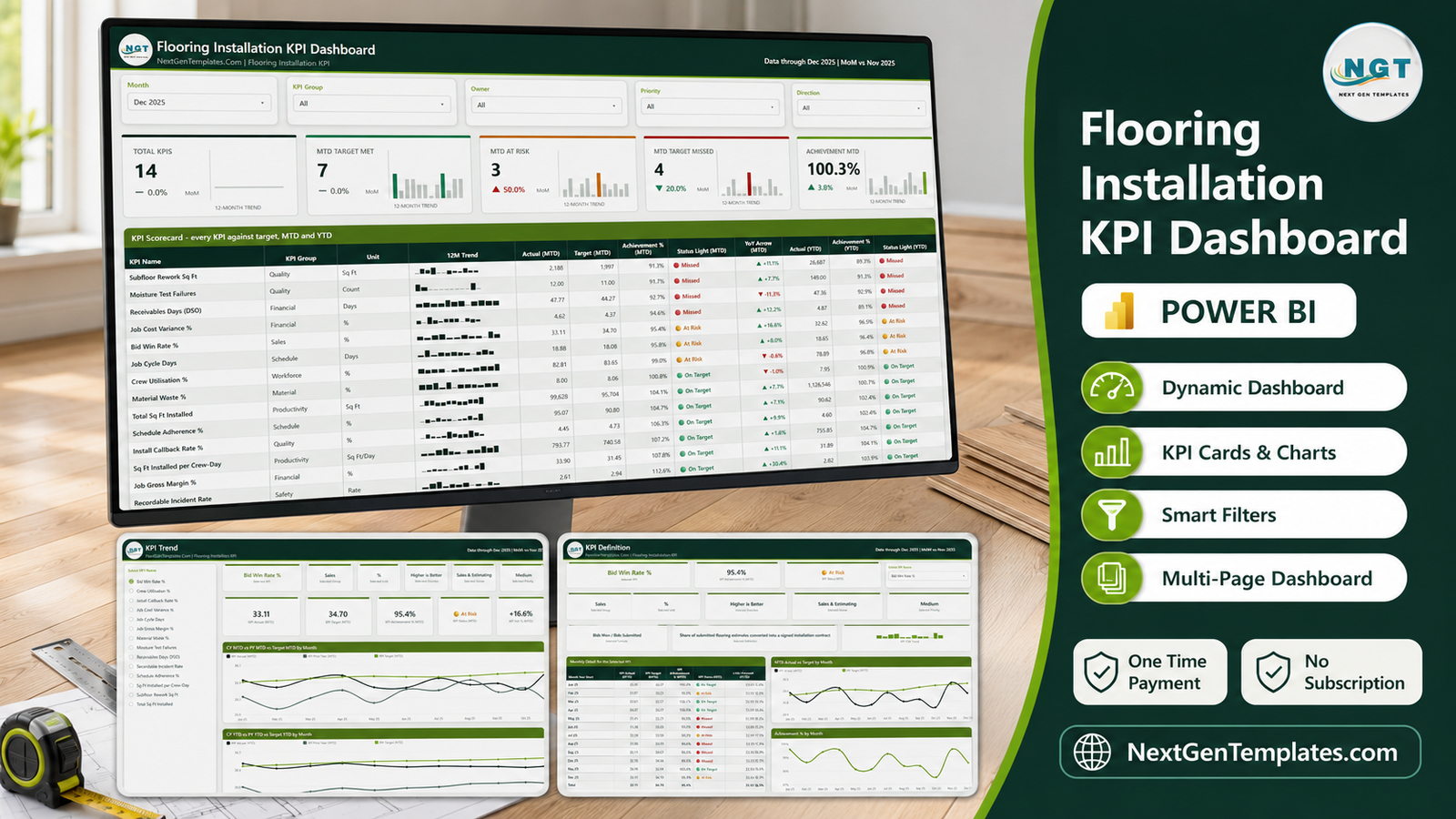
It ships as one ZIP: a fully editable .pbix, the Data.xlsx workbook it reads from, and a user manual PDF. There is no subscription, no per-seat licence, and no locked visual. The sample data covers Jan-Dec 2025 plus the whole prior year, so every year-on-year arrow on the report has something real behind it the moment you open the file.
Key Features of the Flooring Installation KPI Dashboard in Power BI
- 14 KPIs chosen for flooring installation work, not generic business metrics: Sq Ft Installed per Crew-Day, Total Sq Ft Installed, Crew Utilisation %, Material Waste %, Subfloor Rework Sq Ft, Moisture Test Failures, Install Callback Rate %, Job Cycle Days, Schedule Adherence %, Job Cost Variance %, Job Gross Margin %, Bid Win Rate %, Receivables Days (DSO) and Recordable Incident Rate.
- Eight KPI groups – Productivity, Workforce, Material, Quality, Schedule, Financial, Sales and Safety – so a review can be run one department at a time.
- Direction-aware achievement. Six KPIs are higher-is-better (UTB) and eight are lower-is-better (LTB). A lower-is-better KPI scores target divided by actual, so beating a waste or cycle-time target reads above 100% rather than looking like a failure.
- Three-state traffic lights – On Target at 100% or more, At Risk between 95% and 100%, Missed below 95% – shown separately for MTD and YTD on every row.
- Five slicers, synced across pages: Month, KPI Group, Owner, Priority and Direction.
- A 12-month sparkline inside every scorecard row, so the level and the shape arrive together.
- An accountable owner and a Critical / High / Medium priority on every KPI, which is what turns a dashboard into a meeting agenda.
- Two hidden tooltip pages that give hover detail on the scorecard and trend visuals without a single extra click.
- Native Power BI visuals only and a single custom theme file, so re-branding is one edit and nothing depends on an AppSource visual that might be retired.
Dashboard Pages Explanation
Page 1 – KPI Scorecard
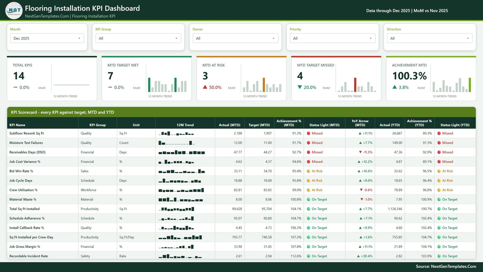
Five summary cards sit across the top: Total KPIs, MTD Target Met, MTD At Risk, MTD Target Missed and Achievement MTD, each carrying a month-on-month delta and a 12-month bar trend. In the shipped sample month of December 2025 that reads 14 KPIs tracked, 7 on target, 3 at risk, 4 missed, and 100.3% overall achievement – which is exactly the kind of headline that starts a useful conversation, because a perfectly respectable aggregate is hiding four misses underneath it.
Below the cards, the scorecard table lists every KPI with its group, unit, sparkline, MTD actual, MTD target, MTD achievement %, MTD status light, a year-on-year arrow, then YTD actual, YTD achievement % and YTD status light. The table is sorted by achievement, so the worst performers are always at the top. Subfloor Rework Sq Ft leads at 2,188 against a 1,997 target (91.3%, Missed); Recordable Incident Rate closes it at 2.61 against 2.94 (112.6%, On Target).
Page 2 – KPI Trend
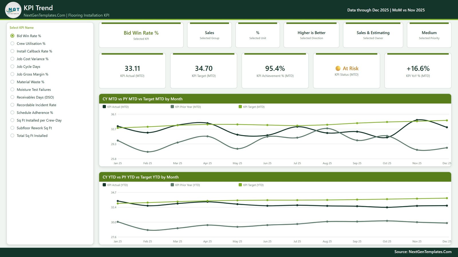
Select one KPI from the list on the left and the entire page becomes that KPI. Six context cards restate the selected group, unit, direction, owner and priority – so nobody reads a number without knowing what it is or who answers for it – and five value cards give actual, target, achievement %, status and year-on-year change. Two line charts follow: CY MTD vs PY MTD vs Target MTD by Month and CY YTD vs PY YTD vs Target YTD by Month, each plotting this year, last year and target across the full twelve months.
Page 3 – KPI Definition
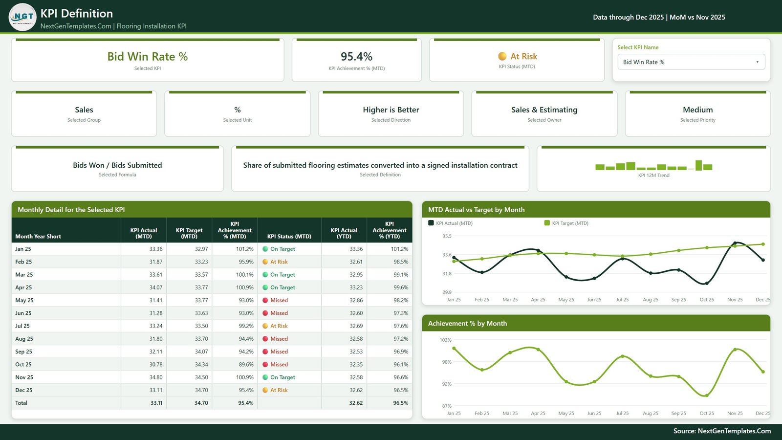
The page that ends the definitional arguments. For the selected KPI it prints the calculation and the plain-English definition side by side – Bid Win Rate % is “Bids Won / Bids Submitted”, defined as the share of submitted flooring estimates converted into a signed installation contract – alongside owner, priority and direction. Underneath sits a month-by-month table of MTD actual, MTD target, achievement %, status and YTD figures for all twelve months, plus MTD Actual vs Target by Month and Achievement % by Month charts. The KPI slicer on this page is synced with the trend page, so a KPI picked on one is already picked on the other.
Page 4 – Get More Templates
A catalogue page listing other NextGenTemplates Power BI dashboards, plus a short guide to customising this one. It carries no data. Delete it before you circulate the file internally.
The data behind it
Data.xlsx holds four sheets: a Read Me, KPI Definition (14 rows – group, unit, formula, definition, direction, owner, priority), Input_ Target (168 rows: 14 KPIs x 12 months) and Input_ Actual (336 rows: the same for the reporting year and the year before). Nothing in the report hard-codes a KPI name, so adding, renaming or deleting a KPI is a spreadsheet edit followed by Home > Refresh. If you move the files apart, repoint the query in Transform data > Data source settings, as described in the Microsoft Learn documentation on Power BI data sources.
Power BI Template vs. Tableau or Qlik vs. Paid Contractor SaaS – Feature Comparison
| This Power BI template | Tableau / Qlik build | Procore, ServiceTitan, RFMS | |
|---|---|---|---|
| Cost | One payment | Licence plus build time | Per-user monthly subscription |
| Platform | Power BI Desktop (free) | Tableau Desktop / Qlik Sense | Vendor cloud |
| Setup time | Open, swap the workbook data, refresh | Model and design from scratch | Onboarding and data migration |
| Real-time team collaboration | No – refresh on demand | Via paid server | Yes |
| Mobile access | Only if you publish it yourself | Via paid server | Native apps |
| Customizable fields | Every KPI, group, owner and target | Yes, if you build it | Limited to vendor fields |
| Share with link | Send the file, or publish to your workspace | Server link | Account invite |
| Year-1 cost at 5 users | The one-time template price | Licences plus consultant days | Typically four figures and up |
| Direction-aware KPI scoring | Built in for all 14 KPIs | You write the logic | Fixed vendor metrics |
| Where your data lives | Your own files | Your own files or server | The vendor’s cloud |
Who Should Use This Template
It suits flooring installation contractors running roughly 5 to 60 crews who already capture job, crew and cost numbers somewhere – a job-costing system, an accounts package, or a set of spreadsheets – and want one monthly page that scores them. It suits operations managers who report upward every month and would rather present a scorecard than a slide deck. And it suits Power BI users who would sooner adapt a finished, documented model than build the DAX for direction-aware achievement themselves.
It is a poor fit if you were hoping for estimating or takeoff software, a crew-scheduling system, or a live connector into QuickBooks, Sage, Procore, ServiceTitan, RFMS or Measure Square. There is none. You export or type your monthly numbers into the Excel workbook. It is also not a compliance tool: Moisture Test Failures is a count you enter, not an ASTM F2170 test the report performs, and Recordable Incident Rate is a number you type – there is no OSHA 300 or 300A log behind it and it evidences nothing about your safety programme.
Real-World Use Cases
The monthly operations review. An operations manager at a 30-crew commercial installer opens the scorecard on the closing month, sets the Priority slicer to Critical, and walks supervisors through only the five KPIs that decide the bonus pool – Material Waste %, Install Callback Rate %, Job Cost Variance %, Job Gross Margin % and Moisture Test Failures. The other nine stay on the page but off the agenda.
The finance check. A finance lead filters Owner to Finance and reviews Job Gross Margin % and Receivables Days (DSO) alone. When DSO reads 47.77 days against a 44.27-day target, she opens KPI Definition and shows the collections team the twelve-month table, which settles whether it is a trend or a single bad month faster than any argument does.
The consultant’s starting model. A Power BI consultant keeps the file as a base for trade-contractor clients: swap the 14 KPI rows in the workbook, keep the achievement measures, the traffic lights, the sparklines and the synced slicers, and a bespoke client scorecard becomes a day’s work rather than a week’s.
Advantages of the Flooring Installation KPI Dashboard in Power BI
- The scoring logic is already correct. Direction-aware achievement is the part most home-built KPI reports get wrong, and it is the part that makes a lower-is-better KPI readable at a glance.
- Every KPI has a name attached. Owner and priority are columns in the data, not annotations, so they filter.
- It is genuinely editable. No locked visuals, no proprietary components, and one theme file for the whole colour scheme.
- The prior year is already modelled. Year-on-year arrows work on day one because Input_ Actual carries two years, not one.
- Small footprint. The whole package is under 300 KB and opens in seconds.
Opportunities for Improvement
Three honest limitations, so nothing surprises you after the download.
There is no drillthrough. This build contains no drillthrough definitions at all. The KPI Definition page is reached by picking a KPI from a slicer that is synced with the KPI Trend page – so if you right-click a scorecard row expecting a drill menu, nothing will happen. That is by design, and the report’s own guidance page says as much, but it is worth knowing before you go hunting.
Refresh is manual. The model imports from a local Excel file. There is no scheduled refresh, no gateway and no live connection unless you set one up yourself.
The numbers are samples. Every figure in the shipped file is realistic demonstration data for 2025 and the prior year – not benchmarks, not industry averages, and not anything you should quote. Replace them.
Worth noting for anyone comparing editions: the workbook-line faults reported against the Excel edition of this dashboard – a KPI count label that disagreed with the KPI list, and off-topic examples left in a Read Me – were checked against this Power BI build and are not present. The card reads 14, the scorecard lists 14, the KPI slicer lists 14, and the Read Me is written for flooring. Number formatting uses standard thousands grouping throughout.
Best Practices
- Fix your KPI definitions before your data. Fill the KPI Definition sheet first and get the formula wording agreed – it prints on the report, and a KPI that two people define differently is worse than no KPI.
- Make YTD an average for rates. For any %, Days, Ratio or Index, YTD should be the average of the months so far, never the sum. A completion percentage that adds up to 1,900% by December is the single most common mistake in a KPI pack.
- Set targets you would defend in the meeting. The traffic lights are only as honest as the target column.
- Use Priority to shorten the review. Fourteen KPIs is too many for a 30-minute meeting; four Critical ones is not.
- Keep the .pbix and Data.xlsx in the same folder so the refresh path stays valid, and take a copy before you restructure anything.
Explore Relevant Templates
- Flooring and Tiles Dashboard in Power BI – the analytical report for the same trade, if you want to slice the detail rather than score it.
- Flooring and Tiles KPI Dashboard in Power BI – the retail and supply side of flooring.
- Electrical Contractor KPI Dashboard in Power BI and Plumbing Business KPI Dashboard in Power BI – the same scorecard pattern for the other trades.
- Flooring Installation KPI Scorecard in Excel – a smaller ten-KPI workbook on the same subject.
Frequently Asked Questions
Do I need a paid Power BI licence?
No. Power BI Desktop is free from Microsoft and opens the file. A Pro or Premium licence is only needed if you want to publish the report and share it through the Power BI Service.
How many pages does the report have?
Four visible pages – KPI Scorecard, KPI Trend, KPI Definition and Get More Templates – plus two hidden tooltip pages that appear on hover.
Can I use my own KPIs instead of the 14 supplied?
Yes. Add, rename or delete rows in Data.xlsx – the name is the join key across all three sheets – then press Home > Refresh. Every card, chart and table follows.
Why does a KPI score above 100%?
Because achievement is direction-aware. Lower-is-better KPIs score target divided by actual, so beating a target lands above 100%. Recordable Incident Rate at 2.61 against a 2.94 target reads 112.6%.
Is there an Excel edition of this exact dashboard?
Yes – see Flooring Installation KPI Dashboard in Excel. The two editions cover the same subject but their KPI lists are not identical, so compare both if the exact metrics matter to you.
Does it connect to my accounting or job-costing system?
No. It reads a local Excel workbook. There is no connector to QuickBooks, Sage, Procore, ServiceTitan, RFMS or Measure Square.
Is the data in the file real?
No. It is realistic sample data for Jan-Dec 2025 and the prior year, built to demonstrate the model. Replace it with your own before you show anyone.
About the Author
Built by PK – Microsoft Certified Professional with 15+ years of Excel, Google Sheets, and Power BI experience. Founder of NextGenTemplates, reaching 300K+ subscribers across YouTube channels. Every template is hand-built and tested before release.
Conclusion
A flooring installation business is decided by a handful of numbers that most owners only see once a quarter, if at all. The Flooring Installation KPI Dashboard in Power BI puts 14 of them on one page, scores them correctly in both directions, attaches an owner and a priority to each, and gives you the twelve-month story and the formula behind any of them in two clicks. It is a scorecard, not an analytics playground, and it is deliberately small enough to actually get used every month.
Get the Flooring Installation KPI Dashboard in Power BI on NextGenTemplates – one payment, instant download, fully editable .pbix.
For Power BI and Excel walkthroughs, subscribe to youtube.com/@PKAnExcelExpert.