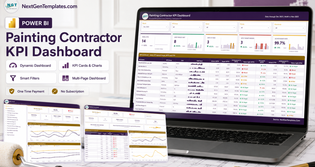
Every painting business measures roughly the same handful of things: how much wall went up, what the paint cost to put there, how many jobs came back for touch-ups, and whether the money arrived. The trouble starts the month somebody asks whether 41.4% job gross margin is good, whether 52 days sales outstanding is worse than last November, and who exactly is supposed to fix a bid win rate that has sat under target for eleven months. The Painting Contractor KPI Dashboard in Power BI answers all of that on one screen: 14 painting-contracting KPIs across 8 KPI groups, each with a target, a month-to-date and year-to-date traffic light, a year-on-year arrow, a 12-month sparkline, a named owner and a priority.

One thing to be clear about before anything else, because the names look alike in a catalogue: this is a KPI scorecard. It answers “did we hit the number this month, and who owns it”. It is not an analytical dashboard that slices jobs, crews and cost codes so you can explore why – that is a different kind of report. It is also not the lighter one-page KPI Scorecard line, which exists for this same trade in Excel and Google Sheets. And it is emphatically not a compliance, estimating or safety system; more on that below, because on a painting trade it matters.
Key Features of the Painting Contractor KPI Dashboard in Power BI
- 14 KPIs across 8 groups – Production, Materials, Quality, Estimating, Financial, Workforce, Scheduling and Safety. The full list: Production Rate per Painter-Day, Sq Ft Painted, Coverage Yield per Gallon, Material Cost per 100 Sq Ft, Touch-Up Hours, Punch-List Items per Job, Estimate Accuracy %, Bid Win Rate %, Job Gross Margin %, Contract Revenue, Days Sales Outstanding, Crew Utilisation %, Days to Complete per Job and Recordable Incident Rate.
- Direction-aware scoring. Nine of the fourteen are higher-is-better and five are lower-is-better. Beat a material-cost, touch-up, punch-list, DSO or cycle-time target and the KPI scores above 100% – it is not punished for being small.
- MTD and YTD in the same row. Actual, target, achievement % and a status light for the month, then the same for the year to date, plus a year-on-year arrow. A KPI can be green on the month and red on the year, and the scorecard shows you both without a second page.
- Five synced slicers – Month, KPI Group, Owner, Priority and Direction – which carry across the report rather than resetting per page.
- A 12-month sparkline on every KPI row that stays on the full year even when you change the reporting month, so the trend does not vanish the moment you filter.
- Eight ownership lines and three priority levels. Field Operations, Materials & Purchasing, Quality & Warranty, Estimating, Finance, Workforce Planning, Scheduling and Safety & Compliance, each KPI marked Critical, High or Medium.
- Worst-first sorting. The table is ordered by achievement %, so the misses sit at the top of page 1 and the meeting starts where it should.
- Fully editable .pbix – native Power BI visuals only, nothing locked, nothing to install from AppSource, no per-user fee.
- Nothing hard-codes a KPI name. The summary cards, the scorecard table, the KPI list and every chart are driven by whatever rows exist in the source tables, so the report follows you when you change the KPI set.
Dashboard Pages Explanation
Six pages in total: four you navigate, and two hidden 280 x 360 report-page tooltips that surface when you hover a chart point.
Page 1 – KPI Scorecard
The month view, and the page you will spend most of your time on. Five slicers run across the top – Month, KPI Group, Owner, Priority, Direction – and under them five summary cards: Total KPIs, MTD Target Met, MTD At Risk, MTD Target Missed and Achievement MTD. Each card carries its own 12-month mini-trend and a month-on-month delta, so “3 missed” also tells you whether that is better or worse than last month.
Below sits the scorecard table itself: KPI Name, KPI Group, Unit, a 12-month sparkline, then Actual (MTD), Target (MTD), Achievement % (MTD), Status Light (MTD), a YoY arrow, Actual (YTD), Achievement % (YTD) and Status Light (YTD). In the shipped sample month – December 2025 – that reads 14 KPIs, 8 met, 3 at risk, 3 missed and 99.7% achievement for the month. Punch-List Items per Job sorts to the top at 90.6% and Touch-Up Hours sits at the bottom at 108.7%, which is exactly the pattern you want a scorecard to produce.
The sample data also shows off the thing spreadsheets usually get wrong. Punch-List Items per Job is Missed on the month at 90.6% but On Target on the year at 101.1%; Material Cost per 100 Sq Ft is At Risk on the month and Missed on the year. One number would have hidden either of those.
Page 2 – KPI Trend
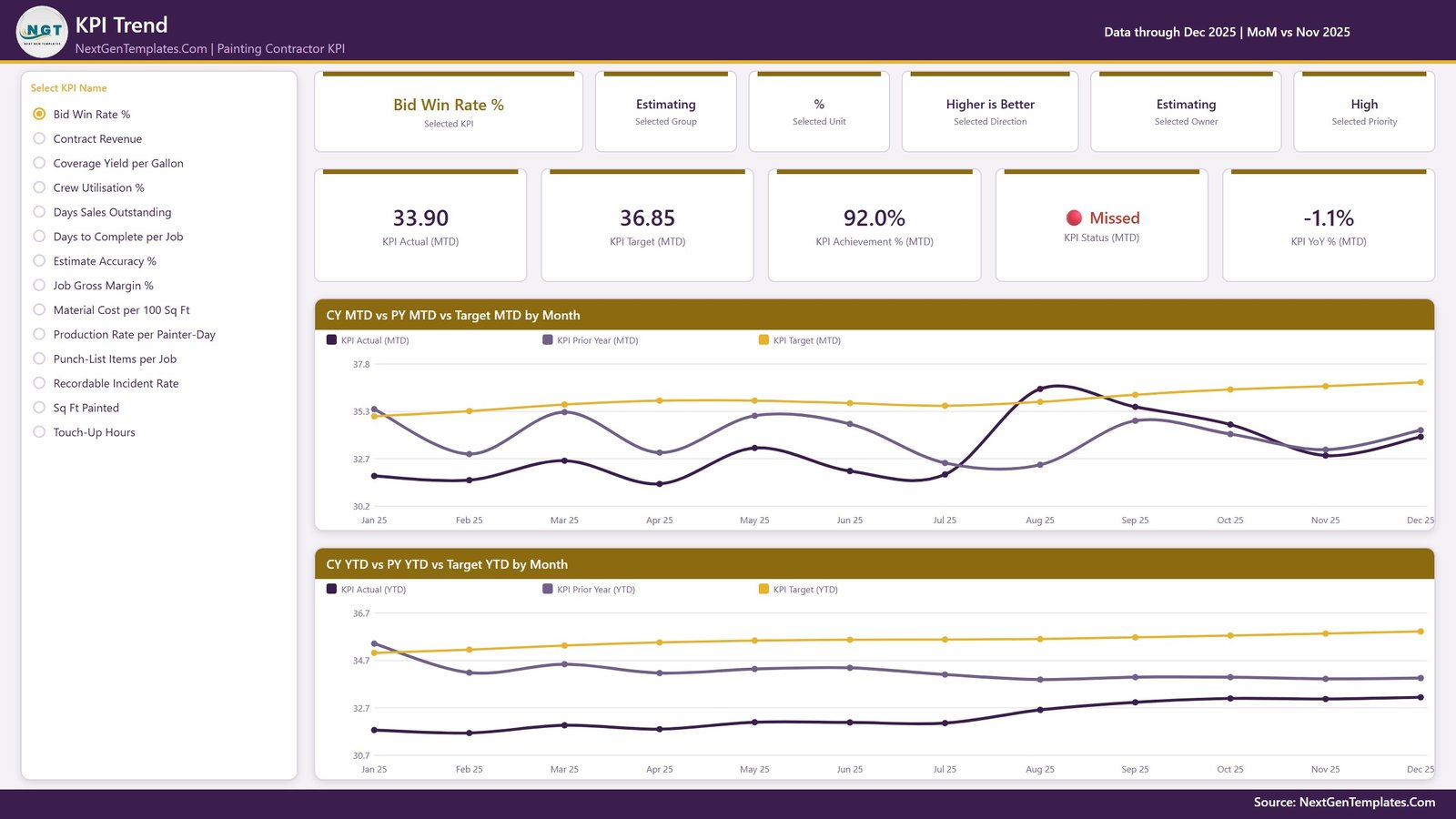
Pick one KPI from the list on the left and the whole page becomes that KPI. Six context cards name the selected KPI, its group, unit, direction, owner and priority; five value cards give Actual (MTD), Target (MTD), Achievement % (MTD), status and YoY % (MTD). Then two line charts: CY MTD vs PY MTD vs Target MTD by Month and CY YTD vs PY YTD vs Target YTD by Month, three series each across twelve months.
The two-chart layout is the point. In the sample file, Bid Win Rate % sits at 33.90 against a 36.85 target – 92.0%, Missed, with a -1.1% year-on-year arrow. The MTD chart shows a genuine August spike above target that faded through the autumn; the YTD chart shows a line that never once caught the target all year. A single monthly number would have told you neither.
Page 3 – KPI Definition
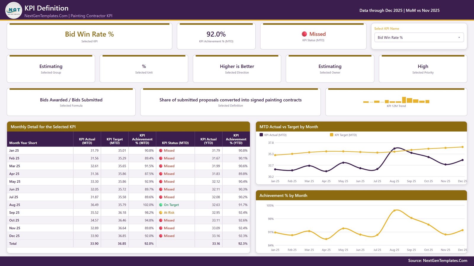
The same KPI selection, carried across by a synced slicer, with the documentation attached. The formula, the written definition, the group, unit, direction, owner, priority and a 12-month trend across the top; underneath, a month-by-month table (Actual MTD, Target MTD, Achievement % MTD, status, Actual YTD, Achievement % YTD, with a total row) beside MTD Actual vs Target by Month and Achievement % by Month.
This is the page that settles arguments. Bid Win Rate % resolves to “Bids Awarded / Bids Submitted”, defined as “share of submitted proposals converted into signed painting contracts”, owned by Estimating at High priority. The monthly table then shows the whole year: Missed in every month except August, which came in at 102.0%, and September at 98.2% At Risk. Nobody has to remember what the number meant or which spreadsheet it came from.
Page 4 – Get More Templates
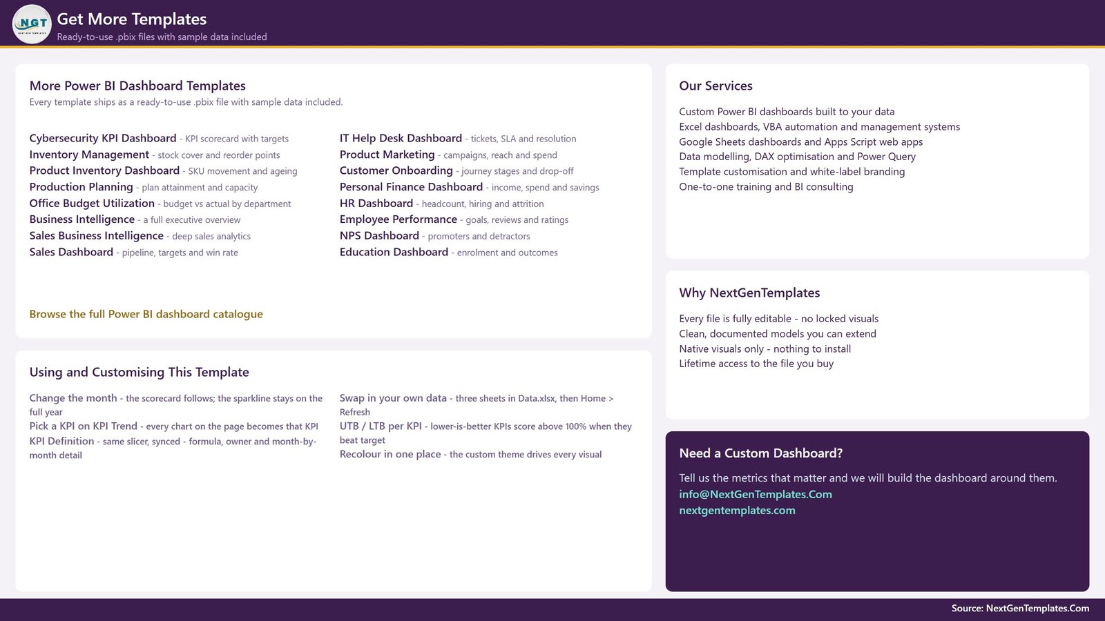
An in-file reference page. It lists other NextGenTemplates Power BI dashboards, summarises the services offered, and carries a short “Using and Customising This Template” panel: how to change the month, how the KPI slicer syncs across pages, how UTB and LTB scoring works and how to recolour the whole file from one place. Part catalogue, part help page – and the customisation panel is genuinely the fastest way to learn the report.
The two hidden pages
KPI Detail and Trend Detail are 280 x 360 report-page tooltips, hidden in view mode by design. They appear on hover over the charts and are not pages you click to. If you open the file and count four tabs, that is correct – the other two are doing their job.
Navigation is by synced slicer, not drillthrough
Worth stating plainly, because the family it belongs to varies on this point: this build has no right-click drillthrough. The “Select KPI Name” slicer on KPI Trend is synced to the KPI Definition page, and Month, KPI Group, Owner, Priority and Direction are synced across the report the same way. Choose a KPI once and both detail pages follow it. Do not go hunting for a drillthrough menu that is not there.
The data behind it
Three input tables drive the whole report. A KPI definition table of 14 rows by 9 columns – number, group, name, unit, formula, plain-English definition, type (UTB or LTB), owner and priority. A target table of one row per KPI per month with an MTD and a YTD figure, which comes to 168 rows for a 14-KPI year. An actual table of the same shape across two years – 336 rows – and it is the second year that feeds every prior-year line and every YoY arrow on the report.
One rule from the template’s own Read Me is worth repeating, because it is the single most common mistake in a home-made KPI pack: for a rate, ratio or index, the YTD figure must be the average of the months so far, never a sum. A compliance percentage that adds up to 1,900% by December makes every YTD chart useless.
Painting Contractor KPI Dashboard in Power BI vs. a Spreadsheet Scorecard vs. Job-Costing Software Reporting
| This Power BI scorecard | A hand-built spreadsheet | Job-costing / estimating software | |
|---|---|---|---|
| Target per KPI per month | Yes – MTD and YTD, typed by you | Only if you build it | Sometimes, often not |
| Direction-aware scoring | Yes, per KPI | Rarely – most sheets punish low cost figures | Varies |
| Money, production, materials, quality, crew and safety on one page | Yes – 8 KPI groups | Usually one tab per topic | Usually one module per topic |
| Prior-year comparison per KPI | Yes – CY vs PY vs Target, MTD and YTD | Manual | Sometimes |
| Owner and priority per KPI | Yes | Manual | Rarely |
| Connects to accounting or estimating software | No – you type or paste monthly figures | No | Yes, it is the system of record |
| Checks lead-paint (RRP), VOC or coatings regulation | No | No | No |
| Tells you what a good margin or spread rate is | No – you set every target | No | No |
| Cost | One-time, lifetime access to the file | Your own time | Per-user monthly |
Who Should Use This Template
It suits painting businesses that already have the numbers somewhere – in an accounting package, a job sheet, a whiteboard – and want them on one reviewed page each month. Residential repaint crews, commercial painting contractors, new-construction subs, industrial and specialty coatings firms. The person who actually opens it is usually the owner, the estimator, the operations lead or the office manager who prepares the monthly review. A two-crew shop gets as much out of it as a multi-branch operation, because the KPI list is yours to edit rather than a fixed set you have to live with.
It is not the right file if you are looking for regulatory compliance, a safety management system, estimating or takeoff software, job costing, or a live connector to your accounting platform. Each of those is covered in the FAQ below, and the answer is No every time – deliberately, because a reporting file that pretends to be a compliance record is worse than no file at all.
Real-World Use Cases
- The monthly owners’ meeting. One page, fourteen KPIs, three lights, worst first. Fifteen minutes instead of an hour of scrolling.
- Estimating review. Bid Win Rate % and Estimate Accuracy % side by side, month on month against last year. A falling hit rate and a drifting estimate look similar on a P&L and need completely different fixes.
- Material control. Coverage Yield per Gallon against Material Cost per 100 Sq Ft. The template defines the yield KPI against a 350 sq ft theoretical coverage, so a spread rate drifting below it and a rising cost per hundred feet usually turn out to be one story, not two.
- Crew productivity. Production Rate per Painter-Day beside Crew Utilisation %. A slow crew and paid hours that never reached a live job are different failures with different owners – Field Operations and Workforce Planning respectively, and the Owner slicer separates them in one click.
- Callbacks and warranty. Touch-Up Hours next to Punch-List Items per Job – what the corrections cost you in crew time, not just how often the final walkthrough finds something.
- Cash review. Days Sales Outstanding trended over twelve months with the target line beside it, retainage included in the definition.
- Branch or crew comparison. Duplicate the source workbook per branch, or prefix the KPI names and use the KPI Group slicer to switch between them.
Advantages of the Painting Contractor KPI Dashboard in Power BI
- It renders before you do any work. The sample year is already in the model, so you can walk all four pages and decide whether the structure suits you before typing a number.
- Lower-is-better KPIs are handled properly. Five of the fourteen are LTB, and getting this wrong is what makes most home-made scorecards quietly useless – a cost KPI that scores 60% for coming in under budget teaches everyone to ignore the colours.
- Documentation lives with the number. Page 3 carries the formula and definition for whichever KPI is selected, so the meaning does not live in one person’s head.
- Native visuals only. Nothing to install, nothing that breaks when a custom visual is deprecated, nothing that needs an organisational AppSource approval.
- One-time purchase. Power BI Desktop is free; the file is yours; there is no seat count and no renewal.
Opportunities for Improvement
- It is monthly, and it is manual. Fourteen numbers a month is not much work, but it is work, and nothing arrives automatically. If you want live data you need a different kind of build.
- No per-job or per-crew grain. Everything is aggregated to a month. You cannot click a KPI and see the three jobs that caused it – the scorecard tells you which number moved, not which job moved it.
- The targets are yours to justify. Nothing in the file suggests what a good spread rate, DSO or incident rate looks like for your market, and the sample targets are placeholders rather than benchmarks.
- Two years of history is the design limit. The prior-year comparison assumes the reporting year and the one before it; a three-year view means extending the model yourself.
Best Practices
- Cut the KPI list before you extend it. Fourteen is already a lot for a monthly meeting. Delete what nobody will act on rather than adding a fifteenth because it is easy.
- Set the direction flag first. UTB or LTB on every KPI, before you type a single target. Getting it wrong turns the whole traffic-light system into noise.
- Average, do not sum, the YTD figure for rates and ratios. Percentages, days and index values only. Money, square feet and counts add up normally.
- Put a real name in the Owner column. “Operations” owns nothing. A person owns something, and the Owner slicer only earns its place when it filters to somebody who will be in the room.
- Load the prior year properly. Every PY line and YoY arrow reads from it. Skip it and page 2 loses half its value.
- Review the misses, not the whole table. The worst-first sort exists so the top three rows are the agenda. If the meeting reads all fourteen rows every month, the sort is doing nothing for you.
Explore Relevant Templates
- Painting Contractor KPI Scorecard in Excel and the Painting Contractor KPI Scorecard in Google Sheets – the same trade in a lighter, single-page format from a different product line. Companions rather than duplicates, and the KPI lists are not identical.
- Electrical Contractor KPI Dashboard in Power BI and the Plumbing Business KPI Dashboard in Power BI – the identical four-page build for the neighbouring trades.
- HVAC Contractor KPI Dashboard in Excel – the workbook build of this scorecard idea, for a firm that lives in Excel rather than Power BI.
- Power BI Industry Dashboards Vol.2 – fifteen premium Power BI templates in a single bundle.
- Browse the full Power BI KPI Dashboard category or the wider Power BI template catalogue.
Frequently Asked Questions
What exactly is in the download?
A single ZIP holding the editable .pbix report and a Power BI Dashboard user manual PDF. The report opens with the full sample year already loaded, so all four pages render immediately. When you are ready to use your own numbers, point the model at your own workbook through Home > Transform data > Data source settings, then Refresh.
Does it check lead-paint (RRP), VOC limits or any coatings regulation?
No. It is a management reporting file with no regulatory content whatsoever. It does not check compliance, interpret a standard, or evidence that any job was compliant. Nothing on any page should be read as a compliance determination.
Is the Recordable Incident Rate a safety management system?
No. It is a buyer-typed monthly figure on a management scorecard. It is not an incident log, not OSHA 300/300A recordkeeping, and it evidences nothing on its own. Keep your real safety records in your real safety system – this KPI just puts the monthly number in front of the people who should be looking at it.
Does it do estimating, takeoffs or colour matching?
No. There is no measuring tool, no square-foot takeoff, no paint or coating product database and no colour system. Estimate Accuracy % scores how close a finished job landed to its estimate; it does not build the estimate.
Does it connect to QuickBooks, Sage, Procore or ServiceTitan?
No. There is no live connector to any accounting, ERP or field-service platform. You type or paste fourteen monthly numbers and click Refresh. That is deliberate – it keeps the file portable and keeps you out of an integration project you did not ask for.
Do I need a paid Power BI licence?
No. Power BI Desktop is free from Microsoft and opens, edits and uses this file completely. A Pro or Premium licence only comes into it if you later choose to publish the report to a Power BI workspace and share it that way.
Can I add or remove KPIs?
Yes, and that is the intended use. Nothing in the report hard-codes a KPI name. Rename a KPI consistently across the three input tables, add a row to the definition table plus its monthly target and actual rows, or delete one entirely – then Refresh. The counts, the table, the slicers and the charts all follow.
Why does a lower-is-better KPI score above 100%?
Because the scoring is direction-aware. Higher-is-better KPIs score Actual / Target; lower-is-better KPIs score Target / Actual. So Touch-Up Hours coming in at 103 against a 112 target scores 108.7%, which is what you want – the crew spent fewer hours fixing things than planned. On Target is 100% or more, At Risk is 95% to 100%, Missed is below 95%. Those bands are the template’s own convention, not an industry standard.
How many pages does the report have?
Six – four you navigate (KPI Scorecard, KPI Trend, KPI Definition, Get More Templates) and two hidden 280 x 360 report-page tooltips (KPI Detail, Trend Detail) that appear on hover.
Is there a drillthrough to the definition page?
No – this build uses synced slicers. The “Select KPI Name” slicer on KPI Trend is synced to KPI Definition, so picking a KPI on one page carries it to the other. There is no right-click drillthrough menu in this file.
Is the sample data real?
No. Every figure shipped is realistic sample data generated for the template – two years of actuals and a year of targets. It is not real company data, it is not a benchmark, and the 99.7% achievement in the sample month means nothing about your business. Replace it with yours.
Can I rebrand the colours?
Yes. The report runs on a custom Power BI theme, so recolouring is a single theme change rather than a visual-by-visual edit. Page 4 says exactly where to do it.
How is this different from the Excel and Google Sheets scorecards for the same trade?
They are separate products from a different line, not one product in three formats. The Excel and Google Sheets Painting Contractor KPI Scorecards are lighter single-page builds with their own KPI lists and no report tooltips. This Power BI edition is the four-page interactive build, and it is the one to pick if you want slicers that carry across pages or you may publish to a workspace later.
About the Author
Built by PK – Microsoft Certified Professional with 15+ years of Excel, Google Sheets, and Power BI experience. Founder of NextGenTemplates, reaching 300K+ subscribers across YouTube channels. Every template is hand-built and tested before release.
Conclusion
A painting business does not usually fail because nobody measured anything. It fails because the measurements sat in four places, nobody agreed what “estimate accuracy” meant, and the month everything drifted looked like every other month. This file fixes the narrow, boring part of that problem: fourteen defined KPIs, a target beside each one, a colour, an owner and last year’s line for context – all on a page you can put on a screen in a fifteen-minute meeting.
It will not estimate a job, price a gallon of paint or keep you compliant, and it does not pretend to. What it will do is make the month legible.
Get the Painting Contractor KPI Dashboard in Power BI – instant download, one-time payment, lifetime access to the file, and every visual fully editable in the free Power BI Desktop.