A cement mixer works runs on a batch log: which line built what, on which shift, how many units were planned against produced, how many were rejected, and what the batch was worth. That log is usually a flat export nobody reads. The Cement Mixer Production Dashboard in Power BI reads it for you. It is a .pbix report with five business pages, 105 DAX measures already written, a 21-column fact table and a 10-column date table, shipped with 500 rows of demo data so every visual has something to draw the moment you open it.
The demo model covers four plants, five assembly lines, three shifts and six mixer models across a full year. Those are not hard-coded lists – they are ordinary text columns, so your own plants and models replace them on refresh. Below is a page-by-page walkthrough of what the report actually shows, followed by where it fits, where it does not, and how to get your own data into it.
Key Features of the Cement Mixer Production Dashboard in Power BI
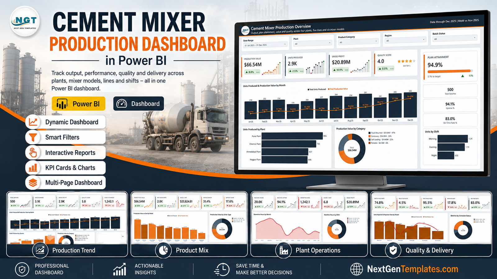
- Five business pages plus a catalogue page. Overview, Production Trend, Product Mix, Plant Operations and Quality & Delivery, each answering one question rather than repeating the same chart in a new colour.
- 105 DAX measures. Plan Attainment %, First Pass Yield, Rejection Rate, Rework Rate, On Time Rate, Value / Unit, Gross Margin %, Export Share, Machine Uptime, Hours / Unit and their month-on-month variants, all readable and editable in the model.
- Synced slicers. Date Range, Plant, Product Category and Region carry across every page; each page adds one filter of its own – Batch Status, Shift, Order Type, Production Line or Supervisor.
- A hidden Details drillthrough page on ten fields, so right-clicking a bar opens the batch-level rows behind it.
- Two custom tooltip pages – Category Detail and Trend Detail, each a 280×360 report page that replaces Power BI’s default hover card.
- KPI cards with month-on-month deltas and lollipop sparklines, green for up, red for down, on all five pages.
- Three scorecard tables – Model Economics, Plant Utilisation and Line Quality – for reading rankings rather than eyeballing bars.
Dashboard Pages Explanation
Overview
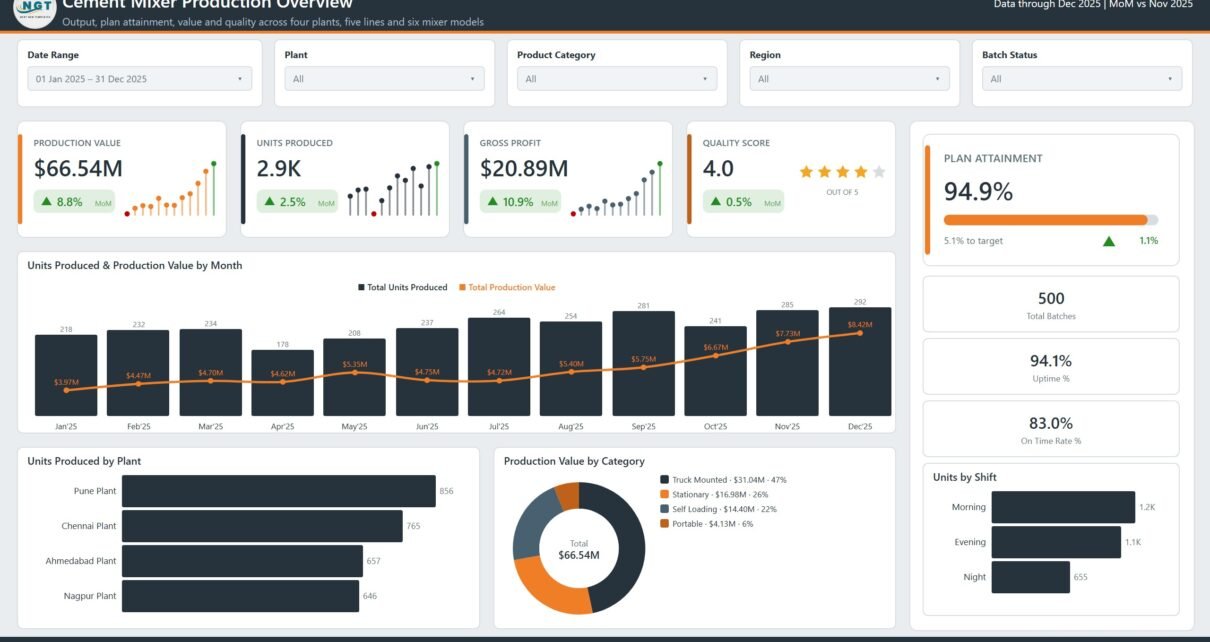
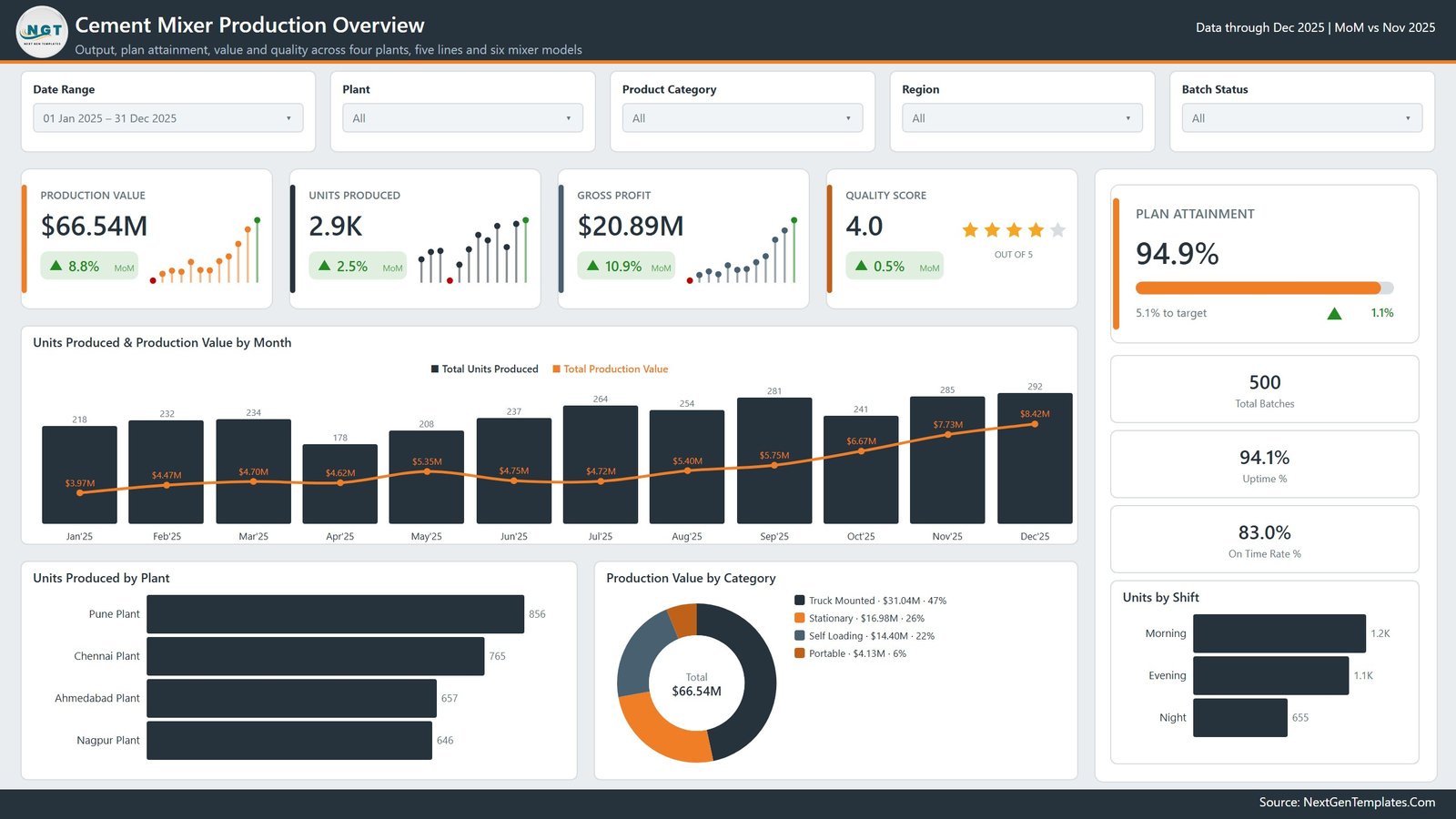
The page you open on. Production Value, Units Produced, Gross Profit and a Quality Score rating sit as KPI cards, with Plan Attainment shown as a progress bar and the gap to target spelled out underneath. A side rail carries Total Batches, Uptime % and On Time Rate %.
The main visual, Units Produced & Production Value by Month, puts volume bars and a value line on one axis pair, so a month where units rose but value fell is immediately visible. Below it, Units Produced by Plant, Production Value by Category and Units by Shift cut the same total three more ways.
Production Trend
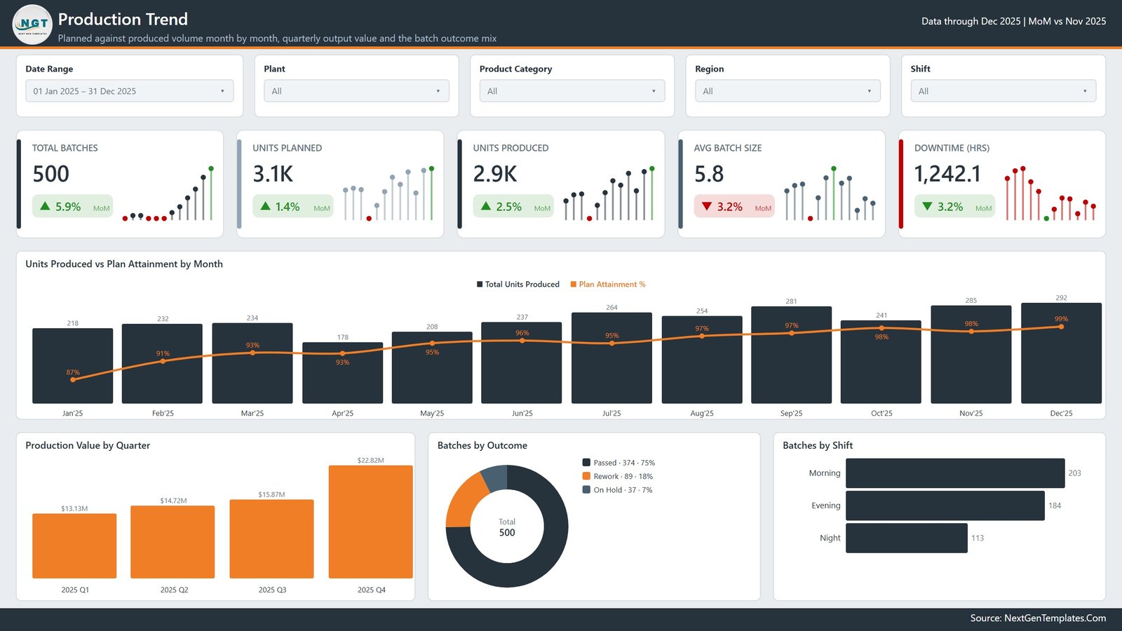
Plan against actual. Total Batches, Units Planned, Units Produced, Avg Batch Size and Downtime Hours head the page, and Units Produced vs Plan Attainment by Month overlays the attainment percentage on the volume bars so the two are read together instead of on separate tabs.
Production Value by Quarter gives the coarse view for a board pack, Batches by Outcome splits passed, rework and on-hold batches, and Batches by Shift shows how the workload is distributed. A Shift slicer lets you isolate one crew.
Product Mix
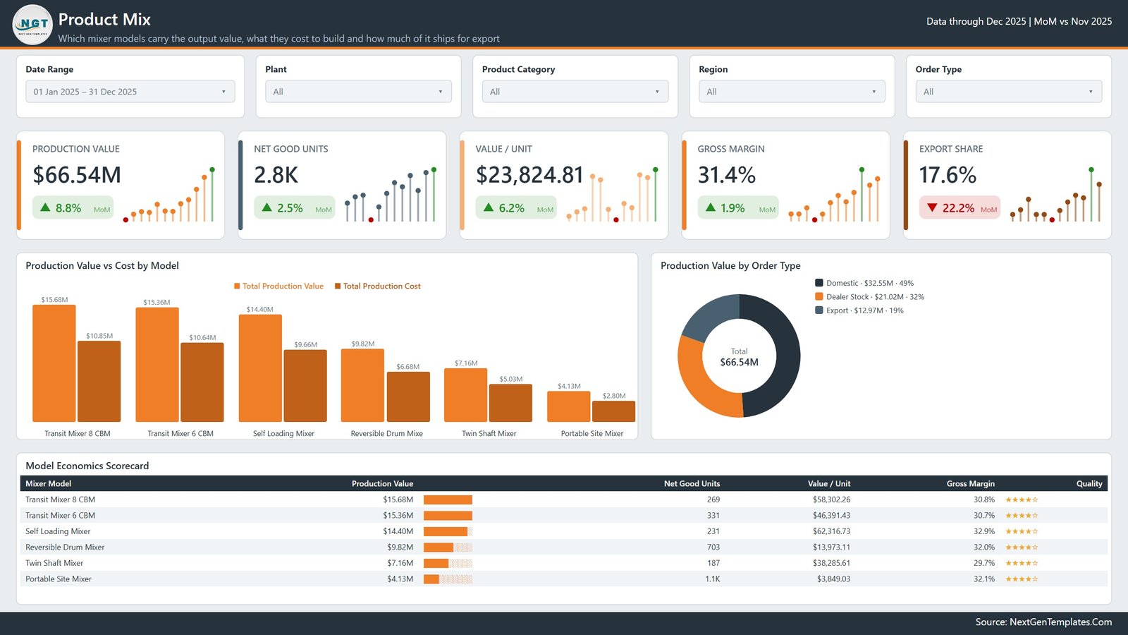
The commercial page. Production Value, Net Good Units, Value / Unit, Gross Margin and Export Share run across the top. Production Value vs Cost by Model pairs a revenue bar and a cost bar for each of the six mixer models, which is the fastest way to see that a high-volume model is not automatically the profitable one.
Production Value by Order Type splits domestic, dealer stock and export, and the Model Economics Scorecard table lists production value, net good units, value per unit, gross margin and a quality rating for every model in one place.
Plant Operations
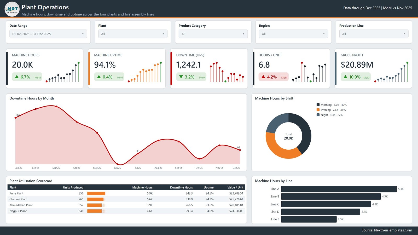
Where the machine time goes. Machine Hours, Machine Uptime, Downtime Hours, Hours / Unit and Gross Profit lead into Downtime Hours by Month, an area chart that makes a bad quarter obvious at a glance.
Machine Hours by Shift and Machine Hours by Line split capacity two ways, and the Plant Utilisation Scorecard puts all four plants side by side on units produced, machine hours, downtime hours, uptime percentage and value per unit. A Production Line slicer narrows everything to a single line.
Quality & Delivery
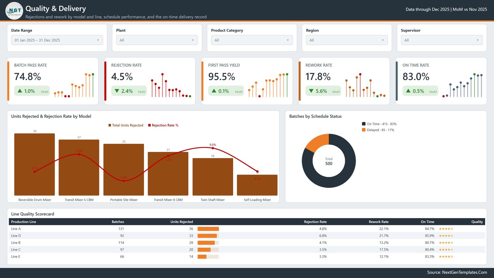
Rejections, rework and schedule performance. Batch Pass Rate, Rejection Rate, First Pass Yield, Rework Rate and On Time Rate head the page. Units Rejected & Rejection Rate by Model deliberately shows count and rate together, because the model with the most rejected units is often not the model with the worst rate.
Batches by Schedule Status splits on-time against delayed, and the Line Quality Scorecard ranks the five production lines on batches, units rejected, rejection rate, rework rate and on-time percentage. A Supervisor slicer makes the page usable in a one-to-one review.
The pages you do not see
Three more pages sit behind the five above and are hidden in view mode. Details is a drillthrough page: right-click a bar or a scorecard row and Power BI opens a batch-level table filtered to exactly what you clicked, wired on ten fields including Plant, Production Line, Shift, Supervisor, Mixer Model and Batch Status. Category Detail and Trend Detail are report-page tooltips – small 280×360 canvases that appear on hover. Microsoft documents both mechanisms in the Power BI drillthrough guide, and both are worth understanding before you edit the report.
A sixth visible page, Get More Dashboards, is our catalogue and contact page. Delete it before you share the report internally.
Cement Mixer Production Dashboard in Power BI vs. Excel vs. Paid Manufacturing SaaS – Feature Comparison
| This Power BI report | Excel version | Paid MES / BI suite | |
|---|---|---|---|
| Cost | $17.99 once | $17.99 once | $70-$300 per user / month |
| Platform | Power BI Desktop (free) | Microsoft Excel | Vendor cloud |
| Setup time | Under 30 minutes | Under 20 minutes | Weeks of implementation |
| Real-time team collaboration | Via Power BI Service (Pro licence) | Via OneDrive / SharePoint | Built in |
| Mobile access | Power BI mobile app | Excel mobile | Native app |
| Customizable fields | Full – edit the model and DAX | Full – edit sheets and pivots | Limited to vendor schema |
| Share with link | Yes, once published | File or cloud link | Yes |
| Year-1 cost at 5 users | $17.99 (+ Pro if you publish) | $17.99 | $4,200-$18,000 |
| Drillthrough to batch level | Yes – hidden Details page | Via pivot drill-down | Yes |
| Measures you can read and change | 105, all visible | Formulas on the sheet | Black box |
Who Should Use This Template
Production and plant managers who already export a batch log and want it read back as trend, mix, utilisation and quality. BI analysts who would rather adapt a working manufacturing model than build one from an empty canvas. Operations leads running a weekly review across several plants or lines. And anyone learning Power BI who wants 105 finished DAX measures to pull apart – the model is a decent teaching artefact on its own.
It is worth being blunt about what this is not. It is not a safety system, and it addresses nothing to do with plant or workplace safety. It performs no concrete or material strength testing and no mix-design validation. It makes no claim of conformance to ASTM, EN or IS standards, and it is not a quality-certification tool for ISO 9001 or ISO 14001. It does not measure, model or report emissions or environmental compliance. It is a reporting layer over figures you supply, and it is not a live MES or SCADA feed.
Real-World Use Cases
The Monday operations call. A plant manager with four sites opens the Plant Utilisation Scorecard, sees which plant lost the most machine hours to downtime, and takes that one line to the call instead of a stack of shift sheets.
The plan-versus-actual review. A production planner watches Units Planned against Units Produced month by month on the Production Trend page and uses Batches by Outcome to separate rework from genuinely lost capacity.
The margin question. A commercial analyst works the Model Economics Scorecard – which of the six mixer models carries the margin, what each costs to build, how much of the value is export – then drills through to the batch rows when a value-per-unit figure moves unexpectedly.
Advantages of the Cement Mixer Production Dashboard in Power BI
- It opens for free. Power BI Desktop costs nothing; a Pro licence is only needed if you publish to the Service and share by link.
- Nothing is hidden. All 105 measures sit in the model where you can read the DAX, copy it, or change it.
- Every number has a direction. No KPI card shows a value without its month-on-month change.
- Drillthrough closes the loop. A surprising chart resolves to the actual batch rows in two clicks, rather than a request to the data team.
- It is rebrandable. Logo, theme colours and page titles are all yours to change.
Opportunities for Improvement
Honest limitations, so nothing is a surprise after purchase:
- The model imports from a workbook. Connecting it to a database or an ERP extract is a Power Query change you make yourself.
- Refresh is manual in Desktop. Scheduled refresh needs the Power BI Service and a gateway if your source is on-premises.
- The 500 demo rows are generated sample data – realistic in shape, meaningless in substance. Delete them before anyone reads a number as fact.
- There is no row-level security configured. If different plants must not see each other’s figures, you add RLS roles yourself.
- The Quality Score field is a 1-5 rating you record, not a measured or tested property of any product.
Best Practices
- Click through all five pages with the demo data still loaded before you change anything, so you know what each measure should return.
- Keep the 21 fact-table column headers exactly as shipped – rename columns in Power Query instead, and the 105 measures keep working.
- Load at least 13 months of history so the month-on-month deltas and sparklines have a baseline.
- Do not delete the hidden pages. They are visible in the Desktop page tabs and are easy to remove by accident, which silently breaks drillthrough and tooltips.
- Delete the Get More Dashboards page before circulating the report inside your organisation.
- Set the date table as the model’s official date table if you extend it, so time intelligence keeps behaving.
Explore Relevant Templates
- Cement Mixer Production Dashboard in Excel – the same reporting for teams without Power BI.
- Cement and Steel Dashboard in Google Sheets – a browser-based view of the same industry.
- Industrial Gas Production Dashboard in Power BI – process manufacturing on the same pattern.
- Railway Equipment Manufacturing Dashboard in Power BI – heavy equipment assembly.
- Ceramic Tiles Production Dashboard in Excel – another building-materials production report.
- Plant Production Manager Toolkit – nine Excel and Power BI templates in one bundle.
Frequently Asked Questions
Does this dashboard certify quality, test materials or prove standards conformance?
No. It reports the production, cost and quality figures you load into it. It performs no concrete or material strength testing, no mix-design validation, no ASTM / EN / IS conformance check, no ISO 9001 or ISO 14001 certification and no emissions or environmental compliance reporting.
Do I need a paid Power BI licence?
Not to use the report. Power BI Desktop is free and opens the .pbix directly. A Pro licence is only needed to publish to the Power BI Service and share by link.
Is the data in the screenshots real?
No. All 500 batch rows are demo data created for the template. Replace them with your own export.
Can I add my own plants, lines and mixer models?
Yes. They are text columns in the fact table, not fixed lists, so the slicers, charts and scorecards pick up your values on refresh.
What is in the download?
A zip containing the .pbix report, the Data workbook that feeds it, and a Power BI Dashboard user manual PDF.
Can I connect it to our ERP instead of the workbook?
Yes, through Power Query. Match your source columns to the 21 fact-table columns and the measures continue to work unchanged.
About the Author
Built by PK – Microsoft Certified Professional with 15+ years of Excel, Google Sheets, and Power BI experience. Founder of NextGenTemplates, reaching 300K+ subscribers across YouTube channels. Every template is hand-built and tested before release.
Conclusion
The Cement Mixer Production Dashboard in Power BI is not trying to run your plant. It is trying to make the batch log you already keep answer five questions quickly: are we hitting plan, which models pay, where is the machine time going, what is being rejected, and are we delivering on time. Five pages, 105 measures, a drillthrough page and two tooltip pages do that, and everything in the model is open for you to change.
Get the Cement Mixer Production Dashboard in Power BI – and if your team lives in spreadsheets instead, the Excel version covers the same ground.
For step-by-step Power BI and Excel walkthroughs, subscribe to youtube.com/@PKAnExcelExpert.