Most museum reporting packs are built the night before the meeting. Someone pulls attendance out of the ticketing system, revenue out of finance, renewal rates out of the CRM, pastes it all into a deck, and colours a few cells by hand. By the time it is printed nobody can say whether a number is good, because the target lives in a different file.
The Museum Operations KPI Dashboard in Power BI exists to end that. It is a KPI scorecard: twelve museum KPIs, each with a target, each scored month-to-date and year-to-date, each given a red / amber / green light. Pick a month at the top and the whole report restates itself. That is the entire interaction model.
This is deliberately not the analytical Museum Dashboard in Power BI, which is built for slicing activity by exhibition, channel and segment. The scorecard is what you take into the monthly management meeting. The dashboard is what you open afterwards when someone asks why.
What a KPI Scorecard Does That a Dashboard Does Not
An analytics dashboard answers open questions: what happened, where, to whom. A scorecard answers one closed question, twelve times over: did we hit the number?
That difference shows up in the design. There is no free exploration on the main page. There is a table with one row per KPI and a status light on the end of it, and there is a month picker. The value is not in the charting – it is in the fact that every KPI has an owner, a target, a direction and a definition, and that nobody can quietly move the goalposts between meetings. Museum Operations KPI Dashboard in Power BI
Page 1: The Museum Operations KPI Scorecard
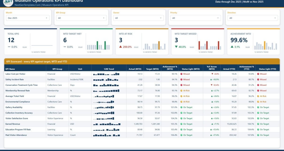
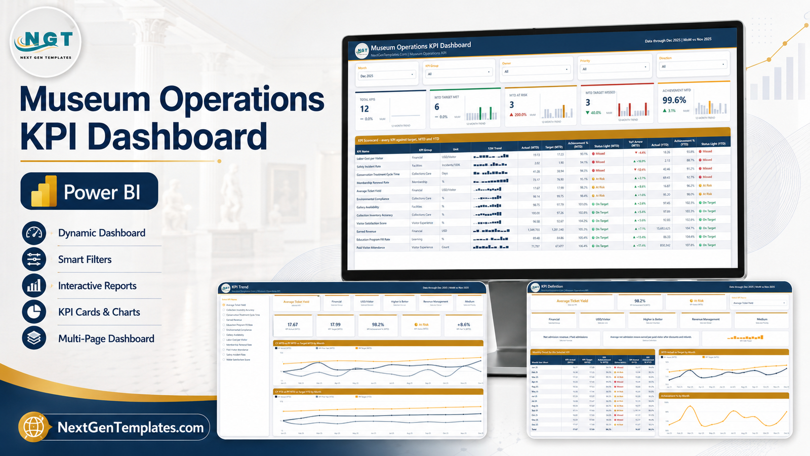
The landing page carries five slicers along the top – Month, KPI Group, Owner, Priority and Direction. The Month slicer is the important one: set it to Dec 2025 and the header reads “Data through Dec 2025 | MoM vs Nov 2025”, and every figure below follows.
Five summary cards sit under the slicers, each with a month-over-month delta and its own twelve-month trend bar: Museum Operations KPI Dashboard in Power BI
- Total KPIs – 12 in the sample
- MTD Target Met – 6
- MTD At Risk – 3
- MTD Target Missed – 3
- Achievement MTD – 99.6%, up 3.1% on the month
That top row is the headline a director actually needs: half the estate is on plan, a quarter is wobbling, a quarter has missed, and overall we are a whisker under target.
Below it is the KPI Scorecard table, one row per KPI, with KPI name, group, unit, a twelve-month sparkline, MTD actual, MTD target, MTD achievement %, MTD status light, a YoY arrow, then YTD actual, YTD achievement % and a YTD status light. Sorting runs worst-first, so the problems are at the top of the table rather than buried.
In the sample month that reads:
- Labor Cost per Visitor – 19.13 against a 17.23 target, 90.1% achievement, Missed, and 4.4% worse than last year
- Safety Incident Rate – 2.02 per 100K against 1.90, Missed on both MTD and YTD
- Conservation Treatment Cycle Time – 41.28 days against 38.94, Missed
- Membership Renewal Rate – 73.17% against 76.90%, At Risk for the month but Missed on the year
- Paid Visitor Attendance – 71,797 against 67,477, On Target and up 17.4% year on year
- Earned Revenue – 1,349,703 against 1,281,340, On Target, with 15.69M banked year to date
Note the pattern that makes this useful: attendance and revenue are strong while cost per visitor and safety are missing. A single “overall performance” number would have hidden that completely.
Page 2: KPI Trend
The KPI Trend page puts a list of all twelve KPI names down the left. Select one – Average Ticket Yield, say – and the page rebuilds around it.
A row of context cards names the KPI’s group (Financial), unit (USD/Visitor), direction (Higher is Better), owner (Revenue Management) and priority (Medium). A second row gives the numbers: KPI Actual (MTD) 17.67, KPI Target (MTD) 17.99, KPI Achievement % (MTD) 98.2%, KPI Status At Risk, KPI YoY % +8.6%.
Then two charts:
- CY MTD vs PY MTD vs Target MTD by Month – this year’s monthly actual against last year’s and against the monthly target, across all twelve months
- CY YTD vs PY YTD vs Target YTD by Month – the same three series on a cumulative basis
The MTD chart is where you catch volatility and the YTD chart is where you see whether the gap to target is closing or widening. On Average Ticket Yield the sample shows actual tracking below target all year but well above the prior year – a KPI that is improving and still not enough, which is a very different conversation from one that is simply failing.
Page 3: KPI Definition
This is the page that stops the arguments. The Select KPI Name slicer here is synced with the KPI Trend page, so whichever KPI you were just looking at is already loaded – there is no drillthrough to remember and no risk of the two pages showing different KPIs.
For the selected KPI you get its achievement % and status, its group, unit, direction, owner and priority, and then the two fields that matter most for governance:
- Formula – for Average Ticket Yield, “Net admission revenue / Paid admissions”
- Definition – “Average net admission revenue earned per paid visitor after discounts and refunds”
Underneath sits Monthly Detail for the Selected KPI – twelve rows of actual, target, achievement %, status light and the YTD pair, with a total row – alongside an MTD Actual vs Target by Month chart and an Achievement % by Month chart.
Write the definitions once, in the data, and every future disagreement about whether a number includes refunds is settled by opening a page.
Page 4: Get More Templates
The closing page holds the customisation notes – change the month, pick a KPI, swap in your own data, recolour in one place – plus the wider NextGenTemplates Power BI catalogue. The landing page carries five slicers along the top – Month, KPI Group, Owner, Priority and Direction. The Month slicer is the important one: set it to Dec 2025 and the header reads “Data through Dec 2025 | MoM vs Nov 2025”, and every figure below follows.
The Twelve KPIs and Why These Twelve
The KPI set is grouped so that each department sees its own row without the board losing the single view:
| Group | KPIs | Owner-side question it answers |
|---|---|---|
| Visitor Experience | Paid Visitor Attendance, Visitor Satisfaction Score | Are people coming, and are they glad they did? |
| Financial | Earned Revenue, Average Ticket Yield, Labor Cost per Visitor | Is the visit paying for itself? |
| Membership | Membership Renewal Rate | Is the recurring base holding? |
| Learning | Education Program Fill Rate | Are the schools and workshops filling? |
| Collections Care | Collection Inventory Accuracy, Conservation Treatment Cycle Time, Environmental Compliance | Is the collection safe and accounted for? |
| Facilities | Gallery Availability, Safety Incident Rate | Is the building open and safe? |
Three of the twelve – Labor Cost per Visitor, Conservation Treatment Cycle Time and Safety Incident Rate – are lower-is-better. The model knows that. A lower-is-better KPI scores above 100% when the actual comes in under target, so a cheap month never reads as a failure and a slow conservation queue is never mistaken for a win.
Loading Your Own Museum’s Numbers
- Open the .pbix in Power BI Desktop (the free version is enough – only native visuals are used).
- Play with the sample first. Move the Month slicer, filter to a single KPI Group, then click through to KPI Trend and KPI Definition to see the synced selection carry across.
- Open the Data workbook. It holds three sheets: the KPI list with targets, the monthly actuals, and the KPI metadata (group, unit, direction, owner, priority, formula, definition).
- Replace the rows, keep the headers. The column names are what the model binds to.
- Check every direction flag. This is the one step people skip, and it is the one that makes achievement percentages wrong.
- Fill in the formula and definition columns properly. Page 3 is only as good as what you type here.
- Home > Refresh. The scorecard, the lights, the sparklines and every chart rebuild against your numbers.
- Recolour once through the custom theme if you want the museum’s own palette across all four pages.
Practical Notes From Using It
- Set targets monthly, not annually divided by twelve. Museum attendance is violently seasonal; a flat target makes February look like a disaster and August like genius.
- Give every KPI a named owner. The Owner slicer is only useful if the owners are real people, and a KPI with no owner never improves.
- Watch the MTD and YTD lights together. Membership Renewal Rate in the sample is At Risk for the month but Missed for the year – that combination means a recent improvement that has not yet repaired the damage, and it is the single most useful signal on the page.
- Use Priority for the board pack. Filter to high priority and you have a five-KPI summary without building a second report.
Frequently Asked Questions
Do I need Power BI Pro?
No. Power BI Desktop, which is free, opens and edits the file. Pro is only needed if you want to publish it to the Power BI Service and share it with colleagues there.
Can I add or remove KPIs?
Yes. The KPI list lives in the data, not in the visuals, so adding a thirteenth KPI is a new row plus its metadata. The scorecard, the KPI list on page 2 and the definition page all pick it up.
How do I reach the KPI Definition page?
Through the page tabs. The KPI selection is synced between KPI Trend and KPI Definition, so the KPI you were studying is already selected when you arrive. There is no drillthrough action to learn. The landing page carries five slicers along the top – Month, KPI Group, Owner, Priority and Direction. The Month slicer is the important one: set it to Dec 2025 and the header reads “Data through Dec 2025 | MoM vs Nov 2025”, and every figure below follows. The landing page carries five slicers along the top – Month, KPI Group, Owner, Priority and Direction. The Month slicer is the important one: set it to Dec 2025 and the header reads “Data through Dec 2025 | MoM vs Nov 2025”, and every figure below follows.
Will this work for a gallery, heritage site or science centre?
Yes. The structure is generic – KPI, target, direction, owner, definition – so any visitor attraction can swap the twelve museum measures for its own. The landing page carries five slicers along the top – Month, KPI Group, Owner, Priority and Direction. The Month slicer is the important one: set it to Dec 2025 and the header reads “Data through Dec 2025 | MoM vs Nov 2025”, and every figure below follows.
Is sample data included?
Twelve months of realistic figures for all twelve KPIs, so the report is fully populated the moment you open it.
Get the Template
The Museum Operations KPI Dashboard in Power BI ships as a ready-to-use .pbix with sample data, fully editable, nothing locked, lifetime access to the file. The landing page carries five slicers along the top – Month, KPI Group, Owner, Priority and Direction. The Month slicer is the important one: set it to Dec 2025 and the header reads “Data through Dec 2025 | MoM vs Nov 2025”, and every figure below follows.
Download the Museum Operations KPI Dashboard in Power BI on NextGenTemplates
If you want the analytical companion rather than the scorecard, look at the Museum Dashboard in Power BI. For neighbouring sectors, the Heritage Tourism KPI Dashboard in Power BI and the Arts and Culture Dashboard in Power BI follow the same house style. The landing page carries five slicers along the top – Month, KPI Group, Owner, Priority and Direction. The Month slicer is the important one: set it to Dec 2025 and the header reads “Data through Dec 2025 | MoM vs Nov 2025”, and every figure below follows.