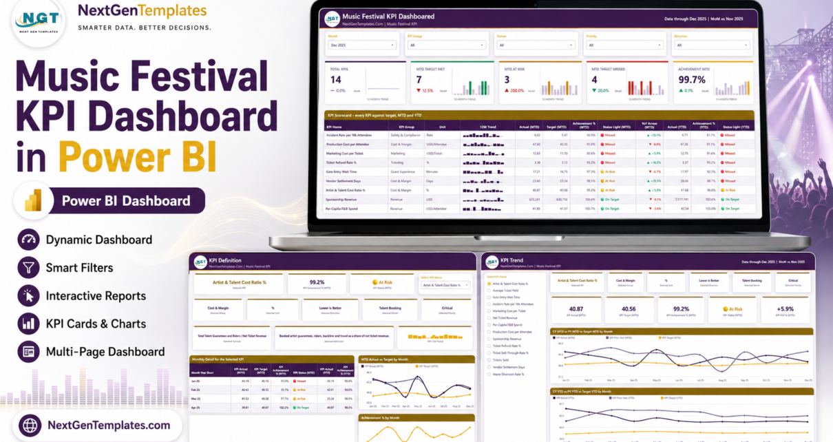
The Music Festival KPI Dashboard in Power BI puts 14 festival KPIs on one page, across four report pages, with a month picker, direction-aware traffic lights and a 12-month sparkline on every scorecard row. The shipped data pack carries 168 monthly target rows and 336 monthly actual rows, covering a full reporting year plus the prior year for every year-on-year comparison. Setup takes under 10 minutes.
Festival reporting usually falls apart in the same place. Ticketing has one spreadsheet, production has another, the sustainability lead has a third, and by the time the monthly promoter call happens nobody agrees on what “on target” means. This template fixes the format, not the numbers: you set every target yourself, and the report scores, colours and ranks them consistently every month.
This is the KPI scorecard, not the analytical dashboard
NextGenTemplates publishes two very similarly named festival templates and they are different products. The Music Festival KPI Dashboard in Power BI is a scorecard: targets versus actuals, achievement percentages, and MTD and YTD traffic lights by month. The Music Festivals Dashboard in Power BI is an analytical dashboard that slices ticket, attendance and vendor transactions by stage, tier and channel.
If you run a monthly performance review, you want the scorecard. If you want to explore where the revenue actually came from, you want the analytical dashboard. Plenty of festival teams keep both open in the same meeting.
Key Features of the Music Festival KPI Dashboard in Power BI
- 14 named festival KPIs across seven groups — Ticketing, Revenue, Cost & Margin, Guest Experience, Safety & Compliance, Marketing and Sustainability.
- Direction-aware achievement scoring. Seven KPIs are higher-is-better and score Actual ÷ Target. The other seven are lower-is-better and score Target ÷ Actual, so beating a cost or wait-time target reads above 100% instead of looking like a failure.
- Fixed status bands. On Target is 100% or more, At Risk is 95% to 100%, Missed is below 95% — applied identically to every KPI, MTD and YTD.
- Five slicers, synced across pages — Month, KPI Group, Owner, Priority and Direction. The KPI selection is synced between the KPI Trend and KPI Definition pages.
- Two hidden tooltip pages (KPI Detail and Trend Detail) that surface on hover without cluttering the layout.
- Native Power BI visuals only — cards, line charts, bar charts, tables and slicers. Nothing to install from AppSource, and the .pbix is fully editable.
- Nothing hard-coded to a KPI name. Add, rename or delete a KPI in the spreadsheet and the counts, the KPI list, the scorecard and every chart follow on refresh.
The 14 KPIs it ships with
Ticketing: Ticket Sell-Through Rate %, Tickets Sold, Ticket Refund Rate %. Revenue: Net Ticket Revenue, Average Ticket Yield, Per-Capita F&B Spend, Sponsorship Revenue. Cost & Margin: Artist & Talent Cost Ratio %, Production Cost per Attendee, Vendor Settlement Days. Guest Experience: Gate Entry Wait Time. Safety & Compliance: Incident Rate per 10k Attendees. Marketing: Marketing Cost per Ticket. Sustainability: Waste Diversion Rate %.
Each one carries its own formula, plain-English definition, unit, direction, owner and priority in the data pack — which is what makes the KPI Definition page useful rather than decorative.
Dashboard Pages Explanation
Page 1: KPI Scorecard
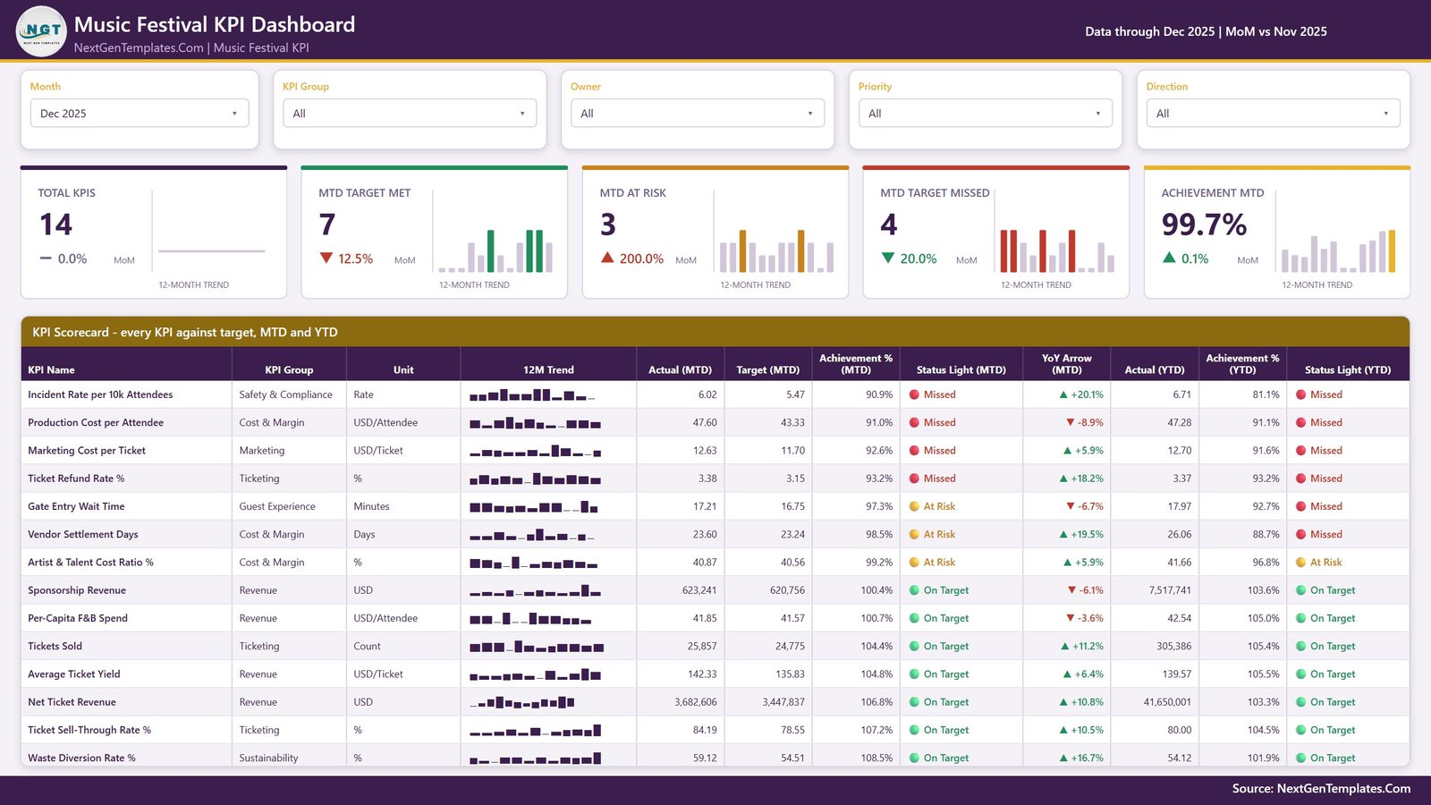
The monthly review page. Month, KPI Group, Owner, Priority and Direction slicers run across the top, above five summary cards — Total KPIs, MTD Target Met, MTD At Risk, MTD Target Missed and Achievement MTD — each with a month-on-month delta and a 12-month trend sparkline. The scorecard table beneath lists every KPI with its group, unit, 12-month trend, Actual (MTD), Target (MTD), Achievement % (MTD), Status Light (MTD), a year-on-year arrow, Actual (YTD), Achievement % (YTD) and Status Light (YTD).
Because MTD and YTD lights sit side by side, the awkward cases show themselves: a KPI that is green this month but red for the year cannot quietly pass the meeting.
Page 2: KPI Trend
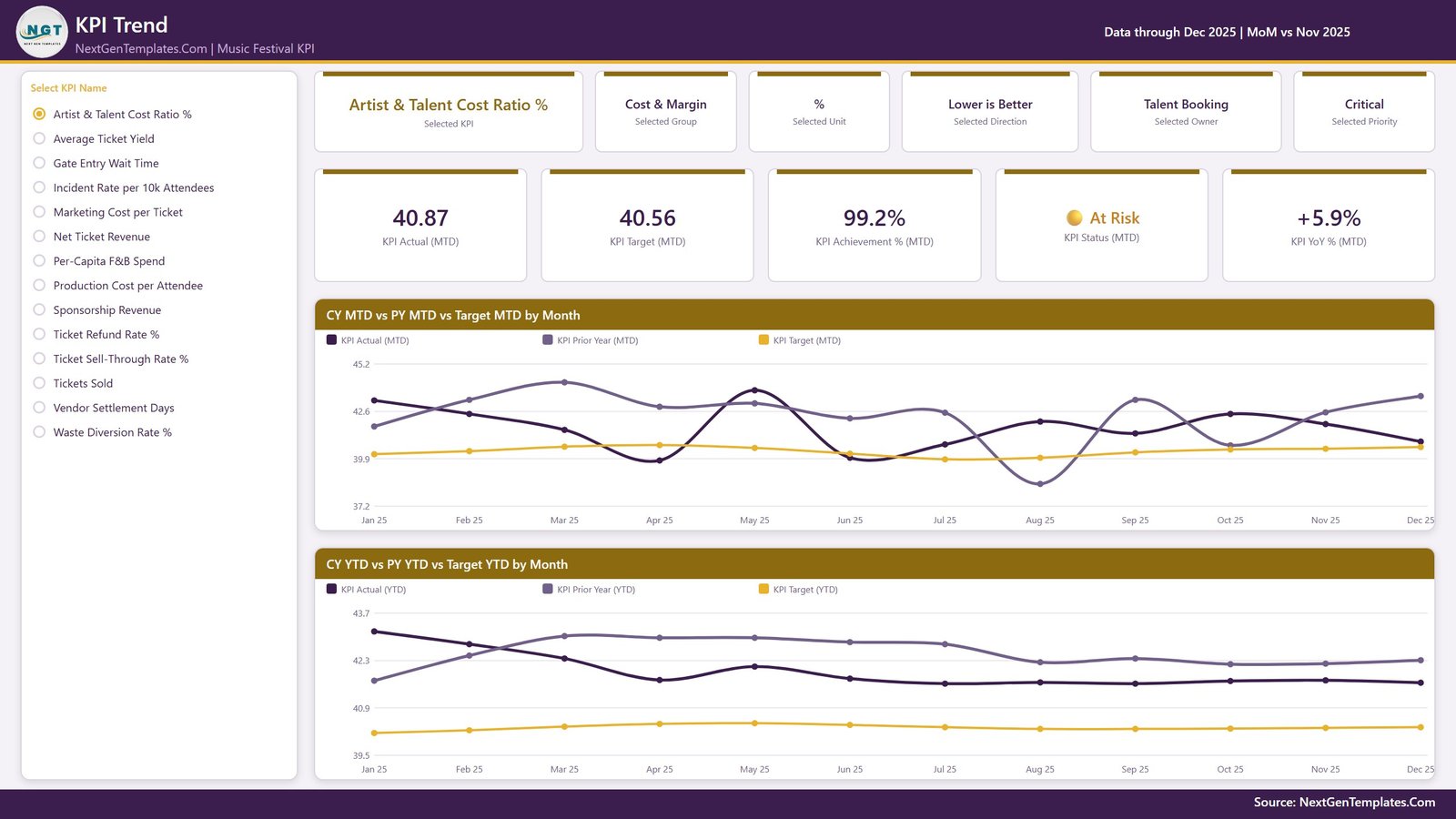
Choose one KPI from the radio list on the left and the entire page becomes that KPI. Six context cards restate the selected KPI, group, unit, direction, owner and priority; five value cards show Actual (MTD), Target (MTD), Achievement % (MTD), Status (MTD) and YoY % (MTD). Two line charts follow: CY MTD vs PY MTD vs Target MTD by Month, and CY YTD vs PY YTD vs Target YTD by Month.
This is the page that answers “is this a bad month or a bad year?” — the MTD chart is noisy by design and the YTD chart smooths it out.
Page 3: KPI Definition
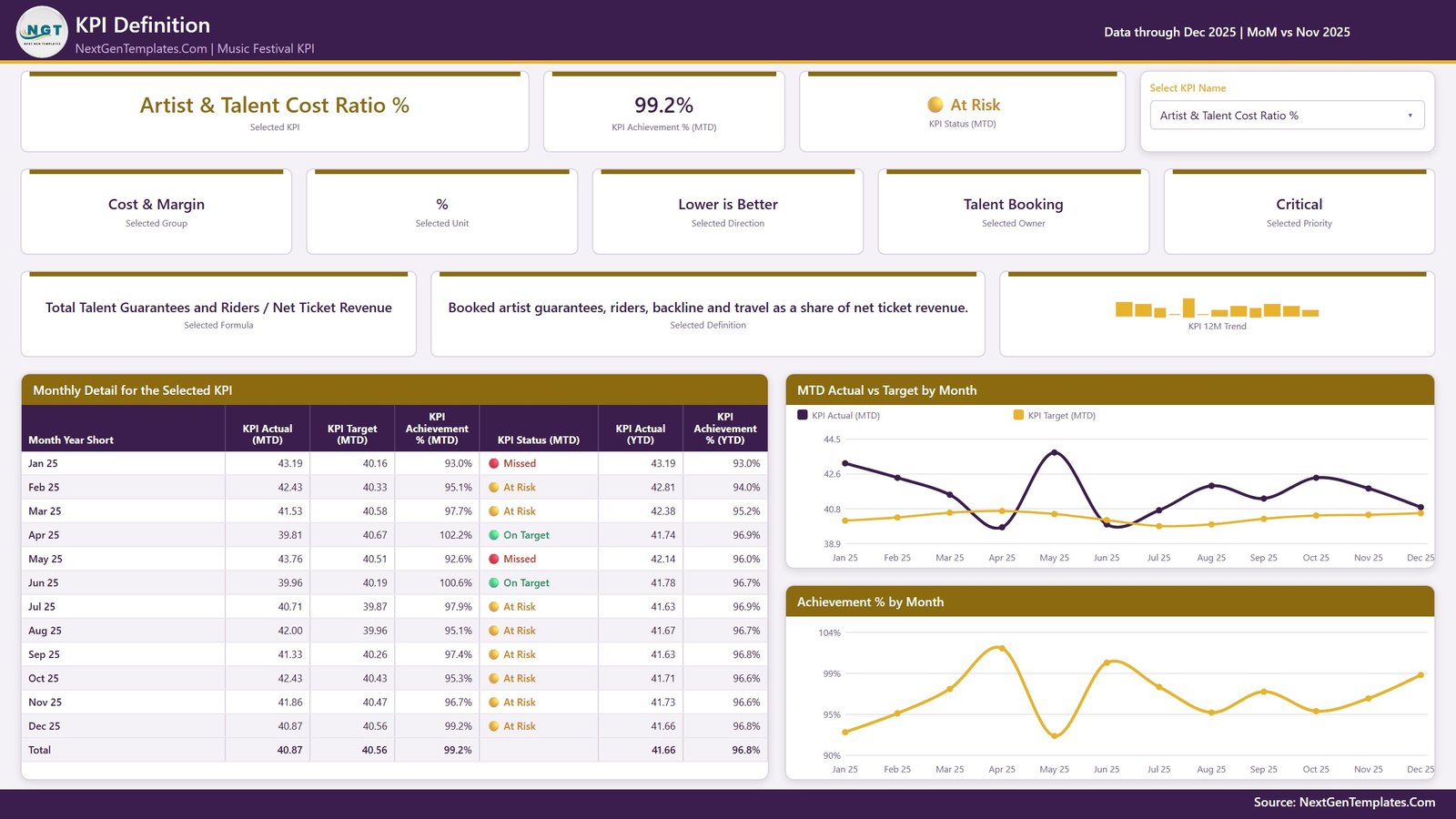
A dropdown picks the KPI and the page prints its formula and definition in full — for example, Artist & Talent Cost Ratio % is Total Talent Guarantees and Riders ÷ Net Ticket Revenue, defined as booked artist guarantees, riders, backline and travel as a share of net ticket revenue. Alongside it sit the group, unit, direction, owner, priority, achievement and status cards, a Monthly Detail table covering all twelve months, and MTD Actual vs Target by Month and Achievement % by Month charts.
The KPI slicer here is synced with the KPI Trend page, so you pick a KPI once and both pages follow.
Page 4: Get More Templates
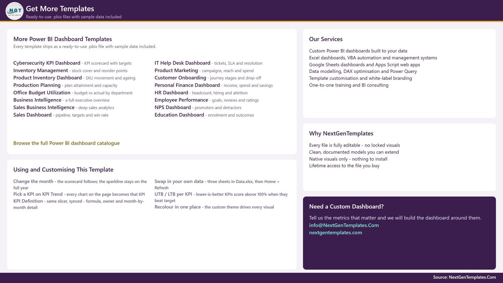
A catalogue page of other ready-to-use .pbix templates, plus a short Using and Customising guide covering the month picker, the KPI sync, the higher-is-better and lower-is-better rule, and how to recolour the whole report from its single custom theme.
The data pack behind it
Data.xlsx holds four sheets: a Read Me, KPI Definition (one row per KPI), Input_ Target (one row per KPI per month) and Input_ Actual (the same shape for the reporting year and the year before it, which is what every prior-year and YoY figure reads from). The Read Me also spells out a rule worth repeating: for rates, ratios and index KPIs, YTD is the average of the months so far, never a sum. A compliance percentage that adds up to 1,900% by December is the single most common mistake in a KPI pack.
Refreshing is a single click — keep the workbook beside the .pbix and use Home > Refresh in Power BI Desktop, which Microsoft distributes free.
Music Festival KPI Dashboard in Power BI vs. Tableau / Qlik vs. Festival SaaS Reporting — Feature Comparison
| Feature | Music Festival KPI Dashboard in Power BI | Tableau / Qlik build | Festival SaaS reporting |
|---|---|---|---|
| Cost | $12.99 one-time ✅ | $75+ / user / month plus build time | $50-300 / month, often revenue-share |
| Platform | Power BI Desktop (free) ✅ | Tableau or Qlik licence required | Vendor’s own web portal |
| Setup time | Under 10 minutes ✅ | Days to weeks of dashboard building | Onboarding call plus data migration |
| Targets you set yourself | Yes, per KPI per month ✅ | Yes, if you build it | Often fixed to vendor metrics |
| Direction-aware scoring for cost KPIs | Built in ✅ | Manual calculation work | Rarely offered |
| Works offline | Yes, it is a local file ✅ | Desktop yes, server no | No |
| Add or remove KPIs | Edit a spreadsheet row ✅ | Re-model and re-publish | Vendor roadmap |
| Year-1 cost at 5 users | $12.99 ✅ | $4,500+ | $600-3,600 |
| You own the file forever | Yes ✅ | No, licence lapses | No, data lives with vendor |
For festival teams that want a board-ready monthly scorecard without a BI licence or a per-event SaaS bill, the Music Festival KPI Dashboard in Power BI sits in the sweet spot.
Who Should Use This Template
Perfect for:
- Festival directors and promoters producing a monthly KPI pack for investors, sponsors or the board
- Event operations and production managers watching gate wait time, incident rate and production cost per attendee
- Festival finance and revenue-management teams tracking net ticket revenue, ticket yield, sponsorship and vendor settlement days
- Agencies and venue groups reporting the same metrics across several festivals in one repeatable format
Not a fit if:
- You need live box-office data — this reads a spreadsheet you refresh, not a ticketing API
- You need order-level or vendor-level drilldown — the analytical Music Festivals Dashboard does that instead
- You need row-level security, SSO or scheduled Power BI Service refresh configured out of the box
- You are hoping for industry benchmark targets — every target here is a blank you fill in
Real-World Use Cases
Maya programmes a three-day city festival for 25,000 people. On the first Monday of each month she sets the Month slicer, screenshots the five summary cards for the promoter update, and drills into anything amber. When Artist & Talent Cost Ratio % slipped, the KPI Definition page settled the argument in thirty seconds by showing the formula and the twelve-month table together.
Dan runs guest operations for a touring festival brand. He filters the scorecard by Owner to Guest Operations and Health & Safety, so his review covers only Gate Entry Wait Time and Incident Rate per 10k Attendees — against target, rather than against whatever people remembered from the weekend.
Priya is finance lead at a venue group with four festivals. She keeps one copy of the template per event. Because the format never changes, four board packs come out of the same routine and the group can compare Vendor Settlement Days across events without rebuilding anything.
Advantages of the Music Festival KPI Dashboard in Power BI
The biggest saving is not the licence fee, it is the argument that does not happen. Every KPI carries a stored formula and a stored owner, so the monthly review is about the number, not about the definition. Direction-aware scoring means cost and cycle-time KPIs are treated fairly instead of always looking red. And because the model is driven entirely by the spreadsheet, a festival that adds an accessibility or artist-welfare KPI next season does not need a BI developer — it needs three new rows.
At $12.99 one-time against $50-300 a month for festival SaaS reporting, the template pays for itself before the first event lands.
Opportunities for Improvement
Honest limitations, because they matter more than the feature list:
- It is not live. The report refreshes from Data.xlsx. There is no connector to a ticketing platform, EPOS or access-control system, so somebody has to fill the monthly rows.
- Monthly grain only. KPIs are stored per month. Day-of-show or per-gate analysis needs the analytical dashboard, not this one.
- No drillthrough page. Movement between KPI Trend and KPI Definition is by synced slicer rather than a right-click drillthrough — fast once you know it, slightly less discoverable at first.
- Two years of history. Current year and prior year drive every comparison; a three-year view means extending the actuals sheet yourself.
- The demo figures are demo figures. The shipped 2024-2025 numbers illustrate the mechanics. None of them is a festival benchmark.
Best Practices
- Set targets before the season starts, not retrospectively — a target edited after the fact makes the whole scorecard meaningless.
- Assign a real owner to every KPI. The Owner slicer is only useful if the names are people who will actually answer for the number.
- Keep rate and ratio KPIs as averages in the YTD column, never sums.
- Trim the KPI list rather than growing it. Fourteen is already a full page; twenty-five is a spreadsheet nobody reads.
- Keep the .pbix and Data.xlsx together, and if you move them, repoint with Home > Transform data > Data source settings > Change Source.
Explore Relevant Templates
- Music Festivals Dashboard in Power BI — the analytical companion to this scorecard.
- Concert Promoters Dashboard in Power BI — the promoter side of the same business.
- Music and Performing Arts Dashboard in Power BI — a wider view across venues and productions.
- Nightclubs Dashboard in Power BI — for the year-round venue business between festivals.
- Library Services KPI Dashboard in Power BI — the same scorecard engine applied to public services.
Also available as: Music Festival KPI Dashboard in Excel, Music Festival KPI Dashboard in Google Sheets and Music Festival KPI Scorecard in Excel. You can also read our walkthrough of the Excel edition or the Ticketing and Live Events Dashboard in Power BI.
Frequently Asked Questions
What KPIs does the Music Festival KPI Dashboard in Power BI track?
The Music Festival KPI Dashboard in Power BI ships with 14 KPIs across seven groups: Ticketing, Revenue, Cost & Margin, Guest Experience, Safety & Compliance, Marketing and Sustainability. They include Ticket Sell-Through Rate %, Net Ticket Revenue, Sponsorship Revenue, Production Cost per Attendee and Waste Diversion Rate %.
How long does setup take?
Under 10 minutes. Replace the sample rows in the three input sheets of Data.xlsx, keep the workbook beside the .pbix file, and press Home > Refresh in Power BI Desktop. The Music Festival KPI Dashboard in Power BI rebuilds every card, status light and chart from whatever rows exist.
Is this the same product as the Music Festivals Dashboard in Power BI?
No. The Music Festival KPI Dashboard in Power BI is a KPI scorecard built on targets, achievement percentages and traffic lights. The Music Festivals Dashboard in Power BI is an analytical dashboard that slices ticket, attendance and vendor transactions. They are separate templates and many teams own both.
Can I add my own KPIs?
Yes. Nothing in the Music Festival KPI Dashboard in Power BI is hard-coded to a KPI name. Add a row to the KPI Definition sheet plus its monthly target and actual rows, then refresh. The KPI list, the summary counts and every chart update automatically.
How does this compare to festival SaaS reporting tools?
Festival SaaS reporting typically costs $50-300 a month and keeps your history on the vendor’s servers. The Music Festival KPI Dashboard in Power BI is a one-time $12.99 purchase, runs in free Power BI Desktop, works offline and stays yours permanently — but it does not connect live to a ticketing platform.
Do I need Power BI Pro or any custom visual?
Neither. The report uses only native Power BI visuals — cards, line charts, bar charts, tables and slicers — and opens in the free Power BI Desktop. There is nothing to install from AppSource and no page is locked.
Are the shipped targets industry benchmarks?
No. Every target in the Music Festival KPI Dashboard in Power BI is a placeholder you set yourself, and the shipped 2024-2025 figures are demo data. Nothing in the file is a benchmark, a safety standard or a recommendation.
About the Author
Built by PK — Microsoft Certified Professional with 15+ years of Excel, Google Sheets and Power BI experience. Founder of NextGenTemplates, reaching 300K+ subscribers across YouTube channels. Every template is hand-built and tested before release.
Conclusion
If your festival already has the numbers but not the format, the Music Festival KPI Dashboard in Power BI gives you the format: 14 KPIs, one month picker, honest direction-aware scoring and a page that explains every formula when somebody asks.
👉 Click here to Purchase the Music Festival KPI Dashboard in Power BI
Instant download · One-time payment · No subscription
For step-by-step walkthroughs, visit Youtube.com/@PK-AnExcelExpert.
Last updated: August 2026