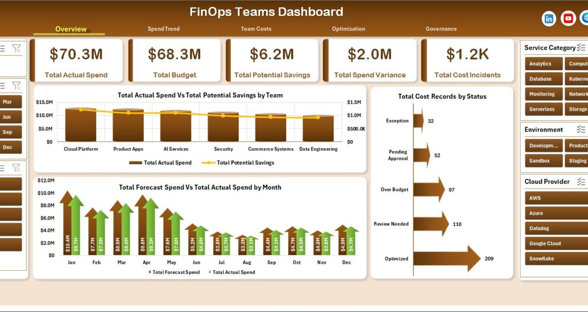
FinOps Teams Dashboard in Excel helps cloud finance, engineering, and IT leaders turn exported cloud cost data into a practical review dashboard. Cloud bills often spread across AWS, Azure, Google Cloud, Kubernetes, shared services, environments, teams, projects, and owners. When that data sits in disconnected exports, it becomes difficult to explain actual spend, budget variance, forecast movement, savings opportunities, and governance issues in one meeting-ready view.
This Excel dashboard gives teams a structured workbook with 7 worksheet tabs, 5 executive KPI cards, 18 analysis charts, multiple slicers, a Data Sheet, and a Support Sheet. It is designed for recurring FinOps reviews where managers need to see spend, budget, forecast, savings, incidents, priority, owners, environments, and untagged resources without building a workbook from zero.
You can download the template here: FinOps Teams Dashboard in Excel.
Key Features of FinOps Teams Dashboard in Excel
- Ready Excel dashboard workbook for cloud cost tracking, budget review, optimization, and governance.
- 5 KPI cards for Total Actual Spend, Total Budget, Total Potential Savings, Total Spend Variance, and Total Cost Incidents.
- 5 analytical dashboard pages covering Overview, Spend Trend, Team Costs, Optimization, and Governance.
- Data Sheet tab where users can replace sample records with their own FinOps data.
- Support Sheet tab with pivot tables used to keep the dashboard dynamic.
- Multiple slicers to filter quickly by team, provider, environment, service category, owner, status, priority, month, quarter, and year.
- Refresh All workflow so updated records flow into pivots, charts, slicers, and cards.
Dashboard Pages Explanation
1. Overview Page
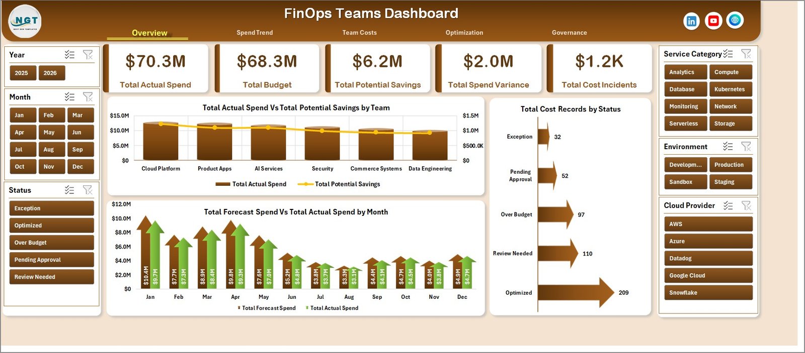
The Overview page is the executive summary for FinOps reviews. At the top, it shows Total Actual Spend, Total Budget, Total Potential Savings, Total Spend Variance, and Total Cost Incidents, giving managers a quick read on cloud cost health before they drill into supporting pages.
Total Actual Spend and Total Potential Savings by Team: This chart compares actual cloud spend with the savings opportunity for each team. It helps FinOps leads identify teams with the biggest optimization potential and prioritize review conversations.
Total Forecast Spend and Total Actual Spend by Month: This chart compares expected cloud spend with actual cloud spend month by month. It helps teams catch recurring overspend, under-forecasting, and sudden usage changes.
Total Cost Records by Status: This chart groups cost records by status so users can see what is open, pending, reviewed, optimized, or closed. It supports accountability because follow-up items are easier to track.
2. Spend Trend
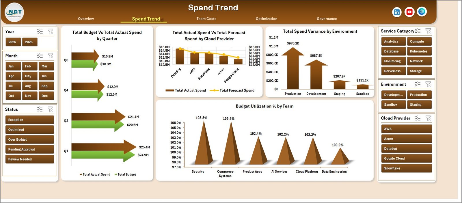
The Spend Trend page focuses on time-based and provider-based analysis. It includes Total Budget and Total Actual Spend by Quarter, Total Actual Spend and Total Forecast Spend by Cloud Provider, Total Spend Variance by Environment, and Budget Utilization % by Team.
This page is useful when leadership asks whether cloud spend is moving in line with budget. It also helps compare cloud providers and environments, making it easier to identify whether production, development, testing, or shared services are creating unusual cost pressure.
3. Team Costs
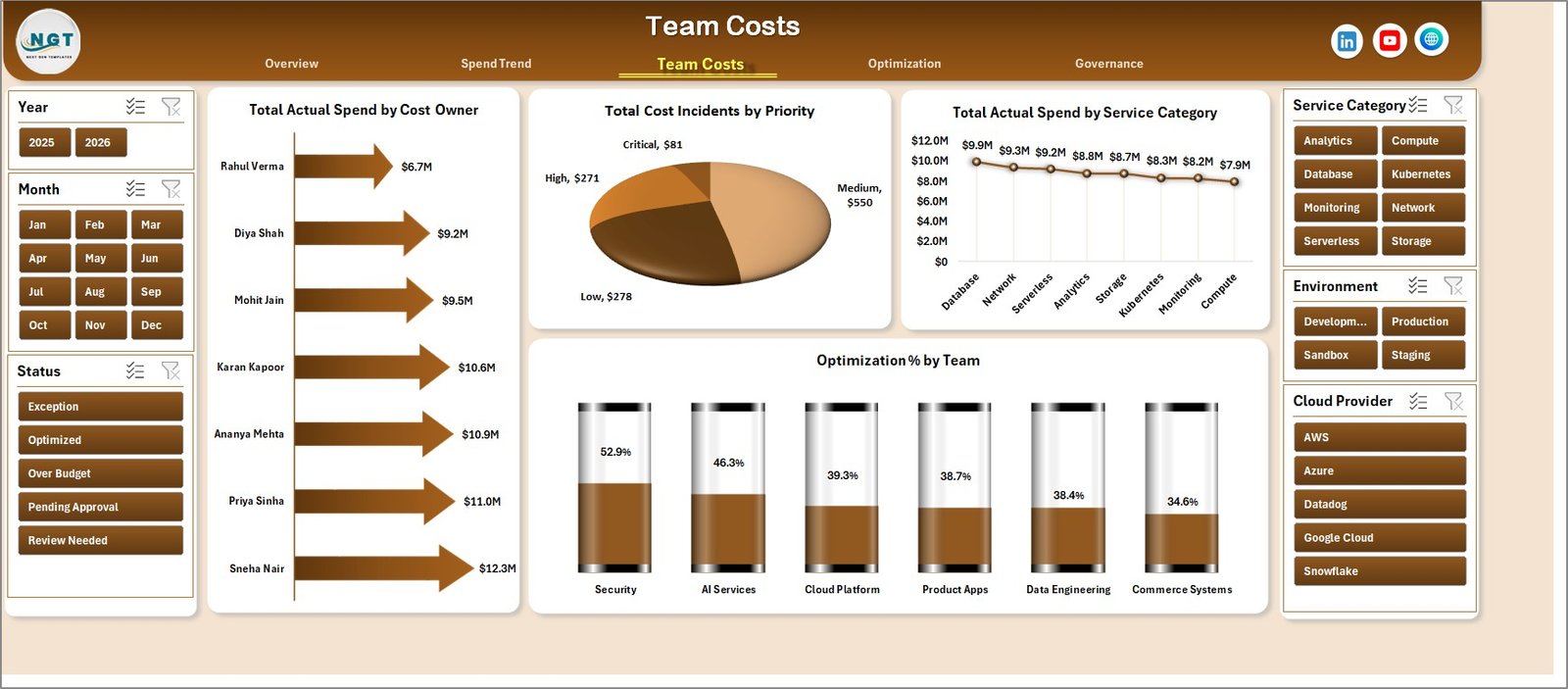
The Team Costs page explains spend accountability. It includes Total Actual Spend by Cost Owner, Total Cost Incidents by Priority, Total Actual Spend by Service Category, and Optimization % by Team.
This is the page to use when managers need team-level visibility. It helps connect cloud spend to owners, identify high-priority incidents, compare service categories, and review which teams are making progress on optimization.
4. Optimization
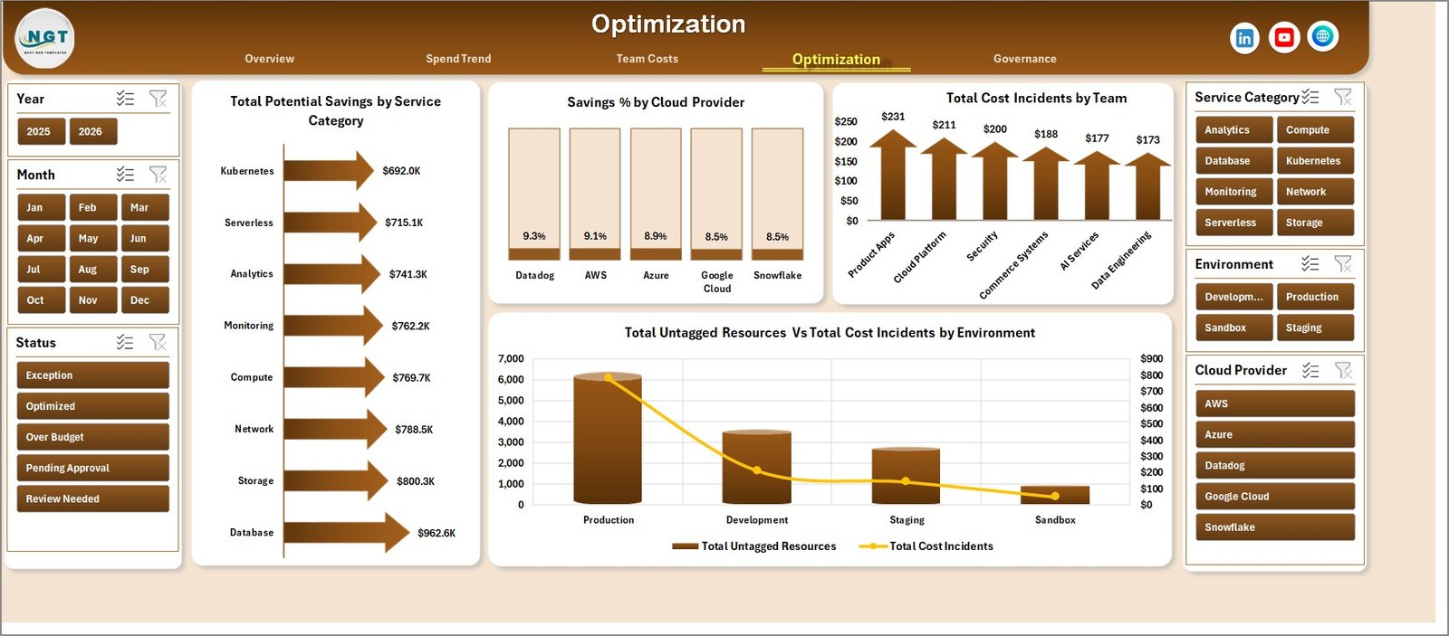
The Optimization page focuses on savings and waste reduction. It includes Total Potential Savings by Service Category, Savings % by Cloud Provider, Total Cost Incidents by Team, and Total Untagged Resources with Total Cost Incidents by Environment.
This page helps teams turn cloud cost data into action. Instead of only reporting spend, it highlights where savings may exist, which providers show better optimization rates, and which environments have tagging or incident patterns that need attention.
5. Governance
The Governance page supports cost control and ownership review. It includes Total Spend Variance by Priority, Total Untagged Resources by Cost Owner, and Total Actual Spend with Total Forecast Spend by Year.
This page is especially useful for leadership and control reviews. It helps users see whether variance is concentrated in high-priority items, whether ownership gaps are creating untagged resources, and how actual spend compares with forecast over a longer period.

6. Data Sheet Tab
The Data Sheet tab is where users enter or paste records in the same format as the sample data. Once the data is updated, the workbook can be refreshed so all dashboard pages, charts, KPI cards, and slicers reflect the latest records.

7. Support Sheet Tab
The Support Sheet contains pivot tables used to build the dashboard dynamically. After updating the Data Sheet, go to the Data tab in the Excel Ribbon and click Refresh All. If you want a cleaner end-user workbook, you can keep this sheet hidden.

FinOps Teams Dashboard in Excel vs. Google Sheets vs. Paid Cloud Cost SaaS – Feature Comparison
| Feature | This Excel Dashboard | Google Sheets Alternative | Paid Cloud Cost SaaS |
|---|---|---|---|
| Cost | $17.99 one-time | Low-cost spreadsheet setup | Monthly or annual subscription |
| Platform | Microsoft Excel | Browser-based spreadsheet | Vendor cloud platform |
| Setup time | Replace data and refresh | Copy sheet and paste data | Requires onboarding and integrations |
| Real-time team collaboration | Available through OneDrive or SharePoint | Built in | Usually included |
| Mobile access | Available through Microsoft 365 apps | Available in browser or app | Usually included |
| Customizable fields | Fully editable workbook | Editable sheet | Limited by vendor configuration |
| Share with link | Available through Microsoft 365 | Built in | Login controlled |
| Year-1 cost at 5 users | $17.99 plus Excel licensing already used | Usually low | Often hundreds or thousands |
| FinOps-ready pages | 5 dashboard pages included | Requires equivalent build | Depends on plan and source integrations |
Who Should Use This Template
This dashboard is built for FinOps practitioners, cloud finance analysts, engineering managers, platform teams, IT operations teams, CFO office users, and business unit owners who need a recurring way to review cloud cost data.
It is also useful for teams that already export data from AWS, Azure, Google Cloud, or internal billing systems and want a simple reporting layer in Excel. Microsoft has its own cloud cost tools, including Microsoft Cost Management documentation, but many teams still need a lightweight workbook for internal reviews and offline analysis.
Real-World Use Cases
Monthly FinOps review: A FinOps lead exports cost records, refreshes the workbook, and reviews spend variance, savings, and incidents with engineering managers.
Engineering accountability: A team manager filters the dashboard by owner, environment, and service category to understand where their group is exceeding forecast.
Finance leadership reporting: A finance analyst uses the Overview and Governance pages to explain actual spend, forecast spend, and high-priority variance to leadership.
Advantages of FinOps Teams Dashboard in Excel
- Fast setup: Start from a ready dashboard instead of building pivots, slicers, and charts manually.
- Clear accountability: View spend and incidents by team, owner, provider, service category, and priority.
- Optimization focus: Track potential savings, savings percentage, incidents, and untagged resources.
- Excel familiarity: Most finance and operations teams already know how to filter, refresh, and edit Excel workbooks.
- One-time cost: Use the template without paying a recurring dashboard subscription.
Opportunities for Improvement
This template is intentionally workbook-based, so it does not replace automated cost ingestion, anomaly alerting, approval workflows, or live cloud billing APIs. Teams that need real-time integrations should still use native cloud billing tools or a dedicated FinOps platform.
The best improvement path is to connect your exported cost data consistently, standardize team and owner naming, and maintain clear tagging rules so the Data Sheet remains clean.
Best Practices
- Keep team, owner, service category, environment, provider, and priority values consistent.
- Refresh the workbook after every data update.
- Review high-variance and high-priority items first.
- Use the Optimization page to assign savings actions to named owners.
- Hide the Support Sheet for end users, but keep it available for workbook maintenance.
- Store a monthly copy before making major data or pivot changes.
Explore Relevant Templates
You can download the FinOps Teams Dashboard in Excel from NextGenTemplates. You may also find these finance-related templates useful: Outsourced Accounting KPI Dashboard in Excel, Accounting Firms KPI Dashboard in Excel, and Digital Microloans Dashboard in Excel.
Frequently Asked Questions
What does the FinOps Teams Dashboard in Excel track?
It tracks actual spend, budget, forecast spend, potential savings, spend variance, cost incidents, untagged resources, teams, cost owners, cloud providers, environments, service categories, statuses, priorities, months, quarters, and years.
How many worksheet tabs are included?
The workbook includes 7 worksheet tabs: Overview, Spend Trend, Team Costs, Optimization, Governance, Data Sheet, and Support Sheet.
Can I use this with AWS, Azure, and Google Cloud data?
Yes. The dashboard can be used with exported cloud cost data as long as your records are arranged in the required Data Sheet format.
Does this template require macros?
No. The described workflow uses Excel data, pivot tables, charts, slicers, and Refresh All.
Can I customize the dashboard pages?
Yes. You can customize chart titles, colors, source fields, formulas, pivots, slicers, and page labels.
Is this a replacement for paid FinOps software?
No. It is a reporting workbook for analysis and review. It does not replace live integrations, anomaly alerts, automated rightsizing, or approval workflows.
About the Author
Built by PK – Microsoft Certified Professional with 15+ years of Excel, Google Sheets, and Power BI experience. Founder of NextGenTemplates, reaching 300K+ subscribers across YouTube channels. Every template is hand-built and tested before release.
Conclusion
The FinOps Teams Dashboard in Excel is a practical option for teams that want to review cloud cost, budget, forecast, savings, incidents, and governance in a familiar spreadsheet environment. Update the Data Sheet, click Refresh All, and use the dashboard pages to guide better cloud cost conversations.
For more Excel dashboard tutorials, visit youtube.com/@PKAnExcelExpert.