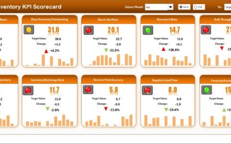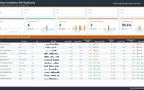
FinOps Teams Dashboard in Power BI helps cloud finance, engineering, and IT teams turn cost records into a clear review dashboard for spend, budget utilization, savings, variance, and governance. Cloud costs can move quickly across teams, services, providers, owners, and environments. When the data is reviewed only in raw exports, it is easy to miss forecast pressure, high-priority variance, unowned spend, and savings opportunities.
This Power BI dashboard gives users a ready reporting structure with 5 report pages, 6 executive KPI cards, 13 analytical visuals, and multiple slicers. It is designed for recurring FinOps reviews where managers need to discuss actual spend, potential savings, forecast spend, budget utilization, ownership, priorities, and environment-level performance in one place.
You can review the product draft here: FinOps Teams Dashboard in Power BI.
Key Features of FinOps Teams Dashboard in Power BI
- 5 Power BI pages for Overview, Spend Trend, Team Costs, Optimization, and Governance.
- 6 KPI cards for Total Potential Savings, Total Cost Records, Spend Variance, Budget Utilization, Total Actual Spend, and Savings Rate.
- Multiple slicers so users can filter by team, owner, provider, service category, status, priority, environment, and period.
- Spend trend analytics for budget, actual spend, quarters, teams, and environments.
- Team cost reporting by cost owner, service category, and priority.
- Optimization views for savings opportunities, cost records, teams, service categories, and cloud providers.
- Governance reporting for budget utilization, spend variance, and savings rate.
- Editable .pbix file that can be customized in Power BI Desktop.
Dashboard Pages Explanation
1. Overview Page
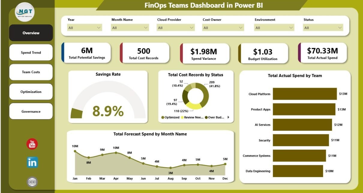
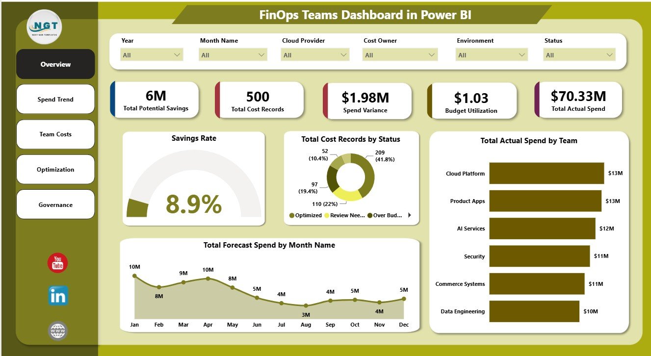
The Overview page is the executive summary for FinOps reviews. At the top, it shows Total Potential Savings, Total Cost Records, Spend Variance, Budget Utilization, Total Actual Spend, and Savings Rate, giving stakeholders a fast view of cloud cost health.
Total Cost Records by Status: This chart groups cloud cost records by status so teams can see what is open, pending, reviewed, optimized, or closed. It helps owners track the flow of cost actions and focus on records that still need attention.
Total Actual Spend by Team: This visual compares actual spend across teams. It supports chargeback discussions, team-level accountability, and leadership reviews where cost ownership matters.
Total Forecast Spend by Month Name: This trend shows expected cloud spend by month. It helps finance and FinOps teams spot seasonal movement, forecast pressure, and changing cloud usage patterns.
Savings Rate by Overall Dashboard: This visual gives a quick indicator of optimization performance. It helps leaders understand whether savings efforts are improving or need more focus.
2. Spend Trend
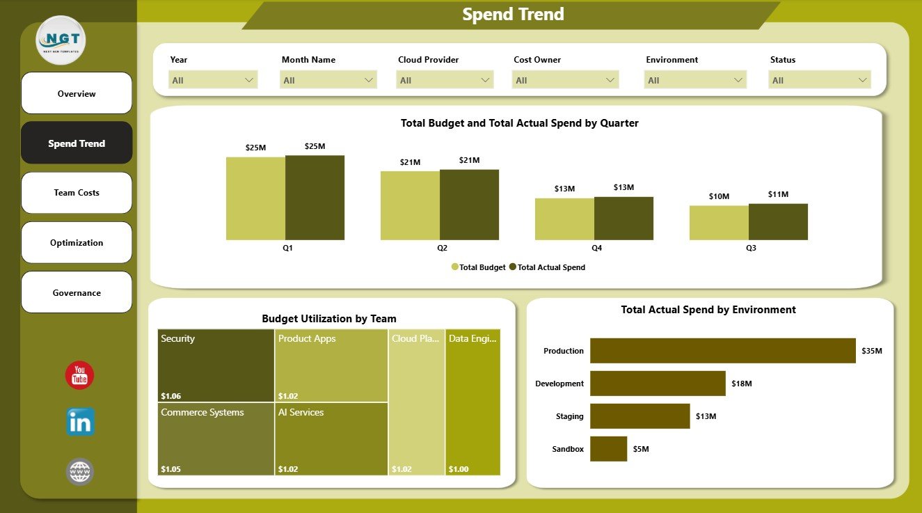
The Spend Trend page focuses on time-based and environment-based cost performance. It includes Total Budget and Total Actual Spend by Quarter, Budget Utilization by Team, and Total Actual Spend by Environment.
This page is useful when leadership asks whether cloud spend is moving in line with budget. It also helps compare environments such as production, development, testing, and shared services.
3. Team Costs
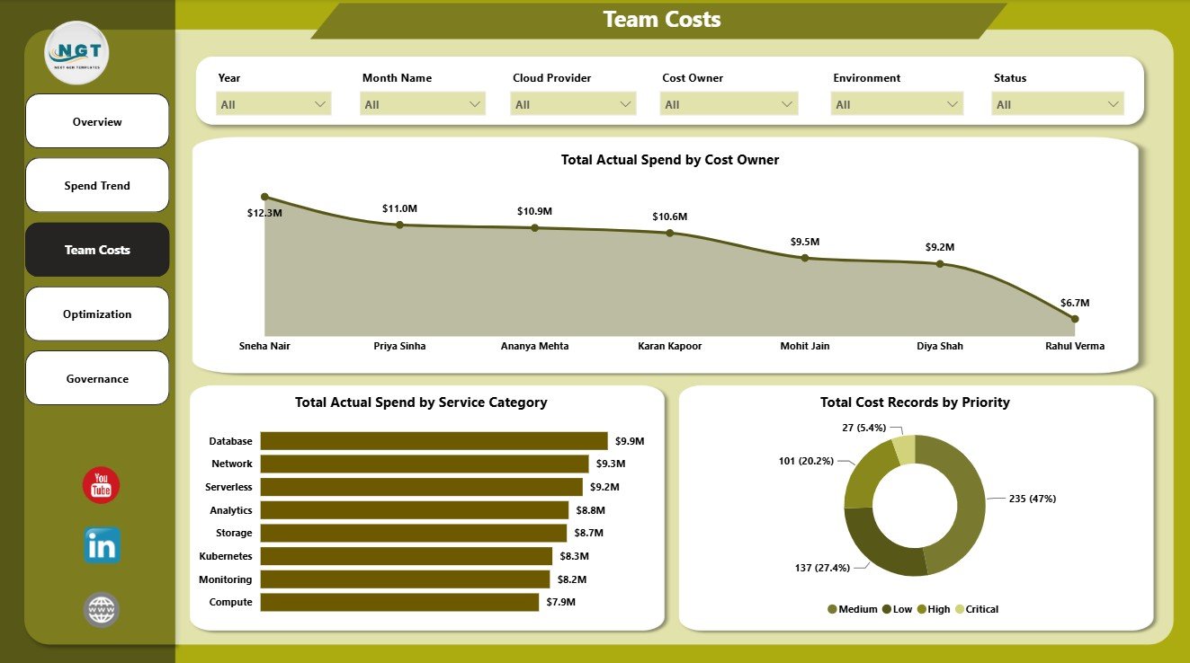
The Team Costs page explains cost ownership. It includes Total Actual Spend by Cost Owner, Total Actual Spend by Service Category, and Total Cost Records by Priority.
This page helps managers understand which owners and services are driving spend. Priority-level views also make it easier to separate routine cost records from items that need immediate review.
4. Optimization
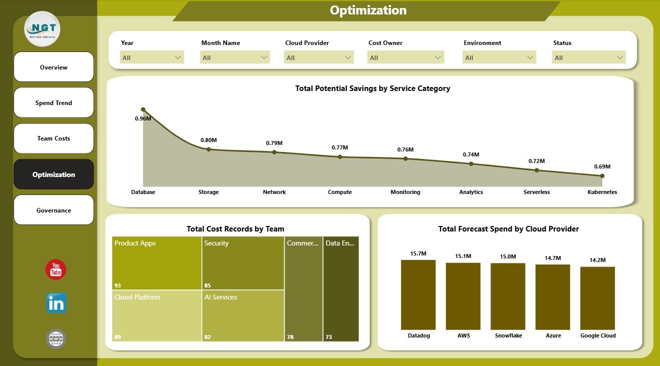
The Optimization page focuses on savings and improvement opportunities. It includes Total Potential Savings by Service Category, Total Cost Records by Team, and Total Forecast Spend by Cloud Provider.
This page helps convert reporting into action. Instead of only showing what was spent, it highlights where potential savings exist and which teams or providers should be reviewed first.
5. Governance
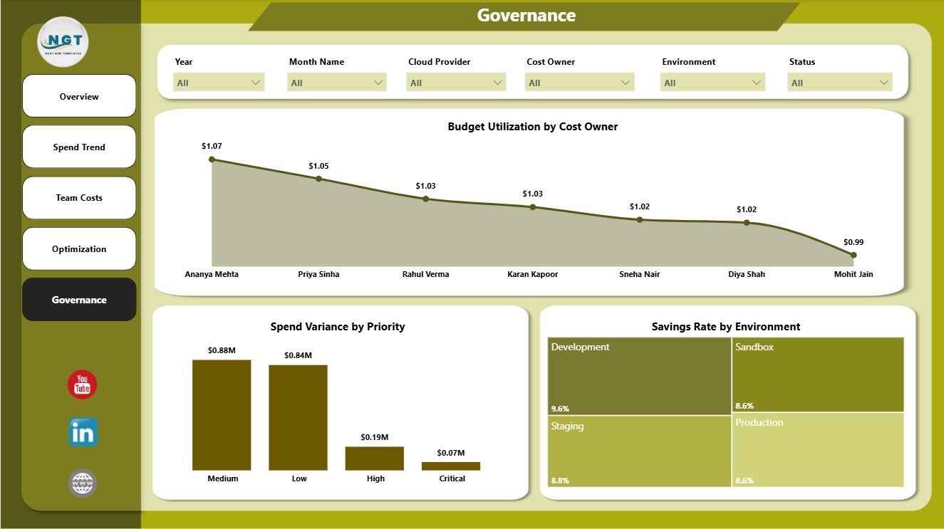
The Governance page supports control, ownership, and accountability. It includes Budget Utilization by Cost Owner, Spend Variance by Priority, and Savings Rate by Environment.
This page is helpful for reviews where leaders need to understand who owns budget pressure, whether variance is linked to high-priority records, and which environments show stronger savings performance.
FinOps Teams Dashboard in Power BI vs. Tableau vs. Paid Cloud Cost SaaS – Feature Comparison
| Feature | This Power BI Dashboard | Tableau Alternative | Paid Cloud Cost SaaS |
|---|---|---|---|
| Cost | $17.99 one-time | License plus dashboard build time | Monthly or annual subscription |
| Platform | Power BI Desktop and Power BI Service | Tableau Desktop or Cloud | Vendor cloud platform |
| Setup time | Open .pbix, replace or connect data, refresh | Build or adapt workbook | Requires onboarding and integrations |
| Real-time team collaboration | Available through Power BI Service after publishing | Available through Tableau Cloud | Usually included by plan |
| Mobile access | Available after publishing | Available after publishing | Usually included |
| Customizable fields | Editable model, visuals, measures, and filters | Editable if you own the workbook | Limited by vendor configuration |
| Share with link | Available through Power BI Service | Available through Tableau Cloud | Login controlled |
| Year-1 cost at 5 users | $17.99 plus any Microsoft licensing | Usually much higher | Often hundreds or thousands |
| FinOps-ready pages | 5 report pages included | Requires custom dashboard design | Depends on plan and source integrations |
Who Should Use This Template
This template is useful for FinOps practitioners, cloud finance analysts, engineering managers, IT leaders, platform teams, cost governance leads, and CFO office users. It is especially helpful when a team already exports cloud cost data and wants a reusable Power BI layer for monthly or weekly review.
It is not a live cloud billing connector or automated optimization engine. For native cloud cost management, Microsoft also provides Power BI documentation and Azure cost management resources, but many teams still need a simple review dashboard that can be customized to their internal reporting format.
Real-World Use Cases
Monthly FinOps review: A FinOps lead refreshes the report before a meeting and reviews actual spend, potential savings, status, and forecast movement with engineering managers.
Engineering accountability: A team manager filters by team, owner, service category, and environment to understand which services are creating budget pressure.
Finance leadership reporting: A finance analyst uses Spend Trend and Governance to explain budget utilization, variance, and savings rate in a leadership-ready format.
Advantages of FinOps Teams Dashboard in Power BI
- Fast setup: Start from a ready report instead of building every visual from scratch.
- Clear ownership: Review spend by team, owner, service, provider, environment, and priority.
- Optimization focus: Track potential savings and savings rate rather than only total spend.
- Power BI flexibility: Customize measures, visuals, pages, filters, and model logic.
- One-time cost: Use the template without adding another dashboard SaaS subscription.
Opportunities for Improvement
The dashboard depends on clean source data. If team names, service categories, owners, priorities, or environments are inconsistent, the visuals may need data cleanup before they become reliable.
The template also does not replace real-time anomaly detection, automated rightsizing recommendations, approval workflows, or native billing APIs. Teams that need those features should combine this dashboard with their cloud provider tools or a dedicated FinOps platform.
Best Practices
- Keep team, cost owner, service category, status, priority, environment, and provider values consistent.
- Refresh the report after each data update.
- Review high-priority spend variance first.
- Use the Optimization page to assign savings actions to named owners.
- Validate KPI cards after changing the data model or replacing source fields.
- Publish to Power BI Service only after reviewing access permissions and refresh settings.
Explore Relevant Templates
You can review the FinOps Teams Dashboard in Power BI on NextGenTemplates. You may also find the FinOps Teams Dashboard in Excel, Fertilizer Manufacturing Dashboard in Power BI, and Power BI Dashboard Templates category useful.
Frequently Asked Questions
What does the FinOps Teams Dashboard in Power BI track?
It tracks potential savings, cost records, spend variance, budget utilization, actual spend, savings rate, teams, owners, service categories, priorities, environments, providers, and forecast spend.
How many report pages are included?
The dashboard includes 5 report pages: Overview, Spend Trend, Team Costs, Optimization, and Governance.
Can I use AWS, Azure, or Google Cloud data?
Yes. You can use exported or connected cloud cost records as long as the data is mapped to the fields used by the report.
Do I need Power BI Desktop?
Yes. Power BI Desktop is needed to open, refresh, customize, and edit the .pbix file.
Can I publish the report online?
Yes. You can publish it to Power BI Service if you have the required Microsoft account and licensing.
Is this a replacement for paid FinOps software?
No. It is a reporting dashboard for review and analysis, not a live cloud billing platform or automated savings engine.
About the Author
Built by PK – Microsoft Certified Professional with 15+ years of Excel, Google Sheets, and Power BI experience. Founder of NextGenTemplates, reaching 300K+ subscribers across YouTube channels. Every template is hand-built and tested before release.
Conclusion
The FinOps Teams Dashboard in Power BI is a practical option for teams that want to review cloud cost, savings, budget utilization, variance, ownership, forecast spend, and governance in an editable Power BI report. It gives finance and engineering teams a shared view for better cloud cost conversations.
For more dashboard tutorials, visit youtube.com/@PKAnExcelExpert.