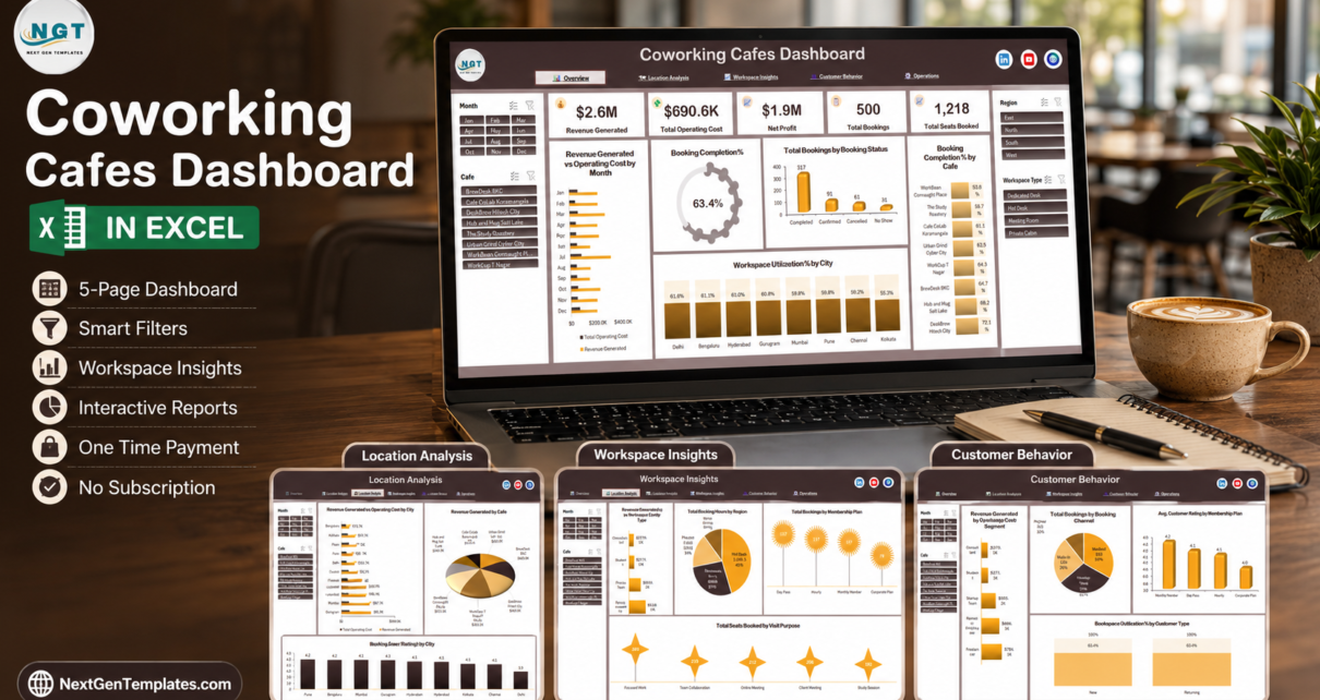
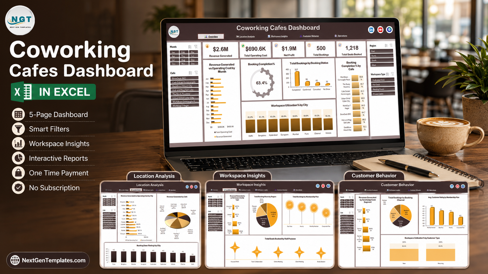
A coworking cafe sells two things at once – a seat and a coffee – and most owners only measure one of them properly. The Coworking Cafes Dashboard in Excel puts both on the same page. The sample build carries a full trading year for eight cafes across eight Indian cities: $2.6M of revenue generated, $690.6K of operating cost, $1.9M of net profit, 500 bookings and 1,218 seats booked, with a booking completion rate of 63.4%. That last number is the one that hurts – 192 of 500 bookings never turned into a seated session, and until you can see it split by cafe, region and workspace type, you cannot do anything about it.
This is the analytical five-page Excel dashboard, not a monthly KPI scorecard. There is no month picker, no target-versus-actual column and no traffic lights. Instead there are five wide report pages driven by four synced slicers, built on ordinary pivot tables and charts – no macros, no Power Pivot licence, no add-ins. It opens in Excel 2016 and later, including Excel for Mac and Microsoft 365.
Key Features of the Coworking Cafes Dashboard in Excel
- Four synced slicers on every page. Month, Cafe, Region and Workspace Type sit in fixed left and right rails. Select The Study Roastery plus Meeting Room and all five pages answer that one question together.
- Five headline cards. Revenue Generated, Total Operating Cost, Net Profit, Total Bookings and Total Seats Booked, all recalculating with the slicers.
- 21 charts across five pages, each titled by what it measures rather than by chart type – “Revenue Generated vs Operating Cost by City”, “Total Seats Booked by Visit Purpose”, “Occupied Seat Hours by Quarter”.
- A 500-row Data sheet with 31 columns, including Booking ID, Date, Cafe, City, Region, Workspace Type, Membership Plan, Booking Channel, Customer Segment, Customer Type, Visit Purpose, Booking Status, Seats Booked, Booking Hours, Hourly Rate, Cafe Pass Revenue, Food Beverage Spend, Meeting Room Spend, Total Revenue, Operating Cost, Available Seat Hours and Customer Rating.
- Two revenue lenses at once. Cafe Pass Revenue, Food Beverage Spend and Meeting Room Spend are separate columns, so a cafe that fills desks but sells nothing over the counter is visible.
- No macros. The file is a plain
.xlsx, so it opens with no security prompt and no “enable content” banner.
Dashboard Pages Explanation
Page 1 – Overview
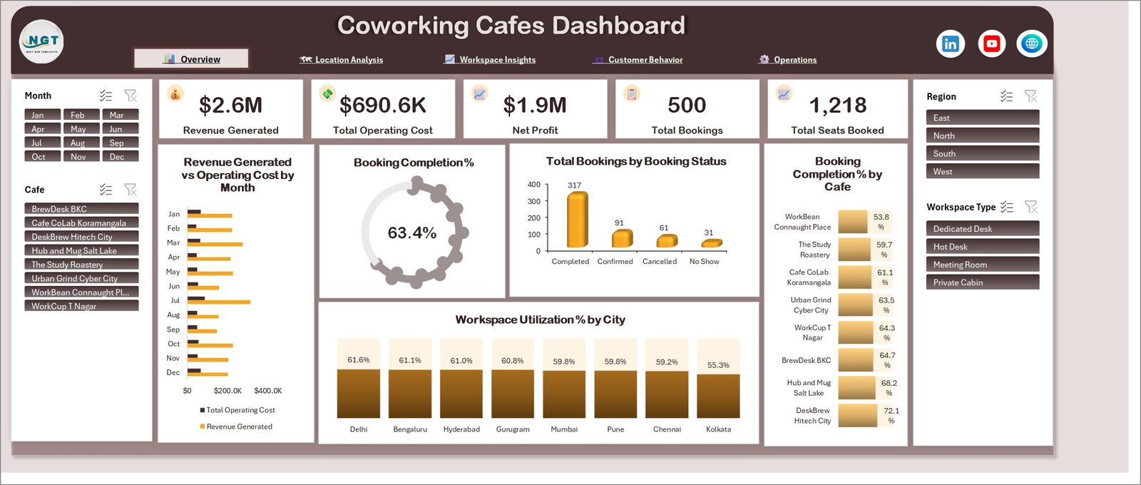
The five KPI cards sit above the fold, followed by Revenue Generated vs Operating Cost by Month, a Booking Completion % dial reading 63.4%, and Total Bookings by Booking Status – Completed 317, Confirmed 91, Cancelled 61, No Show 31. The four numbers add to exactly 500, which is the fastest sanity check in the whole file. On the right, Booking Completion % by Cafe runs from DeskBrew Hitech City at 72.1% down to WorkBean Connaught Place at 53.8%, and along the bottom Workspace Utilization % by City spans Delhi 61.6% to Kolkata 55.3%.
Page 2 – Location Analysis
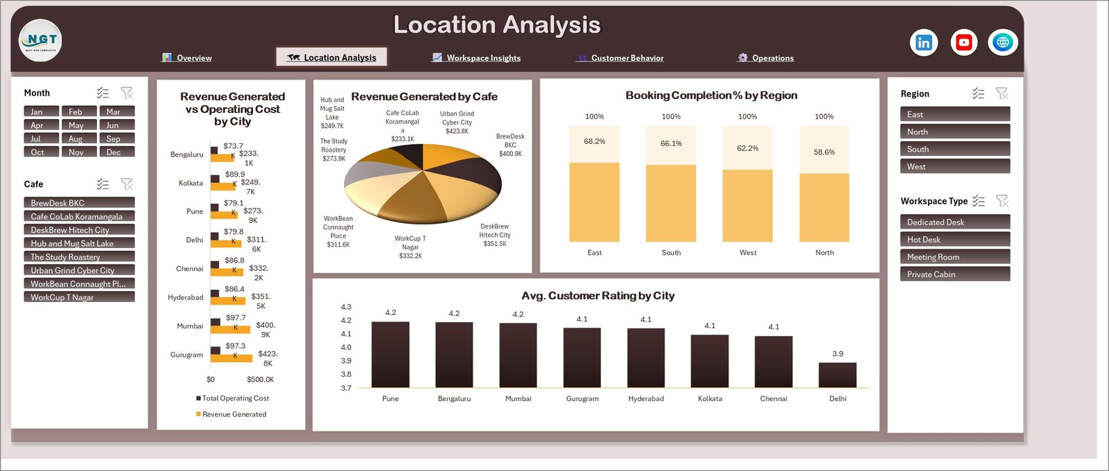
Revenue Generated vs Operating Cost by City puts the two bars side by side for all eight cities, from Bengaluru at $233.1K revenue against $73.7K cost up to Gurugram at $423.8K against $97.3K. Revenue Generated by Cafe repeats the same money as a share pie, Booking Completion % by Region shows East 68.2%, South 66.1%, West 62.2% and North 58.6%, and Avg. Customer Rating by City runs from Pune, Bengaluru and Mumbai at 4.2 down to Delhi at 3.9. Delhi is the case this page exists for: high utilisation, lowest rating.
Page 3 – Workspace Insights
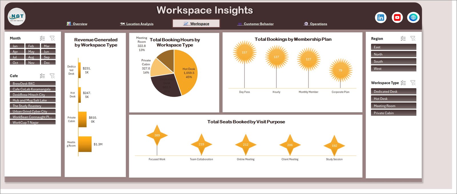
This is where the pricing argument lives. Revenue Generated by Workspace Type gives Meeting Room $1.3M, Private Cabin $810.0K, Hot Desk $247.5K and Dedicated Desk $231.1K – but Total Booking Hours by Workspace Type inverts it, with Hot Desk taking 1,059.5 hours (45%) and Meeting Room only 322.8 hours (13%). Hot desks fill the room; meeting rooms pay for it. Underneath, Total Bookings by Membership Plan gives Day Pass 157, Hourly 137, Monthly Member 127 and Corporate Plan 79, and Total Seats Booked by Visit Purpose shows Focused Work 389 well clear of Team Collaboration 219, Online Meeting 212, Client Meeting 206 and Study Session 192.
Page 4 – Customer Behavior
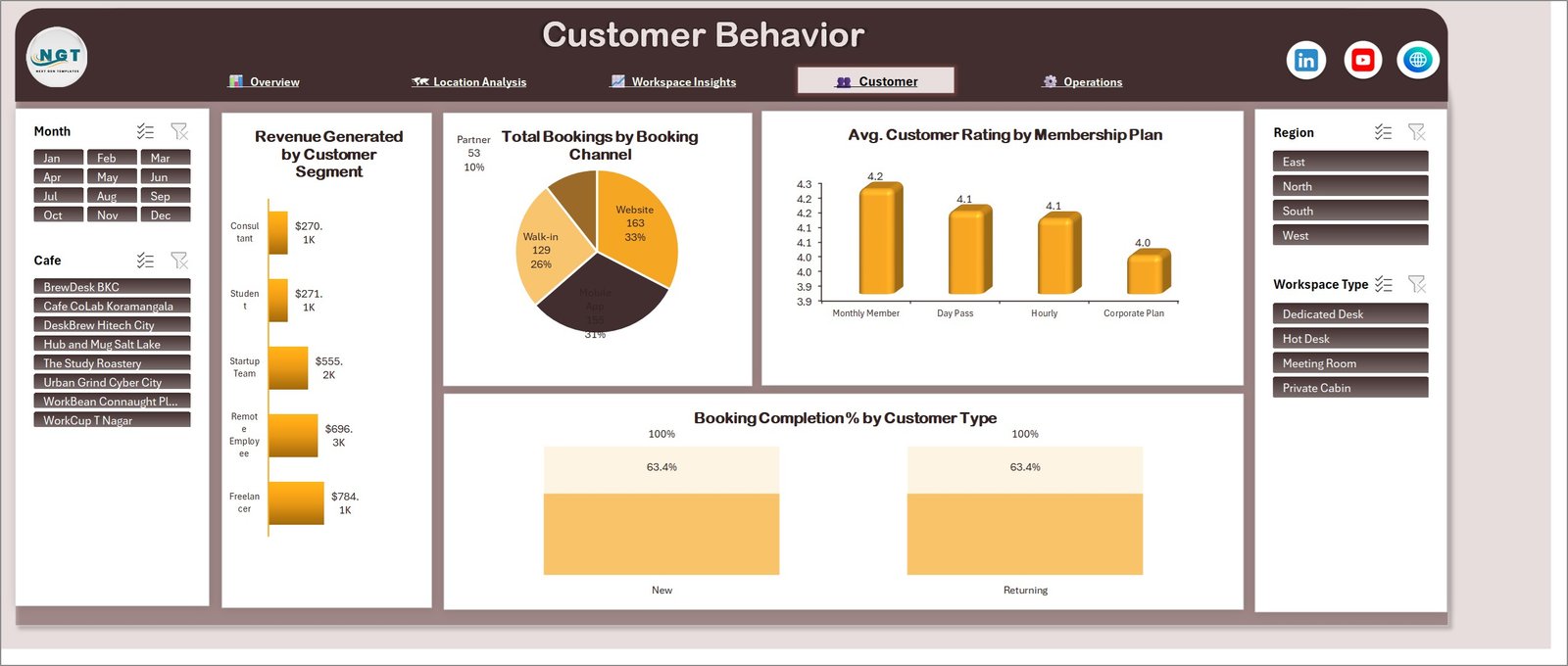
Revenue Generated by Customer Segment ranks Freelancer $784.1K, Remote Employee $696.3K, Startup Team $555.2K, Student $271.1K and Consultant $270.1K. Total Bookings by Booking Channel splits Website 163, Mobile App 155, Walk-in 129 and Partner 53 – the app and the website together carry two thirds of the diary. Avg. Customer Rating by Membership Plan puts Monthly Member top at 4.2 and Corporate Plan last at 4.0, and Booking Completion % by Customer Type compares New against Returning.
Page 5 – Operations
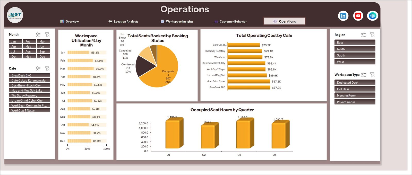
Workspace Utilization % by Month runs as a twelve-row bar strip from October’s 54.1% low to March’s 66.9% high. Total Seats Booked by Booking Status re-cuts the diary by seats rather than bookings – Completed 807, Confirmed 211, Cancelled 130, No Show 70, adding to 1,218. Total Operating Cost by Cafe ranks the eight sites from Cafe CoLab Koramangala at $73.7K to BrewDesk BKC at $97.7K, and Occupied Seat Hours by Quarter shows Q1 1,196.5, Q2 994.3, Q3 1,188.2 and Q4 1,092.7.
Coworking Cafes Dashboard in Excel vs. Google Sheets vs. Paid Coworking SaaS – Feature Comparison
| This Excel dashboard | A Google Sheets build | Coworking SaaS (Nexudus, Cobot, OfficeRnD) | |
|---|---|---|---|
| Cost | $17.99 once | Free to build, days of your time | Roughly $100-$300 per site per month |
| Platform | Excel 2016+, Mac, Microsoft 365 | Any browser | Vendor-hosted web app |
| Setup time | Paste your bookings, refresh, done | Build every chart yourself | Onboarding call, data migration, staff training |
| Real-time team collaboration | Only via OneDrive or SharePoint co-authoring | Yes, native | Yes |
| Mobile access | Excel mobile app, read-only in practice | Good | Good, plus a member app |
| Customisable fields | All 31 columns are yours to rename | Yes | Only what the vendor exposes |
| Share with a link | No – share the file | Yes | Yes |
| Year-1 cost at 5 users | $17.99 | $0 plus your build time | $1,200-$3,600 per site |
| Takes bookings and payments | No – it reports on them | No | Yes, that is the point of it |
| Multi-site comparison out of the box | Yes, 8 cafes across 8 cities | You build it | Usually a paid tier |
The honest summary: SaaS runs the business, this dashboard reads it. If you already take bookings somewhere – a booking platform, a POS, even a shared sheet – and you export a row per booking, this turns that export into a management pack for the price of one month’s coffee.
Who Should Use This Template
Use it if you run between two and twenty coworking cafes or hybrid cafe-workspaces and already collect bookings somewhere exportable; if you need a monthly owners’ or investors’ pack rather than a live operations screen; if you want to compare sites on completion rate, utilisation and cost rather than on gross revenue alone; or if you are pricing hot desks against meeting rooms and want the hours-versus-revenue picture in one chart.
Skip it if you need to take bookings or payments – this reports, it does not transact. Skip it if you run a single site with fifteen bookings a month, where a pivot table over one sheet is enough. Skip it if you need live occupancy from door sensors, or if your team will not open Excel.
Real-World Use Cases
Meera, who owns four cafes in Bengaluru and Chennai. She exports last month’s bookings on the first of the month, pastes them over the Data sheet and refreshes. Booking Completion % by Cafe tells her which site is losing seated sessions to no-shows before she looks at revenue at all – in the sample data that would be the difference between 72.1% and 53.8%.
Rahul, an operations lead at an eight-site chain. He filters to Meeting Room across all sites and reads the hours-versus-revenue split on page 3. Meeting rooms earn the most money on the fewest hours, which is the argument he takes into the quarterly pricing review.
Anjali, preparing a funding deck. She needs revenue, operating cost and net profit by city on one page with a utilisation number beside them. Page 2 and page 5 print straight into the appendix, and the figures reconcile because they all come from the same 500 rows.
Advantages of the Coworking Cafes Dashboard in Excel
- Every total reconciles. Bookings by status, by membership plan and by channel each add to 500; seats by status and by visit purpose each add to 1,218; the eight cities’ revenue and the eight cafes’ operating cost tie back to the $2.6M and $690.6K cards.
- One click filters five pages. Because the slicers are shared across pivot caches, a cafe selection follows you from Overview to Operations.
- It is your file. Unlocked, no password on the sheets, no vendor account, no seat licence, nothing that expires.
- Nothing to install. Plain pivot tables and charts. If you can open a spreadsheet you can open this.
- Cost lives next to revenue. Operating Cost is a column in the source data, so net profit is a real subtraction rather than a guess.
Opportunities for Improvement
Three things are worth knowing before you buy, all cosmetic rather than structural:
- Long category names wrap or truncate. On page 3 the axis labels break mid-word (“Dedicat ed Desk”), and on page 5 the Total Operating Cost by Cafe chart clips names to “Urban Grind Cyber…” and “Hub and Mug Salt…”. Widening the plot area or shortening the names in the Data sheet fixes both.
- Two pie charts put dark labels on dark slices. The Dedicated Desk slice on page 3 and the Mobile App slice on page 4 are legible but low-contrast. Changing the data-label font to white takes ten seconds.
- Booking Completion % by Customer Type is flat in the demo data. New and Returning both read 63.4%, the same as the overall rate, so that chart tells you nothing until your own data goes in. It is a property of the sample rows, not of the formula.
Nothing here affects the arithmetic. Every cross-check above was run against the shipped workbook and ties.
Best Practices
- Keep one row per booking. Every chart assumes it. Do not pre-aggregate by day or by cafe before pasting.
- Paste values, not formats. Use Paste Special > Values over the Data sheet so the table formatting and the six helper columns survive.
- Fill Operating Cost honestly. Net Profit is only as good as that column. Allocate rent, staff and consumables per booking even if the split is rough.
- Refresh everything at once. Data > Refresh All after each paste. See Microsoft’s guide to using slicers to filter data if a slicer stops matching a chart.
- Keep last year’s copy. Save a dated copy before each month’s paste so you can compare December against December.
- Shorten cafe names to about 14 characters in the source data and the label-wrapping problem above disappears everywhere at once.
Explore Relevant Templates
- Coworking Cafes Dashboard in Excel – the template this article covers.
- Coworking Space Dashboard in Excel – the same analytical format for desk-only spaces without the food and beverage side.
- Co-working Space KPI Dashboard in Excel – the month-picker scorecard format with targets and traffic lights, if that is what you actually wanted.
- Remote Work Communities Dashboard in Excel – membership, engagement and community revenue.
- Resource Booking Tracker in Excel – a simple desk and room booking log that can feed this dashboard.
- Coworking Space Dashboard in Power BI – the same subject for a Power BI team.
Frequently Asked Questions
Is this a KPI scorecard with targets and traffic lights?
No. This is the analytical line – five wide report pages you explore with slicers. There is no month picker, no target column and no red/amber/green. If you want that format, the Co-working Space KPI Dashboard in Excel is the scorecard version.
Does it take bookings or payments?
No. It reads a booking export and reports on it. Keep taking bookings wherever you take them now.
Do I need macros, Power Pivot or an add-in?
None of the three. The file is a plain .xlsx built on pivot tables, charts and slicers, so it opens with no security prompt. Excel 2016 or later, Windows or Mac.
How much of my own data can it take?
The sample carries 500 bookings across 31 columns. Pivot tables handle tens of thousands of rows comfortably; extend the Data sheet and refresh. Very large exports are better summarised to a row per booking first.
Are the cafe names and cities real businesses?
No. BrewDesk BKC, Cafe CoLab Koramangala, The Study Roastery and the rest are invented demo names, and the figures are generated sample data. Nothing in the file is a benchmark, a market study or a valuation.
Can I add my own columns and charts?
Yes. Nothing is protected. Add columns to the right of the Data sheet, extend the pivot source and build charts in the same style, or rename any of the 31 existing columns to match your own vocabulary.
What exactly is in the download?
A ZIP containing the .xlsx workbook and an Excel Dashboard user manual in PDF. Seven sheets: five report pages, the Data sheet and a Support sheet holding the pivot tables the charts read from.
About the Author
Built by PK – Microsoft Certified Professional with 15+ years of Excel, Google Sheets, and Power BI experience. Founder of NextGenTemplates, reaching 300K+ subscribers across YouTube channels. Every template is hand-built and tested before release.
Conclusion
Coworking cafes fail quietly. Utilisation looks acceptable, revenue looks flat, and nobody notices that a third of the diary never sits down. The Coworking Cafes Dashboard in Excel makes that visible on the first page, then lets you chase it by city, by workspace type, by membership plan and by channel without writing a formula. It costs $17.99 instead of $29.99, downloads instantly, and the file is yours to edit forever.
For step-by-step Excel dashboard tutorials, subscribe at youtube.com/@PKAnExcelExpert.