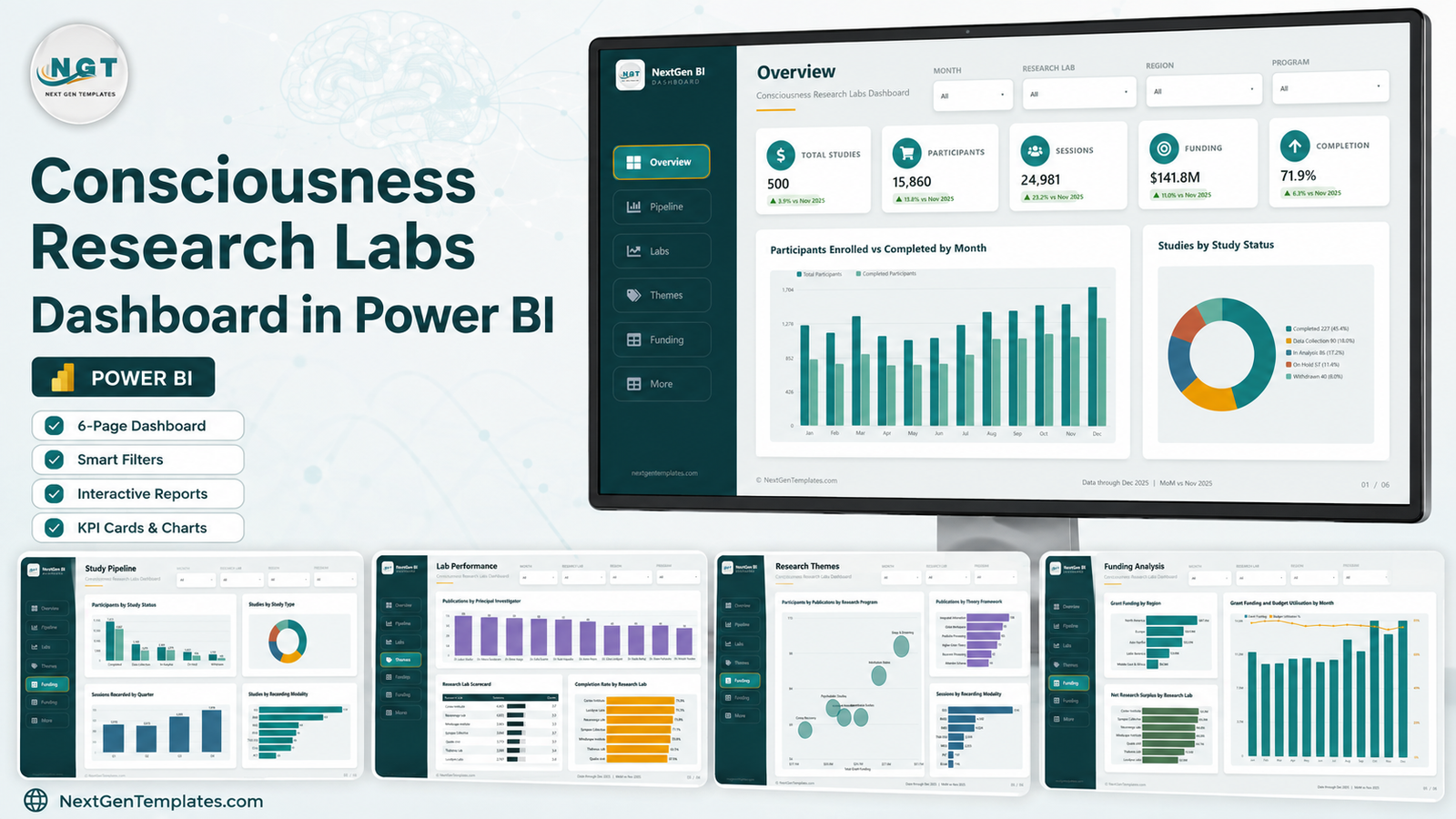
A consciousness research group is an operations problem before it is a science problem. Studies sit in five different statuses at once, participants drop out between screening and completion, EEG and fMRI suites get booked unevenly, grant money lands in one region and gets spent in another, and the principal investigators all want to know where their throughput went. The Consciousness Research Labs Dashboard in Power BI is a five-page analytical report that answers those questions from one file. The demo portfolio it ships with holds 500 studies, 15,860 enrolled participants, 24,981 recording sessions, $141.8M of grant funding and a 71.9% completion rate across seven research labs, so every visual is populated the second you open it.
Two things to be clear about before anything else. This is an operations dashboard – it reports on studies, participants, sessions, publications and funding. It does not measure, model or say anything about consciousness itself. And every figure quoted in this article is sample data shipped with the template, not a finding: the labs, the investigators and the numbers are all fictional demonstration records you are meant to replace with your own.
It is also worth naming what it is not, because our catalogue has near-identical names. This is an analytical Power BI dashboard from the Power BI Dashboard line – many charts, four synced slicers, a drillthrough page. It is not one of the Power BI KPI scorecard templates, which are month-picker scorecards with traffic lights and a KPI trend page. Different product, different shape.
Key Features of the Consciousness Research Labs Dashboard in Power BI
- Nine report pages – five visible analysis pages, a Get More Dashboards page, a hidden Study Details drillthrough and two hover tooltip pages.
- Five SVG KPI cards on the Overview, each showing a month-on-month delta against November 2025.
- 39 DAX measures, grouped into display folders so they are easy to find and reuse – Completion Rate %, Net Research Surplus, Budget Utilisation %, average data quality and the rest.
- Four slicers synced across every page: Month, Research Lab, Region and Program. Filter once, and all five pages move together.
- 500 demo study rows covering the whole of 2025, plus a generated Date table for month, quarter and year-month analysis.
- A Study Details drillthrough bound on eight fields, so you can right-click almost any bar and land on the underlying study list.
- Editable .pbix – no locked visuals, no external dependencies, and the PowerPoint background the design is built on is included so you can rebrand it.
- A User Manual PDF and the source
Data.xlsxin the same download.
Dashboard Pages Explanation
1. Overview
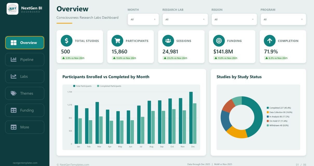
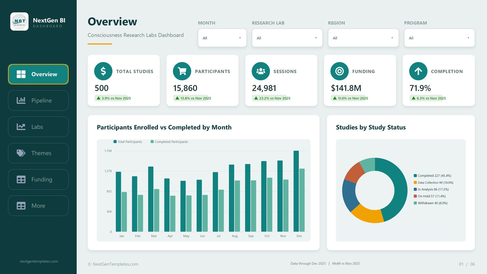
The one-screen answer. Five KPI cards run across the top – Total Studies 500, Participants 15,860, Sessions 24,981, Funding $141.8M and Completion 71.9% – each carrying a month-on-month delta against November 2025. Below them, Participants Enrolled vs Completed by Month is a clustered column chart with two series, and the gap between them is the whole point: enrolment climbs steadily to a December peak while completions lag behind it all year. To the right, Studies by Study Status is a donut splitting the portfolio into Completed 227 (45.4%), Data Collection 90 (18.0%), In Analysis 86 (17.2%), On Hold 57 (11.4%) and Withdrawn 40 (8.0%).
2. Study Pipeline
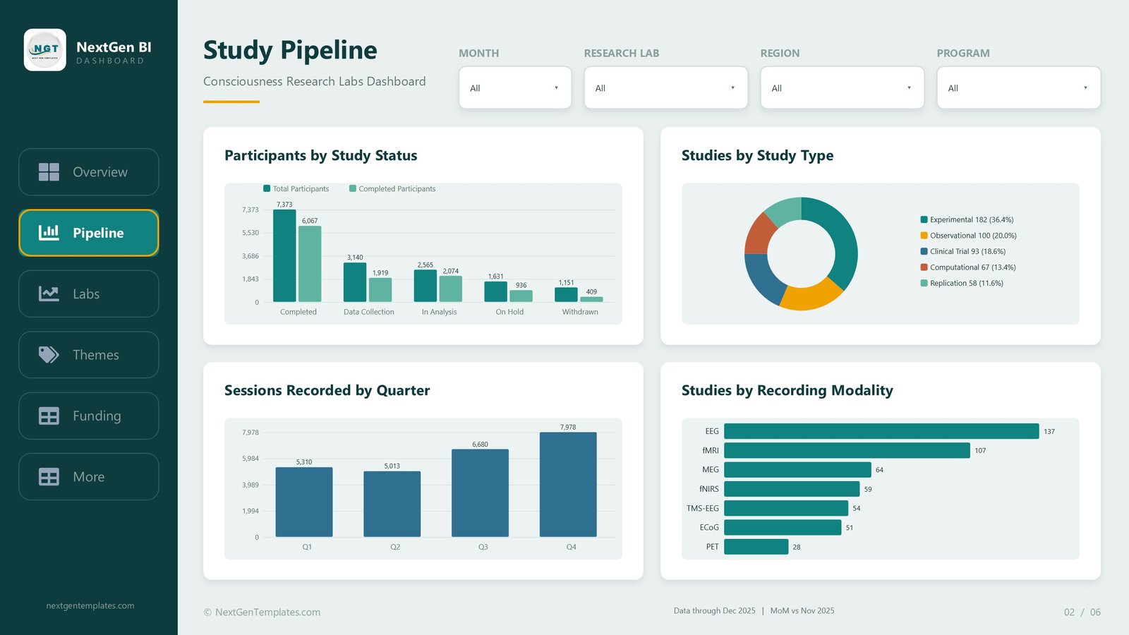
Four visuals on where studies and people actually are. Participants by Study Status pairs total against completed participants for each stage, and the attrition is visible immediately – 7,373 against 6,067 at Completed, but 1,631 against 936 at On Hold and 1,151 against 409 at Withdrawn. Studies by Study Type breaks the 500 studies into Experimental 182 (36.4%), Observational 100 (20.0%), Clinical Trial 93 (18.6%), Computational 67 (13.4%) and Replication 58 (11.6%). Sessions Recorded by Quarter shows a rising back half – Q1 5,310, Q2 5,013, Q3 6,680, Q4 7,978 – and Studies by Recording Modality ranks EEG 137, fMRI 107, MEG 64, fNIRS 59, TMS-EEG 54, ECoG 51 and PET 28.
3. Lab Performance
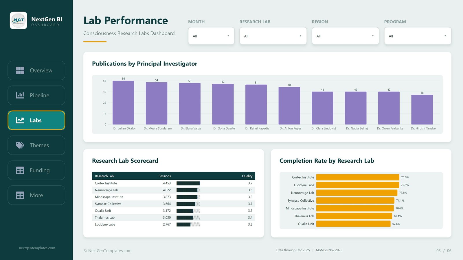
The comparison page. Publications by Principal Investigator runs across ten named investigators from 56 publications down to 38 – a deliberately flat distribution, so the interesting question becomes output per session rather than raw count. Underneath, the Research Lab Scorecard is a table with an in-cell session-volume bar and an average quality score: Cortex Institute 4,453 sessions at 3.7, Neuroverge Lab 4,022 at 3.6, Mindscape Institute 3,873 at 3.3, Synapse Collective 3,664 at 3.7, Qualia Unit 3,172 at 3.3, Thalamus Lab 3,030 at 3.4 and Lucidyne Labs 2,767 at 3.8. Completion Rate by Research Lab sits beside it and does not rank the same way at all – Lucidyne Labs is last on volume but second on completion at 75.5%, just behind Cortex Institute at 75.6%. That disagreement between the two visuals is the most useful thing on the page.
4. Research Themes
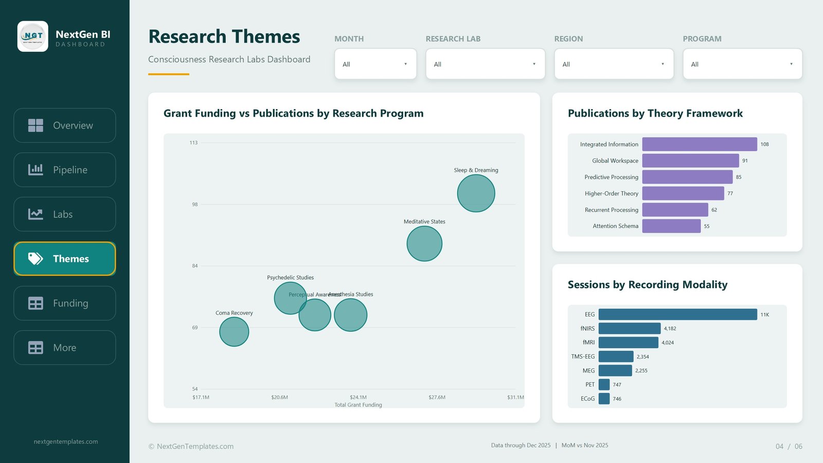
The science-programme view. Grant Funding vs Publications by Research Program is a bubble chart plotting money against output, with Sleep & Dreaming at the top right on both axes, Meditative States behind it, and Coma Recovery anchoring the bottom left. Psychedelic Studies, Perceptual Awareness and Anesthesia Studies cluster in the middle, which is where cost-per-publication conversations tend to start. Publications by Theory Framework ranks Integrated Information 108, Global Workspace 91, Predictive Processing 85, Higher-Order Theory 77, Recurrent Processing 62 and Attention Schema 55. Sessions by Recording Modality makes EEG’s dominance obvious at 11K sessions against fNIRS 4,182, fMRI 4,024, TMS-EEG 2,354, MEG 2,255, PET 747 and ECoG 746. These are labels on demonstration rows, not a position on any theory.
5. Funding Analysis
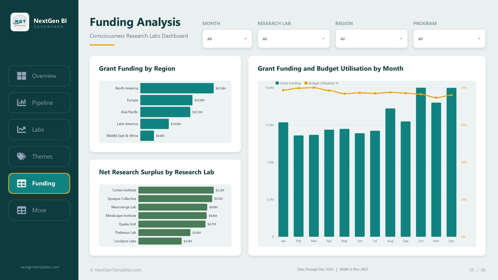
The money page. Grant Funding by Region runs North America $47.8M, Europe $33.9M, Asia Pacific $32.5M, Latin America $18.6M and Middle East & Africa $8.9M. Net Research Surplus by Research Lab ranks Cortex Institute $5.3M, Synapse Collective $5.2M, Neuroverge Lab $4.8M, Mindscape Institute $4.8M, Qualia Unit $4.7M, Thalamus Lab $3.6M and Lucidyne Labs $3.0M. The widest visual, Grant Funding and Budget Utilisation by Month, is a combo chart: monthly funding columns on the left axis against a budget utilisation line on the right, hovering around 70-81% all year. Funding steps up sharply from August onward while utilisation drifts slightly down – exactly the pattern a finance lead wants flagged before year end.
6. Get More Dashboards, and the hidden pages
The sixth visible page lists the rest of the Power BI catalogue and summarises what is inside the file. Behind it sit three pages you never navigate to directly: a Study Details drillthrough that you reach by right-clicking a data point, and two tooltip pages that appear on hover.
Consciousness Research Labs Dashboard in Power BI vs. Excel vs. Paid Research Platforms – Feature Comparison
| Feature | This Power BI template | Excel dashboard equivalent | Paid research platform (LabArchives, Benchling, RedCap-class) |
|---|---|---|---|
| Cost | $17.99 once | $17.99 once | $3,000-$25,000+ per year |
| Platform | Power BI Desktop (free, Windows) | Microsoft Excel | Vendor cloud |
| Setup time | Under 15 minutes – swap the data source | Under 15 minutes | Weeks, usually with onboarding |
| Real-time team collaboration | Only if you publish to the Power BI Service | Via OneDrive or SharePoint | Yes, built in |
| Mobile access | Power BI mobile app after publishing | Excel mobile, limited | Yes |
| Customisable fields | Full – the model and all 39 measures are editable | Full | Configurable within vendor limits |
| Share with a link | After publishing to the Service | Via cloud storage | Yes |
| Year-1 cost at 5 users | $17.99 | $17.99 | $15,000+ typical |
| Drillthrough to study-level detail | Yes, on 8 fields | Via slicers and pivot drill-down | Yes |
| Data capture / eCRF | No – reporting only | No | Yes, that is the point of them |
The honest read: if you need to capture regulated study data, buy a platform. If you already capture it somewhere and simply cannot see across it, this template does that job for the price of lunch.
Who Should Use This Template
Research operations managers who run a portfolio of studies across several labs and get asked for a status roll-up every month. Lab directors who want one page that compares seven sites on volume, quality and completion at the same time. Grant and finance leads tracking funding against budget utilisation by region. Power BI learners who want a finished, non-trivial model to take apart – 39 measures, a proper Date table, synced slicers and a working drillthrough is a good afternoon of reading.
It is a poor fit if you need electronic data capture, participant consent tracking, an audit trail, or anything that has to hold up as a validated system of record. It is also the wrong file if your data is small enough for a pivot table – in that case the Excel version of the same dashboard is a lighter tool.
Real-World Use Cases
Priya, research operations manager at a multi-site institute. Her monthly steering pack used to take a day and a half of pulling exports from three labs. She points the model at her own study export, filters the Region slicer to Asia Pacific, screenshots the Overview and the Lab Performance page, and the pack is done before lunch.
Daniel, lab director. His site records the second-highest session volume but sits mid-table on completion rate. Putting the scorecard and the completion-rate bar chart side by side on the Lab Performance page is what makes that mismatch arguable in a management meeting rather than a hunch.
Amara, grants and finance lead. She lives on the Funding Analysis page. The combo chart tells her utilisation has drifted below its January peak while funding stepped up in the autumn – the exact signal that triggers a reforecast conversation with her programme leads.
Advantages of the Consciousness Research Labs Dashboard in Power BI
It arrives finished. Every visual is populated, the slicers are already synced across all five pages, and the drillthrough is wired up – so the first thing you do is read it, not build it. The measures are organised into display folders rather than dumped in one list, which matters the moment you want to borrow three of them for another report. Nothing is locked: rename a lab, add a region, change the theme colours, or drop the PowerPoint background in and rebrand the whole thing. And because it is a plain .pbix, there is no add-in, no macro and no subscription attached to it – Power BI Desktop is a free download from Microsoft for Windows.
Opportunities for Improvement
Being straight about the limits. The report is built on a single flat study table plus a generated Date table – clean and fast, but if your source is genuinely relational you will want to remodel before you scale it. There is no row-level security configured, so if different labs must not see each other’s numbers you have to add that yourself. The demo data stops at December 2025 and the deltas are hard-wired to compare against November 2025; once you load your own rows the comparison follows your dates, but you should sanity-check the KPI cards on first load. Power BI Desktop is Windows-only, so Mac users need a VM or the Power BI Service. And the report reads data – it does not write any, so it cannot replace whatever you use to collect it.
Best Practices
Open the file once with the sample data before you touch anything, so you know what “working” looks like. Keep the column names in Data.xlsx exactly as shipped when you paste your own rows in – that is the single biggest cause of broken visuals. Refresh the Date table’s range if your data runs outside 2025. Test the drillthrough early by right-clicking a bar on Lab Performance; if it does not fire, your field names have drifted. Publish to the Power BI Service only once the numbers look right, then share the link rather than mailing the file around. And rename the labs and investigators before anyone outside your team sees it, so the demonstration names are never mistaken for yours.
Explore Relevant Templates
If you work in or around research operations, these pair well with this one:
- Consciousness Research Labs Dashboard in Excel – the same portfolio, same numbers, built as an Excel workbook. Its full walkthrough is here.
- Brain-Computer Interfaces Dashboard in Power BI – the neurotech device side of the same field.
- Clinical Data Management Dashboard in Power BI – query resolution, data cleaning and lock timelines.
- Laboratory Instruments Dashboard in Power BI – utilisation, calibration and downtime for the hardware behind the sessions.
- Quantum Computing Labs Dashboard in Power BI and Machine Learning Labs Dashboard in Power BI – the same lab-operations shape in two other research domains.
Or browse the whole Power BI dashboard category.
Frequently Asked Questions
Does this dashboard measure or explain consciousness?
No. It reports on how a research organisation runs – studies, participants, sessions, publications, staff and funding. It makes no scientific claim of any kind, and the theory frameworks named on the Research Themes page are simply category labels on the sample rows.
Are the labs, investigators and figures real?
No. Cortex Institute, Neuroverge Lab, Dr. Julian Okafor and every number in this article come from the 500-row demonstration dataset shipped with the template. Replace them with your own before you show it to anyone.
What software do I need to open it?
Power BI Desktop, which Microsoft gives away free for Windows. No Pro licence is needed to open, edit or use the file locally – a licence only comes into play if you want to publish and share it through the Power BI Service.
Does it run on a Mac?
Not natively. Power BI Desktop is Windows-only, so Mac users need a Windows VM, Parallels, or a cloud desktop. The Excel version opens on macOS.
Is this the same as the Power BI KPI scorecard templates?
No. This is an analytical dashboard – many charts across five pages with four synced slicers and a drillthrough. The KPI scorecard line is a different product: a month-picker scorecard with traffic lights and a KPI trend page.
Can I add my own labs, regions or research programmes?
Yes. They are ordinary columns in Data.xlsx. Add rows with new values and the slicers, charts and measures pick them up on refresh – no DAX editing required unless you want a new measure.
What exactly is in the download?
A ZIP containing the editable .pbix report, the source Data.xlsx, and a Power BI Dashboard User Manual PDF.
About the Author
Built by PK – Microsoft Certified Professional with 15+ years of Excel, Google Sheets, and Power BI experience. Founder of NextGenTemplates, reaching 300K+ subscribers across YouTube channels. Every template is hand-built and tested before release. More Power BI and Excel walkthroughs on youtube.com/@PKAnExcelExpert.
Conclusion
Most research groups already have the data. What they do not have is a single file that puts pipeline, lab performance, research programmes and funding on five pages that filter together. That is all this template is, and it is enough: 500 studies, seven labs, ten investigators, 39 measures and a drillthrough, in an editable .pbix that opens in free Power BI Desktop. Point it at your own export, rename the demo labs, and you have your monthly pack.
Get the Consciousness Research Labs Dashboard in Power BI – $17.99 instead of $29.99, instant download, lifetime use, User Manual PDF included.
Reporting and visualisation template only. This file is not an electronic case report form, a laboratory information management system, or a validated system of record for any regulated study, and nothing in it constitutes clinical, ethical or regulatory advice. All laboratory names, investigator names and figures shown are demonstration data.