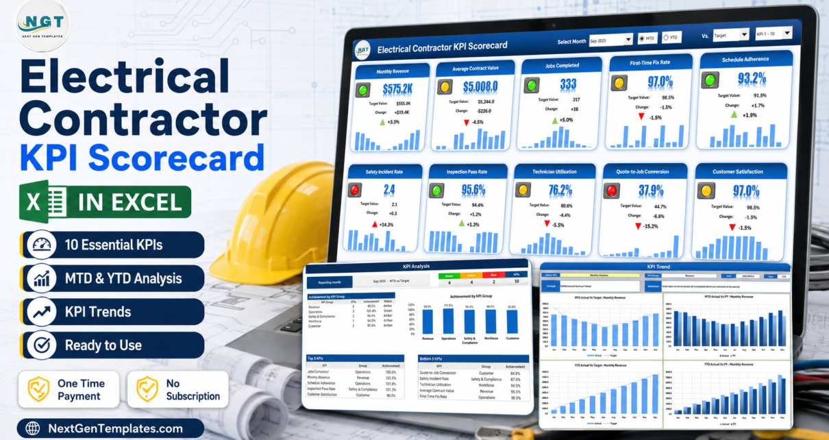
Most electrical contracting businesses already have the numbers. Revenue is in the accounts package, jobs are in the job book or the field-service app, incidents are in a safety file, and the quote conversion sits in somebody’s head. What is usually missing is the one page that puts all of it side by side, scored against a target, once a month. The Electrical Contractor KPI Scorecard in Excel is that page: ten KPIs across five groups, nine worksheets, room for twenty KPIs in total, and zero macros – it is 100% worksheet formulas, conditional formatting, camera pictures and sparklines.
One thing to be clear about before anything else, because the names in this catalogue are confusingly similar. This is a KPI scorecard, not an analytics dashboard. A dashboard slices a table of transactions with slicers and pivot charts so you can explore. A scorecard takes finished monthly figures that you type in, and scores them – green, amber or red – against target, prior year or prior month. Different job, different tool. If you want to explore job-level data, you want a dashboard, and there are links to two of them below.
Key Features of the Electrical Contractor KPI Scorecard in Excel
- A single month picker. The Select Month dropdown in the Scorecard header sets the reporting period for all ten tiles, and the KPI Analysis page follows it.
- MTD or YTD. One radio toggle switches every tile between month-to-date and year-to-date.
- Three comparison bases. The “Vs.” dropdown scores each KPI against Target, against the same period last year, or against the prior month.
- Direction-aware scoring. Each KPI is tagged UTB (upper the better) or LTB (lower the better). Safety Incident Rate is an LTB measure, so a fall is scored as good rather than as a miss.
- A twelve-month sparkline on every tile, with the absolute change, the percentage change and a coloured arrow.
- Editable traffic-light bands. The workbook ships with green at or above target, amber within 10%, red beyond that – and those two numbers are typed on the Color Settings sheet.
- Twenty KPI slots. Ten are filled in; the header’s KPI-set picker switches the Scorecard between KPI 1-10 and KPI 11-20.
- Two sheets to edit, and only two. Input Data takes the numbers, KPI Definition takes the names and rules.
- Opens on any Excel from 2016 onward with nothing to enable – though the header form controls are built for Excel on Windows desktop.
Scorecard Pages Explained
1. Home
Eight hyperlinked tiles – Scorecard, KPI Analysis, KPI Trend, Input Data, KPI Definition, Color Settings, Read Me and Get More Templates – each with a one-line description of what that sheet is for. It is a small thing, but it is the difference between handing this file to a colleague and having to explain it.
2. Scorecard
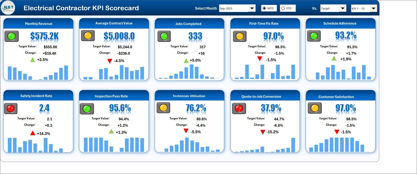
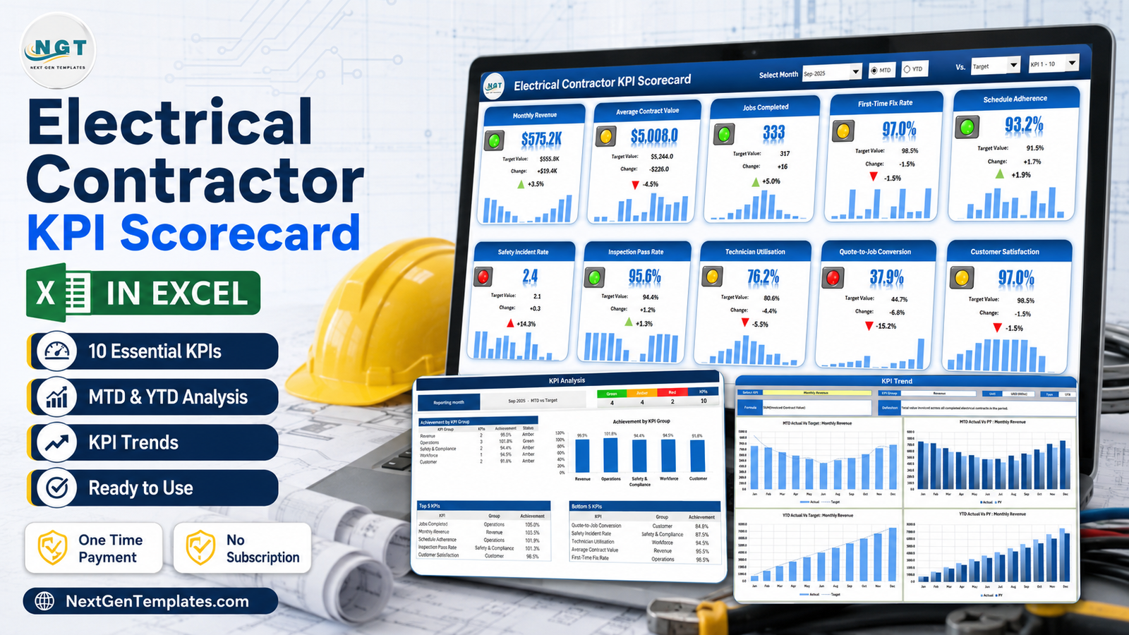
The page you will actually use. Ten tiles in two rows, each with a traffic light, the headline value, the target, the change and the sparkline. In the sample month of September 2025 it reads: Monthly Revenue $575.2K against a $555.8K target (green, +3.5%), Average Contract Value $5,008.0 against $5,244.0 (amber, -4.5%), Jobs Completed 333 against 317 (green, +5.0%), First-Time Fix Rate 97.0% against 98.5% (amber), Schedule Adherence 93.2% against 91.5% (green), Safety Incident Rate 2.4 against 2.1 (red, and correctly red because it went up), Inspection Pass Rate 95.6% against 94.4% (green), Technician Utilisation 76.2% against 80.6% (amber), Quote-to-Job Conversion 37.9% against 44.7% (red, -15.2%) and Customer Satisfaction 97.0% against 98.5% (amber).
3. KPI Analysis
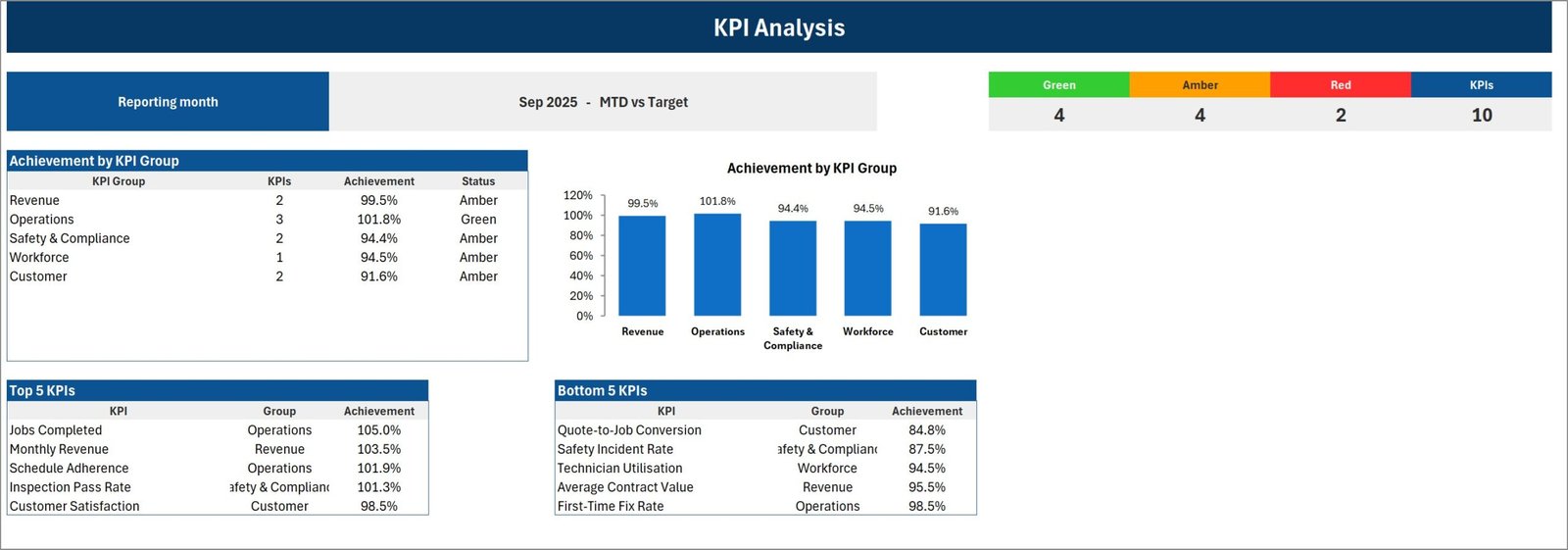
The summary you take into the meeting. A counter across the top shows 4 green, 4 amber, 2 red out of 10. An Achievement by KPI Group table and matching column chart break the month down by group – Revenue 99.5%, Operations 101.8%, Safety & Compliance 94.4%, Workforce 94.5%, Customer 91.6% – and two ranked tables list the Top 5 and Bottom 5 KPIs by achievement. In the sample month Jobs Completed tops the list at 105.0% and Quote-to-Job Conversion sits at the bottom on 84.8%.
4. KPI Trend
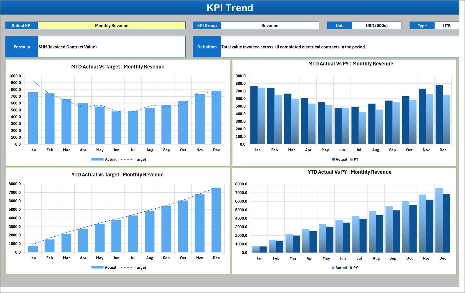
One KPI at a time, across the whole year. Pick the KPI and the header fills in its group, unit, direction type, calculation formula and written definition; below that are four twelve-month charts – MTD Actual vs Target, MTD Actual vs PY, YTD Actual vs Target and YTD Actual vs PY. This is where a red tile on the Scorecard turns into a conversation about whether it is a bad month or a bad year.
5. Input Data
The only sheet you type numbers into. One numbered block per KPI, twelve monthly rows, six figures per row: MTD Actual, MTD Target, MTD PY, YTD Actual, YTD Target and YTD PY. Note that YTD is typed, not calculated. That is intentional, and the Read Me sheet explains why: the correct roll-up differs by KPI. Revenue and job counts sum; rates like First-Time Fix Rate and Customer Satisfaction average; some measures need something else entirely. Rather than guess, the workbook asks you.
6. KPI Definition
Ten rows, nine columns – number, KPI group, KPI name, unit, formula, definition, direction type, YTD basis and a Check column that turns red if you use the same KPI name twice. Every other page in the workbook looks its KPIs up by name from this sheet, so this is where you make the scorecard yours.
7-9. Color Settings, Read Me and Get More Templates
Color Settings holds the RAG bands for both UTB and LTB KPIs, plus the report title and the reporting year that feeds the month picker. Read Me is a nine-section explanation of the wiring. Get More Templates is the catalogue page.
The Ten KPIs as Shipped
| # | KPI | Group | Unit | Direction |
|---|---|---|---|---|
| 1 | Monthly Revenue | Revenue | USD (000s) | Upper the better |
| 2 | Average Contract Value | Revenue | USD | Upper the better |
| 3 | Jobs Completed | Operations | Count | Upper the better |
| 4 | First-Time Fix Rate | Operations | % | Upper the better |
| 5 | Schedule Adherence | Operations | % | Upper the better |
| 6 | Safety Incident Rate | Safety & Compliance | Per 100k Hrs | Lower the better |
| 7 | Inspection Pass Rate | Safety & Compliance | % | Upper the better |
| 8 | Technician Utilisation | Workforce | % | Upper the better |
| 9 | Quote-to-Job Conversion | Customer | % | Upper the better |
| 10 | Customer Satisfaction | Customer | % | Upper the better |
Electrical Contractor KPI Scorecard in Excel vs. Google Sheets vs. Paid Field-Service Software – Feature Comparison
| This scorecard (Excel) | Google Sheets version | Paid field-service platform | |
|---|---|---|---|
| Cost | One-time purchase | One-time purchase | Roughly $40-$100 per user per month |
| Platform | Excel for Windows desktop | Browser, any device | Web plus mobile app |
| Setup time | Under an hour | Under an hour | Weeks, with data migration |
| Real-time team collaboration | No – one file, one editor | Yes, native | Yes |
| Mobile access | View-only in the Excel mobile app | Yes | Yes |
| Customisable KPIs | Yes – all 20 slots are yours | Yes | Limited to the vendor’s metric set |
| Share with a link | No – you send the file | Yes | Yes |
| Year-1 cost at 5 users | The purchase price, once | The purchase price, once | $2,400-$6,000 |
| Reads job data automatically | No – you type the monthly figures | No | Yes, it is the system of record |
| Works offline | Yes | No | Partly |
If your office lives in a browser rather than in Excel, the same scorecard exists for Google Sheets – see the Electrical Contractor KPI Scorecard in Google Sheets.
Who Should Use This Template
It suits an electrical contracting business roughly between three and eighty electricians, where the monthly numbers already exist somewhere and the problem is presenting them rather than producing them. Owners who want one page on the screen at the monthly review. Operations managers who currently rebuild the same summary by hand. Health-and-safety leads who have to report a small set of measures upward every month.
It does not suit you if you expect the file to read your accounting or field-service system – it has no connector and no import, and you type the figures in. It is not a scheduler, a quoting tool, a timesheet or a compliance register, and it does not send alerts, reminders or emails. It is also not the right pick for a Mac-only or Sheets-only office; the header controls and camera-picture layout are built and tested for Excel on Windows desktop.
Real-World Use Cases
The Monday morning review. The month closes on the fourth working day. Somebody types the figures into Input Data, opens the Scorecard, and the two red tiles set the meeting agenda. Nobody spends the first ten minutes arguing about whose numbers are current.
The seasonal contractor. A domestic and small-commercial firm with a heavy summer and a thin January runs the scorecard on Prior Month instead of Target, because an annual target flatters or punishes the wrong months. The comparison basis is a dropdown, so it takes one click.
Reporting to a main contractor. A subcontractor renames three of the spare KPI slots to the safety and quality measures their client asks for, tags them correctly as lower-the-better where relevant, and attaches the workbook to the monthly report.
Advantages of the Electrical Contractor KPI Scorecard in Excel
- Nothing to install and nothing to enable. A plain .xlsx with no macros means no security prompt, no blocked file, and no argument with an IT policy.
- The scoring logic is visible. The RAG thresholds are two typed numbers on a sheet, not a hidden rule. You can see, and change, exactly why a tile went amber.
- It is genuinely re-badgeable. Because every page looks KPIs up by name, renaming a KPI on one sheet renames it everywhere. Ten slots are free for measures the shipped set does not cover.
- Direction handling is correct. Plenty of homemade scorecards score every KPI as higher-is-better and then quietly mark a falling incident rate as a failure. This one does not.
- It scales down. A contractor with five KPIs can delete five rows and still have a working file.
Opportunities for Improvement
Being honest about the edges is more useful than pretending there are none.
- YTD is typed, not calculated. This is a deliberate design decision and the Read Me explains it, but it does mean six figures per KPI per month rather than three. If all of your KPIs roll up the same way, that is more typing than you strictly need.
- No data source. The scorecard sits at the end of your reporting process, not inside it. Somebody still has to produce the monthly numbers.
- Windows-first. The form-control dropdowns and camera pictures behave best on Excel for Windows desktop. The file opens elsewhere, but that is where it is tested.
- Single-user by nature. It is a workbook. Two people cannot edit it at once, and there is no link to share. The Google Sheets edition exists precisely for teams that need that.
- Ten visible at a time. The Scorecard shows one set of ten; if you fill all twenty you flip between them rather than seeing them together.
Best Practices
- Set the reporting year first. On Color Settings, before you do anything else – it feeds the month picker so it reads Sep-25 rather than a bare Sep.
- Define before you type. Fill KPI Definition completely – including the YTD Basis column – before you touch Input Data. It tells the next person how you rolled the year up.
- Keep KPI names unique. Every page matches on name, so two identical names get added together. The Check column flags it; do not ignore it.
- Get the direction right. Anything where lower is better – incident rates, callbacks, rework, overtime – must be tagged LTB or the traffic light will be inverted.
- Pick a tolerance and leave it. The default 10% amber band is a reasonable starting point, but the value of a scorecard comes from the threshold being stable month to month.
- Ten KPIs is plenty. The workbook holds twenty. Resist filling it. A management review that fits on one screen gets read.
- Back up the file. A workbook is a file. Keep it in OneDrive or SharePoint so version history covers you – Microsoft’s guide to restoring a previous version is worth five minutes.
Explore Relevant Templates
- Electrical Contractor KPI Scorecard in Excel – the template this post is about.
- Electrical Contractor KPI Scorecard in Google Sheets – the same scorecard for a browser-based team.
- HVAC Contractor KPI Scorecard in Excel – the direct sibling on this line.
- Plumbing Business KPI Scorecard in Excel – the same engine tuned for a plumbing trade.
- Electricity Project KPI Dashboard in Excel and Power Distribution KPI Dashboard in Excel – the analytical KPI builds, if exploring data is what you actually need.
- Office Safety Inspection Tracker in Excel – the log that produces your Inspection Pass Rate.
- Maintenance Work Order Data Entry System in Excel – a form-driven job log for the raw work orders.
Frequently Asked Questions
Does the scorecard connect to my accounting or field-service software?
No. There is no connector, no import and no API. You type finished monthly figures onto the Input Data sheet, which is what makes it work regardless of which system your numbers come from.
Does it alert me when a KPI turns red?
No. The traffic lights are conditional formatting inside the workbook. Nothing is emailed, notified or sent anywhere.
Is this the same as an Electrical KPI Dashboard?
No. A KPI dashboard is an analytical build driven by a table of transactions, with more pages and more charts. This is a monthly target-versus-actual scorecard. Different tools for different meetings – and plenty of contractors own one of each.
Can I use my own KPIs instead of the ten shipped?
Yes, all twenty slots are yours. Rename them on KPI Definition and every page – Scorecard, KPI Analysis, KPI Trend – follows automatically.
Which version of Excel does it need?
Excel 2016 or later on Windows desktop. It is a plain .xlsx with no macros. It will open in Excel for Mac and in Excel for the web, but the form controls and camera-picture layout are built and supported for Windows desktop.
Are the figures in the screenshots real company data?
No. Every number shown is sample data for a fictional contractor, included so you can see the workbook working before you clear it and type your own.
Do I have to enable macros?
No, because there are none. Everything is worksheet formulas, conditional formatting, camera pictures and sparklines. If you want to understand the technique behind the tiles, Microsoft Learn’s overview of sparklines in Excel is a good starting point.
About the Author
Built by PK – Microsoft Certified Professional with 15+ years of Excel, Google Sheets, and Power BI experience. Founder of NextGenTemplates, reaching 300K+ subscribers across YouTube channels. Every template is hand-built and tested before release.
Conclusion
An electrical contracting business does not usually fail for want of data – it fails for want of a monthly habit around it. Ten KPIs, one month picker, a colour on every tile and a page that fits on one screen is a habit you can actually keep. The Electrical Contractor KPI Scorecard in Excel ships with the sample month already filled in, so you can see the whole thing working before you type a single figure of your own, and the twenty-slot KPI Definition sheet means it will still fit you in two years when your measures have changed.
For step-by-step Excel walkthroughs of dashboards, scorecards and the formula techniques behind them, subscribe to youtube.com/@PKAnExcelExpert.