Running a coaching business means juggling a lot: session bookings across multiple coaches, package revenue that doesn’t line up with calendar months, client satisfaction scores, goal-progress notes, and a dozen referral channels that either are or aren’t pulling their weight. Most coaches end the month knowing revenue happened — but not where it came from, which coach drove it, or which program actually delivered client outcomes. The Coaching Business Dashboard in Excel solves exactly that. It’s a pivot-powered Microsoft Excel template with 5 interactive analysis pages, 5 KPI cards, and 15+ charts that turn your messy session log into a clean, CEO-level scorecard.
In this post we’ll walk through every page of the dashboard, explain the KPI model, share real-world advantages and opportunities for improvement, and give you best practices so you can get maximum value out of the template from day one. If you prefer a shortcut, you can Click here to Purchase the Coaching Business Dashboard in Excel and follow along as we tour each sheet.
Key Features of the Coaching Business Dashboard in Excel
The template is built for real coaching operations, not a toy dataset. Every feature maps to a recurring question coaches ask each month:
- 5 high-level KPI cards — Total Session Revenue, Total Package Revenue, Total Records, Avg. Satisfaction, and Avg. Goal Progress. One glance tells you whether the month is on, below, or above track.
- 5 analysis pages — Overview, Coach Performance, Client Analysis, Program Insights, and Revenue Trends. Each page answers a different strategic question.
- 15+ dynamic charts — all driven by pivot tables on a hidden Support sheet. Update the data once and every chart refreshes automatically.
- Slicer-based filtering — filter by coach, client type, program, session format, referral source, or month on any page without touching a formula.
- Premium BI design — dark-sidebar navigation, card-first layout, readable typography. It looks like a Power BI dashboard, but it’s pure Excel.
- Excel 2016 through Microsoft 365 compatibility — works on Windows and Mac, no add-ins, no macros, no internet required.
If you already run other service-business dashboards in Excel, the architecture will feel familiar — the Freelancer Business Dashboard and our recent Small Business CFO Dashboard use the same pivot-plus-slicer approach.
Dashboard Pages Explained
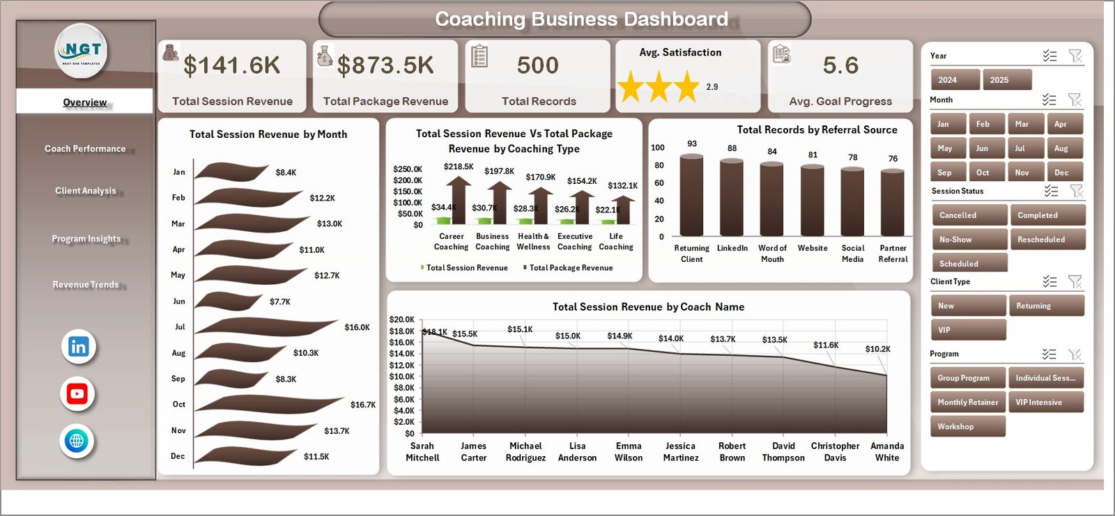
1. Overview Page
The Overview page is your mission-control screen. The top band holds five KPI cards — Total Session Revenue, Total Package Revenue, Total Records, Avg. Satisfaction, and Avg. Goal Progress — so you immediately see volume, money, and quality on one line.
Below the cards sit four charts:
- Total Session Revenue by Month — month-over-month income from 1-on-1 sessions, with seasonality visible at a glance.
- Coach Session Revenue Vs Total Package Revenue by Coaching Type — compares session and package income across life, executive, career, wellness, and other coaching types. Great for spotting which coaching types are over-reliant on one revenue stream.
- Total Records by Referral Source — shows which channels (word-of-mouth, LinkedIn, website, partner referrals, etc.) are actually generating client records.
- Total Session Revenue by Coach Name — ranks individual coaches by session revenue contribution.
Slicers on the side let you filter the whole view by program, coach, client type, or referral source.
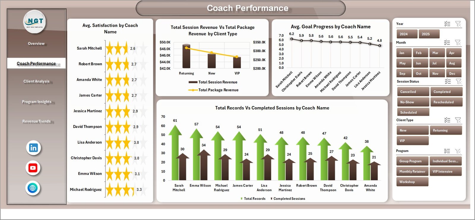
2. Coach Performance
Most coaching agencies eventually ask: “Are all my coaches actually equal?” The Coach Performance page answers that with four charts designed to separate revenue contribution from delivery quality:
- Avg. Satisfaction by Coach Name — spots the coaches clients love and the ones who need support.
- Total Session Revenue Vs Total Package Revenue by Client Type — breaks revenue across individual, corporate, and group clients.
- Avg. Goal Progress by Coach Name — measures actual client outcomes, not just sessions delivered.
- Total Records Vs Completed Sessions by Coach Name — flags completion-rate issues before they become retention issues.
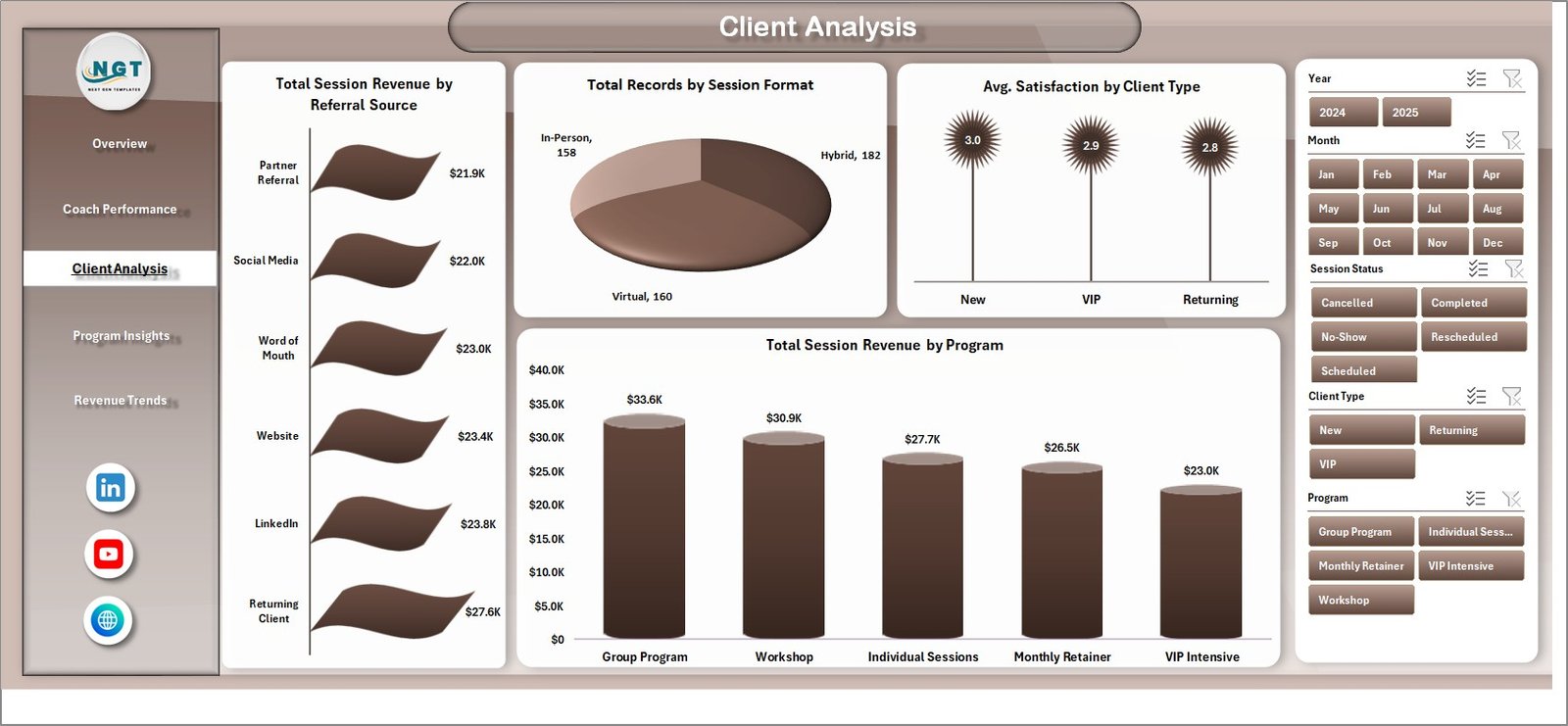
3. Client Analysis
The Client Analysis page helps you understand who is actually paying and staying. It contains:
- Total Session Revenue by Referral Source — tells you which marketing channels produce the highest-revenue clients (not just the most clients).
- Total Records by Session Format — splits activity by video, in-person, and phone formats.
- Avg. Satisfaction by Client Type — surfaces whether corporate, individual, or group clients are happiest.
- Total Session Revenue by Program — ranks programs by revenue so you know where to invest.
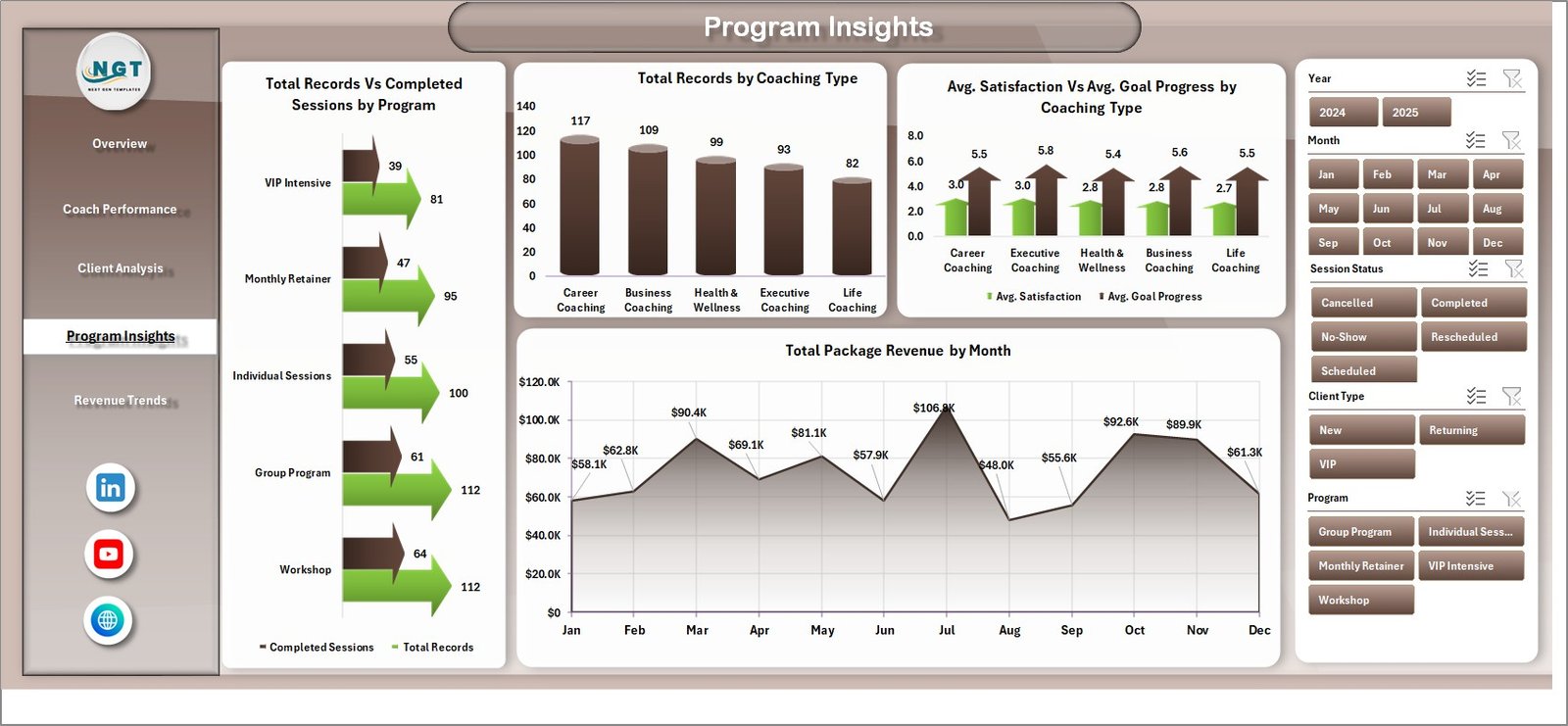
4. Program Insights
Programs are your productized offering, and this page tells you which ones are pulling weight:
- Total Records Vs Completed Sessions by Program — exposes programs with high drop-off.
- Total Records by Coaching Type — shows the mix between life, executive, career, and wellness.
- Avg. Satisfaction Vs Avg. Goal Progress by Coaching Type — separates programs clients like from programs that actually work.
- Total Package Revenue by Month — tracks recurring package income over time.
5. Revenue Trends
The Revenue Trends page zooms out to the multi-year view:
- Total Session Revenue Vs Total Package Revenue by Year — long-term revenue-mix shift.
- Total Session Revenue by Session Format — tracks the ongoing shift toward (or away from) virtual delivery.
- Total Package Revenue by Referral Source — which channels sell packages vs. one-off sessions.

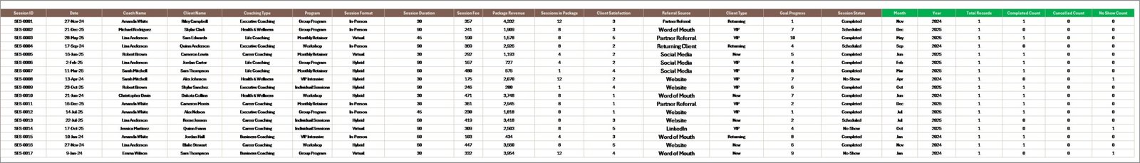
6. Data Sheet
This is where you enter or paste your coaching records. The columns are pre-formatted — Coach Name, Client Name, Coaching Type, Program, Session Format, Referral Source, Session Revenue, Package Revenue, Satisfaction, Goal Progress, Date, and so on. Once your data is in, every dashboard page will update after a single refresh.
7. Support Sheet
The Support sheet holds every pivot table that drives the dashboard. You never need to touch it in normal use — just go to Data → Refresh All on the Excel ribbon after updating your data, and every pivot (and therefore every chart and KPI) refreshes. You can hide this sheet during day-to-day use. For the underlying pivot mechanics, Microsoft has a helpful primer on PivotTables.

Advantages of Using This Coaching Business Dashboard
- One source of truth — revenue, performance, and outcomes in a single workbook instead of three different spreadsheets.
- Zero formula maintenance — you work in the data sheet, and pivot tables do the rest.
- Coach accountability becomes data-driven — monthly reviews stop being subjective when you can show Avg. Satisfaction and Goal Progress per coach.
- Marketing ROI becomes visible — the Referral Source charts make it obvious which channel deserves more of your ad budget.
- Scales with you — whether you add 50 records a month or 5,000, the pivot engine handles it without rewriting formulas.
- Offline-friendly — no cloud dependency. The workbook works on a plane, at a client site, or anywhere your laptop runs Excel.
Opportunities for Improvement
No template is perfect, and honesty helps you get the most out of it:
- No built-in forecasting — the dashboard is descriptive, not predictive. If you need a revenue forecast, layer that on top manually or pair it with a separate Power BI Dashboard.
- No client CRM features — this is a performance dashboard, not a CRM. You’ll still want a separate tool for contact details, contracts, and notes.
- Data entry is manual — for now you type or paste records into the Data sheet. You can connect it to Power Query, but that’s a DIY step.
- Satisfaction and Goal Progress are self-reported — garbage in, garbage out. Build a simple post-session form and keep the scale consistent.
Best Practices
- Standardize your categories first. Pick a fixed list for Coaching Type, Program, Session Format, Client Type, and Referral Source. Free-text variations like “Linkedin”, “LinkedIn”, and “linked in” will fragment your charts.
- Refresh on a schedule. Enter records weekly, and click Data → Refresh All every Friday. Monthly refreshes lead to surprise quarter-end numbers.
- Review Coach Performance monthly, not quarterly. Avg. Satisfaction and Goal Progress become coaching conversations, not performance reviews, when they’re timely.
- Protect the Support sheet. Once the dashboard is live, hide the Support sheet so nobody accidentally drags a pivot off-grid.
- Back up before every refactor. Save a dated copy of the workbook before you change column structures or add new KPIs.
Explore Relevant Templates
If the coaching dashboard fits your needs, these related templates from our library are likely to as well:
- Freelancer Business Dashboard in Excel — same architecture for solo service providers.
- Gym & Fitness Business Dashboard in Excel — for wellness coaches and fitness studios.
- Real Estate Agent Dashboard in Excel — for individual professional-service tracking.
- Staffing Agency Dashboard in Excel — for multi-recruiter service operations.
- Browse all Excel Dashboard Templates.
For more Excel walkthroughs, our recent deep-dives on the Event Management Analysis Dashboard and the Staffing Agency Dashboard cover similar BI techniques, and our Best Excel Dashboard Templates roundup is a good starting point if you’re still evaluating options.
Frequently Asked Questions
What is the Coaching Business Dashboard in Excel?
The Coaching Business Dashboard in Excel is a ready-to-use Microsoft Excel template that helps life coaches, executive coaches, business coaches, and coaching agencies track session revenue, package revenue, coach performance, client satisfaction, and goal progress across 5 interactive analysis pages, 5 KPI cards, and 15+ dynamic charts — all refreshable with a single click.
What KPIs does the coaching dashboard track?
It tracks 5 primary KPIs — Total Session Revenue, Total Package Revenue, Total Records, Avg. Satisfaction, and Avg. Goal Progress — plus 15+ supporting metrics across coach, client, program, session-format, and referral-source dimensions.
Do I need advanced Excel skills to use this template?
No. Basic Excel knowledge is enough. You only need to paste your records into the Data sheet and click Data → Refresh All. Every chart and KPI updates automatically. No formula editing, no macros, no VBA.
Which versions of Excel are supported?
The Coaching Business Dashboard works in Microsoft Excel 2016, 2019, 2021, and Microsoft 365 on both Windows and Mac. It uses only native Excel features — no add-ins required.
Can I customize the coaching types, programs, and colors?
Yes. You can rename coaching types and programs directly in the Data sheet. Colors, logos, and chart styles are all editable. After any change, click Data → Refresh All and the dashboard picks up your edits.
How many coaches and clients can this template handle?
Because the back-end is pivot-driven, the template scales from a solo coach with 50 records to a multi-coach agency with 10,000+ sessions without any performance issues.
Conclusion
If you run a coaching practice at any scale — solo life coach to multi-coach agency — the Coaching Business Dashboard in Excel replaces three different spreadsheets and a gut-feel monthly review with one refreshable, BI-grade workbook. You’ll see session and package revenue, coach performance, client outcomes, and referral ROI in one place, and you’ll get there without writing a single formula.
👉 Click here to Purchase the Coaching Business Dashboard in Excel.
For more Excel, VBA, and Power BI tutorials, subscribe to our YouTube channel: 🎥 Youtube.com/@PK-AnExcelExpert.