Event Management Analysis Dashboard in Excel is a powerful, ready-to-use interactive Excel dashboard designed to help event planners, corporate coordinators, marketing professionals, and venue managers track, analyze, and optimize every aspect of their event operations. Whether you are managing corporate conferences, trade shows, fundraising galas, workshops, or community events, this comprehensive Excel dashboard template gives you complete visibility into revenue, spending, ticket sales, attendance rates, satisfaction scores, budget utilization, and regional performance — all in one beautifully designed workbook.
Event management is a data-heavy discipline. From tracking how many tickets were sold for each event type to comparing budget allocations versus actual spending across regions and cities, event professionals need a centralized reporting tool that brings everything together. Spreadsheets are often the go-to tool, but without a structured dashboard, data gets lost in endless rows and columns. The Event Management Analysis Dashboard in Excel transforms your raw event data into actionable visual insights through 5 dedicated analysis pages, 5 KPI summary cards, dynamic slicer filters, and pivot-table-powered charts that refresh automatically when you update your data.
This template is part of our growing collection of Excel Dashboard Templates at NextGenTemplates.com, designed for professionals who want plug-and-play analytics without writing a single formula. If you are also interested in wedding or special event budgeting, check out our Wedding Budget Dashboard in Excel tutorial. For hotel and hospitality analytics, see the Hotel and Hospitality Revenue Dashboard in Excel.
Key Features of Event Management Analysis Dashboard in Excel
- 5 Interactive Dashboard Pages — Overview, Event Type Analysis, Regional Performance, Budget Analysis, and Attendance Insights cover every dimension of event performance.
- 5 KPI Summary Cards — Total Records, Total Revenue, Total Spend, Total Tickets Sold, and Average Satisfaction displayed prominently on the Overview page.
- Dynamic Slicer Filters — Filter the entire dashboard instantly by event type, region, category, status, venue, and marketing channel.
- Revenue vs Spend Comparison — Side-by-side visual comparison of Total Revenue versus Total Spend by Event Type for instant profitability analysis.
- Budget Utilization Tracking — Compare planned budgets to actual spending with Budget Utilization % by Category.
- Regional and City-Level Insights — Break down revenue, attendance, and spending by region and city for geographic performance analysis.
- Attendance Analytics — Track actual attendees by event type, venue-wise distribution, and event status breakdown.
- Pivot Table Powered — All charts and KPIs auto-refresh when you update data and click Refresh All.
- No VBA or Macros — Works with standard Excel features, compatible with Excel 2016, 2019, 2021, and Microsoft 365.
- Professional Print-Ready Design — Clean layout ready for executive presentations and stakeholder reports.
Click to buy Event Management Analysis Dashboard in Excel
Dashboard Pages Explained
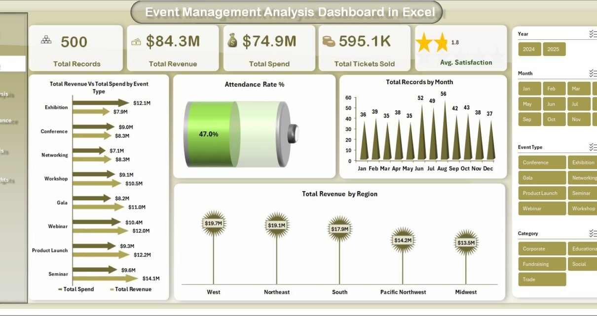
1. Overview Page
The Overview page is the main command center of the Event Management Analysis Dashboard in Excel. At the top, you will find 5 high-level KPI cards displaying Total Records, Total Revenue, Total Spend, Total Tickets Sold, and Average Satisfaction Score. Below the cards, interactive charts visualize Total Revenue Vs Total Spend by Event Type for instant profitability comparison, Attendance Rate % to measure actual versus expected attendance, Total Records by Month for seasonal trend analysis, and Total Revenue by Region for geographic revenue distribution. Multiple slicer controls are positioned on the page so you can filter the entire dashboard by event type, region, category, or any other dimension instantly.
 Event Management Analysis Dashboard in Excel – Overview Page
2. Event Type Analysis
The Event Type Analysis page provides a deep breakdown of event performance by category. This page includes charts for Total Records Vs Total Completed by Event Type to measure completion rates, Total Tickets Sold by Event Type to see which event categories drive the most ticket sales, Total Revenue by Category for revenue distribution analysis, and Average Satisfaction by Event Type to identify which event formats receive the highest attendee satisfaction ratings. This page helps event managers decide which event types to invest more resources in and which need improvement.
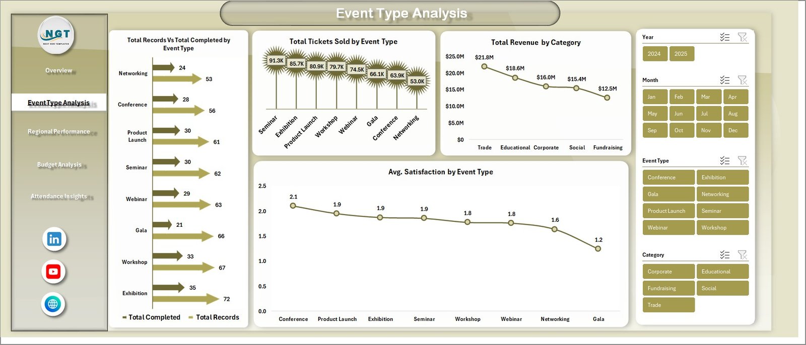 Event Type Analysis Page
3. Regional Performance
The Regional Performance page delivers geographic insights across all your events. It includes visualizations for Total Records Vs Total Cancelled by Region to identify regions with high cancellation rates, Total Revenue by City for city-level revenue analysis, Attendance Rate % by Region to compare regional attendance performance, and Total Spend by City to track where your event budgets are being spent. This page is essential for organizations running events across multiple locations who need to optimize geographic resource allocation.
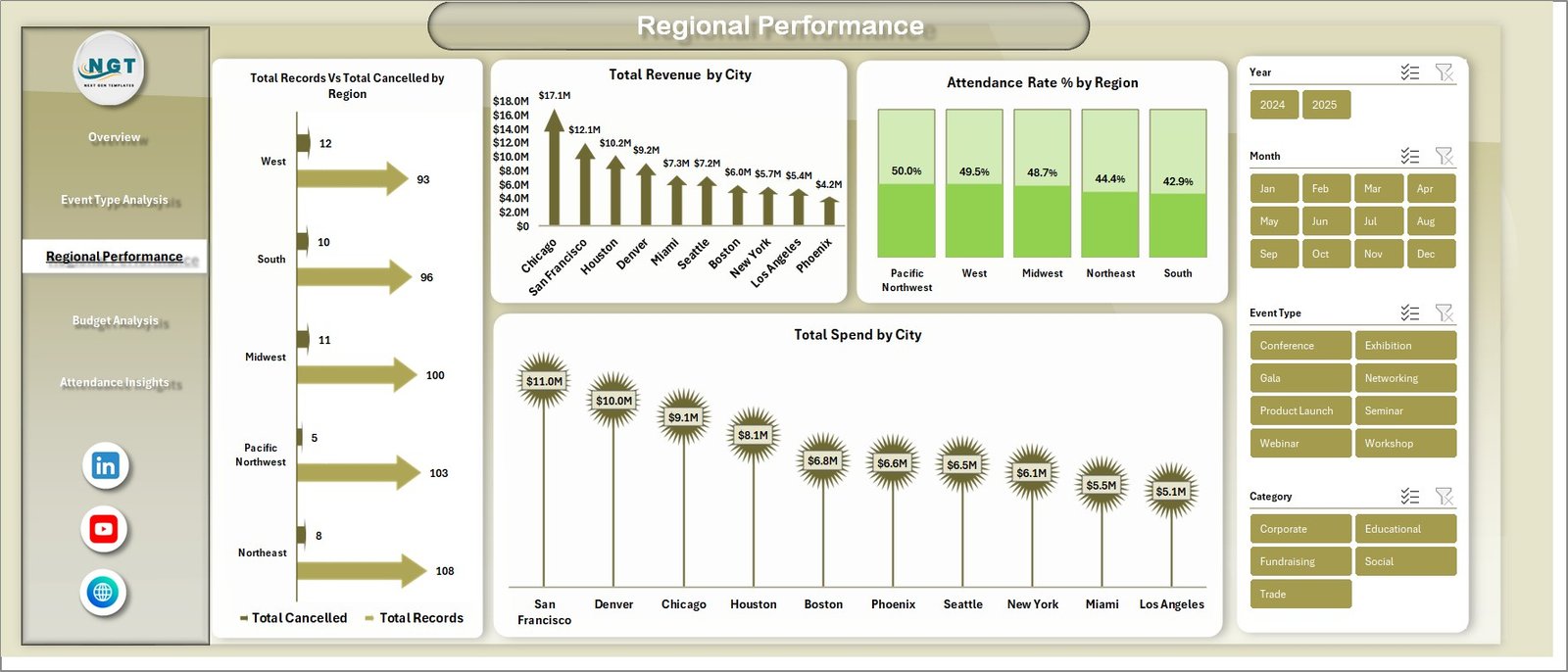 Regional Performance Page
4. Budget Analysis
The Budget Analysis page provides a comprehensive financial deep-dive into your event operations. Charts include Total Budget Vs Total Spend by Event Type for planned versus actual spending comparison, Budget Utilization % by Category to measure how efficiently each category uses its allocated budget, Total Revenue by Month for monthly revenue trend tracking, and Total Revenue by Marketing Channel to analyze which marketing channels deliver the best revenue returns. This page helps finance teams and event directors make smarter budget allocation decisions.
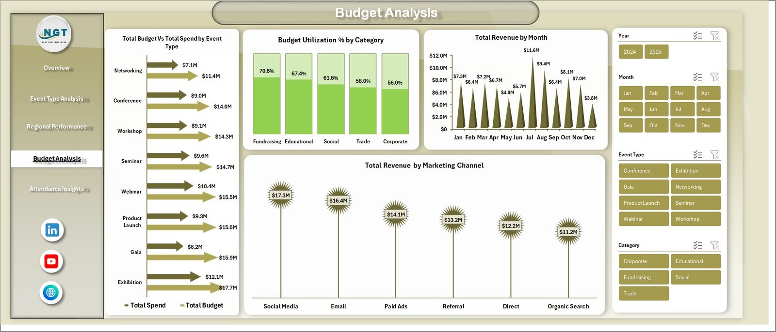 Budget Analysis Page
5. Attendance Insights
The Attendance Insights page focuses entirely on attendee data and event status tracking. It features Total Actual Attendees by Event Type to see which event formats attract the most participants, Total Records by Venue to analyze venue-wise event distribution and popularity, and Total Records by Status to monitor the proportion of completed, cancelled, and in-progress events. This page gives event coordinators actionable insights into venue selection, capacity planning, and event execution success rates.
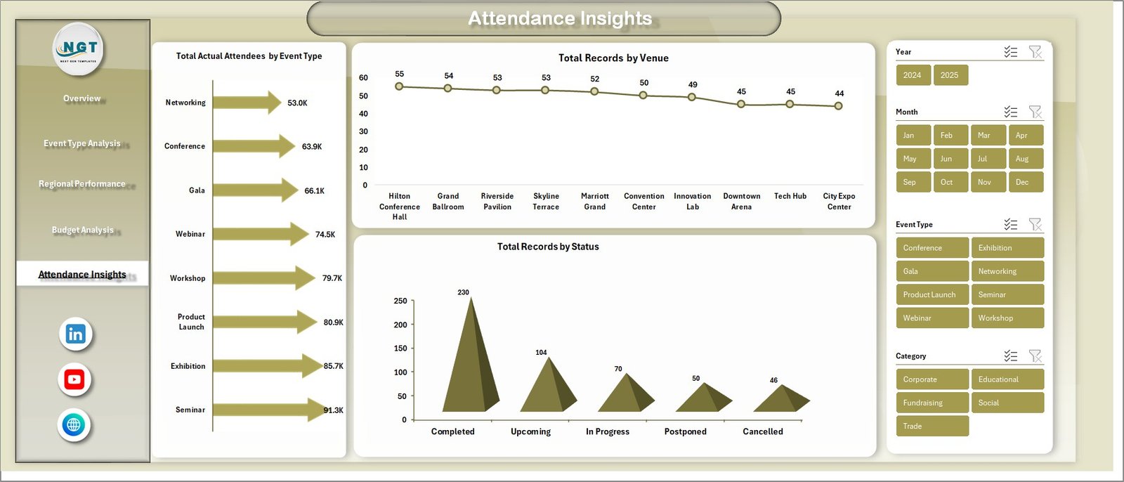 Attendance Insights Page
6. Data Sheet Tab
The Data Sheet is where all your raw event data lives. It contains structured columns for event name, event type, category, region, city, venue, date, status, revenue, spend, budget, tickets sold, actual attendees, satisfaction score, marketing channel, and more. Simply add your event records in the same format as the provided sample data. This sheet feeds all the pivot tables in the Support Sheet, which in turn power all the charts and KPI cards across every dashboard page.
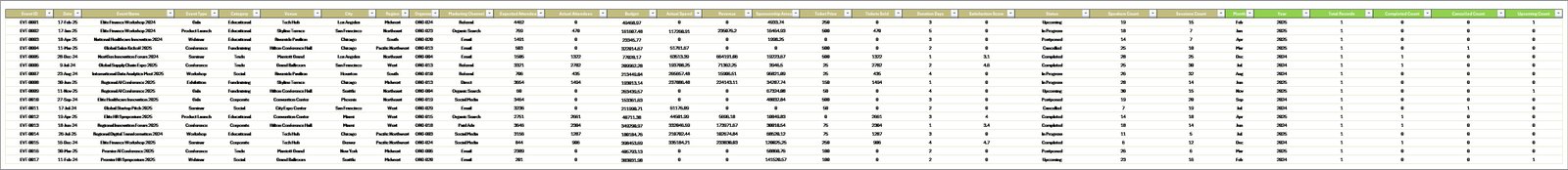 Data Sheet Tab
7. Support Sheet
The Support Sheet contains multiple pivot tables that power the entire dashboard dynamically. Every chart and KPI card on every dashboard page pulls its data from these pivot tables. After updating or adding new records in the Data Sheet, simply go to the Data tab in the Excel Ribbon and click Refresh All. All pivot tables will recalculate and every chart across all 5 dashboard pages will update automatically. You can keep this sheet hidden during presentations for a clean look.

Click to buy Event Management Analysis Dashboard in Excel
Advantages of Event Management Analysis Dashboard in Excel
- Centralized Event Reporting — Consolidate data from all your events into a single dashboard instead of maintaining separate spreadsheets for each event or region.
- Instant Visual Insights — Transform raw event data into meaningful charts and KPI cards that tell a clear story to stakeholders and decision-makers.
- Budget vs Actual Tracking — The dedicated Budget Analysis page gives finance teams clear visibility into where money is being spent versus what was planned.
- Multi-Dimensional Filtering — Slicer controls on every page let you drill down into specific event types, regions, venues, or time periods without modifying any data.
- No Learning Curve — If you can use Excel, you can use this dashboard. No VBA, no macros, no complex formulas to maintain.
- Cost-Effective Alternative — Replace expensive event management software with a one-time purchase Excel template that works offline and requires no subscription fees.
Opportunities for Improvement
- Custom Metrics — You can extend the Data Sheet with additional columns like sponsor revenue, social media engagement, or speaker ratings and create new pivot tables to track them.
- Multi-Year Comparison — Add a year column to your data and create year-over-year comparison charts to track event program growth over time.
- Power BI Integration — For organizations needing more advanced analytics, the same data structure can be imported into Power BI Desktop for interactive online dashboards with sharing capabilities.
- Conditional Formatting — Apply color-coded thresholds to the Data Sheet to highlight underperforming events or budget overruns automatically.
Best Practices for Using This Event Dashboard
- Update Data Regularly — Add new event records after each event concludes to keep the dashboard current and actionable.
- Always Refresh Pivots — After adding or modifying data, always click Data > Refresh All to ensure all charts and KPIs reflect the latest information.
- Use Slicers Strategically — Combine multiple slicer selections to create targeted views such as “Corporate Events in North Region with High Satisfaction.”
- Back Up Your File — Keep a master copy of the original template before adding your data so you can start fresh if needed.
- Present Dashboard Pages Individually — Each page is designed to stand alone, so you can print or share specific pages with different stakeholders who need different insights.
Explore Relevant Templates
If you are looking for more Excel dashboard templates for related use cases, explore these popular templates from NextGenTemplates:
- Wedding Budget Dashboard in Excel — Track wedding expenses, vendor payments, and budget allocations for special event planning.
- Property Management Dashboard in Excel — Manage property revenue, occupancy, and maintenance with dynamic Excel charts.
- Warehouse Efficiency Dashboard in Excel — Monitor warehouse operations, efficiency KPIs, and logistics performance.
- Staffing Agency Dashboard in Excel — Track recruitment metrics, placement rates, and agency performance.
Frequently Asked Questions
What is the best Excel dashboard template for event management analytics?
The Event Management Analysis Dashboard in Excel is one of the best templates for event management analytics. It provides 5 interactive dashboard pages covering overview metrics, event type performance, regional analysis, budget tracking, and attendance insights — all powered by auto-refreshing pivot tables and slicer filters.
How many KPIs does the Event Management Analysis Dashboard in Excel track?
The dashboard tracks 5 primary KPIs on the Overview page: Total Records, Total Revenue, Total Spend, Total Tickets Sold, and Average Satisfaction Score. Additionally, each of the 5 dashboard pages provides detailed metrics and visual analytics across event types, regions, budgets, and attendance data.
Can I use this event dashboard template with Microsoft 365?
Yes. The Event Management Analysis Dashboard in Excel is fully compatible with Microsoft Excel 2016, 2019, 2021, and Microsoft 365. It uses standard pivot tables, charts, and slicers without any VBA macros, ensuring seamless compatibility across all modern Excel versions.
How do I update the event dashboard with my own data?
Navigate to the Data Sheet tab, replace the sample records with your own event data following the same column format, then go to the Data tab in the Excel Ribbon and click Refresh All. All pivot tables, charts, and KPI cards across all 5 dashboard pages will update automatically.
Does this dashboard require VBA or macros to work?
No. The Event Management Analysis Dashboard in Excel is built entirely with standard Excel features including pivot tables, pivot charts, formulas, and slicers. No VBA macros are used, making it lightweight, safe, and easy to maintain.
Who should use the Event Management Analysis Dashboard in Excel?
This dashboard is ideal for event planners, corporate event coordinators, marketing teams, nonprofit organizations managing fundraisers, venue managers, hospitality professionals, and any business that runs events and needs centralized performance reporting in Excel.
Conclusion
The Event Management Analysis Dashboard in Excel is a comprehensive, plug-and-play analytics solution that transforms your raw event data into actionable insights across 5 interactive dashboard pages. With KPI summary cards, dynamic slicer filters, budget tracking, attendance analytics, and regional performance breakdowns, this template gives event professionals everything they need to make data-driven decisions without expensive software. Download it today and take full control of your event analytics in Microsoft Excel.