The cruise industry operates in a highly dynamic environment. Passenger demand fluctuates by season, operating costs remain high, and service quality directly impacts customer satisfaction. Therefore, cruise line executives and operations teams must monitor performance continuously. However, many cruise companies still rely on static Excel reports and manual reviews. As a result, decision-making often becomes slow and reactive.
That is exactly where a Cruise Lines KPI Dashboard in Power BI delivers immense value.
This ready-to-use Power BI dashboard helps cruise companies track operational, financial, and service KPIs in real time. Moreover, it connects seamlessly with Excel data sources and transforms raw numbers into interactive visuals and insights.
In this detailed article, you will learn what a Cruise Lines KPI Dashboard in Power BI is, how it works, its pages and features, advantages, best practices, and frequently asked questions.
Click to Purchases Cruise Lines KPI Dashboard in Power BI
What Is a Cruise Lines KPI Dashboard in Power BI?
A Cruise Lines KPI Dashboard in Power BI is an interactive analytics solution designed specifically to track and analyze key performance indicators for cruise line operations.
Instead of reviewing multiple reports, this dashboard allows cruise companies to:
-
Track Month-to-Date (MTD) and Year-to-Date (YTD) performance
-
Compare Actual vs Target vs Previous Year values
-
Instantly identify target met and target missed KPIs
-
Analyze KPI trends using dynamic charts
-
Drill through to detailed KPI definitions
Because the dashboard runs in Power BI, users gain real-time insights with strong visual clarity.
Why Do Cruise Lines Need a KPI Dashboard in Power BI?
Cruise line operations involve multiple moving parts such as fleet management, onboard services, revenue generation, and customer experience. Therefore, leadership teams must monitor KPIs frequently.
A Cruise Lines KPI Dashboard in Power BI helps because:
-
It centralizes all KPIs into one interactive dashboard
-
It reduces dependency on manual Excel reports
-
It improves decision speed and accuracy
-
It enhances visibility across departments
-
It supports data-driven planning and strategy
Moreover, Power BI provides advanced interactivity without complex setup.
How Does the Cruise Lines KPI Dashboard in Power BI Work?
The Cruise Lines KPI Dashboard in Power BI works using three well-structured pages inside the Power BI Desktop file. Additionally, it uses an Excel file as the data source.
Let’s explore each page in detail.
Click to Purchases Cruise Lines KPI Dashboard in Power BI
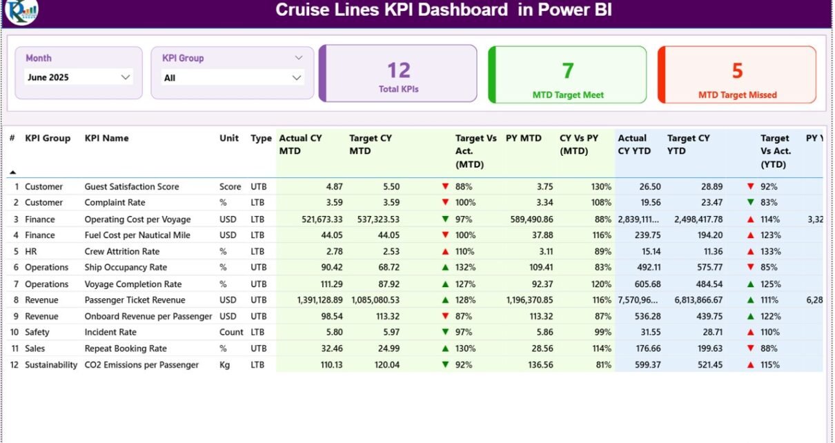
What Is the Summary Page in the Cruise Lines KPI Dashboard?
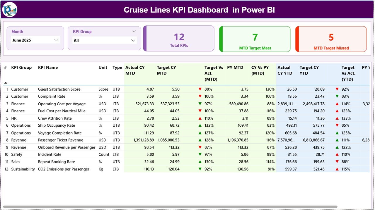
The Summary Page acts as the main landing page of the dashboard.
What Filters Are Available on the Summary Page?
At the top of the Summary Page, the dashboard includes:
-
Month slicer – Select the reporting month
-
KPI Group slicer – Filter KPIs by category
Once you select these filters, the entire dashboard updates automatically.
What KPI Cards Are Displayed?
The Summary Page shows three KPI cards:
-
Total KPIs Count
-
MTD Target Met Count
-
MTD Target Missed Count
These cards provide an instant performance snapshot.
What Information Does the Detailed KPI Table Show?
Below the cards, the dashboard displays a detailed KPI table with the following columns:
-
KPI Number – Sequential KPI identifier
-
KPI Group – Category of the KPI
-
KPI Name – Name of the KPI
-
Unit – Measurement unit
-
Type – LTB (Lower the Better) or UTB (Upper the Better)
How Does the Dashboard Show MTD Performance?
For Month-to-Date performance, the table displays:
-
Actual CY MTD – Current year actual MTD value
-
Target CY MTD – Current year target MTD value
-
MTD Icon – ▲ or ▼ icon with green or red color
-
Target vs Actual (MTD) – Actual ÷ Target percentage
-
PY MTD – Previous year MTD value
-
CY vs PY (MTD) – Current year vs previous year comparison percentage
These indicators help users instantly identify performance gaps.
How Does the Dashboard Show YTD Performance?
For Year-to-Date performance, the table shows:
-
Actual CY YTD – Current year actual YTD value
-
Target CY YTD – Current year target YTD value
-
YTD Icon – ▲ or ▼ icon for YTD performance
-
Target vs Actual (YTD) – Actual ÷ Target percentage
-
PY YTD – Previous year YTD value
-
CY vs PY (YTD) – Current year vs previous year comparison percentage
Because of this structure, users can evaluate both short-term and long-term performance in one view.
Click to Purchases Cruise Lines KPI Dashboard in Power BI
How Does the KPI Trend Page Help Cruise Lines?

The KPI Trend Page focuses on performance trends over time.
How Can You Select a KPI on the Trend Page?
On the left side, the page includes a KPI Name slicer. Once you select a KPI:
-
Charts update instantly
-
Trends become visible for analysis
What Charts Are Shown on the KPI Trend Page?
This page includes two combo charts:
-
MTD Trend Chart – Actual, Target, and Previous Year
-
YTD Trend Chart – Actual, Target, and Previous Year
These charts help cruise teams identify seasonality, growth patterns, and performance issues.
What Is the KPI Definition Page and Why Is It Hidden?
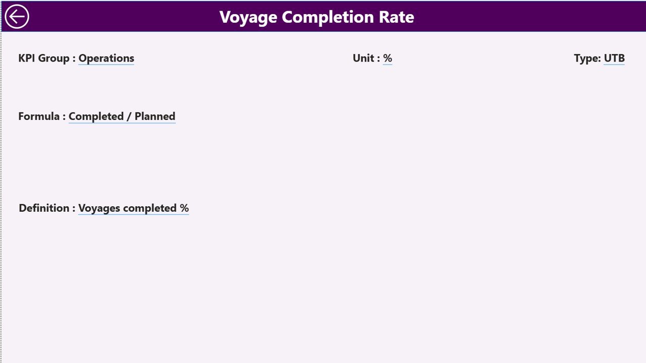
The KPI Definition Page works as a drill-through page.
What Information Does the KPI Definition Page Show?
This page displays:
-
KPI Formula
-
KPI Definition
-
KPI Type and Unit
The dashboard hides this page intentionally to keep the main interface clean.
How Do You Access the KPI Definition Page?
From the Summary Page:
-
Right-click on a KPI
-
Select Drill Through
-
View detailed KPI information
To return to the Summary Page, simply click the Back button located at the top left corner.
Click to Purchases Cruise Lines KPI Dashboard in Power BI
What Excel Data Is Used in the Cruise Lines KPI Dashboard?
The dashboard uses an Excel file as the data source. This file contains three structured worksheets.
What Is the Input_Actual Sheet?
The Input_Actual sheet captures actual performance data.
What Data Do You Enter Here?
You enter:
-
KPI Name
-
Month (use first date of the month)
-
MTD Actual value
-
YTD Actual value
This sheet drives actual performance calculations.
What Is the Input_Target Sheet?
The Input_Target sheet stores KPI target values.
What Data Do You Enter Here?
You enter:
-
KPI Name
-
Month (first date of the month)
-
MTD Target value
-
YTD Target value
Targets allow the dashboard to calculate variances and status icons.
What Is the KPI Definition Sheet in Power BI?
The KPI Definition sheet defines all KPIs used in the dashboard.
What Columns Are Included?
This sheet captures:
-
KPI Number
-
KPI Group
-
KPI Name
-
Unit
-
Formula
-
Definition
-
Type (LTB or UTB)
Because of this structure, KPI logic remains consistent across the dashboard.
Click to Purchases Cruise Lines KPI Dashboard in Power BI
Advantages of Cruise Lines KPI Dashboard in Power BI
Using this dashboard offers several strong advantages.
Key Advantages
-
Real-time KPI monitoring
-
Interactive slicers and drill-through
-
Clear MTD and YTD comparisons
-
Visual KPI status indicators
-
Easy Excel data integration
-
Scalable for small and large cruise lines
-
Professional and executive-ready design
Moreover, Power BI improves storytelling through data.
Who Should Use a Cruise Lines KPI Dashboard in Power BI?
This dashboard suits multiple roles, such as:
-
Cruise Line Executives
-
Operations Managers
-
Finance and Revenue Teams
-
Fleet and Operations Analysts
-
Strategy and Planning Teams
Because of its intuitive design, both technical and non-technical users can use it confidently.
Click to Purchases Cruise Lines KPI Dashboard in Power BI
Best Practices for the Cruise Lines KPI Dashboard in Power BI
1. Maintain Clean KPI Definitions
-
Use consistent KPI names
-
Keep formulas simple
-
Avoid overlapping KPIs
2. Update Excel Data Monthly
-
Enter actual data on time
-
Review targets regularly
-
Validate previous year data
3. Review Dashboard Frequently
-
Analyze trends monthly
-
Track target misses early
-
Take corrective actions quickly
4. Limit the Number of KPIs
-
Focus on business-critical KPIs
-
Avoid overcrowding the dashboard
5. Secure the Data Source
-
Protect Excel files
-
Control access permissions
-
Maintain backups
These practices ensure reliable insights and long-term usability.
How Is This Dashboard Better Than Static Reports?
Static reports lack flexibility and real-time updates. In contrast, this Power BI dashboard:
-
Updates automatically
-
Enables interactive exploration
-
Reduces manual reporting effort
-
Improves decision confidence
As a result, teams shift focus from reporting to analysis.
Conclusion: Is a Cruise Lines KPI Dashboard in Power BI Worth It?
Yes, absolutely.
A Cruise Lines KPI Dashboard in Power BI transforms raw Excel data into actionable insights. With interactive slicers, KPI status icons, trend analysis, and drill-through capabilities, cruise companies gain complete visibility into performance.
Instead of reacting late, teams can act early. As a result, cruise operations become more efficient, controlled, and profitable.
Frequently Asked Questions (FAQs)
What is a Cruise Lines KPI Dashboard in Power BI?
It is an interactive Power BI dashboard that tracks cruise line KPIs using MTD, YTD, target, and previous year comparisons.
Does this dashboard require Power BI Service?
No, you can use it directly in Power BI Desktop. You can publish it later if needed.
Can I customize KPIs and targets?
Yes, you can easily update KPIs, targets, and definitions through the Excel data source.
Does the dashboard support drill-through?
Yes, you can drill through from the Summary Page to view KPI definitions.
Is this dashboard suitable for large cruise companies?
Yes, the scalable design supports both small operators and large cruise lines.
Click to Purchases Cruise Lines KPI Dashboard in Power BI
Visit our YouTube channel to learn step-by-step video tutorials