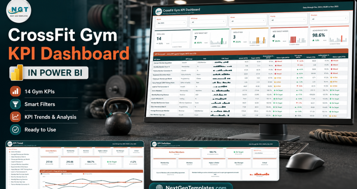
Most CrossFit affiliates measure the same three things – members, revenue and how full the 6am class is – and then argue about everything else from memory. The CrossFit Gym KPI Dashboard in Power BI replaces that with 14 box KPIs on one scorecard, each scored twice: once against its month-to-date target and once against its year-to-date target. In the December 2025 sample month that ships in the file, 7 KPIs read On Target, 3 At Risk and 4 Missed, at 98.6% overall MTD achievement – a normal, believable month rather than a demo where everything is green.
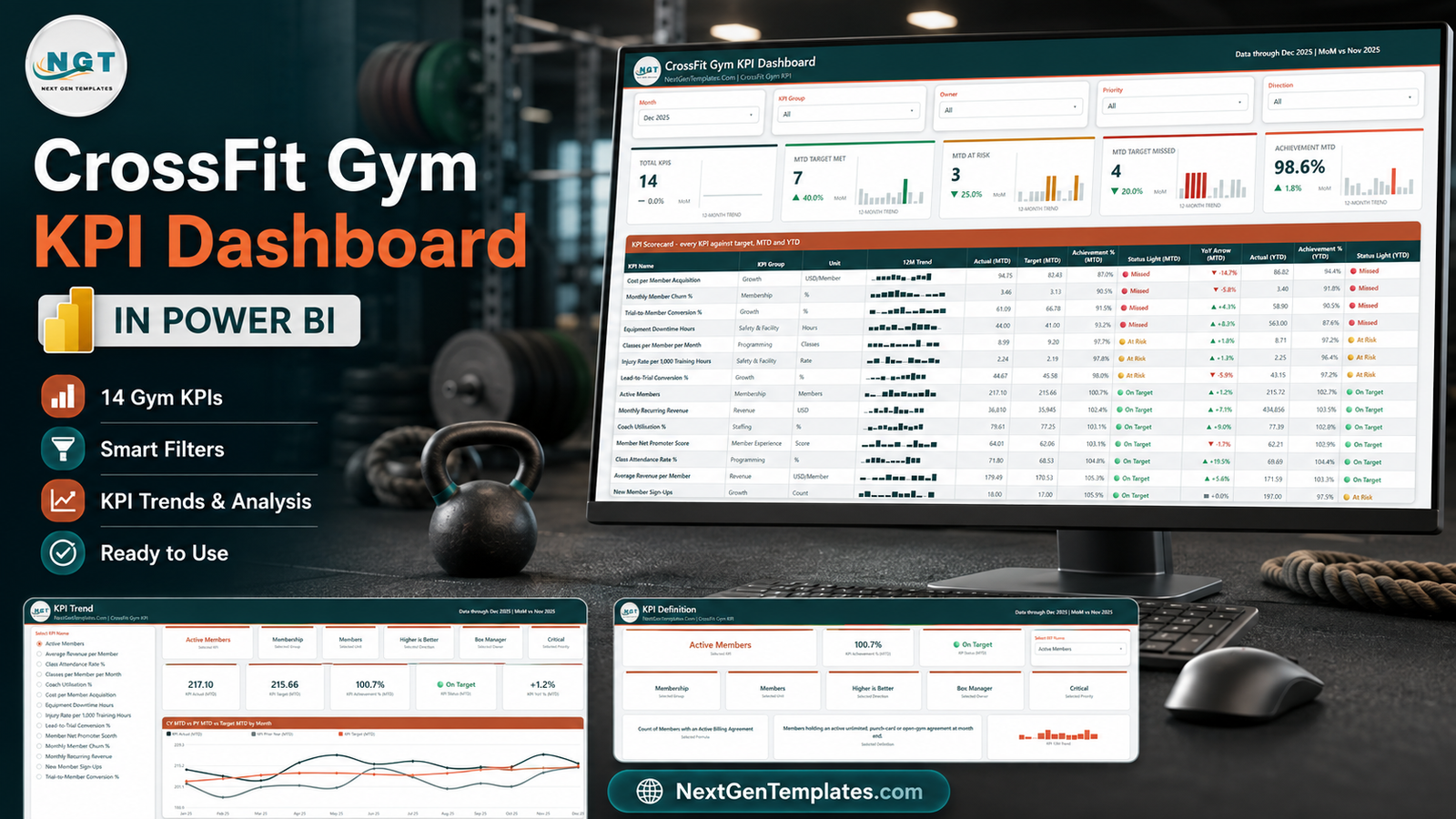
This is the KPI scorecard, not the analytical dashboard
Worth clearing up before anything else, because NextGenTemplates ships several gym templates with similar names. This one is a KPI scorecard: a table-led monthly review pack with traffic lights, sparklines, a trend page and a definitions page. It is deliberately narrow.
- If you want charts that slice revenue, retention cohorts and class mix, the analytical builds are the Gym Retention Dashboard in Power BI and the Gym Fitness Business Dashboard in Power BI.
- The same 14-KPI scorecard also exists in Excel – see CrossFit Gym KPI Dashboard in Excel – and in Google Sheets. Same idea, different tool.
- There is also a lighter one-page Excel review sheet, the CrossFit Gym KPI Scorecard in Excel.
Buy the one that matches how your box already reports. They are companions, not duplicates.
Key Features of the CrossFit Gym KPI Dashboard in Power BI
- Two traffic lights per KPI. MTD and YTD are scored separately, with three states each: On Target, At Risk, Missed. A KPI can therefore read green for December and red for the year, which is exactly the conversation most monthly reviews miss.
- A 12-month sparkline on every scorecard row. It stays on the full year even when the Month slicer is set to a single month, so context never disappears when you filter.
- Direction-aware achievement. Each KPI carries a UTB (higher is better) or LTB (lower is better) flag. Churn, cost per acquisition, injury rate and equipment downtime score above 100% when they drop below target – the detail that home-built scorecards nearly always get backwards.
- Five slicers on page 1 – Month, KPI Group, Owner, Priority and Direction – so a coach can filter to their own metrics in one click.
- Prior-year built in. The data pack ships 24 months of actuals, so every YoY arrow and every prior-year line comes from real history.
- 38 DAX measures referenced by the report visuals, over a clean two-table model: a Data table and a proper Date table.
- Fully editable. No custom visuals, no locked pages, no AppSource dependency, and a custom theme file so re-colouring is a single edit.
The 14 KPIs it ships with
They sit in 7 groups, and each carries a formula, a plain-English definition, an owner and a priority inside the file.
- Membership – Active Members (members with an active billing agreement at month end); Monthly Member Churn % (cancellations over the opening base).
- Growth – New Member Sign-Ups; Lead-to-Trial Conversion %; Trial-to-Member Conversion %; Cost per Member Acquisition.
- Programming – Class Attendance Rate % (checked-in athletes over published class capacity); Classes per Member per Month.
- Revenue – Monthly Recurring Revenue; Average Revenue per Member.
- Staffing – Coach Utilisation % (coached class hours over paid coaching hours).
- Member Experience – Member Net Promoter Score.
- Safety & Facility – Injury Rate per 1,000 Training Hours; Equipment Downtime Hours.
Owners in the sample run from Box Manager and Head Coach to Sales & Front Desk, Marketing, Membership Retention, Facilities and Owner / Finance, with priorities of Critical, High or Medium. All of it is free text you can rewrite for your own staffing.
Dashboard Pages Explanation
The .pbix carries 6 pages – 4 you navigate and 2 hidden 280×360 tooltip pages that surface on hover.
Page 1 – KPI Scorecard
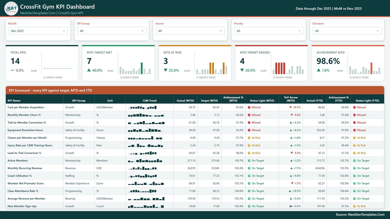
Five slicers across the top, then five summary cards – Total KPIs, MTD Target Met, MTD At Risk, MTD Target Missed and Achievement MTD – each with a MoM delta and its own 12-month trend. Below them, the full table: KPI Name, KPI Group, Unit, 12M Trend, Actual (MTD), Target (MTD), Achievement % (MTD), Status Light (MTD), YoY Arrow (MTD), Actual (YTD), Achievement % (YTD) and Status Light (YTD). It sorts worst-first, so the meeting starts where it should.
Page 2 – KPI Trend
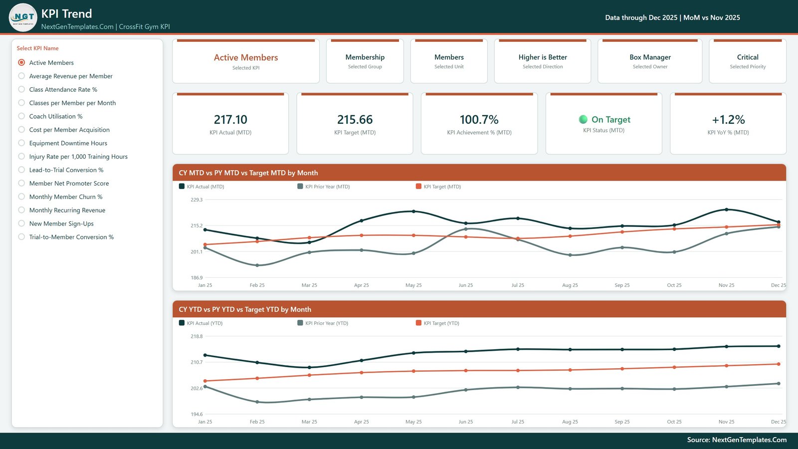
Pick one KPI from the list on the left and the whole page becomes that KPI. Six context cards restate its group, unit, direction, owner and priority; five value cards give Actual MTD, Target MTD, Achievement % MTD, Status and YoY %. Then two line charts: CY MTD vs PY MTD vs Target MTD by Month and CY YTD vs PY YTD vs Target YTD by Month. Three lines each – this year, last year, target – which is usually enough to tell a bad month from a bad trend.
Page 3 – KPI Definition
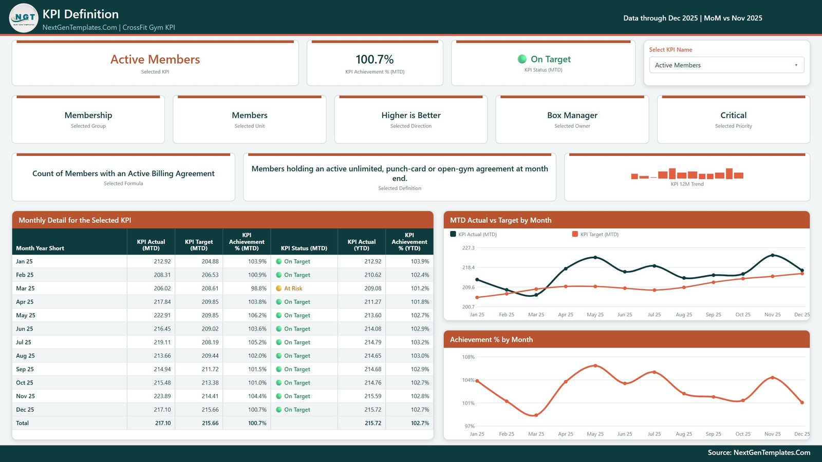
The same KPI selection, synced across pages, now showing the formula and the definition in words, plus a month-by-month table (Actual MTD, Target MTD, Achievement % MTD, Status, Actual YTD, Achievement % YTD, with a total row) and two charts – MTD Actual vs Target by Month and Achievement % by Month. This is the page that settles “how are we actually calculating that?” without anyone opening the model.
Page 4 – Get More Templates
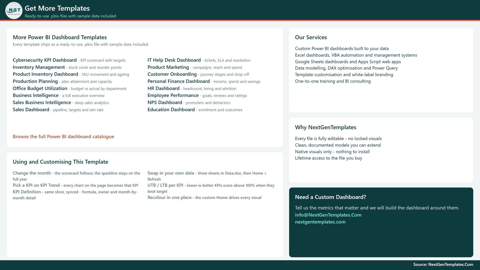
An in-file quick guide – changing the month, swapping in your own data, the UTB/LTB rule, recolouring in one place – alongside links to the wider catalogue. It is a navigation and upsell page rather than an analysis page, and it is included in the product gallery for exactly that reason.
CrossFit Gym KPI Dashboard in Power BI vs. Tableau or Qlik vs. Gym SaaS Reporting – Feature Comparison
| This template | Tableau / Qlik build | Gym SaaS reporting module | |
|---|---|---|---|
| Cost | One-time purchase | Per-user subscription plus build time | Recurring, bundled per location |
| Platform | Power BI Desktop (free) | Tableau or Qlik licence | Your vendor’s portal |
| Setup time | Replace 3 sheets, refresh | Days to weeks of modelling | Instant, vendor’s metrics only |
| Real-time team collaboration | Publish to the Power BI Service | Yes, on the paid server | Yes |
| Mobile access | Power BI mobile app once published | Yes | Yes |
| Customisable KPIs | Add, rename or delete any KPI in Excel | Fully, with developer effort | Fixed metric set |
| Share with a link | Yes, after publishing | Yes | Yes |
| Year-1 cost at 5 users | One purchase, plus any Power BI licence you hold | Recurring per-user – check vendor pricing | Recurring per-location – check vendor pricing |
| MTD and YTD scored separately | Yes | If you build it | Rarely |
| Reads live from your gym software | No – export to Excel, then refresh | With a connector | Yes |
Who Should Use This Template
Box owners running one site or a small group who want a monthly review pack rather than another live ops screen. Head coaches who need a filtered view of the four or five metrics they actually control. General managers reporting upward to an owner or a franchisor. And consultants who advise several affiliates and want one review format across all of them.
It is a poor fit if you need a live feed. This model imports from a bundled Excel file – it does not connect to Wodify, PushPress, Zen Planner, Mindbody or any other platform, and it is not a membership, billing or check-in system. It ships no industry benchmarks and no recommended targets; those are yours to set. The injury rate KPI is a management measure for internal safety reviews, not a medical, insurance or regulatory record.
Real-World Use Cases
The monthly owners’ meeting. Export billing and check-ins on the 2nd, paste into three sheets, refresh, set the Month slicer. In the sample data, Cost per Member Acquisition sits at 87.0% MTD achievement against an 82.43 target – which turns a vague “marketing feels expensive” into a specific line item.
The coaching huddle. Filter Owner to “Head Coach” and the scorecard drops to Class Attendance Rate %, Classes per Member per Month, Coach Utilisation % and Injury Rate per 1,000 Training Hours. Four metrics, one page, no noise.
The multi-box consultant. One copy per client, a different KPI list in each (some drop NPS, some add retail revenue), and the same review format delivered to all of them without rebuilding a report.
Advantages of the CrossFit Gym KPI Dashboard in Power BI
- Nothing is hard-coded. Add a KPI, rename one or delete one in the data pack, then Home > Refresh – the cards, the scorecard, the KPI list and every chart follow. The KPI name is the join key across the three input sheets.
- The scoring logic is already right. Lower-is-better metrics do not need a manual sign flip.
- Definitions travel with the numbers. Formula, definition, owner and priority live on page 3, so nobody has to trust a number they cannot trace.
- It opens in free software. Power BI Desktop is a free download from Microsoft; you only need a licence to publish and share online. Microsoft’s own Power BI Desktop documentation covers installation and the refresh basics.
Opportunities for Improvement
Being honest about the limits: the refresh is manual, so someone has to maintain the Excel pack each month. There is no drillthrough on this build – KPI Trend and KPI Definition are linked by a synced “Select KPI Name” slicer instead, which works well but means there is no right-click path from the scorecard. The 12-month sparkline shows shape rather than exact values. And the sample figures are realistic demo data, not real gym results – replace them before you decide anything on them.
Best Practices
- Set targets from your own history first, then tighten them. A scorecard where everything is green teaches nothing.
- Keep the KPI count near 14. Beyond about twenty, the monthly review stops being a review.
- Give every KPI a real owner. Traffic lights without a name attached become wallpaper within three months.
- Load the prior year properly. Without it, the YoY arrows and prior-year lines are the weakest part of the report instead of the strongest.
- Fix the export routine before the dashboard. Ten minutes on a repeatable export beats an hour of manual typing every month.
- Review MTD and YTD together. The pair is the point – either one on its own is misleading.
Explore Relevant Templates
- CrossFit Gym KPI Dashboard in Power BI – the template covered in this post.
- Gym Retention Dashboard in Power BI – analytical companion for churn and cohorts.
- Gym Fitness Business Dashboard in Power BI – a wider business view.
- Fitness Trainer Dashboard in Power BI – individual trainer performance.
- CrossFit Gym KPI Dashboard in Excel and in Google Sheets – the same scorecard on other platforms.
- Browse every Power BI KPI Dashboard.
Frequently Asked Questions
Does it connect to Wodify, PushPress, Zen Planner or Mindbody?
No. The model imports from the bundled Data.xlsx. You export from whatever your box runs on, paste into the three input sheets and refresh. Nothing in the file talks to a gym platform’s API.
Do I need a paid Power BI licence?
Not to use it. Power BI Desktop is free from Microsoft and opens the .pbix immediately. A licence is only required to publish the report and share it with others online.
Can I change the 14 KPIs?
Yes. Add, rename or delete rows in all three sheets – the KPI name is the join key – then refresh. No DAX editing and no visual rebuilding.
How does it handle metrics where lower is better?
Each KPI is tagged UTB or LTB in the KPI Definition sheet. LTB metrics such as churn, cost per acquisition, injury rate and equipment downtime score above 100% when the actual comes in under target.
What are the two hidden pages?
They are 280×360 tooltip pages, hidden by design. Hover a KPI card or a point on a trend line and one of them appears as a rich tooltip.
Is this the same as the Excel or Google Sheets version?
Same 14-KPI scorecard, three different tools. Buy the one your box already reports in.
What exactly is in the download?
A ZIP containing the .pbix and its Data.xlsx source. Data.xlsx has four sheets: a Read Me, KPI Definition (14 rows across 9 columns), Input_ Target (168 rows) and Input_ Actual (336 rows, covering the reporting year and the year before it).
About the Author
Built by PK – Microsoft Certified Professional with 15+ years of Excel, Google Sheets, and Power BI experience. Founder of NextGenTemplates, reaching 300K+ subscribers across YouTube channels. Every template is hand-built and tested before release.
Conclusion
A CrossFit box does not fail because nobody counted the members. It fails because churn, coach utilisation and acquisition cost drifted for six months while everyone watched the headcount. The CrossFit Gym KPI Dashboard in Power BI puts all 14 of those numbers on one page, scores them against your own targets on both MTD and YTD, and tells you who owns each red light – in a file you can edit end to end and keep forever.
For walkthroughs of this and other Power BI templates, subscribe to youtube.com/@PKAnExcelExpert.