Most yoga studios measure the same three things: how many members, how full the classes are, and how much came in. The trouble starts the month someone asks whether 4.6% churn is good, whether a 66.8% fill rate is better or worse than last November, and who exactly is supposed to fix the no-shows. The Yoga Studio KPI Dashboard in Power BI answers all three in one screen: 14 studio KPIs across 9 KPI groups, each with a target, a month-to-date and year-to-date traffic light, a year-on-year arrow, a 12-month sparkline, a named owner and a priority. It ships as an editable .pbix with a plain Excel data pack holding 24 months of sample actuals and 12 months of targets, so every visual renders before you have typed a single number of your own.
Key Features of the Yoga Studio KPI Dashboard in Power BI
This is a KPI scorecard, not an analytical dashboard. The difference matters: an analytical dashboard invites you to slice and explore, while a scorecard answers a single question – are we on target? – for every metric that matters, in one pass.
- 14 named yoga-studio KPIs. Active Member Base, Monthly Member Churn Rate %, Trial-to-Member Conversion %, New Member Sign-Ups, Member Acquisition Cost, Class Capacity Fill Rate %, Average Class Attendance, Class No-Show Count, Instructor Retention Rate %, Instructor Payroll % of Revenue, Total Studio Revenue, Average Revenue Per Member, Retail Revenue Per Visit and Member Net Promoter Score.
- Nine KPI groups – Membership, Retention, Acquisition, Class Utilisation, Studio Operations, Instructor, Revenue, Retail & Ancillary and Member Experience – so a review can be run group by group instead of metric by metric.
- Seven owners and three priority levels. Every KPI carries an owner (Studio Director, Membership Manager, Marketing Manager, Programming Lead, Front Desk Supervisor, Finance Manager, Retail Lead) and a priority of Critical, High or Medium. Both are slicers.
- Direction-aware scoring. Each KPI is flagged UTB (higher is better) or LTB (lower is better). Higher-is-better KPIs score Actual / Target; lower-is-better KPIs score Target / Actual – so beating a churn target or an acquisition-cost target scores above 100% rather than looking like a failure.
- One consistent scoring band. On Target is 100% or more, At Risk is 95% to 100%, Missed is below 95%. Because the KPIs use different units, every cross-KPI figure on the dashboard is either an achievement percentage or a count of KPIs – absolute values only ever appear per KPI, where they mean something.
- Native Power BI visuals only – cards, tables, line charts, bar charts and slicers. There is nothing to install from AppSource and nothing that breaks when a marketplace visual is retired.
Dashboard Pages Explanation
The file holds six pages: four you navigate and two hidden tooltip pages that appear on hover.
Page 1 – KPI Scorecard
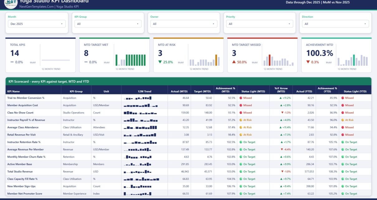
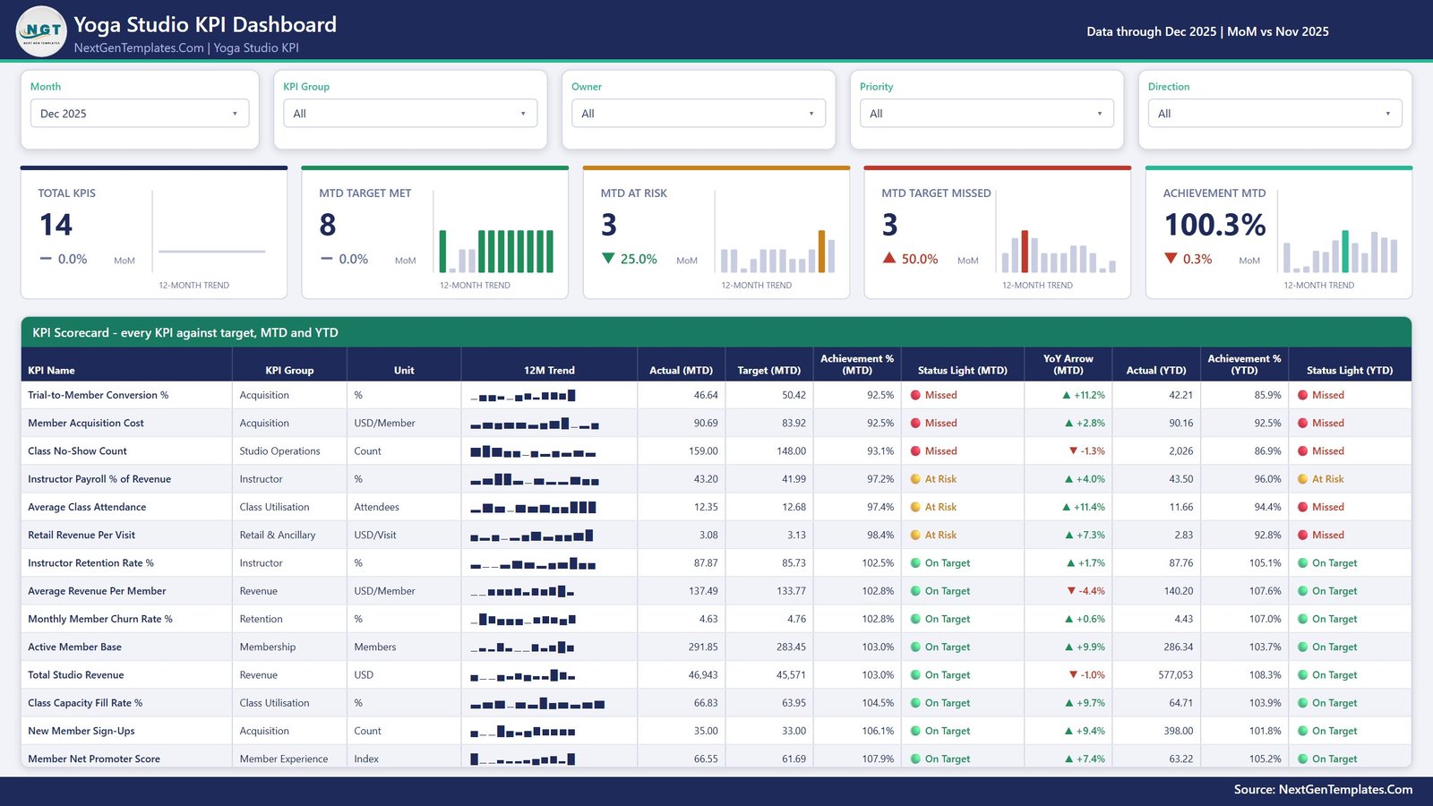
Five slicers run across the top: Month, KPI Group, Owner, Priority and Direction. Below them sit five summary cards – Total KPIs, MTD Target Met, MTD At Risk, MTD Target Missed and Achievement MTD – each with a month-on-month delta and its own 12-month trend bar. In the sample data for December 2025 that reads 14 KPIs, 8 met, 3 at risk, 3 missed and 100.3% overall achievement.
The scorecard table underneath gives one row per KPI with twelve columns: KPI Name, KPI Group, Unit, a 12-month trend sparkline, then Actual (MTD), Target (MTD), Achievement % (MTD), Status Light (MTD), a YoY arrow, and finally Actual (YTD), Achievement % (YTD) and Status Light (YTD). It is sorted worst-achievement-first, so the rows that need a decision are already at the top.
Page 2 – KPI Trend
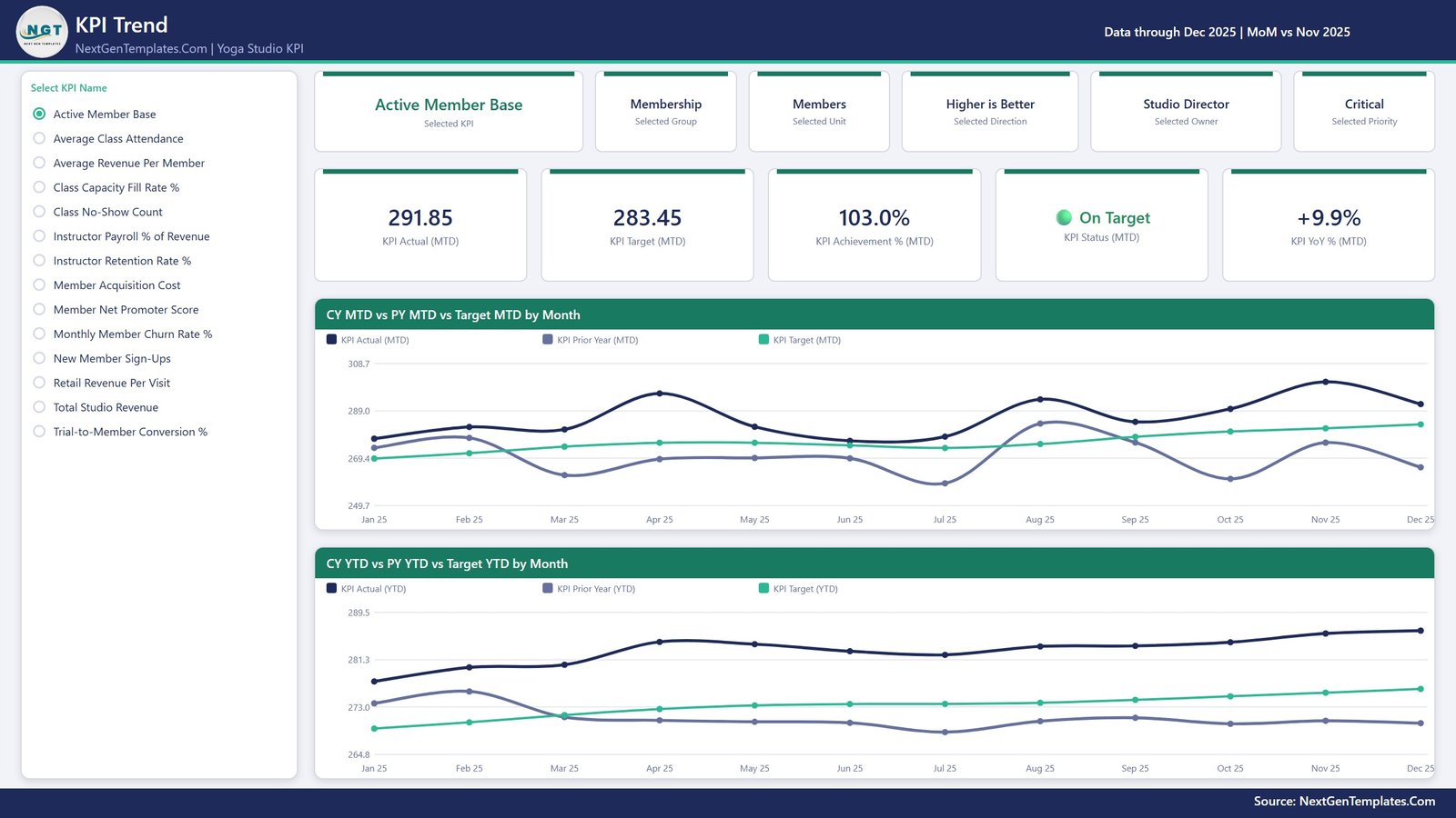
Choose one KPI from the list on the left and the whole page becomes that KPI. Six context cards restate its group, unit, direction, owner and priority; five metric cards give its MTD actual, target, achievement %, status and year-on-year change. Two line charts follow – CY MTD vs PY MTD vs Target MTD by Month and CY YTD vs PY YTD vs Target YTD by Month – each carrying three series, so you can see at once whether a KPI is improving against last year, against plan, or neither.
Page 3 – KPI Definition
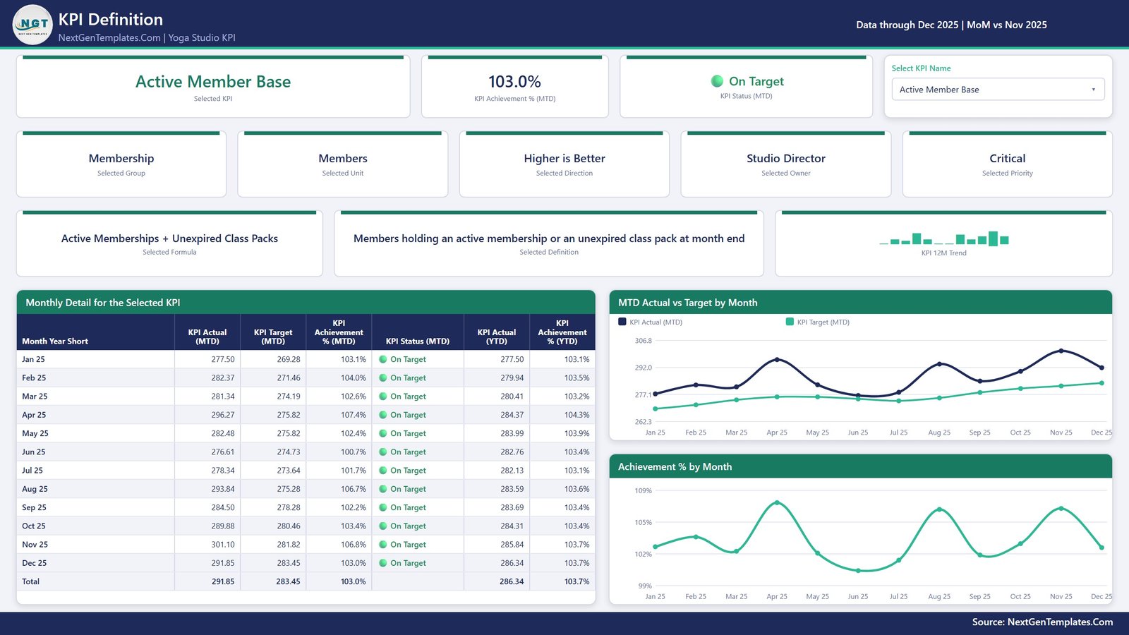
The same KPI selection carries over. This page is where arguments about definitions go to die: the KPI’s formula and its written definition are on screen as cards, next to a 12-month trend. Underneath, a Monthly Detail for the Selected KPI table lists every month with its MTD actual, target, achievement % and status plus the YTD actual and achievement, ending in a total row. Two charts sit alongside it – MTD Actual vs Target by Month and Achievement % by Month.
Worth knowing how the navigation actually works: this build does not use a Power BI drillthrough. The KPI selection is a slicer that is synced between the KPI Trend and KPI Definition pages, so picking a KPI on one page selects it on the other. The report says as much on page 4. It behaves like a drillthrough from the reader’s seat, but if you are pulling the file apart to learn from it, that is the mechanism you will find.
Page 4 – Get More Templates
A short in-file guide – how the month slicer works, how the sparkline stays on the full year, how UTB and LTB scoring behaves, where to recolour – plus the wider template catalogue and contact details for custom work.
Yoga Studio KPI Dashboard in Power BI vs. a Spreadsheet Scorecard vs. Studio Software Reporting – Feature Comparison
| This template (Power BI) | Excel / Google Sheets scorecard | Studio management SaaS reporting | |
|---|---|---|---|
| Cost | One-time $12.99 | One-time, similar | Recurring subscription, priced per location |
| Platform | Power BI Desktop, free from Microsoft | Excel or a browser | The vendor’s own web portal |
| Setup time | Paste your numbers into three sheets, then Refresh | Similar | Already live, but only for the vendor’s metric set |
| Real-time team collaboration | No, until you publish it to your own workspace | Google Sheets yes; Excel via OneDrive | Yes |
| Mobile access | After publishing to the Power BI service | Via the Excel or Sheets app | Yes |
| Customisable KPIs | Yes – add, rename or delete any KPI | Yes | Usually fixed |
| Share with a link | After publishing to your workspace | Yes | Yes |
| Year-1 cost for five viewers | $12.99 total, no per-user fee | One-time | Ongoing, and usually scales with staff or sites |
| Owner and priority per KPI | Built in | Only if you build it | Rarely |
| Connects to your booking system | No – it refreshes from the bundled Excel file | No | Yes, it is the booking system |
Who Should Use This Template
Studio owners and managers who already export numbers from a booking platform once a month and want a single, repeatable pack rather than a fresh spreadsheet each time. Small multi-site groups who need every site reporting the same 14 metrics with the same definitions. Operations or finance staff who have to defend a number in a meeting and want the formula on screen. And Power BI learners who want a readable, honestly-built KPI model to take apart – the data model is small, the visuals are all native, and nothing is locked.
Real-World Use Cases
The first-Monday review. Export attendance, membership and revenue, paste into the workbook, refresh, set the Month slicer, screenshot page 1. The red rows are the meeting agenda and nobody has to argue about which numbers to look at.
The single-owner filter. The Programming Lead sets the Owner slicer to their own name and sees only Class Capacity Fill Rate %, Average Class Attendance and Class No-Show Count. Three KPIs, all of them timetable decisions, no noise from payroll or retail.
The definition argument. Two people disagree about whether “churn” counts lapsed class packs. Page 3 shows the formula and the written definition in the file itself, so the disagreement becomes a one-line edit in the workbook rather than a recurring monthly debate.
Advantages of the Yoga Studio KPI Dashboard in Power BI
- It is genuinely dynamic. Nothing in the report hard-codes a KPI name. Add a row to the KPI Definition sheet plus its monthly target and actual rows and every card, chart, table and count re-derives on Refresh. Delete one and it disappears cleanly.
- MTD and YTD are handled properly. The Read Me is explicit that YTD sums for money, volume and counts but averages for rates, ratios and index KPIs. A compliance percentage that adds to 1,900% by December is the single most common mistake in a KPI pack, and this one is built to avoid it.
- The prior year is real, not implied. The actuals sheet carries both the reporting year and the year before, which is what makes the YoY arrows and the PY series on page 2 meaningful rather than decorative.
- No dependency you do not control. No custom visuals, no gateway, no API key, no subscription. Power BI Desktop is a free download from Microsoft and opens the file.
Opportunities for Improvement
Three honest limitations, so nobody is surprised after downloading:
- No live connection. The dashboard refreshes from the Data.xlsx that ships with it. It does not connect to Mindbody, WellnessLiving, Momence, Glofox, Arketa, Punchpass, ClassPass or any POS or payments system, and there is no connector to configure. Monthly export and paste is the intended workflow.
- No user manual in the download. This line ships the .pbix and the Excel data pack only – the guidance lives in the workbook’s Read Me sheet and on page 4 of the report. That is normal for the Power BI KPI range rather than a missing file.
- One formatting nit in the sample data. Active Member Base is a count of people but is shown to two decimal places (291.85 Members in the December sample), because the sample values were generated as decimals. It is cosmetic and disappears the moment you paste in whole-number member counts, or you can set the column format in the workbook.
And the obvious one: the numbers shipped are realistic sample values for one mid-sized studio. They are not real operational data and they are not an industry benchmark. The targets are placeholders for you to replace.
Best Practices
- Keep the .pbix and Data.xlsx in the same folder. If you move them, repoint the query with Transform data > Data source settings > Change Source.
- Set the direction flag before anything else. A cost or churn KPI left as UTB will score backwards, and it is the one mistake that quietly invalidates a whole pack.
- Fill the prior year. Skipping the year-before rows in Input_ Actual does not break the file, but every YoY arrow and PY line becomes meaningless.
- Set targets you would actually defend. The scoring bands are tight – a 5% shortfall is already Missed – so a wishlist target will paint the whole board red.
- Review by group, not by row. Use the KPI Group slicer to walk a meeting through Acquisition, then Retention, then Revenue. It is a better conversation than reading fourteen unrelated rows top to bottom.
- Rename consistently. The KPI name is the join key across all three sheets. Change it in one place only and that KPI will vanish from the report.
Explore Relevant Templates
- Yoga Studio KPI Dashboard in Power BI – the template described in this post.
- Yoga Wellness Studio Dashboard in Power BI – the analytical companion. That one is built for slicing and exploring classes, members and revenue; this one is built to score them against target. They complement rather than replace each other.
- Yoga Studio KPI Dashboard in Excel and the Google Sheets version – the same scorecard idea for teams that live in a workbook or want a shared link.
- Yoga Centres KPI Dashboard in Power BI – the same shape aimed at multi-centre operators.
- CrossFit Gym KPI Dashboard in Excel – the equivalent for a strength-and-conditioning box.
- Browse the full Power BI KPI Dashboard category.
Frequently Asked Questions
Does the Yoga Studio KPI Dashboard in Power BI connect to my booking software?
No. It reads from the Data.xlsx workbook included in the download. You export your monthly figures from whatever system you use, paste them in and click Refresh. There is no live connector and no login to any studio platform.
Do I need a paid Power BI licence?
No. Power BI Desktop is free from Microsoft and opens the .pbix. A Power BI Pro licence is only required if you want to publish the report to the cloud and share it with colleagues by link.
Can I add or remove KPIs?
Yes. Add a row to the KPI Definition sheet with its unit, formula, definition, type, owner and priority, add its monthly rows to the target and actual sheets, and refresh. Deleting works the same way in reverse. Nothing in the report is bound to a specific KPI name.
Why does a lower-is-better KPI score above 100%?
Because scoring is direction-aware. Lower-is-better KPIs are scored Target / Actual, so coming in under a cost or churn target produces an achievement above 100% and a green light – which is the correct reading.
How many pages does the report have?
Six. Four you navigate – KPI Scorecard, KPI Trend, KPI Definition and Get More Templates – plus two hidden tooltip pages, KPI Detail and Trend Detail, that appear on hover.
Is a user manual included?
No. The download is the .pbix and Data.xlsx. The instructions live in the workbook’s Read Me sheet and on the Get More Templates page of the report.
Can I rebrand the colours?
Yes. The report uses a custom theme, so recolouring in one place changes every visual. All the visuals are native and unlocked, so you can also move, resize or delete anything.
About the Author
Built by PK – Microsoft Certified Professional with 15+ years of Excel, Google Sheets, and Power BI experience. Founder of NextGenTemplates, reaching 300K+ subscribers across YouTube channels. Every template is hand-built and tested before release.
Conclusion
A yoga studio does not need a bigger report. It needs the same fourteen numbers, scored the same way, in front of the same people, every month – with a name against each one. That is exactly what the Yoga Studio KPI Dashboard in Power BI does: four pages, five slicers, MTD and YTD traffic lights, a prior-year comparison and a definition you can point at when someone disagrees. Open it in the free Power BI Desktop, paste in your own month, and the review runs itself.
For step-by-step Excel and Power BI tutorials, visit youtube.com/@PKAnExcelExpert.