Most septic and wastewater firms already have the numbers. They are in the job book, in the accounting package, in the dispatch app. What they do not have is one page that puts ten of them side by side, with a target next to each and a colour that says whether last month was good. The Septic Tank Service KPI Scorecard in Excel is that page: 10 KPIs in 4 groups, 9 working sheets, 12 months of Actual, Target and prior-year figures for both MTD and YTD, and zero macros. It is a plain .xlsx that opens in Excel 2016 and later.
Before anything else, one clarification that saves refunds. NextGenTemplates ships three families with confusingly similar names: analytical Excel Dashboards built on a row-level transaction table with pivots and slicers; the KPI Dashboard line; and the KPI Scorecard line. This workbook is the KPI Scorecard. It does not read transactions. It reads monthly summary figures that you type, and it turns them into a traffic-light page. If you want the analytical kind, buy the analytical kind – they are separate products.
Key Features of the Septic Tank Service KPI Scorecard in Excel
Ten KPIs, chosen for a septic service business
They ship as: Tanks Pumped, Jobs Completed and Avg Job Duration under Operations; On-Time Arrival %, First-Time-Fix %, Callback Rate % and Inspection Pass % under Service Quality; Revenue per Job and Disposal Cost/Job under Financial; and Customer Retention % under Customer. Every name, group, unit, formula text and definition is editable text on the KPI Definition sheet, and every other page looks a KPI up by that name, so a rename propagates everywhere.
A header that actually controls the page
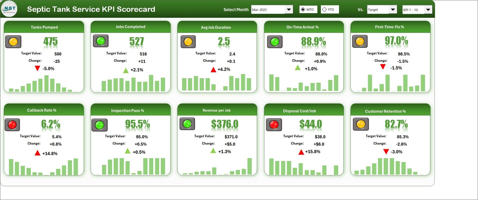
Four controls sit in the Scorecard header. Select Month is a dropdown offering Jan-2025 through Dec-2025 – the year comes from Color Settings, so it reads Mar-2025 rather than a bare “Mar”. MTD / YTD is a pair of option buttons. Vs. is a dropdown with three entries: Target, PY and Prior Month. And a fourth dropdown switches the tile wall between KPI 1-10 and KPI 11-20.
All four are Excel form controls wired to linked cells on a hidden support sheet, and the tile formulas read those cells. Change the month and all ten tiles, both hidden lookup tables, the KPI Analysis counters and the group rankings all recalculate. That is worth saying plainly, because month pickers that look wired and are not are a real failure mode in template land.
Traffic lights that respect direction
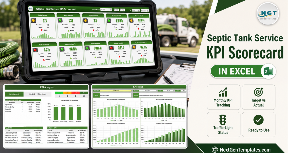
Each KPI carries a UTB (upper the better) or LTB (lower the better) flag. Three of the ten shipped KPIs are LTB – Avg Job Duration, Callback Rate % and Disposal Cost/Job – and the workbook mirrors the bands for them. In the shipped March 2025 sample, Callback Rate % comes in at 6.2% against a 5.4% target: a red light and a red up-arrow, because rising callbacks are bad. Disposal Cost/Job at $44.0 against $38.0 does the same. Get that backwards and a scorecard is worse than no scorecard, so it is the first thing worth checking in any template you buy.
Bands you can move
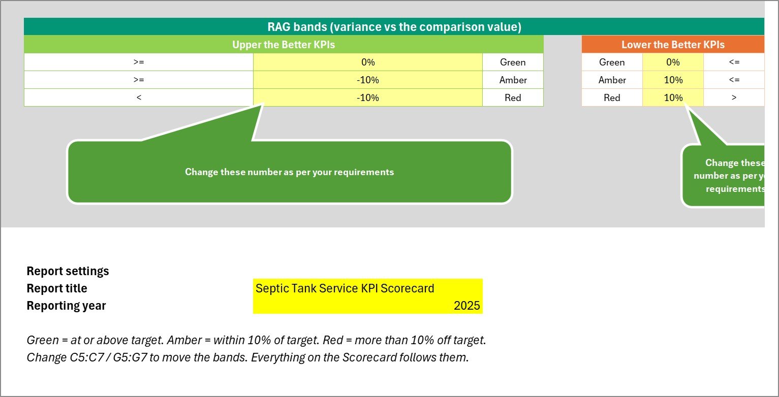
The Green / Amber / Red thresholds live on the Color Settings sheet in C5:C7 (upper the better) and G5:G7 (lower the better). The default is Green at or above target, Amber within 10%, Red beyond 10%. These are not documentation: the tile status formula and the KPI Analysis status column both reference those cells directly, so editing six numbers re-colours the whole workbook.
Sparklines, not pictures
Each tile carries a real Excel column sparkline across Jan to Dec, driven by the hidden monthly lookup row behind that tile. Change the month or flip to YTD and the twelve underlying values change with it.
Workbook Pages Explained
Nine visible sheets and two hidden calculation sheets. You only ever type on two of them.
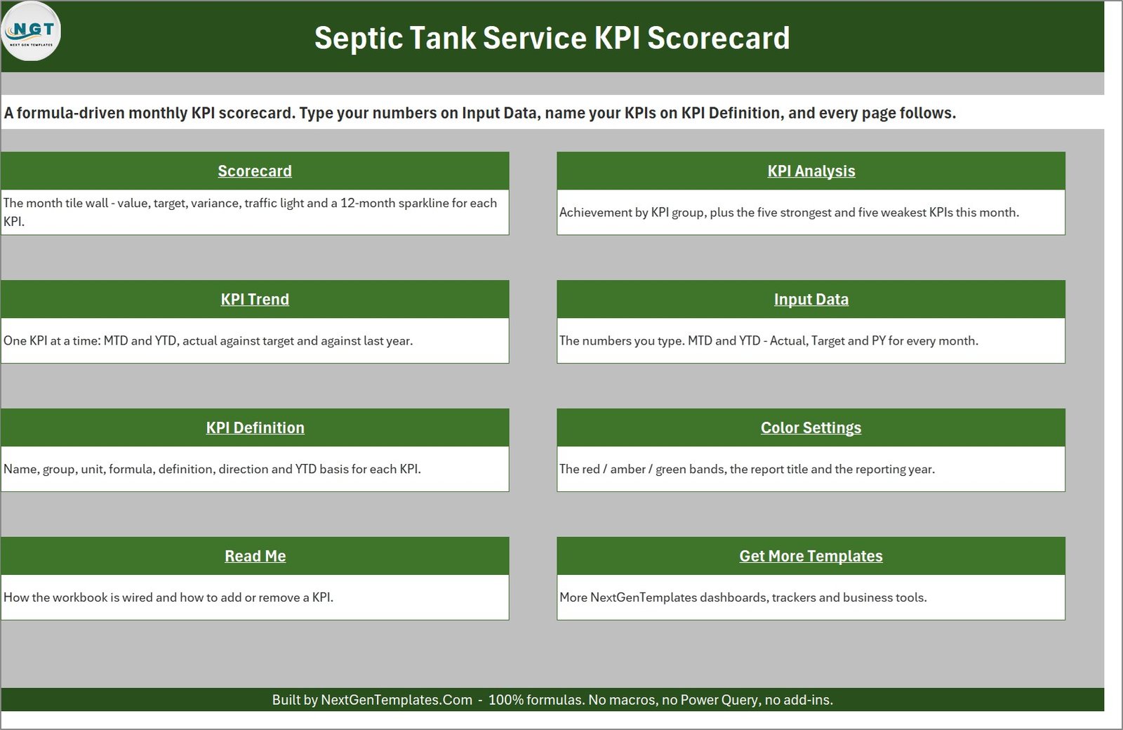
1. Home
A linked index. Eight tiles, each hyperlinked to its sheet, each with a one-line description. The footer states the workbook’s own promise: 100% formulas, no macros, no Power Query, no add-ins.
2. Scorecard
The tile wall – two rows of five. Every tile shows the KPI name, the value for the selected month, the comparison value, the absolute change, the percentage change, a coloured arrow, a traffic light and the 12-month sparkline. In the shipped sample (Mar-2025, MTD, versus Target) it reads: Tanks Pumped 475 against 500, amber; Jobs Completed 527 against 516, green; Avg Job Duration 2.5 hours against 2.4, amber; On-Time Arrival 88.9% against 88.0%, green; First-Time-Fix 97.0% against 98.5%, amber; Callback Rate 6.2% against 5.4%, red; Inspection Pass 95.5% against 95.0%, green; Revenue per Job $376.0 against $371.0, green; Disposal Cost/Job $44.0 against $38.0, red; Customer Retention 82.7% against 85.3%, amber.
3. KPI Analysis
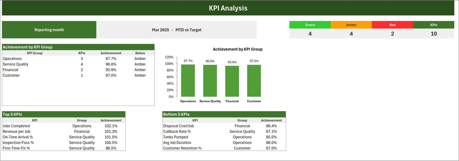
A counter strip across the top – Green 4, Amber 4, Red 2, KPIs 10 – then achievement by KPI group as a table and a matching column chart (Operations 97.7%, Service Quality 96.8%, Financial 93.9%, Customer 97.0%), then Top 5 and Bottom 5 KPI tables ranked by achievement. In the sample the top is Jobs Completed at 102.1% and the bottom is Disposal Cost/Job at 86.4%. The achievement calculation inverts for LTB KPIs, which is why an over-budget disposal cost lands at the bottom rather than the top.
4. KPI Trend
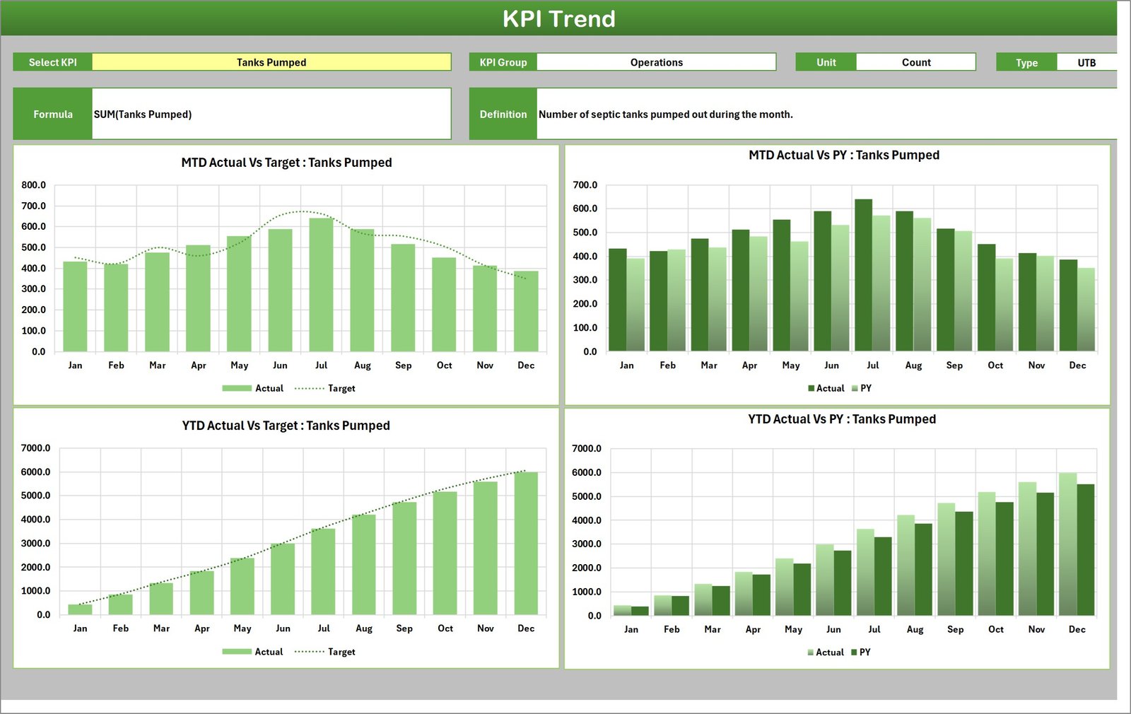
One KPI at a time. A data-validation dropdown lists whatever is on KPI Definition; picking one fills in its group, unit, direction, formula and definition, then redraws four charts: MTD Actual vs Target (columns with a target line), MTD Actual vs PY (clustered columns), YTD Actual vs Target and YTD Actual vs PY. All four titles rewrite themselves with the KPI name.
5. Input Data
Twenty numbered blocks – KPI-1 through KPI-20 – each twelve rows of Jan to Dec with six columns: MTD Actual, Target and PY, then YTD Actual, Target and PY. Ten blocks are filled in the sample and ten read “(empty slot)”. The sheet runs to row 319, which is what makes the twenty-KPI capacity real rather than aspirational.
6. KPI Definition
Ten rows: number, group, name, unit, formula text, definition, UTB/LTB type, YTD basis and a Check column that flags a duplicate KPI name. The Check column matters more than it looks – every page matches KPIs by name, so two identical names get added together.
7. Color Settings
The two RAG band tables, plus the report title and the reporting year. Small print worth knowing: both bright-green callouts on this sheet read “Change these number as per your requirements”, a grammar slip, and in the sheet’s exported preview image the right-hand callout is clipped by the page edge. The sheet works correctly; only the wording and one export are untidy.
8. Read Me and 9. Get More Templates
The Read Me is genuinely written, not a placeholder: nine sections covering what you type, why MTD and YTD are both yours to supply, UTB versus LTB, the traffic lights, adding a KPI, unique names, the header controls, the reporting year, and the no-macros statement. Get More Templates is the house catalogue page.
What It Does Not Do – the part septic operators need to read
Septic and wastewater work is regulated, and it would be easy to imply more than this file delivers, so here it is flatly. This workbook provides no environmental compliance capability whatsoever. It does not track, generate, validate or submit discharge permits, waste or septage manifests, effluent testing results, land-application records, EPA or state and local health-department reports, or operator certification and renewal dates. It is not an inspection system – “Inspection Pass %” is one percentage you work out elsewhere and type into a cell; the workbook records no inspection and checks nothing against any standard. It is not a safety or OSHA recordkeeping system – there are no safety KPIs in this set and no incident log. And it holds no customer, property or job records: no addresses, tank IDs, permit numbers or hauler numbers exist anywhere in it. Twelve monthly numbers per KPI, and nothing else.
Keep the regulatory record where your regulator requires it. This is the management review that sits on top.
Septic Tank Service KPI Scorecard in Excel vs. Google Sheets vs. Paid Field-Service SaaS – Feature Comparison
| This Excel scorecard | Google Sheets scorecard | Paid field-service SaaS | |
|---|---|---|---|
| Cost | $9.99 on sale, $15.99 list, one payment | One payment, similar | Typically $100-$400 per user per month |
| Platform | Excel 2016+ / Microsoft 365, offline | Browser, Google account required | Browser plus field app, vendor cloud |
| Setup time | Under an hour | Under an hour | Weeks |
| Real-time collaboration | No | Yes | Yes |
| Mobile access | Excel mobile, read-only in practice | Yes | Yes |
| Rename KPIs and edit formulas | Yes, all ten | Yes | Vendor metric library only |
| Year-1 cost at 5 users | $9.99 | About $9-$14 | $6,000-$24,000 |
| Per-job detail, routing, dispatch | No | No | Yes |
| Permit, manifest and compliance records | No | No | Sometimes, as an add-on |
Who Should Use This Template
Owner-operators and small septic, portable-sanitation and grease-trap firms running roughly two to fifteen trucks, who already produce monthly numbers and want them on one page. Office managers who rebuild the same summary from scratch every month. Service managers who want callbacks and on-time arrival in front of crew leads with a colour attached. It is a poor fit for anyone who needs job-level detail, scheduling or invoicing, for anyone hoping it will double as a compliance file, and for teams that must edit the same workbook simultaneously – the Google Sheets edition of this line exists for that.
Real-World Use Cases
The monthly crew meeting. Close the month, spend twenty minutes on Input Data, open the Scorecard on the new month, and the two red tiles are your agenda. Nobody argues with a red light next to a target they agreed to.
The year-on-year argument. Switch MTD to YTD and Vs. Target to Vs. PY. If Tanks Pumped is behind last year, open KPI Trend, pick Tanks Pumped, and the YTD Actual vs PY chart shows you which part of the year the gap opened in.
Adapting it to a different trade. A firm doing portable sanitation alongside septic renamed Tanks Pumped to Units Serviced and Disposal Cost/Job to Dump-Site Fees per Job on KPI Definition. Nothing else needed changing, because the pages match by name.
Advantages of the Septic Tank Service KPI Scorecard in Excel
- Everything is a formula. You can trace any figure on the Scorecard back to a cell on Input Data.
- No macro prompt, no security warning, no add-in – it opens like any other spreadsheet.
- The direction logic is done properly, which is the single most common thing scorecard templates get wrong.
- Thresholds, KPI names, groups, units, title and year are all data, not code.
- Twenty KPI slots are pre-built, so growth costs you typing rather than formula surgery.
- Three comparison bases from one dropdown, rather than three separate copies of the file.
Opportunities for Improvement
- You type YTD yourself. That is a defensible design choice – the correct roll-up genuinely differs per KPI – but it is twice the typing, and a formula-driven option would suit firms whose KPIs are all sums.
- The Color Settings callouts read “Change these number as per your requirements”, and one is clipped in the exported preview of that sheet.
- In the shipped sample data several percentage KPIs sit at exactly 97.0% in more than one month, which makes the demo figures look slightly synthetic. The formulas are unaffected.
- On the tiles the large KPI number is always green regardless of status; only the light and the arrow carry the RAG colour. Some readers will want the number coloured too.
- The two Actual-vs-PY charts on KPI Trend shade the Actual and PY series in opposite tones. Both legends are correct, but the inconsistency is visible.
- No dark mode, no print layout tuned for A4, and no multi-year view – one reporting year at a time.
Best Practices
- Set the reporting year on Color Settings first. It feeds the month picker labels, and it is annoying to fix later.
- Fill KPI Definition before Input Data. The block headings on Input Data pick up the KPI names automatically, so you will know which block is which.
- Write down your YTD rule in the YTD Basis column as you go. In six months the next person will need it.
- Do not leave two KPIs with the same name. The Check column will tell you, and the pages would otherwise add them together silently.
- Widen the RAG bands in your first quarter if everything is red. A scorecard that is entirely red teaches nothing.
- Keep one file per reporting year and archive the previous one, rather than overwriting last year’s figures.
Explore Relevant Templates
The same scorecard engine ships for neighbouring trades: Plumbing Business KPI Scorecard in Excel, HVAC Contractor KPI Scorecard in Excel and Insulation Contractor KPI Scorecard in Excel. For a browser-based team, the Plumbing Business KPI Scorecard in Google Sheets covers the same ground. And if you want the larger month-picker dashboard rather than the ten-tile scorecard, compare the Plumbing Business KPI Dashboard in Excel before deciding. Paving Contractor, Fencing Contractor and Swimming Pool Service editions of this scorecard are in preparation.
More related walkthroughs on this blog: Fencing Contractor KPI Scorecard in Excel, Paving Contractor KPI Scorecard in Excel and Concrete Contractor KPI Scorecard in Excel. Each is a separate template with its own layout and sample data.
Frequently Asked Questions
Does the month picker really change the whole page?
Yes. It is a form-control dropdown wired to a linked cell that every tile formula reads through the hidden support sheet. All ten tiles, the sparklines, the RAG counters, the group achievements and the Top 5 / Bottom 5 tables recalculate on the change.
Can I change the red, amber and green thresholds?
Yes – six cells on Color Settings, C5:C7 and G5:G7. The Scorecard tiles and the KPI Analysis status column both reference them live, so the whole workbook follows.
Does it score “lower is better” KPIs correctly?
Yes. Avg Job Duration, Callback Rate % and Disposal Cost/Job ship as LTB, and rising values on those turn red with a red up-arrow.
Does it calculate YTD from the monthly figures?
No. You type MTD and YTD separately, because the right roll-up is a sum for volumes and an average for rates. The YTD Basis column is where you note which you used.
Can it handle permits, manifests or health-department reporting?
No. There is no compliance, permit, manifest, effluent-testing or regulatory-reporting capability of any kind in this workbook, and it is not a substitute for whatever records your regulator requires.
Are there macros?
None. It is a plain .xlsx built from formulas, conditional formatting, camera pictures, sparklines and form controls, and it opens in Excel 2016 and later including Microsoft 365.
How many KPIs can it hold?
Twenty. Ten are filled in the sample; Input Data ships with twenty numbered blocks, and the KPI-set picker switches the tile wall between KPI 1-10 and KPI 11-20.
About the Author
Built by PK – Microsoft Certified Professional with 15+ years of Excel, Google Sheets, and Power BI experience. Founder of NextGenTemplates, reaching 300K+ subscribers across YouTube channels. Every template is hand-built and tested before release.
Conclusion
The Septic Tank Service KPI Scorecard in Excel does one job and does it without ceremony: it takes ten monthly numbers you already have and puts them on a page with targets, direction-aware traffic lights, twelve-month sparklines, a group breakdown and a per-KPI trend view. It has no macros, no data connection, no compliance pretensions and no hidden thresholds – the bands are six editable cells. If your monthly review currently happens in someone’s head or in a spreadsheet rebuilt from scratch each time, this is a cheap way to make it repeatable.
Get the Septic Tank Service KPI Scorecard in Excel on NextGenTemplates – $9.99 on sale, one payment, instant download.
For more Excel dashboard and KPI tutorials, subscribe to youtube.com/@PKAnExcelExpert.