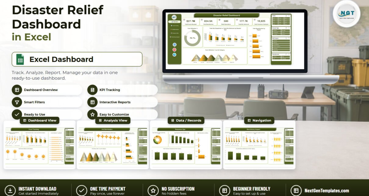
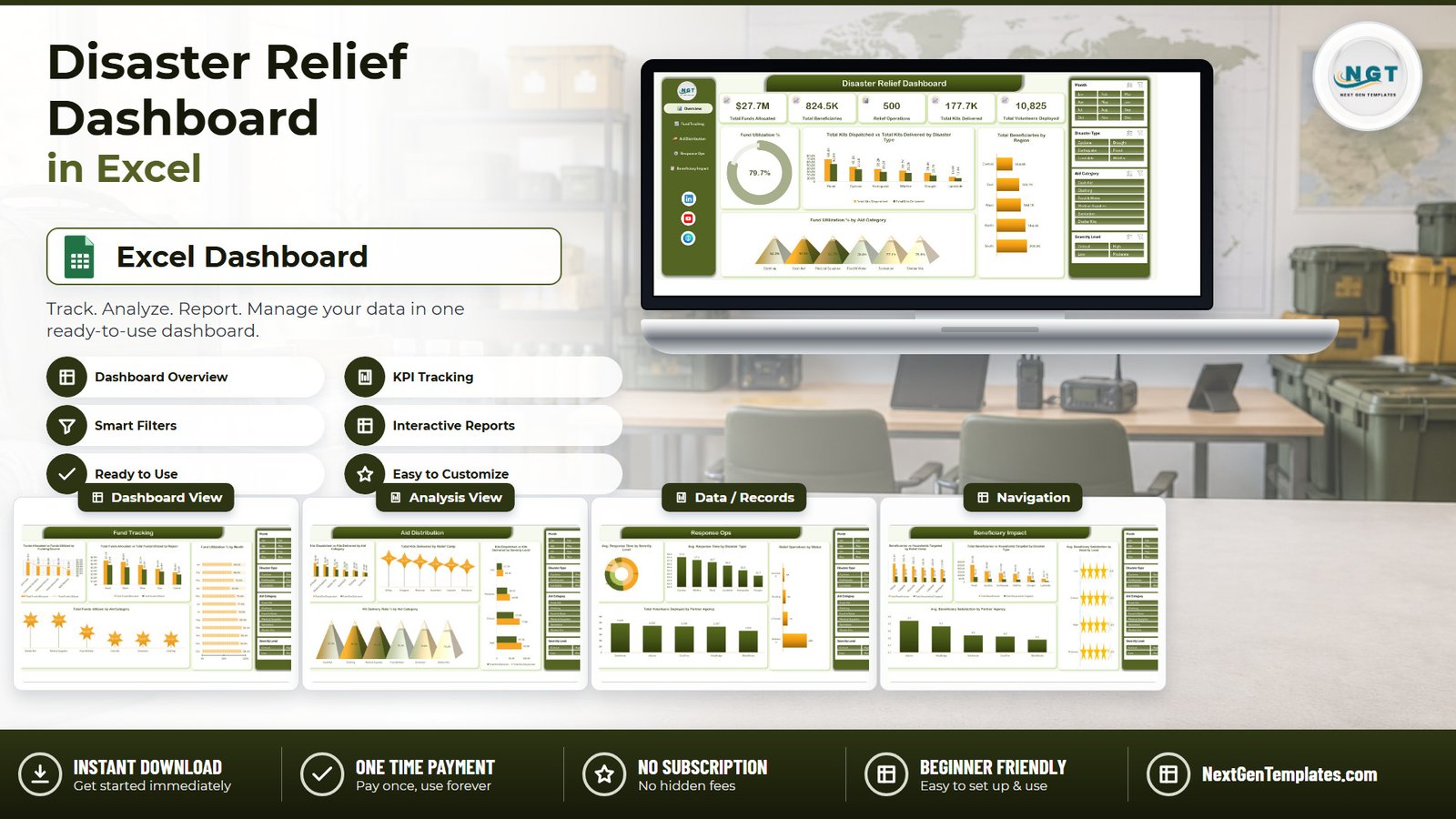
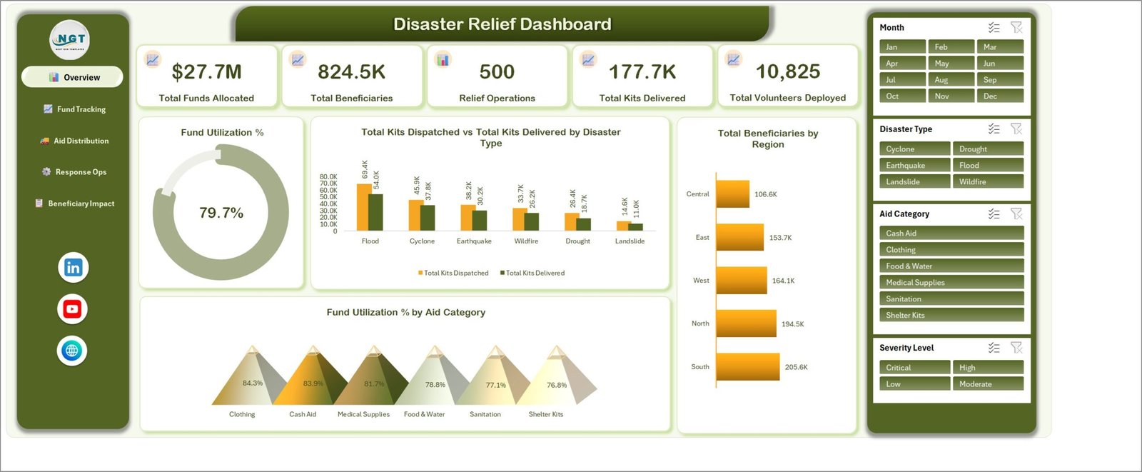
The Disaster Relief Dashboard in Excel packs 5 interactive pages, 20 pivot charts, 25 pivot tables and 4 cross-page slicers into a single .xlsx file. The sample workbook ships with 500 relief operation records across 19 data fields — $27.7M in funds allocated, 824.5K beneficiaries reached, 177.7K relief kits delivered and 10,825 volunteers deployed — so every chart is populated before you type a thing.
Relief programmes drown in spreadsheets. Funds arrive from five different sources, kits leave a warehouse and never quite all arrive, response times vary wildly by severity, and the board wants one page that explains all of it. The Disaster Relief Dashboard in Excel is that one page — actually five — built on pivot tables so it recalculates the moment you refresh with your own log.
Key Features of the Disaster Relief Dashboard in Excel
- Five KPI cards on the Overview page. Total Funds Allocated, Total Beneficiaries, Relief Operations, Total Kits Delivered and Total Volunteers Deployed. Each is a live pivot value, not a typed number.
- Four slicers wired to all 25 pivot tables. Month, Disaster Type, Aid Category and Severity Level appear on every page, and one click filters funds, kits, response time and satisfaction together.
- Allocated versus utilized, kept separate. The Data sheet stores Funds Allocated and Funds Utilized as distinct fields, and the workbook derives Fund Utilization % — 79.7% in the sample — by source, region, month and aid category.
- Dispatched versus delivered, everywhere. Relief Kits Dispatched and Relief Kits Delivered are charted side by side by disaster type, aid category, relief camp and severity level, plus a Kit Delivery Rate % view.
- Operational speed and staffing. Average Response Time Hours by severity and disaster type, relief operations by status, and volunteers deployed per partner agency.
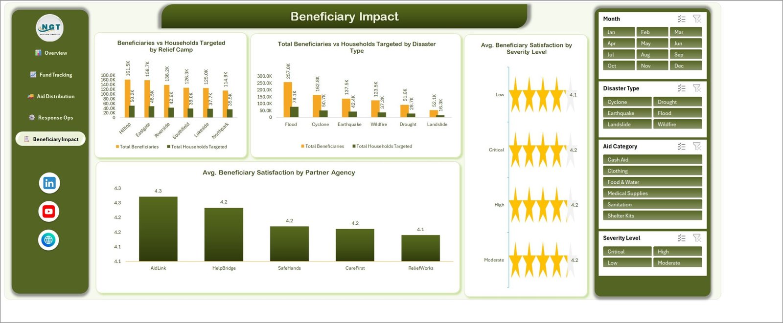
- Beneficiary satisfaction on a 5-point scale, scored by partner agency and by severity level with a star-rating visual.
- No macros. It is a plain .xlsx — nothing to enable, nothing to trust.
Dashboard Pages Explanation
Page 1: Overview
The landing page. Five KPI cards run across the top, a Fund Utilization % gauge sits on the left at 79.7%, and three charts fill the rest: Total Kits Dispatched vs Total Kits Delivered by Disaster Type, Total Beneficiaries by Region, and Fund Utilization % by Aid Category. In the sample, Flood is the largest kit consumer at 69.4K dispatched against 54.0K delivered, and South leads regional reach with 205.6K beneficiaries.
Page 2: Fund Tracking
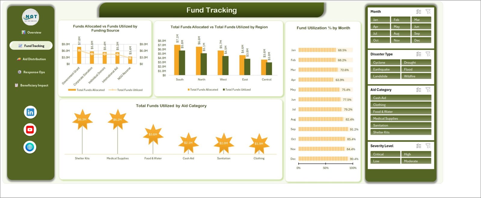
This page follows the money from source to spend. Funds Allocated vs Funds Utilized by Funding Source ranks Government Grant, Corporate Donation, Individual Donors, International Aid and NGO Reserve; Total Funds Allocated vs Total Funds Utilized by Region does the same geographically; Fund Utilization % by Month runs Jan to Dec with in-cell bars; and Total Funds Utilized by Aid Category shows where the spend actually landed.
Page 3: Aid Distribution
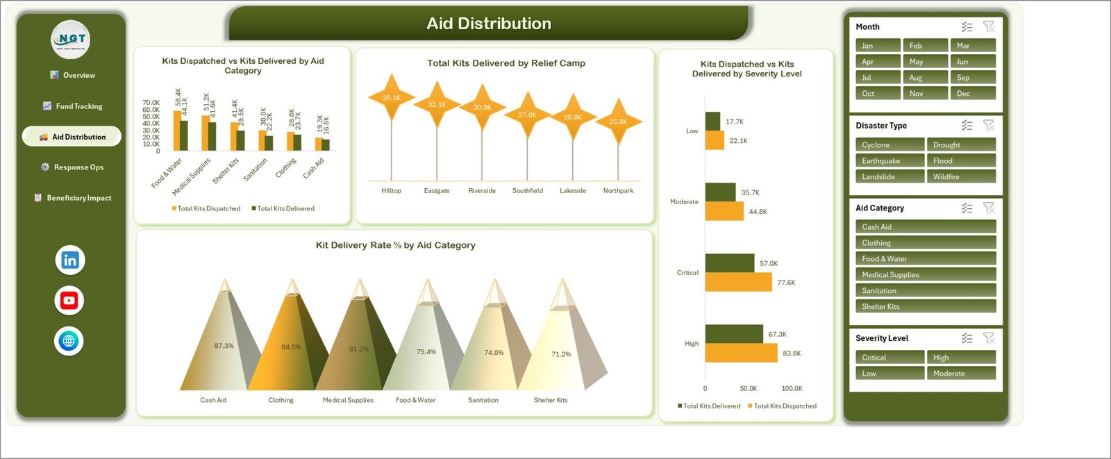
The logistics page. Kits Dispatched vs Kits Delivered by Aid Category, Total Kits Delivered by Relief Camp across Hilltop, Eastgate, Riverside, Southfield, Lakeside and Northpark, Kits Dispatched vs Kits Delivered by Severity Level, and Kit Delivery Rate % by Aid Category — which in the sample runs from 87.3% on Cash Aid down to 71.2% on Shelter Kits. That spread is the number a logistics lead argues budget with.
Page 4: Response Ops
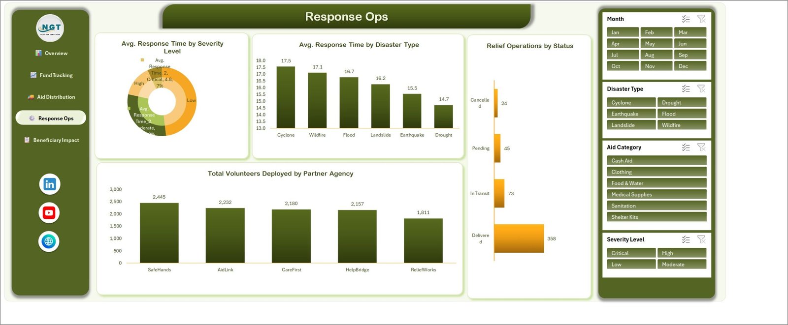
Speed and staffing. Avg. Response Time by Severity Level, Avg. Response Time by Disaster Type (Cyclone slowest at 17.5 hours, Drought fastest at 14.7), Relief Operations by Status splitting Delivered, In Transit, Pending and Cancelled, and Total Volunteers Deployed by Partner Agency across SafeHands, AidLink, CareFirst, HelpBridge and ReliefWorks.
Page 5: Beneficiary Impact
Reach against target, plus experience. Beneficiaries vs Households Targeted by Relief Camp, Total Beneficiaries vs Households Targeted by Disaster Type, Avg. Beneficiary Satisfaction by Severity Level shown as star ratings, and Avg. Beneficiary Satisfaction by Partner Agency — 4.3 for AidLink down to 4.1 for ReliefWorks in the sample.
Data Sheet and Support Sheet
The Data sheet holds 500 sample relief records with 19 fields: Relief ID, Response Date, Disaster Type, Region, Relief Camp, Partner Agency, Aid Category, Severity Level, Funding Source, Status, Households Targeted, Beneficiaries Reached, Relief Kits Dispatched, Relief Kits Delivered, Funds Allocated, Funds Utilized, Response Time Hours, Volunteers Deployed and Beneficiary Satisfaction. The Support sheet holds the 25 pivot tables that feed all 20 charts; you never edit it, but it is left visible so you can add a chart of your own.
Disaster Relief Dashboard in Excel vs. a Google Sheets Build vs. Paid Humanitarian SaaS — Feature Comparison
| Feature | Disaster Relief Dashboard in Excel | Google Sheets equivalent | Salesforce Nonprofit Cloud / DevResults |
|---|---|---|---|
| Cost | $17.99 one-time | $0 but built by you | $40-100 / user / month |
| Platform | Microsoft Excel desktop, offline | Browser, needs connectivity | Cloud only |
| Setup time | Under 10 minutes | Several days to build | 4-12 week implementation |
| Works in the field with no internet | ✅ Yes | ❌ No | ❌ No |
| Real-time team collaboration | Via OneDrive / SharePoint | ✅ Native | ✅ Native |
| Mobile access | Excel mobile app (view) | ✅ Browser | ✅ Native app |
| Customizable fields and charts | ✅ Full — it is your workbook | ✅ Yes | Limited without a consultant |
| Fund allocated vs utilized tracking | ✅ Built in, with utilization % | Build it yourself | ✅ Yes, at a price |
| Year-1 cost at 5 users | $17.99 total | $0 + build time | $2,400-6,000 |
For relief teams that want fund, kit and beneficiary reporting without a per-seat contract or a 12-week rollout, the Disaster Relief Dashboard in Excel sits in the sweet spot.
Who Should Use This Template
Perfect for:
- NGO and relief programme managers reporting on 100-2,000 relief operations a year
- Disaster response coordinators who need offline reporting from a field office
- Grant and donor reporting officers who must show funds allocated against funds utilized by source
- Logistics leads tracking kit dispatch, delivery rate and camp-level distribution
- Consultants building a relief report for a client in a day rather than a month
Not a fit if:
- You need live incident command — this is a reporting layer, not a dispatch or alerting system
- Twenty people must edit the same file at once; that wants a database, not a workbook
- You intend to store personally identifiable beneficiary records — the schema is deliberately aggregate, and personal data belongs in a system with real access control
- You work Mac-only and depend on advanced slicer behaviour, which is best on Excel for Windows desktop
Real-World Use Cases
Priya coordinates flood response for a regional NGO. She logs every distribution in the Data sheet and uses the Aid Distribution page to show her board that Food & Water kits deliver at 75.4% while Cash Aid clears 87.3%. That single gap justified her next warehousing request — she did not need a consultant to find it.
Daniel manages donor reporting for a disaster relief fund. Each quarter he filters the Fund Tracking page by funding source and exports one page showing Government Grant, Corporate Donation, Individual Donors, International Aid and NGO Reserve allocated against utilized. What used to be a three-day slide rebuild is now a slicer click and a PDF export.
Amina runs field operations across six relief camps. Response Ops and Beneficiary Impact let her compare average response time by severity against satisfaction by partner agency. Seeing AidLink at 4.3 and ReliefWorks at 4.1 while response times diverged is what prompted her to move two volunteer teams mid-season.
Advantages of the Disaster Relief Dashboard in Excel
- It costs once. $17.99 against $2,400-6,000 a year for a five-seat SaaS contract in the same space.
- It works offline. Field offices lose connectivity; a desktop workbook does not care.
- It is honest about the gap. Because dispatched and delivered are separate fields, the delivery-rate view exposes losses that a single “kits distributed” number hides.
- It saves the rebuild. Twenty charts and twenty-five pivot tables already exist; you supply rows and press refresh.
- It is yours to change. Nothing is locked, nothing is a picture, and the Support sheet is visible if you want to build on it.
Opportunities for Improvement
Being straight about the limits: the Disaster Relief Dashboard in Excel has no data-entry form, so records are typed or pasted into the Data sheet — pair it with the Relief Distribution Data Entry System in Excel if you want validated entry. It has no map visual, so regional analysis is by bar chart rather than geography. It reports on history rather than forecasting demand. And because it is a workbook, concurrent editing depends on OneDrive or SharePoint rather than a true multi-user database. For programmes above a few thousand operations a year, that ceiling is real.
Best Practices
- Keep the 19 column headers exactly as shipped — the pivot tables reference them by name.
- Paste values, not formatted ranges, so the Data sheet table stays clean.
- Press Ctrl+Alt+F5 (Refresh All) after every import; the KPI cards are pivot values and will not move otherwise.
- Clear all four slicers before exporting a board pack, or you will publish a filtered view by accident.
- Keep one workbook per response season and archive the previous one — it keeps refresh times short.
- If you extend the disaster types or agencies, add them in the Data sheet first; the slicers pick up new values on refresh. Microsoft’s guide to using slicers to filter data covers the details.
Explore Relevant Templates
- Crisis Mapping Startups Dashboard in Excel — the same five-page analytical layout applied to crisis mapping data.
- Emergency Rescue Services Dashboard in Excel — response times, call volumes and crew utilization.
- Donation Register Data Entry System in Excel — capture incoming donations before they become allocated funds.
- Emergency Management Report in Excel — a printable report companion.
Also available as: the scorecard cousins, Disaster Relief KPI Dashboard in Excel and Disaster Relief KPI Dashboard in Google Sheets. If your reporting leans public sector, see also Emergency Management KPI Dashboard in Excel and Public Safety KPI Dashboard in Power BI.
Frequently Asked Questions
What KPIs does the Disaster Relief Dashboard in Excel track?
The Disaster Relief Dashboard in Excel tracks five headline KPIs — Total Funds Allocated, Total Beneficiaries, Relief Operations, Total Kits Delivered and Total Volunteers Deployed — plus Fund Utilization %, Kit Delivery Rate %, average response time in hours and average beneficiary satisfaction on a 5-point scale.
How long does setup take?
Under 10 minutes. Open the Disaster Relief Dashboard in Excel, paste your relief log into the Data sheet under the existing 19 headers, and press Refresh All. All 25 pivot tables, 20 charts and 5 KPI cards recalculate automatically — there are no formulas to rewrite.
How does this compare to Salesforce Nonprofit Cloud or DevResults?
Those platforms run roughly $40-100 per user per month with a multi-week implementation. The Disaster Relief Dashboard in Excel is a one-time $17.99 purchase that works offline. It reports rather than orchestrates, which is what most small and mid-size relief programmes actually need.
Is this the same template as the Disaster Relief KPI Dashboard?
No. The Disaster Relief Dashboard in Excel is the analytical five-page report described in this post. The Disaster Relief KPI Dashboard in Excel is a separate month-picker scorecard with traffic-light targets. They are different products with different layouts, and plenty of teams run both.
Do I need macros or an add-in?
No. The Disaster Relief Dashboard in Excel is a plain .xlsx built on native pivot tables, pivot charts and slicers. There is nothing to enable and no add-in to install, which also means it passes most corporate and NGO IT restrictions without a ticket.
Can I change the disaster types, regions or partner agencies?
Yes. Edit those values in the Data sheet of the Disaster Relief Dashboard in Excel and refresh — the slicers, pivot tables and all 20 charts follow your list. The Support sheet stays visible so you can add pivot tables and charts of your own.
What exactly do I download?
A ZIP containing the Disaster Relief Dashboard in Excel workbook (.xlsx) and the Excel Dashboard user manual PDF. Delivery is instant after checkout, with lifetime access and no subscription.
About the Author
Built by PK — Microsoft Certified Professional with 15+ years of Excel, Google Sheets, and Power BI experience. Founder of NextGenTemplates, reaching 300K+ subscribers across YouTube channels. Every template is hand-built and tested before release.
Conclusion
If your relief programme is currently explained by a folder of spreadsheets and a slide deck rebuilt every quarter, the Disaster Relief Dashboard in Excel replaces both with one workbook: 5 pages, 20 charts, 4 slicers, and a Data sheet you own. It will not run your incident command, and it is not a database — but for fund, kit, response and beneficiary reporting, it does the job in ten minutes rather than twelve weeks.
👉 Click here to Purchase the Disaster Relief Dashboard in Excel
Instant download · One-time payment · No subscription
🎥 For step-by-step video tutorials, visit Youtube.com/@PKAnExcelExpert
Last updated: September 2026