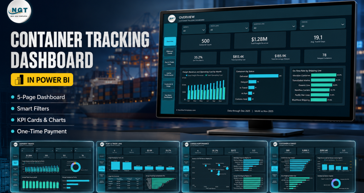
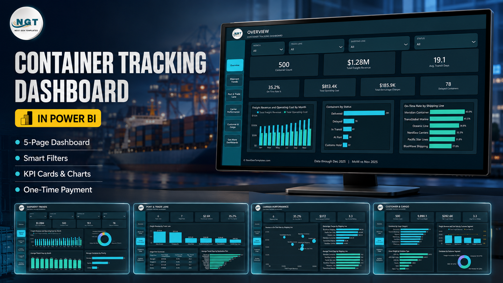
A single container sitting one extra week at a destination terminal can cost more in demurrage than a month of business intelligence licensing. Yet most freight teams still review container performance in a spreadsheet that gets rebuilt every month. The Container Tracking Dashboard in Power BI is a finished .pbix report that turns a flat container export into five analysis pages: 500 sample container movements, $1.28M of freight revenue, $813.4K of operating cost, $185.9K of demurrage, 78 delayed containers and a 35.2% on-time rate, all filtered by four synced slicers and drillable to the individual container.
One thing to be clear about before anything else. This is an analysis template, not a track-and-trace product. It does not connect to a carrier API, a terminal operating system, an AIS or vessel-tracking feed, an EDI message set or a GPS device. There is no live position and no automatic status update. It refreshes from the Data.xlsx file that ships in the download, and that file is yours to maintain. Everything below is written on that basis.
Key Features of the Container Tracking Dashboard in Power BI
- Five analysis pages plus a resources page – Overview, Shipment Trends, Port & Trade Lane, Carrier Performance, Customer & Cargo, and a Get More Dashboards page.
- Four synced slicers – Month, Trade Lane, Shipping Line and Status. Choose a shipping line on one page and the whole report follows.
- 17 DAX measures referenced by the visuals, including On-Time Rate %, Avg. Transit Days, Demurrage per Container, Revenue per Container, Net Freight Margin, Cost Ratio % and Avg. Service Rating.
- A hidden Details drillthrough page wired to seven fields – Trade Lane, Shipping Line, Status, Container Type, Cargo Category, Origin Port and Priority.
- Two tooltip pages – Container Summary and Shipment Trend Detail – that appear on hover.
- 500 sample rows across 18 columns, including Planned Transit Days and Transit Days, which is what makes the on-time calculation possible.
- Everything editable – the DAX, the page titles, the footer, the logo placement and the theme JSON.
- No custom visuals, no add-ins, no gateway – it opens in free Power BI Desktop.
Dashboard Pages Explanation
Page 1 – Overview
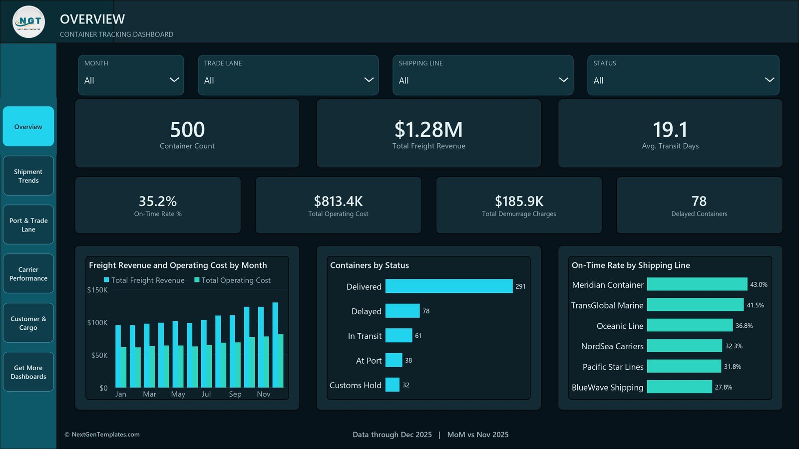
Seven KPI cards run across the top: Container Count 500, Total Freight Revenue $1.28M, Avg. Transit Days 19.1, On-Time Rate % 35.2%, Total Operating Cost $813.4K, Total Demurrage Charges $185.9K and Delayed Containers 78. Below them, Freight Revenue and Operating Cost by Month puts the two series side by side so the widening gap through the second half of the year is visible without arithmetic. Containers by Status splits the fleet into Delivered 291, Delayed 78, In Transit 61, At Port 38 and Customs Hold 32, and On-Time Rate by Shipping Line ranks the six carriers from Meridian Container at 43.0% down to BlueWave Shipping at 27.8%.
Page 2 – Shipment Trends
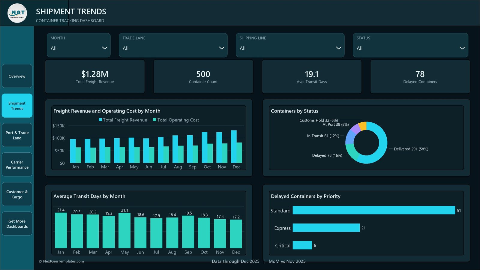
This is the time page. Average Transit Days by Month steps down from 21.4 in January to 17.2 in December, which is the kind of movement that gets lost in a monthly table. The status split repeats here as a donut with percentages, and Delayed Containers by Priority breaks the 78 delays into Standard 51, Express 21 and Critical 6 – the last of which is a phone-call list rather than a chart.
Page 3 – Port & Trade Lane
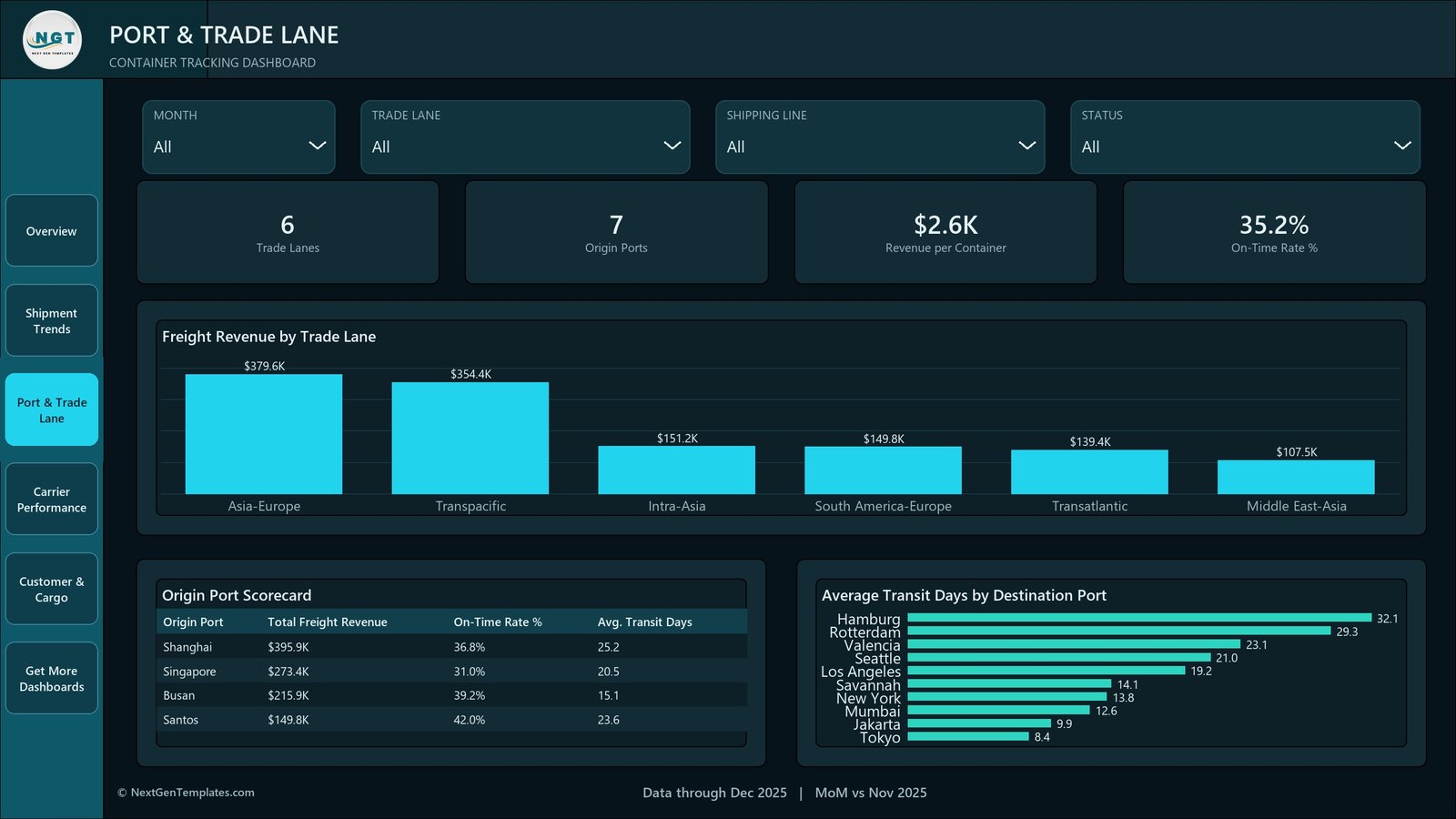
Four cards – Trade Lanes 6, Origin Ports 7, Revenue per Container $2.6K, On-Time Rate % 35.2% – sit above Freight Revenue by Trade Lane: Asia-Europe $379.6K, Transpacific $354.4K, Intra-Asia $151.2K, South America-Europe $149.8K, Transatlantic $139.4K, Middle East-Asia $107.5K. The Origin Port Scorecard table pairs revenue with on-time rate and transit days per port, which is where the interesting tension shows: Shanghai carries the most revenue at $395.9K but runs 25.2 average transit days, while Busan does $215.9K at 15.1 days and a better 39.2% on-time rate. Average Transit Days by Destination Port spans Hamburg at 32.1 days to Tokyo at 8.4.
Page 4 – Carrier Performance
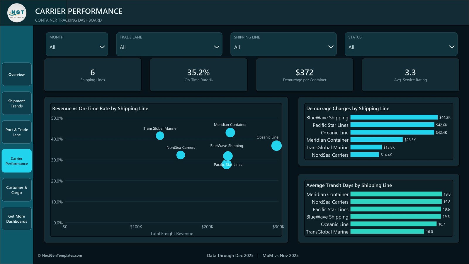
Revenue vs On-Time Rate by Shipping Line is the page’s argument: a scatter that separates the carrier you spend most with from the carrier that performs best. In the sample, Oceanic Line sits furthest right on revenue but below Meridian Container on reliability. Demurrage Charges by Shipping Line ranks BlueWave Shipping $44.2K, Pacific Star Lines $42.6K and Oceanic Line $42.4K against NordSea Carriers at $14.4K, and Average Transit Days by Shipping Line shows the spread is narrow – 16.0 to 19.8 days – which tells you demurrage here is not really a transit-time story.
Page 5 – Customer & Cargo
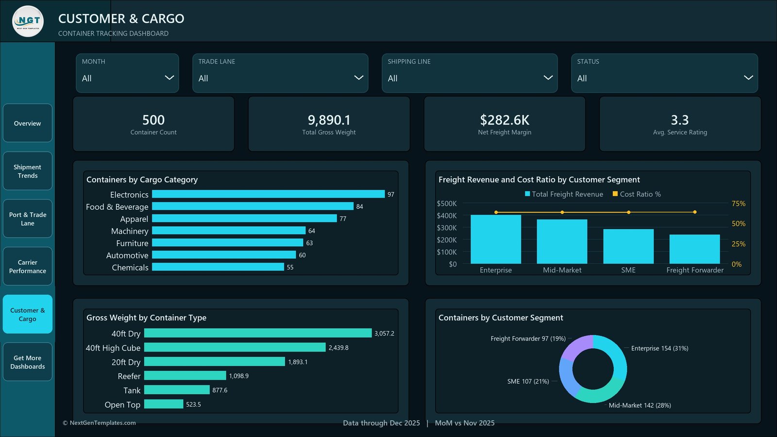
Container Count 500, Total Gross Weight 9,890.1, Net Freight Margin $282.6K and Avg. Service Rating 3.3 head the commercial page. Containers by Cargo Category runs Electronics 97, Food & Beverage 84, Apparel 77, Machinery 64, Furniture 63, Automotive 60, Chemicals 55. Gross Weight by Container Type ranks 40ft Dry, 40ft High Cube, 20ft Dry, Reefer, Tank and Open Top. Freight Revenue and Cost Ratio by Customer Segment combines bars with a cost-ratio line, and Containers by Customer Segment closes with Enterprise 154 (31%), Mid-Market 142 (28%), SME 107 (21%) and Freight Forwarder 97 (19%).
Container Tracking Dashboard in Power BI vs. Tableau vs. Paid Visibility SaaS – Feature Comparison
| This template (Power BI) | Tableau or Qlik build | Paid visibility SaaS | |
|---|---|---|---|
| Cost | $17.99 one time | Licence from ~$70/user/month | Typically $500+/month |
| Platform | Power BI Desktop (free) | Tableau Desktop or Qlik Sense | Vendor web app |
| Setup time | About 15 minutes | Days of modelling | Weeks of carrier onboarding |
| Live carrier / AIS feed | No – manual Excel refresh | No, unless you build it | Yes |
| Real-time team collaboration | Only after publishing to a workspace | Server or Cloud licence | Yes |
| Mobile access | Power BI mobile app after publishing | Vendor app | Yes |
| Customisable fields | Full – model, DAX and theme | Full | Vendor schema only |
| Share with link | After publishing to your tenant | After publishing | Yes |
| Year-1 cost at 5 users | $17.99 | $4,200+ | $6,000+ |
| Demurrage analysis | Built in – total, per container, by line | You build it | Usually an add-on |
| Container-level drillthrough | Built in on seven fields | You build it | Yes |
Who Should Use This Template
Freight forwarders and NVOCCs reviewing lane profitability monthly. Shipper-side logistics analysts who already pull a container status extract out of a TMS or carrier portal and want a report instead of a rebuilt pivot table. Power BI learners who want a finished logistics model with real drillthrough and tooltip pages to pick apart. Consultants who need a credible shipping demo they can rebrand in ten minutes.
It is the wrong purchase if you expect live vessel positions, exception alerting, customs filing or multi-user editing of the source data. The sample file carries no vessel name, no coordinates and no bill of lading number, because none of those are needed for the analysis it does.
Real-World Use Cases
Monthly lane review. Paste the carrier export into Data.xlsx, refresh, and open Port & Trade Lane. When Asia-Europe carries $379.6K of $1.28M and Middle East-Asia carries $107.5K, the rate negotiation agenda writes itself.
Demurrage recovery. Filter Status to Delayed, read Delayed Containers by Priority, then right-click Critical and drill through to the container IDs. In the sample that is six containers, not a spreadsheet full of them.
Carrier scorecard for a QBR. Carrier Performance already pairs spend with reliability and ranks demurrage by line, which is the single slide most quarterly business reviews are actually about.
Advantages of the Container Tracking Dashboard in Power BI
- It is finished. The model, the measures, the drillthrough and the theme already work – you are swapping data, not building a report.
- The numbers are traceable. Every KPI on every page can be reconciled against the 500 rows in Data.xlsx, so you can prove a measure before you trust it.
- Demurrage is treated as a first-class metric, not a footnote – total, per container and per shipping line.
- Nothing is locked. No password, no protected sheet, no proprietary visual that stops working if a licence lapses.
- Costs less than a rounding error on a single detention invoice.
Opportunities for Improvement
Being honest about the limits is more useful than a feature list. There is no live feed of any kind – carrier API, terminal, AIS, EDI or GPS – so the report is only as current as your last refresh. The model is built on a single flat table rather than a star schema, which is fine at 500 rows and worth revisiting past a few hundred thousand. There is no exception alerting; Power BI data alerts on a published tile are the closest built-in equivalent. The sample on-time rate of 35.2% is deliberately poor so every visual has something to show, and it will look nothing like yours. And the report has no geographic map visual – port names are treated as categories, not coordinates.
Best Practices
- Do not rename the 18 columns. The measures bind to those names; a renamed column is the usual cause of a blank card.
- Keep Planned Transit Days populated. On-time is Transit Days at or under Planned Transit Days – with the planned column empty the KPI is meaningless.
- Refresh on a schedule you actually keep, and put the refresh date in the footer so nobody reads a stale page as live.
- Use the drillthrough before you export. Right-clicking a bar is faster than filtering the source workbook.
- Repoint the query properly through Transform data > Data source settings rather than editing the M code by hand.
- Publish to a workspace if more than one person needs it – emailing .pbix files around is how two versions of the truth start.
Explore Relevant Templates
- Container Tracking Dashboard in Excel – the Excel edition of this same subject.
- Port Logistics Dashboard in Power BI – the terminal and yard side of the journey.
- Logistics Automation Dashboard in Power BI – process and automation metrics.
- Ship Chartering Dashboard in Power BI – vessel chartering economics.
- Ports and Harbors Dashboard in Power BI – port throughput and utilisation.
Frequently Asked Questions
Does this dashboard track containers live?
No. There is no carrier API, terminal, AIS, EDI or GPS connection. It reports on the Data.xlsx file bundled with the download, which you maintain and refresh yourself.
What is in the download?
A ZIP containing the .pbix report, Data.xlsx with 500 sample container rows, and a user manual PDF.
Do I need a paid Power BI licence?
No. Power BI Desktop is free and opens the file. Pro or PPU is only needed to publish and share it in the Power BI service.
Can I point it at my own database instead of Excel?
A Power BI developer can repoint the query, but that work is not included and is not supported. Out of the box the source is Excel.
Are the carriers and ports real?
No. Meridian Container, TransGlobal Marine, Oceanic Line, NordSea Carriers, Pacific Star Lines and BlueWave Shipping are invented names in invented sample data.
Can I rebrand it for a client?
Yes. The page text, logo placement and theme JSON are all editable, and nothing in the file is password-protected.
About the Author
Built by PK – Microsoft Certified Professional with 15+ years of Excel, Google Sheets, and Power BI experience. Founder of NextGenTemplates, reaching 300K+ subscribers across YouTube channels. Every template is hand-built and tested before release.
Conclusion
The Container Tracking Dashboard in Power BI does one job well: it turns a container export into a report a freight team can argue from – lane revenue, carrier reliability, demurrage by line, delays by priority, and a right-click down to the individual container. It will not tell you where a box is right now, and it does not pretend to. If what you actually need is a monthly view of which lanes make money, which carriers cost you in detention and which delays are worth chasing, this is a working report for the price of a takeaway.
Get the Container Tracking Dashboard in Power BI on NextGenTemplates – $17.99, one-time payment, lifetime use.
For Excel and Power BI walkthroughs, subscribe on YouTube at youtube.com/@PKAnExcelExpert.