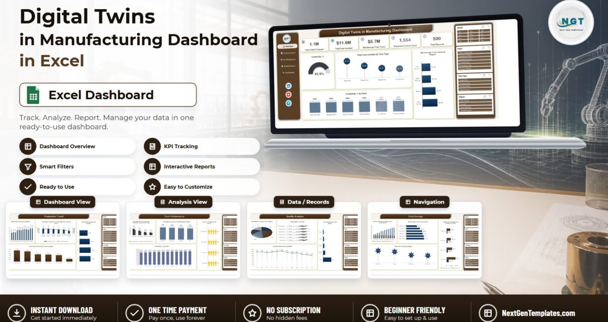
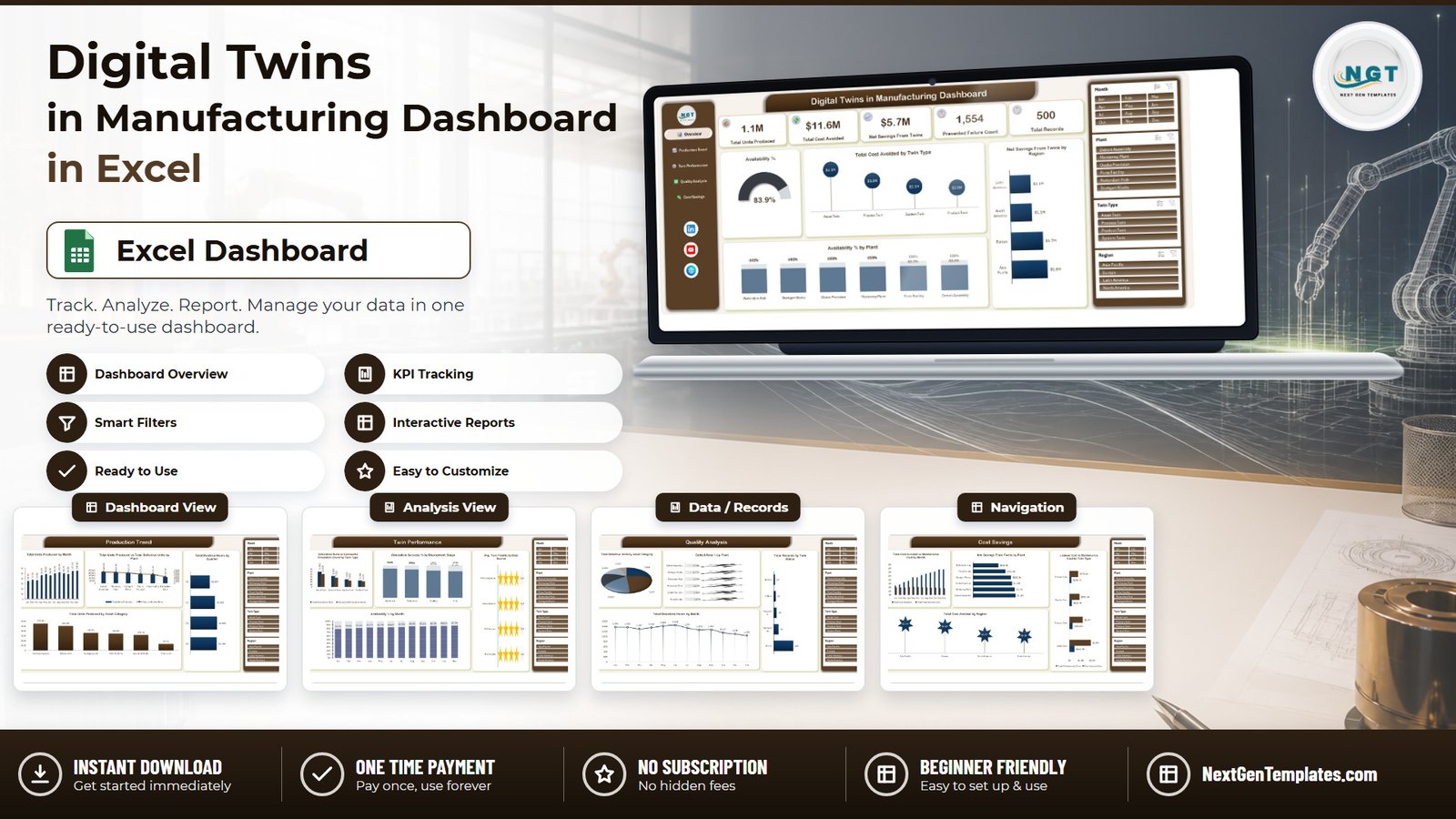
The Digital Twins in Manufacturing Dashboard in Excel reports a full year of twin deployments — 500 records, 33 fields, 1 January to 31 December 2025 — across 5 interactive pages, 20 pivot charts and 25 pivot tables. Four slicers (Month, Plant, Twin Type and Region) sit on every page and share a single cache, so one click filters the whole workbook. In the sample year the twins cover 6 plants and 4 regions, 1.1M units produced, 83.9% availability and $5.7M in net savings.
Most manufacturers who start a digital twin programme can describe it perfectly well and still cannot show what it returned. The telemetry lives in a platform, the maintenance costs live in the ERP, and the license invoices live with procurement — so the monthly review turns into three spreadsheets and an argument. This Digital Twins in Manufacturing Dashboard in Excel puts all of it on one page: what the twins produced, how available the assets were, how many failures were prevented, and what the whole thing cost against what it avoided.
Key Features of the Digital Twins in Manufacturing Dashboard in Excel
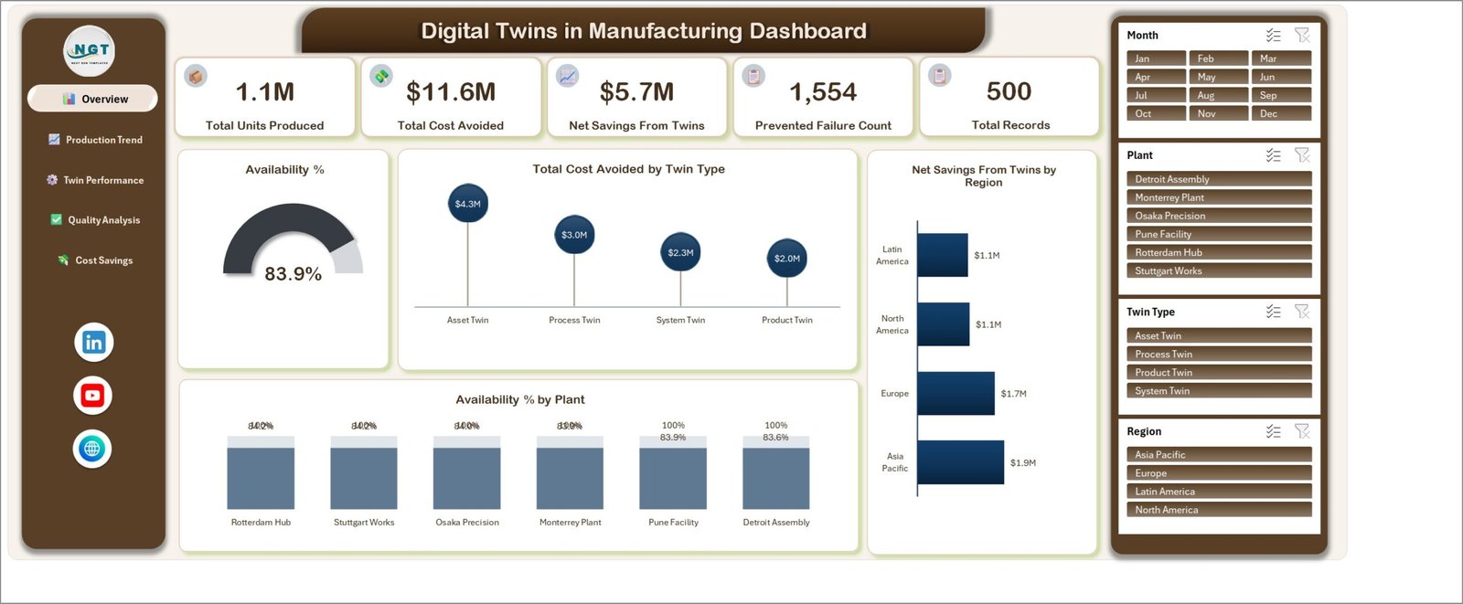
- Five KPI cards on the Overview page — Total Units Produced (1.1M), Total Cost Avoided ($11.6M), Net Savings From Twins ($5.7M), Prevented Failure Count (1,554) and Total Records (500).
- 20 pivot charts across five pages, every one named by metric and category, so a reader knows what a chart shows before reading its axis.
- 25 pivot tables on a single Support sheet, all built from one pivot cache over the
TblDataExcel Table. Nothing on any page is a typed-in number. - Four slicers repeated on all five pages — Month, Plant, Twin Type and Region — sharing their cache so a selection made on Overview is already applied on Cost Savings.
- Six plants and four regions: Detroit Assembly, Monterrey Plant, Osaka Precision, Pune Facility, Rotterdam Hub and Stuttgart Works, across Asia Pacific, Europe, Latin America and North America.
- Four twin types — Asset Twin, Process Twin, Product Twin and System Twin — and four deployment stages: Pilot, Scaling, Production and Optimized.
- No macros, no add-ins. A plain
.xlsxworkbook using only Excel Tables, PivotTables, pivot charts and slicers.
Dashboard Pages Explanation
The workbook holds seven sheets: five dashboard pages plus a Data sheet and a Support sheet. A navigation rail on the left of every page links the five pages together.
Page 1: Overview
Five KPI cards run across the top, with four charts underneath: Availability % rendered as a gauge showing 83.9%, Total Cost Avoided by Twin Type (Asset Twin $4.3M, Process Twin $3.0M, System Twin $2.3M, Product Twin $2.0M), Net Savings From Twins by Region and Availability % by Plant.
Page 2: Production Trend
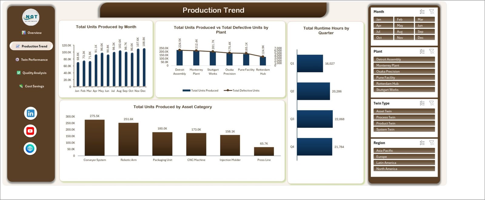
Output over time and by asset. Charts are Total Units Produced by Month, Total Units Produced vs Total Defective Units by Plant, Total Runtime Hours by Quarter (16,027 / 20,286 / 22,068 / 21,784) and Total Units Produced by Asset Category, which ranks Conveyor System, Robotic Arm, Packaging Unit, CNC Machine, Injection Molder and Press Line.
Page 3: Twin Performance
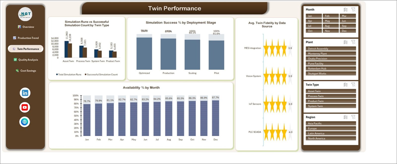
How the twins themselves are running. Charts are Simulation Runs vs Successful Simulation Count by Twin Type, Simulation Success % by Deployment Stage, Avg. Twin Fidelity by Data Source shown as star ratings across IoT Sensors, MES Integration, PLC SCADA and Vision System, and Availability % by Month, which climbs from 78.7% in January to 87.7% in December.
Page 4: Quality Analysis
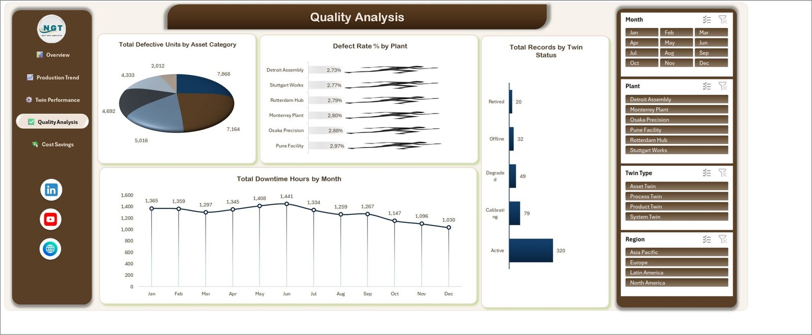
Defects, downtime and fleet health. Charts are Total Defective Units by Asset Category, Defect Rate % by Plant (2.73% at Detroit Assembly to 2.97% at Pune Facility), Total Records by Twin Status — Active 320, Calibrating 79, Degraded 49, Offline 32 and Retired 20 — and Total Downtime Hours by Month, which falls from 1,365 in January to 1,030 in December.
Page 5: Cost Savings
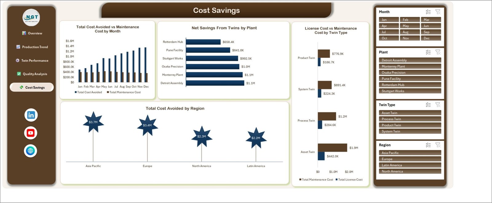
The money case for the programme. Charts are Total Cost Avoided vs Maintenance Cost by Month, Net Savings From Twins by Plant, License Cost vs Maintenance Cost by Twin Type and Total Cost Avoided by Region (Asia Pacific $3.7M, Europe $3.4M, North America $2.3M, Latin America $2.2M).
Data sheet
An Excel Table named TblData spanning B3:AH503 — 500 rows and 33 columns, coded DTM-0001 to DTM-0500. Fields include Date, Plant, Region, Twin Type, Asset Category, Deployment Stage, Data Source, Twin Status, Units Produced, Defective Units, Planned and Actual Runtime Hours, Downtime Hours, Simulation Runs, Successful Simulations, Predicted and Prevented Failures, Maintenance Cost, Downtime Cost Avoided, Twin License Cost, Energy Consumption and Twin Fidelity Rating. There are no operator names, employee IDs or customer details anywhere in the file.
Support sheet
The 25 pivot tables that drive every chart and KPI card. You do not edit it by hand — it is the arithmetic layer between the Data sheet and the five pages.
Digital Twins in Manufacturing Dashboard vs. Google Sheets vs. Paid Industrial IoT SaaS — Feature Comparison
| Feature | Digital Twins in Manufacturing Dashboard in Excel | Google Sheets equivalent | Siemens Insights Hub / PTC ThingWorx |
|---|---|---|---|
| Cost | $17.99 one-time ✅ | $0-30 one-time | $5,000-50,000+ per year |
| Platform | Microsoft Excel, offline ✅ | Browser only | Vendor cloud + connectors |
| Setup time | Under 10 minutes ✅ | 15-30 minutes | Weeks to months of integration |
| Live plant-floor telemetry | No — periodic extracts | No | Yes ✅ |
| Real-time team collaboration | Via OneDrive / SharePoint co-authoring | Yes ✅ | Yes ✅ |
| Customisable fields and charts | Fully — it is your workbook ✅ | Fully | Vendor-defined, change requests |
| Works with no internet | Yes ✅ | No | No |
| Data stays on your machine | Yes ✅ | Google servers | Vendor cloud |
| Year-1 cost at 5 users | $17.99 ✅ | ~$30 | $25,000+ |
For plants that want a board-ready view of what their digital twins actually saved — without a platform contract and an integration project — the Digital Twins in Manufacturing Dashboard in Excel sits in the sweet spot.
Who Should Use This Template
Perfect for:
- Plant managers and operations leads running twin pilots across 2-10 sites who need one monthly view
- Industry 4.0 and digital-transformation managers defending twin spend to a finance committee
- Maintenance and reliability engineers tracking prevented failures, downtime hours and availability by plant
- Manufacturing consultants who want a ready comparison layout instead of building pivots from scratch
Not a fit if:
- You need live streaming telemetry from PLCs or IoT gateways — this reads periodic extracts, not a real-time feed
- You are looking for the twin simulation engine itself; this reports twin outcomes, it does not run models
- You work only in Google Sheets or Power BI — this is an
.xlsxworkbook and wants desktop Excel for full slicer behaviour - You want a traffic-light KPI scorecard with targets and RAG status rather than an analytical dashboard
Real-World Use Cases
Marcus runs operations for a six-site automotive components group. Each month he pastes the twin extract into the Data sheet, filters Cost Savings to Europe, and takes one printed page to the steering committee showing Stuttgart Works and Rotterdam Hub returning $1.65M in combined net savings — instead of stitching together three separate workbooks.
Priya is the reliability engineer at a precision-machining plant. She watches Defect Rate % by Plant and Total Downtime Hours by Month on the Quality Analysis page, and uses Twin Performance to show that her Pilot-stage twins run a lower Simulation Success % than the Optimized ones — the evidence she needed to fund more sensor coverage.
Dan consults on Industry 4.0 rollouts for mid-market manufacturers. He hands clients this workbook in week one so a twin programme is measured from day one, rather than waiting six months for a platform deployment to start producing numbers.
Advantages of the Digital Twins in Manufacturing Dashboard in Excel
- The savings arithmetic is visible and it cross-foots. $11,566,954 cost avoided, less $4,733,847 maintenance cost, less $1,137,590 twin license cost, gives the $5.7M Net Savings card. Anybody can check it.
- One-time cost. $17.99 against $25,000+ a year for a platform seat block — and the workbook keeps working when the subscription would have lapsed.
- Nothing to install. No add-in, no macro prompt, no gateway, no IT approval cycle.
- Every number is traceable. Double-click any pivot value and Excel shows you the underlying rows.
- It travels. Print a filtered page to PDF and the monthly review pack is done.
Opportunities for Improvement
Honest limitations, because they matter when you are choosing a tool:
- No live data connection. You paste or link extracts; the workbook will not poll a historian or an MQTT broker.
- Availability % by Plant has overlapping data labels where two plants sit at the same rounded value. It is cosmetic — click the chart, select the series and reposition or remove the labels.
- Sample volume is 500 records. Excel will handle far more, but past roughly 100,000 rows a Power BI or Power Pivot model will refresh faster.
- Slicer behaviour needs desktop Excel. Excel for the web renders the pages but handles slicers less smoothly.
- No target or RAG column. This is an analytical dashboard, not a scorecard; if you want traffic lights against targets, a KPI dashboard is the right shape.
Best Practices
- Keep the 33 column headers in
TblDataexactly as shipped — every pivot field name is bound to them. - Use consistent spellings for Plant, Region, Twin Type, Asset Category, Deployment Stage, Data Source and Twin Status. A stray “Detroit assembly” becomes a seventh plant in every chart.
- Press Ctrl+Alt+F5 (Refresh All) after every data change, not just F9.
- Load one row per twin per period rather than one row per twin — the Month, Year and Quarter columns are what the time charts group on.
- Clear all four slicers before you print, or save a filtered copy under a name that says what it is filtered to.
- Keep a clean master copy of the file before your first big paste, so a bad import is a one-minute fix.
Explore Relevant Templates
- Manufacturing Dashboard in Excel — general plant performance, output and quality without the twin-specific pages.
- Digital Twin Services Dashboard in Excel — the other side of the market, for firms selling digital-twin services to clients. A different product from this one.
- IoT Services Dashboard in Excel — sensor estate, connectivity and device health.
- Machine Maintenance Data Entry System in Excel — the capture form that can feed a dashboard like this one.
- Manufacturing Efficiency Dashboard in Power BI — the Power BI route if your data has outgrown a workbook.
- Plant Production Manager Toolkit — 9 Premium Templates — bundle this with eight more plant templates and save 40%.
Also worth reading on this blog: Digital Twin Services Dashboard in Excel, IoT Services Dashboard in Excel Template and Packaging Machine Downtime Dashboard in Excel.
Frequently Asked Questions
What does the Digital Twins in Manufacturing Dashboard in Excel actually measure?
The Digital Twins in Manufacturing Dashboard in Excel measures units produced, defective units, availability, downtime hours, simulation runs and success rate, twin fidelity, prevented failures, maintenance cost, license cost and cost avoided — 33 fields across 500 sample records covering a full calendar year.
How long does setup take?
Under 10 minutes. Open the Digital Twins in Manufacturing Dashboard in Excel, paste your rows into the TblData table on the Data sheet keeping the same 33 headers, and press Refresh All. All 25 pivot tables and 20 charts rebuild by themselves.
Does it need macros, Power Query or Power Pivot?
No. The Digital Twins in Manufacturing Dashboard in Excel is a plain .xlsx workbook built from Excel Tables, pivot tables, pivot charts and slicers only. There is no VBA, no add-in and no macro security prompt to accept.
How does this compare to Siemens Insights Hub or PTC ThingWorx?
Those platforms ingest live machine telemetry and cost thousands of dollars a year. The Digital Twins in Manufacturing Dashboard in Excel is a $17.99 one-time reporting layer over periodic extracts. It will not replace a twin platform, but it will report a twin programme’s results without one.
Can I add my own plants, regions or twin types?
Yes. Type your own values into the Data sheet and press Refresh All. Every slicer and chart category in the Digital Twins in Manufacturing Dashboard in Excel is pivot-driven, so new plants, regions, asset categories or twin types appear automatically.
Is this the same as the Digital Twin Services Dashboard?
No. The Digital Twins in Manufacturing Dashboard in Excel reports a manufacturer’s own twin deployments on its own shop floor. The Digital Twin Services Dashboard reports the book of a company that sells digital-twin services to clients. They are separate products with different data models.
Does the workbook contain personal or confidential data?
No. The Digital Twins in Manufacturing Dashboard in Excel ships with coded records DTM-0001 to DTM-0500 and site names only. There are no operator names, employee IDs, customer names or contact details anywhere in the file.
About the Author
Built by PK — Microsoft Certified Professional with 15+ years of Excel, Google Sheets and Power BI experience. Founder of NextGenTemplates, reaching 300K+ subscribers across YouTube channels. Every template is hand-built and tested before release.
Conclusion
A digital twin programme that cannot show its return gets cut at the first budget review. The Digital Twins in Manufacturing Dashboard in Excel gives it one page of evidence — 1.1M units, 83.9% availability, 1,554 prevented failures and $5.7M in net savings in the sample year — built from 500 records you can replace with your own in under ten minutes.
👉 Click here to Purchase the Digital Twins in Manufacturing Dashboard in Excel
Instant download · One-time payment · No subscription
🎥 For step-by-step Excel dashboard tutorials, visit Youtube.com/@PKAnExcelExpert.
Last updated: September 2026