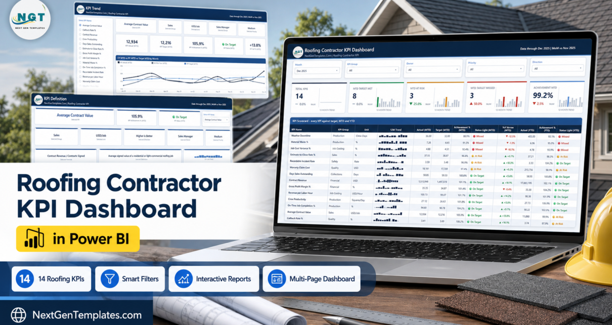
Roofing is one of the few trades where a single wet fortnight can wipe out a quarter, and where the difference between a good year and a bad one usually shows up in three numbers nobody looks at until it is too late: material waste, job cost variance and callbacks. The Roofing Contractor KPI Dashboard in Power BI puts 14 of those numbers on one page, scores each one against target for the month and the year to date, and colours them green, amber or red so a management meeting starts with the exceptions instead of the agenda.
It is a four-page .pbix report driven by one Excel workbook. Nothing is hard-coded: rename a KPI, add one, delete one, and the cards, the scorecard, the KPI list and every chart follow after a refresh. A full sample year ships with it – 14 KPI definitions, 168 monthly target rows and 336 actual rows covering the reporting year and the year before it – so you can see how the whole thing behaves before you type a single number of your own.
Key Features of the Roofing Contractor KPI Dashboard in Power BI
- 14 roofing KPIs in seven groups – Financial, Job Costing, Sales, Production, Quality, Safety and Collections.
- MTD and YTD on the same row. Actual, target, achievement percentage and status light for both periods, so a strong December inside a weak year has nowhere to hide.
- Direction-aware scoring. Lower-is-better KPIs score Target divided by Actual, so beating a waste or callback target reads above 100 percent and turns green like everything else.
- Five summary cards – Total KPIs, MTD Target Met, MTD At Risk, MTD Target Missed and Achievement MTD – each with a month-on-month delta and a 12-month trend bar.
- A 12-month sparkline on every KPI row that keeps the full year even when the report is filtered to one month.
- Five synced slicers – Month, KPI Group, Owner, Priority and Direction – that follow you from page to page.
- Prior-year comparison built in – YoY arrows on the scorecard plus CY vs PY vs Target line charts for MTD and YTD.
- Every KPI has an owner – Finance Director, Estimating Manager, Production Manager, Sales Manager, Field Operations, Purchasing Lead, Service Manager, Safety Officer or Accounts Receivable.
- Native visuals only. No custom visuals to install, no locked objects, no paid workspace required to open it.
Dashboard Pages Explanation
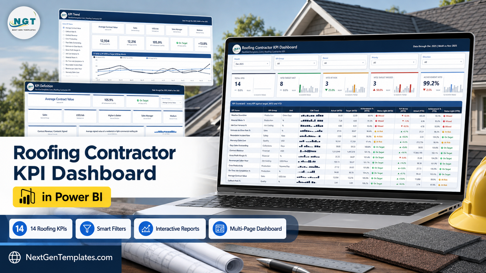
Page 1 – KPI Dashboard. The month picker sits top left, then KPI Group, Owner, Priority and Direction. Under them the five summary cards, then the KPI Scorecard: KPI Name, KPI Group, Unit, 12M Trend, Actual (MTD), Target (MTD), Achievement % (MTD), Status Light (MTD), YoY Arrow (MTD), Actual (YTD), Achievement % (YTD) and Status Light (YTD).
In the sample December 2025 view the headline reads 14 KPIs, 8 On Target, 3 At Risk, 3 Missed, Achievement MTD 99.2 percent. The three misses are Weather Downtime at 36.00 crew-days against a 32.00 target (88.9 percent), Material Waste % at 7.28 against 6.65 (91.3 percent) and Job Cost Variance % at 4.88 against 4.51 (92.4 percent). At the other end, Callback Rate % at 3.41 against a 3.69 target scores 108.2 percent and On-Time Job Completion % at 94.60 against 90.78 scores 104.2 percent. That is the whole point of a scorecard: three numbers to argue about, eleven you can leave alone.
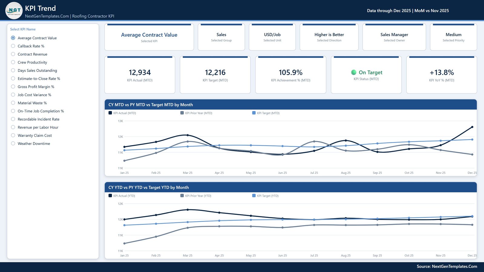
Page 2 – KPI Trend. Choose one KPI from the list on the left and the entire page follows it. An attribute strip repeats the selected group, unit, direction, owner and priority; five cards give KPI Actual (MTD), KPI Target (MTD), KPI Achievement % (MTD), KPI Status (MTD) and KPI YoY % (MTD); and two line charts sit underneath – CY MTD vs PY MTD vs Target MTD by Month and CY YTD vs PY YTD vs Target YTD by Month. Prior year is drawn in grey behind the current year, which is what turns “we had a good month” into “we had a good month compared with what”.
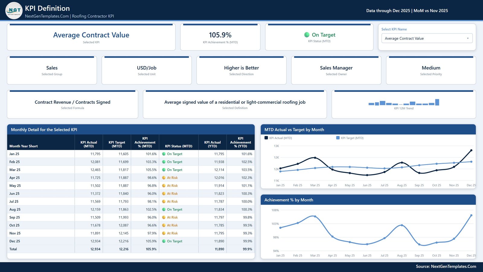
Page 3 – KPI Definition. The same synced KPI picker, plus the plain-English definition and the formula behind the number. For Average Contract Value that is Contract Revenue divided by Contracts Signed, defined as the average signed value of a residential or light-commercial roofing job. A Monthly Detail table lists all twelve months with MTD actual, MTD target, achievement, status and the YTD pair, and two charts show MTD Actual vs Target by Month and Achievement % by Month. This is the page you open when somebody says the number looks wrong.
Page 4 – Get More Templates. A catalogue page for the rest of the Power BI library, plus a short guide to changing the month, swapping in your own data, understanding UTB and LTB scoring and recolouring the whole report from one custom theme.
The 14 KPIs, and Why These 14
| Group | KPI | Unit | Direction | Typical owner |
|---|---|---|---|---|
| Financial | Contract Revenue | USD | Higher is better | Finance Director |
| Financial | Gross Profit Margin % | % | Higher is better | Finance Director |
| Job Costing | Job Cost Variance % | % | Lower is better | Estimating Manager |
| Job Costing | Revenue per Labor Hour | USD/Hour | Higher is better | Production Manager |
| Sales | Estimate-to-Close Rate % | % | Higher is better | Sales Manager |
| Sales | Average Contract Value | USD/Job | Higher is better | Sales Manager |
| Production | Crew Productivity | Squares/Day | Higher is better | Field Operations |
| Production | Material Waste % | % | Lower is better | Purchasing Lead |
| Production | Weather Downtime | Crew-Days | Lower is better | Field Operations |
| Production | On-Time Job Completion % | % | Higher is better | Production Manager |
| Quality | Callback Rate % | % | Lower is better | Service Manager |
| Quality | Warranty Claim Cost | USD | Lower is better | Service Manager |
| Safety | Recordable Incident Rate | Rate | Lower is better | Safety Officer |
| Collections | Days Sales Outstanding | Days | Lower is better | Accounts Receivable |
Notice the balance. Four production KPIs, because that is where a roofing company makes or loses its margin, but only one safety KPI and one collections KPI – enough to keep them visible without drowning the board. Recordable Incident Rate uses the standard OSHA formula, incidents multiplied by 200,000 divided by hours worked, so it is comparable with anything your insurer quotes at you.
Roofing Contractor KPI Dashboard in Power BI vs. a Sheet You Build vs. Roofing Field Software – Feature Comparison
| This Power BI template | A spreadsheet you build | AccuLynx / JobNimbus reporting | |
|---|---|---|---|
| Cost | One-time 19.99 USD | Free, plus several days of your time | Roughly 100-300 USD per user per month |
| Time to first review | About 20 minutes | Two to five days | Weeks of onboarding |
| MTD and YTD together | Yes, on the same scorecard row | Only if you build it | Usually separate reports |
| Direction-aware scoring | Built in, UTB and LTB | Manual IF logic per KPI | Varies |
| Prior-year comparison | Built in, MTD and YTD | You maintain a second year of data | Depends on plan and history |
| Add or rename a KPI | One row in the workbook, then Refresh | Rebuild the formulas | Not possible – fixed report set |
| Owner accountability | Owner slicer on every page | Manual | Sometimes |
| Connects to your job board | No – you enter the monthly numbers | No | Yes, it is the job board |
| Mobile access | Power BI mobile app after publishing | Spreadsheet app | Yes |
| You own the history | Yes, the file is yours forever | Yes | No, it stays in the vendor account |
Who Should Use This Template
It is built for residential and light-commercial roofing contractors running roughly 2 to 20 crews – the size where the owner still knows every job but no longer sees every invoice. Production managers who already export monthly numbers from AccuLynx, JobNimbus, Roofr or a shared spreadsheet get the most out of it fastest, because the hard part is already done: the numbers exist, they are just scattered.
It also works well for a controller or fractional CFO who reviews several trade contractors, and for an owner preparing for a bank review or a sale, where a twelve-month scorecard with targets and prior-year comparison is worth considerably more than a folder of exports.
It is not for anyone expecting a live feed. This report does not connect to a CRM, a supplier portal or an accounting system – every figure comes from the Excel workbook you fill. It is not an estimating tool, not a crew scheduler and not a material take-off calculator. If you want the same scorecard without installing Power BI Desktop, the Excel and Google Sheets editions linked below do the same job.
Real-World Use Cases
Ray, owner of a six-crew residential roofer. First Monday of the month, Page 1, filtered to December. Weather Downtime and Material Waste % are red, so the meeting starts there. The YoY arrow on Weather Downtime reads -12.5 percent, which tells him this is not simply a wet December – the crews lost more days than the same month last year, and the scheduling conversation is a different one from the weather conversation.
Dana, production manager. She sets the Owner slicer to Field Operations, which leaves her with Crew Productivity and Weather Downtime, then moves to the KPI Trend page. Twelve months of actual against target with last year underneath turns “summer is always busy” into a number she can plan crews against.
Tom, controller. Financial and Collections groups only. He watches Gross Profit Margin % against Days Sales Outstanding, because margin that never converts to cash is not margin. The KPI Definition page carries the formula he agreed with the accountant, so the calculation stops being re-argued every quarter.
Maria, service manager. Callback Rate % and Warranty Claim Cost are hers, both lower-is-better, both scored above 100 percent when she beats target. The 12-month sparkline is what lets her show that a warranty spike tracked one crew’s summer schedule rather than a bad batch of shingles.
Advantages of the Roofing Contractor KPI Dashboard in Power BI
- The model is generic, the content is roofing. Nothing in the report knows what a square is, so you can retire a KPI the day it stops mattering without breaking a single visual.
- One theme drives every visual. Recolour in one place and all four pages restyle – useful if you white-label it for clients.
- Thresholds are explicit. On Target is 100 percent and above, At Risk is 95 to 100 percent, Missed is below 95 percent. They live in the model and can be moved.
- The sparkline resists the slicer. Filter to one month and the 12-month trend column still shows the year, which is the detail most home-made scorecards get wrong.
- It is a file, not a subscription. One payment, and the history stays yours.
Opportunities for Improvement
Being honest about the limits is more useful than a feature list. Three things this template deliberately does not do:
- No automatic data feed. Monthly figures are typed or pasted into Data.xlsx. If you want a live connection to your CRM, that is a custom build, not a template.
- Monthly grain only. There is no weekly or per-job drill-down. A job-level view is a different report – see the analytics dashboards rather than the KPI scorecards.
- You must set the targets. The sample targets are realistic but generic. A scorecard against targets nobody agreed to is theatre, so spend the hour setting them before you spend the twenty minutes loading data.
Best Practices
- Set targets once a year, review monthly. Moving a target mid-year to make a KPI green is the fastest way to make the whole board worthless.
- Get the YTD rule right. YTD sums for money and volume, but averages for rates, percentages and day counts. A callback rate that adds to 40 percent by December makes every YTD chart useless – this is the single most common mistake in a KPI pack.
- Load the prior year too. Every PY and YoY figure reads from it. Skip it and you lose half the report.
- One owner per KPI, and mean it. The Owner slicer only earns its place if each name in it belongs to somebody who can actually move the number.
- Keep the .pbix and Data.xlsx together. If you move them, repoint the query under Home > Transform data > Data source settings.
- Review exceptions, not everything. Amber and red first. Green KPIs get thirty seconds unless the YoY arrow disagrees with them.
Explore Relevant Templates
- Roofing Contractor KPI Dashboard in Power BI – the template covered in this post.
- Roofing Contractor KPI Dashboard in Excel – the same 14-KPI scorecard as worksheet formulas, no Power BI needed.
- Roofing Contractor KPI Dashboard in Google Sheets – the browser-based edition.
- Roofing Contractor KPI Scorecard in Excel – a lighter ten-KPI monthly scorecard.
- Roof Inspection Checklist in Google Sheets – the field checklist behind the callback numbers.
- HVAC Contractor KPI Dashboard in Power BI and the Plumbing Business KPI Dashboard in Excel – the same scorecard for the other trades.
- Fleet Management KPI Dashboard in Power BI – for the trucks behind the crews.
- Browse the full Power BI catalogue.
Frequently Asked Questions
Do I need a paid Power BI licence?
No. Power BI Desktop is free from Microsoft and opens the file. A Pro or Premium licence is only needed if you want to publish the report to a workspace and share it with colleagues.
Does it connect to AccuLynx, JobNimbus or Roofr?
No, and that is deliberate. Every number comes from the included Excel workbook, so the template works regardless of which roofing platform you run – and your history stays in a file you own rather than a vendor account.
Can I add or remove KPIs?
Yes. Nothing in the report hard-codes a KPI. Add a row to KPI Definition plus its monthly target and actual rows, hit Refresh, and the counts, the scorecard, the KPI list and every chart pick it up. The KPI name is the join key, so rename it in all three sheets at once.
How can a lower-is-better KPI score above 100 percent?
Achievement is direction-aware. LTB KPIs score Target divided by Actual, so a callback rate under target scores above 100 percent and turns green like any other KPI.
What are the traffic light thresholds?
On Target is 100 percent and above, At Risk is 95 to 100 percent, Missed is below 95 percent. They are set in the model and can be changed.
What is in the download?
A zip containing the .pbix report, the Data.xlsx workbook that feeds it, and a Power BI Dashboard user manual PDF.
Is the sample data real?
No. The shipped numbers are realistic sample values for a residential and light-commercial roofing contractor, not real operational data. Replace them with your own and refresh.
Can I change the colours?
Yes. The report uses one custom Power BI theme, so recolouring it in a single place restyles every visual on all four pages.
About the Author
PK is a Microsoft Certified Professional with 15+ years of Excel, Google Sheets, and Power BI experience, and the founder of NextGenTemplates, reaching 300K+ subscribers across YouTube channels. Every template is hand-built and tested before release.
Conclusion
A roofing company does not need more reports. It needs one board that says, in ten seconds, which three numbers are off and who owns them. That is what the Roofing Contractor KPI Dashboard in Power BI does: 14 KPIs, seven groups, MTD and YTD scored against target with prior-year comparison, in a fully editable .pbix with a complete sample year already loaded.
Set your targets, paste twelve months of actuals plus the year before, hit Refresh, and walk into the next management meeting with the exceptions already highlighted. One-time payment, instant download, lifetime access to the file.
Get the Roofing Contractor KPI Dashboard in Power BI