Managing ceramic production is never simple. A ceramic manufacturing business handles many moving parts every day. You need to track production quantity, defective units, raw material cost, labor cost, quality score, plant performance, and much more. When this information stays in different files or scattered reports, decision-making becomes slow and confusing.
Click to Purchases Ceramic Manufacturing Dashboard in Excel
That is exactly why a Ceramic Manufacturing Dashboard in Excel becomes so useful.
This dashboard helps ceramic manufacturers organize important production data in one place. As a result, managers, plant heads, quality teams, and business owners can quickly understand what is happening across production lines, shifts, product types, plant locations, and operators. Instead of checking raw data again and again, you can view meaningful charts, KPI cards, and slicers that make analysis easy and fast.
In this article, you will learn everything about the Ceramic Manufacturing Dashboard in Excel, including its pages, features, benefits, best practices, and how it helps improve production planning and cost control.
Why Is a Ceramic Manufacturing Dashboard in Excel Important?
Ceramic manufacturing involves continuous monitoring. You need to keep an eye on:
- Production output
- Quality levels
- Defective units
- Raw material usage
- Labor cost
- Energy cost
- Plant efficiency
- Operator performance
When you do this work manually, it takes a lot of time. Moreover, manual reports often lead to errors and delays. On the other hand, an Excel dashboard gives you a clear and visual view of your manufacturing data.
Because of this, you can:
- Make faster decisions
- Spot production issues early
- Control manufacturing costs
- Improve quality standards
- Compare plants and production lines
- Analyze trends over time
So, instead of depending on guesswork, you can use real numbers to manage your ceramic business better.
What Is a Ceramic Manufacturing Dashboard in Excel?
Click to Purchases Ceramic Manufacturing Dashboard in Excel
A Ceramic Manufacturing Dashboard in Excel is a ready-to-use reporting and analysis tool built in Microsoft Excel. It collects production-related data and turns it into interactive charts, summary cards, and analysis pages.
This dashboard helps users track the complete manufacturing process in an easy and visual format. In addition, it supports dynamic reporting through pivot tables, slicers, and charts. Therefore, whenever you update the data sheet and refresh the dashboard, all reports update automatically.
This dashboard is especially helpful for:
- Ceramic manufacturing companies
- Plant managers
- Operations teams
- Production supervisors
- Quality control teams
- Cost analysts
- Business owners
What Does This Ceramic Manufacturing Dashboard in Excel Include?
This dashboard contains multiple pages designed to analyze ceramic manufacturing data from different angles. Each sheet serves a specific purpose. As a result, users can move from high-level insights to detailed performance analysis with ease.
The dashboard includes:
- Overview Page
- Production Analysis
- Quality Control
- Cost Analysis
- Plant Performance
- Data Sheet Tab
- Support Sheet
Let us understand each page in detail.
What Can You See on the Overview Page?
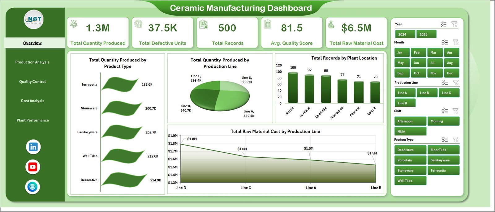
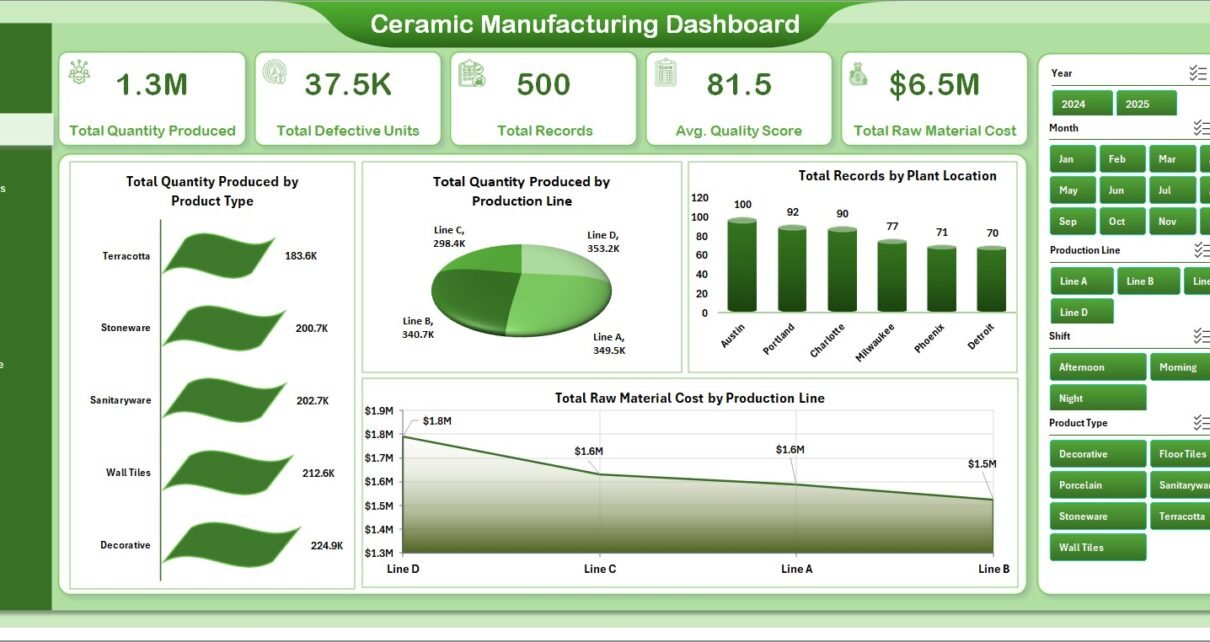
The Overview Page gives a high-level summary of the entire ceramic manufacturing process. This page works as the main dashboard screen. It displays key cards at the top and visual charts below them. In addition, slicers help users apply filters quickly and see only the required data.
KPI Cards on the Overview Page
The dashboard includes the following cards:
- Total Quantity Produced
This card shows the total production quantity across all records. It helps users understand the overall manufacturing output instantly. - Total Defective Units
This card displays the number of defective units found in the production process. Therefore, it helps quality teams monitor waste and quality problems. - Total Records
This card shows the total number of records available in the data. It gives a quick idea of the data volume used for analysis. - Avg. Quality Score
This card shows the average quality score of produced items. Because of this, users can quickly measure production quality at a glance. - Total Raw Material Cost
This card displays the overall raw material cost. It helps management track how much material spending affects total manufacturing cost.
Charts on the Overview Page
Total Quantity Produced by Product Type
This chart shows which ceramic product types contribute the most to total production quantity. As a result, users can easily identify high-volume products and compare product demand.
Total Quantity Produced by Production Line
This chart compares production output across different production lines. Therefore, it becomes easy to spot the most productive line and identify low-performing lines.
Total Records by Plant Location
This chart displays the number of records for each plant location. It helps users understand how data and activity distribute across manufacturing plants.
Total Raw Material Cost by Production Line
This chart shows how raw material cost varies from one production line to another. Because of this, managers can analyze cost-heavy lines and improve material control.
How Does the Production Analysis Page Help?
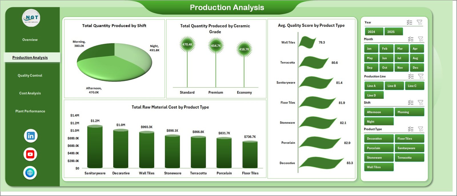
The Production Analysis sheet focuses on production performance in detail. It helps users understand output from different operational views such as shifts, ceramic grades, and product types.
Charts on the Production Analysis Page
Total Quantity Produced by Shift
This chart shows production quantity for each work shift. It helps managers compare shift performance and identify which shift produces the highest output.
Total Quantity Produced by Ceramic Grade
Click to Purchases Ceramic Manufacturing Dashboard in Excel
This chart displays production quantity by ceramic grade. As a result, users can understand which grades dominate the production schedule.
Avg. Quality Score by Product Type
This chart compares the average quality score of each product type. Therefore, it helps identify products that maintain strong quality levels and those that need improvement.
Total Raw Material Cost by Product Type
This chart shows the raw material cost associated with each product type. Because of this, manufacturers can compare product-wise material consumption and cost efficiency.
What Insights Does the Quality Control Page Provide?
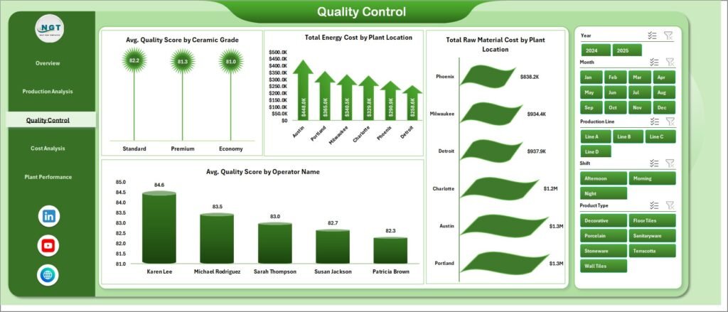
The Quality Control page focuses on quality performance and cost impact across ceramic grades, plants, and operators. Since quality plays a major role in manufacturing success, this sheet helps users monitor standards clearly.
Charts on the Quality Control Page
Avg. Quality Score by Ceramic Grade
This chart shows the average quality score of each ceramic grade. It helps users understand which grades perform better in terms of quality.
Total Energy Cost by Plant Location
This chart displays energy cost by plant location. Therefore, plant managers can compare utility usage and identify energy-intensive plants.
Total Raw Material Cost by Plant Location
This chart compares raw material cost among different plant locations. As a result, users can analyze which plants consume more material or operate at a higher material cost.
Avg. Quality Score by Operator Name
This chart shows the quality score achieved by each operator. Because of this, managers can recognize top performers and arrange training where needed.
Why Is the Cost Analysis Page Useful?
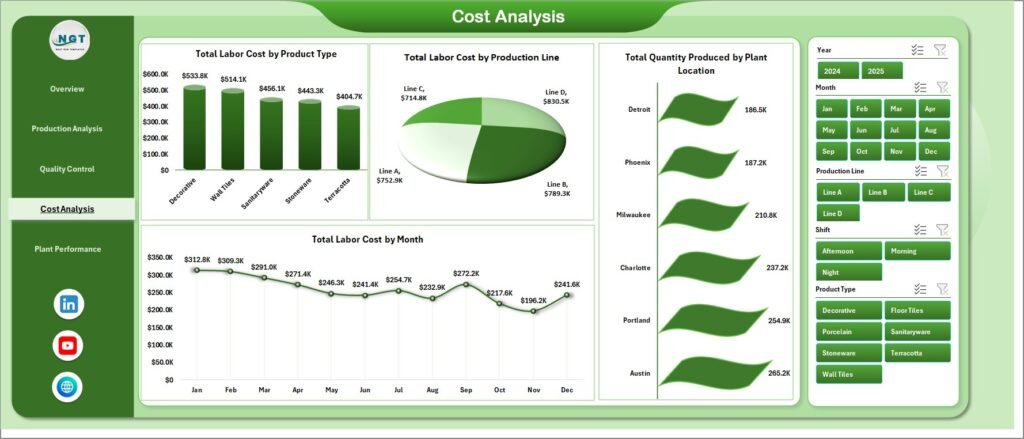
The Cost Analysis sheet helps users study the cost side of ceramic manufacturing. Since profitability depends on cost control, this page gives an important view of labor cost and output performance.
Charts on the Cost Analysis Page
Total Labor Cost by Product Type
This chart shows labor cost for each product type. It helps management compare labor-heavy products and understand where production effort is highest.
Total Labor Cost by Production Line
This chart compares labor cost across production lines. Therefore, users can identify lines that require more labor spending and review efficiency.
Total Quantity Produced by Plant Location
This chart shows output quantity for each plant location. As a result, managers can compare plant productivity side by side.
Total Labor Cost by Month
This chart tracks labor cost month by month. Because of this, businesses can monitor cost trends over time and plan budgets more accurately.
How Does the Plant Performance Page Improve Monitoring?
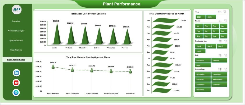
The Plant Performance sheet helps compare manufacturing performance across different plants and operators. This sheet supports better plant-level decision-making and performance reviews.
Charts on the Plant Performance Page
Total Labor Cost by Plant Location
This chart compares total labor cost among plant locations. It helps users understand which plants operate with higher workforce expenses.
Total Quantity Produced by Month
This chart shows monthly production quantity trends. Therefore, users can track seasonal patterns and measure output progress over time.
Total Raw Material Cost by Operator Name
This chart shows raw material cost linked to each operator. As a result, managers can study operator-level cost impact and improve material handling practices.
What Is the Role of the Data Sheet Tab?
Click to Purchases Ceramic Manufacturing Dashboard in Excel
The Data Sheet Tab is the main source of data for the dashboard. Here, users enter or paste their ceramic manufacturing data in the same format already designed in the file.
This sheet is very important because all pivot tables, charts, and KPI cards depend on it. So, when you update this sheet with fresh production data, the dashboard reflects the new results after refresh.
Why the Data Sheet Matters
- It stores all raw manufacturing data
- It supports dynamic reporting
- It acts as the single source for analysis
- It keeps reporting organized and structured
Why Is the Support Sheet Important?
The Support Sheet contains multiple pivot tables used to create the entire dashboard dynamically. Although users may not need to work on this sheet every day, it is the backbone of the dashboard.
Once you update the data in the Data Sheet, you can go to the Data tab in the Excel Ribbon and click Refresh All. After that, all pivot tables and linked charts update automatically.
You can also keep this sheet hidden so the workbook looks cleaner and easier to use.
Benefits of the Support Sheet
- Helps create dynamic charts
- Supports automatic refresh
- Keeps the dashboard structure stable
- Makes Excel reporting faster and smarter
What Are the Main Features of the Ceramic Manufacturing Dashboard in Excel?
This dashboard offers many useful features that make manufacturing analysis easier:
- Interactive KPI cards for quick monitoring
- Multiple analysis pages for deep insights
- Slicers for fast filtering
- Dynamic charts linked with pivot tables
- Easy data entry format
- Monthly and location-based analysis
- Production, quality, and cost tracking in one file
- Operator and plant-level performance review
- Refresh-all functionality for quick updates
- User-friendly Excel layout
Because of these features, the dashboard supports both day-to-day operations and long-term business planning.
Advantages of Ceramic Manufacturing Dashboard in Excel
Click to Purchases Ceramic Manufacturing Dashboard in Excel
Using this dashboard gives many practical benefits to ceramic manufacturers. Below are the key advantages:
- Improves decision-making
The dashboard presents important data clearly. Therefore, managers can make faster and smarter decisions. - Saves reporting time
Instead of preparing reports manually, users can refresh the dashboard and get updated analysis in seconds. - Tracks quality performance easily
Since the dashboard includes quality score and defective unit analysis, quality monitoring becomes much simpler. - Controls manufacturing cost
Raw material, labor, and energy cost analysis help businesses reduce unnecessary spending. - Improves plant monitoring
Users can compare plant locations, production lines, operators, and shifts in one place. - Supports better planning
Monthly trends and production breakdowns help plan future manufacturing schedules and budgets. - Easy to use in Excel
Since many businesses already use Excel, there is no need for expensive software training.
Opportunities for Improvement in the Ceramic Manufacturing Dashboard
Even though this dashboard is highly useful, businesses can improve its value further with a few smart additions:
- Add target vs actual comparison for production and quality
- Include defect percentage and rejection rate
- Add downtime analysis by machine or production line
- Track maintenance cost and machine performance
- Include inventory level of raw materials
- Add daily, weekly, and monthly trend filters
- Create alert indicators for high cost or low quality score
- Add profit analysis with selling price and revenue data
These improvements can make the dashboard even more powerful for production management.
Best Practices for the Ceramic Manufacturing Dashboard
To get the best results from this dashboard, follow these best practices:
- Update the data regularly
Always enter the latest production data in the correct format. This keeps your analysis meaningful and accurate. - Use consistent data entry rules
Keep product types, plant names, operator names, and grades consistent. Otherwise, reports may split the same item into different groups. - Refresh all pivot tables after updating data
After entering new records, always click Refresh All from the Data tab so that charts and KPIs update properly. - Review defects and quality trends often
Do not wait until the month-end report. Instead, check quality performance regularly to solve issues faster. - Compare costs across multiple views
Look at raw material, labor, and energy costs together. This gives a more complete picture of manufacturing efficiency. - Hide the support sheet for cleaner use
Since most users do not need to work on the support sheet directly, keeping it hidden improves the workbook experience. - Back up the file before major updates
A backup copy helps protect your reporting system and prevents accidental data loss. - Train users on slicers and filters
Once users understand filtering options, they can find useful insights much faster.
Who Can Benefit from This Dashboard the Most?
This dashboard fits many users inside a ceramic manufacturing business. For example:
- Plant Managers can monitor output, costs, and location performance.
- Production Supervisors can compare shifts, grades, and lines.
- Quality Teams can watch quality scores and defective units.
- Cost Analysts can study labor, energy, and material expenses.
- Business Owners can view the complete manufacturing picture quickly.
- Operations Teams can improve workflow and planning with better insights.
So, whether you manage one plant or multiple locations, this dashboard offers strong value.
Why Should You Choose Excel for a Ceramic Manufacturing Dashboard?
Many businesses choose Excel because it is familiar, flexible, and practical. While advanced tools also exist, Excel still remains one of the best options for quick dashboard reporting.
Reasons to use Excel
- Easy to understand
- Widely available in most businesses
- Supports charts, pivot tables, and slicers
- No major setup cost
- Easy to customize based on business needs
- Suitable for small and medium manufacturing companies
Therefore, if you want a powerful yet simple solution, Excel is an excellent choice.
Click to Purchases Ceramic Manufacturing Dashboard in Excel
How Can This Dashboard Help Improve Ceramic Manufacturing Performance?
A dashboard becomes powerful when it supports action. This Ceramic Manufacturing Dashboard does exactly that. It does not just show numbers. Instead, it helps users identify where improvement is needed.
For example:
- If defective units rise, the quality team can check operators or grades.
- If raw material cost increases, managers can review production lines.
- If one plant produces less quantity, operations can investigate the issue.
- If labor cost rises month by month, finance and production teams can adjust planning.
Because of this, the dashboard becomes a daily decision-support tool, not just a report.
Conclusion
The Ceramic Manufacturing Dashboard in Excel is a practical and powerful tool for tracking production, quality, and cost performance in one place. It helps ceramic manufacturers move away from slow manual reporting and toward faster, smarter, and more organized analysis.
With pages like Overview, Production Analysis, Quality Control, Cost Analysis, and Plant Performance, this dashboard gives a complete view of the manufacturing process. In addition, the Data Sheet and Support Sheet make the dashboard dynamic and easy to refresh.
If you want to improve production visibility, control costs, monitor quality, and make better manufacturing decisions, this dashboard can be a very valuable solution for your business.
Frequently Asked Questions with Answers
1. What is a Ceramic Manufacturing Dashboard in Excel?
It is an Excel-based dashboard that helps users track ceramic production, quality, defects, costs, and plant performance using charts, KPI cards, and slicers.
2. Who should use this dashboard?
Plant managers, production teams, quality control teams, business owners, and cost analysts can use this dashboard for better reporting and decision-making.
3. Can I update the dashboard with my own data?
Yes, you can enter your own manufacturing data in the Data Sheet tab in the same format and then refresh the dashboard.
4. How do I refresh the dashboard after updating data?
Go to the Data tab in Excel and click Refresh All. This updates pivot tables, charts, and summary cards.
5. What does the Overview Page show?
The Overview Page shows high-level KPI cards and charts such as total quantity produced, total defective units, average quality score, and raw material cost.
6. Does this dashboard help with quality monitoring?
Yes, it includes charts for quality score by ceramic grade, product type, and operator name, which makes quality analysis easier.
7. Can this dashboard track manufacturing costs?
Yes, it tracks raw material cost, labor cost, and energy cost across different dimensions like plant location, product type, and production line.
8. Is the Support Sheet necessary?
Yes, the Support Sheet contains pivot tables that drive the dashboard. However, you can keep it hidden for a cleaner workbook layout.
9. Why is Excel a good choice for this dashboard?
Excel is easy to use, flexible, widely available, and powerful enough to create interactive dashboards using pivot tables, slicers, and charts.
10. Can I customize this dashboard further?
Yes, you can customize it by adding more KPIs, trend charts, targets, defect rate analysis, inventory tracking, or machine performance metrics.
Visit our YouTube channel to learn step-by-step video tutorials
Click to Purchases Ceramic Manufacturing Dashboard in Excel