E-learning Content Services Dashboard in Excel gives education teams and content service managers a clear way to monitor operational cost, spend, downtime, customer impact, safety score, assets, regions, and maintenance activity without building a dashboard from scratch. Many teams still manage service logs and monthly reporting in separate sheets. That creates delays, duplicated work, and weak visibility. This Excel dashboard turns those records into KPI cards, slicers, monthly visuals, asset analysis, regional analysis, and pivot-driven reporting that can be refreshed after every data update.
Click here to purchase the E-learning Content Services Dashboard in Excel.
E-learning Content Services Dashboard in Excel
Key Features of E-learning Content Services Dashboard in Excel
- Seven worksheet tabs covering Overview, Monthly Trend, Asset Analysis, Regional Analysis, Maintenance Type, Data Sheet, and Support Sheet.
- High-level KPI cards for Total Maintenance Cost, Total Spend, Total Downtime Hours, Total Customers, and Avg. Safety Score.
- Multiple slicers to filter the dashboard quickly and view focused results.
- Pivot-driven charts so the dashboard refreshes after the source data is updated.
- Structured data sheet where users can paste or enter records in the same format.
- Support sheet with pivot tables that can be hidden after setup.
- Editable Excel format for teams that want full control over calculations, labels, colors, and charts.
Dashboard Pages Explanation
1. Overview Page
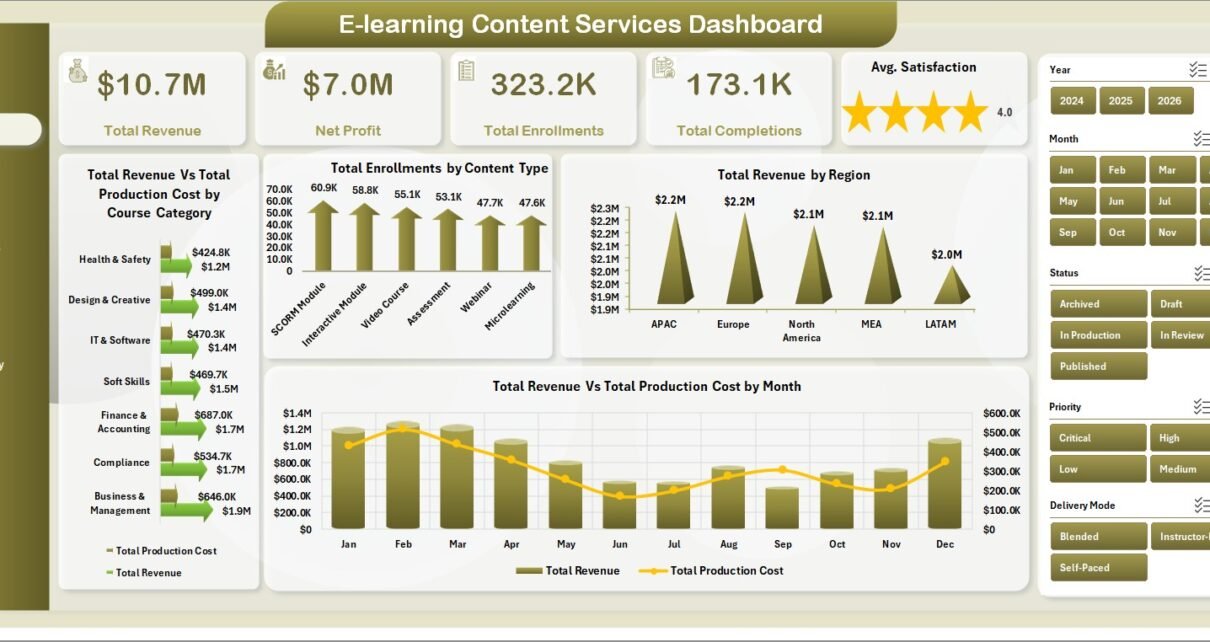
The Overview page is the main control center of the workbook. At the top, the dashboard shows Total Maintenance Cost, Total Spend, Total Downtime Hours, Total Customers, and Avg. Safety Score. These cards help managers understand cost, operational impact, and service quality before moving into deeper analysis.
Completion % by Total Records: This chart helps users compare completed work against all records. It gives a fast read on progress and backlog pressure.
Total Downtime Hours by Region: This chart highlights which regions have the highest downtime. It helps users identify locations that may need process review, resource support, or preventive action.
Total Records by Maintenance Type: This visual breaks activity into maintenance categories. It helps users understand whether planned, unplanned, corrective, or other service types are driving workload.
Total Maintenance Cost Vs Total Parts Cost by Asset Type: This comparison shows how cost behaves across asset types. It helps decision-makers identify asset categories where maintenance cost and parts cost may require budget attention.
Overview Page
2. Monthly Trend
The Monthly Trend tab explains how core metrics move over time. It includes Total Maintenance Cost Vs Total Parts Cost by Month, Total Downtime Hours by Month, Total Spend by Month, and Total Customers Affected by Month. This page is useful for identifying seasonal changes, cost spikes, downtime patterns, and service months that affected more customers than usual.
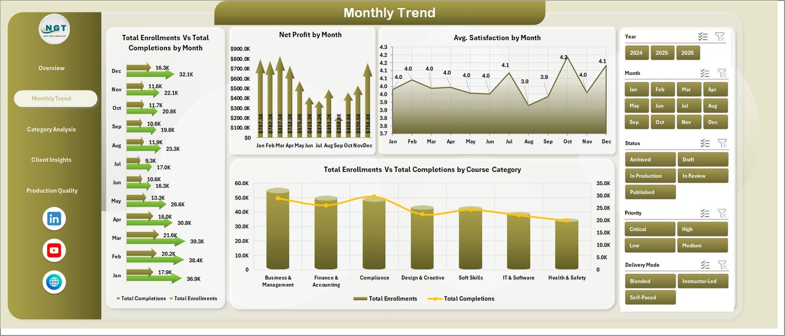
Monthly Trend
3. Asset Analysis
The Asset Analysis tab helps users review service performance by asset type and voltage level. It includes Total Downtime Hours by Asset Type, Total Spend by Asset Type, Total Maintenance Cost by Voltage Level, and Avg. Safety Score by Asset Type. This is especially useful when a team wants to identify asset groups that cause higher downtime or require higher spend.
Asset Analysis
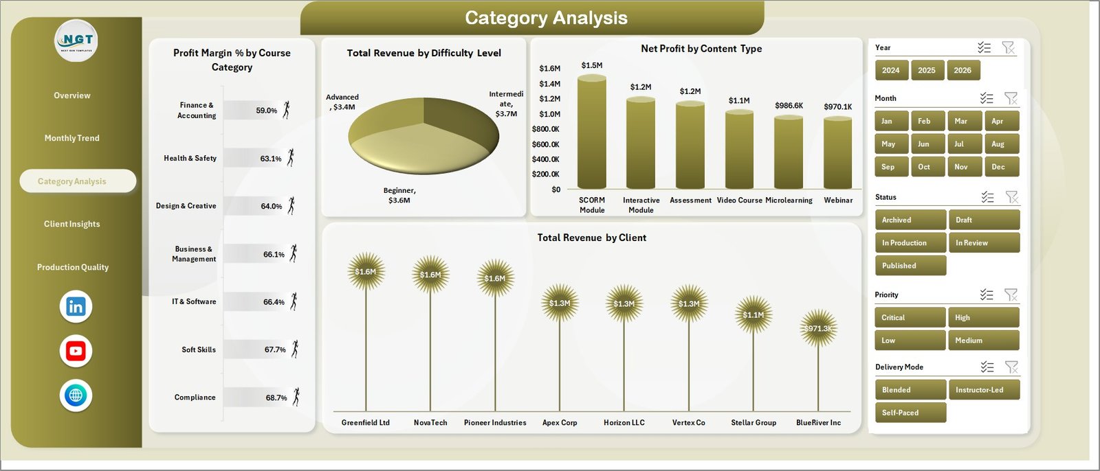
4. Regional Analysis
The Regional Analysis tab compares performance across locations. It includes Total Maintenance Cost by Region, Total Customers Affected by Region, SLA Compliance % by Region, and Total Spend by Substation. Managers can use this page to compare regional workload, service quality, spend concentration, and SLA performance in one view.
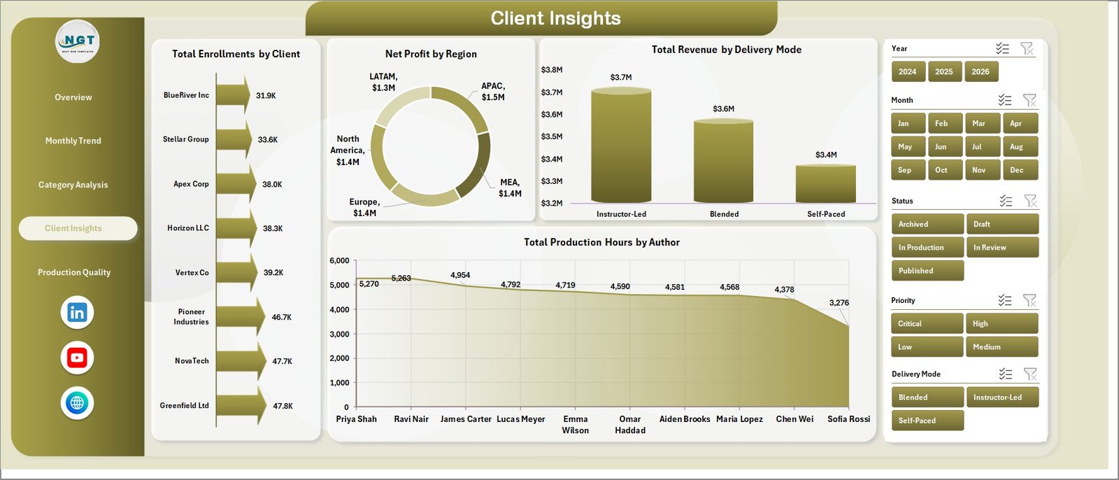
Regional Analysis
5. Maintenance Type
The Maintenance Type tab focuses on work priority, cost, record status, and crew activity. It includes Total Records by Priority, Total Maintenance Cost by Maintenance Type, Total Records by Status, and Total Labor Hours by Crew Lead. This page helps coordinators understand workload mix and the people or teams carrying the most hours.
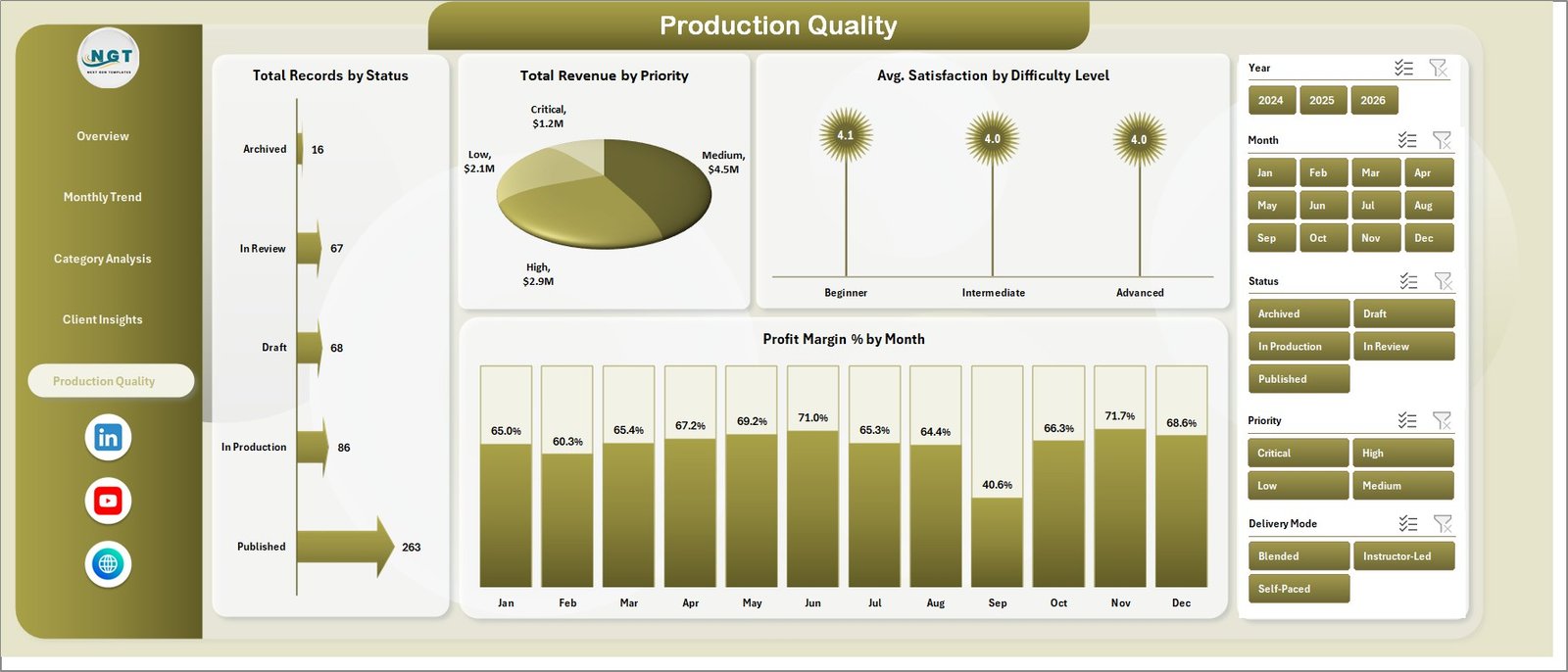
Maintenance Type
6. Data Sheet Tab
The Data Sheet is where users enter or paste the source records. The dashboard depends on this sheet, so the format should remain consistent. After data is updated, the user can refresh pivots and charts to reflect the latest information.
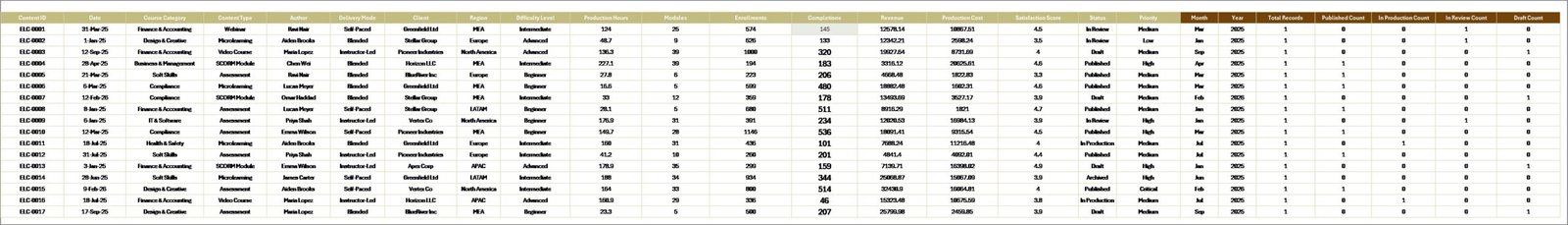
Data Sheet tab
7. Support Sheet
The Support Sheet contains pivot tables used to make the dashboard dynamic. After updating the Data tab, go to the Data tab in the Excel Ribbon and click Refresh All. The pivots and charts will refresh. This sheet can remain hidden to keep the workbook clean for end users.
Support sheet tab
E-learning Content Services Dashboard in Excel vs. Google Sheets vs. Paid CRM/SaaS – Feature Comparison
| Feature | This Excel Template | Google Sheets Alternative | Paid SaaS Alternative |
|---|---|---|---|
| Cost | $17.99 one-time | Low direct cost, manual build time | Monthly or yearly subscription |
| Platform | Microsoft Excel | Google Sheets | Vendor cloud software |
| Setup time | Replace data and refresh | Build charts, pivots, and formulas | Requires configuration and onboarding |
| Real-time team collaboration | Available through OneDrive or SharePoint | Strong native collaboration | Usually included by user license |
| Customizable fields | Fully editable workbook | Editable if built manually | Limited by product settings |
| Share with link | Possible through Microsoft cloud storage | Built in | Usually account based |
| Year-1 cost at 5 users | $17.99 plus existing Excel access | Low tool cost, higher build time | Often hundreds or thousands |
| Pivot refresh workflow | Included | Must be built | Depends on reporting module |
Who Should Use This Template
This dashboard is useful for e-learning companies, content services teams, online training operations, education support vendors, platform service analysts, and managers who need a clean way to track service records in Excel. It is also helpful for consultants who prepare recurring operational reports for education or content delivery clients.
The template is not meant to replace a full learning management system, ticketing system, asset management platform, or ERP. It works best as a reporting layer when your source data is already available in rows and columns.
Real-World Use Cases
Nina, content services lead: Nina uses the Overview page to prepare weekly updates for leadership, focusing on cost, spend, downtime, and customer impact.
Arjun, operations analyst: Arjun uses Monthly Trend and Regional Analysis to find periods and locations where downtime or spend increased sharply.
Priya, service coordinator: Priya uses Maintenance Type to review priority, status, cost, and crew lead labor hours before assigning new work.
Advantages of E-learning Content Services Dashboard in Excel
- It reduces manual chart-building time.
- It keeps high-level KPIs and detailed analysis in one workbook.
- It helps users filter data quickly using slicers.
- It supports monthly reviews and operational performance meetings.
- It can be customized because it is built in Excel.
- It avoids the recurring cost of a separate reporting SaaS tool.
Opportunities for Improvement
Because this is an Excel template, it depends on clean source data and manual refresh. Teams that need live database connections, automated alerts, role-based permissions, or real-time workflow approval may need a full business intelligence or operations platform. However, for teams that want fast reporting with editable Excel logic, this template is a practical starting point.
Best Practices
- Keep the Data Sheet column structure unchanged.
- Refresh all pivots after every data update.
- Use consistent names for regions, asset types, priorities, and statuses.
- Review monthly trends before making budget decisions.
- Hide the Support Sheet after validation to keep the workbook simple for end users.
- Use Microsoft guidance for Excel tables and structured data when preparing the source file: Microsoft Support: Create and format tables.
Explore Relevant Templates
- E-learning Content Services Dashboard in Excel
- Educational NGOs Dashboard in Power BI
- Disability Support NGOs Dashboard in Power BI
- Excel Dashboard Templates
Frequently Asked Questions
What is the E-learning Content Services Dashboard in Excel?
It is an Excel dashboard template for tracking service costs, spend, downtime, customer impact, safety score, assets, regions, maintenance type, status, priority, and labor hours.
Can I use this dashboard with my own data?
Yes. Add your data in the Data Sheet using the same format, then refresh all pivots and charts.
Does the dashboard require macros?
The provided details describe a pivot-driven Excel dashboard. Normal refresh and analysis can be handled through Excel’s Data tab and slicers.
Can I customize the workbook?
Yes. Since it is an Excel file, you can edit fields, chart titles, colors, formulas, and sheet layouts according to your needs.
What is the purpose of the Support Sheet?
The Support Sheet stores pivot tables used by the dashboard. It can be hidden once the workbook is set up.
Is this suitable for non-education operations?
It is named for e-learning content services, but teams with similar cost, downtime, asset, region, and maintenance data can adapt it.
About the Author
Built by PK – Microsoft Certified Professional with 15+ years of Excel, Google Sheets, and Power BI experience. Founder of NextGenTemplates, reaching 300K+ subscribers across YouTube channels. Every template is hand-built and tested before release.
Conclusion
The E-learning Content Services Dashboard in Excel gives teams a practical way to convert service records into useful insights. With KPI cards, slicers, monthly trends, asset analysis, regional analysis, maintenance type reporting, a structured data sheet, and refreshable support pivots, it helps managers move from scattered records to clear decision-making.
Visit Youtube.com/@PKAnExcelExpert for step-by-step Excel tutorials.