E-learning Content Services Dashboard in Power BI gives education businesses, course production teams, and e-learning service providers a clean way to monitor revenue, production cost, enrollments, completions, net profit, course categories, clients, delivery modes, and production quality in one interactive report. Many content service teams still review these numbers across separate spreadsheets, client files, and monthly summaries. That slows decisions and makes it harder to see which courses, clients, regions, or months are creating profit. This Power BI template turns those records into KPI cards, slicers, trend charts, client views, category analysis, and production quality reporting.
Click here to purchase the E-learning Content Services Dashboard in Power BI.
E-learning Content Services Dashboard in Power BI
Key Features of E-learning Content Services Dashboard in Power BI
- Five report pages for Overview, Monthly Trend, Category Analysis, Client Insights, and Production Quality.
- High-level KPI cards for Total Revenue, Total Production Cost, Total Enrollments, Total Completions, and Net Profit.
- Multiple slicers that let users apply filters and view the filtered dashboard quickly.
- Revenue and production cost analysis by region, course category, month, and selected filters.
- Course and learner trend analysis through net profit, average revenue per course, enrollments, and completions.
- Client and delivery insights to compare revenue by delivery mode, enrollments by client, and profit by region.
- Production quality reporting by priority, status, and monthly profit margin.
- Editable Power BI file for teams that want to adapt visuals, fields, measures, and colors in Power BI Desktop.
Dashboard Pages Explanation
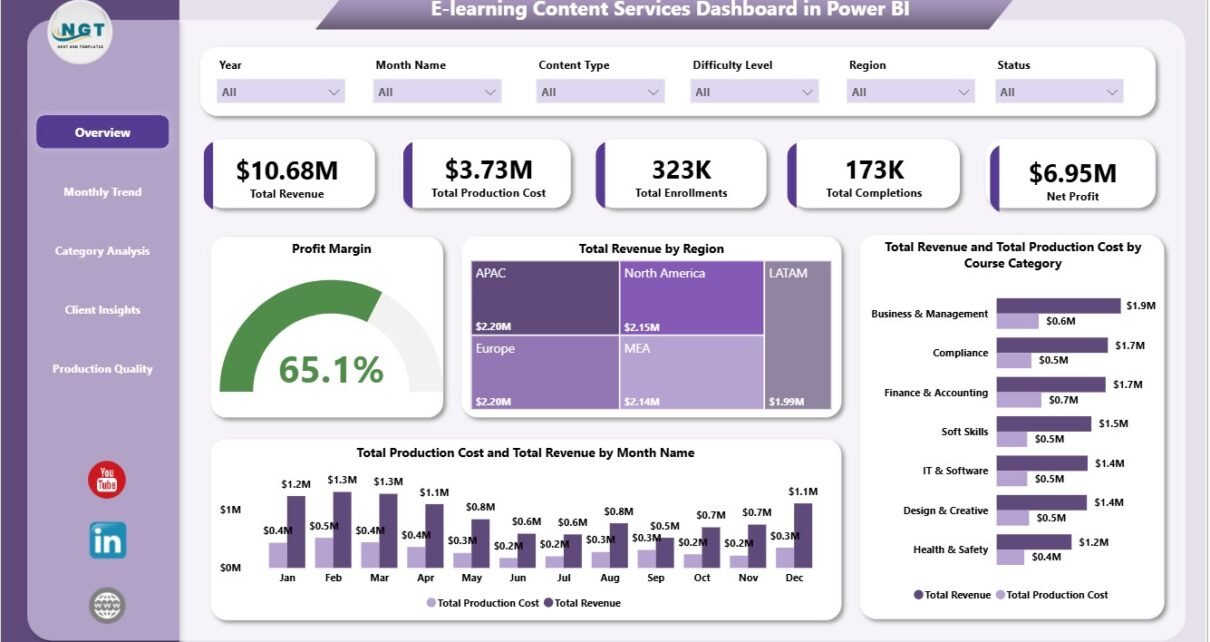
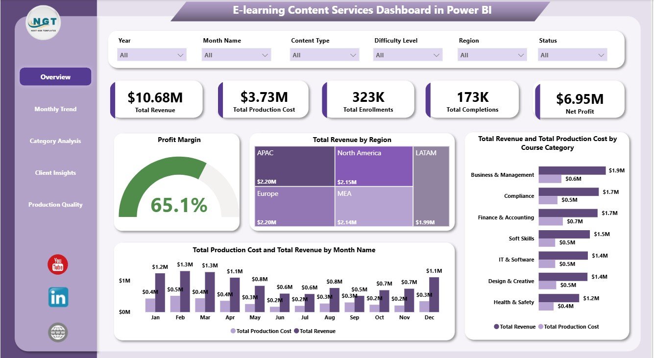
1. Overview Page
The Overview page is the main executive view of the report. At the top, it shows Total Revenue, Total Production Cost, Total Enrollments, Total Completions, and Net Profit. These cards help managers understand financial output and learning activity before they move into detailed pages.
Profit Margin by Selected Filters: This chart shows margin after slicers are applied. It helps managers test profitability for specific regions, clients, categories, delivery modes, or months.
Total Revenue by Region: This chart compares revenue by region. It helps teams identify strong markets and locations where sales, content delivery, or client engagement may need improvement.
Total Revenue and Total Production Cost by Course Category: This chart compares income and cost by course category. It helps decision-makers see which course groups are profitable and which categories may need cost review or pricing changes.
Total Production Cost and Total Revenue by Month Name: This monthly comparison shows whether revenue is staying ahead of production cost. It is useful for spotting cost spikes, seasonal patterns, and months with stronger profit potential.
Overview Page
2. Monthly Trend
The Monthly Trend page helps users understand how performance changes over time. Net Profit by Month Name highlights profit movement by month, making it easier to find profitable periods and months that require cost control.
Avg Revenue Per Course by Month Name tracks whether each course is generating more or less revenue over time. Total Completions and Total Enrollments by Month Name compares learner intake with learner completion, which is important for measuring whether enrollment activity is turning into finished courses.
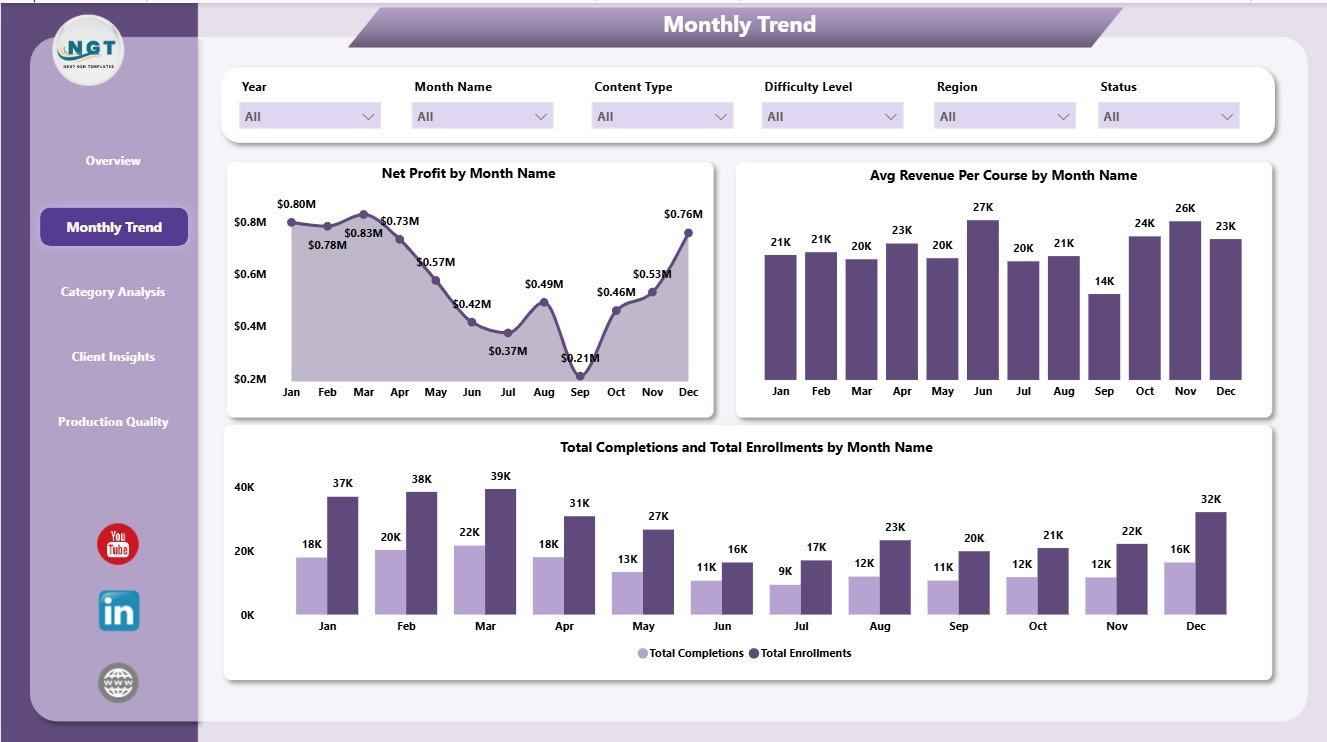
Monthly Trend
3. Category Analysis
The Category Analysis page breaks down results by learning and content attributes. Total Revenue by Difficulty Level shows whether beginner, intermediate, advanced, or other difficulty groups produce more revenue.
Net Profit by Content Type compares profit by content format, such as video, interactive modules, assessments, or other service types. Total Revenue by Client identifies which clients contribute the highest revenue and can support client prioritization.
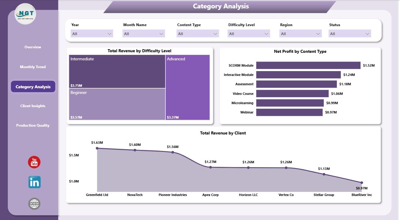
Category Analysis
4. Client Insights
The Client Insights page helps account managers and delivery leaders understand client-side performance. Total Revenue by Delivery Mode compares financial output from online, blended, live, recorded, or other delivery methods.
Net Profit by Region shows which regions are creating stronger profitability after costs are considered. Total Enrollments by Client highlights client-level learner volume and helps teams prepare client review conversations.
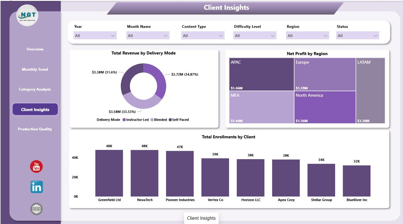
Client Insights
5. Production Quality
The Production Quality page connects operational status with financial performance. Total Revenue by Priority shows how much revenue is attached to each priority level, helping teams manage urgent and high-value content work.
Net Profit by Status compares profit across production status values such as planned, in progress, completed, or delayed. Profit Margin by Month Name tracks margin over time and helps users spot months where quality issues, rework, or production delays may have affected profitability.
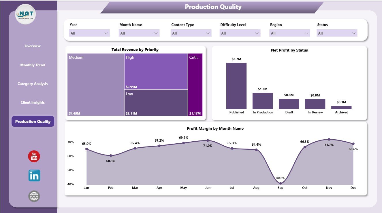
Production Quality
E-learning Content Services Dashboard in Power BI vs. Tableau vs. Paid CRM/SaaS – Feature Comparison
| Feature | This Power BI Template | Tableau Alternative | Paid SaaS Alternative |
|---|---|---|---|
| Cost | $17.99 one-time | Requires Tableau licensing | Monthly or annual subscription |
| Platform | Power BI Desktop | Tableau Desktop or Cloud | Vendor-hosted platform |
| Setup time | Open .pbix, replace data, refresh | Build workbook, model, and visuals | Requires onboarding and configuration |
| Real-time team collaboration | Available through Power BI Service | Available through Tableau Cloud | Usually included by plan |
| Mobile access | Available after publishing to Power BI Service | Available through Tableau Cloud | Depends on vendor app |
| Customizable fields | Editable visuals, fields, model, and measures | Editable if built manually | Limited by vendor settings |
| Share with link | Possible through Microsoft sharing | Possible through Tableau sharing | Usually login based |
| Year-1 cost at 5 users | $17.99 plus any Microsoft licensing | Usually much higher | Often hundreds or thousands |
| E-learning production analytics | Pre-built across five pages | Must be designed | Depends on reporting module |
Who Should Use This Template
This dashboard is useful for e-learning companies, course production agencies, online training providers, education service vendors, client success teams, content operations teams, and finance analysts who report on revenue, production cost, enrollments, completions, net profit, course categories, clients, and production quality.
It is not a course authoring platform, student portal, CRM, invoice system, or live learning management system. It is best used as a reporting layer when your operational data already exists in a structured table.
Real-World Use Cases
Nina, content services lead: Nina uses the Overview page each week to discuss total revenue, production cost, enrollments, completions, and net profit with leadership.
Arjun, operations analyst: Arjun reviews Monthly Trend and Production Quality to see where profit margin changed and whether production status or priority affected results.
Priya, client success manager: Priya uses Client Insights before review calls to identify top clients by enrollment volume and revenue contribution.
Advantages of E-learning Content Services Dashboard in Power BI
- It saves time compared with building Power BI visuals from scratch.
- It keeps financial, learner, client, category, and production views in one report.
- It lets users filter quickly with slicers instead of creating separate reports.
- It supports monthly business reviews and client performance discussions.
- It can be customized in Power BI Desktop as the reporting process grows.
- It avoids the recurring cost of a separate analytics SaaS tool.
Opportunities for Improvement
Because this is a Power BI template, it depends on clean source data and a refresh process. Teams that need live API connections, automated alerts, role-based workflows, or LMS-level learner management may need additional Power BI setup or a full operating platform. The template is strongest when you want a ready reporting foundation that can be edited and extended.
Best Practices
- Keep source data columns consistent before refreshing the report.
- Use clear naming for clients, regions, course categories, delivery modes, priority, and status values.
- Review monthly revenue and production cost together, not separately.
- Use the completion and enrollment visuals together to compare demand and learner outcomes.
- Open the report in Power BI Desktop and refresh after data changes.
- Use Microsoft guidance to install or update Power BI Desktop: Microsoft Learn: Get Power BI Desktop.
Explore Relevant Templates
- E-learning Content Services Dashboard in Power BI
- E-learning Content Services Dashboard in Excel
- Educational NGOs Dashboard in Power BI
- Employee Training KPI Dashboard in Power BI
- Power BI Dashboard Templates
Frequently Asked Questions
What is the E-learning Content Services Dashboard in Power BI?
It is an editable Power BI dashboard template for tracking e-learning content services revenue, production cost, enrollments, completions, net profit, clients, categories, delivery modes, priority, status, and profit margin.
Can I use this dashboard with my own data?
Yes. Replace the sample source with your structured data and refresh the Power BI report.
Do I need Power BI Desktop?
Yes. The report is designed for Power BI Desktop, which is free from Microsoft. Publishing and sharing may require Power BI Service licensing.
Can I customize the dashboard?
Yes. You can edit visuals, fields, measures, colors, labels, and source connections in Power BI Desktop.
Does this dashboard replace an LMS?
No. It is a reporting and analytics template, not a learning management system, course delivery tool, or student portal.
Who is this dashboard best for?
It is best for e-learning agencies, education service providers, training content teams, client success managers, and analysts who need reusable reporting for course revenue, cost, enrollment, completion, and production quality.
About the Author
Built by PK – Microsoft Certified Professional with 15+ years of Excel, Google Sheets, and Power BI experience. Founder of NextGenTemplates, reaching 300K+ subscribers across YouTube channels. Every template is hand-built and tested before release.
Conclusion
The E-learning Content Services Dashboard in Power BI helps content teams move from scattered reports to a structured analytics view. With five report pages, KPI cards, slicers, monthly trends, category analysis, client insights, and production quality visuals, it gives managers a practical way to review revenue, cost, learner activity, and profitability.
Visit Youtube.com/@PKAnExcelExpert for step-by-step Excel and Power BI tutorials.