Electric Utility Maintenance Dashboard in Excel gives utility maintenance teams a clear way to review maintenance cost, total spend, downtime hours, customers affected, safety score, asset performance, regional activity, and maintenance type workload in one workbook. Many electric utilities still review maintenance records across disconnected sheets, monthly reports, and manual pivot tables. That slows down decisions and makes it harder to see where outages, high-cost assets, or SLA issues are building up.
This ready-to-use Excel dashboard turns structured maintenance records into KPI cards, slicers, charts, monthly trends, asset analysis, regional reporting, and pivot-driven maintenance views. Users update the Data Sheet, click Refresh All, and the dashboard pages update from the refreshed pivots. You can purchase the template here: Electric Utility Maintenance Dashboard in Excel.
Electric Utility Maintenance Dashboard in Excel
Key Features of Electric Utility Maintenance Dashboard in Excel
- 7 worksheet tabs covering Overview, Monthly Trend, Asset Analysis, Regional Analysis, Maintenance Type, Data Sheet, and Support Sheet.
- 5 headline KPI cards for Total Maintenance Cost, Total Spend, Total Downtime Hours, Total Customers, and Avg. Safety Score.
- Multiple slicers that let users filter the dashboard quickly without rebuilding charts.
- Pivot-driven visuals so cards and charts update after source data is refreshed.
- Structured Data Sheet where users can replace sample maintenance records with their own rows.
- Support Sheet containing pivot tables that power the dashboard and can be hidden after setup.
- Editable Excel format for teams that want control over labels, colors, formulas, charts, and reporting layout.
Dashboard Pages Explanation
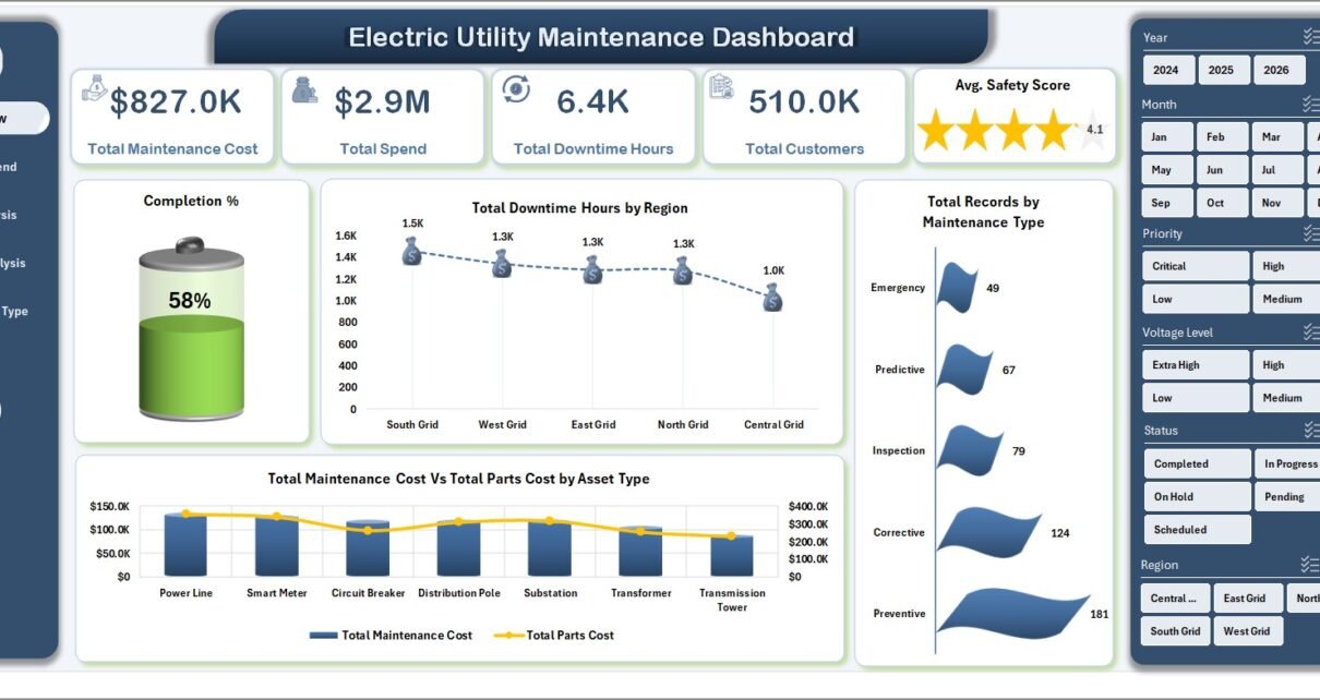
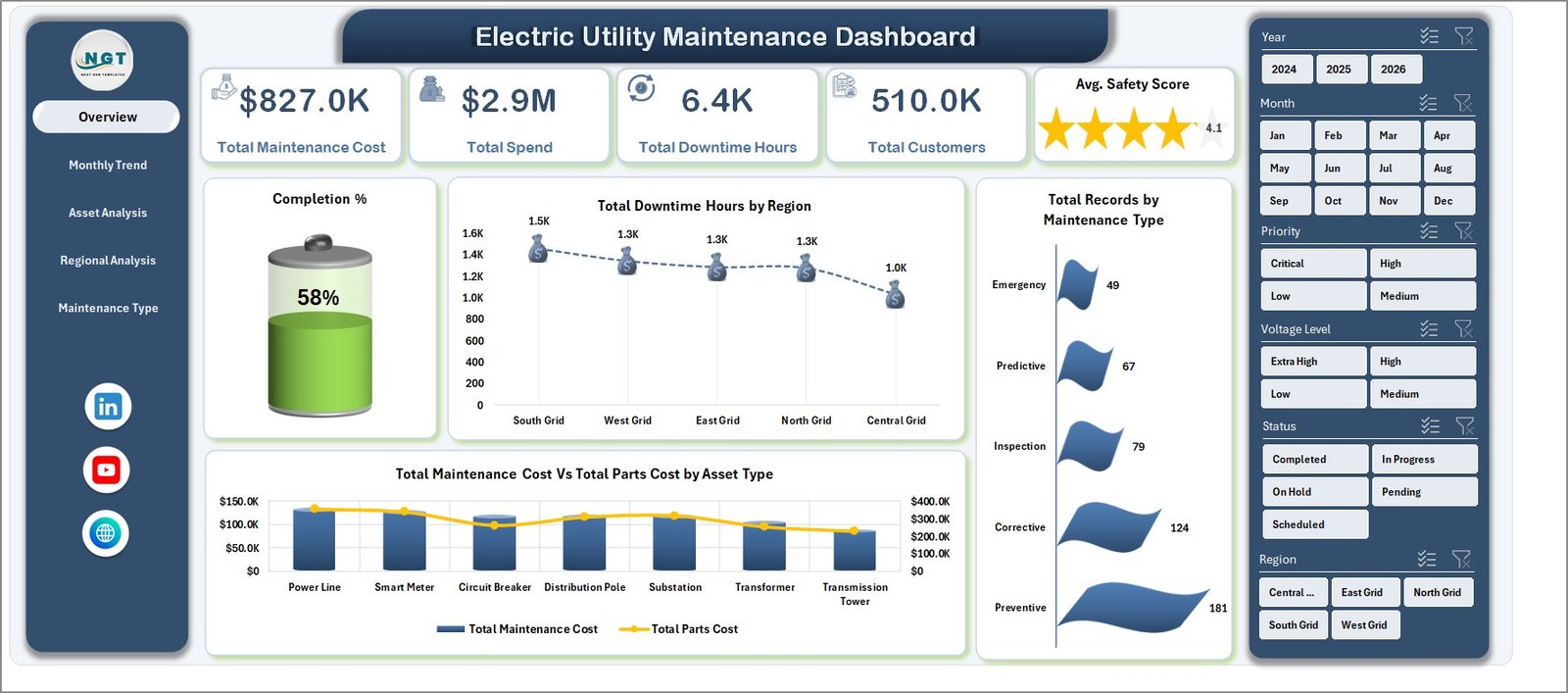
1. Overview Page
The Overview Page is the main control center of the workbook. The top KPI cards summarize Total Maintenance Cost, Total Spend, Total Downtime Hours, Total Customers, and Avg. Safety Score. These cards help maintenance leaders understand cost, reliability impact, and safety performance before moving into detailed analysis.
Completion % by Total Records: This chart compares completed records with the full maintenance workload. It helps managers see whether work is moving through the process or whether backlog pressure is increasing.
Total Downtime Hours by Region: This visual highlights which regions are producing the most downtime. It helps operations teams identify service areas that may need more preventive maintenance, crew support, or asset review.
Total Records by Maintenance Type: This chart groups records by maintenance category. It helps users understand whether preventive, corrective, planned, emergency, or inspection work is driving the highest activity volume.
Total Maintenance Cost Vs Total Parts Cost by Asset Type: This comparison shows how maintenance cost and parts cost behave across asset categories. It is useful for identifying asset types that may need replacement planning, vendor review, or stronger preventive schedules.
Overview Page
2. Monthly Trend
The Monthly Trend tab explains how maintenance cost, parts cost, downtime, total spend, and customers affected change month by month. It includes Total Maintenance Cost Vs Total Parts Cost by Month, Total Downtime Hours by Month, Total Spend by Month, and Total Customers Affected by Month. This page is useful for spotting seasonal cost spikes, repeated outage periods, and months where customer impact was unusually high.
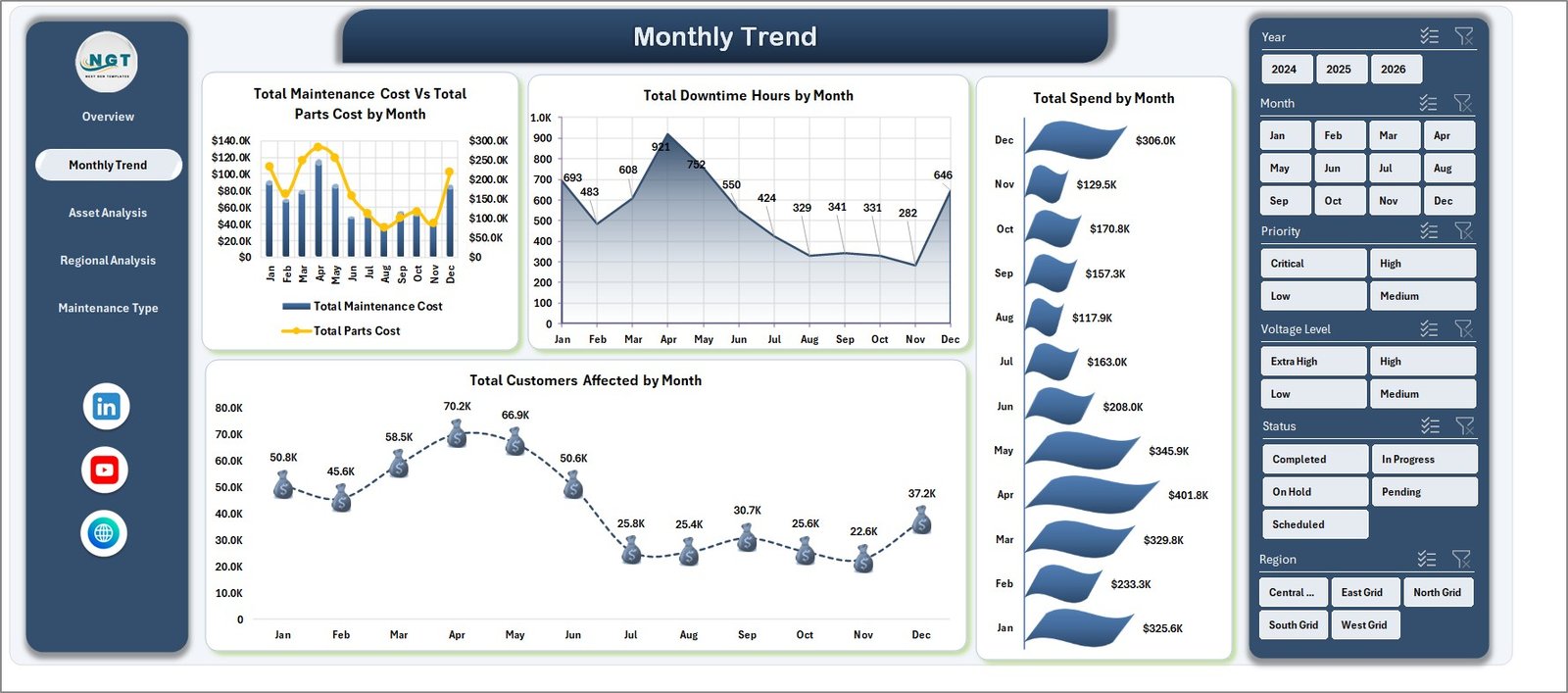
Monthly Trend
3. Asset Analysis
The Asset Analysis tab focuses on maintenance results by asset type and voltage level. It includes Total Downtime Hours by Asset Type, Total Spend by Asset Type, Total Maintenance Cost by Voltage Level, and Avg. Safety Score by Asset Type. Reliability engineers can use this page to identify expensive assets, high-downtime asset groups, and areas where safety score needs attention.
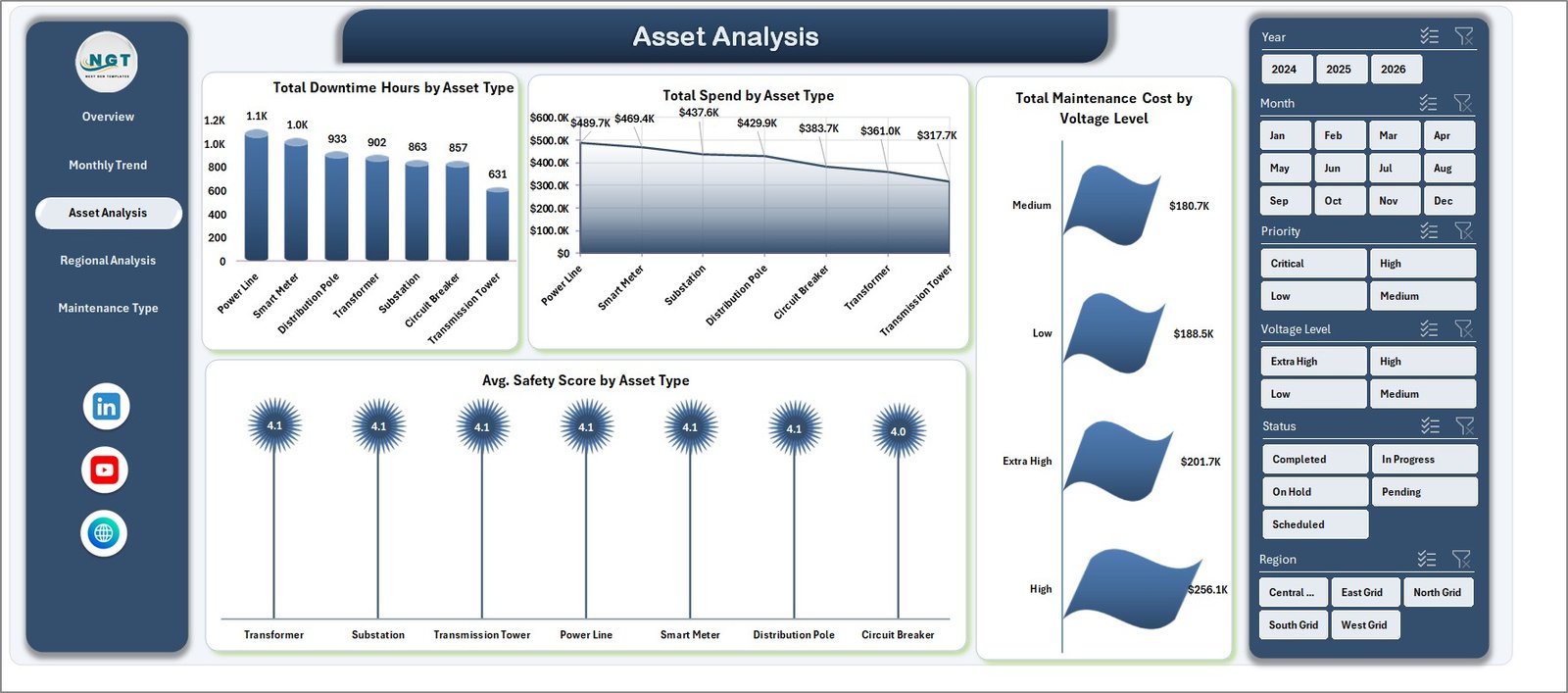
Asset Analysis
4. Regional Analysis
The Regional Analysis tab compares maintenance cost, customers affected, SLA compliance, and substation spend across locations. It includes Total Maintenance Cost by Region, Total Customers Affected by Region, SLA Compliance % by Region, and Total Spend by Substation. Regional managers can use it to compare workload, service quality, and cost concentration in one view.
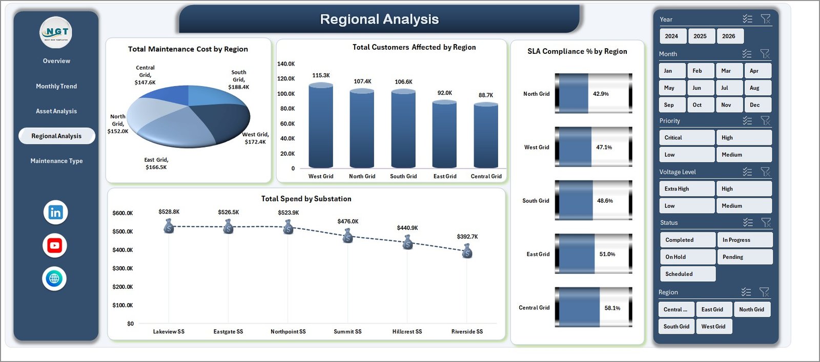
Regional Analysis
5. Maintenance Type
The Maintenance Type tab focuses on priority, maintenance type, status, and crew lead labor. It includes Total Records by Priority, Total Maintenance Cost by Maintenance Type, Total Records by Status, and Total Labor Hours by Crew Lead. This page helps maintenance coordinators understand workload mix, open work status, and crew-hour distribution before planning the next cycle.
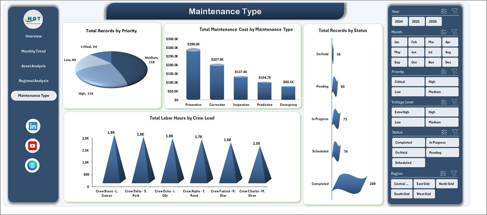
Maintenance Type
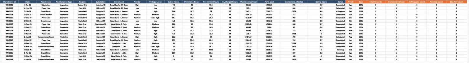
6. Data Sheet Tab
The Data Sheet is the source table for the dashboard. Users should add or replace maintenance records in the same format, keeping the column structure consistent. After updating the data, refresh the workbook so pivot tables, slicers, cards, and charts reflect the latest records.
Data Sheet tab
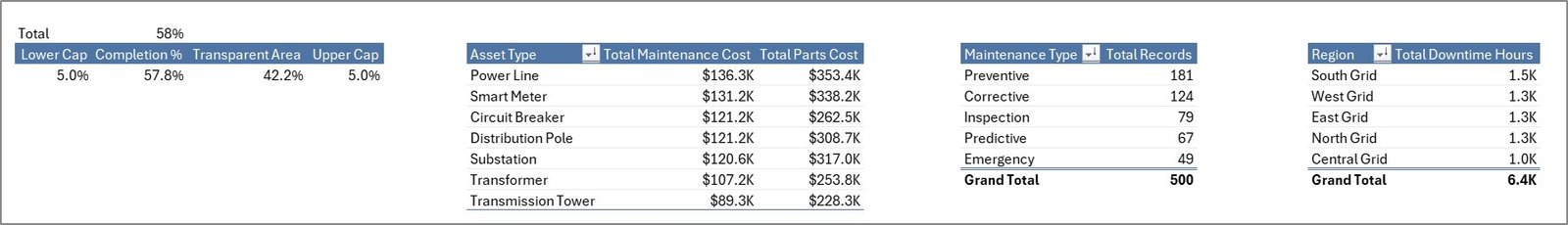
7. Support Sheet
The Support Sheet contains the pivot tables used to make the entire dashboard dynamic. After users update the Data Sheet, they can go to the Data tab in the Excel Ribbon and click Refresh All. Microsoft also documents this workflow in its guidance for refreshing PivotTable data. Once the workbook is set up, this sheet can be hidden to keep the dashboard cleaner for end users.
Support sheet tab
Electric Utility Maintenance Dashboard in Excel vs. Google Sheets vs. Paid CRM/SaaS – Feature Comparison
| Feature | This Excel Template | Google Sheets Alternative | Paid SaaS Alternative |
|---|---|---|---|
| Cost | $17.99 one-time | Low direct cost, manual build time | Monthly or annual subscription |
| Platform | Microsoft Excel | Google Sheets | Vendor cloud platform |
| Setup time | Replace data and refresh | Build pivots and charts manually | Requires configuration and onboarding |
| Real-time team collaboration | Available through OneDrive or SharePoint | Strong native collaboration | Usually included by user license |
| Mobile access | Excel mobile app or cloud storage | Browser and mobile app | Usually included |
| Customizable fields | Fully editable workbook | Editable if built manually | Limited by vendor settings |
| Share with link | Possible through Microsoft cloud storage | Built in | Account based |
| Year-1 cost at 5 users | $17.99 plus existing Excel access | Low tool cost, higher build time | Often hundreds or thousands |
| Maintenance-specific pages | Included | Must be built | Depends on reporting module |
Who Should Use This Template
This dashboard is useful for electric utility maintenance managers, operations managers, reliability engineers, asset management teams, substation supervisors, regional service managers, and analysts who prepare monthly maintenance reports. It is best for teams that already have maintenance records in a tabular format and want to turn those records into clear Excel reporting.
It is not meant to replace SCADA, outage management, field dispatch, enterprise asset management, or work order software. Instead, it works as a reporting layer for cost, downtime, customer impact, asset, region, SLA, status, and crew-lead analysis.
Real-World Use Cases
Meera, maintenance manager: Meera uses the Overview page every Monday to review cost, spend, downtime, customers affected, and safety score before assigning follow-up actions.
Daniel, reliability engineer: Daniel uses Asset Analysis to find asset types with higher downtime and maintenance cost, then recommends preventive maintenance or replacement review.
Asha, operations analyst: Asha updates the Data Sheet each month, refreshes pivots, and prepares filtered regional views for leadership meetings.
Advantages of Electric Utility Maintenance Dashboard in Excel
- It reduces manual chart-building and reporting time.
- It keeps cost, downtime, customer impact, safety, asset, region, and maintenance type data in one workbook.
- It uses slicers for fast filtering during review meetings.
- It allows users to customize charts, formulas, colors, and labels.
- It avoids the recurring cost of a separate dashboard SaaS product.
Opportunities for Improvement
Because this is an Excel template, it depends on clean source data and manual refresh. Teams needing live data feeds, automated outage alerts, permission-based workflows, GIS mapping, or system integrations may need a full enterprise platform. However, this workbook gives Excel-first teams a practical foundation for structured maintenance analytics.
Best Practices
- Keep the Data Sheet column structure unchanged.
- Use consistent names for regions, substations, asset types, priorities, statuses, and maintenance types.
- Refresh all pivots after every data update.
- Review monthly trends before making budget or staffing decisions.
- Hide the Support Sheet after confirming that all charts refresh correctly.
Explore Relevant Templates
- Energy and Utility Dashboard in HTML
- Power Distribution KPI Dashboard in Excel
- Solar Energy Dashboard in Power BI
- Browse Excel Dashboard Templates
Frequently Asked Questions
What is the Electric Utility Maintenance Dashboard in Excel?
It is an Excel dashboard template for tracking utility maintenance cost, spend, downtime, customers affected, safety score, asset performance, regional metrics, and maintenance type workload.
Can I use my own maintenance data?
Yes. Replace the sample records in the Data Sheet while keeping the same structure, then use Refresh All.
Does the dashboard require macros?
No. The dashboard is designed with Excel tables, slicers, charts, and pivot tables.
Can I customize the workbook?
Yes. You can edit charts, labels, colors, slicers, formulas, and sheet layouts based on your reporting needs.
What is the purpose of the Support Sheet?
The Support Sheet stores pivot tables that power the dashboard charts. It can be hidden after setup.
Is this dashboard suitable for large utility companies?
Yes, as long as the source data is structured and manageable in Excel. Very large or real-time datasets may require a BI or enterprise asset management platform.
About the Author
Built by PK – Microsoft Certified Professional with 15+ years of Excel, Google Sheets, and Power BI experience. Founder of NextGenTemplates, reaching 300K+ subscribers across YouTube channels. Every template is hand-built and tested before release.
Conclusion
Electric utilities need clear visibility into maintenance cost, downtime, customer impact, SLA compliance, safety, and asset reliability. The Electric Utility Maintenance Dashboard in Excel brings those metrics into a single editable workbook with KPI cards, slicers, charts, and refreshable pivots. For utility teams that want practical reporting without a new software subscription, this template is a fast and affordable starting point.
Visit our YouTube channel to learn step-by-step Excel dashboard tutorials.