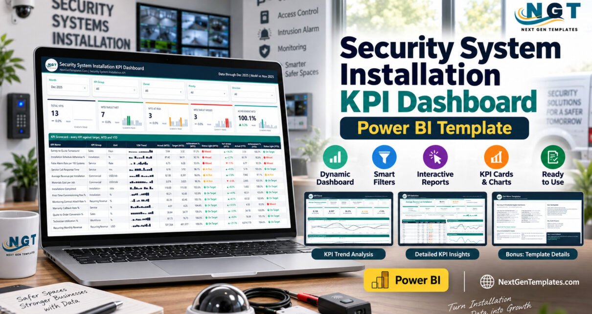
The Security System Installation KPI Dashboard in Power BI scores 13 named KPIs against a monthly target, a prior-year figure and a traffic-light threshold across 3 analytical report pages. It refreshes from one Excel workbook holding 156 target rows, 312 actual rows and a 13-row KPI dictionary, and the shipped ZIP contains the .pbix, that workbook, and a “Power BI Dashboard – User Manual” PDF.
Most alarm, CCTV and access-control installers already have the numbers. They sit in a job sheet, an accounts export and somebody’s spreadsheet, and once a month they get retyped into a deck that looks slightly different every time. This template is the reporting layer on top of those numbers: you fill three sheets, press Refresh, and the same page comes out every month with the same definitions behind it.
One thing to be clear about before anything else. This is an internal management-reporting template over data you supply. It does not monitor, test, certify or assure any alarm, CCTV, access-control or life-safety system. It does not establish compliance with UL 681, UL 827, NFPA 72, EN 50131, SIA standards, local alarm permitting, electrical codes or fire codes, and it satisfies no licensing requirement for security installers. It is not a risk assessment, a system design, a commissioning record or an inspection certificate, and it does not replace a licensed installer’s statutory duties. Every installation, compliance, response-time and inspection number in the screenshots below is a buyer-entered demo figure, not something the template measures.
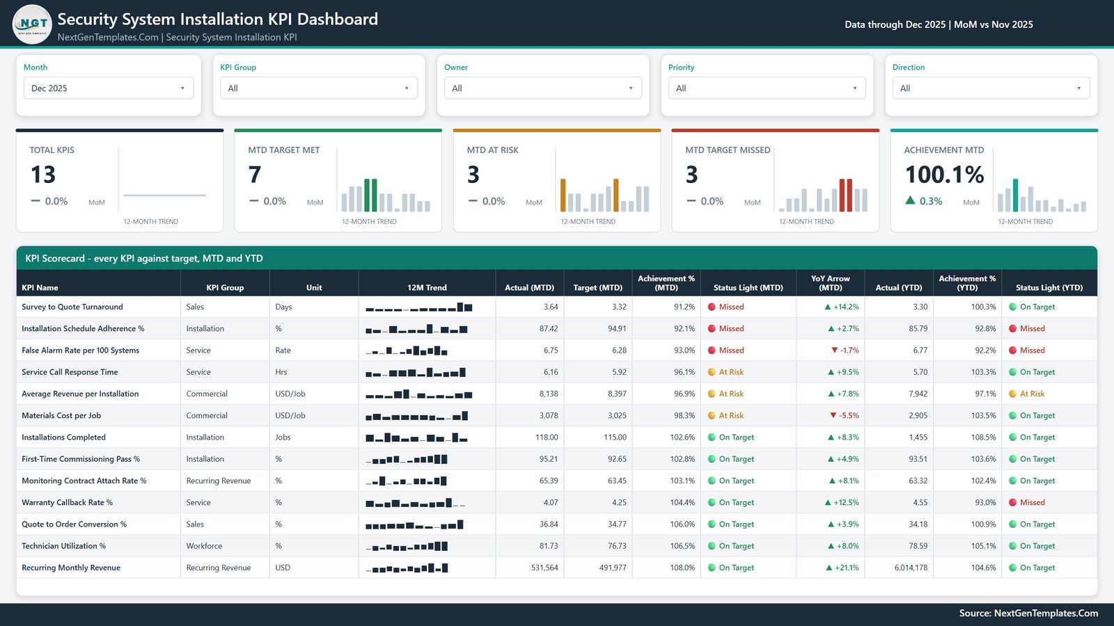
Key Features of the Security System Installation KPI Dashboard in Power BI
- 13 KPIs across 6 groups. The sample set covers Sales (Survey to Quote Turnaround, Quote to Order Conversion %), Installation (Installations Completed, First-Time Commissioning Pass %, Installation Schedule Adherence %), Service (False Alarm Rate per 100 Systems, Service Call Response Time, Warranty Callback Rate %), Workforce (Technician Utilization %), Recurring Revenue (Monitoring Contract Attach Rate %, Recurring Monthly Revenue) and Commercial (Average Revenue per Installation, Materials Cost per Job).
- Direction-aware scoring. Every KPI carries a UTB or LTB flag. Higher-is-better KPIs score Actual / Target; lower-is-better KPIs score Target / Actual, so beating a cost or response-time target scores above 100% instead of looking like a shortfall.
- Three status bands. On Target is 100% or more, At Risk is 95% to 100%, Missed is below 95% — applied to both the MTD and the YTD column.
- Five slicers, four of them synced. Month (single-select), KPI Group, Owner, Priority and Direction. The last four are sync-grouped, so a filter set on one page carries to the others.
- A prior year in the box. The workbook ships 12 months of targets and 24 months of actuals, which is what every PY and YoY figure reads from.
- Six pages, two of them hidden. Four navigable pages plus two 280×360 tooltip pages (“KPI Detail” and “Trend Detail”) that surface Achievement %, Variance % and a small breakdown chart on hover.
- Native visuals only. Across its visuals the report binds to 38 distinct measure names. That is a count of the names the visuals reference, not a claim about how many measures the model contains — the compressed model is not readable from outside Power BI, so we are not going to guess at it.
Dashboard Pages Explanation
Page 1: KPI Scorecard
The landing page. Five slicers run across the top, above five summary cards — Total KPIs, MTD Target Met, MTD At Risk, MTD Target Missed and Achievement MTD — each carrying a month-over-month delta and a 12-month sparkline. Underneath, a twelve-column table titled “KPI Scorecard – every KPI against target, MTD and YTD” shows each KPI with its group, unit, 12-month trend, MTD actual, MTD target, MTD achievement %, MTD status light, YoY arrow, YTD actual, YTD achievement % and YTD status light.
Page 2: KPI Trend
A one-KPI-at-a-time view. A left-hand rail lists all 13 KPI names; selecting one repoints the entire page. Six context cards restate the selected KPI’s group, unit, direction, owner and priority, and five value cards show KPI Actual (MTD), KPI Target (MTD), KPI Achievement % (MTD), KPI Status (MTD) and KPI YoY % (MTD). Below sit two line charts: CY MTD vs PY MTD vs Target MTD by Month and CY YTD vs PY YTD vs Target YTD by Month.

Page 3: KPI Definition
The documentation page, driven by the same synced picker. Cards carry the selected KPI’s achievement %, status, group, unit, direction, owner, priority, its written formula and its plain-English definition, plus a 12-month trend. The table “Monthly Detail for the Selected KPI” lists twelve months and a total with MTD actual, MTD target, MTD achievement %, status, YTD actual and YTD achievement %. Two charts sit alongside: MTD Actual vs Target by Month and Achievement % by Month.
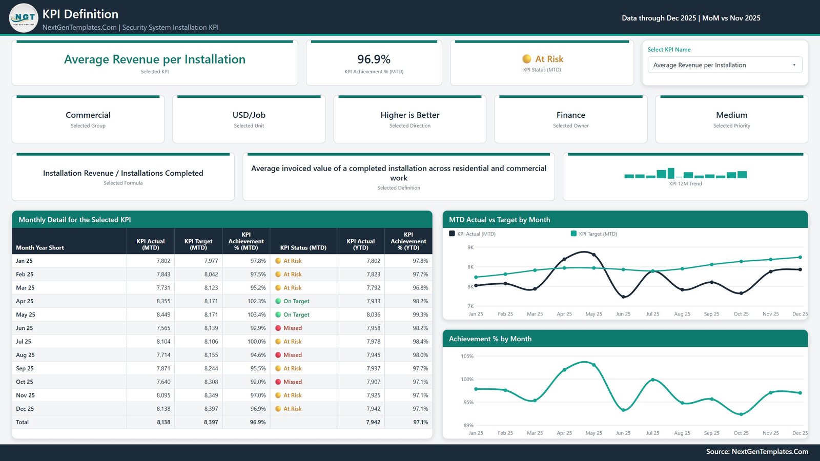
Page 4: Get More Templates
A reference and catalogue page rather than an analytical one — other NextGenTemplates Power BI titles and a short customisation crib sheet. It carries no data from your report. It is in the file you download, and we have deliberately kept it out of the product gallery for that reason.
Security System Installation KPI Dashboard in Power BI vs. Tableau / Qlik vs. Paid Field-Service SaaS
| Feature | This Power BI template | Tableau / Qlik build | ServiceTitan / Simpro / Jobber |
|---|---|---|---|
| Cost | $12.99 one-time | $70-115 / user / month | $100-300+ / user / month |
| Platform | Power BI Desktop (free) | Tableau Desktop or Qlik Sense licence | Vendor cloud only |
| Setup time | Under 10 minutes | Days of modelling | Weeks of onboarding |
| Add or rename a KPI | Edit a spreadsheet row, then Refresh | Edit and republish the workbook | Limited to the vendor’s metric catalogue |
| Direction-aware scoring | Built in per KPI | Hand-written calculations | Usually fixed by the vendor |
| Prior-year comparison | Included (24 months of actuals) | Build it yourself | Often a higher tier |
| Real-time collaboration | Via Power BI Service (separate licence) | Via Tableau / Qlik Cloud | Native |
| Mobile access | Power BI mobile app | Native apps | Native apps |
| Year-1 cost at 5 users | $12.99 total | $4,200-6,900 | $6,000-18,000+ |
For a security installation business that wants a target-scored KPI pack without a per-seat analytics bill, this template sits in the sweet spot.
Who Should Use This Template
Perfect for:
- Owners and operations managers at alarm, CCTV and access-control firms of roughly 5 to 200 staff
- Branch managers who need one repeatable monthly page for a management meeting
- Service and monitoring-centre leads watching response time, false-alarm rate and warranty callbacks
- Power BI users who would rather start from a finished model than a blank canvas
Not a fit if:
- You need compliance evidence, certification, inspection records or permit documentation — no reporting template produces those
- You want a live feed from an alarm receiver or monitoring platform; this refreshes from a spreadsheet you maintain
- You need scheduling, dispatch, quoting or invoicing — that is field-service software
- You cannot install Power BI Desktop
Real-World Use Cases
Ray runs a 40-technician alarm and CCTV installation company. Each month he pastes his figures into the Input_ Actual sheet, refreshes, and takes the scorecard page into the Monday meeting — installations completed, first-time commissioning pass rate and schedule adherence against target, on one page, instead of rebuilding a deck.
Priya manages a monitoring centre. She filters the Owner slicer to her team and watches False Alarm Rate per 100 Systems and Service Call Response Time. Both are flagged lower-is-better, so beating target scores above 100% and shows green — which saves the monthly argument about why a low number is a good number.
Daniel is a fractional CFO across three trade businesses. He uses the KPI Definition page to show each owner the written formula next to the month-by-month table, which has largely ended the disagreements about whose number is correct.
Advantages of This Dashboard
The real saving is not the licence fee, though $12.99 once against $70-115 per user per month for a Tableau Creator seat is not nothing. It is that the definition of each KPI lives in a spreadsheet cell rather than in somebody’s head. When a technician asks what “schedule adherence” counts, the answer is on Page 3, in writing, next to the number. And because the whole model keys on the KPI name, swapping the 13 sample KPIs for your own is a spreadsheet edit and a refresh, not a rebuild.
Opportunities for Improvement
Three things we found while checking the shipped file, disclosed here rather than quietly left for you to trip over:
- The YoY Arrow column is not direction-aware. It colours raw movement — up green, down red — regardless of whether the KPI is higher-is-better or lower-is-better. In the demo data, Materials Cost per Job falling 5.5% shows red while Survey to Quote Turnaround lengthening 14.2% shows green. The Achievement % and status light beside it are direction-aware; read those for the verdict.
- The value axis on the line charts abbreviates to whole thousands, so on a currency KPI two adjacent gridlines can both read “8K”. Cosmetic, and fixable in a minute by changing the axis display units.
- Display rounding can outrun the status band. A month at 99.98% achievement prints as “100.0%” while still being flagged At Risk. The status uses the underlying value; the label rounds.
None of these change a number. Beyond them, the obvious wish-list item is a live connector to a field-service system instead of a spreadsheet refresh — but that would stop the template being a template.
Best Practices
- Keep Data.xlsx in the same folder as the .pbix. If you move it, use Home > Transform data > Data source settings > Change Source.
- For rates, ratios and percentages, make the YTD column the average of the months so far, never a sum. A compliance percentage that reaches 1,900% by December is the single most common mistake in a KPI pack.
- Set Type honestly. Marking a cost KPI as higher-is-better will invert its score and its traffic light.
- Fill the prior year in Input_ Actual. Leave it out and every PY and YoY figure goes blank.
- Use the Owner column. It is what makes the Owner slicer useful in a review with more than one team in the room.
- Learn the refresh mechanics once from Microsoft’s Power BI data refresh documentation.
Explore Relevant Templates
- Fire Safety Services KPI Dashboard in Power BI — the same engine for fire protection and life-safety service work.
- Garage Door Service KPI Dashboard in Power BI — another install-and-service trade.
- Locksmith Business KPI Dashboard in Power BI — closely adjacent physical-security trade.
- Elevator Maintenance KPI Dashboard in Power BI — heavy on service-response and callback metrics.
- Window and Door Installation KPI Dashboard in Power BI — same scorecard layout, different trade.
Also available as: a Google Sheets edition of the same dashboard, and a simpler Security System Installation KPI Scorecard in Google Sheets. For camera work specifically, see the CCTV Installation KPI Dashboard in Google Sheets.
Frequently Asked Questions
Does this certify our installations or make us compliant?
No. The Security System Installation KPI Dashboard in Power BI is an internal reporting template over data you enter yourself. It does not test, certify or assure any alarm, CCTV or access-control system, and it establishes nothing under UL 681, UL 827, NFPA 72, EN 50131, SIA standards or any local permitting, electrical or fire code.
Are the numbers in the screenshots real?
No. Every figure in the images and in the shipped Data.xlsx is realistic sample data, created to demonstrate the layout. Replace all of it with your own numbers before using the dashboard for anything. The template performs no measurement of its own.
What is in the download?
A single ZIP with three files: the Power BI report (.pbix), Data.xlsx holding the KPI dictionary plus 156 target rows and 312 actual rows, and a PDF titled “Power BI Dashboard – User Manual”. No installer, no macros, no custom visuals.
How long does setup take?
Under 10 minutes if your monthly numbers are already in a spreadsheet. Paste your KPI list into the KPI Definition sheet, paste targets and actuals into the two input sheets, then press Refresh in Power BI Desktop. Every card, table and chart re-reads the workbook.
Can I use more or fewer than 13 KPIs?
Yes. Nothing hard-codes a KPI name. Add, rename or delete rows across all three sheets — the KPI name is the join key — then refresh, and the card counts, the scorecard rows and the KPI picker all follow.
How does this compare to ServiceTitan or Simpro?
Those are field-service platforms that run jobs, dispatch and invoicing at roughly $100-300 per user per month. This is a $12.99 one-time reporting layer over a spreadsheet you already maintain. It reports; it does not operate the business, and it is not a substitute for field-service software.
Do I need a paid Power BI licence?
Not to use it. Power BI Desktop is free from Microsoft and opens, refreshes and edits the file. A Pro or Premium licence is only needed to publish the report to the Power BI Service and share it online.
About the Author
Built by PK — Microsoft Certified Professional with 15+ years of Excel, Google Sheets and Power BI experience. Founder of NextGenTemplates, reaching 300K+ subscribers across YouTube channels. Every template is hand-built and tested before release.
Conclusion
If you already have the numbers and just want them scored the same way every month, this is the shortest route there. Thirteen KPIs, a month picker, direction-aware traffic lights, a prior year in the box, and a documentation page that says in writing what each metric means.
👉 Click here to purchase the Security System Installation KPI Dashboard in Power BI
Instant download · One-time payment · No subscription
🎥 More step-by-step tutorials: Youtube.com/@PKAnExcelExpert
Last updated: September 2026