Ask the owner of an equipment hire yard how last month went and you usually get a story. The excavators were out all month, two scissor lifts sat in the workshop, a big contractor still has not paid, and a damaged breaker is being argued over. All of it is true, and none of it tells you whether the month was better or worse than the one before.
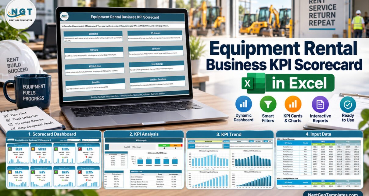
The Equipment Rental Business KPI Scorecard in Excel turns those stories into numbers you can compare: 10 rental KPIs in 5 groups, laid out as tiles with traffic lights and a 12-month sparkline, across 9 visible sheets. It arrives loaded with a full 2025 sample year, and on Aug-2025 it reads 4 Green, 4 Amber and 2 Red. This article walks through what is on each sheet, how the lights decide, and how to load your own figures.
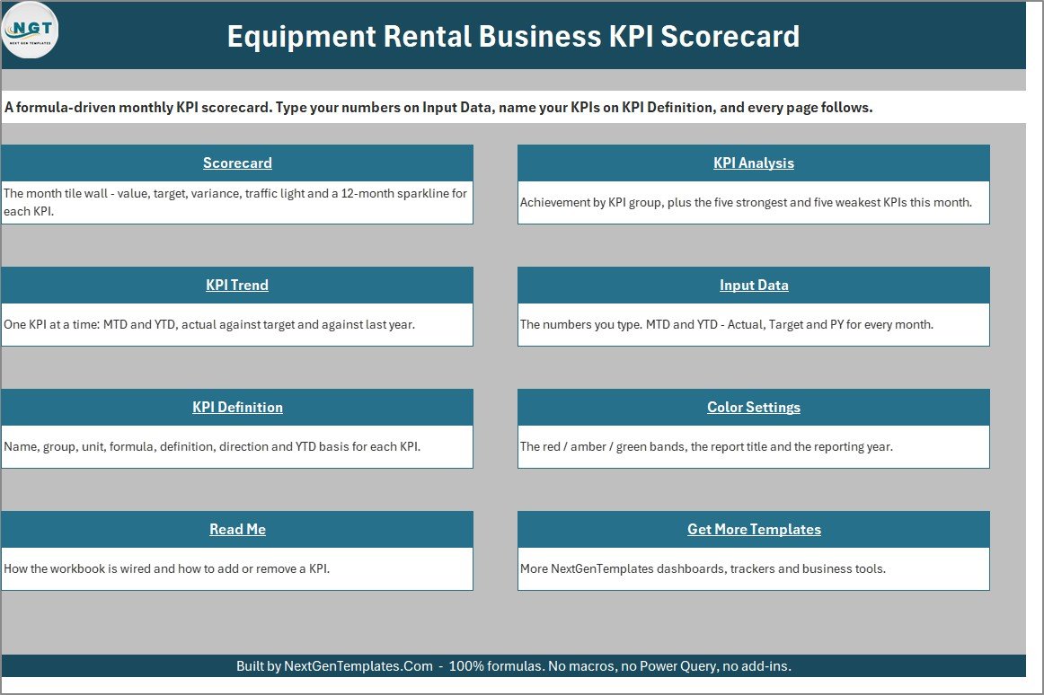
A quick word on naming, because NextGenTemplates sells several products with similar titles. This is the KPI Scorecard family – a tile-based monthly management report driven by numbers you type. The separate Equipment Rental Business KPI Dashboard in Excel belongs to the KPI Dashboard family, with its own KPI set and pages. And neither is a slicer-driven analytics dashboard such as the Rental Services Dashboard in Excel, which works from transaction-level records.
Key Features of the Equipment Rental Business KPI Scorecard in Excel
- Ten rental-specific KPIs. Rental Revenue, Average Rental Rate, Fleet Utilisation, Dollar Utilisation, Average Rental Duration, Delivery On-Time Rate, Maintenance Downtime, Customer Retention, Damage & Loss Recovery and Days Sales Outstanding.
- A header you drive from dropdowns. Select Month, an MTD / YTD switch, a Vs. selector (Target, PY or Prior Month) and a KPI set picker for KPI 1-10 or KPI 11-20.
- Traffic lights that respect direction. Eight KPIs are upper-the-better and two – Maintenance Downtime and Days Sales Outstanding – are lower-the-better, so an improving downtime figure turns green.
- Editable thresholds. The RAG bands live in ordinary cells on Color Settings. Amber defaults to within 10% of the comparison value.
- Analysis and trend pages. KPI Analysis ranks the Top 5 and Bottom 5 KPIs and rolls achievement up by group; KPI Trend charts one KPI by month against target and prior year.
- No macros at all. Formulas, conditional formatting, camera pictures and sparklines only, in a plain .xlsx that opens in Excel 2016 or later.
The Ten Equipment Rental KPIs, and Why These Ten
The KPI set covers the four things that decide whether a rental fleet makes money: how much it earns, how hard the fleet works, how well the yard delivers and maintains it, and whether customers come back and pay.
| Group | KPI | What it measures | Direction |
|---|---|---|---|
| Revenue | Rental Revenue | Total value invoiced for equipment rentals across the fleet (USD 000s) | Higher is better |
| Revenue | Average Rental Rate | Average daily rate charged per unit across active contracts | Higher is better |
| Utilisation | Fleet Utilisation | Share of available fleet days spent out on paid rental | Higher is better |
| Utilisation | Dollar Utilisation | Monthly rental revenue as a percentage of the fleet’s original cost | Higher is better |
| Operations | Average Rental Duration | Average length of a closed rental contract, in days | Higher is better |
| Operations | Delivery On-Time Rate | Deliveries and pickups completed within the promised window | Higher is better |
| Operations | Maintenance Downtime | Share of fleet days lost to units out of service for repair | Lower is better |
| Customer | Customer Retention | Active accounts that rented again within twelve months | Higher is better |
| Customer | Damage & Loss Recovery | Billed damage and loss charges that were actually recovered | Higher is better |
| Finance | Days Sales Outstanding | Average days taken to collect payment on rental invoices | Lower is better |
Fleet Utilisation and Dollar Utilisation are the pair worth reading together. Time utilisation says the machines are out; dollar utilisation says whether they are out at a price that pays back what the fleet cost. None of the ten names is fixed – every page looks a KPI up by name, so you can rename any of them on the KPI Definition sheet.
How the Traffic Lights Decide Green, Amber and Red
Home-made scorecards often paint every increase green, which is wrong for half the measures a rental yard cares about. Here each KPI carries a type:
- Upper-the-better (UTB): at or above the comparison value is green, up to 10% below is amber, more than 10% below is red.
- Lower-the-better (LTB): at or below the comparison value is green, up to 10% above is amber, more than 10% above is red.
A KPI with a blank or zero comparison value reads n/a rather than guessing. Change the percentages on Color Settings and every light, arrow and status label follows.
Workbook Sheets Explained
Scorecard
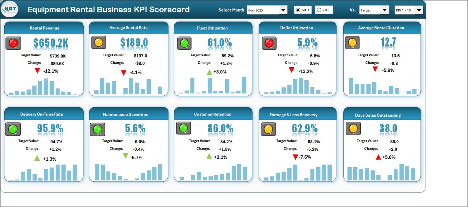
The tile wall. Each of the ten tiles shows the traffic light, the headline value, the target or comparison value, the change and a 12-month sparkline, with the month and comparison controls across the header.
KPI Analysis
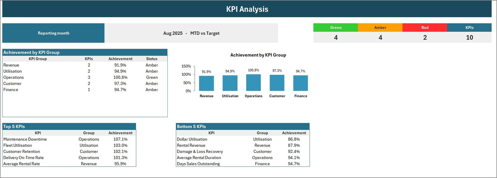
The reporting month and basis, a Green / Amber / Red / KPIs counter strip, Achievement by KPI Group as a table and a chart, and Top 5 and Bottom 5 KPI tables ranked by achievement.
KPI Trend
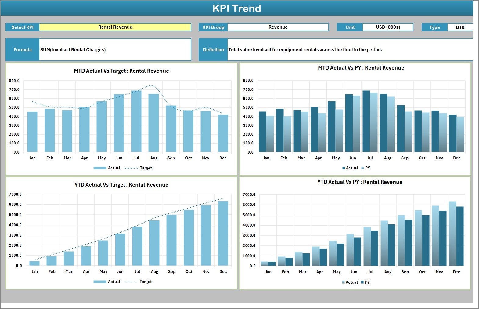
Select a KPI and the page prints its group, unit, type, formula and definition, then charts MTD Actual vs Target, MTD Actual vs PY, YTD Actual vs Target and YTD Actual vs PY month by month.
Input Data
The only sheet with numbers. One block per KPI, twelve rows per block, six columns: MTD Actual, Target and PY, then YTD Actual, Target and PY.
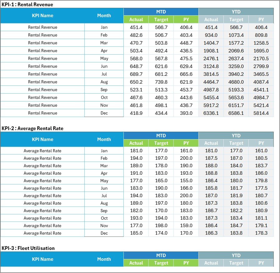
KPI Definition
Group, name, unit, formula, definition, UTB / LTB type and YTD basis for each KPI, with a Check column that turns red on a duplicate name.

Color Settings
The upper-the-better and lower-the-better RAG bands, the report title and the reporting year.
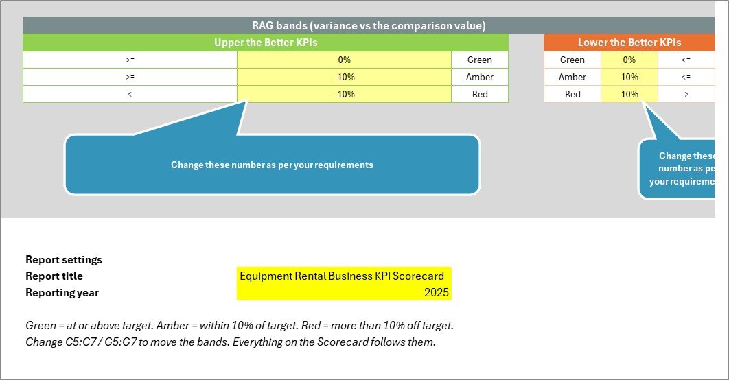
Read Me
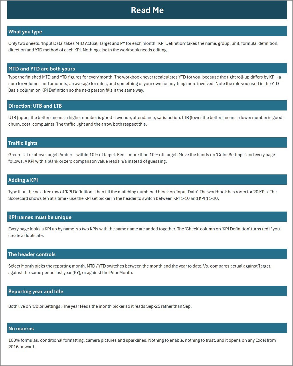
Nine short sections on what to type, how MTD and YTD work, direction, traffic lights, adding a KPI, unique names, the header controls, the reporting year and why there are no macros.
Get More Templates
A short directory of the other NextGenTemplates product lines, with a contact line for customisation.
Reading the Aug-2025 Sample Month
Open the Equipment Rental Business KPI Scorecard in Excel on Aug-2025, MTD, Vs. Target, and the story of the month is visible in four seconds.
The two reds are both about money. Rental Revenue is $650.2K against a $739.8K target, down 12.1%, and Dollar Utilisation is 5.9% against 6.8%, down 13.2%. Yet Fleet Utilisation is green at 61.0% against 59.2%. Machines are out on rent more than planned but earning less than planned, which points at rates or discounting rather than demand – and Average Rental Rate sits amber at $189.0 against $197.0 to confirm it.
The service side is healthy. Delivery On-Time Rate is green at 95.9%, Customer Retention is green at 86.0%, and Maintenance Downtime is green at 5.6% against a 6.0% ceiling, because lower is better for that KPI. The ambers worth watching are Damage & Loss Recovery at 62.9% against 68.1% and Days Sales Outstanding at 38 days against 36.
KPI Analysis rolls that up: Operations is the only green group at 100.8% achievement, with Revenue at 91.9%, Utilisation 94.9%, Customer 97.3% and Finance 94.7%. Its Bottom 5 table – Dollar Utilisation, Rental Revenue, Damage & Loss Recovery, Average Rental Duration and Days Sales Outstanding – is effectively the agenda for the month-end meeting.
Excel KPI Scorecard vs. Google Sheets vs. Rental Management Software – Feature Comparison
| Feature | This Excel KPI scorecard | A Google Sheets scorecard | Rental management SaaS |
|---|---|---|---|
| Cost | $9.99 one-time (sale price) | One-time template price | Recurring monthly subscription |
| Platform | Excel 2016 or later, Microsoft 365 | Web browser | Vendor web app |
| Setup time | Minutes | Minutes | Onboarding and integration |
| Works offline | Yes | No | No |
| Real-time collaboration | No – share the file | Yes | Yes |
| Pulls numbers automatically | No | No | Yes, once connected |
| Change a KPI or threshold | Type over a cell | Type over a cell | Admin settings or vendor support |
| Year-1 cost at 5 users | One purchase | One purchase | Twelve months of fees |
| One-page monthly report | Ready on day one | Ready on day one | Often needs a custom report |
For rental owners who want a board-ready monthly page without paying for a platform, an Excel KPI scorecard sits in the sweet spot.
Who Should Use This Template
Perfect for:
- Independent plant, tool and access equipment hire businesses.
- Fleet and operations managers who present a monthly number to owners or investors.
- Bookkeepers and consultants who produce a monthly pack for rental clients.
Not a fit if:
- You need live telematics, GPS or per-machine utilisation.
- You want bookings, contracts, invoicing or dispatch managed – look at a rental management system instead.
- You run several branches and need a branch filter on one page.
Real-World Use Cases
A two-depot access equipment company. The operations manager prints the Scorecard and KPI Analysis for the monthly owners’ meeting. When Dollar Utilisation lags Fleet Utilisation for three months, the discussion moves straight to rate cards instead of fleet size.
A tool hire yard with slow payers. The owner switches Vs. to PY and watches Days Sales Outstanding and Damage & Loss Recovery side by side. Rising DSO with falling recovery is a sign of disputed damage bills, not just late payment.
A consultant with rental clients. One workbook per client, the same ten tiles every month, and the KPI Trend page to show whether a weak quarter was seasonal or structural.
Advantages of an Excel KPI Scorecard for Equipment Rental
- One purchase, no subscription. The whole scorecard costs less than a single month of most rental software seats.
- Your data stays on your machine. Nothing is uploaded, and the file works on a laptop in the yard office with no connection.
- Consistent month-to-month shape. The same ten tiles in the same order make a bad month stand out.
- Nothing to maintain. No macros, no queries and no add-ins means nothing to break after an Office update.
Opportunities for Improvement
- YTD is typed, not calculated. The Read Me explains why – the right roll-up differs by KPI – but it is still one more column to fill each month.
- No data connection. Figures come from your rental system’s reports by hand.
- One business per workbook. There is no branch, category or asset filter; multi-depot groups need a copy per depot.
- Average Rental Duration ships as upper-the-better. Yards that prefer short, fast-turning contracts should switch it to LTB on KPI Definition.
- Ten tiles at a time. KPIs 11-20 sit behind the set picker rather than on the same screen.
Best Practices
- Agree the definition of each KPI before the first month, and write it on KPI Definition so everyone fills it the same way.
- Set realistic targets from last year’s actuals rather than wishful ones, or every light goes red.
- Record the YTD method in the YTD Basis column – sum for revenue, average for rates and percentages.
- Update on a fixed day each month so the sparklines compare like with like.
- Read Fleet Utilisation and Dollar Utilisation together before changing fleet size.
Microsoft’s Excel help and learning site is a good reference if you want to extend the workbook’s formulas.
Explore Relevant Templates
- Agro Machinery Rental Dashboard in Excel – analytics for farm machinery hire.
- Vehicle Reservation Tracker in Excel – bookings for a small vehicle fleet.
- Machine Maintenance Data Entry System in Excel – the workshop log behind a downtime figure.
- Elevator Maintenance KPI Scorecard in Excel and Glass Installation KPI Scorecard in Excel – the same scorecard engine for other trades.
- Fleet Management KPI Dashboard in Excel and the Rental Equipment Management System Web App on NextGenTemplates.
Frequently Asked Questions
Does it connect to my rental management system?
No. You type the monthly figures on Input Data. That keeps the file portable and offline, and a month’s update for ten KPIs takes a few minutes once your system’s reports are open.
Do I need to enable macros?
No. The workbook is a plain .xlsx with no VBA. It uses formulas, conditional formatting, camera pictures and sparklines, and opens in Excel 2016 or later and Microsoft 365.
How long does setup take?
Usually under half an hour: set the year and title on Color Settings, keep or rename the ten KPIs, then paste twelve months of MTD and YTD figures into Input Data.
How many KPIs can it hold?
Twenty. The Scorecard displays ten at a time, and the set picker in the header switches between KPI 1-10 and KPI 11-20.
How does it compare with rental management software?
Rental platforms run bookings, contracts and billing on a subscription. This scorecard reports the results of that work on one monthly page, for a one-time price, and can sit alongside whatever system you already use.
What is in the download?
A ZIP holding the .xlsx workbook and a PDF user manual for the Excel KPI Scorecard line.
About the Author
Built by PK – Microsoft Certified Professional with 15+ years of Excel, Google Sheets and Power BI experience. Founder of NextGenTemplates, reaching 300K+ subscribers across YouTube channels. Every template is hand-built and tested before release.
Conclusion
A rental business does not need another platform to know how its month went. It needs ten numbers in the same place every month, coloured by whether they are good. That is exactly what this scorecard delivers, with a full sample year to show you the layout before you type a single figure.
Click here to purchase the Equipment Rental Business KPI Scorecard in Excel
Instant download – One-time payment – No subscription
Last updated: September 2026
For video tutorials visit Youtube.com/@PKAnExcelExpert