Managing the recruitment process efficiently is crucial for any organization. An organized Recruitment Calendar in Excel can streamline scheduling, enhance
In the fast-paced world of education operations, staying organized is key to providing a seamless experience for both educators and
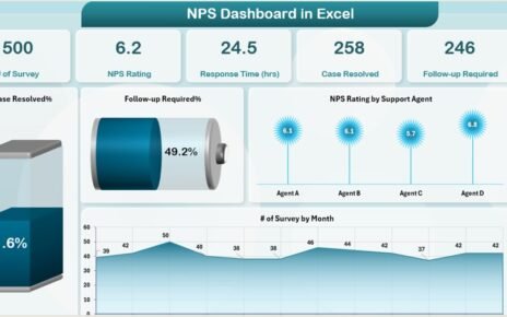
In today's highly competitive market, tracking customer satisfaction is essential for improving products, services, and overall business performance. One of