Managing service delivery in the IT and tech industry requires more than just good intentions; it demands data-driven decision-making. One of the best tools to achieve this is an IT and Tech Service Delivery KPI Dashboard in Excel. Whether you’re tracking incident resolution times, system availability, or project success rates, this dashboard empowers teams to monitor key performance indicators (KPIs) with clarity and efficiency.
In this comprehensive guide, we’ll explore everything you need to know about building and using an IT and Tech Service Delivery KPI Dashboard in Excel, from structure and key features to best practices and common FAQs.
Click to Purchases IT and Tech Service Delivery KPI Dashboard in Excel
What is an IT and Tech Service Delivery KPI Dashboard?
An IT and Tech Service Delivery KPI Dashboard is a centralized reporting tool built in Excel that tracks and visualizes essential metrics related to IT service performance. It simplifies complex data into charts, tables, and indicators, helping teams stay aligned with service goals.
This Excel-based dashboard is ideal for IT managers, support teams, and executives who want a bird’s-eye view of service performance and areas needing attention.
Key Features of the Dashboard
This dashboard template is designed with seven distinct worksheets, each with a unique purpose:
Home Sheet
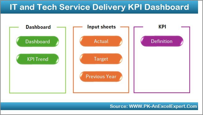
- Acts as the index page.
- Contains six navigation buttons that quickly redirect users to other sheets.
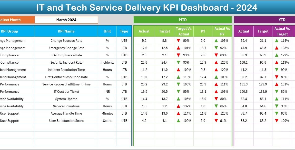
Dashboard Sheet
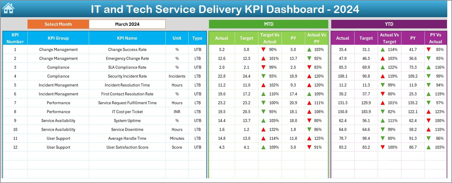
- The main visual representation of all KPIs.
- Month selection is available in cell D3. Once selected, all data updates dynamically.
Displays:
- MTD (Month-To-Date): Actual, Target, Previous Year, and comparisons.
- YTD (Year-To-Date): Actual, Target, Previous Year, and comparisons.
- Includes up/down arrows for visual insight using conditional formatting.
KPI Trend Sheet
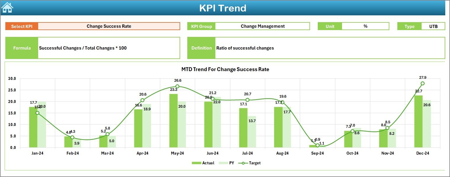
- Allows KPI selection from a dropdown (cell C3).
Displays:
- KPI Group, Unit, Type (LTB or UTB), Formula, and Definition.
- Line charts for MTD and YTD trends for Actual, Target, and PY.
Click to Purchases IT and Tech Service Delivery KPI Dashboard in Excel
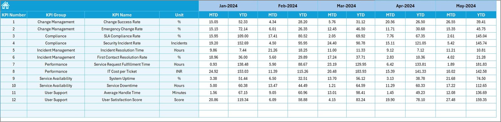
Actual Numbers Input Sheet
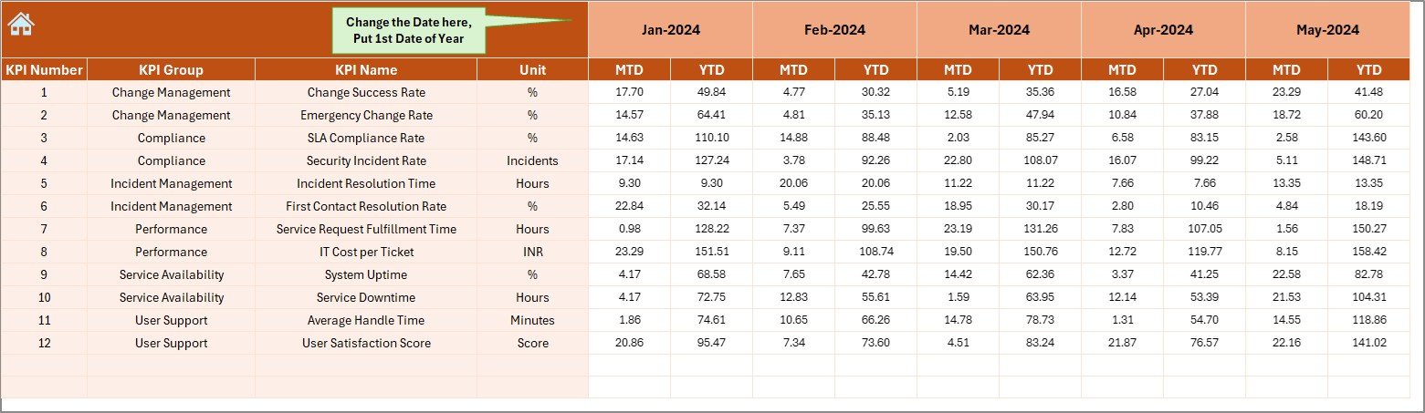
- Users input monthly MTD and YTD actuals.
- Month range is configurable in cell E1 (set the first month of the fiscal year).
Target Sheet
- Record MTD and YTD target values for each KPI.
Previous Year Numbers Sheet
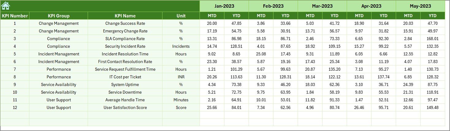
- Enter the same monthly values for the prior year.
KPI Definition Sheet
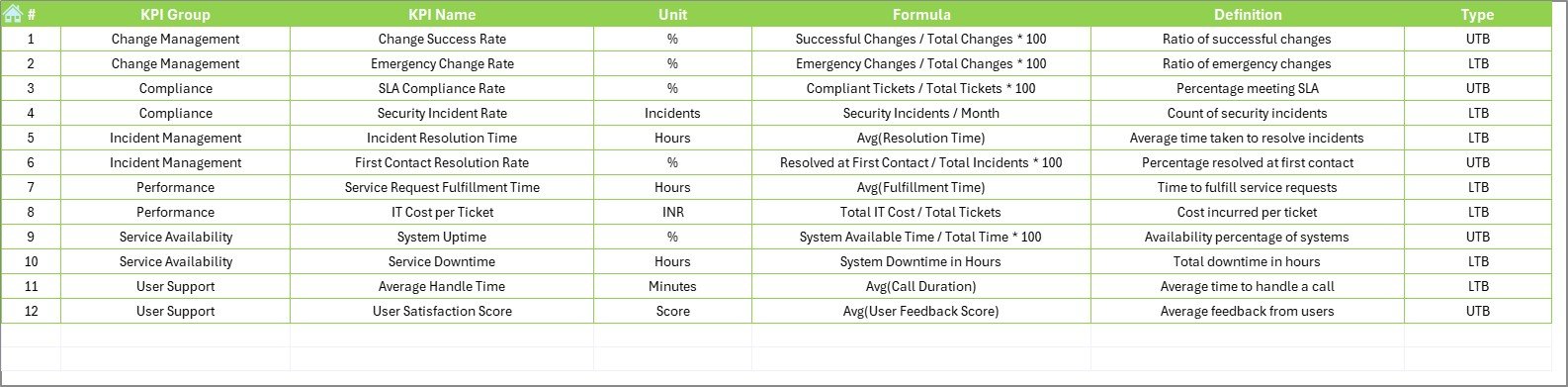
Maintain a list of all KPIs along with:
- KPI Group
- Unit
- Formula
- Definition
- Type (LTB or UTB)
Advantages of Using This Dashboard
✅ Real-Time Tracking
You can view current performance instantly by simply selecting the desired month.
✅ Visual Alerts
Conditional formatting with up/down arrows highlights whether KPIs are meeting targets.
✅ Centralized Data
All KPI definitions, actuals, targets, and trends are available in one Excel file.
✅ User-Friendly
Designed with dropdowns and navigation buttons to simplify access and usability.
✅ Flexible and Scalable
Whether you have 10 or 100 KPIs, this dashboard structure can scale with ease.
Best Practices for IT and Tech KPI Dashboards
1. Keep KPIs Actionable
Avoid vanity metrics. Choose KPIs that align directly with service improvement goals.
2. Update Data Regularly
Schedule monthly updates to ensure your dashboard reflects the latest performance.
3. Review Targets Quarterly
Business needs evolve. Review and adjust targets as per shifting goals.
4. Use Conditional Formatting Wisely
Limit the use of too many color codes. Focus on clear visual signals for performance.
5. Simplify KPI Definitions
Keep formulas and definitions short and clear to reduce confusion and improve usability.
Click to Purchases IT and Tech Service Delivery KPI Dashboard in Excel
Conclusion
An IT and Tech Service Delivery KPI Dashboard in Excel is more than just a report—it’s a strategic tool for improving performance. With this dashboard, you gain complete visibility into your service operations. It’s easy to use, adaptable to any IT environment, and rich with insights that drive better decisions.
Whether you’re managing a service desk or leading a tech infrastructure team, this Excel dashboard can transform how you track and act on your service KPIs.
Frequently Asked Questions (FAQs)
❓ What is the purpose of an IT and Tech KPI Dashboard?
Its purpose is to track key metrics related to IT service delivery and visualize trends and performance gaps clearly.
❓ Can I customize the KPIs?
Yes! You can edit, remove, or add new KPIs in the definition sheet and other input sheets.
❓ How often should I update the dashboard?
You should update it monthly to maintain accuracy and relevance.
❓ Is Excel the best tool for this kind of dashboard?
For small to medium teams, Excel offers flexibility, customization, and easy access. For large-scale automation, you might consider Power BI.
❓ Do I need advanced Excel skills?
Not at all! This dashboard uses basic Excel functions, drop-downs, and charts—easy for most users to manage.
Click to Purchases IT and Tech Service Delivery KPI Dashboard in Excel
Visit our YouTube channel to learn step-by-step video tutorials